
Choosing the right paint color for the outside of your home is one of the biggest design decisions you can make. It sets the tone for your entire property. It’s the first thing people notice, and it has to work with your roof, landscaping, trim, and lighting. If you want a color that feels soft, welcoming, and timeless, Repose Gray by Sherwin-Williams might be the perfect pick.
This shade has become one of the most talked-about neutrals in recent years. Homeowners and designers alike love it for its balance, elegance, and ease of use with other colors.
In this blog, we’ll look over why Repose Gray stands out for exterior use, how it reacts to light, what it pairs well with, and how to use it to give your home a fresh, stylish look.
Why Is Repose Gray Special?

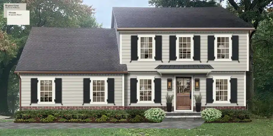
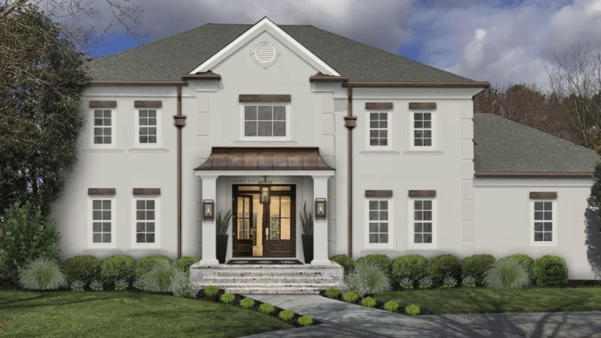
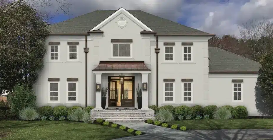
Repose Gray (SW 7015) is a light to medium gray with subtle undertones that make it incredibly adaptable. In comparison, it may look like a soft gray on the paint chip, but its true charm shows up when it’s on a full wall and exposed to natural light. Its ability to shift gently without losing character makes it one of Sherwin-Williams’ most versatile and loved colors.
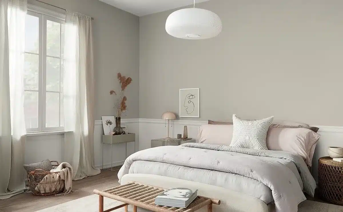
Some gray paints can feel dull or lifeless, especially outside. But Repose Gray has a hint of warmth that stops it from feeling cold. It also carries a slight hint of taupe and sometimes a touch of violet or green, depending on the light and surroundings. These undertones give it depth and character.
Repose Gray maintains a cozy but modern presence. It doesn’t read overly warm, but it isn’t icy either. That in-between balance is hard to find, which is part of what makes this color so popular.
Repose Gray sits right in the sweet spot—not too light, not too dark. That balance makes it a great choice for a variety of homes, from ranch styles to colonials to modern farmhouses. It’s neutral enough to blend with natural surroundings, yet it still stands out in a polished way.
Whether your home has a brick base, a wraparound porch, or sleek metal siding, this shade has the range to match without clashing. It’s also a color that works for both modern minimalism and classic charm.
Repose Gray in Natural Light
One of the most important things to consider when choosing an exterior paint color is how it behaves in daylight. Paint can look completely different on a bright sunny day than it does under a cloudy sky.
Changes Throughout the Day
In morning light, Repose Gray often shows its warmer side. As the sun gets higher, it can feel a little cooler. During sunset, the color can soften even more and reflect the golden tones of the setting sun. On cloudy days, it tends to appear more muted but still holds its structure.
At night, under artificial lighting, it tends to read more solid and even slightly deeper. This makes it a reliable choice for homes that are often viewed in different lighting throughout the day, such as those on corner lots or in neighborhoods with active evening street life.
Works with Different Climates
In cooler, northern climates with less direct sunlight, Repose Gray holds its warmth and won’t feel too icy. In warmer, southern areas with strong sun, it stays cool enough to look fresh and clean. It doesn’t shift in harsh or jarring ways, which is part of why it’s so popular for exteriors.
This color doesn’t just change with the weather. It adapts. That makes it a safe and smart choice when you’re unsure how your light conditions will interact with color.
Accent Colors That Pair Well With Repose Gray
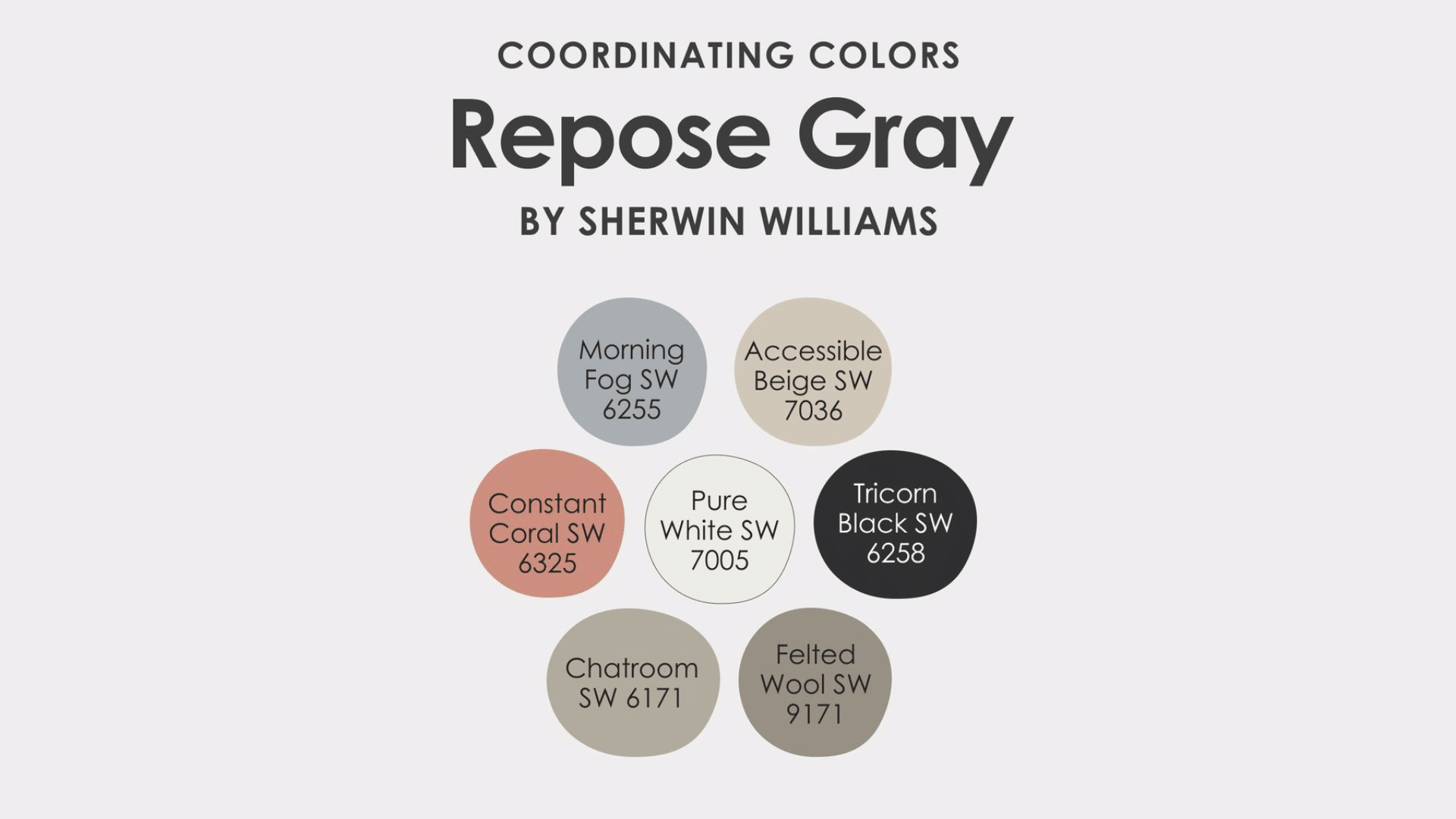
Choosing the right color for the siding is just the beginning. The trim, shutters, doors, and roof all have to work with it. Repose Gray makes pairing easy.
Trim Colors
White trim is a classic choice. A soft white, like Sherwin-Williams’ Pure White or Alabaster, adds contrast without feeling too stark. These off-whites bring warmth without blending into the main color.
For a bolder look, deep tones like Iron Ore, Peppercorn, or Tricorn Black create high contrast and dramatic curb appeal. Black trim with Repose Gray siding has become a popular modern farmhouse combo.
Roof Colors
Because Repose Gray is so adaptable, it works with a variety of roof types. Gray shingles, black asphalt, and even brown or weathered wood tones can look great. Metal rooves in charcoal or matte black also pair well. Repose Gray brings out the warmth in a brown roof and complements the clean lines of black or gray.
If your roof is red or orange-toned, you’ll want to test Repose Gray carefully to ensure the undertones don’t clash. In most cases, though, it holds up well.
Front Doors and Shutters
Want to add personality? Use color in smaller doses. Navy, black, deep green, or even a bold red door can give your home character. Wood-tone doors with warm stains also look beautiful with Repose Gray’s subtle undertones.
Shutters in rich charcoal, navy blue, or even soft beige can enhance the look without overwhelming it. You can also try a monochrome look—paint the shutters and trim in slightly different tones of gray for depth.
How Repose Gray Compares to Other Exterior Grays
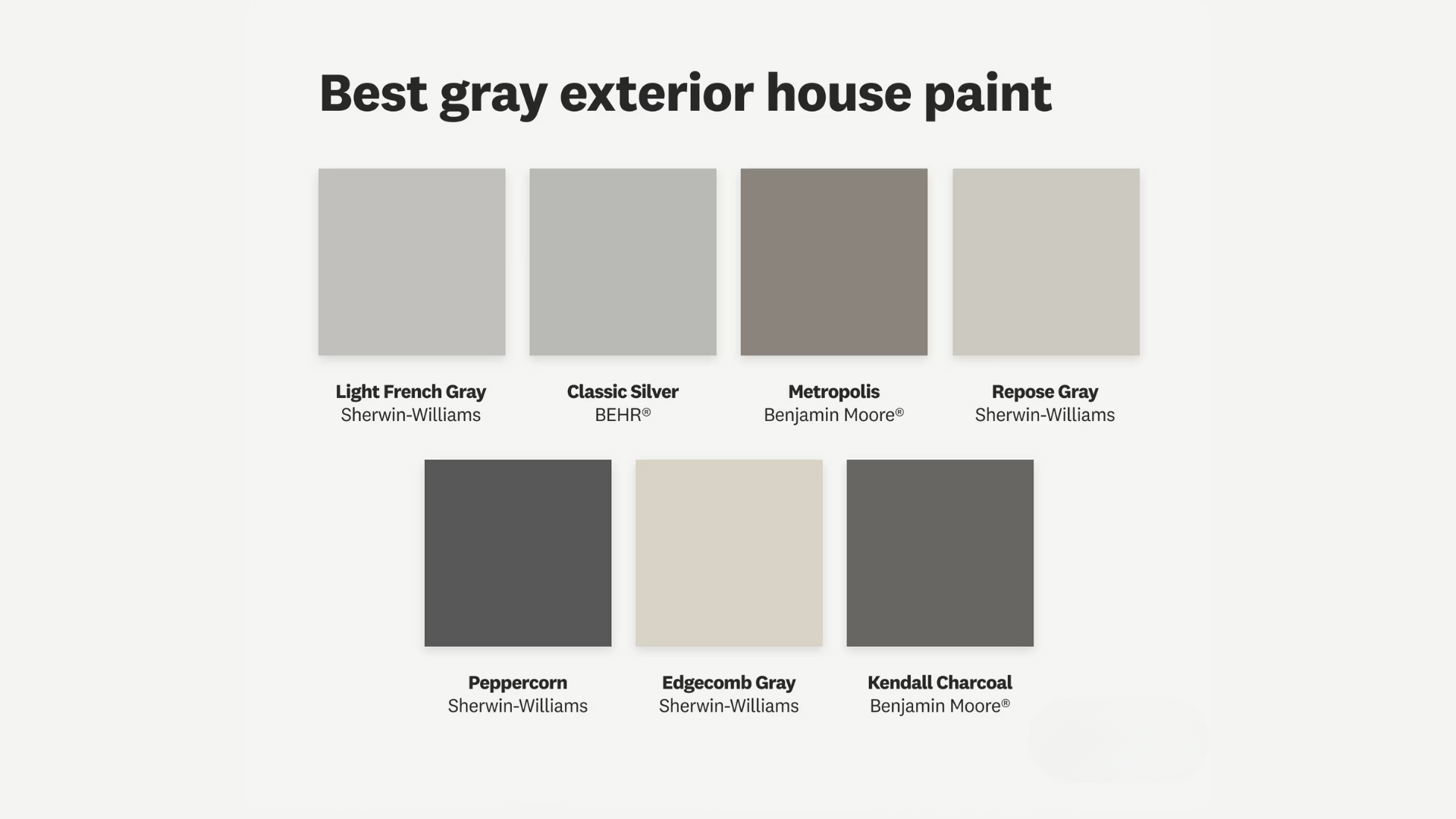
There are a lot of gray paints on the market, so it’s helpful to know how Repose Gray stacks up against some other favorites.
Repose Gray vs. Agreeable Gray
Agreeable Gray is slightly warmer and a bit more beige. It leans more toward greige. If you want something with more gray and less warmth, Repose Gray is the better fit for exterior use.
Agreeable Gray may feel more casual and creamy. Repose Gray, while still warm, feels a bit more tailored and modern in outdoor spaces.
Repose Gray vs. Light French Gray
Light French Gray is cooler and has more blue in it. It can feel sharper and more modern, while Repose Gray is softer and more relaxed. Light French Gray sometimes feels cold in low light, which isn’t a concern with Repose Gray.
Repose Gray vs. Dorian Gray
Dorian Gray is a deeper, darker gray. It’s great for dramatic exteriors, but not everyone wants something that strong. Repose Gray offers a lighter, more airy feel. If you’re painting a two-story home or a smaller house, Repose Gray might be a more balanced option.
Repose Gray vs. Mindful Gray
Mindful Gray is a bit darker and moodier but still in the same color family. It pairs well with Repose Gray, especially if you’re looking to create depth with multiple grays. Mindful Gray is great for trim, shutters, or garage doors when paired with Repose Gray siding.
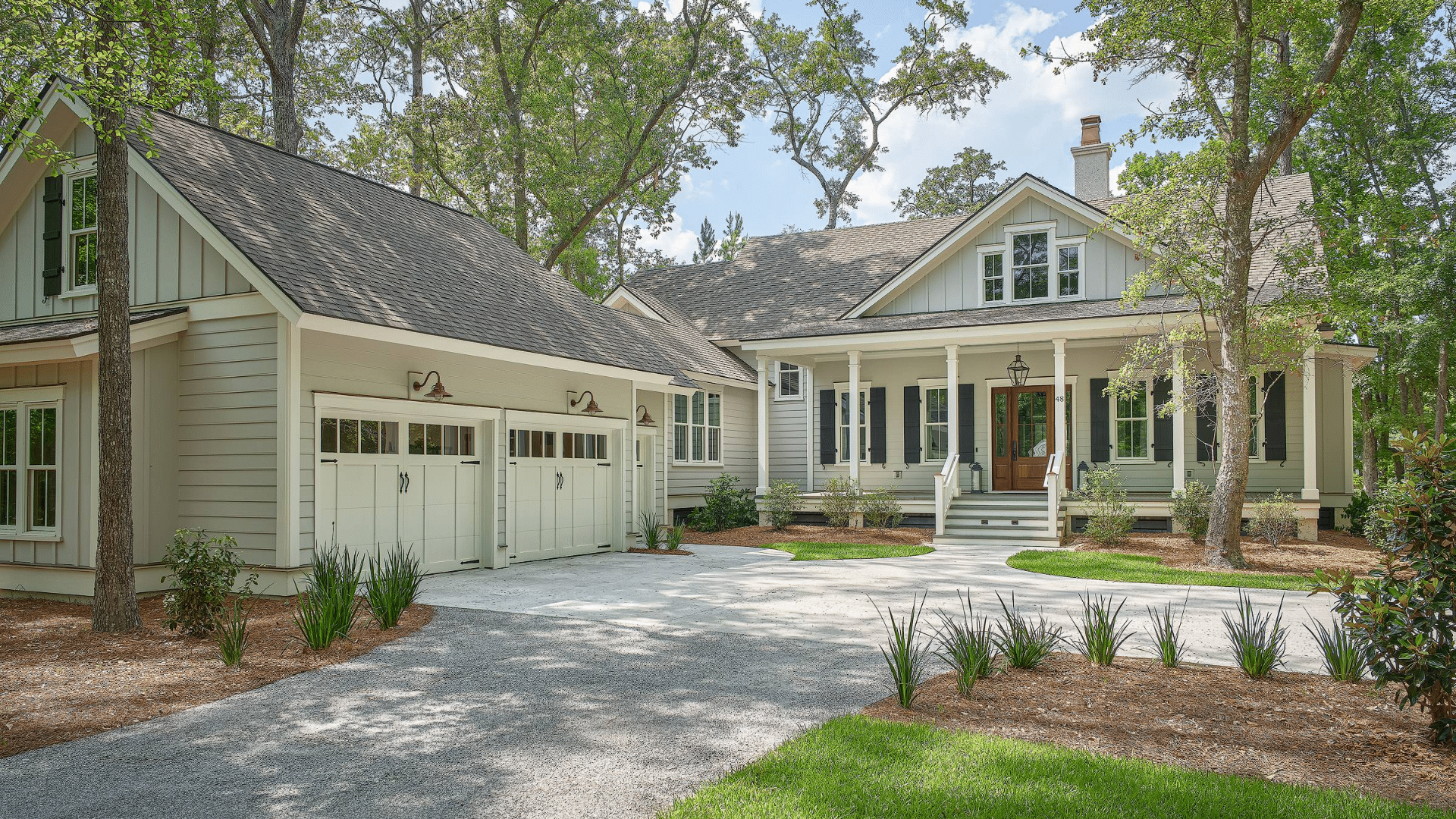
Best Home Styles for Repose Gray
Repose Gray is surprisingly flexible when it comes to architecture. It doesn’t lean so modern that it looks out of place on a traditional home, and it’s not too classic to use on a newer build.
Ranch Homes
Repose Gray brings a fresh, contemporary twist to older ranch homes. It makes dated brick or siding look cleaner and more current. Paired with black or white trim and updated lighting, it’s a simple way to modernize.
Craftsman and Bungalow Styles
On craftsman-style homes, Repose Gray works well with stonework, wood beams, and detailed trim. It complements the earthy tones these homes often have.
Farmhouse Styles
Modern farmhouses are often painted in white or black, but Repose Gray is a great in-between option. It feels softer and more approachable. Use it on the body with black windows and white trim for a timeless look.
Colonial Homes
Colonial homes benefit from Repose Gray’s balanced tone. It brings out the classic charm while updating the look for today’s market. Add traditional shutters and a bold door for curb appeal.
New Construction
Repose Gray is a favorite for new builds. It’s neutral enough to appeal to a wide audience but still feels rich and complete. It also photographs beautifully, which makes it a go-to choice for spec homes and listings.
Is Repose Gray Right for Your Exterior?
Paint is a big commitment, especially outside. Before choosing Repose Gray, think about your home’s surroundings, natural light, and existing materials.
Landscaping and Surroundings
Repose Gray looks great next to green lawns, wood decks, and stone paths. It picks up the natural colors around it without clashing.
If you have lots of trees or a wooded lot, the slight warmth in Repose Gray will make your home feel cozy and nestled in. In more open areas with brighter sun, it gives your house a cool and clean presence.
Even hardscaping materials like concrete, brick walkways, and gravel driveways look polished next to Repose Gray. It complements rather than competes.
Test Before You Commit
Always sample the color first. Paint a few swatches on different sides of your house and look at them at various times of the day. This will show how the color really looks in your space, with your specific lighting and setting.
Use larger paint samples if possible. A small card won’t give you the full effect. Try testing it near your trim, roof, and landscaping for a complete picture.
Conclusion
Repose Gray has earned its reputation as one of the most trusted and loved exterior paint colors for good reason. It’s balanced, warm, modern, and timeless all at once. It brings a home to life without overpowering it. Whether you’re updating an old house or painting a new build, Repose Gray offers the kind of calm, clean backdrop that lets every other part of your home shine.
Its soft undertones, flexibility with trim and roof colors, and compatibility with many styles make it a true go-to. If you’re feeling stuck or overwhelmed by paint choices, starting with Repose Gray is a safe, beautiful step forward.
By choosing Repose Gray, you’re not just picking a color—you’re choosing simplicity, elegance, and reliability. It’s a shade that respects a home’s architecture, elevates its curb appeal, and never tries too hard. It simply works.
Frequently Asked Questions
Does Repose Gray look more gray or beige?
It’s more gray than beige, but it does have a warm undertone. It’s not a true greige, and it won’t read tan or yellow. Instead, it stays mostly soft gray with some added warmth.
Is Repose Gray too light for exteriors?
Not at all. It’s light enough to feel fresh but still has enough depth to stand out. It doesn’t wash out in the sun, which is why it works so well on large surfaces.
What kind of white trim looks best with Repose Gray?
Sherwin-Williams Pure White and Alabaster are both excellent options. They’re soft enough to pair well without making the gray look dingy or cold.
Can I use Repose Gray with brick or stone?
Yes. It works beautifully with red brick, whitewashed brick, and most types of stone. Its undertones are neutral enough to complement natural materials.
Is Repose Gray a good choice for resale?
Absolutely. It’s a safe, popular choice that appeals to a wide range of buyers. It feels fresh and neutral, which makes it ideal for selling.