: A Perfect Shade for Any Room")
Choosing the right paint color can be challenging. You want something gentle, peaceful, and easy to coordinate. That’s where Benjamin Moore Sonnet (AF-55) comes in.
It’s a quiet pinkish-beige with a light reflectance value (LRV) of 70.4, meaning it reflects a lot of light throughout the room. But is it the right pick for your space?
I’ll examine Sonnet (AF-55) closely, determining where it works best and how to pair it. Then, you’ll be able to tell if it suits your home or if another option might be better.
Now, let’s see what makes Sonnet (AF-55) stand out and whether it’s a good match for your walls.
Why Benjamin Moore Sonnet (AF-55) is an Ideal Paint?

Sonnet is a light, warm beige with subtle pink and taupe undertones. It brings warmth to a room without feeling too yellow or too brown.
The soft tone makes it great for living spaces, bedrooms, or anywhere you want a calm and cozy atmosphere.
I’ve tested many paint colors. Some are too bold, and others feel too cold. But then I found Sonnet (AF-55). This color works, and here’s why I think you’ll love it, too.
It’s Neutral but Not Boring
Some neutral paint colors feel dull or flat. Sonnet (AF-55) doesn’t. Its soft, warm undertone gives the walls a little life without being loud.
It feels calm, clean, and balanced. It has a neutral look but more depth and warmth.
It Works in Any Room
I’ve used Sonnet (AF-55) in more than one space. It looked great in a bright kitchen, a small bathroom, a cozy bedroom, and even a hallway with no natural light.
That’s what makes it so reliable; you don’t have to second-guess where it belongs. It just fits.
It Changes with the Light (In a Good Way)
This color doesn’t stay the same all day, and that’s actually a good thing. In the morning, it looks soft and fresh. In the evening, it feels warmer and more relaxed.
Some paints turn too yellow or too gray in changing light, but Sonnet (AF-55) always looks natural.
It’s Easy to Match
Decorating around this color is simple. Pair it with white trim for a clean look or use natural wood to make the room feel cozy.
It also works well with soft blues, muted greens, and even bold black accents. You don’t need to overthink it—Sonnet (AF-55) plays well with others.
Understanding the Subtle Undertones of Sonnet (AF-55)
Sonnet (AF-55) may seem like a simple color at first glance, but it has a lot of character. Its base is a soft light taupe, placing it somewhere between beige and gray.
It leans warm, giving it a gentle and cozy feel that works well in many settings.
In natural sunlight, it looked creamy and light. In dimmer areas or rooms with soft bulbs, the warmth became more noticeable. It took on a calm, sandy look. Under LED lighting, I noticed it leaned a bit more toward beige.
Sonnet (AF-55) has warm undertones that respond to lighting in subtle ways. It doesn’t lean too gray or too beige. It’s a nice, balanced neutral, but the final choice should be based on what feels right in your home.
Best Places to Use Sonnet (AF-55) in Your Home
I’ve worked with Benjamin Moore Sonnet (AF-55) in different spaces, and every time, it brought warmth and calm without being loud.
It’s a soft color that blends in but still makes a space feel better. If you’re thinking of using it, here are a few places in your home where Sonnet really shines.
Living Room

The living room is where we unwind, gather, and live. You want it to feel warm but not stuffy, comfortable but not dull. That’s exactly why I love Sonnet here.
The warm beige tone makes the room feel lived-in and welcoming. It pairs really well with wood tones, natural textures, and white trim. I’ve used it with both modern and traditional furniture, and it works with both.
Want to layer it up? Try:
- Creamy white throws or pillows
- Wicker or rattan accents
- Soft lighting (like table lamps with warm bulbs)
Bedroom
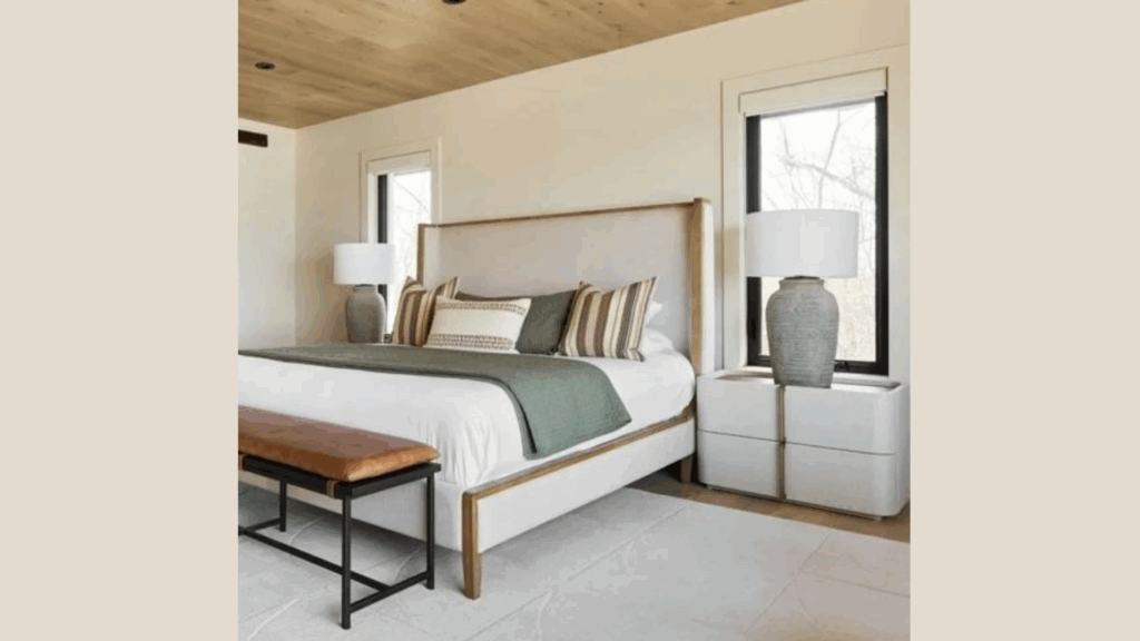
Your bedroom is your retreat. It should be restful and soft, like a quiet exhale. That’s what Sonnet brings.
It gives off a calm, warm light during the day and feels soothing at night. I like it with simple, soft bedding. It doesn’t need a lot of extras to look good. The tone is peaceful, especially when the room is clean and uncluttered.
A few pairings I love in the bedroom:
- White or light gray bedding
- Light wood or upholstered headboard
- Soft curtains in beige or off-white
Entryway or Hallway
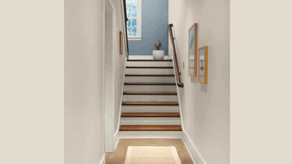
These areas are easy to forget, but they really set the tone for your whole home. That glance when you walk in or pass by matters.
Sonnet is great in narrow or dark spaces. It reflects light in a soft, warm way. It doesn’t scream for attention, but still makes the area feel finished.
You could also try:
- A small mirror with a warm-toned frame
- Hooks or shelves in natural wood
- A simple rug in cream or tan tones
Flooring Options That Pair Beautifully with Sonnet (AF-55)
Here are the options that have worked best for me (and why they might work for you, too).
Light Oak or Natural Hardwoods
This is one of my go-to pairings. Light oak brings out Sonnet’s soft warmth. The tones are close, so the whole room feels smooth and easy. It’s perfect if you want that open, natural look, like sunlight and quiet mornings.
If your wood floors have a bit of texture or grain, even better. That slight variation adds life without making the room feel busy.
Use it in:
- Living rooms
- Bedrooms
- Open-plan spaces
Warm-Toned Carpets or Rugs
Sometimes, you want something soft under your feet. That’s where warm-toned carpet or area rugs come in. These pair well with Sonnet because they sit in the same family of soft, warm tones.
Don’t go for anything too cool or too yellow. And skip busy patterns if the space is small—they can make the room feel tighter. If you already have neutral floors, just layering a warm rug can do the trick.
Stick with these tones:
- Cream
- Light tan
- Beige with a bit of texture
Neutral Tiles or Dark Wood for Contrast
Tiles work really well with Sonnet, especially in kitchens, bathrooms, and entryways. They gently reflect light and keep the room feeling calm. They don’t try to stand out, but they make everything feel more finished.
The Sonnet shows up more against the darker color, but it doesn’t feel sharp or cold.
It actually feels cozier.
Use this combo in:
- Living rooms with classic furniture
- Hallways with natural light
- Bedrooms for a moody, warm vibe
Creative Ways to Decorate with Sonnet (AF-55)
Sonnet (AF-55) by Benjamin Moore is a soft, warm neutral. It works well in many rooms. But on its own, it can feel a little plain. With the right decor, though, it can look clean, cozy, and stylish.
Here are a few simple ways to decorate with Sonnet that make a big impact:
Use Bold Accent Colors
Sonnet pairs well with deeper, richer tones. These bold colors add contrast and interest. Use them in pillows, rugs, curtains, or even a painted piece of furniture. The strong contrast helps Sonnet feel more modern and grounded.
Try colors like:
- Navy blue
- Forest or deep green
- Charcoal gray
Add Texture
A sonnet has a soft, flat look. To keep it from feeling flat in a room, mix in different textures. Even a few small items can make the space feel warm and layered.
Easy texture ideas:
- Woven baskets
- Linen or cotton curtains
- Textured wall hangings
Choose the Right Finishes
Metal finishes matter. They help tie the room together. Small changes can go a long way with a soft neutral like Sonnet.
Focus on color, texture, and finish to create a space that feels complete, calm, and stylish. With Sonnet, go for warm or bold finishes like:
- Gold
- Bronze
- Matte black
Sonnet Compared to Other Warm Neutral Paints
Here is the list of Sonnet (AF-55) compared to other warm tones:-
| Paint Color | Tone | Warm or Cool | How It Compares to Sonnet (AF-55) |
|---|---|---|---|
| BM Sonnet (AF-55) | Soft beige with subtle pink-gray undertones | Warm, gentle | Very soft and balanced; works in many spaces |
| BM Pale Oak | Light taupe with gray and pink | Slightly warm | A bit cooler and grayer than Sonnet |
| BM Edgecomb Gray | Gray-beige mix (greige) | Neutral to warm | Slightly deeper and more beige than Sonnet |
| SW Accessible Beige | Beige with gray undertones | Warm | Warmer and richer; feels more earthy than Sonnet |
Conclusion
Sonnet is a soft, warm neutral that works in almost any room. It’s not too gray or too beige—just calm, balanced, and easy to live with. Here’s why it’s a smart pick:
It blends well with many styles—modern, classic, farmhouse, or minimal. It plays nicely with both light and dark accents. It feels cozy without making the room feel small.
If you’re still unsure, test it in your own space. Paint a sample on a few walls and see how it looks in different lighting throughout the day.
Tip: Try Sonnet in a room with your favorite natural light. That’s where it really shines.