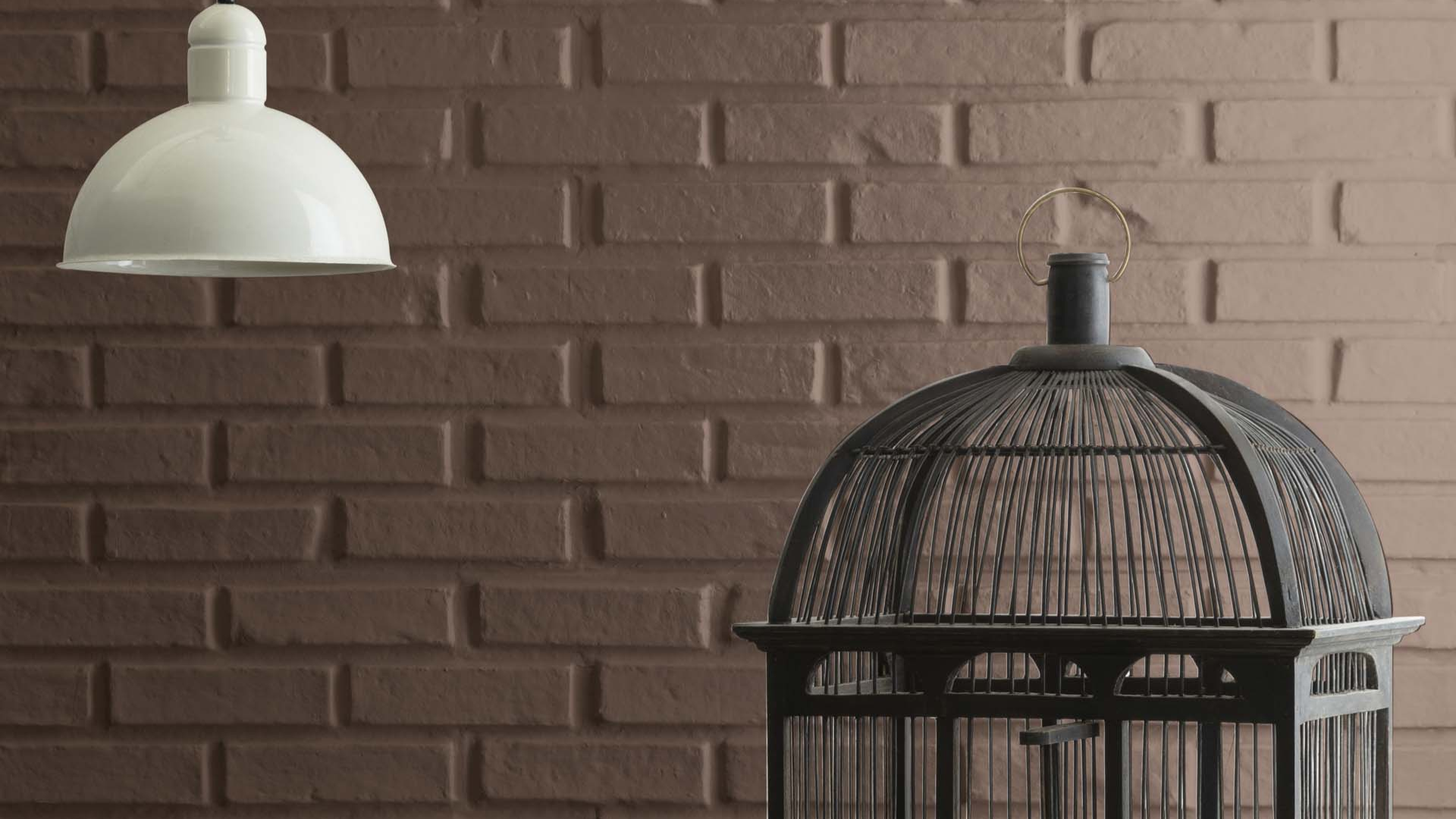
Benjamin Moore French Press (AF-170) is a deep, dark brown that brings warmth, comfort, and richness to any room. It’s a bold color that makes a strong impact while still feeling grounded and timeless.
If you’re looking for a paint color that adds depth and elegance, French Press might be just what you need.
This color works well in both modern and traditional homes. It’s perfect for adding a cozy, high-end feel to bedrooms, living rooms, kitchens, and more. I love how it can make a space feel dramatic and welcoming at the same time.
In this blog, I’ll show you why Benjamin Moore French Press is such a great pick for your next home project
From where to use it to how to pair it with other colors, you’ll see how this dark brown can bring warmth and sophistication to any space.
What Kind of Color Is Benjamin Moore French Press (AF-170)?

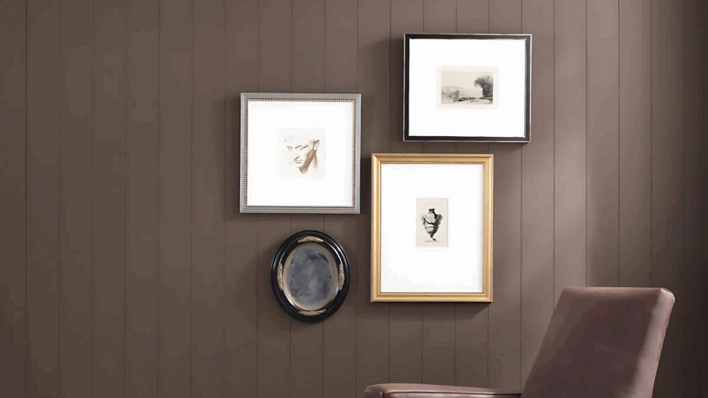
Benjamin Moore French Press is a deep, rich brown with warm undertones. It has the look of fresh brewed coffee—bold, dark, and smooth. This color brings a cozy and comforting vibe to a room while adding dramatic style.
The Light Reflectance Value (LRV) of French Press is just 9.89%, meaning it reflects very little light. It absorbs most of the light in a room, giving it a moody, cocoon-like feel.
Because of this, it’s best used in spaces with good lighting or paired with lighter accents.
French Press is a warm color, which makes it feel inviting rather than cold. The warmth in the brown adds character and charm, especially when used with natural materials like wood, leather, or brass.
This color can act as a strong background or a dramatic accent. No matter where you use it, the French Press brings a rich and stylish look to your space.
French Press: A Bold and Elegant Color for Any Room

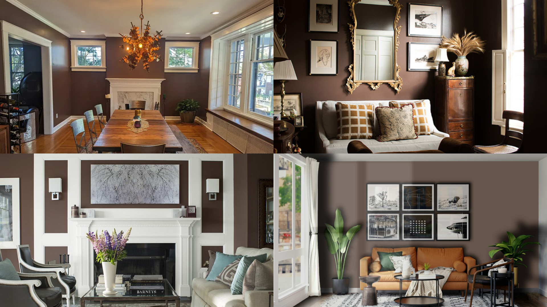
French Press might be dark, but it’s still a very versatile color. It works well in many types of rooms and can make each space feel cozy, dramatic, or even luxurious.
This rich brown color brings depth and style wherever it goes. Let’s look at how the French Press fits into different areas of the home.
Living Room
In the living room, the French Press creates a cozy and inviting atmosphere. It works great on an accent wall or even all four walls if the space has good lighting.
Pair it with cream or beige furniture, warm wood tones, and gold or brass accents for a timeless look. I like to mix and match a few pieces.
Bedroom
I love using French Press in the bedroom because it makes the space feel like a relaxing retreat. The deep brown creates a warm, restful vibe that’s perfect for winding down after a long day.
I’ve used it as a feature wall behind the bed, but it also looks stunning on all the walls for a dramatic, cozy effect. To keep things balanced, I like to add soft bedding in ivory, tan, or muted green—it really helps the bold color feel grounded and inviting.
Kitchen
In the kitchen, French Press is a unique and stylish option for cabinets or an island. It adds depth and richness, especially when paired with white counters, subway tile, and warm metal hardware.
The color brings a fresh twist to farmhouse or industrial-style kitchens.
Bathroom
French Press adds a spa-like feel to a bathroom when paired with the right finishes. Use it on the walls or vanity for a rich, cozy look.
It works especially well with marble, brass fixtures, and creamy white accents. This dark brown adds instant elegance and warmth.
How to Use French Press in Small Spaces or Cozy Corners
French Press is a dark color, but that doesn’t mean you can’t use it in small spaces. In fact, it can help make a small room feel cozy, comforting, and stylish.
Used in the right way, this color brings depth and personality even to tight spaces or areas with less light.
Accent Walls: Use French Press on one wall to create a strong focal point. It’s a great way to add drama without making the whole room feel too dark. Balance the bold wall with lighter furniture and accessories to keep the space feeling open.
Hallways and Entryways: Dark colors like French Press work well in small spots like hallways and entryways. These spaces can often handle deeper shades, especially when paired with good lighting and light-colored trim.
How to Pair French Press with Other Paint Colors and Accents

French Press is bold, so pairing it with the right colors is important. Because it’s a warm and deep shade, it works well with a mix of light neutrals, warm metals, and rich textures.
Neutral Colors: Soft whites, warm beige, and creamy tones pair beautifully with French Press. These shades help lighten the space and bring out the warmth in the brown. Use white trim or ceilings for contrast and to brighten up the room.
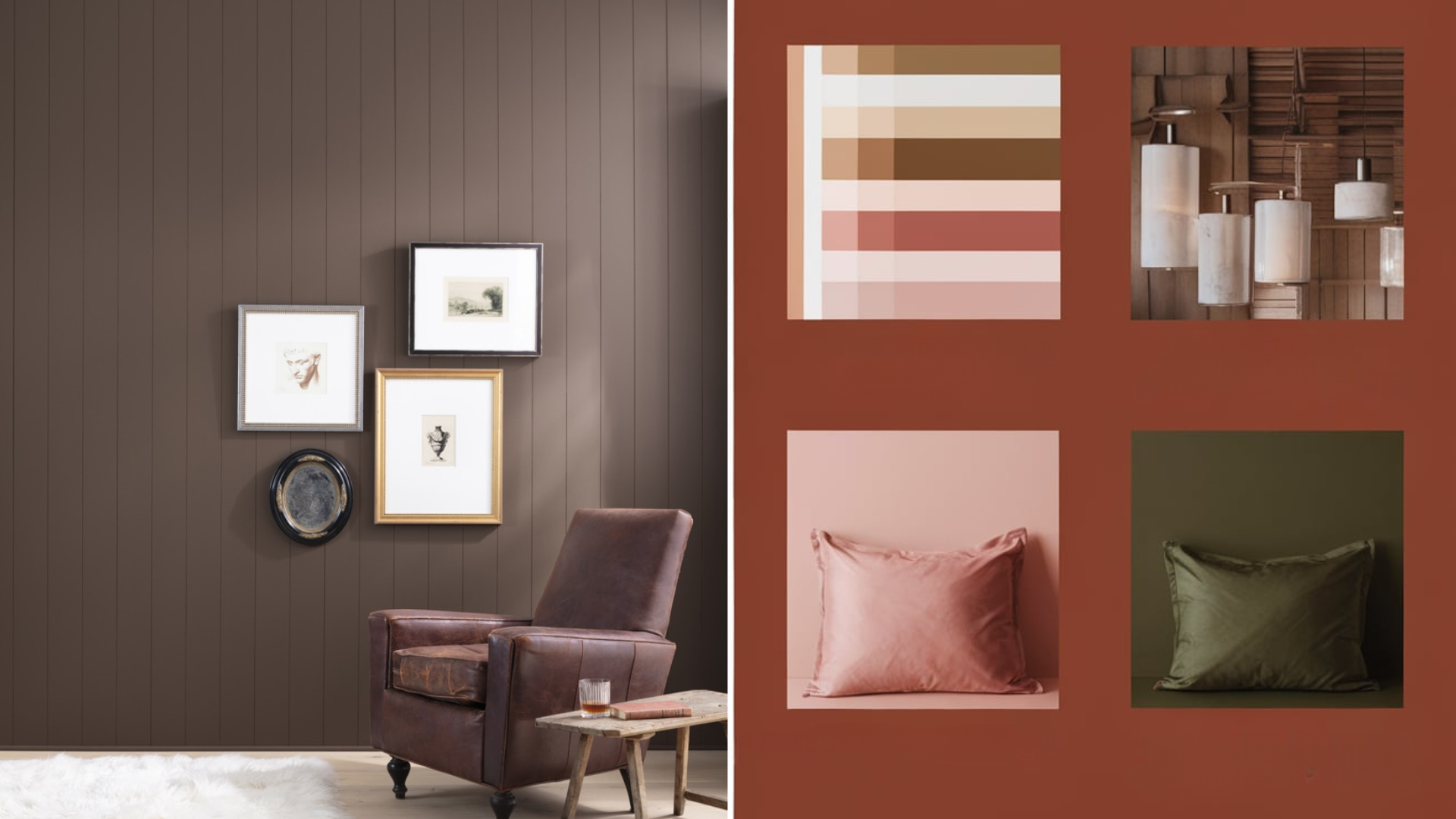
Warm Accents: Gold, brass, and copper accents add a touch of luxury and pair perfectly with French Press. Warm wood tones like walnut or oak also enhance the richness of the brown. Add leather furniture or natural woven textures to keep the space feeling cozy and layered.
Bold Colors: French Press also looks amazing with bold colors. Try pairing it with forest green, burnt orange, or deep burgundy for a rich and stylish look. Use bold accents in small doses to keep the space balanced and inviting.
What Style Works Best with Benjamin Moore French Press?
Benjamin Moore French Press fits well with many home styles, especially ones that focus on warmth, texture, and depth. Its rich tone makes it a great choice for both classic and modern looks.
In traditional homes, French Press adds a timeless, elegant feel. It pairs well with vintage furniture, dark woods, and soft fabrics. It also works beautifully with classic trims and crown molding.
In modern or industrial spaces, this color adds bold contrast. Pair it with sleek black fixtures, natural wood, and metal finishes for a clean and dramatic look. It brings depth and character to minimalist designs.
French Press is also perfect for rustic or farmhouse styles. It blends well with exposed beams, stone, and cozy textiles. It helps create a warm, grounded look that feels homey and timeless.
Is Benjamin Moore French Press a Warm or Cool Color?

French Press is definitely a warm color. It has deep brown undertones with a hint of red, which gives it a cozy, inviting feel. This warmth makes it a great choice for spaces where you want to feel calm, grounded, and comfortable.
Warm colors like French Press are great for adding richness to rooms. Even though it’s dark, it doesn’t feel cold or flat. Instead, it brings in warmth and makes the space feel more connected and relaxed.
This color works especially well with warm lighting, wood furniture, and brass or gold accents. It’s a perfect pick if you want to make your space feel comfortable and stylish at the same time.
Color Characteristics Table
| Color Name | French Press |
|---|---|
| Hex Code | #4A3B31 |
| RGB | 74, 59, 49 |
| Undertones | Warm Brown, Red |
| Mood/Effect | Cozy, Bold, Grounded |
| Best Rooms | Living Rooms, Bedrooms, Kitchens, Bathrooms |
| Style Compatibility | Traditional, Modern, Farmhouse, Industrial |
| Light Reflectance Value (LRV) | 4.37% |
How to Test This Color in Your Home Before Painting
With a bold color like French Press, testing it in your space is key. Lighting, room size, and surrounding finishes can change how it looks.
- Buy a Sample: Get a sample pot from your local Benjamin Moore store or online.
- Paint Large Swatches: Apply it to multiple walls to see how it looks in different lighting. Use two coats to get the full effect.
- Check at Different Times: Look at the color in the morning, afternoon, and evening. Notice how it changes with the light.
- Compare with Decor: Hold up fabrics, furniture, and flooring next to the paint to make sure everything works together.
What Paint Finish Works Best for French Press?
The finish you choose can change how French Press looks and performs. Here’s a simple guide:
Matte or Flat Finish: Best for bedrooms or low-traffic areas. It gives a soft, velvety look with no shine.
Eggshell or Satin Finish: Great for living rooms, kitchens, and bathrooms. These finishes reflect a bit of light and are easy to clean.
Semi-Gloss or Gloss Finish: Perfect for trim, doors, and cabinets. These shiny finishes highlight the richness of French Press and hold up well in busy areas.
Pick your finish based on the room and how much wear and tear the surface will get.
Common Mistakes to Avoid with French Press
Here are some common mistakes people make when using French Press—and how to avoid them:
- Skipping the Sample: This color can look very different depending on the light. Always test it before painting an entire room.
- Using in a Dark Room Without Contrast: Since French Press is so dark, it needs lighter elements to balance it out. Add white trim, light furniture, or mirrors to keep the space from feeling too heavy.
- Going Too Dark Everywhere: While it’s tempting to go bold in every corner, too much of this color in a small or dark space can feel overwhelming. Use it on one wall or with plenty of lighting.
Why People Love Benjamin Moore French Press
People love French Press for many reasons:
- Warm and Bold: It adds cozy drama without feeling cold.
- Flexible Style: It works in many rooms and styles.
- Great Accent Color: It looks amazing on walls, furniture, or cabinetry.
- Timeless Feel: This deep brown color never goes out of style.
Is French Press the Right Paint Color for Your Home?
Benjamin Moore French Press (AF-170) is a bold and rich brown that adds comfort and warmth to any room. Its deep shade makes a space feel cozy, grounded, and stylish.
French Press is a great match for both modern and traditional styles. It looks beautiful with soft neutrals, warm metals, and natural wood.
You can use it on one wall for a bold accent or on cabinets for a dark, elegant touch. Even in small amounts, this color makes a big impact.
This paint works best when paired with good lighting and lighter details. It adds depth without feeling cold. French Press is a timeless color that brings beauty and comfort into your home.
Try a sample and see how it can make your space feel rich, warm, and complete.

