: The Perfect Soft Blue")
If you’re looking for a light blue paint that feels fresh, airy, and peaceful, I think Atmospheric by Benjamin Moore might be just what you need.
This soft, sky-like blue brings a calm, gentle feel to any room. I’ve seen it work beautifully in bedrooms, bathrooms, and living spaces; it really helps create a clean and relaxing vibe.
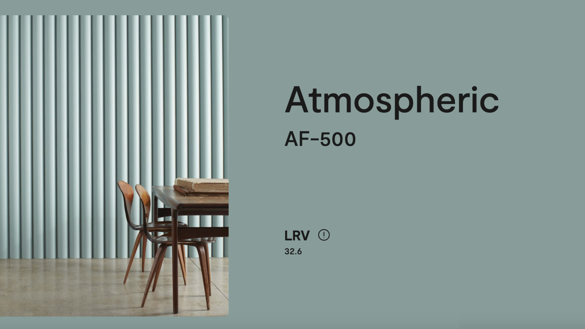
Atmospheric (AF-500) is part of the Affinity Color Collection, which includes balanced colors that are easy to match.
I like it because it’s a light and happy shade that isn’t too bold or too cool. It works in both modern and classic homes and pairs well with many other colors.
In this blog, I’ll share what I’ve learned about Atmospheric and why it’s such a popular choice.
I’ll go over the key details, where it looks best, how to match it with other colors, and how it compares to similar blues.
If you’re thinking about using Atmospheric for your next project, keep reading. I’ve got you covered.
Why Benjamin Moore Atmospheric (AF-500) Is So Popular
People love Atmospheric because it brings a soft, refreshing feel into the home. It reminds many of a clear spring sky or a peaceful morning breeze.
The color feels open and light, without being too pale or too baby blue.
What makes Atmospheric special is that it’s calm, clean, and easy to live with. It adds color without being loud.
It adds personality without feeling bold. It can be used in big or small rooms, and it always helps the space feel peaceful and pulled together.
Designers often use Atmospheric in bedrooms, bathrooms, or even nurseries because of its soft and soothing nature.
It’s also a favorite in coastal homes and spaces where people want that light and breezy feel.
Specifications of Atmospheric (AF-500) by Benjamin Moore
Before deciding if Atmospheric is right for your space, it’s helpful to know its technical specifications. These provide a better idea of how the color will look in your room.
- Color Code: AF-500
- Collection: Affinity Color Collection
- Finish Options: Flat, matte, eggshell, satin, semi-gloss, and more
- RGB: Red 201, Green 214, Blue 217
- HEX Code: #C9D6D9
- Light Reflectance Value (LRV): 32.6
- Undertones: Light blue with subtle gray
Atmospheric’s LRV of 32.6 means it reflects a fair amount of light. It helps brighten a room, especially in spaces with natural sunlight.
But it still has enough color to be seen clearly on the walls.
Its undertones include a touch of gray, which keeps it from feeling too bright or too cool. That soft gray base gives it a calm, balanced look that feels grown-up while still being cheerful.
Using Atmospheric (AF-500) by Benjamin Moore
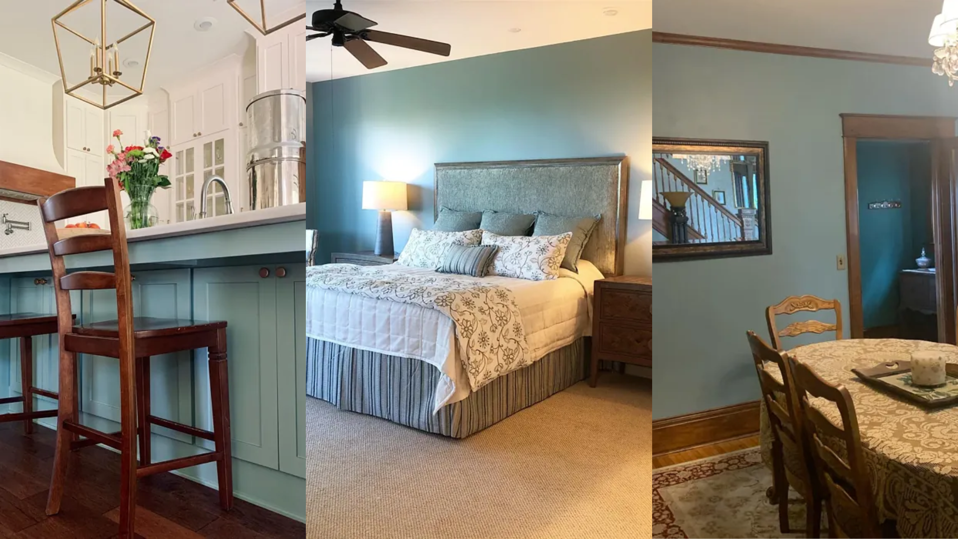
Atmospheric works well in all kinds of rooms and styles. You can use it to add a fresh pop of color or to create a gentle backdrop in a more neutral design.
1. Bedrooms
I think Atmospheric is a beautiful choice for bedrooms. It brings a sense of calm and peace that helps me wind down at the end of the day.
The soft blue tone feels cool and refreshing, but it never feels cold or harsh. It’s the kind of color that makes a room feel light and easy to relax in.
Pair it with:
- White or cream bedding
- Light gray or beige furniture
- Natural wood finishes
- Linen curtains or soft cotton throws
Whether you paint all four walls or just an accent wall, Atmospheric turns your bedroom into a cozy retreat.
2. Bathrooms
I’ve found that bathrooms are another great place to use Atmospheric. The color feels clean and crisp, which is exactly what I want in a space that should feel fresh.
It also pairs really well with finishes I often see in bathrooms, like white tile, marble, or soft gray vanities
Try combining Atmospheric with:
- White subway tile or marble counters
- Brushed nickel or chrome hardware
- Soft white or gray towels
- A simple round mirror
The result is a light, spa-like bathroom that’s calm and inviting.
3. Living Rooms
In living rooms, I like using Atmospheric to create a soft and relaxing vibe. It’s a great choice when I want a bit of color without going too bold.
This gentle blue works with so many furniture styles and helps me add just the right touch of personality to a neutral space.
Pair it with:
- White trim and baseboards
- Beige, gray, or white sofas
- Natural woven rugs
- Accent pillows in navy, blush, or sage green
Atmospheric keeps things feeling fresh, even in more traditional rooms.
4. Nurseries and Kids’ Rooms
Atmospheric is a sweet option for a nursery or a child’s room.
It’s soft, cheerful, and gender-neutral. It creates a peaceful space for sleep while still feeling light and fun during the day.
Use it with:
- White or light wood cribs
- Soft yellow or mint accents
- Simple wall art or decals
- Cozy throws and playful pillows
It’s a great way to bring in color without making the room feel too busy or loud.
5. Kitchens and Dining Rooms
If you like a light and airy kitchen, Atmospheric can help you achieve that look.
Use it on the walls or even on upper cabinets for a soft, coastal feel. It works great with white cabinets, stone counters, and metal finishes.
Add touches like:
- White backsplash
- Open wood shelves
- Brushed nickel handles
- Pale wood or white dining sets
It keeps the kitchen feeling clean, open, and stylish without looking plain.
Coordinating Colors with Atmospheric (AF-500)
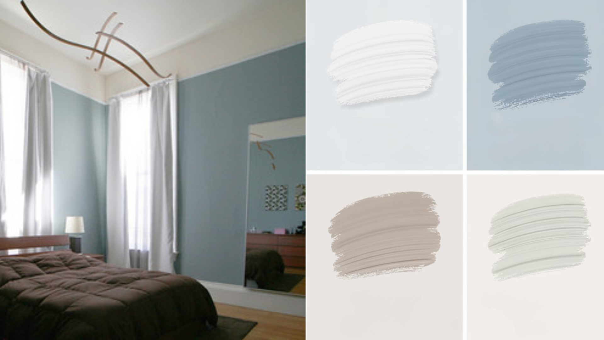
Atmospheric is easy to pair with other colors.
Its cool tone means it works best with other cool or neutral shades, but you can also add warmth with natural materials or soft, earthy colors.
Some great matches for Atmospheric are:
- Chantilly Lace (OC-65): A bright, clean white for trim
- Balboa Mist (OC-27): A warm gray-beige that balances the coolness
- Palladian Blue (HC-144): A soft green-blue for layered, beachy color
- Revere Pewter (HC-172): A greige that brings warmth
- Hale Navy (HC-154): For bold contrast on furniture or doors
- Muted yellow or dusty blush: To add gentle warmth
The result is a clean, comfortable space with just the right touch of color.
Atmospheric vs Similar Blue Paint Colors
There are many light blues to choose from. Here’s how Atmospheric compares to a few other popular Benjamin Moore shades:
| Color | Description | Key Differences |
|---|---|---|
| Atmospheric (AF-500) | A soft, airy light blue with gray undertones | Balanced, fresh, and not too cool |
| Palladian Blue (HC-144) | A green-blue with stronger green tones | Feels more coastal and green-leaning |
| Breath of Fresh Air (806) | A cheerful, slightly brighter blue | More youthful and slightly more saturated |
| Iceberg (2122-50) | A cool, icy blue with soft gray | Feels cooler and more modern than Atmospheric |
| Quiet Moments (1563) | A mix of blue, green, and gray | More muted and earthy, with a peaceful vibe |
If you want a true soft blue that feels peaceful without being too bright or too gray, Atmospheric is a beautiful choice.
Reviews of Atmospheric (AF-500) by Benjamin Moore
Homeowners and designers who use Atmospheric often praise its soft, refreshing feel. Many people say it gives their space a relaxing, light-filled look without being bland or washed out.
Here’s what some people say:
- “Our bedroom feels like a peaceful retreat now.”
- “It’s such a pretty, soft blue—bright but not too bright.”
- “Looks amazing with white trim and oak floors.”
- “Perfect in our bathroom—fresh, clean, and spa-like.”
- “It changes slightly throughout the day, and we love every version of it.”
It’s a color that brings joy and calm at the same time, which is why so many people return to it again and again.
Conclusion
Atmospheric (AF-500) by Benjamin Moore is a light and serene paint color that brings peace and beauty to any space.
With its mix of soft blue and gentle gray undertones, it feels calm and easygoing without looking too cold or too pale.
Whether you’re painting a bedroom, bathroom, nursery, or living space, Atmospheric paint gives your room a clean and airy feel.
It pairs well with warm and cool accents and works with many styles, from coastal to classic to modern.
If you want a color that’s soft, cheerful, and endlessly calming, Atmospheric is definitely worth a try.
Pick up a sample, test it on your wall, and see how it changes in the light. You might just find it’s the breath of fresh air your home has been missing.