
Have you ever looked at a room and thought, “Something’s off, but I don’t know what”?
That used to be me. I’d carefully choose colors and furniture, yet the space still felt disjointed or awkward. It wasn’t until I started paying attention to rhythm and transition in design that things finally clicked.
If you’re here, you’re probably wondering why your space doesn’t feel pulled together. I’ve been there.
I made those same mistakes, learned the hard way, and now I want to help you skip the confusion.
In this blog, I’ll walk you through the common traps to avoid when trying to create flow in your home.
If you’re aiming for a space that feels easy, natural, and balanced, you’re in the right place. Let’s get started.
What Is Rhythm in Interior Design?
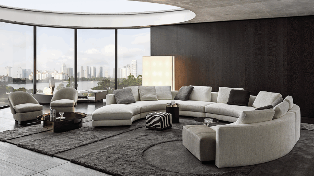
Rhythm in interior design is all about creating a sense of flow in a room, the way your eyes naturally move from one spot to another.
I think of it like this: when you walk into a space and notice repeating colors or similar shapes that echo each other, that’s rhythm doing its job.
I remember rearranging my living room once and noticing how placing matching lamps on both ends of the sofa instantly made the space feel calm and balanced.
It wasn’t about making things look the same; it was about repeating certain elements in a way that felt connected.
Even something as simple as hanging pictures at the same height can guide your eye gently across the wall.
Rhythm helps your space feel thoughtful, welcoming, and put together, without feeling stiff or staged.
Repetition in Interior Design
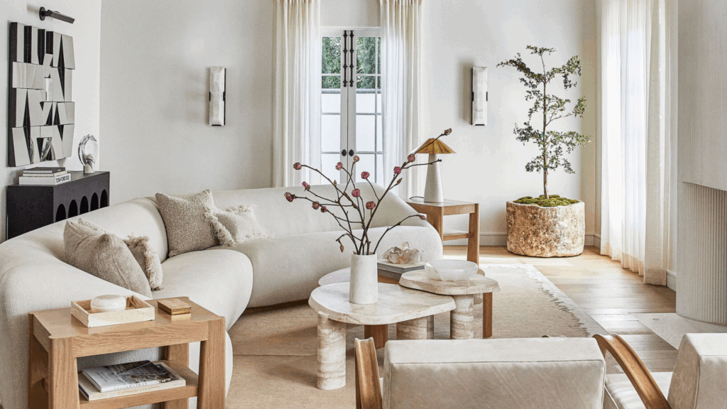
Repetition in interior design means using the same element more than once, like a color, shape, texture, or material, to create a sense of connection throughout the room.
It’s one of those simple tools that can make a space feel more balanced and intentional.
I think of repetition as a way to guide the eye gently around the room. When your brain picks up on familiar elements, like a shape or a color, it feels more at ease.
For example, you might repeat black accents in a light fixture, picture frames, and cabinet handles. That one detail, used in small doses, helps tie everything together.
Or maybe you use the same warm wood tone in your chair legs, side table, and picture frame. It doesn’t have to match perfectly; just echoing the material creates unity.
When used right, repetition makes a room feel put together without looking stiff or too matchy.
Common Mistakes with Repetition
Repetition can bring a room together, but if it’s not used carefully, it can do the opposite. Let’s see a few mistakes I’ve made or seen often, and how to avoid them.
1. Over-Repetition
I’ve made this mistake myself. I once matched the rug, pillows, and lampshades all in the same exact color. Instead of looking calm and clean, the room felt dull and lifeless, like a staged model home.
How to avoid it: Repeat an element, but change its form or finish. For example, use the same color in different textures, like matte black hardware with glossy black frames, or vary the shape slightly to keep things interesting.
2. Under-Repetition
Another problem is not repeating elements enough. That leads to a scattered look, where nothing feels related. I’ve had rooms like that, full of things I liked individually, but together they felt disconnected and random.
How to avoid it: Pick one or two design elements (like a material, shape, or color), and make sure they appear at least three times in different areas of the room. That’s usually enough to create balance without forcing it.
3. Mistaking Variety for Repetition
At one point, I thought mixing lots of patterns counted as repetition. It doesn’t. If they don’t share a common trait, like color or shape, they just clash. This often happens when you try to bring in “personality” without a plan.
How to avoid it: Limit your variety. Stick to two or three patterns that share at least one thing, like all having earth tones or circular motifs. Test how they look together before committing.
Gradation Rhythm in Interior Design
Gradation rhythm in interior design is all about slow, steady change. It’s when something, like size, color, shape, or spacing, shifts gradually across a space.
That soft change helps your eyes move smoothly from one part of a room to another.
Think of candles arranged by height on a shelf, or a set of artwork going from light to dark tones.
That’s gradation at work. I like using this when I want a room to feel layered but not jumpy. It keeps things calm and flowing without being too bold or obvious.
Gradation doesn’t have to be dramatic; it can be as simple as tapering plant pots in different heights or stacking pillows in shades from light beige to deep brown.
When done right, it brings a soft rhythm that gives your space more depth and visual interest.
Common Mistakes with Gradation
Gradation can make a big impact, but it’s easy to get wrong if you’re not paying attention. Let’s see some mistakes I’ve seen (and made), along with how to avoid them:
1. Abrupt Changes
Sometimes people go straight from small to large, or light to dark, without steps in between. It breaks the rhythm and feels jarring.
How to avoid it: Add a middle step. Use three or more sizes or shades to create a gradual, smoother transition.
2. Ignoring Scale
I’ve placed tiny decor on a massive coffee table and wondered why it felt off. When objects aren’t scaled properly, the whole setup looks awkward.
How to avoid it: Think in layers, combine small, medium, and large items so the eye flows naturally from one to the next.
3. Using Gradation in Only One Spot
A single gradual layout in a corner won’t help if the rest of the room feels static.
How to avoid it: Carry the idea across the space. You don’t need to repeat it everywhere, but echo the same principle, like fading tones or stepping heights, in more than one spot.
Gradation rhythm works best when it’s subtle and consistent. A few thoughtful shifts can make the room feel more balanced and visually connected.
Transition Rhythm in Interior Design
Transition rhythm in interior design is about how your eye moves from one space or element to the next.
It’s what makes a room, or even an entire home, feel like it flows naturally instead of jumping from one idea to another. You’ll notice it most in open floor plans or between rooms.
For example, how the living room blends into the dining space without feeling like two totally separate zones.
I think of it as the quiet “in-between” design that ties everything together.
You can create a good transition rhythm with simple tools, like rugs to define spaces, matching tones between rooms, or even repeating a shape or material.
It doesn’t have to be bold; it just has to be thoughtful. When done right, it makes the whole space feel connected, calm, and easy to move through.
Common Mistakes with Transition Rhythm
Getting the transition rhythm wrong can make a space feel choppy, even if each part looks great on its own. Let’s discuss a few common mistakes and how I’ve learned to fix them:
1. Harsh Visual Breaks
Sometimes one area is full of color and detail, and the next is totally bare or completely different. It’s like flipping a switch, and it throws off the whole flow.
How to avoid it: Use a gradual shift, repeat colors, finishes, or materials from one area to the next to bridge the gap.
2. Mismatched Flooring or Ceiling Lines
I’ve seen homes where the floors change suddenly or the ceiling beams don’t line up between rooms. It instantly breaks the visual rhythm.
How to avoid it: Try to keep consistent lines. If changing flooring, use a soft border or shared color. Align beams, moldings, or lighting when possible.
3. Ignoring Traffic Flow
If you’ve ever had to zigzag around furniture just to get to the kitchen, you’ve felt this mistake. It’s not just about looks, it’s about movement.
How to avoid it: Arrange furniture so that paths between rooms stay clear. Use layout, not just walls, to guide how people move through the space.
Key Differences: Repetition vs Gradation vs Transition
These three types of rhythm help bring flow and harmony to a space, but they each serve different purposes.
| Rhythm Type | What It Does | How It Looks | Common Mistake | How to Fix It |
|---|---|---|---|---|
| Repetition | Connects the space by repeating similar elements (like color, shape, or material). | Black metal repeated in light fixtures, chair legs, and picture frames. | Overusing or underusing the same element. | Repeat elements 3+ times with slight variation (texture, finish, form). |
| Gradation | Creates visual flow through gradual changes in size, color, or shape. | Pillows going from light to dark brown, or candles increasing in height. | Jumping between extremes with no middle step. | Use at least 3 levels to make the shift feel smooth and intentional. |
| Transition | Guides the eye or body between spaces or elements. Helps rooms feel connected. | Flooring material that continues between rooms, or a rug tying two areas together. | Harsh breaks between styles or misaligned elements. | Use similar tones or materials and ensure flow lines (like flooring or beams) align. |
Use all three types together to create a space that feels cohesive, calm, and natural to move through.
Quick Tips for Getting Rhythm Right
Rhythm doesn’t have to be complicated; it’s often the small choices that make the biggest impact. These simple tips can help you create flow and harmony throughout your space.
- Use odd numbers for repetition: Groups of 3 or 5 feel more natural and balanced to the eye. Whether it’s wall art, vases, or cushions, odd numbers create a gentle, pleasing rhythm.
- Scale up in gradation from floor to ceiling: Start with heavier or larger items near the floor (like rugs or low furniture) and go lighter or smaller as you move upward. It creates a grounded, natural flow.
- Make transitions smoother with consistent materials or tones: Carry similar colors, wood finishes, or textures from one area to the next. This helps connect spaces without making everything look the same.
- Test the flow by walking through the space: Take a slow walk through your room. Notice where your eye lands or stops. If anything feels jarring or disconnected, that’s your cue to adjust rhythm or placement.
Conclusion
If your space has ever felt off, like things didn’t quite connect, you’re not alone. That’s exactly why you came here: to figure out what’s missing and how to fix it.
I’ve made the same design mistakes, thinking style was enough when what I really needed was rhythm and transition.
Once I started using repetition, gradation, and smoother transitions, my home felt more balanced and welcoming. These small changes made a big difference, and they can for you too.
I hope this helped clear up where things might be going wrong and gave you simple ways to get back on track.
Rhythm in design isn’t about rules; it’s about helping your home feel calm, connected, and easy to live in. That’s what really matters.
2 Comments
Hi, kam dashur të di çmimin tuaj
Kaixo, zure prezioa jakin nahi nuen.