
The right mix of colors can completely change how a room feels or how a piece of art looks.
Color harmony helps designs feel balanced and pleasing to the eye. One of the best ways to achieve this balance is to use split-complementary colors.
This color scheme uses one main color and two others that sit next to its opposite on the color wheel, creating contrast without chaos.
This blog explains what split complementary colors are and how to apply them in projects from creative artwork to cozy home decor.
What are Color Schemes?
Color schemes are organized combinations of colors that help create harmony, balance, and mood in art, design, and decor.
They are based on the color wheel, which shows the relationships between primary, secondary, and tertiary colors.
Common color schemes include:
- Complementary,
- Analogous,
- Triadic,
- And Split Complementary.
Each type offers a different visual effect; some are bold and eye-catching, while others are calm and subtle.
For example, complementary colors sit opposite each other on the wheel, creating strong contrast, while analogous colors sit side by side for a softer look.
What are Split Complementary Colors?
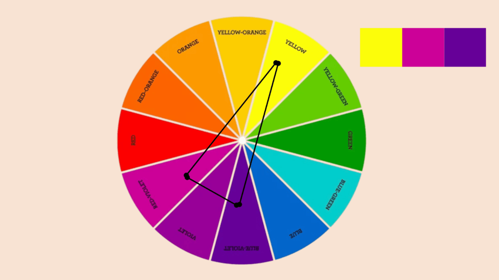
Split complementary colors are an easy way to create harmony. As explained, this color scheme uses three shades: one main color and two others that sit beside its opposite on the color wheel.
To find them, pick a base color, locate the color directly across from it, and then choose the two hues next to it.
For instance, if the main color is blue, the split complements would be yellow-orange and red-orange. This mix gives a nice contrast without feeling too strong or harsh.
The following are the split complementary color schemes that can be inculcated in various designs:
- Red + yellow-green + blue-green
- Orange + blue-green + blue-purple
- Red-purple + yellow + green
- Red-orange + green + blue
- Yellow-green + purple + red
- Yellow-orange + blue + purple
- Yellow + red-purple + blue-violet
- Green + red-purple + red-orange
- Blue + red-orange + yellow-orange
- Blue-green + red + orange
- Blue-purple + orange + yellow
- Purple + yellow-green + yellow-orange
Beautiful Split Complementary Color Schemes for Home Decor
Add balance and personality to your home with split complementary color schemes that bring warmth, calm, and style to any space.
1. Crimson + Lime + Soft-Green
This colorful palette beautifully balances energy with tranquility.
Crimson accents in throw pillows create warmth against lime-painted walls. Soft green curtains or area rugs add calming undertones.
The combination works perfectly in living rooms where you want lively conversation spaces. Plants naturally amplify the green tones, while artwork ties everything together harmoniously.
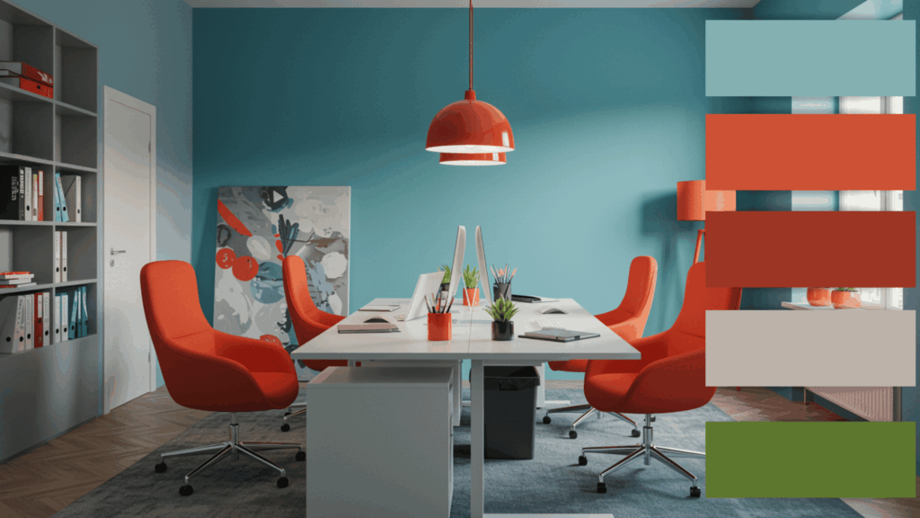
2. Orange + Turquoise + Violet
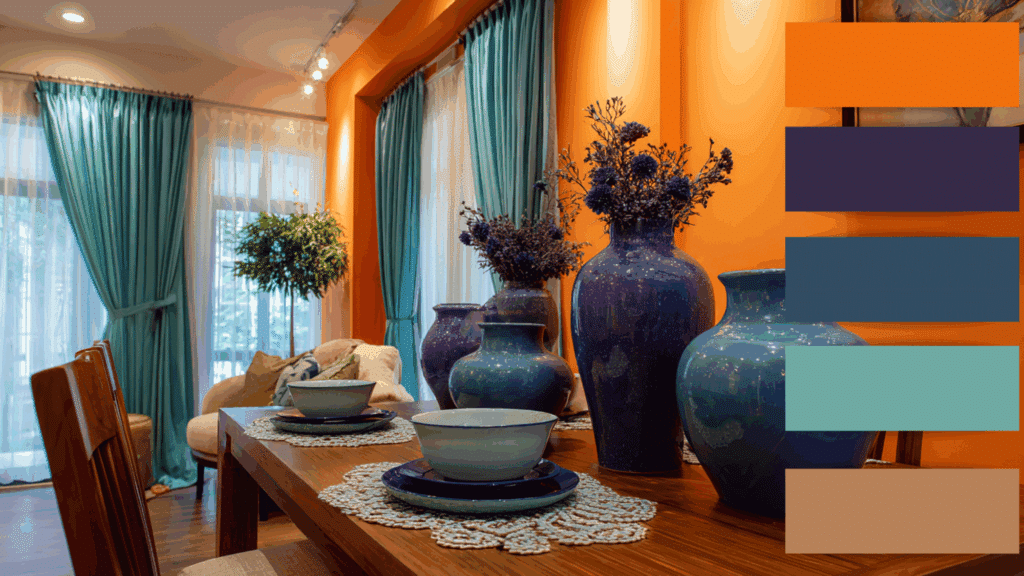
Bold yet soothing, this scheme energizes dining areas and entryways effectively. Orange accent walls provide cheerful warmth while turquoise curtains cool the space down.
Violet accessories, like decorative vases, add modern refinement.
The three colors create an inviting energy that welcomes guests warmly. This palette suits homeowners wanting refined vibrancy in their spaces.
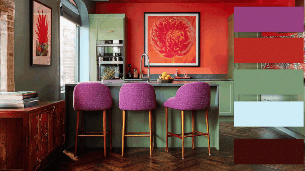
3. Magenta + Yellow + Light-Green
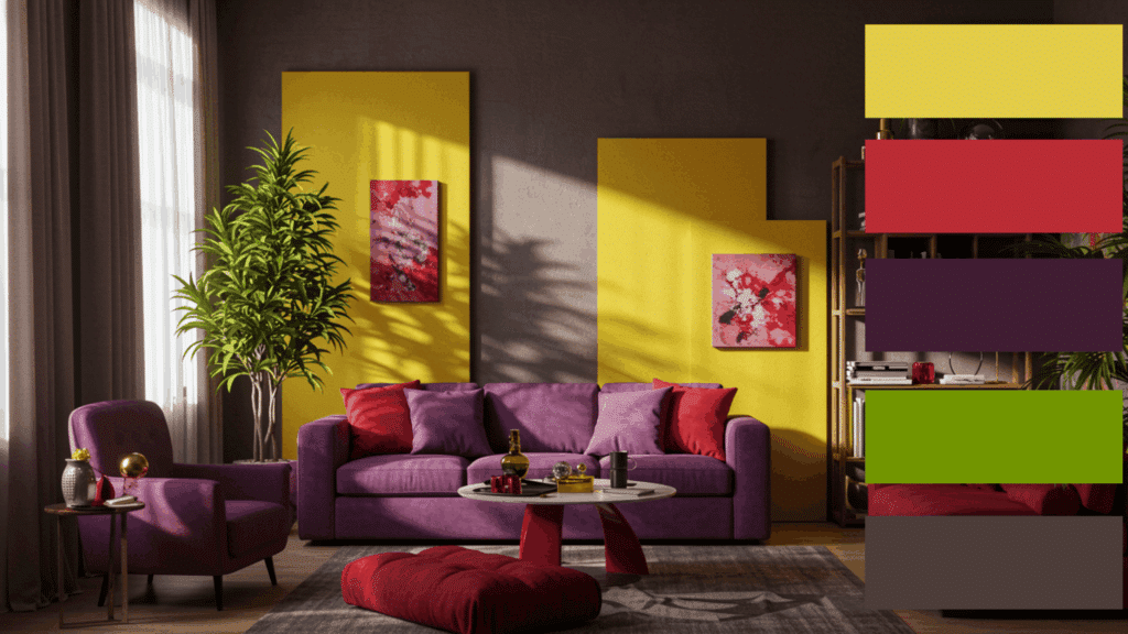
Dynamic and creative, this palette instantly transforms kitchens and art studios.
Magenta adds rich depth through upholstered chairs or wall art. Yellow decor pieces bring sunshine and joy throughout. Light-green plants or painted furniture ground the vibrant tones naturally.
Together, they create spaces full of character and balanced visual interest for modern homes.
4. Brick Red + Forest Green + Royal Blue
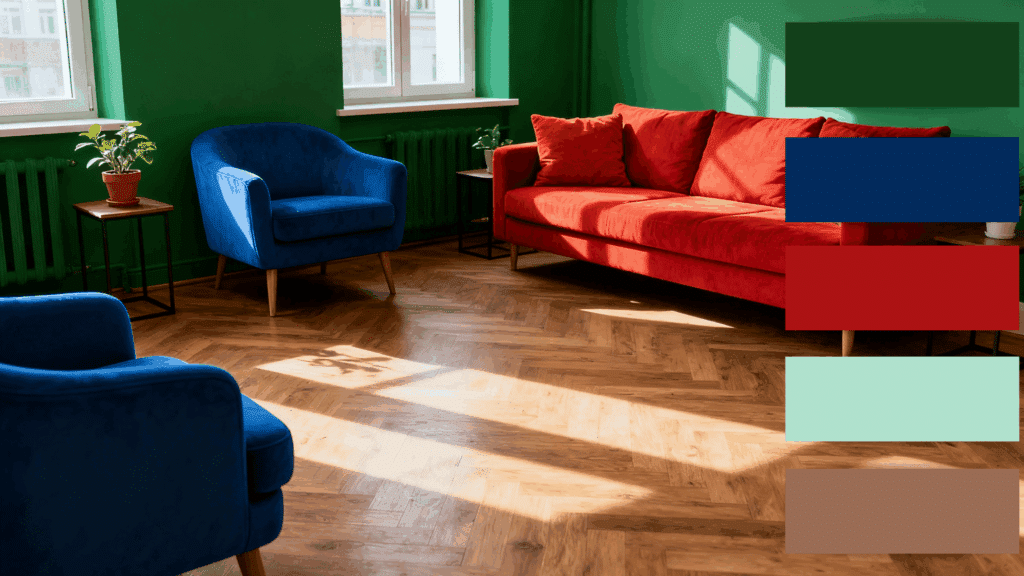
This combination is cheerful and welcoming. Red accents, like cushions or wall art, add warmth and vitality.
Green elements, such as plants or upholstery, bring freshness, while royal blue tones cool the space and tie everything together.
It’s perfect for open-plan living areas or sunrooms where you want both comfort and energy.
5. Lime + Grayish Purple + Maroon
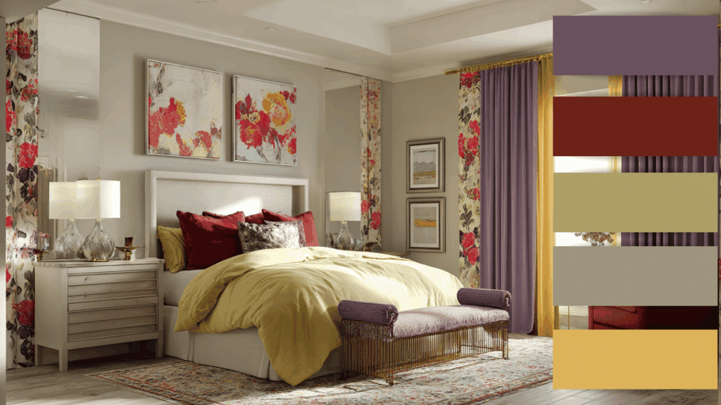
Artistic and playful, this palette creates bold bedroom retreats beautifully. Lime textiles or accent walls provide fresh, vibrant foundations.
Grayish-purple curtains introduce a luxurious depth throughout. Maroon highlights in artwork add exciting visual punches.
The combination works wonderfully in creative spaces where style meets personal expression boldly and confidently.
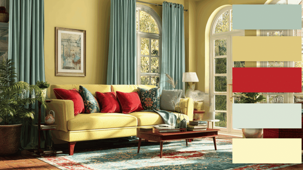
6. Yellow + Navy Blue + Violet
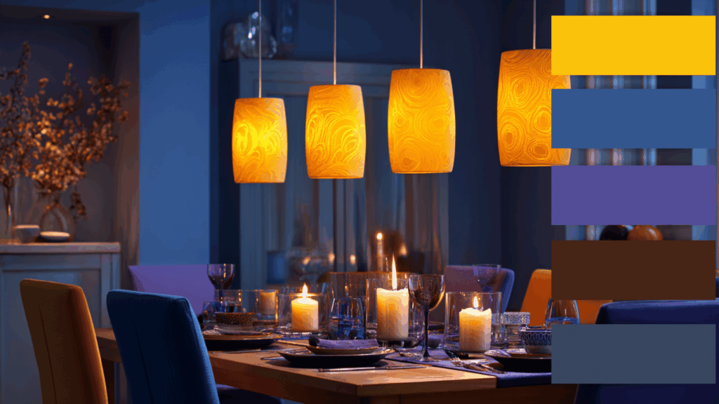
This harmonious trio balances warmth with coolness effortlessly in living spaces. Yellow wall paint or lighting fixtures brighten rooms naturally.
Blue elements provide calming balance through furniture selections. Violet throws, or ceramic vases, add rich undertones.
The palette creates cozy yet stylish dining rooms where comfort and graceful design seamlessly meet.
7. Mustard Yellow + Red + Blue-Violet
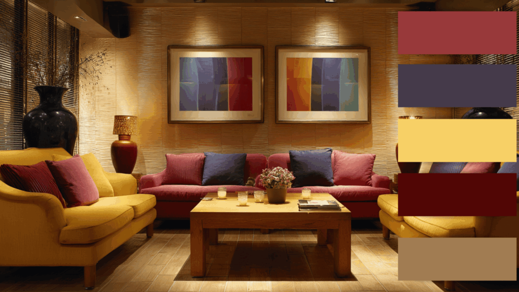
This palette suits bedrooms and lounges wonderfully. Light yellow walls create sunny, optimistic foundations throughout.
Red accents in throw pillows add welcoming warmth. Blue-violet details through area rugs bring peaceful elements.
The balanced combination forms inviting environments where relaxation happens naturally and guests feel immediately comfortable.
8. Sage Green + Magenta + Orange
Earthy yet lively, this mix transforms kitchens and studios dramatically. Sage green walls or furniture pieces ground spaces naturally.
Magenta fabrics or decorative items add stylish pops. Orange artwork injects energetic warmth throughout.
The palette creates balanced atmospheres in sunlit areas where vibrancy meets natural harmony, perfect for creative homeowners.
9. Sky Blue + Burnt Red + Apricot
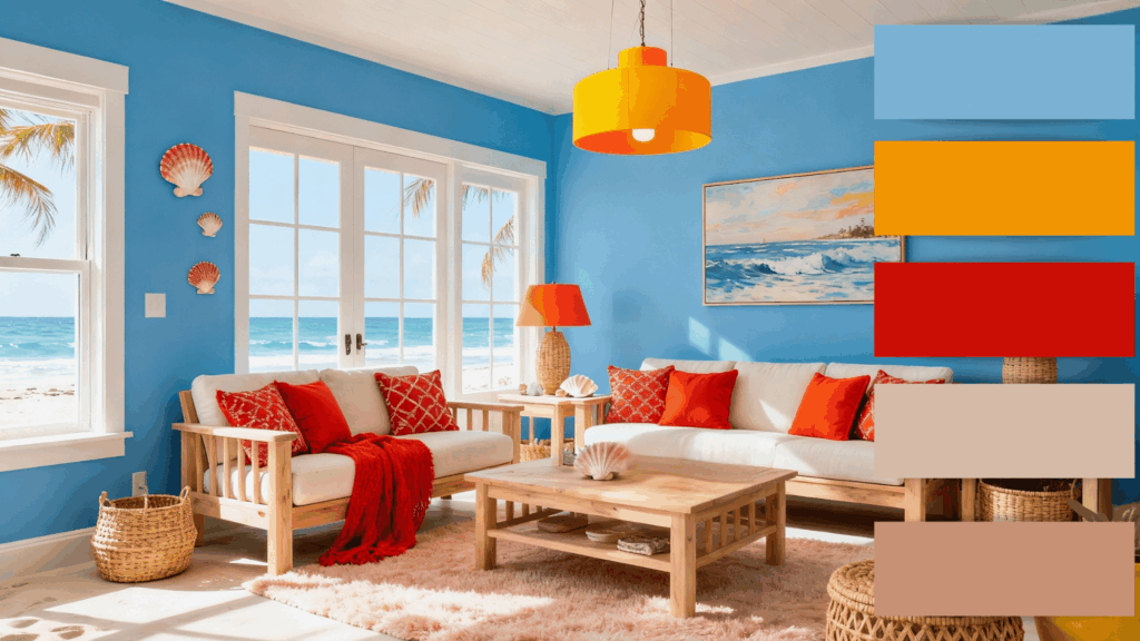
This palette captures breezy coastal beauty with cheerful warmth. Sky Blue provides a calm, refreshing base for walls, upholstery, or rugs.
Burnt Red accents, like throws or lamps, add excitement, while Apricot elements brighten the room through lighting or decor.
The combination feels sunny yet soothing, making it perfect for beach-inspired interiors, modern living rooms, or open spaces that aim for comfort with a touch of energy.
10. Sea Green + Terracotta + Light Gray
A bold yet balanced trio, this palette combines cool tones with vibrant contrast. Sea green sets a peaceful tone for walls or large furniture pieces.
Terracotta adds boldness through accents or art and brings warmth to accessories or decor.
The result is a stylish, energetic space that feels both relaxing and lively, ideal for living rooms, offices, or creative corners needing inspiration and visual depth.
11. Violet + Yellow + Teal Green
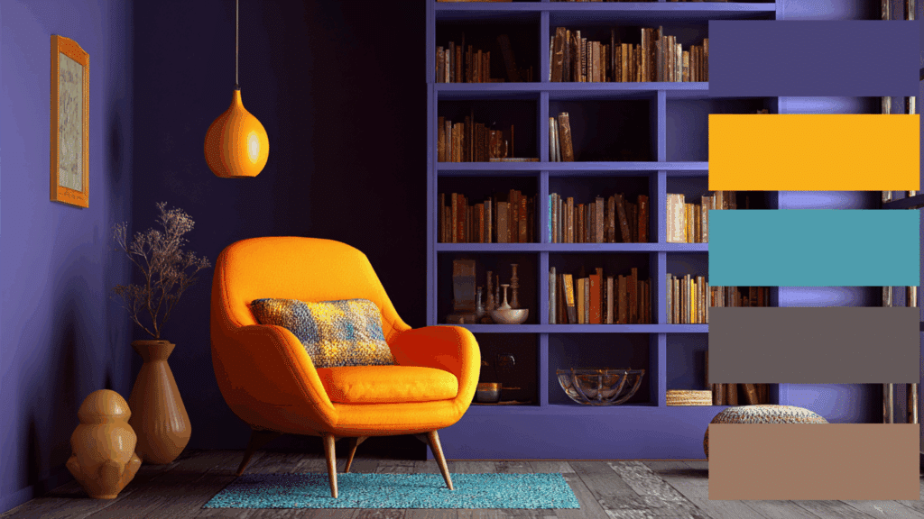
This color scheme mixes cool vibe with sunny energy. Violet establishes a refined mood, great for wall paint or textiles.
Yellow decor adds warmth and friendliness, while teal-green accessories brighten the space.
Together, these hues create a smart yet inviting look, perfect for living rooms, study areas, or reading nooks where creativity and calm coexist harmoniously.
12. Mauve + Yellow + Slate Orange
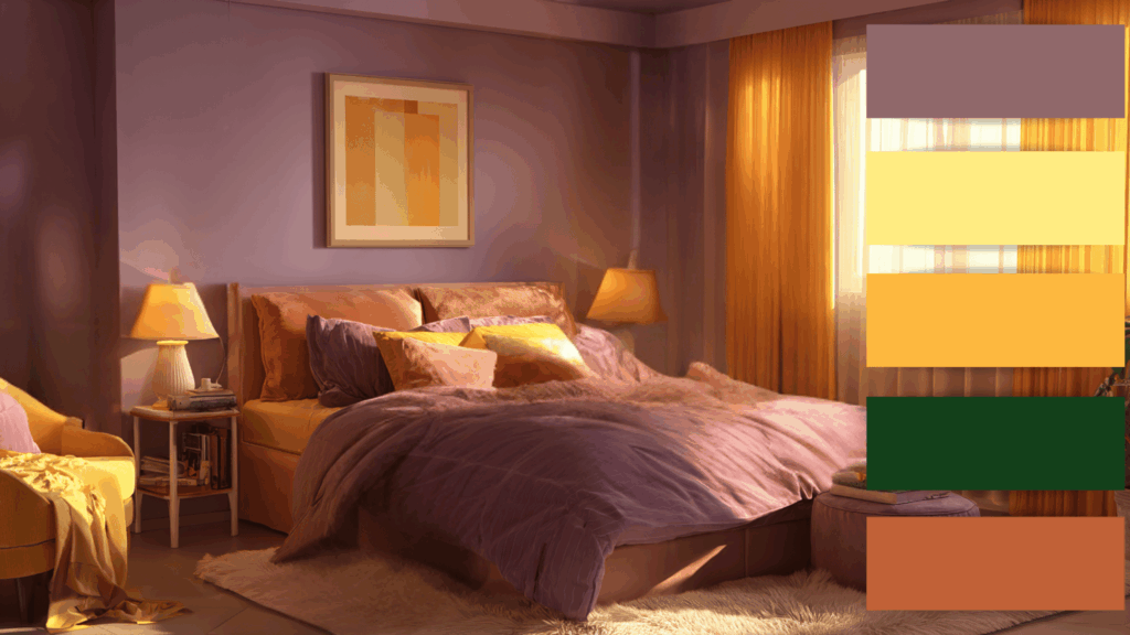
A cheerful yet graceful palette that adds depth and warmth to any room. Purple creates a rich, cozy base for walls or upholstery.
Yellow-green adds freshness through plants or decor, while yellow-orange brings a pop of brightness in cushions or art.
This combination radiates creativity and comfort, ideal for bedrooms, reading corners, or living spaces that aim to feel welcoming, balanced, and full of personality.
How to Choose a Split Complementary Palette
Choosing a split complementary palette means finding three colors that work in harmony. Start with one main color, then pick two hues on either side of its opposite for balanced contrast.
1. Identify Your Main Color: Start with one color you love, or that fits your project’s mood. This will guide the rest of your palette and set the overall tone.
2. Find Its Opposite on the Color Wheel: Locate the color directly across from your main hue. This opposite creates a natural contrast and helps you find the area for your supporting shades.
3. Choose the Two Adjacent Hues: Instead of using the exact opposite color, select the two colors next to it. These become your split complements, creating harmony and visual interest.
4. Adjust Saturation and Brightness: Modify the intensity of each color to match your style. Softer tones feel calming, while bolder hues make your design energetic and eye-catching.
5. Balance with Dominance and Accents: Let your main color take center stage, using the two split complements for accents. This balance keeps the palette cohesive without overwhelming the design.
Using Split Complementary Colors in Art and Design
Split complementary colors work beautifully across various creative fields and applications. In graphic design, they create eye-catching logos and marketing materials that grab attention without overwhelming viewers.
Digital artists use this scheme to add depth and dimension to illustrations while maintaining visual cohesion. Interior designers apply these palettes to establish a seamless mood and flow between connected rooms.
Fashion designers combine these hues in clothing collections to create striking outfits that photograph well.
Photographers use split-complementary tones to amplify emotional impact. Web designers employ this scheme for websites needing both readability and personality.
The versatility makes it valuable for beginners and professionals seeking balanced, attractive results
Tips for Applying Split Complementary Colors Successfully
Successfully applying split complementary colors means creating harmony between contrast and balance. With a few smart tricks, you can achieve beautiful, cohesive results in any design or space.
- Use One Dominant Color: Choose one main hue to lead your design, keeping the other two as subtle supporting accents.
- Add Neutral Shades: Balance bold colors with neutrals like white, beige, or gray to prevent the design from feeling overwhelming.
- Mind the Lighting: Test your colors under natural and artificial light, as lighting can change how each shade appears.
- Play with Textures: Mix matte, glossy, or fabric textures to add dimension and make your split complementary palette more dynamic.
- Test Small First: Try color combinations on small items or samples before committing to larger surfaces like walls or furniture.
Conclusion
Mastering split complementary colors allows anyone to design spaces and artwork that feel both vibrant and balanced.
This color scheme brings harmony through contrast, making it ideal for everything from digital designs to stylish home interiors.
By understanding how colors interact, designers can create moods that inspire comfort, creativity, or energy.
Whether it’s for art, branding, or home decor, learning to work with split complementary colors gives every project a polished, professional look while still leaving plenty of room for personal expression.