
Looking at a painting and feeling something just click? That’s not magic. It’s color theory doing its thing.
Artists have been playing with colors for centuries. They’ve figured out which ones fight, which ones get along, and which ones make viewers stop in their tracks. Most people don’t even realize there’s a whole system behind it.
Color theory might sound like homework from art school. But really, it’s just understanding how colors work together.
Once someone gets the basics down, everything changes. The way they see art, the way they create it, even the way they pick out throw pillows. This post breaks down what artists actually need to know.
What is Color Theory in Art?
Color theory is the roadmap artists use to mix, match, and make sense of colors. It explains why certain combinations pop off the canvas while others fall flat.
At its core, it’s about relationships. How red plays with blue. Why yellow and purple create tension. What happens when colors sit next to each other versus across a color wheel?
Artists use this framework to set moods, guide the eye, and tell stories without saying a word. It’s not about memorizing rules. It’s about understanding the language colors speak.
And once that language clicks, creating art becomes less guesswork and more intentional choice.
Why Color Theory is Important for Artists
Color theory turns guesswork into strategy. It helps artists make intentional choices that actually work instead of hoping things look right.
- Creates mood and emotion without relying on subject matter alone.
- Helps paintings feel balanced instead of visually chaotic or accidentally off.
- Makes color mixing predictable so artists stop wasting paint on muddy mistakes.
- Guides the viewer’s eye exactly where the artist wants it to go.
- Separates amateur work from pieces that feel polished and professional.
- Speeds up the creative process by eliminating endless trial and error.
The Color Wheel in Art
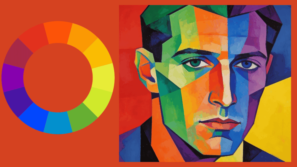
The color wheel is where color theory gets visual. It’s a circular diagram that organizes colors based on how they relate to each other.
Most wheels start with three primary colors that can’t be mixed with anything else. From there, artists combine those to create secondary colors.
Mix those together, and tertiary colors appear. The whole thing maps out like a family tree.
But the wheel isn’t just pretty to look at. It’s a tool. Artists use it to find complementary colors that create contrast, analogous colors that feel harmonious, and triadic schemes that balance energy across a piece.
Think of it as a cheat sheet. Instead of randomly mixing paint and hoping for the best, artists can glance at the wheel and know exactly which colors will play nicely together.
Key Color Theory Terms Every Artist Must Know
Understanding the language of color makes everything easier. These terms show up in every art conversation, and knowing them changes how artists see their work.
1. Color Harmonies: These are combinations that naturally please the eye. Complementary, analogous, and triadic harmonies create balance in different ways. Artists use them to make colors cooperate instead of compete, building visual unity across a piece.
2. Color Schemes: A color scheme is the specific palette an artist chooses for a work. It could be monochromatic, warm, cool, or mixed. The scheme sets the entire visual tone and keeps a painting from feeling scattered or random.
3. Color Temperature: Colors have warmth. Reds, oranges, and yellows feel hot. Blues, greens, and purples read cool. Temperature affects mood instantly. Warm colors advance toward the viewer while cool ones recede, creating depth without perspective tricks.
4. Color Value: Value is how light or dark a color appears. High value means lighter, low value means darker. Value creates form, dimension, and drama. Without it, paintings look flat, no matter how vibrant the colors are.
5. Color Contrast: Contrast happens when colors differ enough to stand apart. High contrast grabs attention and creates energy. Low contrast feels subtle and calm. Artists control contrast to direct focus and build visual hierarchy in their work.
6. Saturation (Intensity): Saturation describes how strong or muted a color appears. Highly saturated colors feel bold and energetic, while desaturated colors feel soft or neutral. Artists control saturation to avoid visual overload and to make focal areas stand out.
7. Tint: A tint is a color mixed with white, making it lighter. Tints create softness, airiness, and highlights. Artists often use tints to suggest light, atmosphere, or delicate transitions.
8. Tone: Tone is created by mixing a color with gray (both black and white). Toned colors feel balanced and natural. Artists rely on tones to unify a palette and keep colors from looking overly harsh or artificial.
9. Color Dominance: Color dominance is when one color or color family visually leads a composition. A dominant color creates unity, while secondary and accent colors provide support. Strong artwork often relies on one clear dominant color rather than equal competition.
Color Psychology: Emotions and Impact in Your Artwork
Colors don’t just sit there looking pretty. They trigger feelings, memories, and reactions people can’t always explain.
- Red gets hearts racing.
- Blue calms things down.
- Yellow feels cheerful until it tips into anxiety.
- Green brings nature to mind.
- Purple carries mystery or luxury depending on the shade.
Artists tap into these associations to set the emotional tone before a viewer even processes what the painting shows.
But color psychology isn’t universal. Culture shifts meaning. White means purity in some places, mourning in others. Personal experiences matter too.
Someone’s favorite color might be another person’s trigger.
Still, understanding common emotional responses gives artists another tool. They’re not just arranging shapes and lines anymore. They’re conveying feelings, using color as the instrument that hits viewers right in the gut.
Common Color Theory Mistakes Artists Make
Even experienced artists fall into color traps. Recognizing these mistakes early saves time, paint, and plenty of frustration down the road. Here are the most common ones:
- Using too many colors at once creates visual noise instead of harmony.
- Ignoring value contrast, making paintings look flat, even with vibrant hues.
- Mixing complementary colors carelessly, ending up with muddy browns and grays.
- Relying only on pure colors straight from the tube without adjusting saturation.
- Forgetting about color temperature, missing opportunities to create depth and atmosphere.
- Choosing colors based on personal preference rather than what the artwork actually needs.
Conclusion
Color theory isn’t about limiting creativity. It’s about expanding it. Knowing why certain colors clash or complement gives artists freedom to break rules intentionally instead of accidentally.
The basics stick around because they work. They’re active tools that make the difference between a piece that works and one that almost does.
Start small. Pick one concept and play with it. Try a complementary scheme. Experiment with temperature shifts. Notice how value changes everything.
The more artists understand color, the less they fight it. And that’s when the real fun begins.