
Light blue is one of those colors that instantly makes you feel calm. It reminds people of the sky, soft waves, or quiet mornings.
Benjamin Moore has some of the best light blue paint colors you can find. They’re clean, soft, and flexible enough to work in just about any room.
But choosing the right shade of blue isn’t always easy. Some blues are too bright, while others lean too gray or feel too cold.
In this post, I’ll explain what makes Benjamin Moore’s light blues so special, which colors go well with them, and how they can fit different rooms and styles.
I’ll also share mistakes to avoid and help you figure out if one of these soft shades might be right for your space.
What Kind of Color Is Light Blue?
Light blue is a gentle color. It sits between cool and warm, depending on the mix of undertones in it. Benjamin Moore’s light blues are known for being soft and slightly gray or green-leaning, which keeps them from looking too bright or icy.
These blues aren’t the bold blue of a kid’s bedroom. They’re more relaxed. Think beach houses, spa-like bathrooms, and peaceful bedrooms. They help a space feel open and calm.
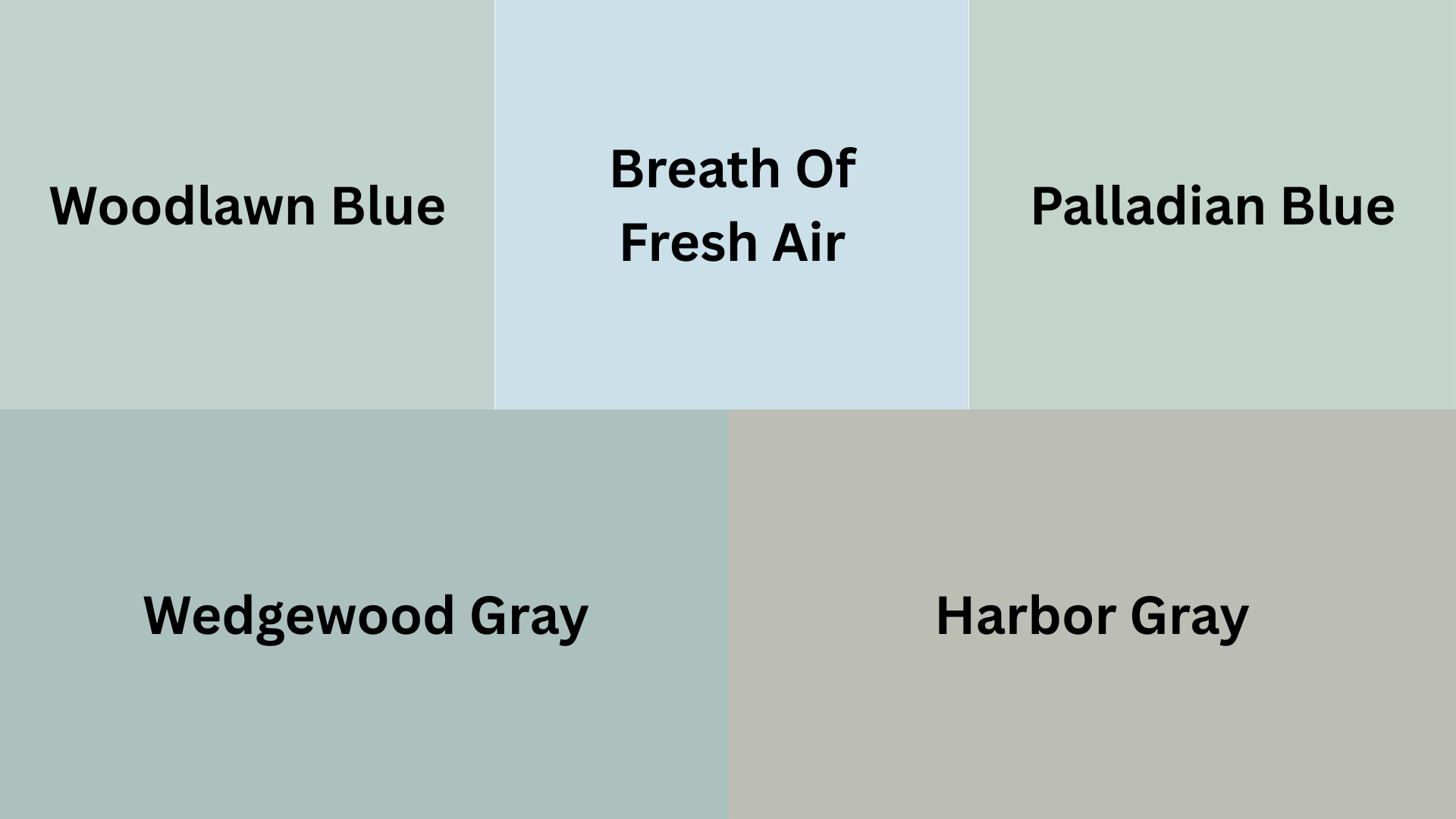
Some Benjamin Moore favorites in the light blue family include:
- Woodlawn Blue HC-147 – A soft, bluish-green with a touch of gray
- Breath of Fresh Air 806 – Light, cheerful, and almost like a morning sky
- Palladian Blue HC-144 – A cool mix of blue, green, and gray
- Wedgewood Gray HC-146– Looks more blue than gray in bright rooms
- Harbor Haze 2136-60 – Breezy and clean, like a cool sea breeze
Each of these colors has its own feel. Some are more gray. Others have a green tint. But they all share one thing: they’re calm without being boring.
What Colors Go Well with Benjamin Moore Light Blues?
One great thing about light blue is how flexible it is. It can stand alone or work as a background for deeper colors or natural textures.
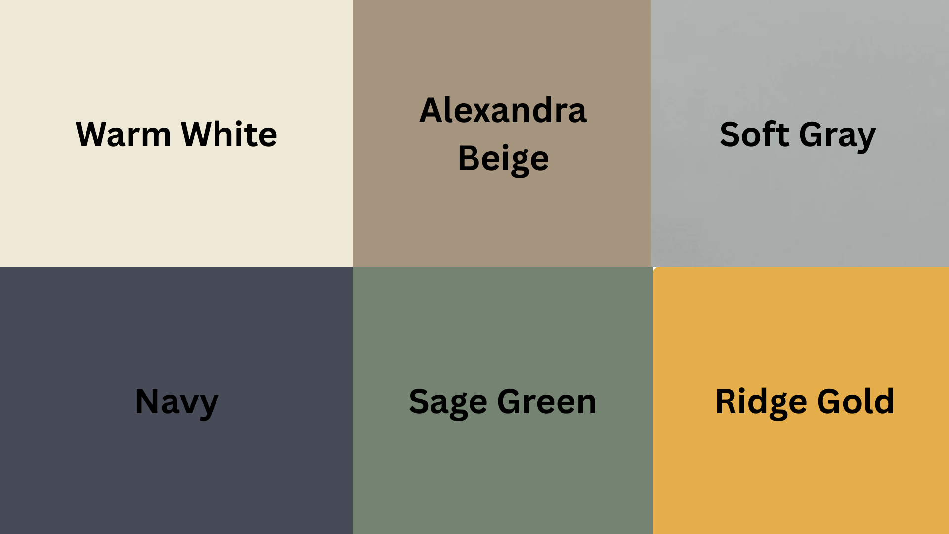
Colors That Pair Well
Here are some colors that go well with light blue:
- Warm Whites – Soft white walls or trim help the blue stand out without being too stark.
- Beige and Tan – These warm neutrals keep the space feeling grounded and cozy.
- Soft Gray – Adds balance without competing with the blue.
- Navy or Dark Blue – Creates depth and contrast in a subtle way.
- Sage Green or Olive – Adds an earthy layer for a more natural, relaxed feel.
- Brass or Gold Accents – Warms up the cool tones in the blue and add a bit of glow.
Light blues also look great with wood tones. Light oak or weathered wood adds warmth and texture, while darker wood like walnut adds contrast.
If you want to add some boldness, deep green or rust accents can make the blue feel richer. But even with soft pastels, the space will feel fresh and clean.
Comparing Benjamin Moore’s Light Blue Paint Shades
If you’re searching for the perfect light blue paint, Benjamin Moore offers several beautiful options—each with its own mood and personality.
No matter if you want a soft coastal vibe, a playful pop of color, or a timeless classic, there’s a shade to match your style.
| Paint Color | Description |
|---|---|
| Woodlawn Blue (HC-147) | A soft bluish-green with a touch of gray—subtle and elegant. |
| Breath of Fresh Air (806) | Light, cheerful, and airy—like a clear morning sky. |
| Palladian Blue (HC-144) | A cool balance of blue, green, and gray—classic and versatile. |
| Wedgewood Gray (HC-146) | Appears more blue than gray in natural light—great for brighter spaces. |
| Harbor Haze (2136-60) | Breezy and clean—captures the feeling of a cool sea breeze. |
Each of these shades brings a unique feel to a room. Whether you want something fresh and light or calm and grounding, Benjamin Moore’s light blues offer plenty of beautiful choices for any style of home.
What Style Works Well with This Color?
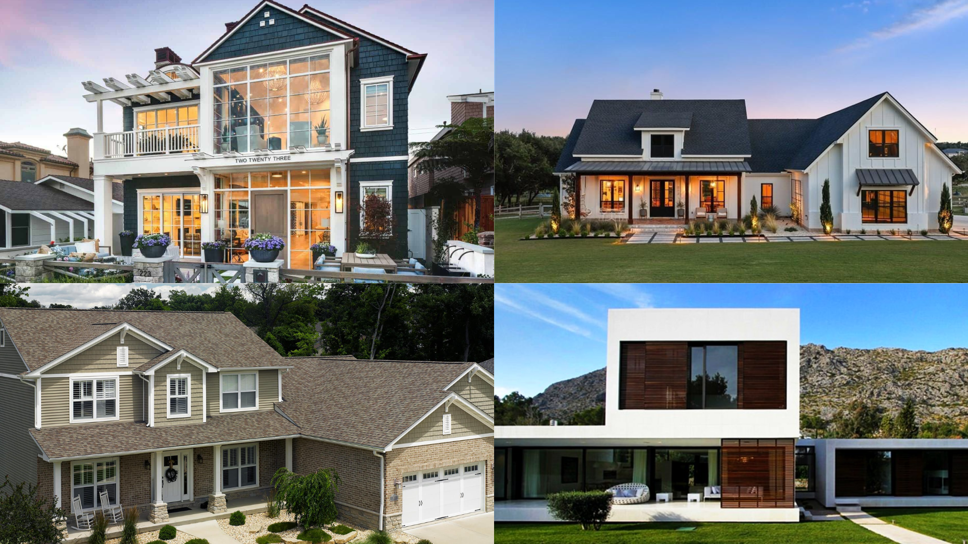
Light blue works in almost every kind of home thanks to its clean, calm feel. It suits both casual and more polished spaces.
In Coastal and Beach-Inspired homes, light blue feels right at home, evoking the sea and sky. Pair it with sandy tones, soft whites, and driftwood-style wood for a breezy, vacation-like vibe.
For Farmhouse and Country styles, choose blues with a touch of gray or green, like Woodlawn Blue. These softer shades add color without overwhelming the space and look great with cream trim, vintage furniture, and natural fabrics like linen or cotton.
In Traditional and Classic homes, pale blue paired with white trim and dark wood creates a timeless, elegant look—an easy way to refresh a room without changing its core elements.
In Modern and Minimal spaces, light blue adds softness and color, working well with white walls, black fixtures, and clean lines.
And in Kids’ Spaces, cheerful shades like Breath of Fresh Air feel happy and playful without being too bright, leaving room for fun accents and patterns.
What Paint Finish Should You Choose?
Choosing the right paint finish depends on how the room is used and how you want it to look.
Room-by-Room Finish Guide
- Flat or Matte: Great for ceilings or low-traffic areas. Hides small flaws but is hard to clean.
- Eggshell: Most popular for walls. Slight sheen. Easy to clean and works in most rooms.
- Satin: Best for kitchens, bathrooms, or kid-friendly areas. More shine, easy to wipe down.
- Semi-gloss: Used for trim, doors, and cabinets. Holds up well and reflects more light.
If you’re painting a bedroom or hallway, eggshell is usually a safe bet. For kitchens and bathrooms, go with satin. It handles moisture and splashes much better in my house.
Using semigloss on trim helps create contrast, especially if your walls are in a soft matte blue. It also makes the room feel more finished.
Real Home Ideas Using Benjamin Moore Light Blues
Let’s take a look at how these blues might look in different spaces. These examples can help you picture them in your own home.
Living Room

A light blue like Wedgewood Gray brings a calm, clean look to a living room. Use it with soft gray or tan furniture and warm wood tables.
Add white curtains and black metal lamps for balance. The room feels open, peaceful, and simple—but not plain.
Kitchen
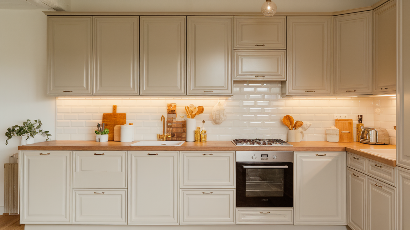
I love using Palladian Blue on the walls or even just on the lower cabinets. It adds a fresh feel without being too bright, giving the space a gentle, soothing vibe.
Pair it with white uppers, butcher block counters, and brass handles. The result is clean and modern but warm and lived-in, perfect for a kitchen that feels welcoming every day.
Bedroom
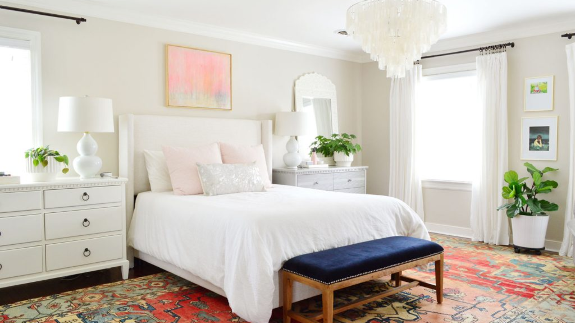
Woodlawn Blue on bedroom walls gives the room a soft, relaxing glow. Use cream bedding, a wood or upholstered headboard, and light rugs.
Add a reading chair in gray or soft tan to finish the space. It’s a great color for winding down at the end of the day.
Bathroom
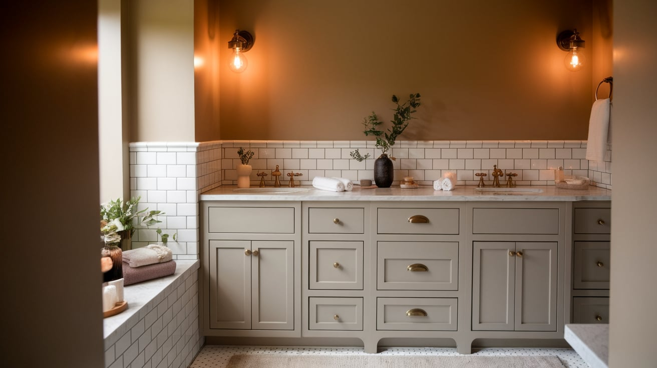
In bathrooms, light blue adds a fresh, clean feel. Try Breath of Fresh Air on the walls with white tiles and a wood vanity. Add gold or matte black fixtures for contrast. The space feels bright and calm, like a little personal spa.
Entryway
I like to use a gray-blue like Harbor Haze in a small entry space to create a peaceful and calming welcome. It’s soft enough to feel inviting but still adds a little personality right when you walk in.
I usually add a bench with a woven basket underneath, a simple coat hook, and a round mirror to reflect light. These small details work together to make the space feel intentional and cozy.
Mistakes to Avoid
Even though light blues are easy to work with, here are a few things to watch out for.
- Picking Without Testing: Always test paint in your space. Light blue can look totally different depending on the lighting and what it’s next to. Use a sample on your wall and check it at different times of the day.
- Going Too Cool: If your room already has a lot of gray or black, a blue with strong gray undertones can feel too cold. Choose a slightly warmer blue or add warmer textures—like wood, rugs, or warm lightbulbs—to keep things balanced.
- Forgetting the Trim: White trim helps light blue walls pop. But don’t pick a bright white with a blue that has a lot of warmth, it can make the blue look muddy. Instead, use a soft white or the same shade in a different finish to keep things smooth.
- Using the Wrong Finish: A flat blue in a bathroom won’t hold up. A glossy blue in a bedroom might feel too shiny. Match the finish to how the space is used so the paint lasts and keeps looking good.
Wrapping Up
If you’re looking for a color that makes your home feel calm, clean, and cozy, Benjamin Moore’s light blues are a great place to start. These colors are flexible, easy to decorate with, and they bring a peaceful feel to any room.
They fit with almost every style, from beachy and casual to clean and modern. They work with warm woods, soft whites, and even bold accents.
Whether you’re painting an entire room, an accent wall, or even cabinets, light blue is a color you can live with and love for years.
So if you want something that feels relaxed and refreshing—but still stylish—give one of these soft blues a try. You might find that it’s exactly what your space has been missing.