")
Choosing the right paint color can feel like solving a puzzle. You want something that looks great, feels right, and doesn’t break the bank.
In this guide, I’ll break down Benjamin Moore’s Pikes Peak Gray (2127-50), a color that might be exactly what your space needs.
Why trust this review? I’ve:
- Analyzed the color in different lights
- Checked its versatility
- Seeing how it pairs with various furniture styles
Whether you’re updating a living room, refreshing a bedroom, or thinking about a home makeover, my blog will help you decide if Pikes Peak Gray is your perfect match or not.
From undertones to lighting effects, I’ll cover everything you need to know. Trust me to give you practical advice that takes the stress out of your color selection and helps you make a confident choice.
Why Pike’s Peak Gray Is an Ideal Paint Color?

Pike’s Peak Gray, with an LRV of 39.38, sits right between light and dark. It gives you color without making the room feel heavy, making it a safe choice for both large and small spaces.
It’s soft enough for bedrooms but rich enough to add interest to common areas. The color feels calm and fresh. It doesn’t demand attention, but it also doesn’t disappear.
It sets a peaceful tone that works well in quiet spaces, such as reading nooks or bedrooms, as well as in busier areas like kitchens or family rooms.
One of the best aspects of this color is its ability to complement both warm and cool accents. You can pair it with white, wood, brass, chrome, or even black. It holds its own and brings balance to the room.
Pike’s Peak Gray also has a lasting style. It looks clean and modern, yet still feels classic, making it a smart choice if you want a color that won’t go out of style too quickly.
Understanding the Subtle Undertones of Pike’s Peak Gray
When I first saw Pike’s Peak Gray, I was struck by its cool, medium gray tone with soft blue undertones. Pike’s Peak Gray is a cool, medium gray with clear blue tones.
In most spaces, the blue is soft, not bright or icy. You may also notice a hint of green or even beige in certain lighting, but these nuances are subtle and don’t dominate.
They help the color feel more natural and less flat. This paint changes gently depending on the light. I have seen that in rooms with lots of daylight, it appears brighter and crisper.
The blue shows up more clearly and gives the space a fresh feel. In darker areas or under warm light bulbs, it can appear deeper and slightly more muted.
One of the reasons I love this color is its versatility. It pairs beautifully with:
- Soft white trim
- Warm wooden furniture
- Brushed metal accents
- Crisp black details
Unlike some other gray-blues, Pike’s Peak Gray does not shift too sharply. It holds steady and avoids turning purple or overly cool.
This makes it easier to use in different rooms without worrying about strange color changes. It blends well with soft whites, warm woods, brushed metals, or black accents.
Whether your space has ample light or very little, Pike’s Peak Gray maintains its smooth, steady appearance. That’s part of what makes it such a good choice for long-term use.
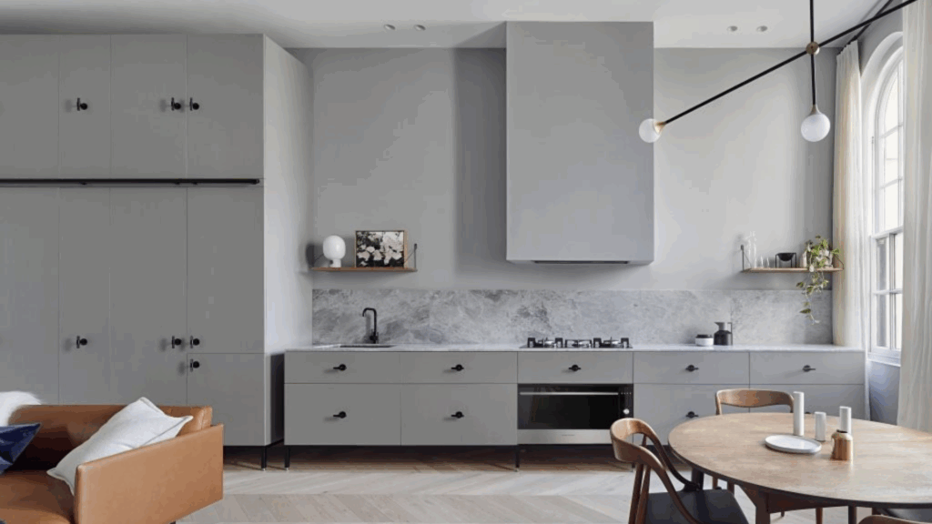
Best Places to Use Pike’s Peak Gray in Your Home
Pike’s Peak Gray is a soft, cool shade that complements many areas of the home. It brings a calm feeling without being too light or too bold. Its a mix of gray and blue that makes it flexible and easy to use in different rooms.
Bedrooms
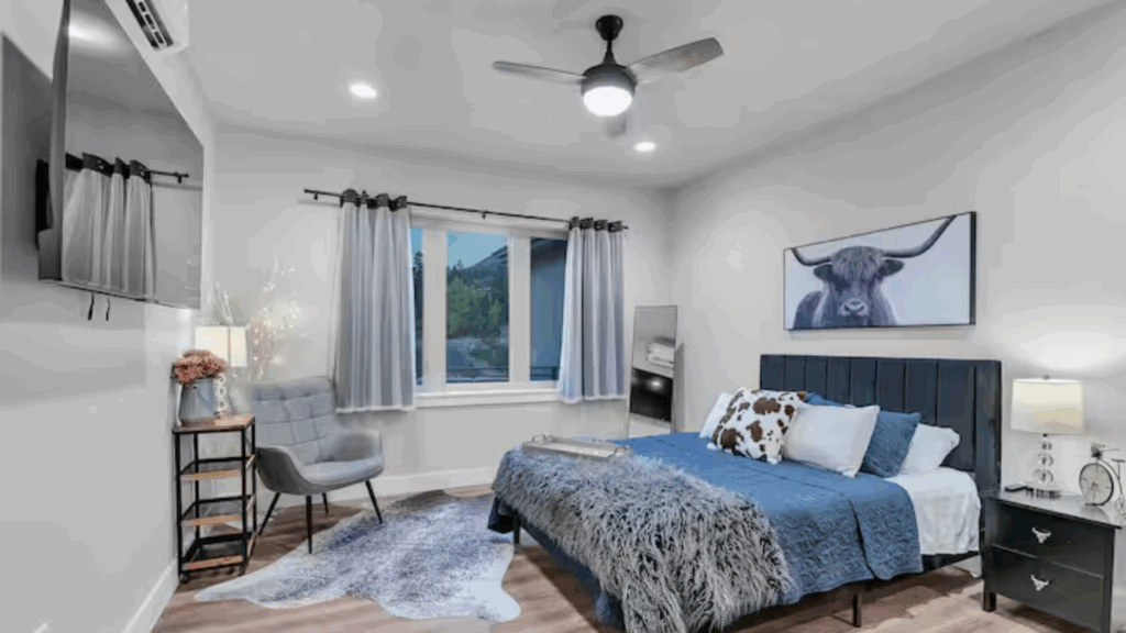
I love how Pike’s Peak Gray turns bedrooms into peaceful retreats. When I painted my bedroom, I found its magic in creating a calm and cool atmosphere.
The blue-gray tone offers just the right touch of color without feeling heavy or overwhelming. In my experience, this color works perfectly with light bedding, soft area rugs, and natural wood furniture.
You’ll find it creates a soft, restful space that helps you unwind after a long day. It feels like a soft whisper of comfort, adding both grace and calm to your space.
Living Rooms
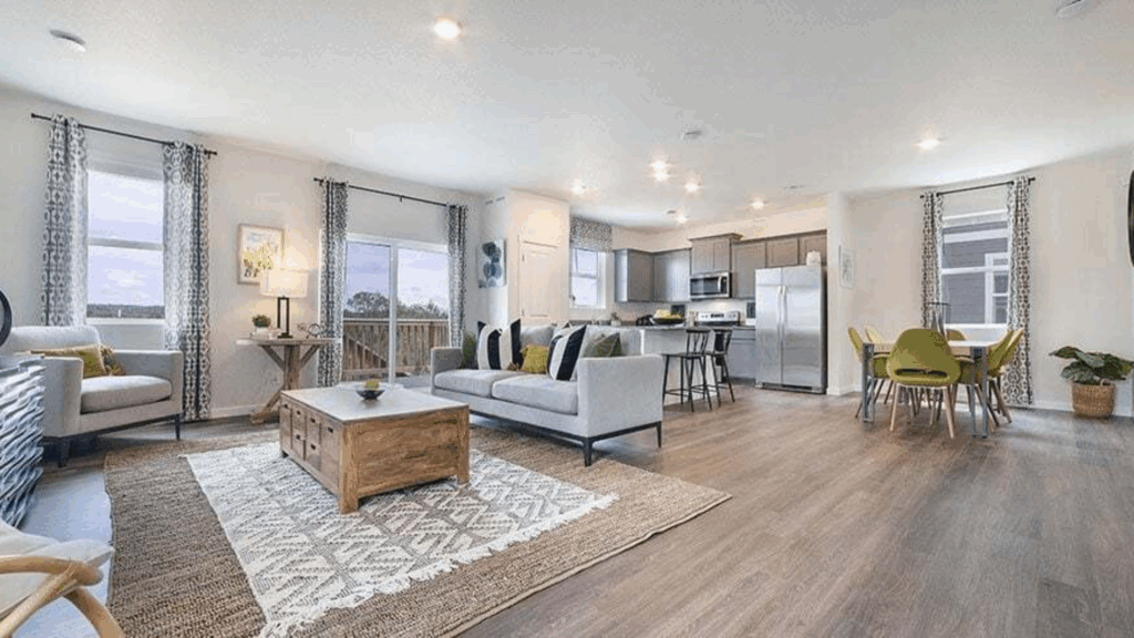
When I chose Pike’s Peak Gray for my living room, I learned its true color strength. This shade brings a steady, balanced look that’s neither too loud nor forgettable.
You’ll love how it creates a space that feels both relaxed and welcoming. I’ve seen it work in different room styles – from clean modern spaces to warm traditional rooms and everything between.
It’s like the expert wall color, adapting beautifully while keeping its own clear personality.
Bathrooms
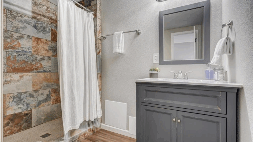
When I updated my bathroom, I found how Pike’s Peak Gray changes the space. It brings a clean, cool tone that feels fresh and welcoming. You’ll love how it adds a crisp look without making the room feel harsh or sterile.
I found it works perfectly with white tiles, stone sinks, silver hardware, and large mirrors. The color creates a smooth, polished appearance that makes your bathroom feel both calm and current.
Hallways
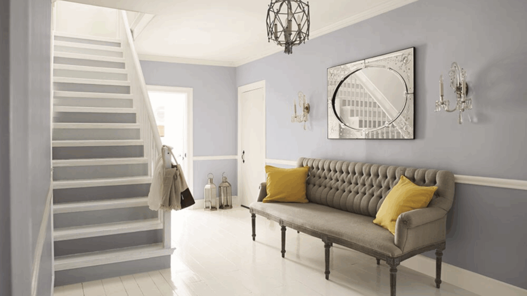
I know how tricky it can be while choosing the right color for hallways. Narrow spaces need careful color selection.
But Pike’s Peak Gray solved my design challenge perfectly. It adds just enough tone to make the space feel complete without closing it in.
I love how this color works as a smooth connector between different rooms. Its neutral quality means you won’t worry about clashing with nearby spaces. It keeps your hallway feeling open, light, and welcoming.
Accent Walls
Not ready to paint an entire room? I’ve got a perfect solution. Try Pike’s Peak Gray as an accent wall.
When I first experimented with this approach, I was amazed at how it adds depth and character to a space without feeling too heavy.
It works brilliantly behind a bed, creating a calm backdrop. Place it behind a desk for a focused work area. In dining spaces, it brings a subtle touch that draws the eye without competing with your decor.
Flooring Options that Pair Beautifully with Pike’s Peak Gray
Pike’s Peak Gray works well with a range of flooring styles. Its cool tone helps balance both warm and cool materials. The right floor can help the color appear softer, brighter, or more grounded, depending on the desired look.
- Pale or whitewashed wood: This wood brings a light, airy feel. This pairing creates a soft and open look, particularly in rooms with abundant natural light. It’s a great choice for modern or coastal-style spaces.
- Warm oak or maple floors: They add a striking contrast. The warmth of the wood balances the coolness of the wall color. This mix works well in living rooms and bedrooms where you want the space to feel cozy but still fresh.
- Soft beige or greige carpet: It keeps things calm and quiet. These tones blend well with the blue-gray without clashing. This flooring is an excellent choice for bedrooms, family rooms, or any space where comfort is a priority.
- Light tile or concrete: It gives a clean, modern look. The smooth surface pairs nicely with the soft gray-blue tone. This combo works well in bathrooms, kitchens, or entryways.
Pike’s Peak Gray Compared to Other Warm Neutral Paints
Pike’s Peak Gray is a cool gray-blue shade, but it’s helpful to see how it compares to similar shades. This table highlights the differences between Pikes Peak Gray and other similar shades.
| Aspect | Pike’s Peak Gray | Comparison Details |
|---|---|---|
| Color Temperature | Warm gray with subtle beige undertones | Softer and more inviting than pure gray |
| Light Reflection | Medium-light shade | Brighter than deep grays, less stark than white |
| Room Impact | Creates a calm, welcoming atmosphere | More versatile than cool-toned grays |
| Undertone | Gentle tan-like warmth | Less yellow than greige, more neutral than taupe |
| Versatility | Works in multiple spaces | Adapts well to living rooms, bedrooms, and home offices |
Paint Finish Ideas for Pike’s Peak Gray
When I first painted with Pike’s Peak Gray, I quickly learned how much the finish matters. Each finish tells a different color story.
The right choice can change how the color looks and feels in your space. I recommend choosing your finish based on three key factors: room lighting, foot traffic, and cleaning needs.
From matte to glossy, each finish brings out unique qualities in Pike’s Peak Gray. Some make it look soft and smooth, while others add a subtle shine that catches the light just right.
- Matte: It has a soft, smooth appearance with no shine, which creates a calming and relaxed feel. It is a good choice for quiet spaces, such as bedrooms or offices, where a gentle, flat surface is desired.
- Eggshell: It’s great for living rooms, hallways, and bedrooms and is easier to clean than a matte finish, but it still feels soft and understated.
- Satin: It has a little more shine and works well in bathrooms and kitchens. It handles moisture and cleaning better than flat finishes. It also helps reflect light in small or dark spaces.
- Semi-gloss: The best option for trim, doors, and cabinetry. It’s smooth, shiny, and easy to wipe down. The slight gloss also provides a nice contrast against the softer wall color.
Conclusion
I’ve painted countless walls. Some colors disappoint, but not this one.
Pike’s Peak Gray isn’t just another paint; it’s your design ally. When you want a color that speaks softly but carries real style, this is your pick. No drama and no fuss.
And if you want proof? Then take a look at the rooms I’ve shown you, bedrooms, hallways, and living spaces. This color adapts like a dream, turning each space with quiet confidence. It’s the friend who fits in everywhere without trying too hard.
My advice will be to grab a sample, test it in your space, and watch how light changes its mood. Some colors look great in the store but weird at home. Not Pike’s Peak Gray. It’s consistent and reliable.
Paint shopping can be tough, but Pike’s Peak Gray makes it simple. Trust me.