
Choosing the right purple paint can be tricky. In this guide, I’ll show you the best Benjamin Moore purple paints for any room in your home. After testing dozens of purples in my own house, I’ve found the perfect shades for every need.
Purple walls can transform boring rooms into beautiful spaces that reflect your style. Whether you want soft lavender for your bedroom or bold eggplant for your dining room, I’ve got you covered.
I’ve seen how the right purple paint can solve common problems like:
- Making small rooms feel larger
- Adding warmth to north-facing spaces
- Creating calm in busy areas
- Adding personality without overwhelming a room
Let me help you find a purple shade you’ll love for years to come!
What Makes a Good Purple Paint?
A good purple paint strikes the right balance between red and blue undertones. I look for these qualities when choosing purple paint:
- Color stability: The paint should look similar in different lighting conditions
- Depth: Good purples have subtle layers that add interest
- Undertones: Knowing if a purple leans warm (red-based) or cool (blue-based) helps with matching
- Coverage: Quality purple paints need fewer coats to achieve full color
Benjamin Moore’s purple paints stand out because they mix well with other colors and create a balanced look. Their formula also stays true after drying, so you won’t be surprised by the final result.
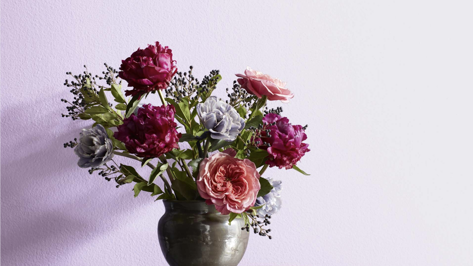
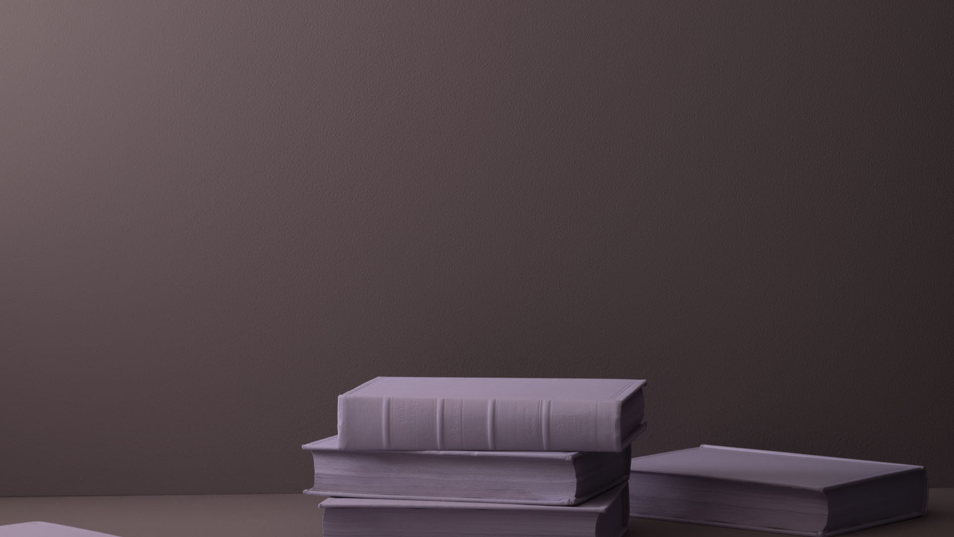
Soft & Subtle Purples (Good for Bedrooms, Bathrooms, Nurseries)
These gentle purples create calm, peaceful spaces that feel both fresh and relaxing.
They’re perfect for rooms where you want to unwind and rest, offering color without overwhelming the senses.
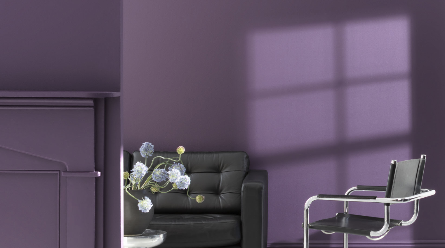
1. Misty Lilac 2071-70
This airy shade feels both soft and refreshing. It catches light beautifully throughout the day, creating a sense of openness and calm.
The subtle blue undertones keep it from feeling too sweet, making it perfect for adult spaces. It pairs wonderfully with white trim and light wood finishes.
I find this color particularly useful in rooms that need to feel spacious yet still cozy.
The cool undertones help reflect natural light, making even north-facing rooms feel welcoming. When paired with soft textiles like linen and cotton, it creates a serene retreat that feels both current and timeless.
- Best for: Bedrooms and reading nooks
- LRV: 77.95
2. Lavender Mist 2070-60
This gentle purple has a crisp, clean quality that makes spaces feel instantly fresh. In morning light, it takes on a slight blue cast, while evening light brings out its warmer tones.
The color works magic in small spaces, making them feel larger and more open.
What I love most about Lavender Mist is its ability to add character without overwhelming a space. It creates a perfect backdrop for both modern and vintage furnishings.
The hint of gray in its base gives it sophistication that many lighter purples lack, allowing it to grow with your style over time.
- Best for: Bathrooms and small bedrooms
- LRV: 63.19
3. Spring Iris 1402
This warm, lavender-leaning scent creates a cozy atmosphere without heaviness. Its pink undertones add a welcoming quality that flatters most skin tones. I love how this color changes subtly throughout the day while maintaining its essential warmth.
Spring Iris stands out for its versatility across different lighting conditions. Even in spaces with minimal natural light, it maintains its gentle warmth rather than turning flat or dull.
The color has an almost nostalgic quality that makes it perfect for creating spaces that feel both fresh and familiar.
- Best for: Guest rooms and nurseries
- LRV: 64.78
4. Touch of Gray 2116-60
This sophisticated dusty lavender feels perfectly balanced between purple and gray. The muted quality creates a sense of calm while still providing more interest than a neutral.
It works exceptionally well with marble and brushed nickel fixtures.
I’ve found Touch of Gray to be one of the most adaptable purples in the Benjamin Moore collection. It serves as an excellent “bridge color” when transitioning between rooms with different color schemes.
Its understated elegance works particularly well in homes with open floor plans where colors need to flow harmoniously from one space to another.
- Best for: Main bathrooms and transitional spaces
- LRV: 68.78
5. Dreamy Cloud 2111-70
This barely there purple creates a cloud-like softness on the walls. The color is so subtle that it reads as an off-white with the faintest purple cast, adding dimension without calling attention to itself.
In bright light, it appears crisp and clean; in shadows, it develops a gentle depth.
What makes Dreamy Cloud special is its chameleon-like ability to complement almost any accent color.
It provides the perfect canvas for showcasing artwork and statement furniture without competing for attention.
In larger spaces with varying light conditions, it maintains a consistent look while still adding more interest than a standard white or beige.
- Best for: Whole-home color schemes and ceilings
- LRV: 76.41
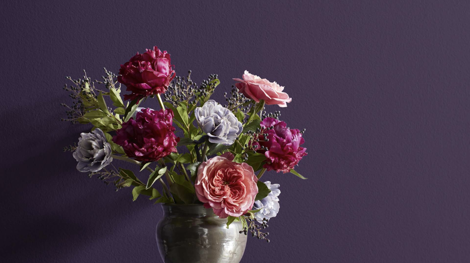
Warm & Moody Purples (Great for Dining Rooms, Libraries, Accents)
These richer purples add depth and character to spaces where you want to create a sense of intimacy.
They work beautifully in rooms used primarily in the evening, creating a cozy atmosphere that feels luxurious and welcoming.
6. French Lilac 1403
This dusty purple creates a sense of timeless comfort in any space. The gray undertones give it a quiet maturity that works equally well in modern and classic settings.
I find it changes wonderfully with the light—more purple at midday and more gray at dusk. It plays beautifully with natural linens and antique brass.
What surprises most people about French Lilac is how neutral it can feel despite being definitively purple. I’ve used it in homes where clients wanted color but were afraid of anything too bold.
The slightly muted quality gives it staying power that trendier colors often lack. It’s particularly stunning when used on all four walls of a room with white trim and ceiling.
- Best for: Dining rooms and studies
- LRV: 56.14
7. Wild Orchid 2072-40
This mauve-tinted purple has a subtle warmth that makes rooms feel instantly welcoming. The color has remarkable depth that appears different from every angle.
It creates a perfect backdrop for artwork and makes wood furniture look rich and expensive.
In my experience, Wild Orchid works wonders in spaces that feel cold or sterile. The warmth in its base helps soften harsh architecture and brings a human element to minimal spaces.
This color is also remarkably forgiving of wall imperfections, making it a smart choice for older homes with character walls that aren’t perfectly smooth.
- Best for: Living rooms and entryways
- LRV: 25.18
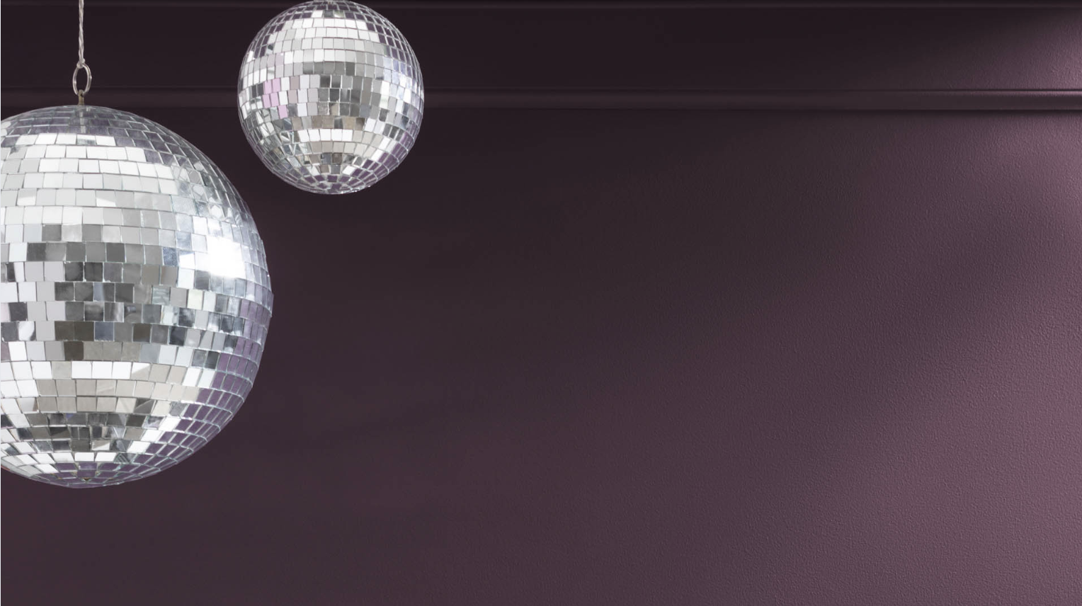
8. Shadow 2117-30
This deep, smoky eggplant creates a dramatic impact while maintaining livability. The rich depth looks almost velvety on the walls and absorbs light most nicely.
In smaller spaces, it creates an intimate, cozy feeling that feels both bold and comforting.
What makes Shadow truly special is its relationship with both natural and artificial light. While many dark colors can feel flat or one-dimensional, Shadow reveals subtle complexity as lighting changes.
I often suggest using it in rooms where you entertain in the evening, as it looks particularly luxurious under warm lighting from lamps and candles.
- Best for: Libraries and accent walls
- LRV: 9.03
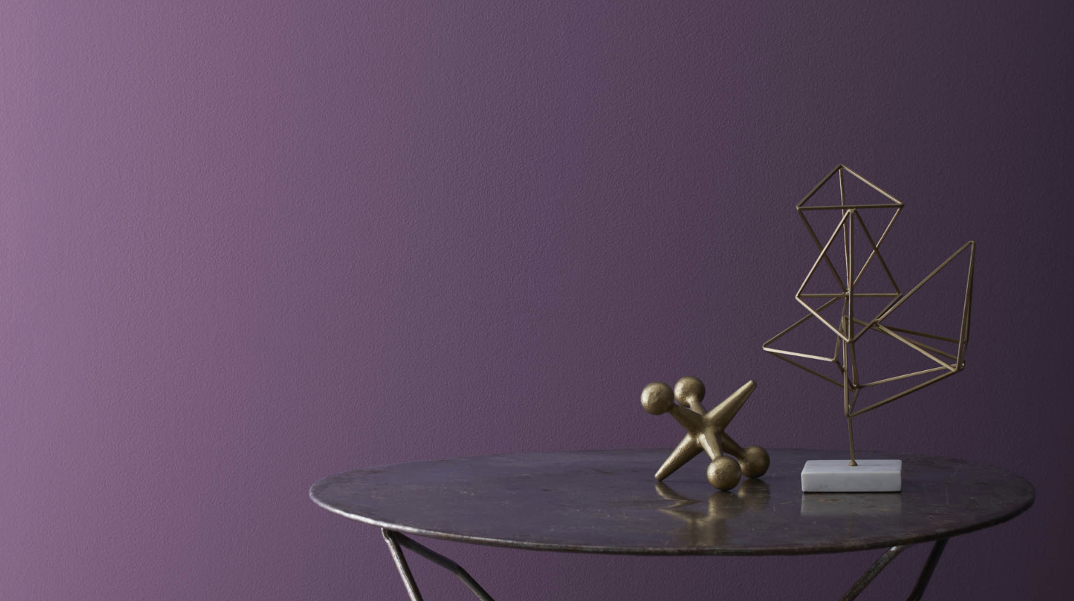
9. Vintage Wine 2116-20
This muted plum has beautiful brown undertones that give it an aged, classic feel. It changes dramatically with lighting—more purple in daylight, more brown in artificial light.
The color creates a perfect balance between moody and inviting, making spaces feel distinctly special.
I’m often struck by how Vintage Wine seems to improve with age, much like its namesake. As the paint cures and settles over months, it develops an even richer quality.
The color has remarkable staying power through changing trends.
It pairs exceptionally well with natural stone surfaces and creates a perfect backdrop for displaying collections or treasured objects.
- Best for: Dining rooms and master bedrooms
- LRV: 8.2
10. Amethyst Shadow 1441
This sophisticated blue-violet creates a refined atmosphere that feels both current and timeless.
Its complex undertones shift subtly throughout the day, creating visual interest without overwhelming the space. It pairs exceptionally well with both cool whites and warm metals.
What I value most about Amethyst Shadow is its surprising adaptability across different design styles. From traditional to contemporary spaces, it serves as a beautiful connecting element.
The color has a grounding quality that makes spaces feel intentional rather than trendy. When paired with natural textures like wool, linen, and leather, it creates spaces with depth that invite longer stays.
- Best for: Home offices and formal living areas
- LRV: 18.29
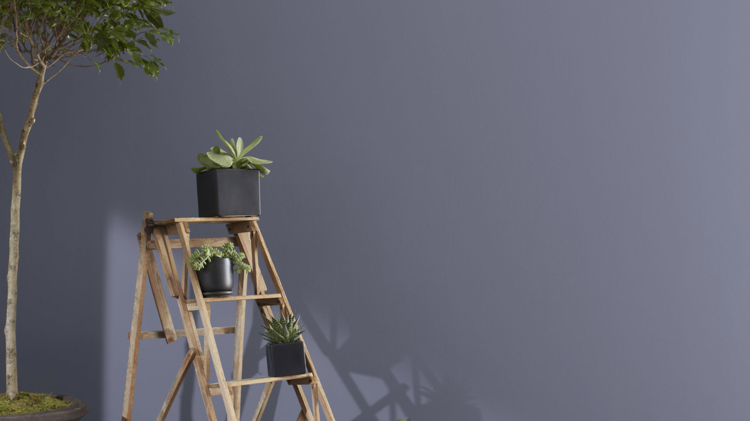
Gray-Purple Hybrids (If You’re Color-Shy)
These sophisticated purples blend with gray for a more subtle, neutral approach to color.
They’re ideal for people who want to try purple but are worried about it being too bold or sweet, offering color with restraint.
11. Exotic Purple 2071-10
This saturated purple creates instant luxury in any space. The deep tone has an almost magnetic quality that draws people in and makes rooms feel purposeful.
With its perfect balance of red and blue undertones, it maintains its character in any light. The color makes the white trim and fixtures stand out with striking clarity.
I’ve found that Exotic Purple creates a sense of intimacy that’s hard to achieve with lighter colors. It transforms ordinary rooms into spaces that feel special and thoughtfully designed.
This color works particularly well in spaces with high ceilings, as it helps bring the scale down to a more human level.
The richness of the pigment creates a perfect backdrop for metallic accents and mirrors, which reflect light beautifully against its depth.
- Best for: Powder rooms and media rooms
- LRV: 5.46
12. Passion Plum 2073-30
This rich purple with subtle red undertones creates a romantic, cozy atmosphere without feeling heavy. Its remarkable depth changes beautifully as light shifts throughout the day.
In artificial light, it takes on an almost velvety quality that makes spaces feel carefully curated.
What I appreciate most about Passion Plum is how it manages to be both bold and livable. Unlike many saturated colors that can feel tiring over time, this shade maintains its appeal day after day.
The warmth in its base makes it particularly flattering to various skin tones, making it a smart choice for spaces where entertaining is frequent.
It pairs surprisingly well with both cool grays and warm taupes for a sophisticated look.
- Best for: Dining areas and accent walls
- LRV: 11.83
13. Purple Lotus 2072-30
This bright, clear purple brings a sense of energy and creativity to any room. Unlike many purples, it maintains its vibrancy even in low-light conditions.
The color creates a perfect backdrop for modern art and clean-lined furniture. It looks particularly striking against a pure white trim.
Purple Lotus has an uncanny ability to transform ordinary spaces into memorable spaces. I’ve used it in everything from creative workspaces to children’s rooms with equal success.
What makes it special is its clarity, despite its intensity; it never feels muddy or overwhelming.
The color works particularly well in rooms that need a boost of energy and positivity, and it pairs beautifully with bright yellows and teals for a contemporary look.
- Best for: Creative spaces and modern rooms
- LRV: 10.25
14. Dark Purple 2073-10
This deep, mysterious purple creates a dramatic impact with surprising versatility. In bright light, it shows its true purple nature; in shadows, it reads almost black.
The color has a grounding quality that makes spaces feel deliberate and thoughtfully designed. It pairs beautifully with both silver and gold accents.
I often recommend Dark Purple for clients who want drama without the starkness of black. This color creates depth that feels rich rather than severe.
What surprises most people is how well it works in spaces of all sizes—rather than making small rooms feel smaller, it creates a sense of expansiveness by blurring boundaries.
The color takes on an almost liquid quality at night under soft lighting, creating spaces that feel both cozy and luxurious.
- Best for: Statement walls and small, intimate spaces
- LRV: 5.7
15. Taro 1386
This crisp, cool purple with strong blue undertones creates spaces that feel both bold and refreshing. Unlike warmer purples, it maintains its clear tone throughout the day.
The color has a modern edge that works wonderfully in contemporary settings. It makes warm wood tones pop with a beautiful contrast.
Purple Rain has a remarkable ability to energize spaces without feeling chaotic or overwhelming.
I’ve found it particularly effective in home offices and creative spaces where focus and inspiration are key.
The color has an almost electric quality that stimulates thinking while still feeling grounded.
When paired with concrete, glass, and metal finishes, it creates spaces with a distinctly modern vibe that still feels welcoming and accessible.
- Best for: Creative offices and contemporary spaces
- LRV: 9
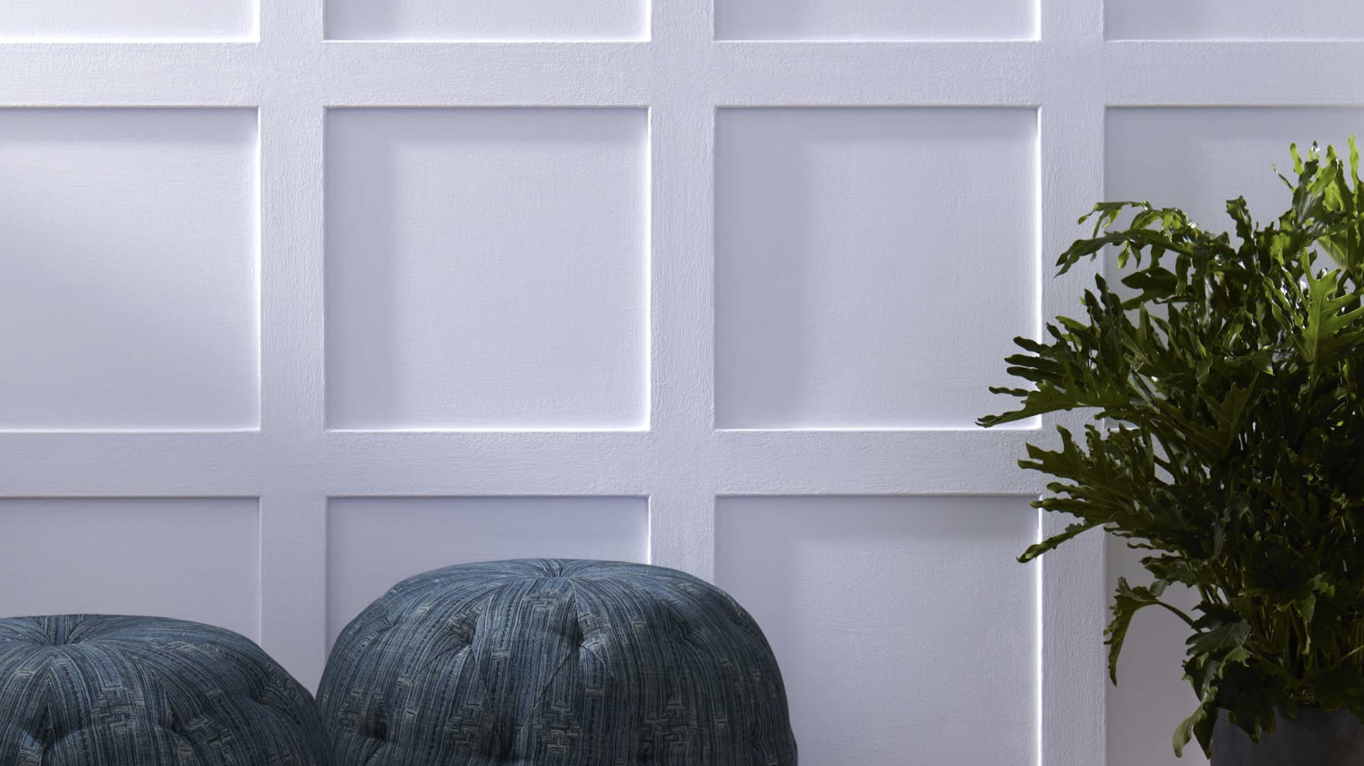
Best Trim and Accent Colors to Pair With Purples
The right trim and accent colors make purple walls shine.
For light purples like Misty Lilac or Lavender Mist, crisp white trim (White Dove OC-17) creates clean definition.
Mid-tone purples like French Lilac pair beautifully with light gray trim (Gray Owl OC-52), adding sophistication.
Deep purples like Shadow need bright white trim for striking contrast.
For accent colors, soft greens (Pale Smoke 2106-60), warm beiges (Manchester Tan HC-81), and light blues (Breath of Fresh Air 806) complement most purples beautifully.
Gold and brass hardware adds warmth, while chrome and nickel fixtures create a cooler, more modern look with purple walls. Black accents create dramatic punctuation that grounds purple rooms.
Where to Use Purple Paint in the Home
Purple is more useful than most people think. Here’s where I’ve used it with great success:
- Bedrooms: Light purples create a calm feeling, perfect for rest
- Home offices: Mid-tone purples boost focus and spark ideas
- Dining rooms: Rich purples make dinner parties feel special
- Powder rooms: Bold purples turn a small space into a talking point
- Accent walls: Any purple can work as a feature in an otherwise neutral room
- Ceilings: Pale purples add unexpected interest overhead
I’ve found that north-facing rooms benefit from warmer purples, while south-facing rooms can handle cooler purple tones.
Sampling Tips for Purple Paint
Purple can be tricky, so I always follow these steps before committing:
- Get sample pots of your top 2-3 choices
- Paint large swatches (at least 12″x12″) on different walls
- Check the color at different times of day – morning, afternoon, and evening
- Look at the color of your furniture and flooring to ensure it matches
- Consider the lighting – purple looks different under warm vs. cool bulbs
Don’t rush this process! I once skipped sampling and ended up with a purple that looked great on the swatch but was too pink on my walls.
Conclusion
Purple paint doesn’t have to be scary! I started with just one purple accent wall and now have various shades throughout my home. Benjamin Moore offers so many options that there’s truly a purple for everyone.
Start small if you’re nervous, try a powder room or accent wall first. If you’re feeling brave, go bold with a fully purple bedroom or dining room.
Either way, the right purple will bring your space to life. Remember to sample colors in your actual space before committing. Light changes everything!
The purples in this guide range from barely-there lavenders to rich, dramatic plums. Each one brings its magic to a room. Trust me – once you find your perfect purple, you’ll wonder why you waited so long to try it.
Frequently Asked Questions
Can Purple Paint Make Small Rooms Look Bigger?
Light purples with blue undertones can create an airy feeling that makes rooms feel larger. Use colors like Misty Lilac or Dreamy Cloud in small spaces with plenty of natural light.
How Do I Choose Between Warm and Cool Purple Tones?
Consider your existing furniture and the direction your room faces. North-facing rooms benefit from warm purples like Spring Iris, while south-facing rooms can handle cooler purples like Purple Rain.
Will Purple Walls Make My Room Too Feminine?
Not at all! Deeper purples like Shadow or Vintage Wine have a masculine edge that works in any space. Pair them with leather, metal, or dark wood for a more gender-neutral look.
What White Trim Color Works Best with Purple Walls?
Benjamin Moore’s White Dove (OC-17) is my go-to trim color for most purples. Its soft warmth complements both light and dark purple tones without looking stark.
How Can I Test Purple Paint Without Painting the Entire Walls?
Paint large poster boards with your samples and move them around the room at different times of day. This helps you see how the color looks in various lighting conditions without committing to walls.