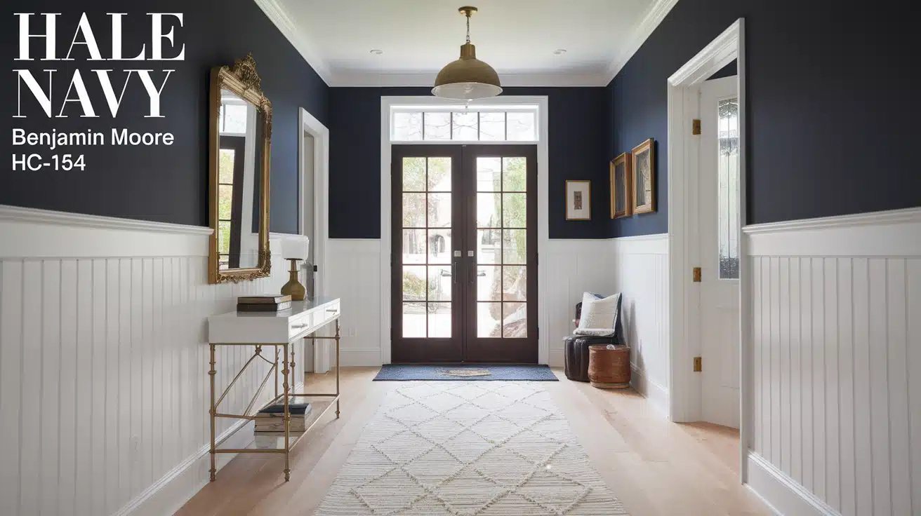
Looking for a paint color that won’t let you down?
I know that feeling. Finding the perfect navy blue can be tricky – too dark and it feels heavy, too bright and it loses its charm.
That’s why I can’t stop talking about Hale Navy.
It’s different from other navy blues I’ve tried, thanks to its gentle gray undertones that add a bit of softness to its rich depth.
I’ve seen this shade work magic in countless rooms, from statement walls to kitchen cabinets. It’s like that reliable friend who always knows how to dress for any occasion.
Let me show you why this might be the navy blue you’ve been searching for.
Hale Navy by Benjamin Moore: Color Profile
Let me break down what makes Hale Navy (HC-154) special.
As someone who’s worked with many paint colors, I can tell you this shade sits perfectly between a true navy and a charcoal gray. The gray undertones help calm the intensity you might find in other navy blues.
The color has an LRV (Light Reflectance Value) of 8.36, which tells us it’s on the darker side.
But don’t let that number worry you – I’ve found it creates a warm, stable feeling in rooms rather than making them feel small or dark.
In different lights, this paint shows subtle changes:
- Morning light brings out its softer blue notes
- Midday sun highlights the gray undertones
- Evening light deepens the navy aspects
The color sits in Benjamin Moore’s Historic Color collection (HC-154), but there’s nothing old-fashioned about how it performs in modern spaces.
Is Hale Navy Warm or Cool?
Here’s something interesting I’ve noticed about Hale Navy – it’s not easy to put it in just one temperature box.
While navy blues typically fall into the cool color family, Hale Navy plays by its own rules.
The gray undertones in this paint create a balanced feel. I like to explain it this way: imagine adding a drop of warmth to a cool navy base.
That’s what the gray does – it softens the coolness without making the color feel warm.
In rooms facing north:
- The color leans into its cooler side
- Shows more of its true navy character
- Can feel more formal
In rooms facing south:
- The gray undertones become more visible
- The color feels more balanced
- Creates a more relaxed vibe
I’ve found that this temperature flexibility makes Hale Navy work well in different spaces. It’s like a color that knows how to read the room and adjust accordingly.
Using Hale Navy in Your Home: A Visual Inspiration Guide
Bedroom
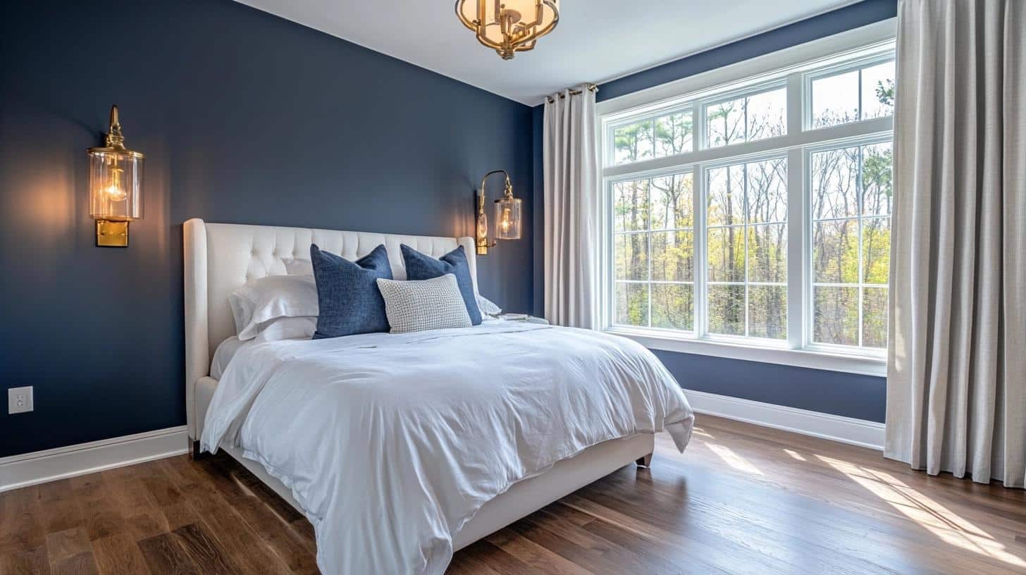
I painted my own bedroom with Hale Navy last spring, and it changed everything.
The color makes my white bedding look crisp and fresh, while my brass light fixtures shine like jewelry against it.
At night, it feels like being wrapped in a cozy blanket, creating just the right mood for rest.
Mood Board Tips:
- Mix in white linens for a clean, fresh look
- Add natural wood tones through furniture or flooring
- Include brass or gold accents for warmth
- Layer in textured throws in cream or beige
- Consider light gray curtains for softness
Living Room (my favourite look)
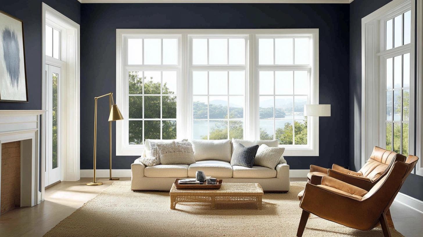
When I used Hale Navy in my client’s living room, it turned their basic space into something special.
It makes the perfect background for family photos and creates a welcoming feeling that’s not too formal or stiff.
Mood Board Tips:
- Use cream-colored sofas for contrast
- Add tan leather chairs for warmth
- Include plenty of soft textures in light colors
- Mix in white trim for definition
- Add silver or brass picture frames
Accessories That Work:
When I style Hale Navy living rooms, I focus on these elements:
- Textured throws in cream or light gray
- Mix of solid and patterned pillows in warm tones
- Natural fiber rugs (jute or sisal) for contrast
- White or cream curtains hung close to ceiling
- Mirrors to bounce light around the room
Extra Tips From Experience:
- Paint samples on large boards you can move around
- Test the color during different times of day
- Consider painting the ceiling a lighter shade
- Keep baseboards and trim white for definition
- Use semi-gloss finish for subtle light reflection
Laundry Room
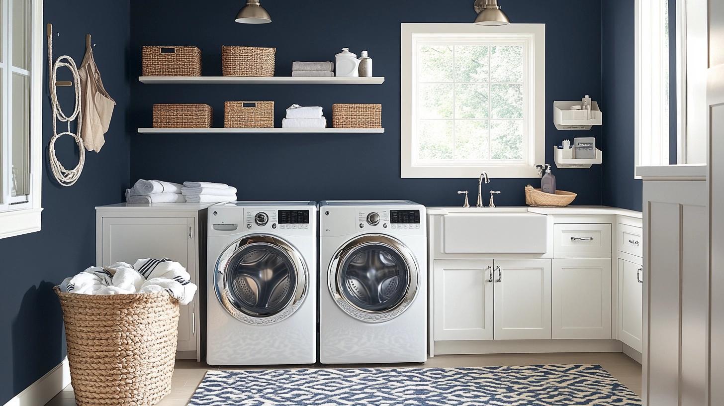
I turned my small laundry room into a happy space with Hale Navy walls. It’s proof that basic chores feel better in a well-designed space.
The color hides marks and scuffs while making the room feel put together.
Mood Board Tips:
- Install white cabinets for contrast
- Add brushed nickel hardware
- Include woven baskets for storage
- Put down a patterned floor mat
- Install good lighting to balance the dark walls
Dining Room
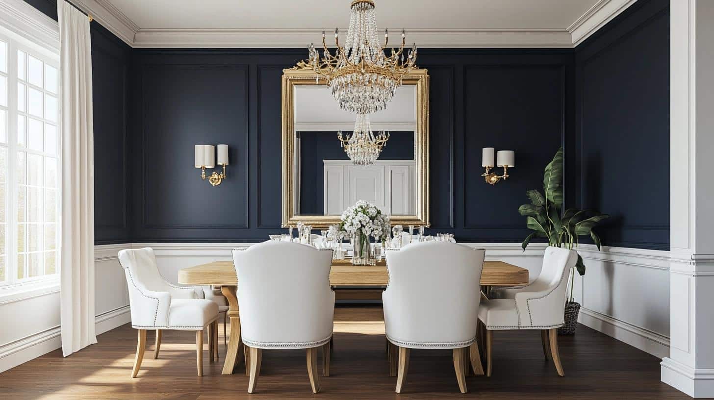
My dining room went from bland to beautiful with Hale Navy. The color sets the perfect mood for dinner parties and makes my china cabinet look extra special.
Mood Board Tips:
- Choose a light wood dining table
- Add white upholstered chairs
- Include a large mirror to reflect light
- Use white trim for contrast
- Add warm metal light fixtures
Kitchen Cabinets
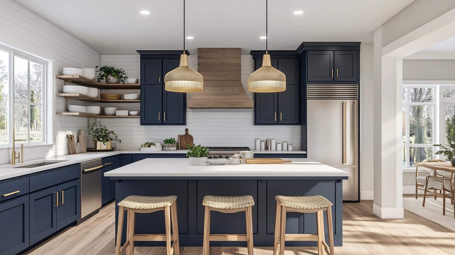
I painted my kitchen cabinets in Hale Navy, and now everyone asks about them. The color feels fresh but not trendy, and it hides cooking spots better than light colors do.
Mood Board Tips:
- Pair with white countertops for contrast
- Use warm brass hardware
- Add light backsplash tiles
- Include natural wood open shelving
- Choose stainless steel appliances
Painting Home Exterior with Hale Navy
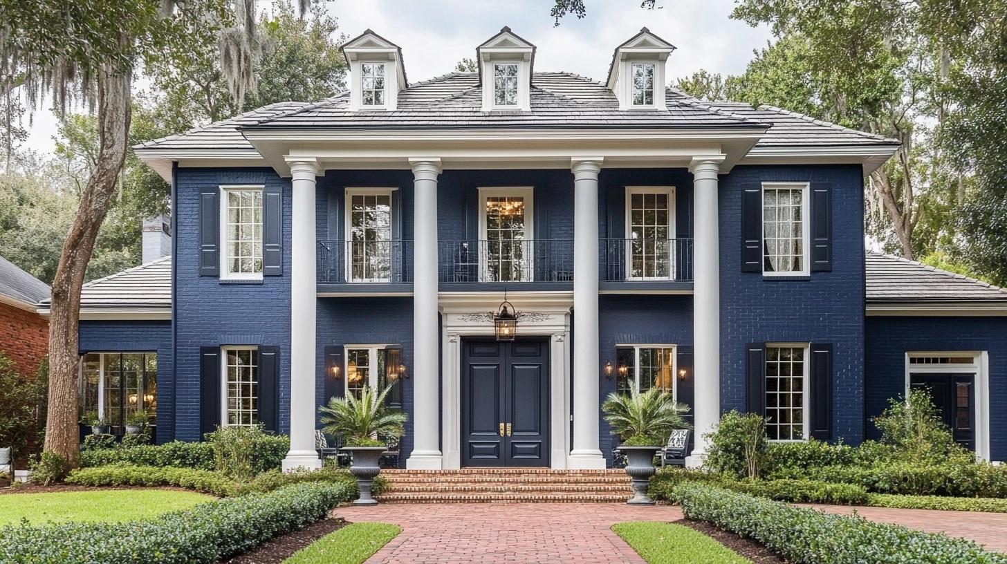
Let me tell you about my first experience painting a house exterior with Hale Navy. I was worried it might feel too dark, but it turned out to be one of my best color choices.
The way it shifts between blue and gray throughout the day keeps the look fresh and interesting.
Perfect Pairings for Exterior Elements: I’ve found these combinations work wonderfully:
- White trim creates sharp, clean lines
- Light gray shutters add subtle contrast
- Natural wood doors bring warmth
- Black metal light fixtures stand out nicely
- Red brick pairs surprisingly well
Where to Use It: Here’s how I like to use Hale Navy on exteriors:
- Main siding color with light accents
- Statement front door color
- Garage door paint choice
- Shutter color against light siding
- Porch ceiling paint for added depth
Real-Life Tips From My Projects:
- Test the paint on both sunny and shady sides
- Paint a large sample board to move around
- Check the color during different weather conditions
- Consider your roof color in the overall scheme
- Look at neighborhood homes for context
Interior Designers Tips on Hale Navy
As an interior designer, I’ve gathered practical tips from my experience with Hale Navy.
Let me share what I’ve learned through trial and success with this color.
Smart Color Combinations:
From my design practice, these pairings work consistently well:
- Off-white and cream create soft contrast
- Light gray adds subtle layering
- Warm browns bring balance
- Soft gold makes the space feel rich
- Silver tones add brightness
Light Management:
Here’s what I tell my clients about lighting:
- Place table lamps in room corners
- Install dimmer switches for control
- Use white lampshades to brighten
- Keep windows clear when possible
- Add mirrors to reflect light
Common Mistakes to Avoid:
I’ve learned these lessons the hard way:
- Not testing in room lighting
- Skipping proper wall prep
- Using too many dark colors
- Forgetting about natural light
- Missing important trim details
The Bottom Line
After trying countless navy colors in my design work, I keep coming back to Hale Navy. Its blend of deep navy and subtle gray makes it special.
I’ve seen it change rooms, brighten spaces, and create stunning exteriors.
Remember, paint color is personal.
What matters is how it makes you feel in your space. If you’re drawn to Hale Navy’s timeless appeal, start small. Try it on one wall or a piece of furniture. Watch how it changes with light throughout the day.
Ready to give Hale Navy a try? I’d love to hear about your plans.
Share your thoughts in the comments below, or join our community of color enthusiasts for more paint color discussions.

