")
Are you looking for a neutral paint color that feels warm but not too bold? Palace Pearl (LRV—61.73) by Benjamin Moore could be just what you need.
This soft shade adds a gentle glow to your space without taking over the room. It fits well in many areas of the home, from bedrooms to hallways and even living rooms.
Palace Pearl gives off a warm and cozy feeling, making any space feel more welcoming. I’ve used this color in many homes, and it always looks beautiful. It works well with different types of light and blends nicely with all kinds of furniture and décor.
If you’re painting one room or your entire home, this shade is worth thinking about. It’s simple, flexible, and adds a touch of style without being too much.
In this article, I’ll explain why Palace Pearl is a color that can fit almost anywhere and make your home feel even better.
Why Palace Pearl (CW-650) Is the Perfect Choice for Your Space?

Choosing the right paint color can be challenging. With so many options, it’s easy to feel unsure. That’s why Palace Pearl stands out. It offers something special that many other neutral shades don’t.
This color fits with many different styles. It brings a soft warmth to modern homes while still feeling classic in traditional spaces.
The undertones shift just a little during the day, depending on the light. That small change helps the color stay interesting without being too bold.
Palace Pearl gives a quiet, welcoming feel. It’s not too beige, not too gray, and not too white. That balance makes it a great choice for many homes today. It fits in easily and doesn’t fight for attention.
The quality of the paint also matters. Benjamin Moore paints cover well and last a long time, so you won’t need to repaint anytime soon.
Palace Pearl lets your furniture and décor stand out while tying everything together smoothly and simply.
Where Is Palace Pearl (CW-650) Best Used in an Interior?
Palace Pearl’s versatility makes it ideal for many areas in your home. This adaptable neutral creates different effects depending on where you use it.
1. Bedroom
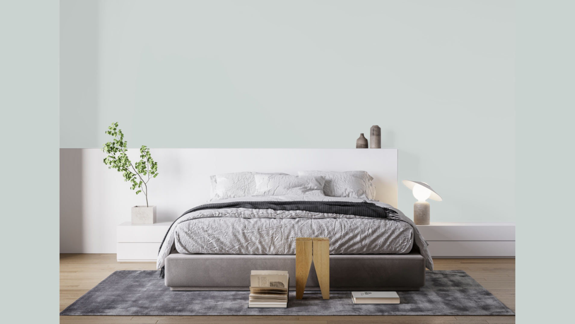
Palace Pearl is a great choice for bedrooms because it creates a calm and peaceful space. Its soft warmth helps you feel relaxed and ready to rest.
This shade works well with white bedding for a fresh look or with deeper colors for a cozier feel. In master bedrooms, it adds a quiet, stylish touch without being too bold.
For kids’ rooms, it’s flexible enough to grow with their changing styles.
It blends easily with new colors, themes, or decorations, making it a smart choice for both comfort and long-term use.
2. Living Room
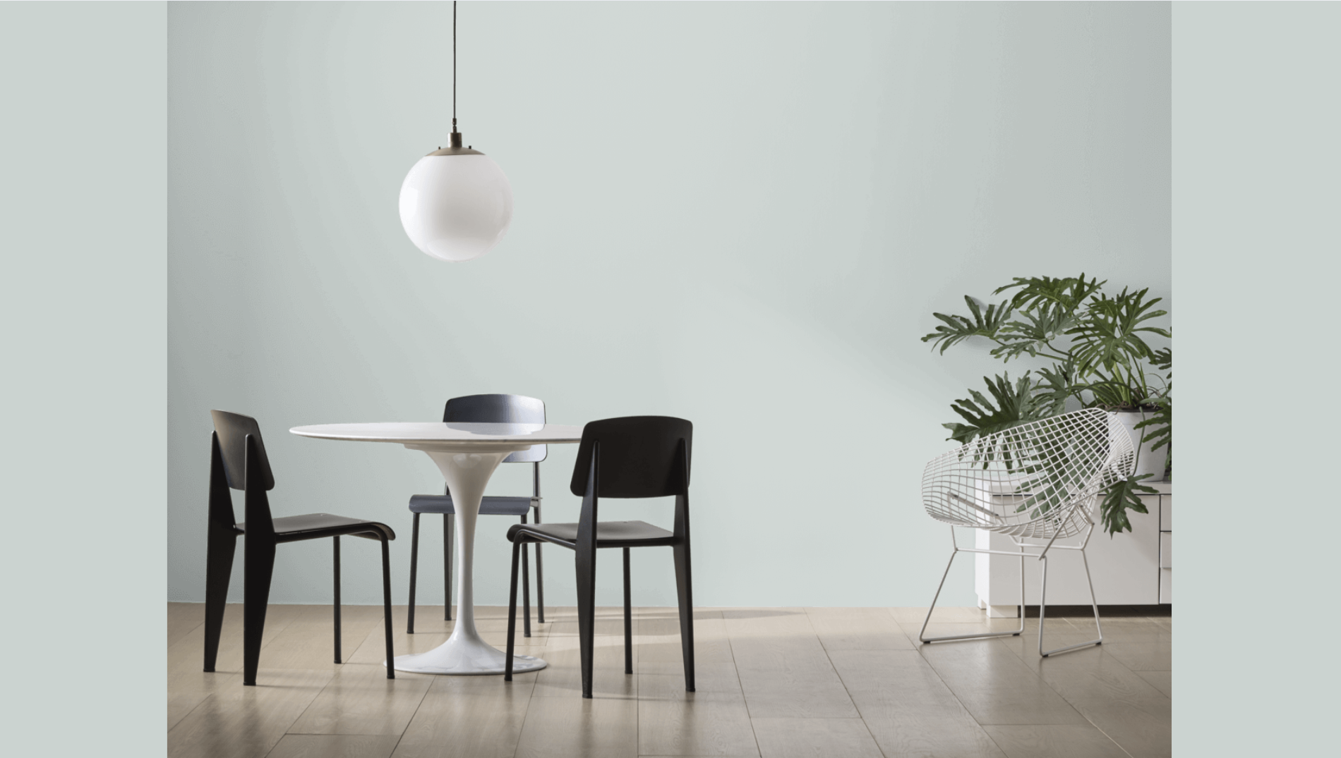
Palace Pearl brings a warm and welcoming feel to living rooms. It reflects light just enough to make the space feel open without feeling too bright or cold.
As the sunlight changes throughout the day, the color stays soft and smooth.
It works well with many types of furniture and keeps the room feeling calm and pulled together.
Palace Pearl also lets artwork and family pictures stand out without clashing.
It’s the kind of color that helps everything in the room look its best while staying in the background.
3. Dining Room
In dining rooms, Palace Pearl adds quiet style without being too much. It gives the room a nice, clean look that works for both casual and special meals.
The warm undertones help food and table settings look even better. If you have a wood table, this color will make it stand out naturally.
If your furniture is classic or more modern, Palace Pearl fits right in. It sets the mood for meals and makes the space feel thoughtful and cared for without drawing too much attention to the walls.
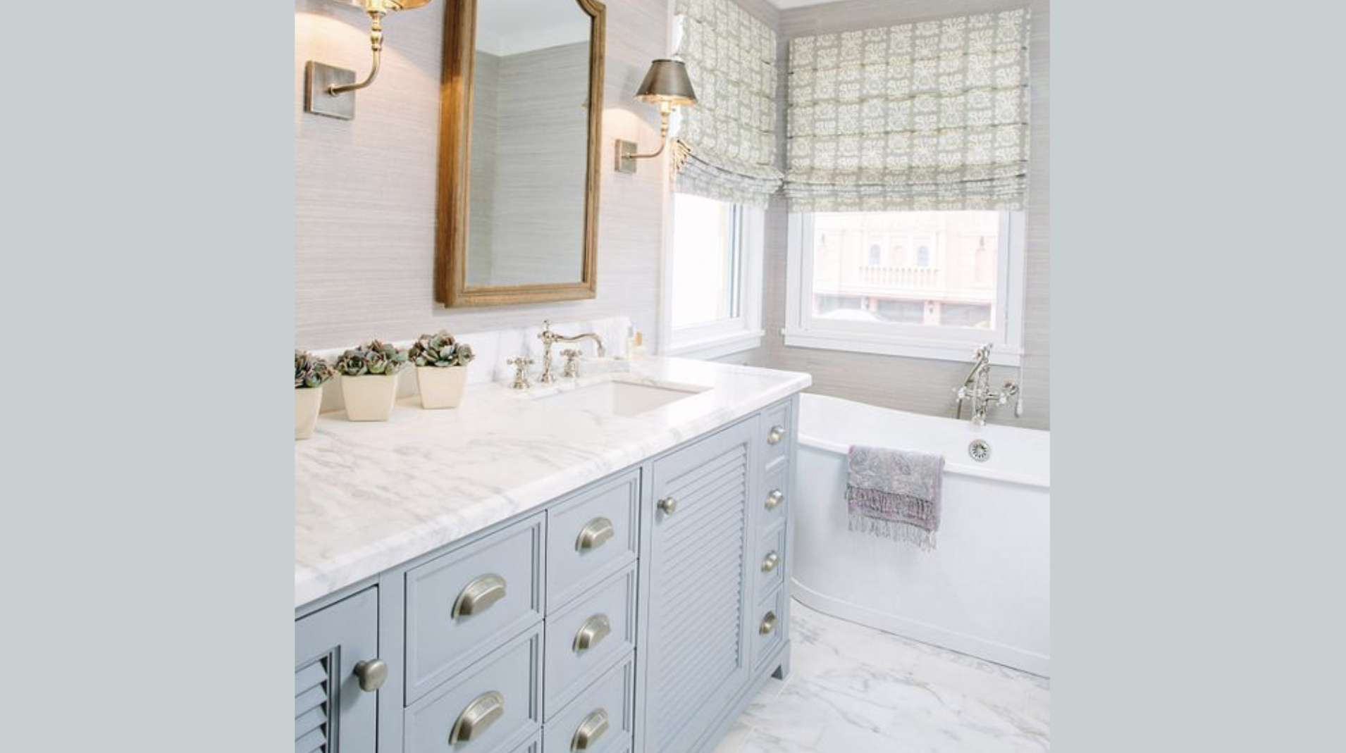
4. Bathroom Walls
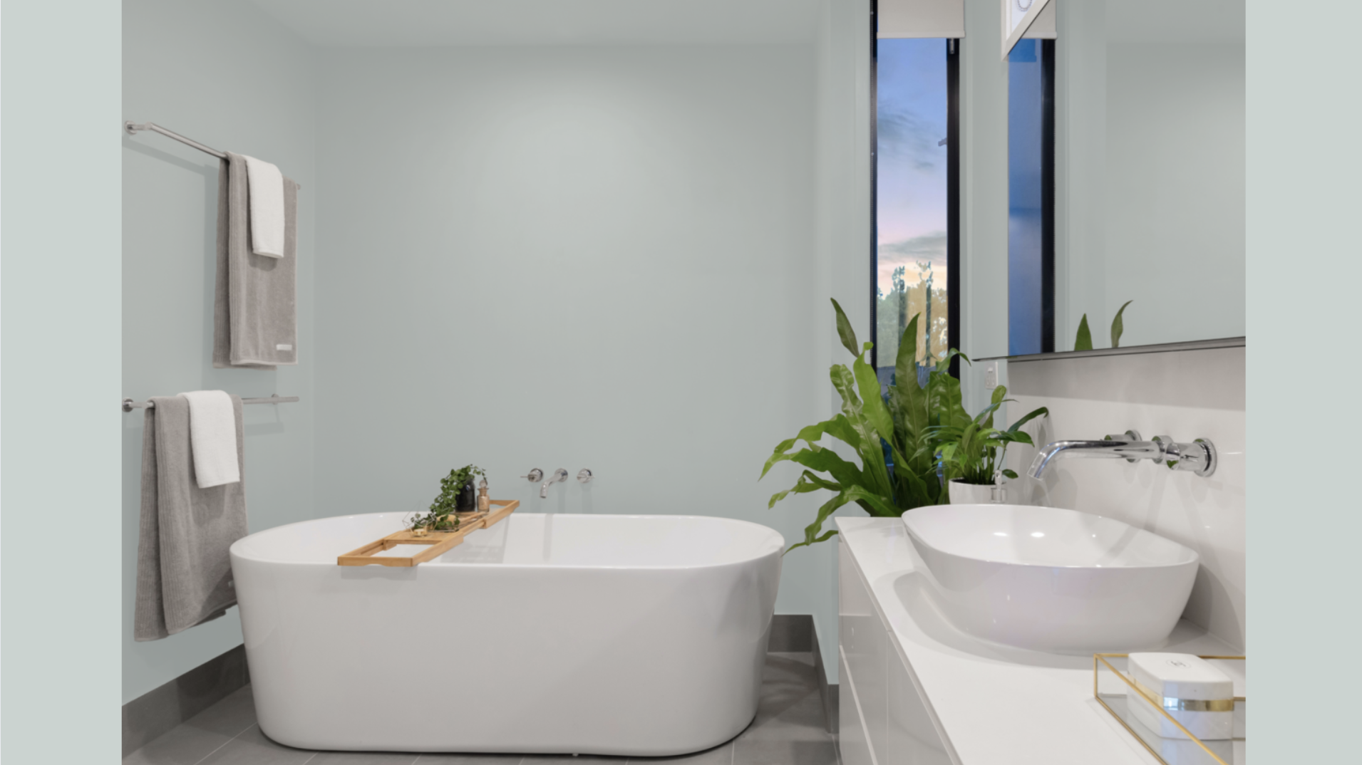
Palace Pearl brings a soft, warm feel to bathrooms, which can sometimes seem too plain or cold. It looks great with white sinks, tubs, and marble surfaces.
When used with the right paint for moisture, it holds up well even in steamy bathrooms. In small powder rooms, the color makes the space feel cozy and inviting.
In larger master bathrooms, it helps create a calm, spa-like mood. Palace Pearl works well in bathrooms of different sizes and adds just the right touch of comfort and quiet beauty.
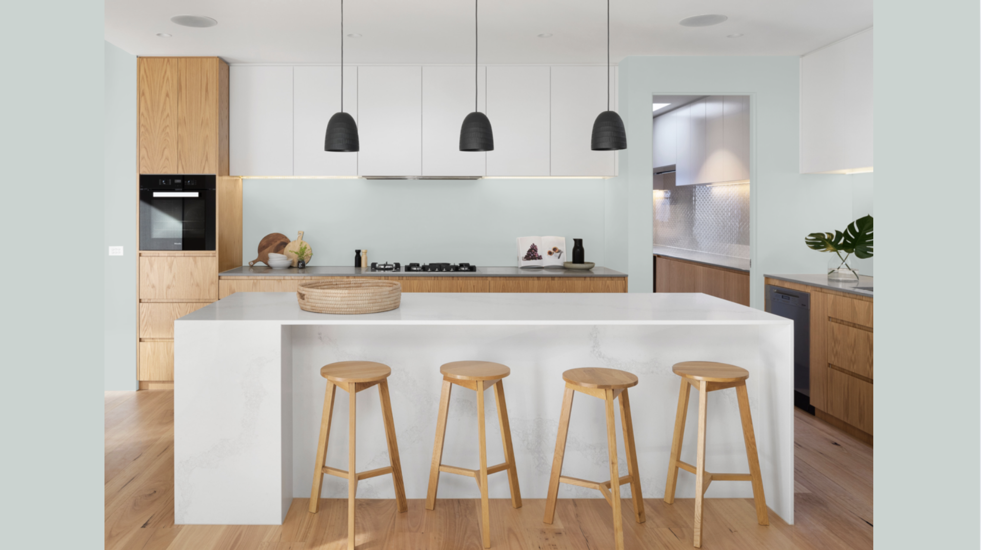
5. Cabinets
Palace Pearl is a lovely option for cabinets in kitchens or bathrooms. Its warm, creamy tone feels softer than plain white but still looks clean and neat.
The color makes cabinets feel fresh without being too bright. Small marks or wear that happen with daily use also help.
Palace Pearl pairs well with many types of countertops, whether you like stone, wood, or something in between. It’s a way to add warmth and style to your space without changing the whole design.
How to Incorporate Palace Pearl Into Your Home Décor?
Palace Pearl is a great choice for creating a smooth, connected feel throughout your home. Gentle color shifts in different lighting keep things interesting without being distracting.
It’s soft and calm, making it easy to use in multiple rooms without feeling repetitive.
This color pairs beautifully with crisp white trim, like Simply White or White Dove, which brings out the details in your space while keeping the overall look clean and classic.
For a softer style, using Palace Pearl on the trim with a glossy finish can still be defined without too much contrast.
Because it’s a neutral shade, it works really well with bold accent colors like deep blue, forest green, or burgundy. This allows you to add personality without overwhelming the space.
Adding texture through rugs, blankets, and natural materials like wood or woven baskets helps the room feel warm and full of life while keeping the wall color in the background.
Using different types of lighting throughout the room, like lamps, ceiling lights, and dimmers, helps showcase Palace Pearl’s chandeliers throughout the day.
Conclusion
Palace Pearl gives homeowners what many are looking for—a soft, flexible neutral that adds warmth without being too bold.
It’s a tool. It quietly stands out. I’ve used it to bring new life to all kinds of spaces, turning simple rooms into calm and beautiful ones.
This shade works in nearly any room and complements all types of décdécorécorher, decorating your whole home or just freshening up one space. Palace Pearl offers a clean and timeless background.
What makes it special is how it changes slightly as the light shifts during the day. That little detail helps keep rooms feeling fresh and never dull.
It’It’steIt’stoerlook soft colors, but the right neutral can change everything. Palace Pearl might look plain at first, but its balanced tone makes other design choices stand out even more. It supports bold accents, soft textures, and bright whites without clashing.
If you’re ready to start, try this color. I’vI’veed it in many homes, and the results are always impressive. You might be surprised by how much it brings your space together.
Frequently Asked Questions
Does Palace Pearl Look Yellow in North-Facing Rooms?
Palace Pearl keeps its neutral look in north-facing rooms. Although the lighting may make it seem a bit cooler, it doesn’t allow for some warm neutrals.
The color stays soft and balanced, offering a calm background even when natural light is cooler or dimmer.
How Does Palace Pearl Compare to Benjamin Palace Pearl?
White Dove is brighter and has more noticeable yellow tones. Palace Pearl feels softer and slightly warmer without being too yellow or gray.
It also has more depth, which helps it feel grounded on the walls. Both are great neutrals, but Palace Pearl looks more muted and gentle overall.
What Flooring Works Best With Palace Pearl?
Palace Pearl looks great with almost all flooring types. It works especially well with natural wood tones, from light oak to dark walnut.
It also pairs nicely with gray or beige tile. Its soft undertone blends easily with most finishes, making it a flexible choice for any room.
Should I Use Palace Pearl in a Small Room?
Yes, Palace Pearl is a good option for small rooms. It gently reflects light, making the space feel open and welcoming.
The warm undertones add softness without making the room feel tight. Unlike darker shades, it keeps the space feeling light and more spacious throughout the day.
What Accent Wall Colors Work With Palace Pearl?
Palace Pearl pairs well with deeper and richer shades. Colors like navy blue, forest green, or warm terra cotta add contrast while still blending nicely.
The soft neutral tone helps these accent colors stand out without making the room feel too busy or mismatched. It keeps the balance just right.