 Benjamin Moore")
I’ve had Stonington Gray by Benjamin Moore on my walls for several months, and I’m excited to share my thoughts and experiences with this sophisticated and versatile gray.
This balanced, cool-toned gray has brought a calm and elegant atmosphere to my home. In this article, you’ll learn:
- What Stonington Gray actually looks like in real homes
- Which rooms work best with this color
- Colors that pair perfectly with it
- How to test it properly before buying
I’ve used this color in different rooms with varying light conditions and have learned firsthand how it changes throughout the day. I’ve made the mistakes so you don’t have to!
Let’s see whether this refined, classic gray is the right choice for your home.
What Kind of Color Is Stonington Gray (HC-170)?
Stonington Gray (HC-170) is a soft, cool gray with just a hint of blue, making it feel both fresh and refined. I like to think of it as the perfect neutral that’s never too cold or too warm but instead offers a balanced presence in any room.
I’ve noticed that Stonington Gray shifts subtly throughout the day. In the morning, it shows a more neutral, clean appearance.
By afternoon, it has a slight bluish tone, and in the evening, it becomes a deeper, more sophisticated shade. The color has an LRV (Light Reflectance Value) of 59.74, making it a medium-light tone that reflects a fair amount of light while maintaining its depth.
What makes Stonington Gray stand out is its versatility. It complements a wide range of decor styles and creates a soothing atmosphere in any space, whether you want a serene retreat or an elegant backdrop for vibrant accents.
What Rooms Work Best with Stonington Gray?
Stonington Gray works wonderfully in spaces where you want a neutral color that exudes elegance and versatility. Based on my experience, here are the rooms where this color performs best:
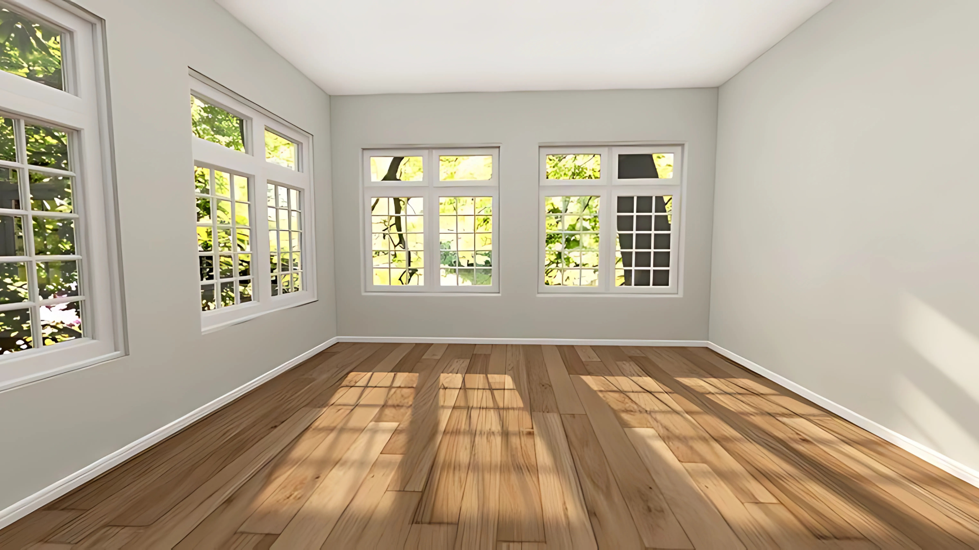
Living Rooms
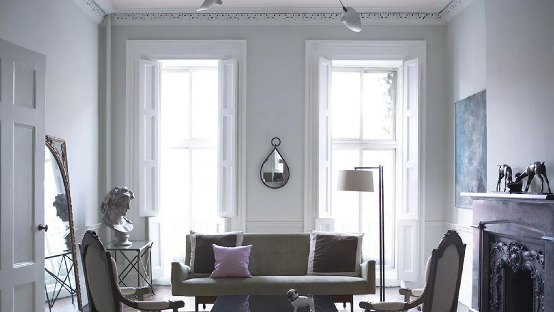
This cool-toned gray makes living areas feel open, calming, and cultured. It acts as a beautiful neutral backdrop that allows accent colors and furniture to shine without overwhelming the space.
In my living room, Stonington Gray walls create a tranquil atmosphere while allowing my colorful artwork and vibrant throw pillows to pop. It’s a great choice if you want a modern and timeless space with understated beauty.
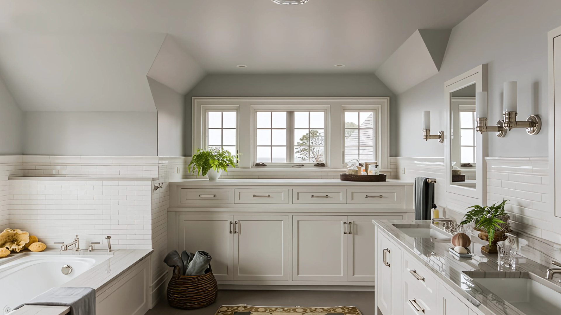
Bathrooms
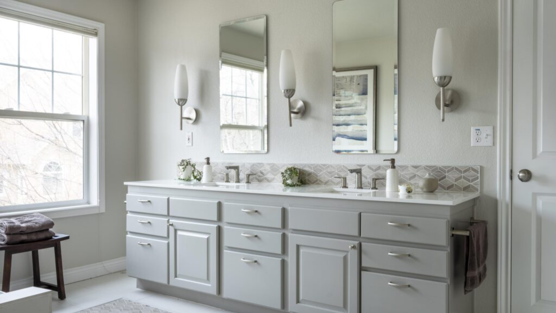
Stonington Gray works beautifully in bathrooms, creating a spa-like feel that’s both serene and refined. The subtle undertones make it perfect for small spaces where you want the feeling of openness without making the room feel too stark.
I used it in my master bathroom with white fixtures and marble accents, and it gave the space a luxurious, clean, and fresh vibe. The color has a way of making bathrooms feel polished and calming, creating a perfect retreat.
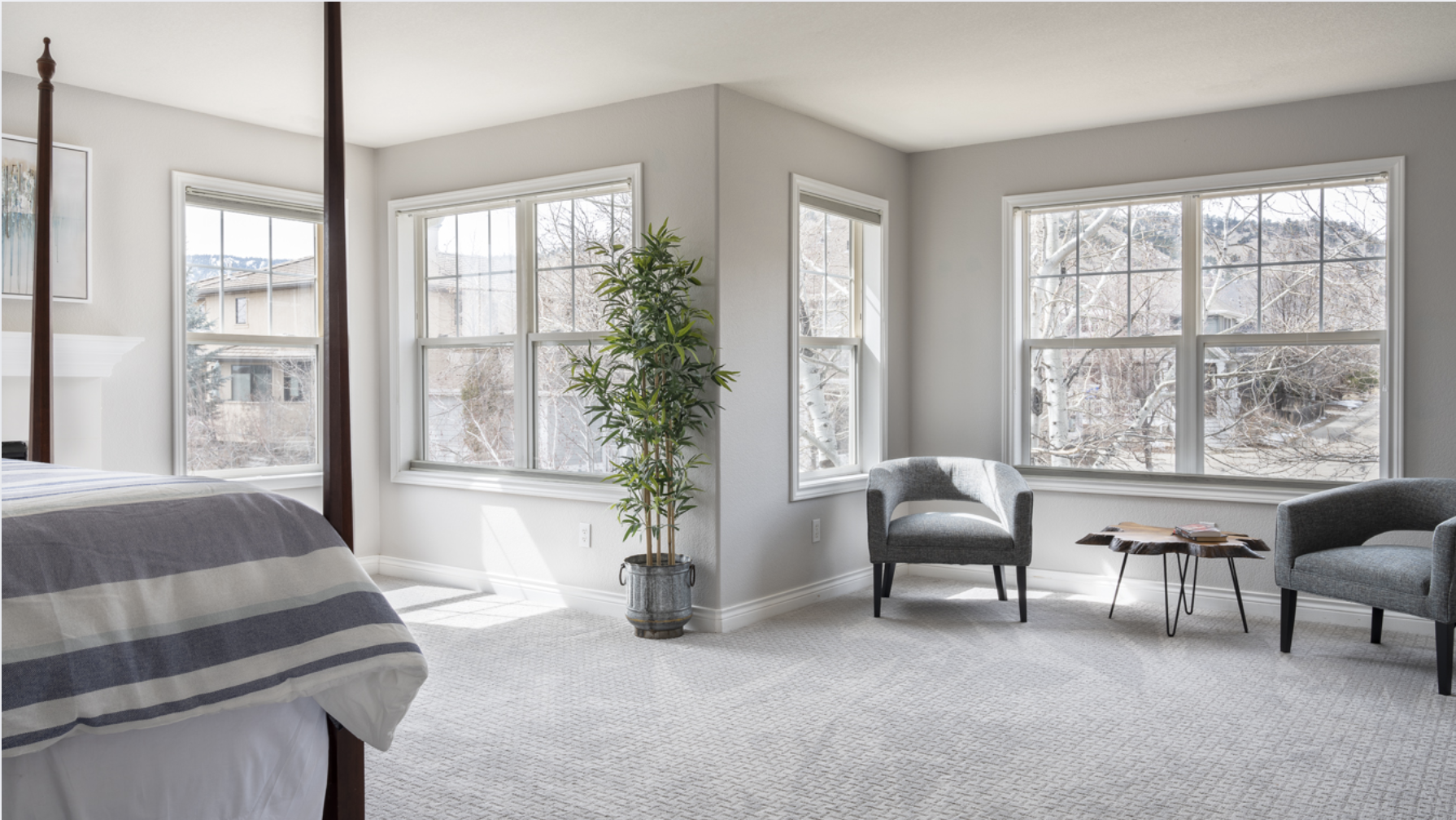
Bedrooms
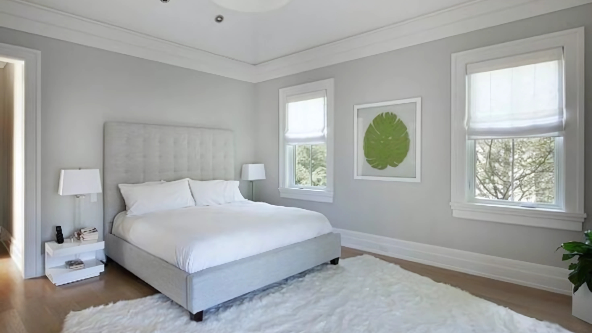
This gray is ideal for bedrooms because it promotes rest and relaxation. It adds a sense of calm, which is perfect for a restful night’s sleep. The neutral shade works well with various bedding styles, making it adaptable to your preferred look.
In my guest bedroom, Stonington Gray provides a soft, tranquil backdrop. I paired it with crisp white linens and dark wood furniture for a balanced, calming space. The subtle gray tones help make the room feel inviting and peaceful without being too heavy.
Home Offices
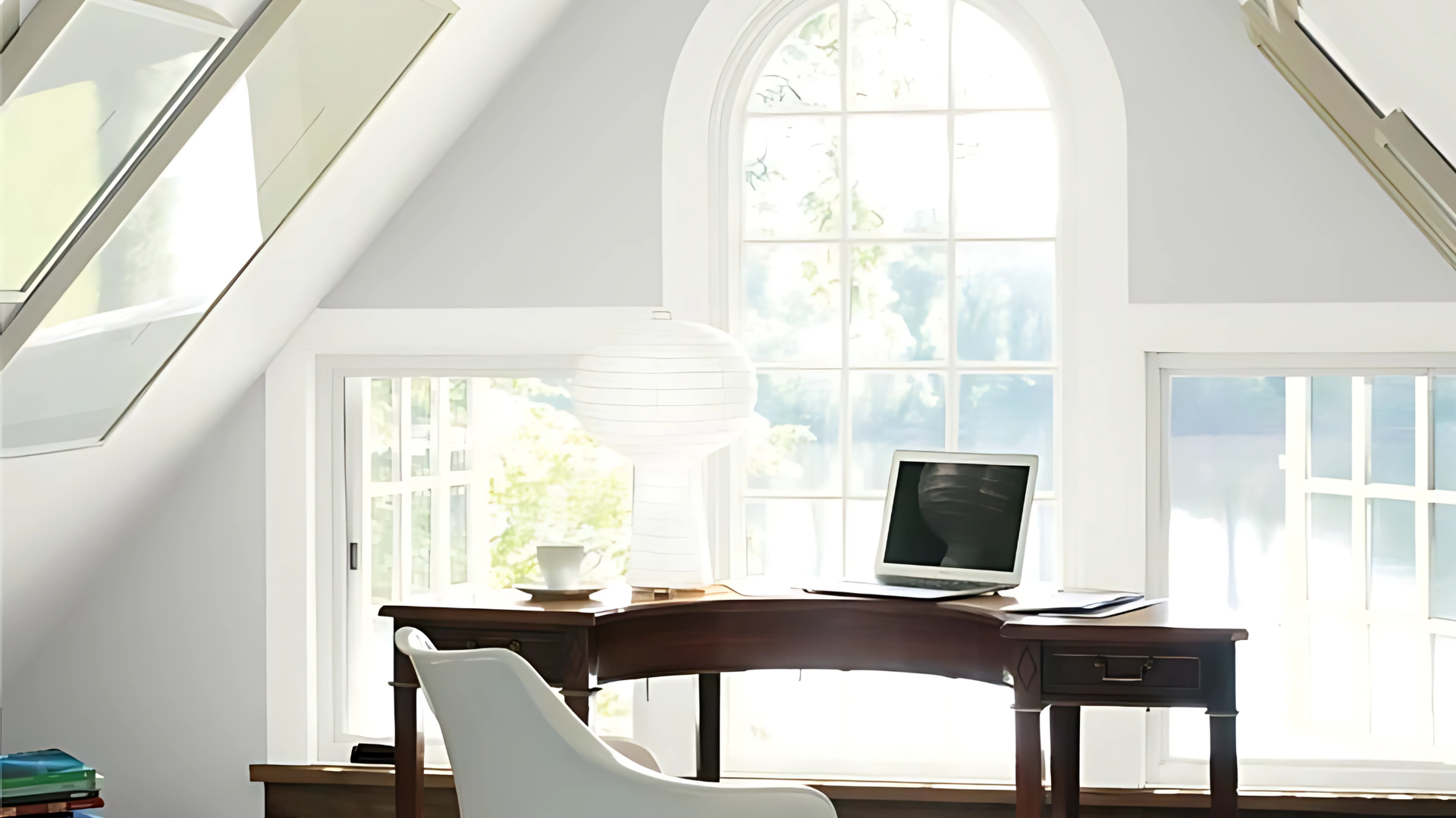
Stonington Gray can also enhance productivity in a home office. Its cool tones provide an atmosphere conducive to focus and clear thinking, making it an ideal backdrop for workspaces.
I painted my office with Stonington Gray and found that it fosters a creative, professional environment. The subtle blue undertones prevent the room from feeling too sterile while adding just the right touch of sophistication.
Kitchens
Stonington Gray is great for kitchens, especially when used on cabinets or as an accent wall. It adds a clean, timeless look that pairs well with white countertops, stainless steel, and natural wood accents.
We painted my sister’s kitchen cabinetry in Stonington Gray, which gave the space a modern, elegant feel. The gray tones blend beautifully with the stainless steel appliances and marble countertops.
What Colors Go Well with Stonington Gray?
-
Crisp whites: These provide a sharp, clean contrast that feels fresh and elegant.
-
Soft blues: Light blues or muted teal accents pair beautifully with Stonington Gray, creating a serene atmosphere.
-
Warm wood tones: Wood furniture or accents add organic warmth and texture, balancing the coolness of the gray.
-
Gold or brass accents: These metallics bring a touch of luxury and shine to the subtle gray backdrop.
For my home, I’ve paired Stonington Gray with white trim and gold lighting fixtures. The contrast feels both timeless and chic, creating a sophisticated space.
What Style Works Well with This Color?
Stonington Gray is incredibly versatile and works across a wide range of styles. It’s perfect for modern, minimalist spaces where neutrality and subtlety are key. In traditional settings, it adds a fresh update while maintaining a classic feel.
In coastal-inspired homes, the cool tones of Stonington Gray evoke the soft blues of the sea, providing a calm, breezy atmosphere. It’s equally at home in farmhouse-style spaces, where it pairs beautifully with rustic wood elements.
This color also fits well with transitional designs, offering a refined neutral that complements both classic and contemporary furnishings. Whether your home is sleek and modern or cozy and traditional, Stonington Gray can adapt to your style.
Is It a Warm or Cool Color?
Stonington Gray is a cool color, but it’s not as icy or stark as some other grays. The subtle blue undertones keep the color feeling fresh and balanced without overwhelming a space. It has a calming, refreshing vibe that’s perfect for creating an airy, peaceful environment.
The cool undertones make it ideal for spaces that need a serene atmosphere, such as bedrooms or bathrooms. However, it’s not so cold that it feels unwelcoming, especially when paired with warmer elements like wood furniture or brass lighting.
Color Characteristics Table
| Characteristic | Stonington Gray | What This Means For Your Space |
|---|---|---|
| Temperature | Cool | Creates a calm, sophisticated feel |
| Undertones | Subtle blue-gray | Adds a refreshing, tranquil tone |
| Light Reflectance Value | 59.74 | Medium-light tone that reflects enough light to brighten rooms without being too bright |
| Seasonal Feel | Year-round | Works beautifully in both winter and summer |
| North vs. South Rooms | Adaptable | Appears cooler and more subdued in north-facing rooms, vibrant in south-facing rooms |
How to Test This Color in Your Space?
- Buy a sample: Grab a small container of Stonington Gray to test.
- Paint a board: Use a 2×2 foot piece of white poster board.
- Move it around: Test it in different locations and see how it looks in both morning and evening light.
- Live with it for 3 days: Your first impression might change after seeing it in different lighting.
When I tested Stonington Gray, I was surprised by how much it shifted between morning and evening. It appeared cooler and more subdued in my north-facing kitchen but looked vibrant and fresh in my south-facing living room.
What Paint Finish Should You Choose?
Flat: Great for ceilings with minimal texture.
Matte: My preferred choice for walls, this finish adds depth to the color without too much shine.
Eggshell: Works well in kitchens and bathrooms, where you need an easy-to-clean surface.
Satin: Adds a slight sheen, perfect for areas that need more durability.
Semi-gloss: This works well for trim but is not ideal for the main walls.
For my living room, I chose matte for the walls and eggshell for the trim. The matte finish enhances the richness of Stonington Gray without reflecting too much light.
Real Home Ideas Using Stonington Gray
- Full room: Using Stonington Gray on all walls creates a serene and elegant atmosphere.
- Accent wall: Try it on one wall to create a statement while keeping other walls lighter.
- Trim: Using Stonington Gray on the rim can make a unique statement when paired with lighter walls.
- Furniture: A cabinet or bookshelf painted in Stonington Gray adds sophistication and balance.
- Exterior: It can be used for a home’s exterior, creating a classy and timeless look.
I’ve seen Stonington Gray used beautifully on kitchen cabinets, and I am considering it for my entryway. The versatility of this color in different rooms and settings makes it a smart choice for various applications.
Mistakes to Avoid
- Not testing in your space: Always test the color in your actual lighting before committing to a full room.
- Using warm lighting: This color is best showcased with cool, balanced lighting (3000-4000K bulbs).
- Expecting it to look exactly like online photos: Colors can appear differently on screens, so it’s essential to test it in your home environment.
- Overusing cool accents: Stonington Gray is a cool color, so balance it with warm elements like wood or gold accents.
Is Stonington Gray Right For Your Home?
In conclusion, Stonington Gray HC-170 is a timeless, versatile color that effortlessly enhances any space. Its soft, cool undertones create a serene and balanced atmosphere, making it ideal for both contemporary and traditional interiors.
Whether you’re looking to refresh a single room or transform your entire home, this classic gray provides the perfect backdrop for any style.
It pairs well with various accent colors and materials, offering endless possibilities for customization. With its ability to adapt to changing decor, Stonington Gray is a color that will continue to elevate your home for years to come.
If you’re in search of a sophisticated, neutral tone that remains fresh and inviting, Stonington Gray is the perfect choice.
Frequently Asked Questions
Does Stonington Gray Work with a White Trim?
Yes, it pairs beautifully with a white trim. The contrast creates a clean and polished look, perfect for both modern and traditional spaces.
Is Stonington Gray Too Dark for Small Rooms?
No, it’s actually great for small rooms. When paired with lighter furniture and proper lighting, it can make small spaces feel more open and welcoming.
How Does It Compare to Other Grays?
Stonington Gray is softer and more versatile than many other grays, with a subtle blue undertone that makes it more dynamic and livable.