")
When I stumbled across Blue Hydrangea in my friend’s newly painted nursery, I couldn’t stop staring. This soft, dreamy blue from Benjamin Moore has quickly become a favorite in homes looking for that perfect balance of calm and charm.
Unlike bolder blues that can overwhelm, Blue Hydrangea (2062-60) works in nearly any room. I’ve seen it transform bedrooms, bathrooms, and even kitchens with its gentle presence.
In this review, I’ll walk you through:
- Where does this color work best
- The lighting conditions that make it shine
- Color combinations that complement it perfectly
Struggling to find a blue that doesn’t feel too childish or too serious? I’ve tested dozens of paint colors over the past eight years of my home renovations. Blue Hydrangea might be your answer.
Trust me when I say this shade deserves its growing popularity. Let’s dive in and see if it’s right for your space.
The Rich Undertones of Blue Hydrangea by Benjamin Moore
Have you ever noticed how some blues feel like they’re shouting at you? Blue Hydrangea isn’t one of those colors.
In morning light, this paint shows its true self – a soft, dreamy blue that reminds me of clear spring skies. But wait until evening! When the sun drops and lamps click on, something magical happens.
The color shifts.
Those hidden purple undertones start to show up. Not bold or flashy, just a gentle hint of periwinkle that makes the room feel warmer than most blues.
I painted my office with Blue Hydrangea last year. During video calls, friends kept asking about my “lavender” walls. They were shocked when I told them it was actually blue!
With an LRV (Light Reflectance Value) of 61.76, Blue Hydrangea sits in the medium-light range. This means it:
- Reflects enough light to brighten spaces
- Won’t wash out completely in strong sunlight
- Keeps its personality even in dim corners
You’ll notice the difference most at sunset, when the walls seem to glow with a soft, purple-blue haze.
The Psychology of Blue Hydrangea by Benjamin Moore
I’ve always been fascinated by how colors make us feel. Blue Hydrangea isn’t just pretty – it actually does something to your brain. Blues calm our nervous system.
Studies show they can lower blood pressure and slow breathing. But not all blues feel the same. Some blues feel cold and distant. Blue Hydrangea doesn’t. The hint of purple makes all the difference.
When I painted my guest room this color, something interesting happened. Friends started lingering longer during visits. One actually fell asleep mid-conversation! That’s when I knew this color had real power.
The feeling reminds me of my grandmother’s house by the sea. It’s like wrapping yourself in a soft quilt while watching ocean waves roll in.
You might notice that you breathe differently in a Blue Hydrangea room. Deeper. Slower. The color doesn’t demand anything from you – it just lets you be.
This isn’t random. Color scientists have found that blue-purple blends hit a sweet spot in our brains, triggering both:
- The calming effects of blue
- The gentle creativity of purple
After living with this color for over a year, I can tell you it’s more than just paint on a wall. It’s almost like adding another dimension to your home.
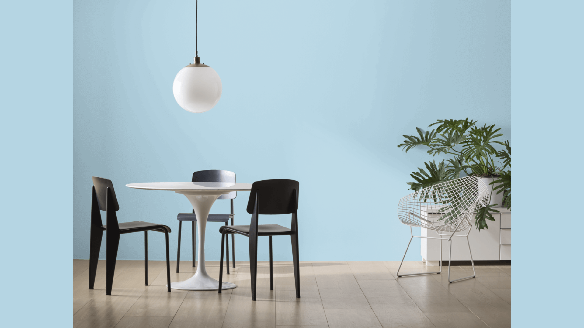
Why Blue Hydrangea Is an Ideal Paint Color for Any Room?

1. Works in Spaces of All Sizes
I’ve tried Blue Hydrangea in both tiny bathrooms and spacious living rooms. The results always surprise me. In small spaces, it doesn’t feel cramped like darker colors can. Instead, it opens things up.
You might think blues would make a small room feel cold. Not this one.
The soft, welcoming tone actually makes tight spaces feel like little retreats. My powder room went from feeling like a closet to feeling like a cozy nook.
In larger rooms, Blue Hydrangea creates unity without being boring. I painted my open-concept living area last year and noticed how the color stayed interesting across different lighting zones. It never felt flat or one-dimensional.
2. Bridges: Different Design Styles
Finding colors that work with both antiques and modern pieces isn’t easy. Most trendy colors clash with older furniture. Most traditional colors look stuffy with modern pieces. Blue Hydrangea somehow bridges this gap.
I placed my grandmother’s mahogany bookcase against a Blue Hydrangea wall. The warm undertones in the paint complemented the rich wood perfectly. Three feet away sits my sleek, white modern desk. Also perfect.
You can pair this color with nearly any style, like farmhouse décor (it looks amazing with worn wood), mid-century modern (especially with walnut tones), and contemporary minimalism (creates soft contrast with stark whites).
3. Changes With the Time of Day
Have you ever noticed how some colors seem to disappear at night? Or worse, turn an unexpected shade when the lights come on? Blue Hydrangea transforms throughout the day in the best possible way.
Morning light brings out its crisp, clean qualities. My breakfast nook feels bright and energizing at 7 AM. By afternoon, the color develops more depth. And evenings? That’s when the magic happens.
When lamps click on, Blue Hydrangea wraps the room in comfort. The subtle periwinkle undertones emerge, creating what I can only describe as visual warmth.
This chameleon quality means you’re essentially getting multiple colors for the price of one. Your space will feel fresh during work hours and cozy during relaxation time.
Best Places to Use Blue Hydrangea in Your Home
Blue Hydrangea provides a soft yet noticeable color that works in many areas of your home. This gentle blue shade can change the feel of any room without being too bold or overwhelming.
1. Peaceful Bedrooms
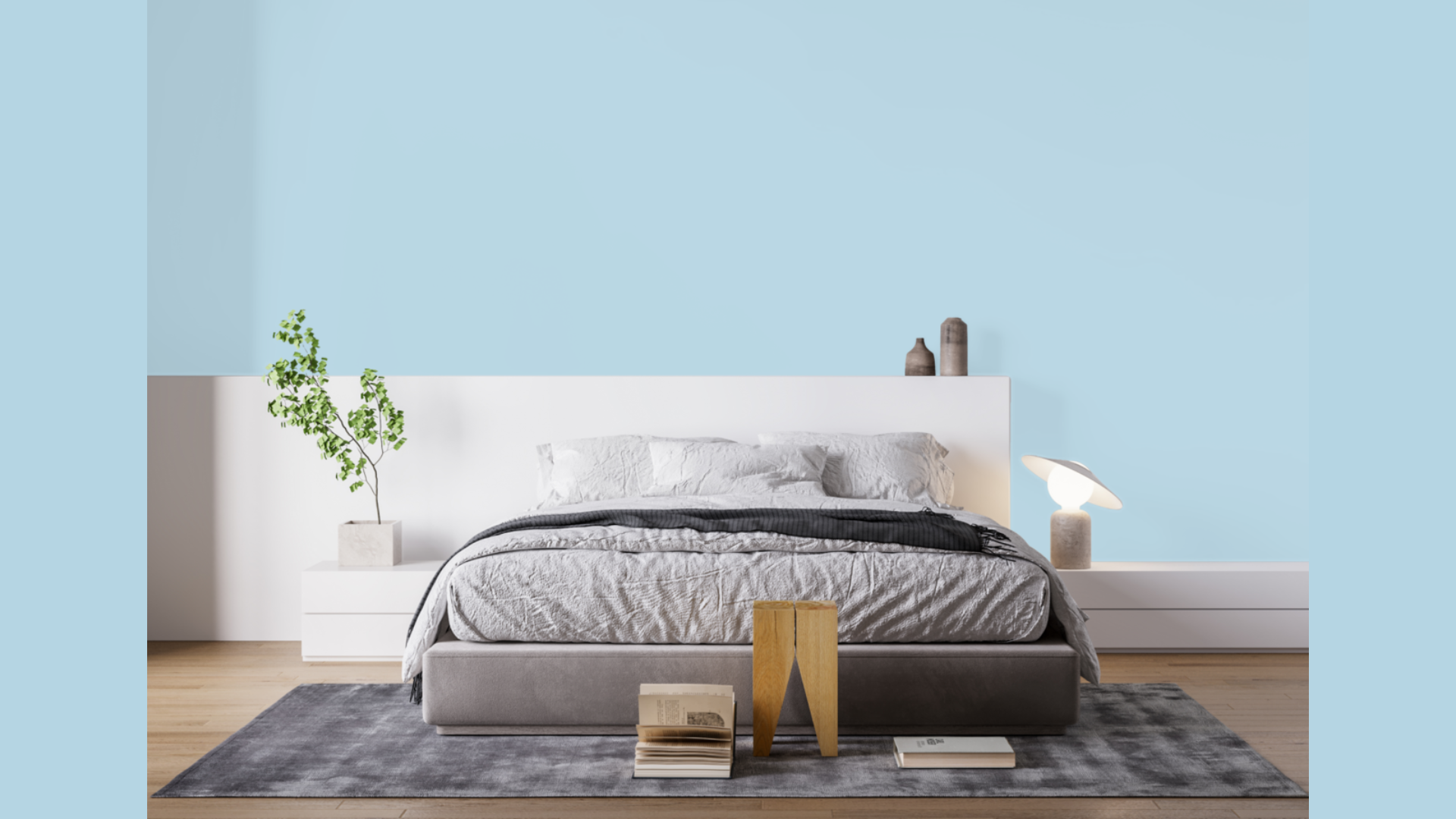
I’ve painted three bedrooms with Blue Hydrangea over the years. Each time, the results amazed me. This color creates a cocoon-like feeling that helps my brain slow down at night.
You might notice better sleep in a Blue Hydrangea bedroom. The soft tone signals to your body that it’s time to rest.
Kids’ rooms work especially well with this color. It’s calm without being boring or babyish. My nephew’s room has stayed this color from toddler years into his teens – a rare victory in kid-room design!
For adult bedrooms, I recommend pairing it with natural linens in cream or oatmeal. The contrast feels both sophisticated and relaxing.
2. Spa-Like Bathrooms
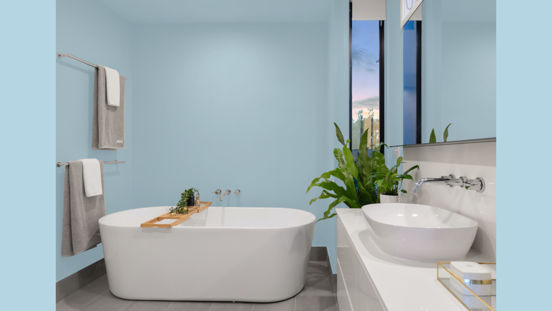
Bathroom lighting can be tricky. Harsh lights bounce off tiles and mirrors, creating a clinical feel. Blue Hydrangea softens everything.
I painted my guest bathroom this shade last year. Now, visitors actually comment on how relaxing the space feels. One friend asked if I had changed the lighting, but it was just the paint doing its magic.
You can use it on all four walls for a fully immersive feel. Or try it as an accent with white wainscoting below. Both approaches work beautifully.
3. North-Facing Rooms
Have you ever noticed how some rooms just never feel warm, no matter how you decorate? North-facing spaces can feel chilly and unwelcoming.
Most blue paints make this problem worse. But Blue Hydrangea’s secret purple undertones actually balance the cool light from northern exposure.
I transformed my north-facing office from a space I avoided to my favorite room in the house. The walls seem to catch what little warmth the sunlight offers and amplify it.
You’ll see the biggest difference on cloudy days, when the color maintains its gentle glow instead of turning flat and lifeless.
4. Kitchen Cabinetry
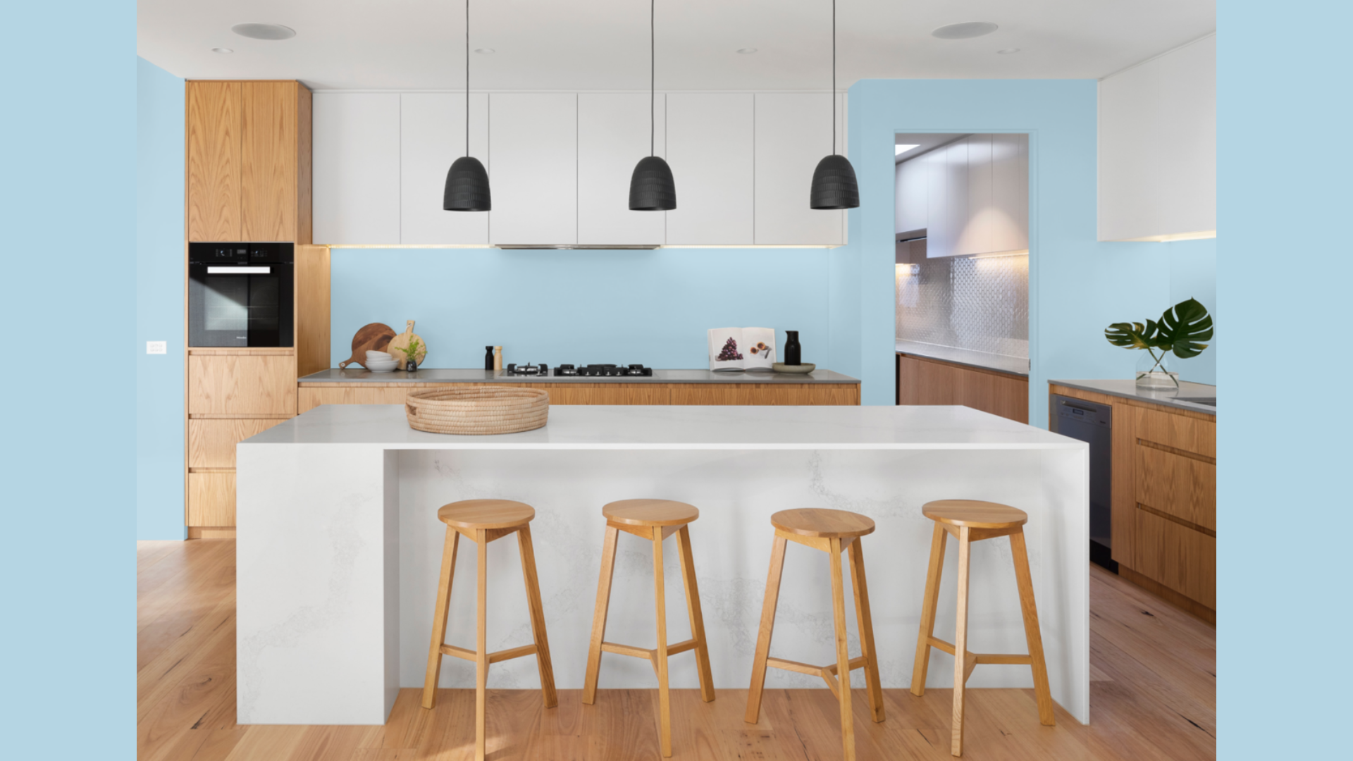
Tired of all-white kitchens? Me too. Blue Hydrangea offers a perfect alternative for cabinets. I painted my kitchen island this color while keeping the upper cabinets white. The contrast makes the kitchen feel custom and thoughtful without being too bold.
You might worry about blue cabinets feeling trendy. Don’t. This particular shade has staying power because it reads almost as a neutral with personality.
The color also hides smudges better than white. As someone who cooks daily, I appreciate not seeing every fingerprint or splash.
For a smaller commitment, try painting inside open shelving or just the pantry door. These little touches add character without overwhelming the space.
Flooring Options that Pair Beautifully with Blue Hydrangea
Blue Hydrangea paint creates a peaceful background that works well with many floor types. Finding the right match can help bring your room together and make the most of this pretty blue shade.
1. Warm Wood Tones
I’ve found that Blue Hydrangea absolutely shines when paired with the right wood flooring. The warmth from honey oak creates a perfect balance against the cool blue walls.
Natural maple floors add a subtle glow to a Blue Hydrangea room. My dining room combines these two elements, and guests always comment on how inviting it feels.
When choosing wood stains, look for those labeled:
- Honey
- Golden
- Natural
Avoid anything with red undertones. Those can fight with the purple hints in Blue Hydrangea.
2. Whitewashed Beach Vibes
Looking for a coastal retreat feeling? Nothing beats whitewashed floors with Blue Hydrangea walls. I transformed my son’s bedroom with this combination. The space instantly felt like a beach cottage.
White oak with a light wash creates magic. It reflects light around the room while Blue Hydrangea adds just enough color to keep things interesting.
You can achieve this look with:
- Bleached oak flooring
- White-washed pine
- Luxury vinyl plank in driftwood tones
The key is keeping the floor light but not stark white. A hint of visible grain adds needed texture.
3. Gray Tones for Modern Spaces
Want something more contemporary? Gray floors take Blue Hydrangea in a whole new direction. I was skeptical about this combo until I saw it in my friend’s condo.
The gray oak floors with Blue Hydrangea walls created a sophisticated space that felt both modern and timeless. Cooler grays work surprisingly well. They pick up on the hidden blue-purple tones in the paint without making the room feel cold.
You might consider:
- Greige wood tones
- Concrete floors for industrial spaces
- Gray luxury vinyl planks for bathrooms
The contrast between cool gray floors and soft blue walls creates a layered look that feels intentional, not matchy-matchy.
Blue Hydrangea Compared to Other Warm-Neutral Paints
I’ve tested dozens of Benjamin Moore blues in my own home and client projects. After years of comparing, I’ve created this simple guide to help you choose the perfect shade.
You might feel overwhelmed by all the blue options. I get it! Let me break it down in a way that actually makes sense.
| Paint Color | What Makes It Special | Best Lighting | Best Rooms |
|---|---|---|---|
| Blue Hydrangea | The most vibrant of these options with noticeable purple undertones. | Works in both north and south-facing rooms. Glows in evening light. | Bedrooms, bathrooms, and living spaces are where you want subtle energy. |
| Palladian Blue | More green undertones with a hint of gray. Feels more historic. | Best in rooms with lots of natural light. Can feel flat in dim spaces. | Dining rooms, kitchens, and sunrooms with traditional furniture. |
| Woodlawn Blue | Grayer and more muted than Blue Hydrangea. Feels sophisticated. | Maintains its character in all lighting. Slightly warmer in artificial light. | Studies, offices, and formal living spaces. |
| Breath of Fresh Air | The lightest and airiest option. Almost white in strong sunlight. | Needs good natural light to show its true color. | Small spaces, hallways, and laundry rooms that need brightening. |
I painted my bathroom Blue Hydrangea and my adjacent bedroom Woodlawn Blue. The difference is subtle but important. Blue Hydrangea feels happier and more energetic, while Woodlawn Blue feels calmer and more grounded.
You’ll notice Blue Hydrangea has more presence than the others. It doesn’t shout, but it definitely speaks. When choosing between these colors, ask yourself:
- Do I want my blue to be noticed or just create a feeling?
- Does my room get good natural light or rely on lamps?
- Am I pairing this with warm or cool furnishings?
For most people, Blue Hydrangea hits the sweet spot. Not too bold, not too shy. Just right.
Conclusion
After living with Blue Hydrangea in my own home for over two years, I can honestly say it stands the test of time. This isn’t just another trendy color that you’ll regret next season.
What makes it special? That perfect balance of softness and personality. Always test before you commit. Paint at least two 12×12 samples on different walls. Check them morning, noon, and night. Blue Hydrangea changes throughout the day – that’s part of its charm.
You might notice it feels different in each room. That’s normal. I’ve recommended this color to friends with farmhouses, modern apartments, and everything in between. It works everywhere because it feels like it belongs.
If you’re searching for a blue that’s both calming and welcoming, that works in sunny rooms and shadowy corners, Blue Hydrangea might just be the one.
Trust your eyes, not just my words.