")
I’ve had Benjamin Moore’s Santorini Blue on my walls for over six months now, and I’m ready to share everything I’ve learned about this classy color. This rich, Mediterranean-inspired blue has transformed my home in unexpected ways.
In this article, you’ll learn:
- What Santorini Blue actually looks like in real homes
- Which rooms work best with this color
- Colors that pair perfectly with it
- How to test it properly before buying
I’ve used this paint in different rooms with various light exposures and watched how it changes from morning to evening. I’ve made the mistakes so you don’t have to.
Let’s see if this vibrant, coastal-inspired blue is right for your home.
What Kind of Color Is Santorini Blue?
Santorini Blue (BM 1634) is a rich, vibrant blue with subtle green undertones. Its presence adds a bold, refreshing feeling to any room. I see it as the color of the Mediterranean Sea on a clear summer day—deep, lively, and full of energy.
I’ve noticed it shifts throughout the day. In morning light, it shows more of its true blue character. By afternoon, the green undertones become slightly more noticeable, and in evening light, it takes on a deeper, more intense quality.
The color has an LRV (Light Reflectance Value) of 44.67, placing it in the medium range. This means it absorbs more light than it reflects, creating spaces with depth and impact. The rich nature of Santorini Blue makes it great for creating rooms that feel bold and thoughtful.
What makes Santorini Blue stand out is its mood-enhancing ability. In most spaces, it creates a sense of calm and focus with an energizing quality that few other colors can match. This emotional effect helps it work well across many settings and home styles.
What Rooms Work Best with Santorini Blue?
I’ve found that Santorini Blue works wonderfully in spaces where you want a bold, refreshing look with lasting appeal. Based on my experience, here are the spaces where Santorini Blue performs best:
Living Rooms
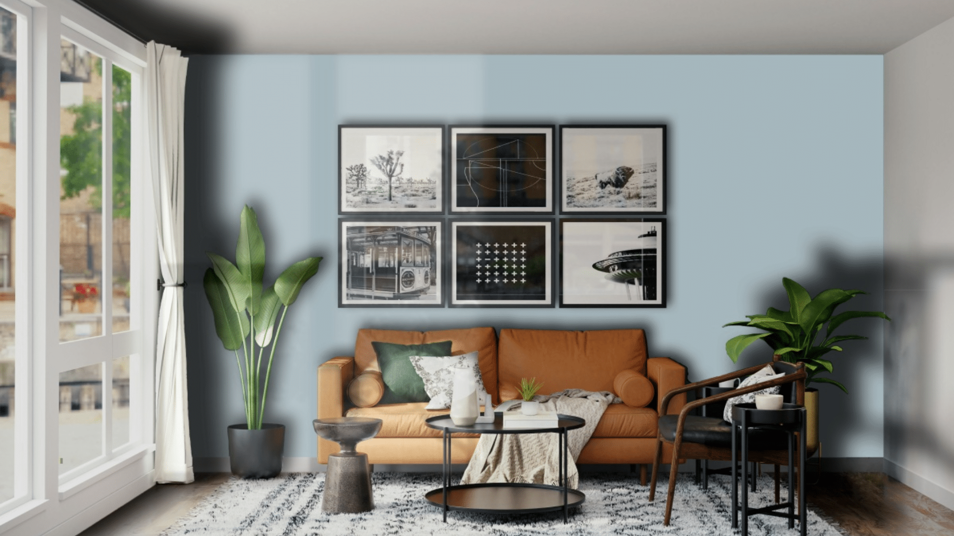
This color makes living areas feel vibrant and welcoming. It creates a strong background that allows light furniture and art to stand out dramatically.
In my living room, Santorini Blue walls make the space feel complete while highlighting my white sofa and brass accent pieces.
The color works especially well in spaces that need some life. It adds enough substance to fill a room with personality. When paired with good lighting, it creates a space that feels both energizing and comforting.
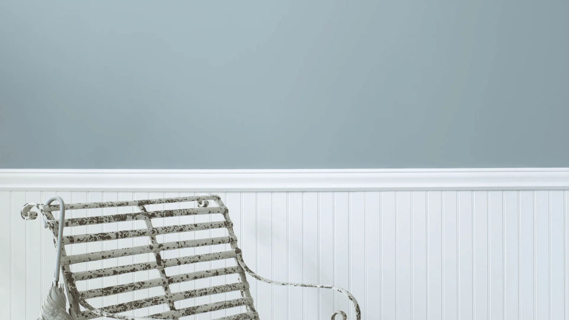
Bathrooms
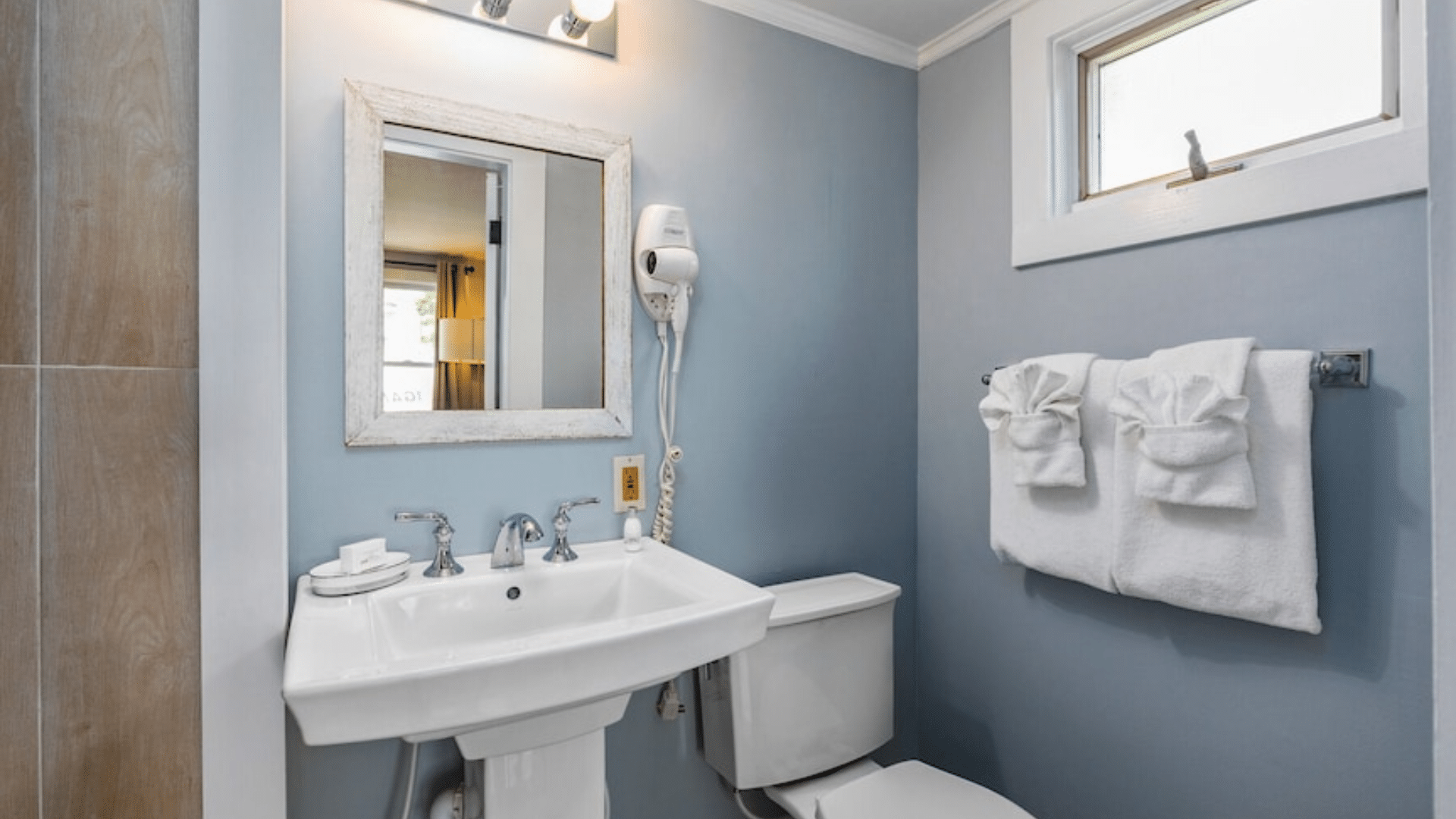
The water-inspired tones make bathrooms feel fresh and clean. This color creates a spa-like atmosphere that feels both luxurious and refreshing.
In my guest bathroom, I paired Santorini Blue with white fixtures and natural wood accents for a look that feels both bold and relaxing.
The color also tends to make bathrooms feel more thoughtful and put-together. The rich undertones create a sense of luxury that many people find perfect for personal spaces. Since painting my bathroom this shade, it feels more special every time I walk in.
Bedrooms
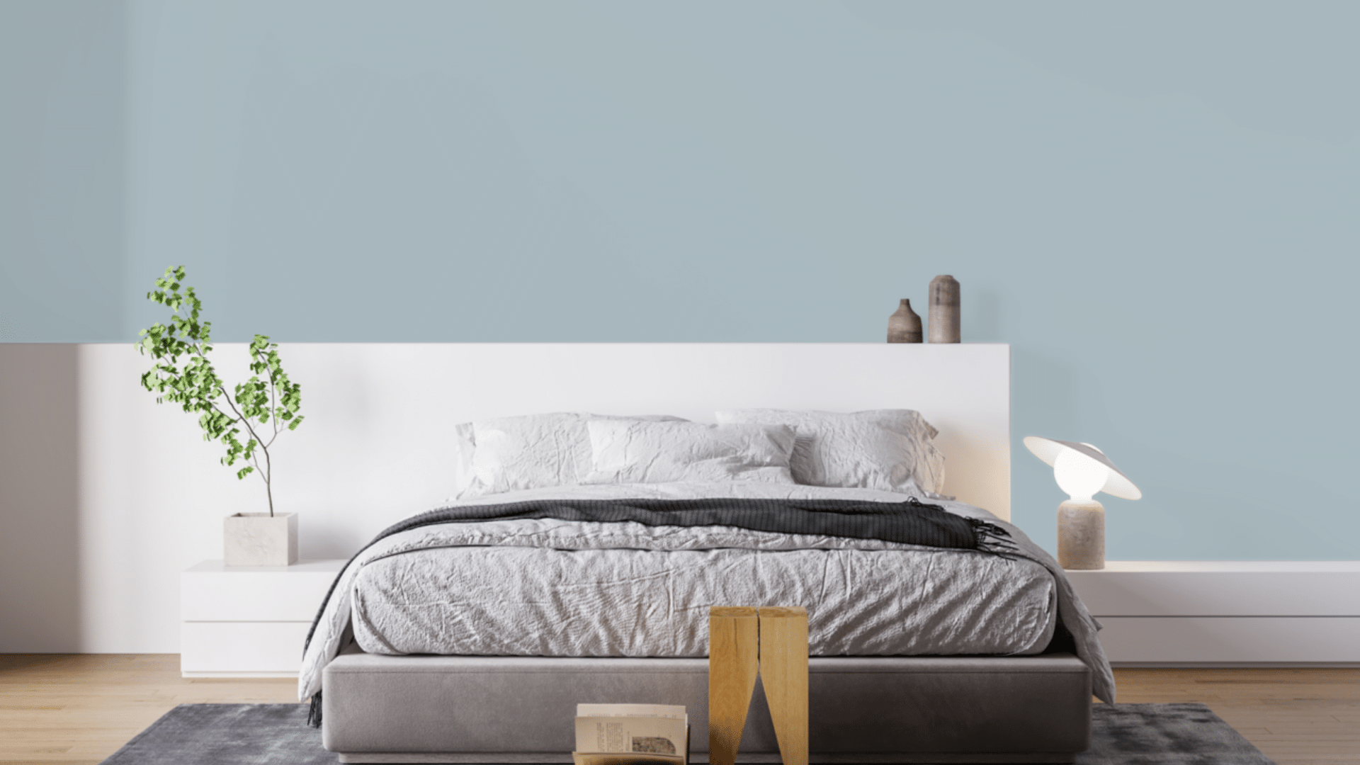
Santorini Blue can transform bedrooms into peaceful retreats. I used it in my guest bedroom, where it creates a cozy yet refreshing atmosphere. The blue tones promote relaxation while still feeling more interesting than typical bedroom colors.
What surprised me is how well it works with different bedding colors. My white linens pop against the blue walls, while the tan throw pillows bring warmth to balance the coolness of the blue. The room feels like a boutique hotel room – special and thought out.
Home Offices
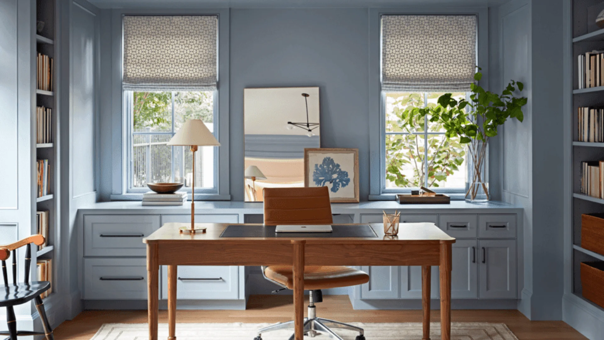
Santorini Blue helps create focus and inspiration in workspaces. The deep blue feels professional yet comfortable during work hours.
I painted my home office accent wall in this shade and find it creates the perfect background for video calls while keeping me alert and focused. Santorini Blue is particularly useful in offices that need to feel creative and professional.
The color seems to add structure while promoting fresh thinking. I’ve noticed I feel more productive in my Santorini Blue office compared to my previous neutral workspace.
Kitchens
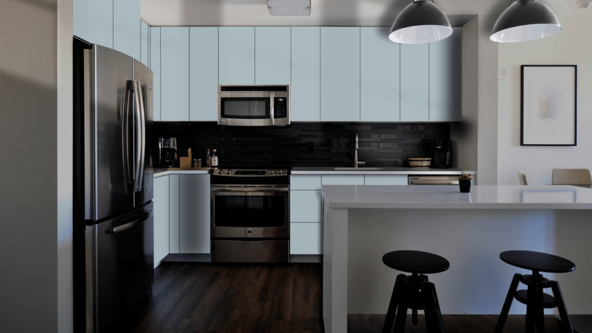
This bold blue can add personality to kitchens, either on walls or cabinets. I helped my sister paint her kitchen island Santorini Blue, and it transformed the space from ordinary to extraordinary.
The blue island now serves as a focal point that anchors the entire room. The color pairs beautifully with white countertops and stainless steel appliances.
It adds just the right amount of personality without overwhelming the space. If you’re not ready to commit to blue cabinets, even a small accent like a pantry door in this shade can make a big impact.
What Colors Go Well with Santorini Blue?
- Crisp whites: These Creates a sharp, clean contrast that feels fresh
- Cream tones: These offer a softer contrast that feels warm
- Coral accents: These add an unexpected touch that works surprisingly well
- Natural wood tones: Add organic texture and warmth
- Gold and brass accents: Add a touch of luxury that makes the color shine
For my living room, I combined Santorini Blue walls with white trim and brass lighting fixtures. The combination feels bold yet welcoming.
What Style Works Well With This Color?
Santorini Blue adapts to many design styles. In modern homes, it brings depth that feels current. For coastal spaces, it creates the perfect background that complements beach-inspired decor.
In Mediterranean settings, it offers an authentic touch that feels right at home. Most impressively, Santorini Blue works well in homes that mix different styles by adding character to spaces that combine various elements.
My own home mixes contemporary items with more traditional ones, and this color creates the perfect background for both. This flexibility makes it a smart choice if you like to change your decor or mix elements from different styles.
Is It a Warm or Cool Color?

Santorini Blue is a cool color with balanced undertones. The blue base gives it that cool, refreshing feeling, while the subtle green undertones add complexity. I’d describe it as “deeply cool” – the kind that makes a room feel alive rather than cold.
The rich aspects keep it from feeling too stark or chilly. This balance makes it work well year-round in most homes.
When used correctly, it doesn’t feel too cold despite being cool. The depth balances the coolness, making it more livable for everyday spaces. In rooms with lots of natural light, the balance helps it show its true blue character throughout the day.
If you’re worried about a space feeling too cold, I’ve found that adding warm elements like wood tones, cream textiles, or brass fixtures creates the perfect balance. In my living room, the Santorini Blue walls look beautiful with my brass floor lamp and cream sofa.
Color Characteristics Table
| Characteristic | Santorini Blue | What This Means For Your Space |
|---|---|---|
| Temperature | Cool | Creates a refreshing, energizing atmosphere |
| Undertones | Blue with subtle green notes | Adds depth and complexity |
| Light Reflectance Value | 44.67 | Medium tone that balances brightness with color depth |
| Seasonal Feel | Year-round | Works well in both winter and summer settings |
| North vs. South Rooms | Adaptable | Appears more vibrant in south-facing rooms, more muted in north-facing rooms |
How to Test This Color in Your Space?
- Buy a sample: Get a small container of Santorini Blue
- Paint a board: Use a 2×2 foot piece of white poster board
- Move it around: See how it looks in different locations at different times of day
- Live with it for 3 days: Your first impression might change
When I tested Santorini Blue, I was surprised by how much it changed from morning to evening. In my north-facing office, it appeared more muted. In my south-facing living room, it showed more of its vibrant blue character throughout the day.
What Paint Finish Should You Choose?
- Flat: Good for ceilings with minimal texture
- Matte: My top choice for most walls – the deep color looks rich without glare
- Eggshell: This works in kitchens and bathrooms where you need to clean walls
- Satin: Adds a slight sheen, could make the color look slightly lighter than expected
- Semi-gloss: Too shiny for Santorini Blue walls, but works for trim and doors
I used matte in my living room and eggshell in my bathroom. The eggshell finish makes cleaning easier without adding too much shine that would change how the color looks.
Real Home Ideas Using Santorini Blue
- Full room: Santorini Blue on all walls creates a strong, immersive feeling
- Accent wall: Used on one wall with light walls for a focal point
- Trim: Using it on trim with white walls creates an unexpected, custom look
- Furniture: A bookcase or cabinet painted this shade adds a bold touch
- Exterior: Works beautifully as a front door color with light siding
My friend painted all her kitchen cabinets Santorini Blue with white walls, creating a custom look that feels both fresh and bold. It looks amazing and has inspired me to think about using it in more areas of my home.
Mistakes to Avoid
- Not using enough lighting – This deeper color needs good lighting to show its true beauty. Make sure you have enough light sources to keep the space from feeling too dark.
- Using very yellow lighting with Santorini Blue—Warm bulbs can cause this color to lose its blue tones. Stick with balanced white bulbs (3000-4000K) to showcase its true beauty.
- Not testing in your actual space – This color can look very different in various lighting conditions. I was surprised how it appeared in my north-facing office versus my south-facing living room. Always test a large sample in your own space.
- Using too many cool accessories – This can make the room feel too cold. Mix in some warm woods, creams, or brass accents for balance.
- Expecting it to look exactly like online photos – Every screen shows colors differently, and professional images are often edited. The only way to know how it will look in your home is to test it yourself.
Why People Like Santorini Blue?
Santorini Blue has become popular among many homeowners, and I understand why. Its rich quality creates spaces with substance while still feeling very livable. People like it because it’s not a basic blue—it has character without being hard to use.
The color creates bold spaces that still feel comfortable. It works with many decorating styles and doesn’t date quickly like more specific colors might. Whether in natural or artificial light, it shifts throughout the day, keeping spaces interesting and dynamic.
Is Santorini Blue Right For Your Home?
Santorini Blue creates spaces that feel both bold and balanced at the same time. After using this color in multiple rooms over several months, I’m still happy with my choice.
What makes it stand out is how it adds strong character while remaining very flexible with different furniture and decor styles. It’s not a color for those who want to play it safe.
Instead, it creates a foundation that supports your furniture and accessories while making a statement of its own. This balanced presence explains why it remains a favorite choice season after season.
In a world of stark whites and gray neutrals, Santorini Blue offers the perfect option for those wanting to add color with purpose. It works with modern, coastal, Mediterranean, and many other styles.
Is it versatile? Yes. It creates beautiful, livable spaces that feel fresh and personal—and that’s what truly matters.
Frequently Asked Questions
Does Santorini Blue Work with A White Trim?
Yes, it pairs beautifully with white. The deep blue creates a striking contrast with the pure white trim that feels clean and intentional.
Is Santorini Blue Too Dark for Small Rooms?
When used with purpose, it can work in small rooms. When paired with proper lighting and lighter furnishings, it can make small spaces feel cozy rather than cramped. For very small spaces, consider using it as an accent wall.
How Does It Compare to Other Blue Paints?
Santorini Blue is deeper and more vibrant than many blues, with subtle green undertones that add interest. It changes more throughout the day than many similar colors.
Will This Color Show Dirt More than Other Colors?
It actually hides dirt quite well. The deeper tone helps mask minor smudges better than very light colors would.
Can I Use Santorini Blue in An Open Floor Plan?
Yes, but with care. Consider using it in one zone of an open space to create visual interest and definition between areas. It pairs well with lighter neutrals in connecting spaces.