")
Choosing white paint might sound easy, but once you look at all the options, it quickly becomes confusing.
Some whites are too bright. Some are too cold. Others change completely once you paint a whole wall. That’s why Benjamin Moore Creamy White (OC-7) stands out. It’s soft, warm, and feels just right.
It’s not a harsh white. It’s not yellow. It’s right in the middle—a creamy, calming tone that makes rooms feel comfortable and calm. Whether you’re painting a bedroom, kitchen, hallway, or even trim, Creamy White fits.
In this blog, you’ll learn:
- What Creamy White actually looks like
- What colors and styles does it work with
- What paint finish to choose
- Real room examples
- Mistakes to avoid
- And if it’s right for your home
What Kind of Color Is Creamy White?

Creamy White is a soft off-white with a warm base. It doesn’t lean bright or stark like pure white. Instead, it has just a touch of beige and yellow that makes it feel gentle and easy on the eyes.
How It Looks in Real Light
The true charm of Creamy White is how it reacts to different lighting.
- In natural sunlight, it glows with warmth and keeps its soft look.
- In low light, it doesn’t turn dull or gray like some whites do.
- Under artificial light, it holds its creamy tone without becoming too yellow.
If you want a white that feels more natural and “lived-in” without going beige, this is a great fit. It’s especially helpful in rooms that feel cold or plain. Creamy White makes them feel calm, warm, and welcoming.
What Colors Go Well with Creamy White?

This shade is flexible. It pairs well with many other colors, from soft pastels to deep, rich shades. Its warmth makes it easy to work with.
Best Color Pairings
Here are some tones that work great with Creamy White:
- Soft Grays – Keep the space neutral but interesting
- Dusty Blues or Sky Blue – Add a calm, cool contrast
- Sage Green or Olive – Bring in nature-inspired balance
- Terracotta and Clay – Add depth and earthy warmth
- Navy or Deep Green – For a stronger contrast that still feels grounded
- Black and Charcoal – Sharp but not too bold when used as accents
What to Avoid
Bright, icy tones—like electric blues or cool silvers—can clash with Creamy White. Since it has yellow warmth, sharp, cool colors may make it look more yellow than it actually is.
When building a color palette, think warm, muted, or earthy. These play best with Creamy White’s tone and help create a space that feels balanced.
Style that Works Well with Creamy White
Creamy White blends well into many styles because it doesn’t demand too much attention. It acts more like a soft background, letting furniture, decor, and natural light take the lead.
Traditional and Classic

Creamy White fits right into older or more classic homes. It highlights trim and molding, and looks beautiful with dark wood floors or vintage furniture. In these spaces, it makes everything feel warm and timeless.
Farmhouse and Cottage

This paint color was made for cozy styles. Whether it’s shiplap, painted cabinets, or soft linen curtains, Creamy White brings a gentle touch that keeps the space bright without being too modern.
Modern or Minimalist

Even clean, modern homes need a warm base sometimes. Pure whites can feel too cold or flat. Creamy White still feels light, but adds a hint of softness that stops the space from feeling too plain. Use it with black fixtures, simple shapes, and sleek furniture.
Boho and Natural

In boho spaces full of texture, plants, and cozy layers, Creamy White works as a calm anchor. It lets the patterns, rugs, and woven materials shine without clashing or making things feel too busy.
Is Creamy White by BM a Warm or Cool Color?
Creamy White is definitely warm. That comes from its soft yellow undertone, which is what gives it its creamy name. But don’t worry—it’s not golden or buttery.
What Warmth Means for a Room
- It helps brighten darker spaces without looking harsh.
- It creates a sense of calm and softness.
- It pairs best with warm wood, natural fabrics, and rich tones.
This warmth is also what makes Creamy White better than cooler whites in many real homes. Cooler whites can feel clinical or even blue under certain lights. Creamy White avoids that, giving you a more natural and balanced look across the day.
What Paint Finish Should You Choose?
The finish you choose will affect how Creamy White looks and how the walls hold up to daily life.
Best Finishes for Different Rooms
- Flat/Matte: Best for ceilings or low-traffic areas. It hides wall flaws but is harder to clean.
- Eggshell: Most common for walls. Soft shine, and easy to clean.
- Satin: Great for kitchens, bathrooms, and kids’ rooms. Slightly shinier than eggshell and very wipeable.
- Semi-Gloss: Perfect for trim, doors, and cabinetry. Shiny and easy to maintain.
Simple Paint Combo Tip:
Use eggshell for the walls and semi-gloss for the trim in the same shade. This keeps everything looking clean and soft while adding just enough contrast to outline the room.
Real Home Ideas Using Creamy White
Let’s walk through a few real-life examples of how this color looks in action.
Living Room
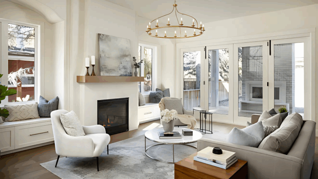
Creamy White makes a living room feel bright but not bare. When paired with a beige sofa, soft brown rug, and a few dark metal accents like lamps or curtain rods, it builds a calm but stylish space. Add in plants or wood frames to keep things feeling warm and grounded.
Kitchen
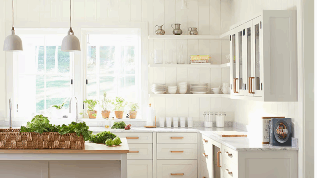
Use Creamy White on the cabinets to make the space feel clean and open. Pair with wood or butcher block countertops for a natural feel, or go with black hardware for a modern contrast. If you’ve got open shelves, this color makes dishes and glassware really stand out.
Bedroom
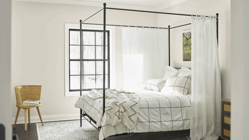
In a bedroom, Creamy White creates a soft background that helps bedding, pillows, and headboards shine. Try pairing it with linen sheets, a wood bed frame, and soft lighting. The overall effect is gentle and relaxing.
Bathroom
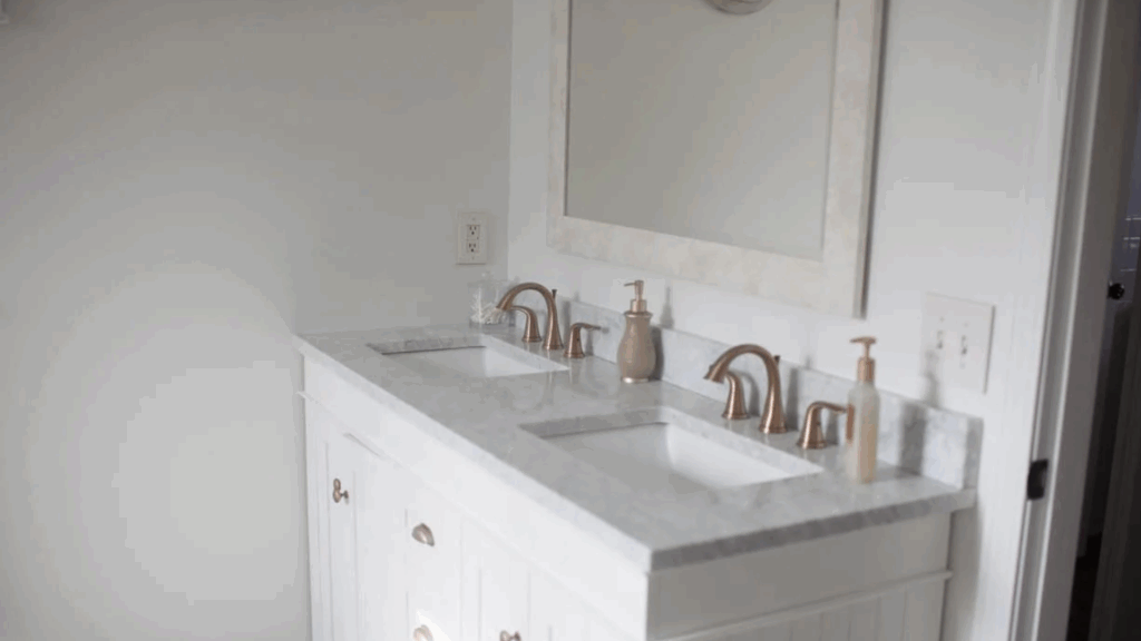
Bathrooms feel fresher with Creamy White. Use it on the walls or even the vanity. Add in light-colored tile and brass or black hardware. It’s a look that stays classic and clean without going too sharp.
Hallway or Entryway
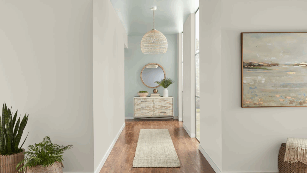
These smaller spaces are often overlooked. Creamy White helps brighten them up and makes narrow spots feel open. Hang a wood mirror or framed photos to add character without clutter.
Mistakes to Avoid
Even though Creamy White is one of the easiest whites to use, there are a few common mistakes that can throw things off.
- Not Testing It First: Always test paint in your actual space. Try it on different walls and look at it during different times of day. What looks creamy and soft in one home may look slightly yellow in another, depending on the lighting.
- Mixing It with Cool Colors: This white doesn’t play well with icy tones or bright blue-based shades. Stick with earthy, muted, or warm colors to keep things balanced.
- Using Flat Finish in Busy Spaces: Flat paint hides wall flaws, but it stains easily. For living areas, kitchens, or spots with a lot of hands touching the wall (like around light switches), eggshell or satin works much better.
- Skipping the Trim Contrast: Don’t forget about your trim and ceilings. If you use Creamy White on the walls, you can either go a little brighter on the trim or use the same shade in a glossier finish to add depth.
Wrapping Up
If you want a paint color that feels warm, soft, and easy to use, Benjamin Moore Creamy White is a smart choice. It works in every kind of room and with many design styles. It gives your home a sense of calm, without making things dull or plain.
This color doesn’t fight with your furniture. It won’t overwhelm your space. It simply adds a soft glow that works with you, not against you.
Whether you’re refreshing a whole room or just want to repaint some trim or cabinets, Creamy White is worth testing.
It might not be the flashiest shade on the wall, but that’s exactly the point. It helps your home feel more comfortable—and that’s something you’ll notice every single day.