
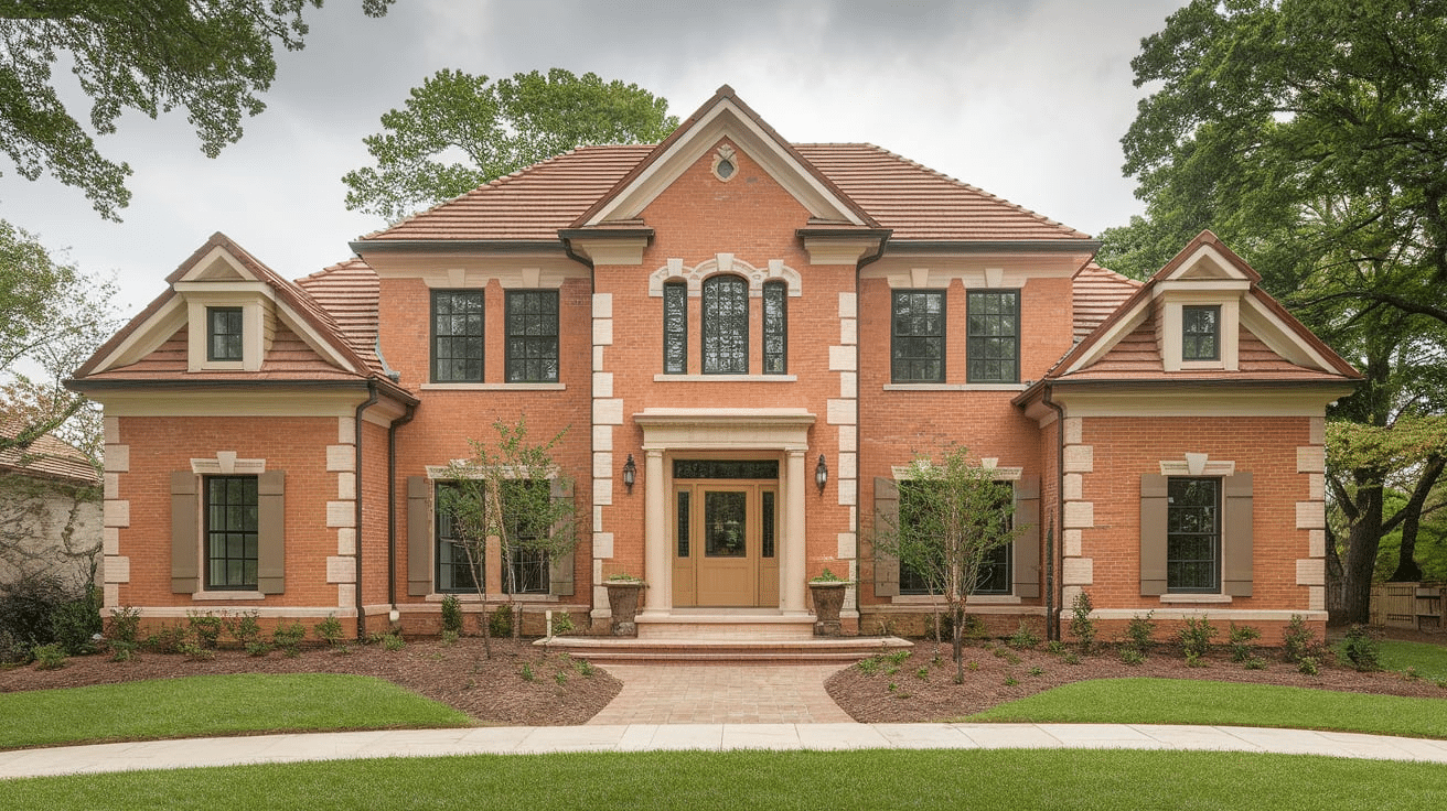
Picking the right color for an orange brick house can feel tricky. I get it—it’s not always easy to know what works. Orange brick has a warm, bold look, and it needs colors that can balance it out or help it pop.
The good news? There are lots of great color options that go really well with it. In this blog, I’ll show you the best colors to match an orange brick house. These colors can work for trim, doors, siding, or even plants and decor.
I kept the list simple and easy to use so you won’t feel overwhelmed. Whether your home has bright orange bricks or a soft, rusty tone, you’ll find something that fits your style. Let’s dive in and find the perfect color match to help your home look its best.
What Makes Orange Brick Unique?
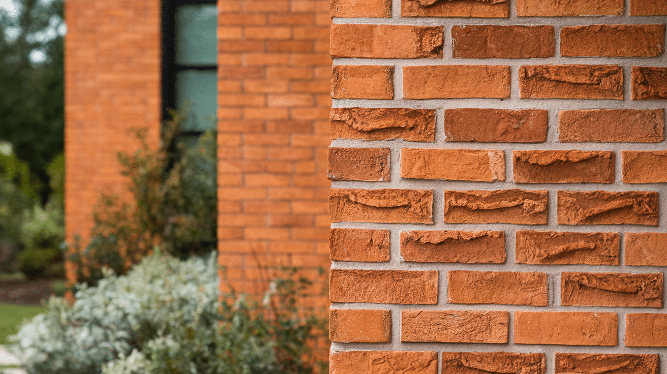
Orange brick is bold, warm, and full of charm. Its rich color stands out, even from a distance. What makes it special is how natural it looks. The color comes from clay and heat, so each brick can have a slightly different tone.
Some bricks look bright orange, while others may be more red, brown, or rusty. This mix gives the home a warm and inviting feel. Orange brick also has texture. The rough surface adds character that smooth siding doesn’t have.
It works well with many styles—farmhouse, traditional, and even modern. But because it’s so strong in color, it needs the right match to look its best. That’s why picking the right paint and decor color is so important.
Colors That Match an Orange Brick House
Orange brick has a warm, bold look. These color ideas help balance or highlight your home to make it look its best.
1. Cream

Cream is soft, warm and works well with orange brick. It brings out the warm tones in the brick without being too loud. Cream trim or siding can make your home look clean and bright. It’s a great choice if you want something classic but still cozy.
Where to use cream:
-
Trim
-
Garage doors
-
Porch rails
-
Window frames
Why it works:
Cream is a warm neutral. It blends in nicely without taking attention away from the brick.
2. Tan
Tan is another warm neutral that looks natural next to orange brick. It’s a little darker than cream, which adds a bit of contrast. Tan can give your home a soft, earthy look that feels calm and welcoming.
Where to use tan:
-
Siding
-
Trim
-
Fences
-
Outdoor furniture
Why it works:
Tan keeps things simple. It brings out the softer shades in the brick without clashing.
3. Charcoal Gray

Charcoal gray is bold and modern. It tones down the warmth of orange brick, giving your home a more balanced look. If you want something strong and sleek, it’s great for siding or doors.
Where to use charcoal gray:
-
Front doors
-
Roofs
-
Garage doors
-
Siding panels
Why it works:
The charcoal adds depth and cool tones, which help balance the warm brick.
4. Olive Green
Olive green is soft and earthy. It blends in with nature, so it’s a nice fit if you like a natural look. Olive green looks great with landscaping and outdoor plants, too.
Where to use olive green:
-
Shutters
-
Trim
-
Planters
-
Porch furniture
Why it works:
Olive green pairs well with the warm and rustic tones of orange brick.
5. Black

Black is strong and classy. It adds bold contrast and can really make a home stand out. The black trim on the doors looks sharp against the orange brick and gives the house a modern twist.
Where to use black:
-
Doors
-
Window frames
-
Porch railings
-
Light fixtures
Why it works:
Black adds drama and detail, making the brick pop even more.
6. Sage Green

Sage green is soft, cool, and calming. It’s not too bright or bold, but it still adds color and life. It goes especially well with older orange brick homes.
Where to use sage green:
-
Siding
-
Trim
-
Planters
-
Garden decor
Why it works:
Sage green balances the orange with a fresh, earthy feel.
7. Brown
Brown and orange brick are both warm tones, so they pair well. Brown adds a cozy, grounded look to the home. Lighter browns are softer, while darker browns add richness.
Where to use brown:
-
Roof shingles
-
Fences
-
Doors
-
Outdoor decor
Why it works:
Brown keeps things warm and earthy. It blends in without being boring.
8. Navy Blue

Navy blue is deep, rich, and stylish. It’s great if you want your home to have a bold but classic look. Navy brings a cool contrast to the warm brick color.
Where to use navy blue:
-
Doors
-
Shutters
-
Porch ceiling
-
Mailbox
Why it works:
Navy blue stands out but still feels timeless next to orange brick.
9. Beige

Beige is a simple, light brown shade that works well with many colors. It’s softer than tan but still gives a nice neutral base. Beige siding or trim can tone down the boldness of orange brick.
Where to use beige:
-
Siding
-
Trim
-
Porch posts
-
Garage doors
Why it works:
Beige adds a clean look without stealing the spotlight from the brick.
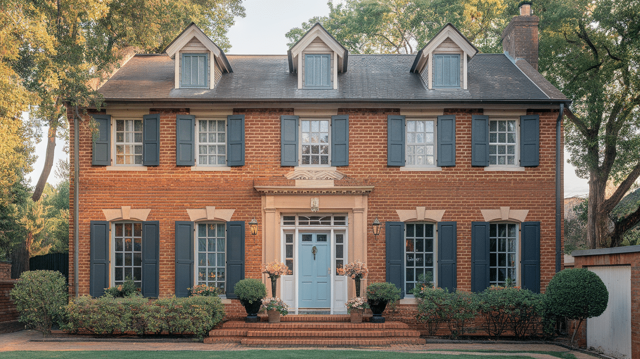
10. Soft Blue
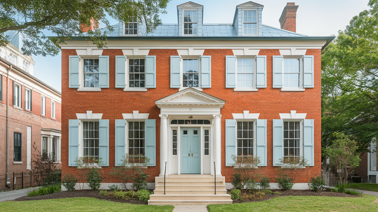
Soft blue gives a light, airy feel. It works best if you want a peaceful, welcoming home. It adds a pop of color without being too strong.
Where to use soft blue:
-
Doors
-
Outdoor furniture
-
Porch ceiling
-
Window boxes
Why it works:
Soft blue brings calm energy and pairs well with the brick’s warmth.
11. Rust

Rust is close in tone to orange brick but a little darker and richer. Using rust gives the house a blended, warm look. It’s great if you like a rustic or farmhouse style.
Where to use rust:
-
Accent walls
-
Outdoor planters
-
Patio cushions
-
Front door
Why it works:
Rust keeps the warm theme going and adds depth.
12. Light Gray

Light gray is soft, cool, and very popular. It tones down the warmth of the orange brick and helps give a fresh look. It’s great for both modern and classic styles.
Where to use light gray:
-
Trim
-
Shutters
-
Siding
-
Outdoor rugs
Why it works:
Light gray cools down the space while keeping it light and simple.
13. Forest Green

Forest green is rich and deep. It pairs well with brick and nature, and it can give your home a classic, earthy style. It looks great all year round.
Where to use forest green:
-
Doors
-
Window trim
-
Fence
-
Porch planters
Why it works:
Forest green adds boldness while keeping things grounded and natural.
Warm vs. Cool Colors: What Works Best?
When choosing colors to match orange brick, think about warm and cool tones.
Warm Colors: like tan, cream, brown, rust, and beige blend with orange brick to create a cozy, soft look. These colors feel calm and natural, which is great if you want your home to feel relaxed and welcoming.
Cool Colors: like gray, navy blue, sage, and charcoal add contrast and help tone down the strong orange. Cool colors give your home a fresh and modern feel and help balance out the heat in the brick.
So, which is better? It depends on your style. Choose warm colors if you like a soft, classic look. Choose cool colors if you want a bold contrast and a modern feel.
How Lighting Affects Color Choices
Lighting changes how colors look. The same paint can look warm in one place and cool in another, depending on the light.
How it works:
-
Sunlight makes colors look brighter. A soft tan might look very light in full sun.
-
A shade can make colors look dull or gray. Test your color on both shaded and sunny spots.
-
Morning vs. evening. Early light is softer. Late-day light is warmer and more golden.
-
Street lights at night. Don’t forget to look at your home after dark, especially if you have lights on your porch or driveway.
That’s why it’s so important to test paint at different times of the day. What looks great at noon might look totally different at 6 p.m.
Tips for Testing Paint Colors on Brick Homes
Before you paint, it’s smart to test your colors. Brick is rough and absorbs paint, so colors may look different on rough walls.
How to test paint the right way:
-
Use real paint samples. Don’t just trust the paint chip. Buy a small sample and test it at home.
-
Paint a large patch. Try at least a 2-foot square area. The bigger the spot, the easier it is to see.
-
Test in more than one place. Paint a few spots—sunny side, shady side, and near trim.
-
Wait a day or two. Look at the paint in the morning, afternoon, and evening.
-
Compare side by side. Try two or three colors next to each other to see which one works best.
Take your time before making the final choice!
Common Color Mistakes With Orange Brick Homes
A few color mistakes that can make an orange brick house look off:
1. Using Bright or Neon Colors: Bright blues, yellows, or greens can clash with the brick. These colors are too strong and don’t blend well.
2. Too Much White: While white trim works great, painting large areas white can be too stark. It might make the brick feel too orange.
3. Picking the Wrong Gray: Some cool grays have blue or purple undertones. These can fight with the orange brick. Stick to soft, balanced grays.
4. Matching Everything to the Brick: Using too much of the same orange or red tone can make the home feel flat. Add contrast to break it up.
5. Forgetting the Roof and Landscaping: Colors should work with the whole home. Don’t forget to match or blend your paint with the roof color and nearby plants or trees.
The key is to test colors, start small, and look at them during different times of day.
Conclusion
Choosing the right color to go with an orange brick house doesn’t have to be hard. With so many great options, you can find a color that fits your style and makes your home look its best. From warm creams and tans to cool grays and greens, each color brings out something special in orange brick.
Start by thinking about the look you want. Soft and cozy? Go with warm shades. Bold and fresh? Try a cool contrast. Don’t forget to test your paint first. Look at it in the sun, in the shade, and even at night. This helps you avoid mistakes and makes sure you really like it.
Take your time and enjoy the process. A good color choice can make your home feel brighter, cleaner, and more welcoming. Use these tips and ideas to guide you, and soon you’ll have a look you can be proud of every time you pull into the driveway.