: Color Review")
Looking for a soft gray that feels calm and easy to live with? Benjamin Moore Horizon Gray (2141-50) might be just what you need. It’s a gentle paint color that mixes gray with a touch of green, giving your home a peaceful, grounded feel.
Horizon Gray is often used in both modern and traditional homes. It blends well with simple styles and natural materials, making it a safe pick for many rooms. People love it because it looks soft and balanced without being boring or flat.
In this review, you’ll find everything you need to know about Horizon Gray. We’ll talk about how it looks in different light, where it works best, and what colors go well with it. You’ll also learn the pros and cons so you can decide if this paint is right for your space.
Horizon Gray at A Glance
Horizon Gray (2141-50) is a soft, medium-light gray that feels calm and steady. Its sage green undertones bring a slight earthiness without making the color feel muddy. The result is a gentle shade that fits naturally into many home styles.
Its Light Reflectance Value (LRV) is around 49. This means it reflects about half the light it receives. In bright rooms, it feels light and clear. In low-light spaces, it can look a bit heavier or more muted, especially if the room has cool lighting.
This color is best for people who want a soft gray with a little depth. It works well in calm spaces like bedrooms, living rooms, or reading areas.
It may not be the best fit for very dark rooms, since the green undertones can feel dull in shadow. Testing it first is a smart way to see how it feels in your home.
Undertones and Lighting Behavior
Horizon Gray has a soft green undertone that gives it a grounded feel. In most rooms, it reads as a gray first, but the green comes through just enough to make it feel steady and calm. It doesn’t swing too warm or too cool, which makes it easy to live with.
In bright daylight, Horizon Gray looks lighter and more balanced. The green undertone becomes subtle and adds depth without overpowering the space. In artificial lighting, especially with warm bulbs, the gray can appear a little deeper and warmer than expected.
In low-light or north-facing rooms, Horizon Gray may feel a bit more muted. The green undertone might stand out more in these spaces, sometimes giving the walls a slightly cooler feel. If you plan to use this shade in a darker room, it’s a good idea to test it first and see how it behaves in your specific lighting.
Best Uses for Horizon Gray
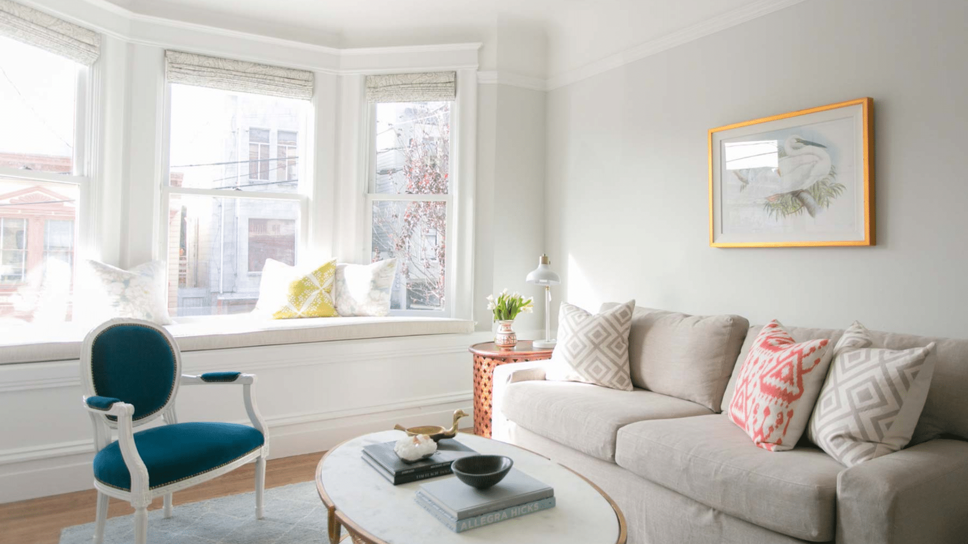
Horizon Gray works best in rooms where you want a soft and calm mood. Bedrooms, living rooms, and sitting areas are great choices. It also looks nice on home exteriors, especially when paired with white or light trim.
It fits well with classic, farmhouse, or transitional styles. If your space has warm wood, natural stone, or soft white features, Horizon Gray helps tie them together. It adds a quiet backdrop that supports other colors and textures.
Avoid using it in rooms with very little natural light, like some north-facing spaces. In those cases, it can feel dull or flat. If you do want to use it there, make sure to test it first in different light throughout the day.
Where to Use Horizon Gray in Your Home?
Horizon Gray works well in spaces where you want a soft and calm look. It’s a strong choice for bedrooms, living rooms, and home offices. These are rooms where quiet colors help you relax, think, or rest.
This color can also be used on exteriors. On outdoor walls, Horizon Gray looks clean and grounded without being too bold. It pairs well with a white trim and light stone or brick, giving homes a fresh yet classic feel.
Horizon Gray fits into many design styles. It blends nicely with farmhouse, traditional, and even minimalist interiors. If your home includes warm woods, light fabrics, or natural textures, this shade will settle in smoothly and help the room feel more connected.
Coordinating Colors and Design Pairings
Horizon Gray works well with clean, soft, trim colors. Crisp whites like Benjamin Moore Chantilly Lace or Simply White make the gray look fresh and clear. These whites help highlight the green undertones without clashing.
For accents and cabinets, stick with soft neutrals or muted earth tones. Cream, light taupe, and gentle greens pair nicely with Horizon Gray. In kitchens, white or light oak cabinets help the gray walls feel balanced and relaxed.
If you’re building a full palette, try combining Horizon Gray with soft white trim, pale olive-green accents, and warm beige or tan furniture.
This creates a grounded, natural look that feels calm and connected. Add a little texture with wood, linen, or matte finishes for even more balance.
Pros and Cons
Horizon Gray stands out as a soft, balanced gray that brings a relaxed feel to many spaces. Its gentle sage undertones make it feel connected to nature, and it doesn’t overpower a room.
Many people choose it because it works well with both cool and warm finishes, making it easy to match with furniture and trim.
| Pros | Cons |
|---|---|
| Works in many room types | It can look dull in very low light |
| Feels soft and calming | Undertones may shift depending on lighting |
| Pairs nicely with many colors | May not stand out in large, open spaces |
| Looks good in both modern and classic styles | Needs testing before full-room use |
Overall, Horizon Gray is a quiet, easygoing paint color that blends into most homes without much effort. Its softness brings comfort, but it may not give the same effect in darker rooms or under cool lighting.
Testing a sample first is always smart so you can see how it behaves throughout the day.
Real-Life Inspiration
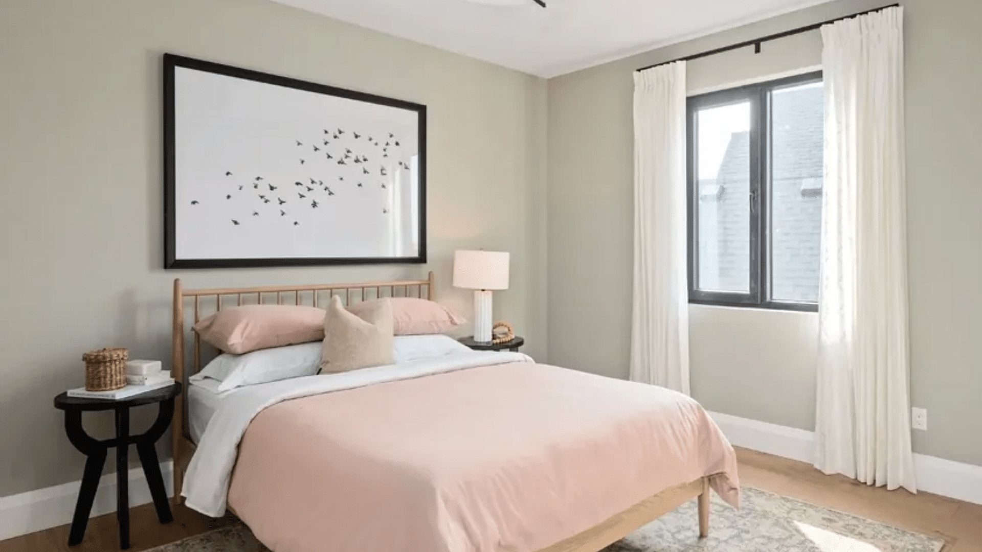
In real homes, Horizon Gray often appears in bedrooms, hallways, and cozy living rooms. It provides a soft, calm backdrop that helps furniture, art, and decor stand out without making the room feel too plain.
Homeowners say it gives their rooms a peaceful feel that’s easy to live with day to day. Designers often pair Horizon Gray with creamy whites and light natural woods to create a balanced, grounded space.
In kitchens, it can be used on walls or lower cabinets to add subtle depth without making the room feel heavy. When paired with simple finishes, it helps a space feel fresh and relaxed, not overly decorated.
People who use Horizon Gray in their homes often describe it as “clean but soft” or “just enough color to feel interesting.” It doesn’t steal the show but supports everything around it.
In bright rooms, it looks light and smooth, while in shadowed areas, it feels a bit moodier—perfect for creating quiet, restful spots.
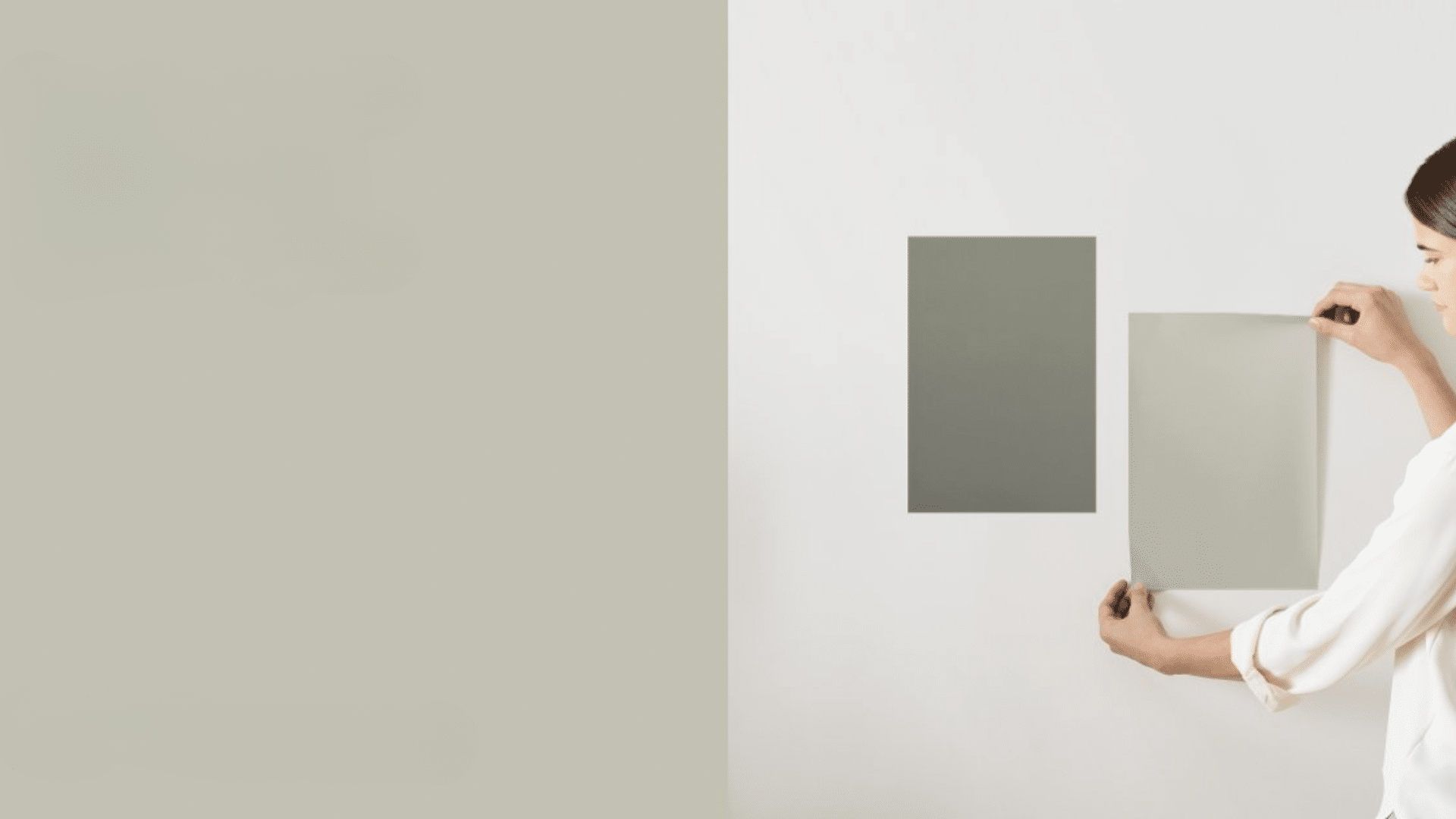
Sample Before You Paint
Horizon Gray may look simple, but like many grays with undertones, it can shift depending on the light.
That’s why testing a sample is an important step before you commit to painting a full room. It helps you avoid surprises and gives you a better idea of how the color feels in your space.
Start by painting a few sample patches on different walls in the room you plan to paint. Try to place the samples near windows, corners, and even next to trim or furniture.
This gives you a clear look at how Horizon Gray reacts to your lighting, surroundings, and time of day.
Check the color in the morning, midday, and evening. In strong daylight, it may feel softer and more balanced, while at night or in darker areas, the green undertone can show up more clearly. Taking the time to test ensures you’ll be happy with the color once it’s on all four walls.
Conclusion
Horizon Gray by Benjamin Moore is a soft, calming color that works well in many homes. It brings just enough color to a space without feeling too light or too dark. The gentle green undertones help it feel grounded and calm, especially in quiet rooms.
This shade is a strong choice for living rooms, bedrooms, and even home exteriors. It pairs well with white trim, natural wood, and soft color palettes. Bright rooms bring out its best look, while softer lighting keeps it feeling warm and steady.
If you’re thinking of using Horizon Gray, try a sample first to see how it reacts to the light in your space. Paint a small section and check it during the day and at night. Testing first is the best way to feel confident before painting the whole room.