 by Benjamin Moore: A Complete Overview")
If you’re looking for a calming, earthy green with a hint of gray, Stillwater by Benjamin Moore is a beautiful choice. This soft, muted color feels natural and peaceful, perfect for creating a serene atmosphere in your home.
Stillwater works wonderfully in spaces like living rooms, bedrooms, kitchens, and even bathrooms. It offers a quiet, grounded vibe without being overpowering. In this blog, we’ll discuss why Stillwater is so popular, where to use it, what colors pair best with it, and how it compares to other similar shades.
If you’re looking for a color that brings a sense of calm and style to your space, Stillwater could be just what you need.
Why Stillwater (HC-159) by Benjamin Moore Is a Bestseller
Stillwater is a popular color because of its soft, serene quality. It’s a grayish-green that brings a natural, earthy feel to any room. People love it because it’s subtle yet rich, offering a balanced vibe that isn’t too bold or too dull.
This color works well in nearly every room of the house, whether you’re going for a peaceful bedroom retreat or a fresh kitchen look. Its versatility is another reason it’s so loved—it pairs beautifully with a variety of furniture and decor styles, from modern to farmhouse to traditional.
Stillwater is also part of Benjamin Moore’s Color Preview Collection, a trusted selection of shades. If you want something calming and timeless, Stillwater is a go-to choice.
Specifications of Stillwater (HC-159) by Benjamin Moore
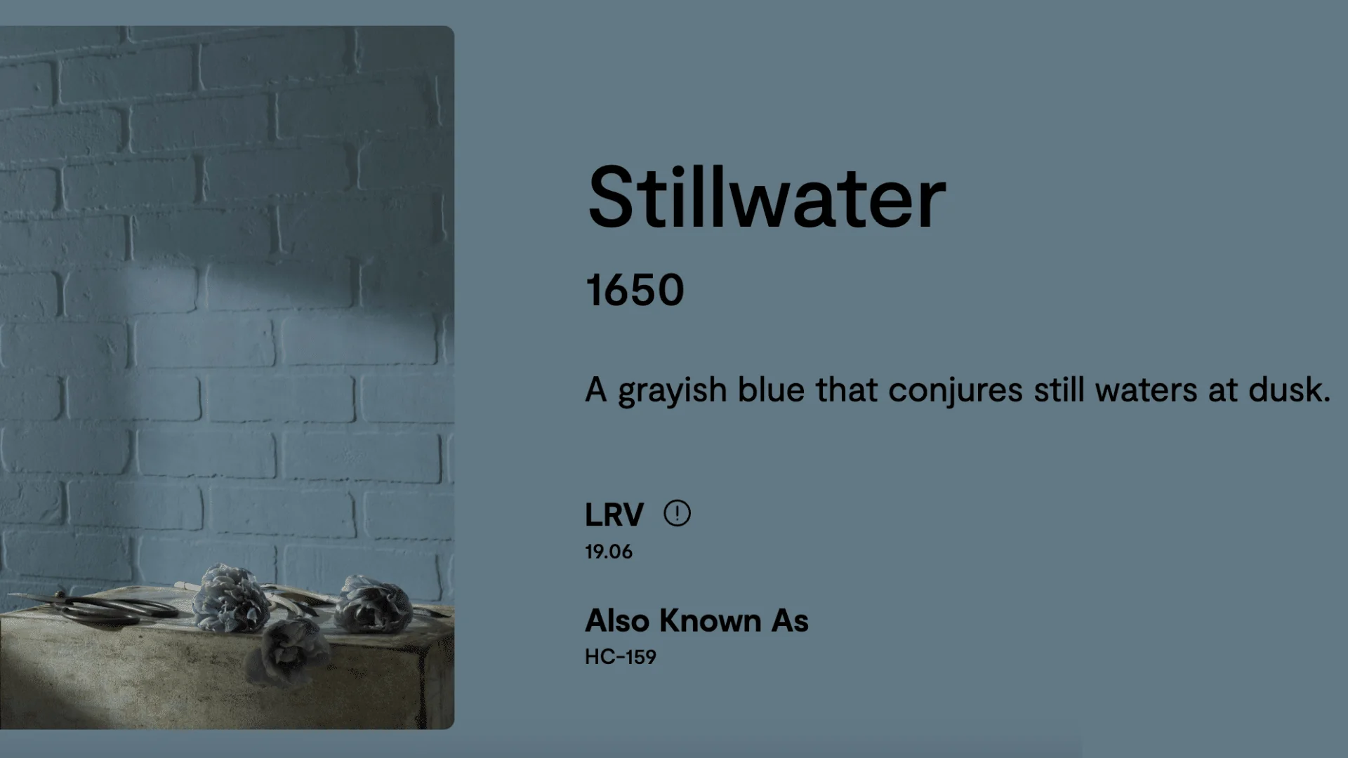
If you’re considering Stillwater for your next project, here’s what you need to know:
- Color Code: 2136-40
- Collection: Color Preview Collection
- Finish Options: Available in matte, eggshell, satin, semigloss, and more
- RGB: Red 142, Green 152, Blue 139
- HEX Code: #8E987D
- Light Reflectance Value (LRV): 37.73 – A medium-dark shade that reflects some light but still feels cozy
- Undertones: Soft gray and green mix
- Sheen Tip: Eggshell or satin works best for a smooth, modern finish
These details help guide you in making the right choice for your space. Stillwater is the perfect blend of calm and character, giving you a beautiful color that’s easy to work with.
Using Stillwater (HC-159) by Benjamin Moore
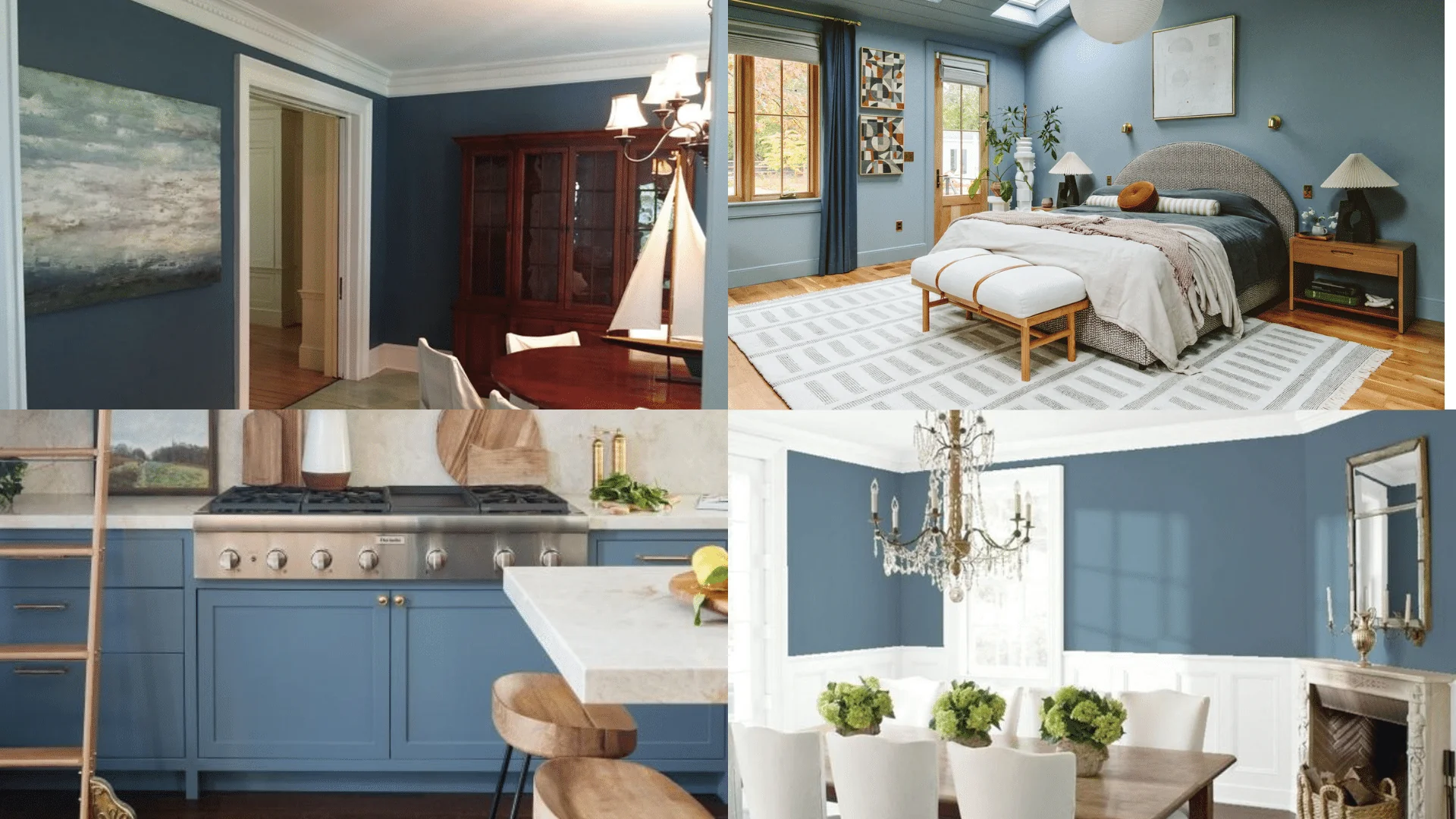
Stillwater is a versatile, soothing color that fits in almost any room. Whether you’re looking to create a relaxed atmosphere or add some color to a neutral space, this shade has you covered.
1. Living Rooms
Stillwater is a fantastic choice for living rooms because it creates a natural, calming atmosphere. The soft green-gray tones blend seamlessly with soft, neutral furniture like beige or light gray sofas, and it pairs beautifully with natural wood elements like coffee tables, bookshelves, and side tables. This balance of color and texture makes the space feel cozy yet elegant, ideal for both relaxing and entertaining.
2. Bedrooms
Stillwater is a soft, muted color that brings a serene, restful feel to the bedroom, making it perfect for creating a sleep-friendly environment. It’s a smooth, relaxing color that promotes relaxation and peace. Use it on the walls and pair it with white or light gray decor, as this combination creates a tranquil and cozy atmosphere.
3. Kitchens
Stillwater is a wonderful choice for kitchens because it adds a fresh, organic vibe without being too bold. You can use it on kitchen cabinets, an island, or even as an accent wall to give the space a calm and grounded feel. When paired with white countertops and stainless steel or brass hardware, Stillwater creates a modern, balanced look that feels both timeless and inviting.
4. Accent Walls
If you’re not ready to commit to painting an entire room, Stillwater makes an excellent accent wall color. It adds visual interest to any room without overwhelming the space. Whether it’s behind a sofa, in the dining area, or in the entryway, Stillwater’s soft yet distinct hue complements natural light and adds a touch of color. This makes it a perfect choice for creating a focal point without taking over the entire room.
5. Hallways and Entryways
Hallways and entryways can often feel narrow or dark, but Stillwater helps brighten and open up these small spaces. Its soft, muted hue reflects light, making even the tiniest hallways feel more inviting and spacious. Pair it with simple decor, like a neutral rug or light fixtures, and you’ll have a welcoming entryway that feels warm and airy. This color also works well with wooden doors or light-colored trim, creating a peaceful and inviting first impression of your home.
6. Bathrooms
Stillwater is a perfect choice for creating a spa-like atmosphere in the bathroom. Its cool yet calming tones create a refreshing vibe that feels clean and relaxed. Whether you use it on the walls, vanities, or even the ceiling, Stillwater pairs beautifully with white tiles, natural wood accents, and soft, neutral towels.
Stillwater is a versatile color that enhances any room with its calming, neutral tone. It’s easy to work with and looks beautiful in any setting.
Coordinating Colors and Design Pairings
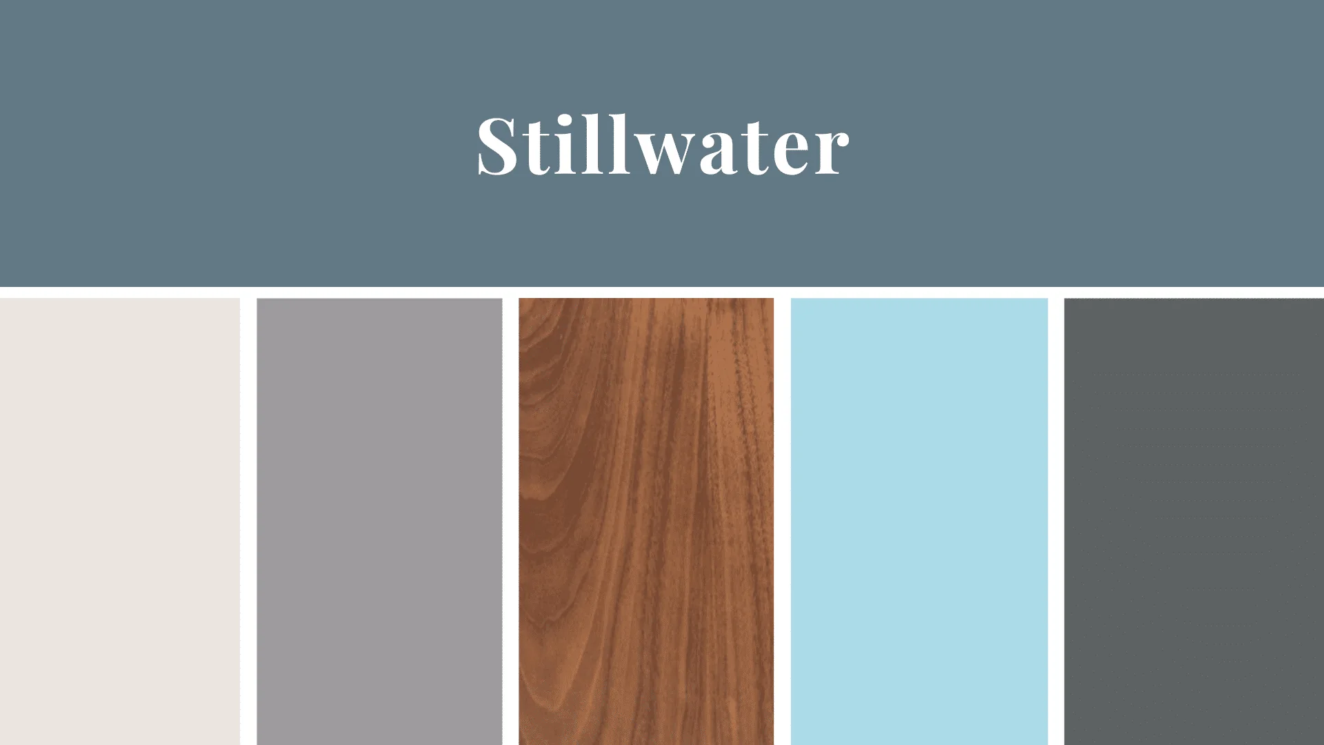
Stillwater is a neutral color with both gray and green undertones, making it easy to pair with a variety of colors and textures.
- Whites and Creams: These light shades are a perfect match for Stillwater. Use them for trim, ceilings, or furniture to create a soft contrast that brightens the space without being too stark.
- Warm Neutrals: Beige, taupe, or soft greys complement Stillwater’s calming tone. These colors create a cozy, grounded look that adds depth to your room.
- Wood Tones: Natural wood finishes, from light oak to dark walnut, bring warmth and texture to rooms painted in Stillwater. Wooden furniture or floors can help balance the coolness of the green-gray undertones.
- Soft Blues or Greens: If you want to add a bit of contrast, muted blues or sage greens work wonderfully with Stillwater. These colors won’t compete, but they add depth and harmony to the room.
- Gold and Brass Accents: Metallic finishes like gold and brass add a touch of luxury when paired with Stillwater. These accents work well in lighting fixtures, furniture, and decor items.
- Charcoal or Dark Grays: Darker tones like charcoal and slate can help ground Stillwater in a room and create a sophisticated, modern look.
Stillwater pairs beautifully with many other colors and materials, allowing you to create a variety of looks, from fresh and airy to warm and inviting.
How to Incorporate Stillwater (HC-159) Into Your Home Decor
Stillwater by Benjamin Moore is a soft, muted green-gray that brings a calming, natural vibe to any room. If you’re looking to refresh your home with this tranquil hue, here are some simple and stylish ways to incorporate it into your decor.
- Use it on Walls: Stillwater works beautifully on walls, whether you’re painting an entire room or just one accent wall. It creates a peaceful backdrop that pairs well with various styles, from modern to farmhouse.
- Incorporate Stillwater in Furniture: If you’re not ready to paint your walls, try using Stillwater on furniture like cabinets, bookshelves, or side tables. It gives pieces a soft, earthy look that complements any space.
- Pair with Natural Elements: Stillwater pairs perfectly with natural materials such as wood, stone, and plants. Consider adding wooden furniture, stone countertops, or a few houseplants to bring out the organic feel of this color.
- Layer with Neutrals: Stillwater works well with neutrals like whites, grays, and beige. These colors create a balanced and cohesive look, allowing Stillwater to shine without overpowering the room.
- Accent with Metallics: To add a touch of elegance, pair Stillwater with gold, brass, or copper accents. These warm metals create a sophisticated contrast with Stillwater’s cool undertones.
- Add Soft Textures: Soft textiles, such as cozy throws, pillows, and rugs, can enhance the comfort and warmth of a room painted in Stillwater. Look for natural fabrics like linen or cotton to complement the calming tone of the color.
- Create Focal Points: Use Stillwater as an accent color in specific areas of a room to create focal points. For example, a Stillwater-painted wall behind a sofa or bed draws attention and adds depth without overwhelming the space.
Stillwater is a versatile and calming color that can enhance any room in your home. Whether you use it on your walls, furniture, or in accents, it brings a fresh and peaceful atmosphere to your space. By pairing it with natural elements, neutrals, and soft textures, you can easily create a harmonious and inviting environment.
Comparing Stillwater (HC-159) by Benjamin Moore with Similar Shades
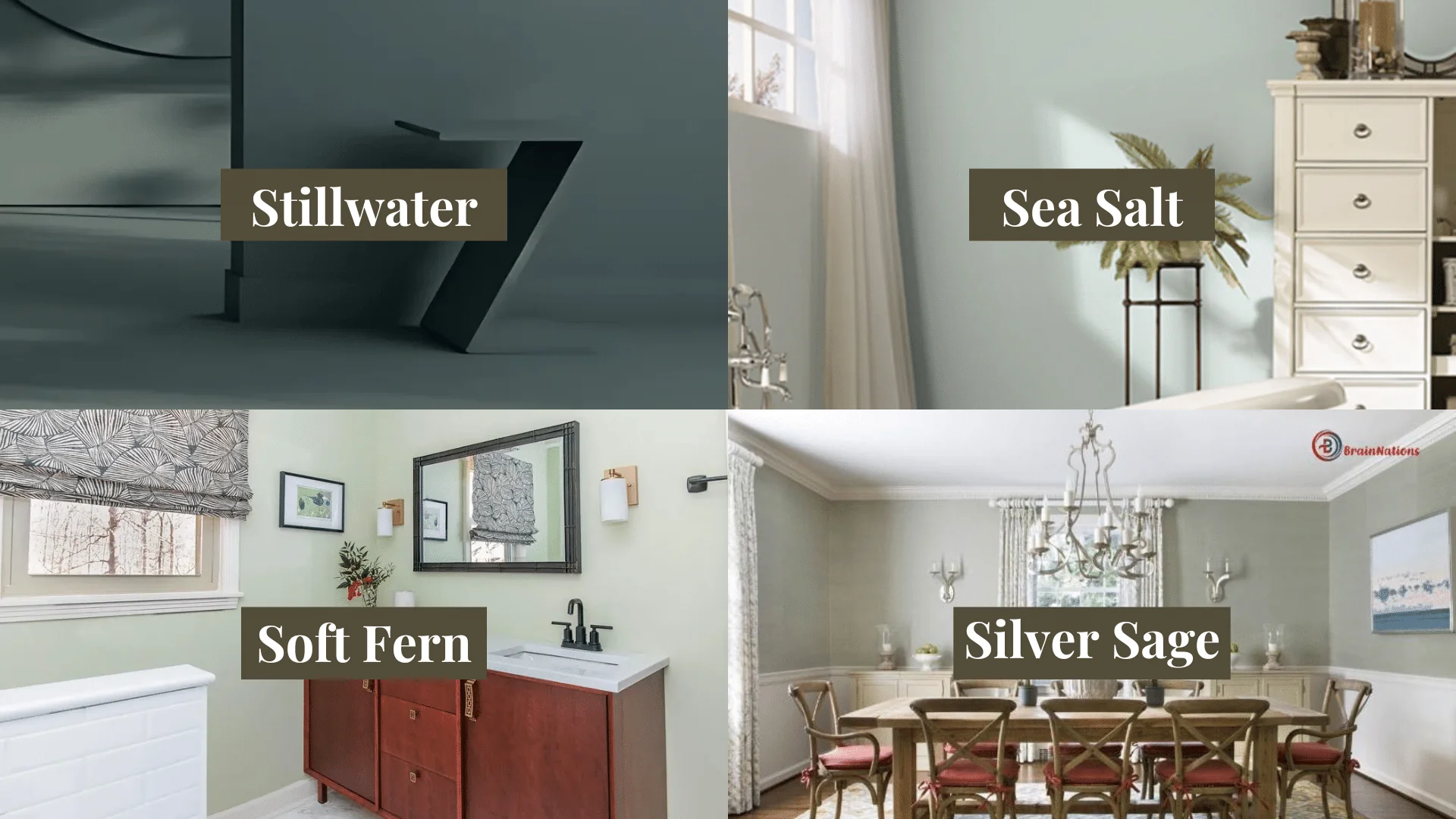
There are other soft, muted greens out there, so let’s see how Stillwater compares to a few similar shades.
1. Stillwater vs. Sea Salt
Sea Salt by Benjamin Moore is a light, watery green with strong blue undertones. It has a more airy, refreshing feel, making it brighter and more vivid in a room. Stillwater, on the other hand, is a more neutral color, blending green and gray. This gives it a warmer, grounded tone compared to Sea Salt.
While Sea Salt brings a cool, crisp look to spaces, Stillwater feels more balanced and earthy. Stillwater’s depth gives it a more subdued and sophisticated feel, making it a great choice for spaces where you want a serene but more refined color.
2. Stillwater vs. Soft Fern
Soft Fern is a softer, lighter green with a more pastel-like quality. It’s very light and airy, with a subtle freshness that works in spaces where you want a lighter, more delicate touch. In contrast, Stillwater is a bit darker and earthier, giving it more presence in a room.
While Soft Fern feels fresh and subtle, Stillwater has a stronger, richer quality, thanks to its combination of green and gray. It’s a bit more robust without feeling overpowering, making it a great choice for larger spaces or areas where you want the color to add depth and character.
3. Stillwater vs. Silver Sage
Silver Sage by Benjamin Moore is often seen as a close cousin to Stillwater, with a very similar muted look. However, Silver Sage has more blue undertones, which gives it a cooler and more modern vibe. Stillwater, on the other hand, is more neutral, with a warmer gray base, making it feel cozier and more natural.
Silver Sage can feel a bit more sleek and contemporary, while Stillwater brings a richer, earthier feel to a room. Stillwater’s balanced tone makes it more versatile, allowing it to work seamlessly in both traditional and modern spaces, while Silver Sage is often better suited for a more contemporary design.
Overall, Stillwater is slightly more versatile and grounded compared to these other shades, making it a go-to color for creating a calm, stylish atmosphere in any room.
Reviews of Stillwater (HC-159) by Benjamin Moore
People who use Stillwater in their homes rave about how calm and serene it makes their rooms feel. It’s the perfect soft green for creating a peaceful atmosphere without feeling too bold or bright. Many homeowners love it in bedrooms, living rooms, and bathrooms because of how it creates a sense of relaxation.
Reviewers often mention that Stillwater looks different in various lighting conditions. In bright light, it has a cool, fresh look, while in softer light, it feels warmer and more muted. This ability to shift slightly with the light makes it a dynamic and interesting color.
Overall, Stillwater has received positive feedback for its versatility, warmth, and calming effect. It’s a color that works in a variety of spaces and with different design styles. Many people are happy with how it transforms their rooms, making them feel comfortable and inviting.
Conclusion
Stillwater by Benjamin Moore is a beautiful, calming color that works well in any room of your home. Its perfect blend of green and gray brings a peaceful, earthy feel to your space.
It’s versatile and easy to pair with other colors, whether you want a soft neutral palette or something with a bit more contrast.
Stillwater pairs beautifully with whites, wood tones, soft blues, and metallics like gold and brass. It creates a relaxed, welcoming atmosphere that feels natural and refreshing. Whether you’re using it in the bedroom, kitchen, bathroom, or living room, Stillwater adds a sense of tranquility to your space.
If you’re looking for a muted, soft color that brings warmth and balance, Stillwater is a fantastic choice. Its ability to adapt to different lighting and decor styles makes it a timeless and dependable option for any home.