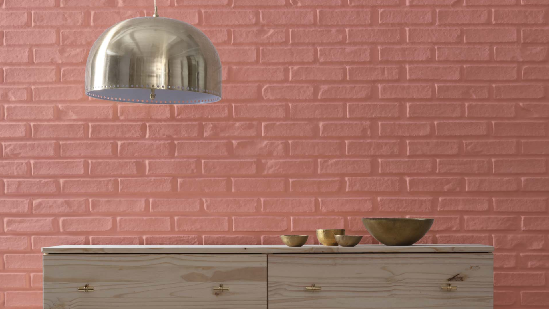
Benjamin Moore Red River Clay (2091-40) is a warm, earthy red that brings a cozy and natural feel to any room. It reminds me of clay soil, red rock, and quiet autumn days.
This color feels rich, bold, and grounded. It adds personality to a space without being too bright or loud.
I like how it works in so many different rooms – living rooms, bedrooms, dining areas, and even hallways. It pairs well with wood, soft neutrals, and warm metals like gold or copper. You can use it as an accent color or paint a whole room with it.
In this blog, I’ll show you why Red River Clay is such a great choice. I’ll talk about how it looks, where it works best, and how to use it in your home.
If you want a color that feels warm and timeless, keep reading. This one might be just right for you.
What Kind of Color Is Benjamin Moore Red River Clay (2091-40)?

Benjamin Moore Red River Clay is a medium-to-dark red with strong earthy brown undertones. It’s warm, bold, and full of natural character.
The color is like a reminder of red rock canyons, clay pottery, or rich soil. It has that timeless, down-to-earth feel that works beautifully in homes of all kinds.
Red River Clay feels strong and cozy at the same time. It adds depth to a room without making it feel too dark. It’s the kind of color that pulls you in and makes a space feel grounded and full of warmth.
With an LRV of 22.99%, Red River Clay reflects some light but also brings a rich, cozy feel. It’s not too dark, but it adds enough depth to give a room a bold presence.
In well-lit rooms, it glows warmly. In darker spaces, it feels deep and soothing.
Red River Clay: A Versatile Color for Any Room

One of the best things about Red River Clay is how versatile it is. You can use it in many rooms and styles. It brings warmth and interest without being too flashy.
Living Room
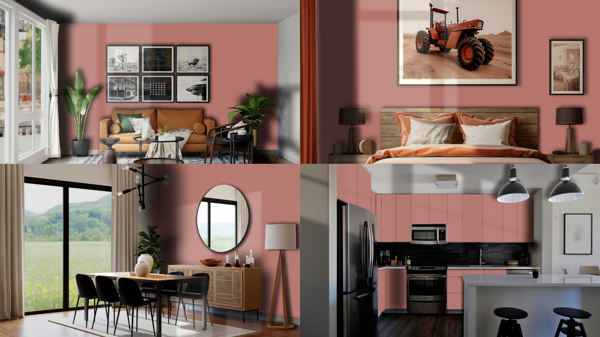
Red River Clay is perfect for a cozy, stylish living room. It creates a warm space where people want to relax and gather. You can use it on all the walls or just as an accent wall.
It pairs well with wood furniture, neutral sofas, and soft textures like rugs and throw blankets.
Bedroom
In the bedroom, I find that Red River Clay brings a sense of calm and comfort. It feels cozy and restful—almost like being wrapped in a soft blanket.
I like to pair it with cream bedding, soft lighting, and wood accents to create a warm, peaceful retreat. The earthy tone also works beautifully with woven textures, giving the space a grounded, natural feel.
Dining Room
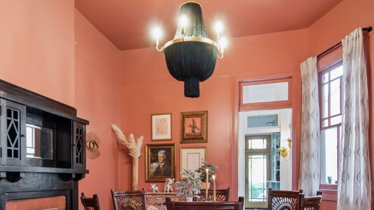
This color really shines in a dining room. It adds richness and depth, creating a great space for hosting and enjoying meals.
Red River Clay makes the room feel warm and inviting, especially when paired with candlelight or gold accents. Its welcoming vibe encourages slow dining and meaningful conversations.
Entryway or Hallway
For an entryway or hallway, Red River Clay makes a bold but welcoming statement. It gives character to small or narrow spaces and creates a warm first impression.
Add light trim or artwork for balance. It’s an easy way to introduce color while still keeping the look sophisticated.
How to Use Red River Clay in Small Spaces
You don’t need a big room to enjoy Red River Clay. It can work well in small spaces, too—just with a bit of balance.
1. Accent Walls: An accent wall is a great way to enjoy this rich color without overwhelming the space. Try it behind a bed, sofa, or fireplace. It draws the eye and adds depth but still leaves the room feeling open.
2. Powder Rooms or Hallways: Smaller spaces like powder rooms or narrow halls are great for trying bolder colors. Red River Clay gives these often-overlooked areas a stylish and cozy upgrade. Add light-colored decor or trim to keep things feeling open.
How to Pair Red River Clay with Other Colors

Pairing Red River Clay with the right colors helps it shine and feel balanced.
Neutral Colors: Neutral shades like warm white, cream, taupe, beige, and light gray help tone down the boldness of Red River Clay. These colors provide balance and keep the space feeling fresh and open. \
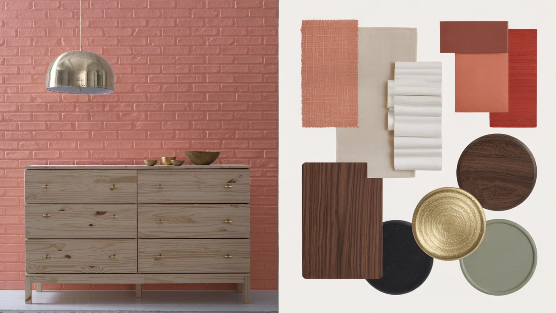
Warm Accents: Red River Clay looks amazing with other warm tones like rust, terracotta, mustard yellow, gold, and copper. These combinations create a rich, layered look that feels inviting and full of character.
Cool Contrast: For a balanced, calming contrast, add cool tones like sage green, navy blue, or dusty teal. These colors soften the warmth of Red River Clay and give your space a peaceful feel. You can use them in furniture, pillows, or nearby rooms.
Black, White, and Metals: Crisp white and deep black give Red River Clay a clean, modern edge. Gold, brass, or bronze metal accents add a warm glow and a touch of elegance. These finishes work well in light fixtures, mirrors, or cabinet hardware.
What Style Works Well With This Color?
Red River Clay fits into many home styles, thanks to its natural, earthy look. Here are a few things I believe it works especially well with:
- Rustic/Farmhouse: It pairs beautifully with raw wood, natural fabrics, and cozy textures.
- Traditional: Adds richness to classic spaces with detailed trim, antique furniture, and warm lighting.
- Southwestern or Boho: Complements woven fabrics, plants, terracotta pots, and global patterns.
- Modern/Industrial: Looks bold and sophisticated with black metal, clean lines, and neutral backgrounds.
- Eclectic: Fits right in with layered textures, bold art, and vintage finds.
This color adapts easily while always adding warmth and charm.
Is It a Warm or Cool Color?

Red River Clay is a warm color, and it shows. The red and brown undertones give it a cozy, welcoming feel. It’s the kind of color that brings people together and makes a space feel full of life.
Warm colors like Red River Clay are great for places where you want to feel at home-like the living room, dining room, or bedroom. It works especially well in cooler months but still looks rich and fresh all year long.
This color helps make large spaces feel more inviting and gives small rooms a strong, stylish look.
Color Characteristics Table
| Color Name | Red River Clay |
|---|---|
| Color Code | 2091-40 |
| Hex Code | #A9504D |
| RGB | 169, 80, 77 |
| Undertones | Red and Brown |
| Mood/Effect | Warm, Cozy, Grounded |
| Best Rooms | Living Room, Bedroom, Dining Room, Entryway |
| Style Fit | Rustic, Traditional, Modern, Boho, Eclectic |
| Light Reflectance (LRV) | 22.99% |
How to Test This Color in Your Space
Before you paint the whole room, it’s smart to test Red River Clay in your space.
- Get a Sample: Buy a sample pot of Red River Clay from Benjamin Moore.
- Paint Swatches: Try it on different walls, near windows and corners.
- Watch the Light: See how it looks in morning light, afternoon light, and at night.
- Check Decor: Look at the color next to your furniture, floors, and trim.
This helps you see how the color really looks in your home before making a final decision.
What Paint Finish Should You Choose?
The right paint finish helps Red River Clay look its best. Here’s a simple guide:
- Flat/Matte Finish: Great for bedrooms and walls where you want a soft, non-shiny look.
- Eggshell/Satin Finish: Best for living rooms and dining areas. It’s smooth and easy to clean.
- Semi-Gloss/Gloss Finish: Use this for trim, doors, or cabinets. It adds shine and resists wear.
Common Mistakes to Avoid
Using a rich color like Red River Clay is easy, but here are a few things to watch out for:
1. Using It in a Dark Room Without Contrast: It can feel heavy without enough light or lighter accents. Use soft white trim or light furniture to keep balance.
2. Going Too Bold in Every Room: Red River Clay is strong—start with one or two rooms before spreading it throughout the house.
3. Forgetting to Test the Color: Always test paint in your actual space. Lighting and surrounding colors make a big difference.
Why Do People Like Benjamin Moore Red River Clay?
Red River Clay is loved for many reasons:
- It feels warm and welcoming.
- It adds personality without being too bright.
- It works in many different styles and rooms.
- It’s rich, earthy, and timeless.
This is the kind of color that makes your home feel special. It’s bold but still feels calm and easy to live with.
Is Benjamin Moore Red River Clay Right For Your Home?
Benjamin Moore Red River Clay is a strong, warm color that works well in homes that need a little more depth, comfort, or personality.
If my space feels plain or cold, I like using this earthy red to add warmth and make it feel more inviting. It’s bold without being too bright, so it stands out but still feels easy to live with every day.
This color is a great fit if you enjoy rich tones, natural materials, and a cozy feel. It looks beautiful with wood furniture, neutral walls, and soft lighting.
However, if you prefer very light or cool-toned spaces, this might not be the best choice. It’s always a good idea to test it in your space first.
Try a sample on your wall and see how it looks with your light and decor. It may be just the color you’ve been looking for.

