")
Choosing the right gray paint can be tricky. Some shades feel too cold, while others disappear into the background. But Benjamin Moore’s Chelsea Grey hits a nice balance.
It’s a medium-dark gray with warm undertones that makes a space feel grounded without feeling heavy. This color has just enough richness to stand out, yet it’s soft enough to feel calm and easy on the eyes.
I’ve seen how well Chelsea Grey works in all kinds of spaces—bedrooms, kitchens, even exteriors. It pairs beautifully with wood tones, white trim, and natural textures. Whether you use it on walls or cabinets, it gives a clean, steady look without being too bold.
In this blog, I’ll talk all about Chelsea Grey’s undertones, lighting effects, best uses, and color pairings to help you decide if it’s the right choice for your home.
Why Chelsea Grey Is the Perfect Choice for Your Space?
Chelsea Grey brings a bold yet calm look that suits many homes. It has a steady tone that gives walls and cabinets a strong finish without feeling too dark.
This color works well in both small and large rooms, helping to create a clear and clean base. People often choose Chelsea Grey because it:
- Has a warm base that adds comfort and depth
- Works with both modern and classic design styles
- Balances well with soft whites, wood tones, and black accents
- Holds up in different types of lighting
- Feels strong without being too heavy
Chelsea Grey gives you a color that adds weight to a room in the best way. It helps bring the space together while still letting furniture and decor stand out.
The Undertones of Chelsea Grey
Chelsea Grey has warm brown undertones that give it a steady and rich feel. These undertones soften the gray, so it doesn’t look too cold or flat. Instead, it brings a quiet strength to the space.
In brighter light, the brown warmth becomes more visible. This helps the color feel settled, even when the room is filled with natural light. It can also work well next to wood, stone, or soft whites.
In low light, the color deepens, and the brown tones give it a grounded look. This makes Chelsea Grey a solid choice for both bright and darker spaces.
Chelsea Grey LRV: Light Reflectance Value Explained
Chelsea Grey has an LRV of 23.33, indicating that it reflects a relatively small amount of light. It falls within the deeper range of grays, giving rooms a more closed-in and settled look.
This makes it helpful in large or bright spaces that need some balance.
Since it doesn’t reflect much light, it can make small or dark rooms feel even smaller if not used carefully. That’s why it’s often paired with white trim or light flooring to keep things from feeling heavy.
When used well, its low LRV brings depth and focus. It gives a space a sense of strength without taking over.
The Psychology of Chelsea Grey: How It Affects Your Mood
Chelsea Grey creates a space that feels steady and firm. The deeper tone gives the room a sense of quiet and control. It’s a color that helps people feel calm and grounded.
Its warm base also adds comfort, which keeps the color from feeling cold or distant. That balance makes it easier to relax or focus in a space painted with Chelsea Grey.
Due to its calming effect, this color is often used in rooms where people seek tranquility. Bedrooms, offices, or reading corners all benefit from its quiet tone.
How Does Chelsea Grey Look in Different Lighting?
Chelsea Grey shifts depending on the direction of the light. In north-facing rooms, the light is cooler, which can make the gray look more muted. Still, the brown undertones help stop it from feeling too cool or dull.
In south-facing rooms, there is more sunlight, so the warmth in the color comes to the forefront. It may appear a bit softer and richer during the day, which helps the room feel more cohesive.
In east- and west-facing rooms, the light changes during the day. Morning light makes the color feel brighter and softer, while evening light deepens it slightly.
These shifts give Chelsea Grey a steady appearance that remains natural throughout the day.
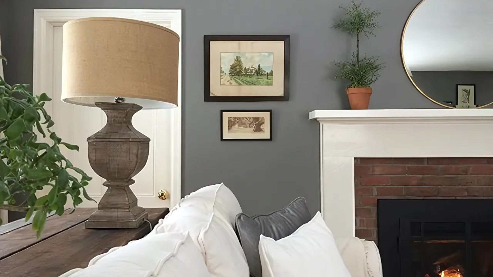
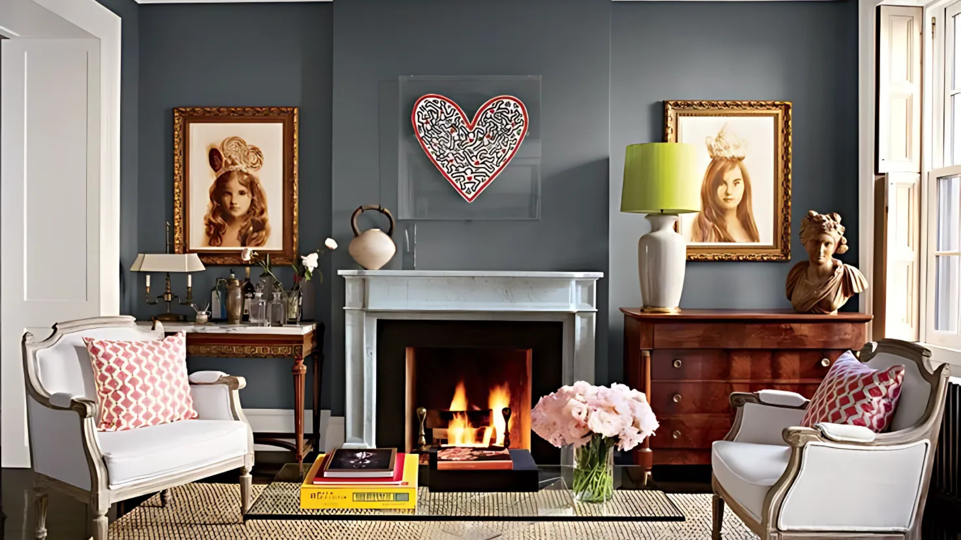
Where Is Chelsea Grey Best Used in An Interior?
Chelsea Grey is a strong, dependable paint color that works well in many parts of the home. It has a rich, warm tone that gives shape and balance to a space without feeling too bold.
One of my favorite ways to use Chelsea Grey is on kitchen cabinets. Paired with white countertops and warm metal hardware, it creates a clean and timeless look.
It also looks beautiful as an accent wall in a living or dining room, where it adds interest without taking over the space. For built-in shelves or around a fireplace, this color gives contrast and makes the details stand out.
Chelsea Grey also works well in bathrooms. A vanity painted in this shade helps ground the room and balances bright tile or white walls.
In entryways or hallways, it adds just the right amount of drama to set the tone for the rest of the home. Even trim and doors painted in Chelsea Grey can give a soft, stylish contrast against lighter walls.
Overall, this color is perfect for spots that need a little extra weight or warmth. It shines in places where clean lines, soft whites, and natural finishes come together to create a welcoming and well-designed space.
What Kind of Floors Would Look Best with Chelsea Grey?
Choosing the right floor can help Chelsea Grey shine. Since this gray has warmth and depth, it pairs best with floors that can match that feel without clashing. The goal is to maintain a balanced space.
Flooring that works well with Chelsea Grey includes:
- Warm oak or walnut for a deep, steady look
- Medium-toned wood to match the paint’s strength
- Light gray wood for a soft contrast
- Natural stone in soft beige or cream
- Black tile for a bold, clean match
- Textured carpet in tan, gray, or warm white
These options help keep the space grounded. They bring out the warmth of the colors while still letting the room feel clean and finished.
How to Incorporate Chelsea Grey Into Your Home Decor?
Chelsea Grey works well as both a main color and an accent. It gives furniture and walls a steady, finished look. You can use it to build a space that feels calm and strong at the same time.
Try pairing it with light or medium wood tones for a contrasting effect. Oak, walnut, and ash bring out the warmth in the color. For a softer look, consider using white or cream-colored furniture to brighten the room and maintain balance.
Accent pieces, such as matte black or brushed metal fixtures, pair well with Chelsea Grey. You can also add soft items, such as throw pillows or rugs, in muted earth tones, deep greens, or soft blues.
Natural textures such as rattan, stone, or linen help add depth without pulling focus. Keep the lighting warm so the color doesn’t feel too dark. With the right mix of pieces, Chelsea Grey helps create a space that feels settled and complete.
Chelsea Grey vs. Other Warm Grays
Chelsea Grey is often compared to other warm grays like Kendall Charcoal and Amherst Gray. While they all sit in the same family, each color brings a slightly different weight and warmth to a room. The best choice depends on how much depth you want and how much light the room gets.
| Feature | Chelsea Grey (HC-168) | Kendall Charcoal (HC-166) | Amherst Gray (HC-167) |
|---|---|---|---|
| Undertone | Warm brown | Deep warm brown/green | Warm with a slight green base |
| Depth | Medium-dark | Dark | Medium |
| LRV | 23.33 | 14.61 | 18.8 |
| Best Use | Walls, cabinets, built-ins | Accent walls, exteriors | Interior walls, trim |
| Lighting Reaction | Holds tone in most lights | It can look darker in low light | Softens in natural light |
Chelsea Grey offers a middle-ground feel. It’s deeper than Amherst Gray but lighter than Kendall Charcoal. That makes it a strong pick when you want something bold without going too dark.
Conclusion
Chelsea Grey is a paint color that brings balance, depth, and a steady look to any room. Its warm undertones keep it from feeling too cold, while the medium-dark base gives it structure.
It works well in spaces where you want a strong background that doesn’t take over the room.
This shade looks good in many lighting setups and matches with wood, metal, and soft colors. From kitchen cabinets to bedroom walls, it helps tie the space together without looking flat or heavy.
It’s a reliable choice for individuals who prefer a gray that feels complete without being too sharp. It offers the perfect blend of strength and calm, making it easy to incorporate into your space.
Chelsea Grey holds its own without being loud. If you’re looking for a gray that feels grounded and clean, this one is worth considering.
Frequently Asked Questions
Can Chelsea Grey Be Used on Interior Doors or Trim?
Yes, Chelsea Grey works well on doors and trim, especially when paired with lighter wall colors. It adds contrast and a clean edge.
Is Chelsea Grey a Good Option for Kitchen Islands?
Chelsea Grey is a strong choice for kitchen islands. It adds depth without being too bold and pairs nicely with white or light countertops.
How Does Chelsea Grey Look with Brass or Gold Fixtures?
Chelsea Grey pairs well with brass or gold. The warm gray base supports these finishes without clashing, giving the room a balanced look.
Can Chelsea Grey Be Used in Commercial Spaces?
Yes, it can be used in offices or retail settings where a calm, grounded tone is needed. It adds a polished, steady feel to walls or cabinets.