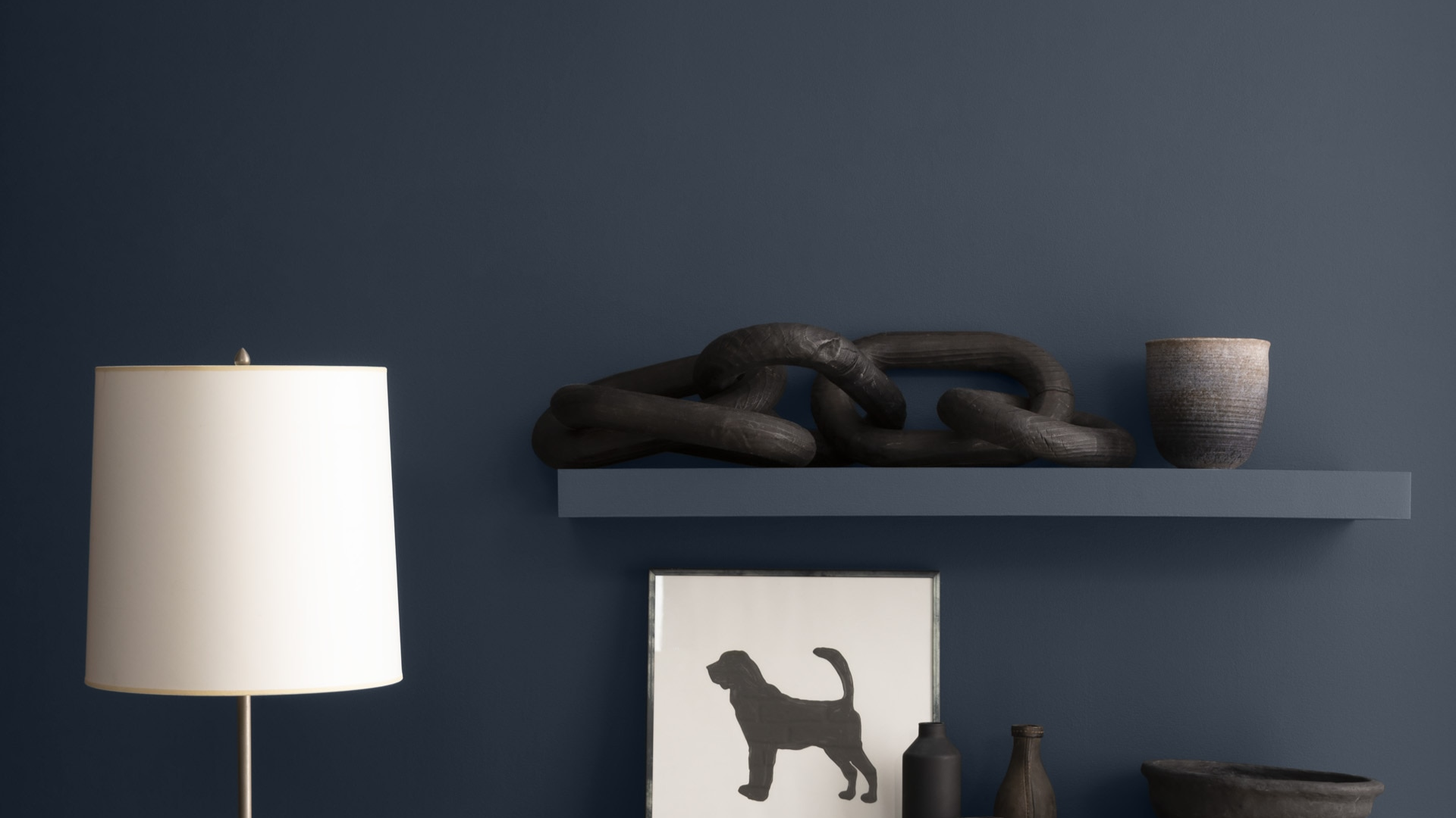
Looking for the perfect navy blue paint for your home? Hale Navy might be your answer.
This deep, rich blue color from Benjamin Moore has won over countless homeowners for good reason.
Hale Navy sits in that sweet spot between too dark and too bright. It works wonderfully in both new builds and older homes, making it a top pick for many painters and designers.
In this honest review, I’ll walk you through everything you need to know about Hale Navy – from its basic traits to how it looks in different rooms and lighting conditions.
You’ll learn:
- What makes this shade different from other blues
- Which rooms work best in
- How to pair it with other colors
- Real-life examples from actual homes
By the end, you’ll know if Hale Navy is the right choice for your next painting project. Let’s get started!
The Rich Undertones of Hale Navy by Benjamin Moore

Hale Navy is not your basic blue. It’s a deep, full-bodied navy that has more going on than meets the eye at first glance.
Look closely and you’ll spot subtle gray hints mixed with soft charcoal tones. These hidden colors give Hale Navy its depth and stop it from looking flat on your walls.
The color has a Light Reflectance Value (LRV) of 8.36. What does that mean for you? It tells us this is a darker shade that doesn’t bounce much light back into the room.
Lighting changes everything with this color. In morning sunlight, you might notice more of the blue coming through.
By afternoon, those gray undertones often take center stage. And when evening comes? The paint can look almost black in dim corners.
I’ve seen Hale Navy look completely different in the same room as the day goes on.
Under bright white bulbs, the blue pops more clearly. Yellow-toned lights, on the other hand, bring out its warmer, muted side.
This is why I always tell my clients to test a sample on different walls. The same can of paint might look like two different colors depending on where you put it!
Do you have a room with changing light throughout the day? Hale Navy might give you a color that keeps things interesting hour by hour.
The Psychology of Hale Navy By Benjamin Moore
Navy blue has a special effect on our minds. Hale Navy brings a sense of calm that you can feel when you walk into a room. It’s like a warm hug at the end of a long day.
I’ve noticed how this color makes spaces feel safe and solid. There’s a good reason why many business suits and school uniforms come in navy – it sends signals of trust and being in control.
When I painted my own study in Hale Navy, it changed how I worked. The walls seemed to help me focus better.
This isn’t just me making things up – color experts agree that deep blues can help quiet busy thoughts.
How does it work in different rooms?
In bedrooms, Hale Navy creates a cocoon-like feeling that can help with sleep. The dark tones tell your brain it’s time to rest.
In kitchens, this color adds weight and makes the space feel more grown-up. Your morning coffee might even taste better surrounded by these stable walls!
Living rooms with Hale Navy walls often become the spot where everyone wants to hang out. The color makes people want to sink into the sofa and stay awhile.
You might find yourself feeling more at ease in a Hale Navy room without even knowing why. That’s the quiet power of this color at work on your mind.
Why Is Hale Navy an Ideal Paint Color for Any Room?
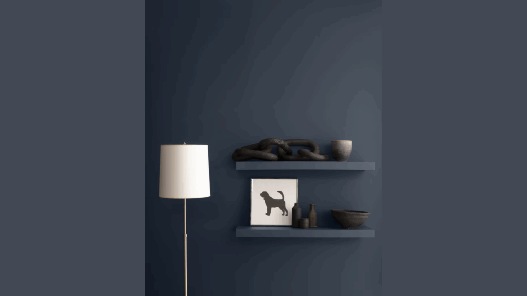
Hale Navy fits into almost any home style without trying too hard. I’ve seen it work just as well in sleek, clean-lined modern spaces as it does in cozy farmhouse settings.
For beach-themed homes, it brings that water feel without being too bright or blue. In more formal, classic rooms, it adds the right touch of class without feeling stuffy.
But what about room size? This is where the Hale Navy really shines. In small rooms, most people think dark colors are a no-no. I disagree!
When you paint a tiny bathroom or office in Hale Navy, the walls seem to fade away. The room feels bigger because the edges aren’t so clear.
For large rooms that feel too open, this color brings things in a bit, making the space feel more cozy and planned.
Here’s my best tip: If you’re scared to go all-in, try using Hale Navy on just one wall.
Behind a bed or sofa, it works great. You can also paint built-in shelves with it to make your books and knick-knacks stand out.
When going for a full room, balance is key. Add light rugs, white trim, or brass lamps to keep the room from feeling too heavy.
I once helped a client who was scared of dark paint. We did just the lower half of her dining room in Hale Navy. Now it’s her favorite spot in the house!
Best Places to Use the Hale Navy in Your Home
I love how Hale Navy brings a rich, deep blue shade that adds character and depth to any room.
I’ve found it works wonderfully whether you use it as the main color or just as a small touch in different spots around your home.
Let me show you where this classic blue can make the biggest impact.
1. Living Room Walls

The living room is where Hale Navy can really show off. I like to use it on the wall where your TV sits. The dark color helps the screen blend in when it’s turned off.
You don’t need to paint every wall, though. One navy wall gives you plenty of impact without making the room too dark.
It works well behind a light-colored sofa where the contrast makes both the wall and your furniture look better.
Have a fireplace? Hale Navy around it draws the eye and makes the area feel extra warm and cozy.
2. Kitchen Cabinets
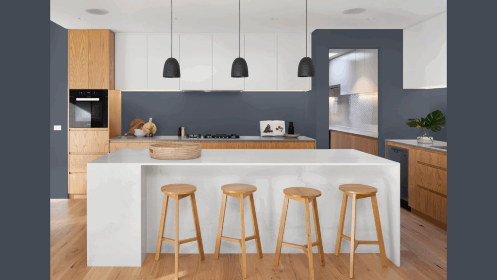
Kitchen cabinets painted in Hale Navy make a huge difference. The color stands up well to daily use and doesn’t show smudges as much as lighter shades.
I often suggest painting just the lower cabinets or the island in this color. The two-tone look keeps things fresh and not too heavy.
Pair these cabinets with white countertops and simple brass pulls, and your kitchen will look like it cost thousands more than it did.
3. Bedroom Retreat

Your bedroom should feel like a hideaway. Hale Navy on the walls creates a sleep-friendly space that feels both snug and grown-up.
In smaller bedrooms, try just the wall behind your headboard. In larger rooms, you can go for all four walls without making the space feel cramped.
The secret is in what else you add. Crisp white bedding pops against navy walls, and warm wood furniture looks rich and planned against this background.
4. Bathroom Wow Factor
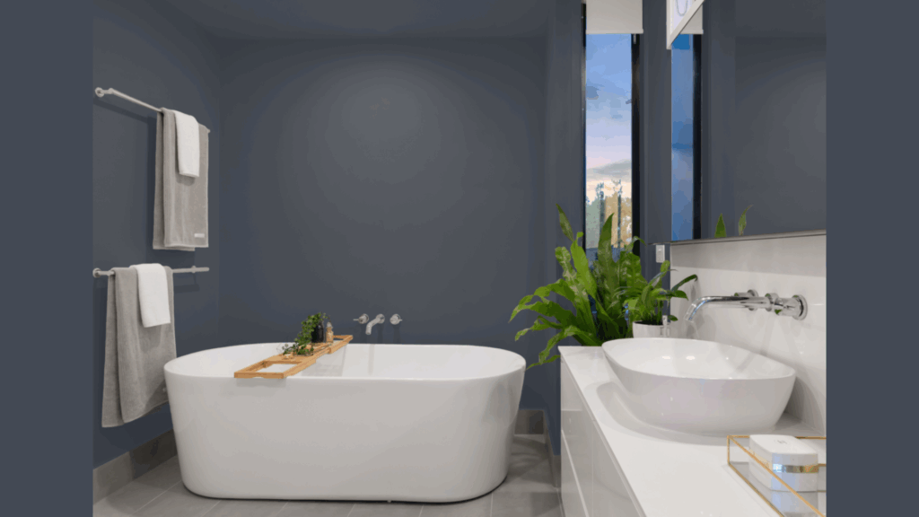
Bathrooms are perfect for bold color choices. A small powder room with Hale Navy walls makes guests say “wow” when they open the door.
In main bathrooms, painting the vanity this color gives you style points without a big commitment.
White sinks and mirrors really stand out against the navy. I painted my own bathroom vanity in Hale Navy three years ago, and it still looks fresh and clean.
Flooring Options that Pair Beautifully with Hale Navy
Finding the right floor to match with Hale Navy walls creates a balanced, put-together look in your home.
The deep blue shade calls for floors that either create contrast or build a smooth color flow. These are some flooring choices that work well with this rich blue tone.
1. Light Wood Floors
Light oak floors next to Hale Navy walls create a stunning mix. The bright wood lifts the dark blue and stops the room from feeling too heavy.
I’ve found that natural, barely finished oak works best. The raw, clean look makes a perfect partner for the rich navy tone. This combo fits in both new and old homes.
When you walk into a room with this pairing, your eyes can rest on either element without one taking over. It’s a balance that feels right without trying too hard.
2. White Tile Choices
White tile with Hale Navy is a classic team-up. Think of sailor outfits or coastal homes – this combo has lasted for good reasons.
In bathrooms, white subway tile or hexagon patterns pop against navy walls or cabinets. The clean lines of white tile keep the space feeling fresh.
For kitchen backsplashes, simple white tile lets navy cabinets be the star while adding a clean backdrop that works for years without going out of style.
What about marble? If your budget allows, white marble with gray veins looks even better with Hale Navy than plain white tile. The gray streaks tie everything together.
3. Carpet and Rug Pairings
Warm-toned rugs help soften Hale Navy’s cool nature. Think rust, tan, or soft coral shades that bring balance to the blue.
I tell my clients to look for rugs with some navy in the pattern, but not as the main color. This ties the floor to the walls without being too “matchy.”
For wall-to-wall carpet, stick with light to mid-tone neutrals. A very light gray or greige carpet gives you comfort underfoot while letting the navy walls shine.
4. Natural Fiber Floor Coverings
Sisal, jute, and seagrass mats bring a rough texture that works magic with smooth navy walls. The mix of rough and smooth, light and dark creates depth.
These natural fibers add warmth to a room with cool-toned walls. Their tan and wheat colors soften the navy’s seriousness. I added a chunky jute rug to my Hale Navy office, and the room instantly felt more lived-in and less formal.
Hale Navy Compared to Other Paints of Benjamin Moore
Hale Navy stands as one of Benjamin Moore’s most liked colors, but how does it stack up against other blues and dark shades in their collection?
Let’s look at the key differences between Hale Navy and similar Benjamin Moore colors to help you make the best choice for your home.
| Paint Color | How It Looks | When To Use It | How It Differs From the Hale Navy |
|---|---|---|---|
| Hale Navy (HC-154) | Deep, rich navy with gray hints | Perfect for rooms where you want depth without darkness | This is our base for comparison – it has an LRV of 8.36 |
| Naval | Brighter, more true-blue navy | Works well in rooms with lots of light | Less gray than Hale Navy, reads as more “blue” even in low light. I find it pops more in sunny rooms. |
| Newburyport Blue | Lighter, more casual blue | Great for beach houses or rooms you want to feel airy | Much lighter than Hale Navy with an LRV around 12. You might prefer this if Hale Navy feels too dark for your space. It has more green in it. |
| Van Deusen Blue | Rich navy with slight purple hints | Wonderful for formal dining rooms or studies | Has a similar depth to Hale Navy but with subtle purple tones instead of gray. In evening light, you’ll notice this difference more. If your room has pink or purple accents, this might work better than Hale Navy. |
Conclusion
Hale Navy has earned its spot as a go-to color for good reasons. It brings warmth and style to any room without showing off too much.
What makes it special is how it changes with light while still staying true to its core. Not many colors can pull that off.
Before you buy gallons, do yourself a favor: get a sample pot. Paint a board or two and move them around your home for a few days. Watch how the color shifts from morning to night.
Is Hale Navy right for you? Only you can answer that.
But if you’re looking for a color that works in almost any setting and won’t go out of style next year, it’s hard to find a better choice.
Taking the plunge with a darker color might feel scary. But with Hale Navy, you’re making a safe bet on a color that’s proven itself in countless homes – maybe yours will be next!

