
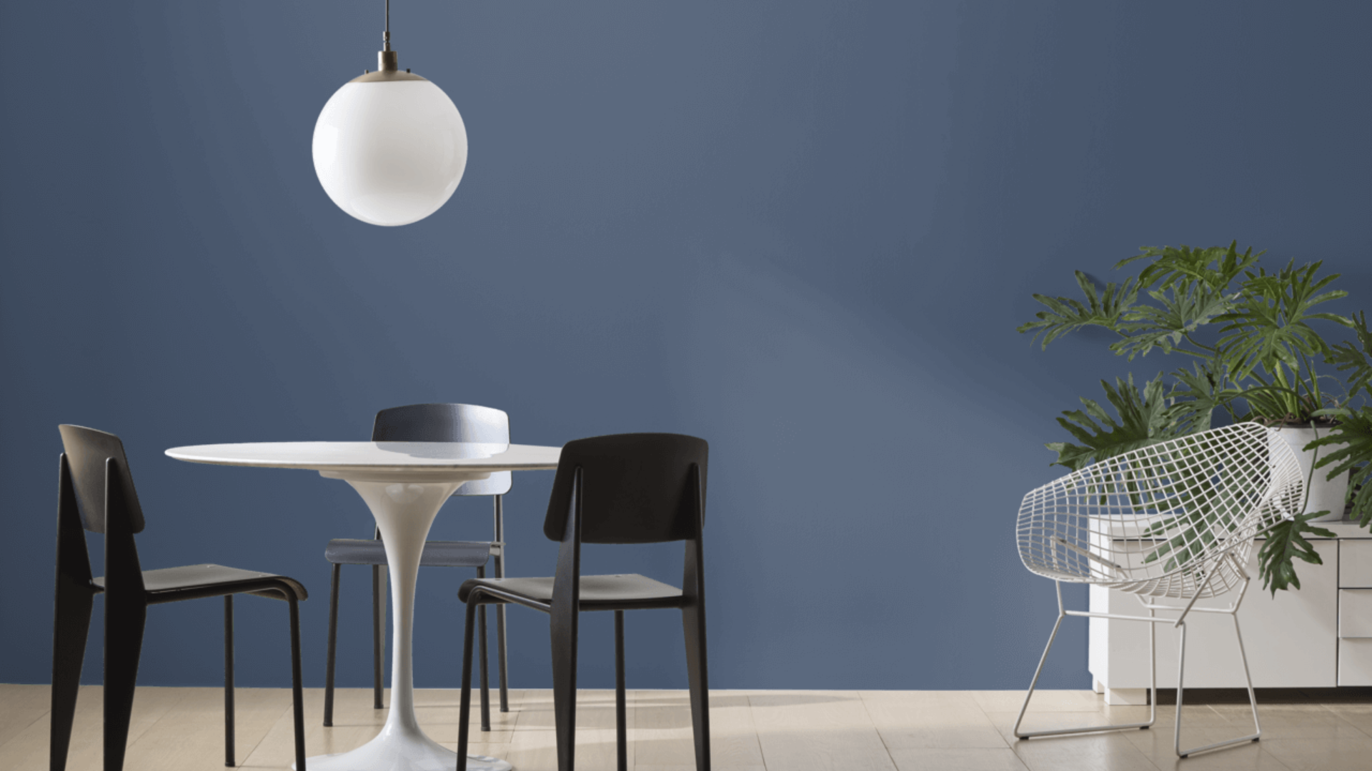
Blue is one of the most popular paint colors for a reason. It’s calm, easy to look at, and works in many spaces. From soft sky blues to deep navy tones, there’s a shade for every style.
Benjamin Moore offers a wide range of blue paints. Their colors are known for being rich, balanced, and easy to live with. Some are light and airy, others bold and dramatic, and many sit somewhere in the middle.
In this post, I’ll explain the different types of blue, the best rooms to use them in, and what colors and finishes pair well with blue. I’ll also compare blue to other Benjamin Moore favorites side-by-side.
If you’re thinking about painting with blue, this guide will help you find the right shade for your space.
Why Benjamin Moore’s Blue Shades Stand Out
Benjamin Moore’s blue shades stand out because they offer balance, variety, and quality. The brand has a wide range of blues, from light and airy to deep and bold.
Each shade has rich undertones that shift slightly in different lighting, giving the color more depth. The finishes are smooth and easy to apply, often needing fewer coats.
Some popular choices include Blue Danube, Palladian Blue, Ocean Air, and Van Deusen Blue. These colors work well in many styles, from modern to traditional, and they tend to stay in style over time.
Whether you want a soft backdrop or a strong statement, there’s likely a Benjamin Moore blue that fits your space.
Top Benjamin Moore Blue Shades to Try
Blue is one of the most flexible colors in home design. Depending on the shade you choose, it can feel soft, bold, cool, or cozy. Benjamin Moore offers many blues that work well in different rooms.
These shades bring depth, drama, and elegance to any room. They are perfect for creating cozy spaces, bold accent walls, or classic styles with a modern twist.
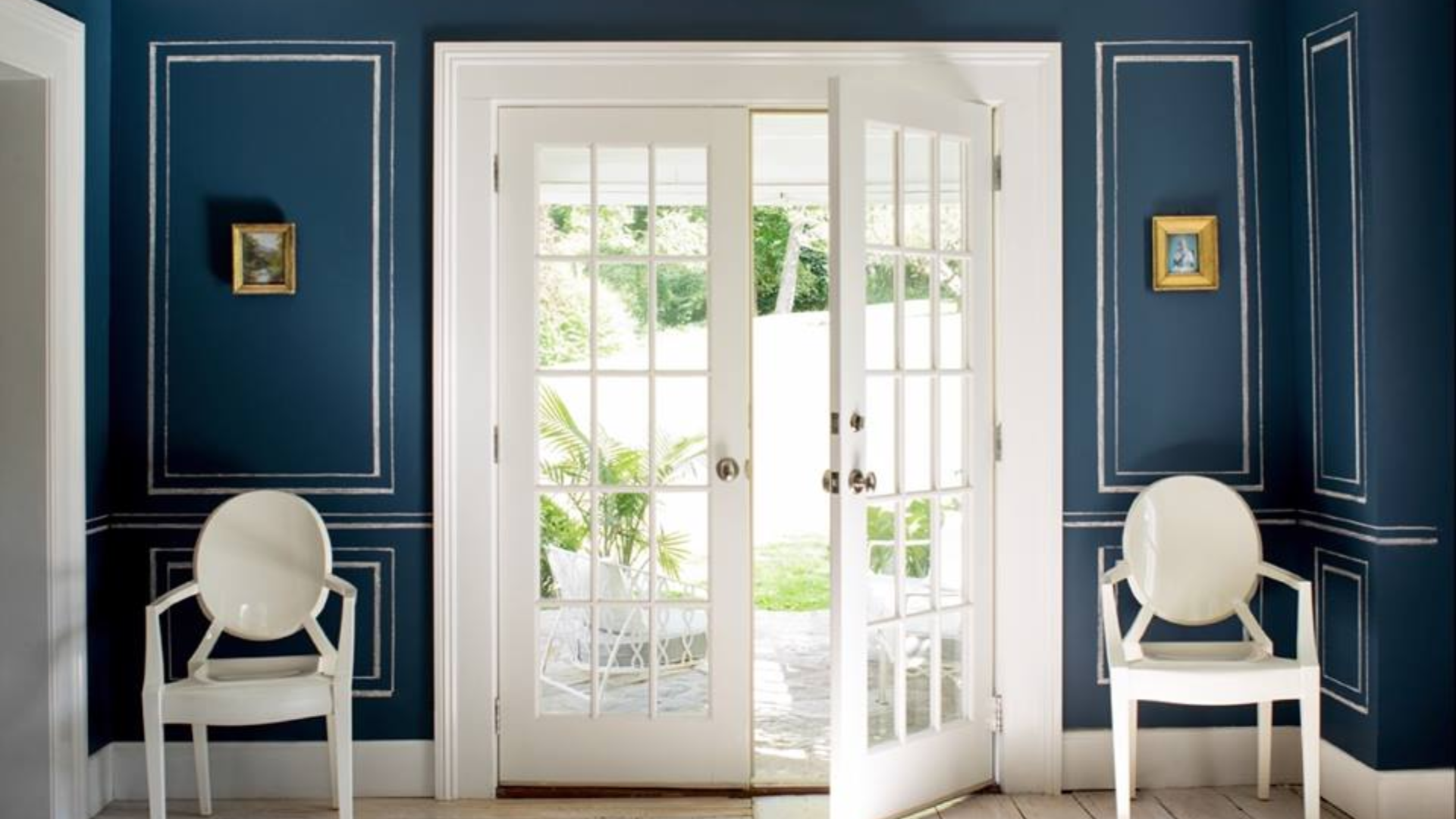
1. Downpour Blue (2063-20)
Downpour Blue is a deep, navy blue with a mix of bold and soft tones. Also known as 794, it feels rich but not too sharp, which makes it easier to use than some darker colors.
This shade has a Light Reflectance Value (LRV) of 7.48, meaning it reflects very little light. I love this shade because it adds strong color and drama to a room.
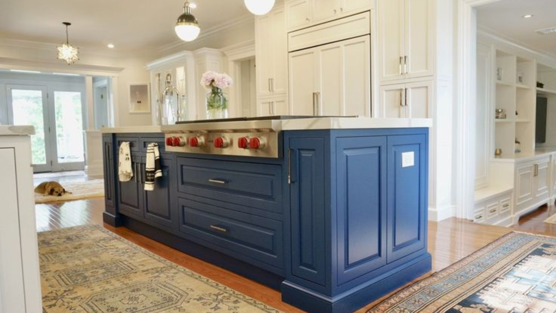
This shade is especially favored for creating a refined and bold look on cabinetry. Whether used in kitchens, bathrooms, or built-in storage units.
Beyond cabinets, Downpour Blue is also popular on accent walls, front doors, and office interiors. Its versatility and confident tone make it a go-to for designers aiming to craft a stylish and memorable look.
2. Blue Danube (2062-30)
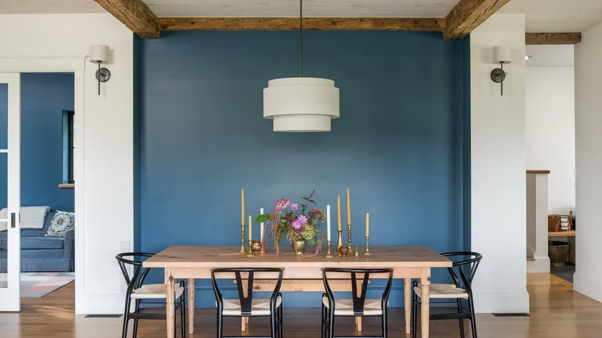
Blue comes in many forms – light, dark, bright, or soft. Its Light Reflectance Value (LRV) is 11.18, so it reflects very little light. This makes it look deep and strong on the walls.
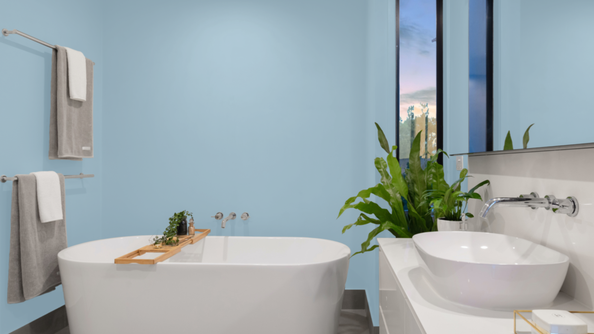
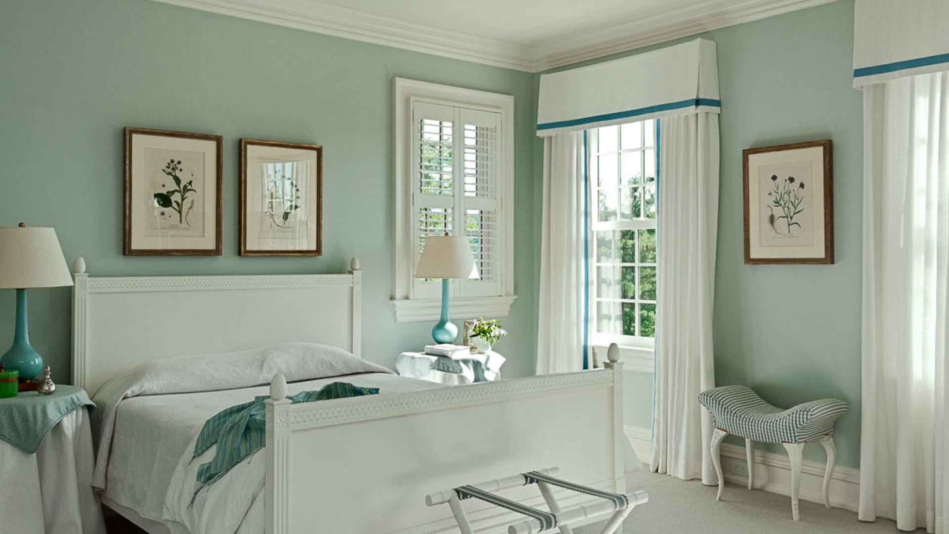
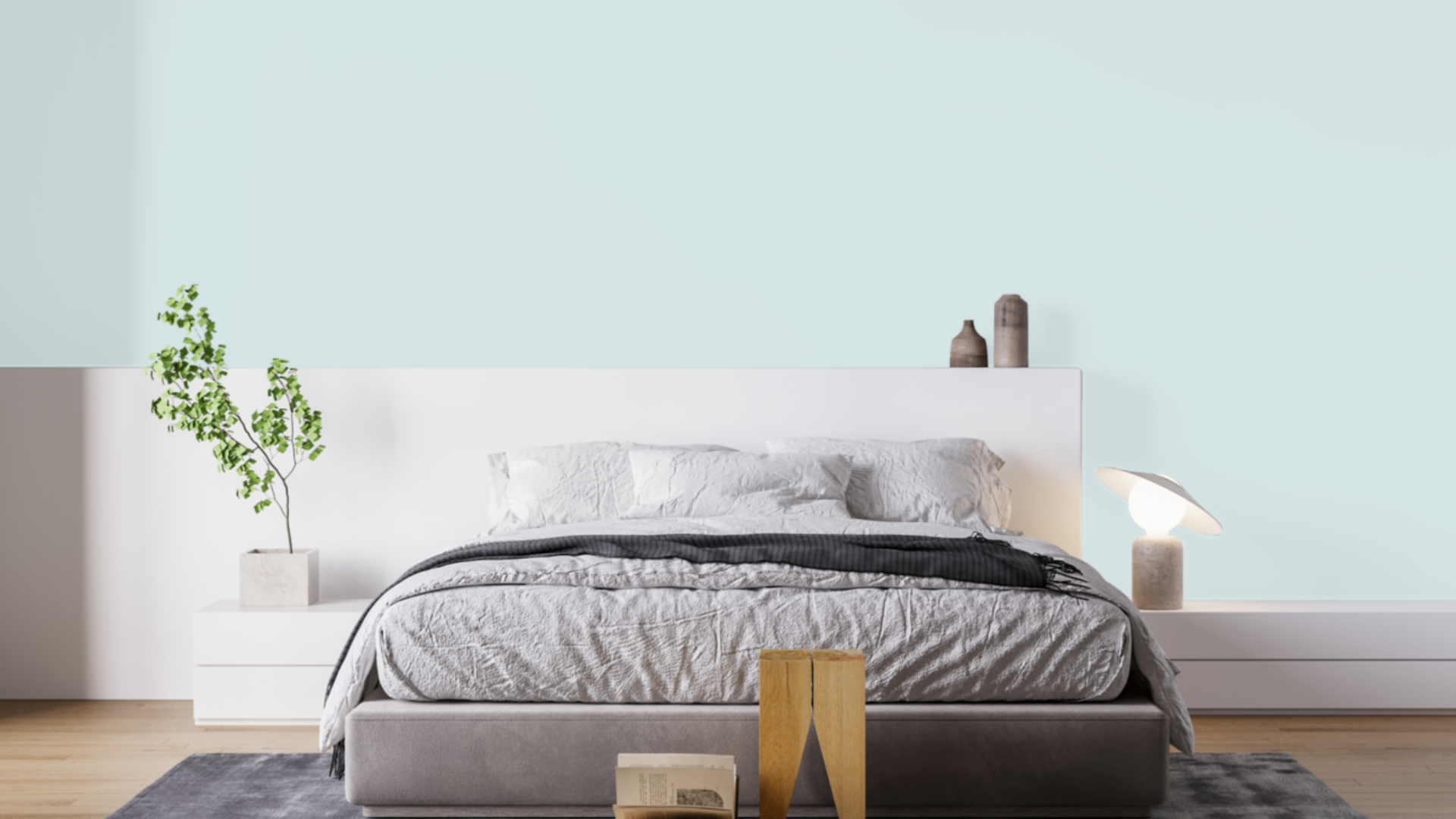
Different shades of blue evoke different moods. Some convey calmness and coolness, ideal for restful areas like bedrooms or reading corners.
Others offer a more intense presence, lending strength and style to living rooms or offices. They’re commonly used on kitchen or bathroom cabinets, feature walls, and even entryways.
Anywhere a touch of confident color is desired without overwhelming the room, these pieces bring balance and visual appeal when styled with light neutrals, wood accents, or metallic finishes.
3. Gentleman’s Gray (2062-20)
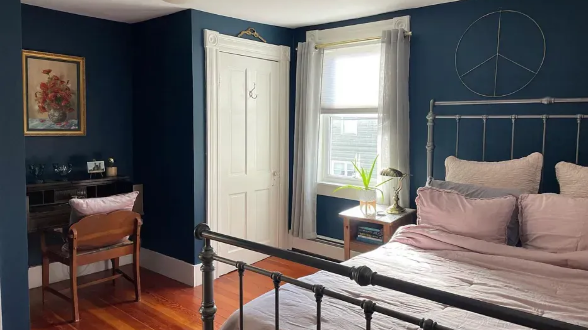
Gentleman’s Gray is a deep, striking color that blends elements of blue, green, and black to create a refined blackened teal. Though it’s a dark shade, it manages to maintain a sense of balance.
With a Light Reflectance Value (LRV) of 7.26, it reflects very little light, making it a strong choice for adding contrast and focus within a room.
It’s among Benjamin Moore’s most popular deep tones, favored for its ability to set a calm, steady atmosphere while also delivering visual interest.
This shade is often used on kitchen and bathroom cabinets, library walls, bedroom accent areas, and even entryway doors and paired with warm wood finishes, brass hardware, or crisp white trims.
4. Hidden Sapphire (CSP-690)
Hidden Sapphire is a deep, intense blue that carries a polished, gem-like character. Its saturated tone brings a dramatic feel to interiors, lending depth and character without overpowering the space.
With a Light Reflectance Value (LRV) of 6.21, it reflects minimal light, making it ideal for settings where a bold visual anchor is desired. This shade offers a composed and confident presence.
Hidden Sapphire is frequently applied to accent walls, cabinetry, interior doors, and even powder rooms or dining areas where a more dramatic ambiance is welcome.
When paired with neutral furnishings, brass accents, or light wood tones, it adds depth and refinement to the space. It performs particularly well in rooms that benefit from natural or layered lighting.
5. Kensington Blue (CC-780)
Kensington Blue (840) is a classic navy that offers a timeless presence. Its depth gives it a strong visual identity, yet it remains smooth and easy to incorporate into everyday spaces.
With a Light Reflectance Value (LRV) of 11.97, this shade reflects little light, contributing to a structured and composed appearance in a room.
Kensington Blue is often used on kitchen cabinets, bathroom vanities, and study or office walls. It also makes a great choice for interior doors, entryways, and focal walls in living areas.
Paired with crisp whites, soft neutrals, or warm metals, it delivers a balanced and polished look across a variety of styles. It works well for those seeking a color that stands out with confidence while maintaining a relaxed, refined feel.
6. Van Deusen Blue (HC-156)
Van Deusen Blue is a strong, well-balanced shade of blue that fits seamlessly into both traditional and modern interiors. Its depth gives it presence, yet it’s not overly dark.
With a Light Reflectance Value (LRV) of 11.97, this color reflects a small amount of light, enough to keep rooms from feeling too enclosed, while still providing noticeable contrast.
It belongs to Benjamin Moore’s Historic Color Collection, and it’s also one of the brand’s top-selling options. It has a crisp tone and a subtle gray undertone that adds versatility and softness.
It’s a popular choice for kitchen cabinets, bathroom vanities, accent walls, and entry doors. When paired with white trim, muted wood tones, or metal finishes, it brings a composed and polished feel to any space.
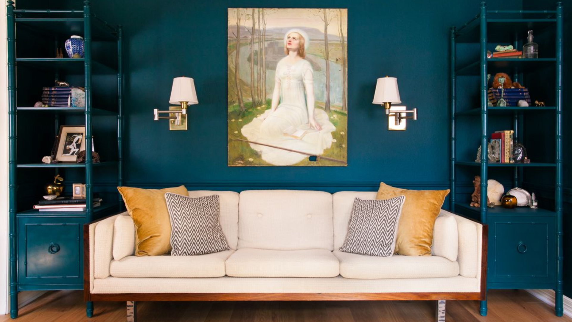
7. Aegean Teal (2136-40)
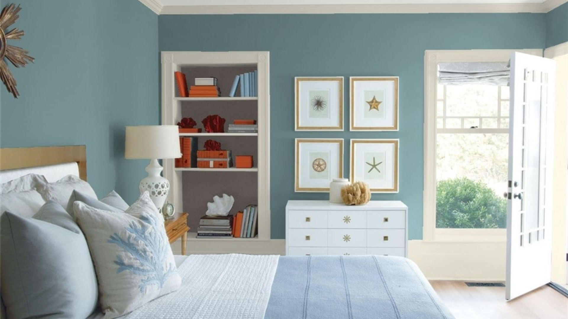
Aegean Teal, one of Benjamin Moore’s best-selling shades, is a soft mix of blue and green with a muted gray undertone. Its composition gives it a calm and balanced presence that works well in a wide range of settings.
With a Light Reflectance Value (LRV) of 25.13, it falls into the mid-tone category, offering enough depth to add character without overpowering a room.
Aegean Teal is frequently used in living rooms, bedrooms, kitchen cabinetry, and even entryways, where a calm and cohesive atmosphere is desired.
It pairs well with soft neutrals, natural wood, and muted metal finishes for a well-rounded look. The subtle blend of hues allows it to pair comfortably with both warm and cool palettes, making it a flexible choice for many styles.
8. Santorini Blue (1634)
Santorini Blue is a cool, refreshing blue with a soft, gray undertone. It feels clean and calm, like a clear sky or peaceful water. It is also known as AC-22 and TH-240.
With a Light Reflection Value (LRV) of 44.67, it reflects a moderate level of light, making it a flexible choice for spaces with varying lighting conditions.
The gray influence softens the tone, allowing it to sit comfortably in both bright, airy rooms and more enclosed areas with less natural light.
Santorini Blue is often used in bedrooms, bathrooms, and kitchens, as well as nurseries or home offices where a clear, composed palette is desired. When paired with soft whites, light woods, or brushed metal finishes, it contributes to a fresh and polished environment.
9. Mineral Springs (CC-848)
Mineral Springs is a light, airy blue with a soft and refined appearance. Its powdery tone offers a soothing presence, making it an ideal choice for creating relaxed and open-feeling interiors.
The color has a Light Reflectance Value (LRV) of 61.66, which means it reflects a fair amount of light, helping to brighten rooms while maintaining a sense of comfort.
This shade performs well in spaces with a mix of natural and artificial lighting, maintaining its soft quality throughout the day. While it leans slightly cool, it avoids feeling stark or overly crisp.
Mineral Springs is frequently chosen for bedrooms, bathrooms, living rooms, and hallways, where a light, composed palette is preferred. It pairs well with whites, soft taupes, or gentle wood tones to support a clean, restful atmosphere.
10. Palladian Blue (HC-144)
Palladian Blue, one of Benjamin Moore’s best-selling shades, is a light, soothing blend of blue and green with a gentle presence. Its airy tone evokes the feel of open skies and quiet water, making it a favored option for creating a relaxed setting.
With a Light Reflectance Value (LRV) of 60.4, it reflects a considerable amount of light, helping to maintain a bright and open feel in a space.
Although it leans slightly cool, the touch of green adds a soft warmth, allowing it to adapt easily across different lighting conditions.
This shade is often used in bedrooms, bathrooms, living areas, and entryways. It works well with white trim, soft neutrals, or natural textures like linen and light wood, offering a balanced, inviting environment that feels both open and composed.
11. Ocean Air (2123-50)
Ocean Air is a soft blend of blue and green with a light, clean appearance. It’s ideal for spaces where a clear, open feeling is desired. With a Light Reflectance Value (LRV) of 71.84, it reflects a high level of light.
In rooms with abundant daylight, Ocean Air can appear close to a pale aqua, offering a crisp and relaxed effect. The color shifts subtly between blue and green depending on the lighting.
It creates a dynamic yet gentle appearance throughout the day. This shade is commonly used in bedrooms, bathrooms, living areas, and ceilings.
It pairs well with off-whites, sandy neutrals, and pale woods to reinforce a fresh, well-balanced interior where its soft tone supports a sense of space and calm.
Blue vs Other Benjamin Moore Neutrals
Blue can be a great choice when you want a color that still feels calm and classic. But how does it compare to other popular neutral shades like green, gray, and beige?
| Color | Look & Feel | When to Use It | Popular Shades |
|---|---|---|---|
| Blue | Cool, calm, fresh | Bedrooms, bathrooms, cabinets, and accent walls | Palladian Blue, Hale Navy |
| Green | Natural, earthy, relaxed | Living rooms, kitchens, cozy spaces | Louisburg Green, Saybrook Sage |
| Gray | Soft, modern, flexible | Any room that needs a clean and quiet backdrop | Classic Gray, Stonington Gray |
| Beige | Warm, neutral, traditional | Hallways, family rooms, open floor plans | Edgecomb Gray, Manchester Tan |
Blue stands out with its calming charm while still offering versatility like other Benjamin Moore neutrals. It’s a dependable choice that brings personality without overpowering a space.
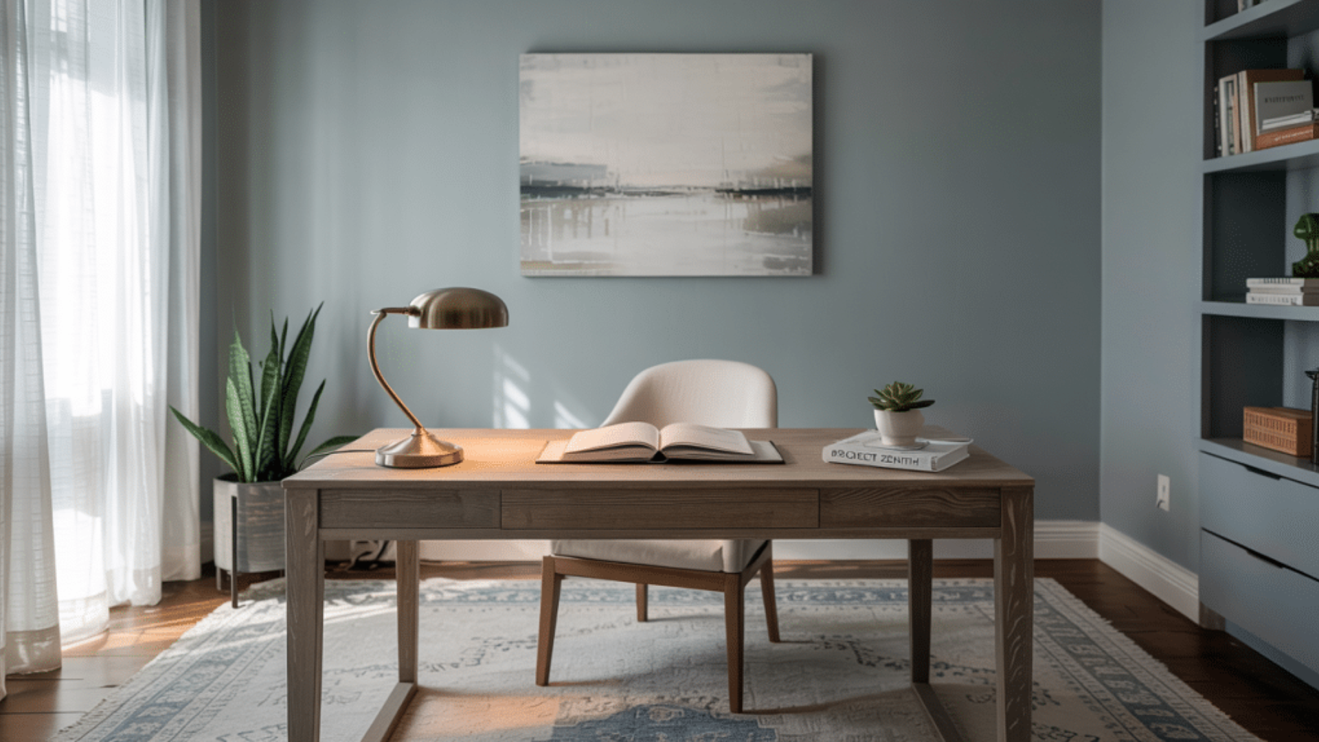
Should You Choose Benjamin Moore’s Blue Shades?
Blue is great for rooms where you want to rest, focus, or refresh, like bedrooms, bathrooms, and studies. Go with blue if you wish.
- A cool, calming mood
- A color that adds style but doesn’t overwhelm
- A clean look that pairs well with white, gray, or wood
How to Test Colors Side by Side
Before choosing, always test a few colors in your own space: This helps you see how the colors really look—and feel—in your home.
- Use sample swatches on the wall.
- Look at them during different times of day.
- Place samples near floors, trim, and furniture.
- Try at least one blue, one warm tone, and one neutral.
Conclusion
Blue paints from Benjamin Moore offer a smart and versatile option for nearly any room.
Available in a wide range of tones, from lighter shades to deeper ones, I’ve found that blue adds just the right amount of character without feeling too bold or overwhelming.
It’s a color that supports a sense of calm and works well in both relaxed and more formal spaces. Before making your final decision, it’s important to try paint samples.
Observe how the color appears in different lighting throughout the day, as natural and artificial light can affect the appearance of any shade. Blue can suit a wide range of interior styles.
From simple to traditional. It coordinates well with a variety of finishes, furnishings, and materials, making it a dependable choice for everything from walls to cabinetry and trim.