")
Some colors have a strong presence without being too bright. Benjamin Moore’s Amsterdam is one of those shades. It creates a calm, layered atmosphere that makes the space feel whole.
In this blog, I’ll take a close look at what makes Amsterdam stand out. You’ll learn how the color reacts to different lighting, how it compares to similar dark blues, and how it works in real rooms.
I’ll also share ideas for pairing it with floors, trim, and furniture. Amsterdam is a deep blue with a touch of gray. It gives rooms a rich look that feels steady but not dull.
If you’re looking for a color that adds weight and calm, this one might be a good fit. Keep reading to find out where it works best and how you can use it to build a space that feels complete and comfortable.
Why Amsterdam Is the Perfect Choice for Your Space?
Amsterdam is a strong, deep color that makes a room feel calm and steady. It’s bold enough to make a statement but soft enough not to feel harsh. The mix of blue and gray gives it a tone that fits many types of homes.
Many people choose Amsterdam because it:
- Brings color without looking too bright
- Adds depth but still feels smooth
- Works in both small and large rooms
- Matches modern, rustic, or classic styles
- Highlights furniture, art, and textures
- Looks great with both warm and cool colors
Amsterdam gives you a strong look that doesn’t take over the space. It adds balance and color in a way that feels steady and complete.
The Rich Undertones of Amsterdam
Amsterdam is a deep navy-based color that leans cool. What makes it different is its gray and soft purple undertones. These touches give it depth without making it feel sharp or cold.
The way Amsterdam looks can change with the lighting. In bright, natural light, it may look a little cooler or bluer. Under soft indoor lighting, the gray or muted purple tones may become more noticeable.
Because of these shifts, it’s best to try the color in your own space before painting a whole room. Put sample swatches on different walls and check them at different times of day.
This will help you choose the best finish and placement for your home.
The Light Reflectance Value of Amsterdam
Benjamin Moore’s Amsterdam has a Light Reflectance Value (LRV) of 29.21. This number tells us how much light the paint reflects. A lower LRV means the paint will absorb more light than it reflects.
With an LRV just under 30, Amsterdam is a shade that holds its depth even in brighter rooms. It won’t make your space feel bright, but it also won’t make it feel too closed in if the room gets some natural light.
This color works well in rooms with windows or layered lighting. If the space feels dim, use light trim, furniture, or floors to help reflect light and keep things feeling balanced.
The Psychology of Amsterdam
Dark colors can shape a room’s feel, and Amsterdam does that in a calm, steady way. Its deep tone brings a sense of quiet and focus, which can help the space feel more settled.
The gray and purple hints in the color make it feel less sharp than a pure navy. That softness adds a little warmth, which makes the room feel less cold and more thoughtful.
This color is a solid choice for bedrooms, offices, or reading corners, any place where quiet thinking or rest is the goal. It helps slow the pace of a room and keeps it cozy.
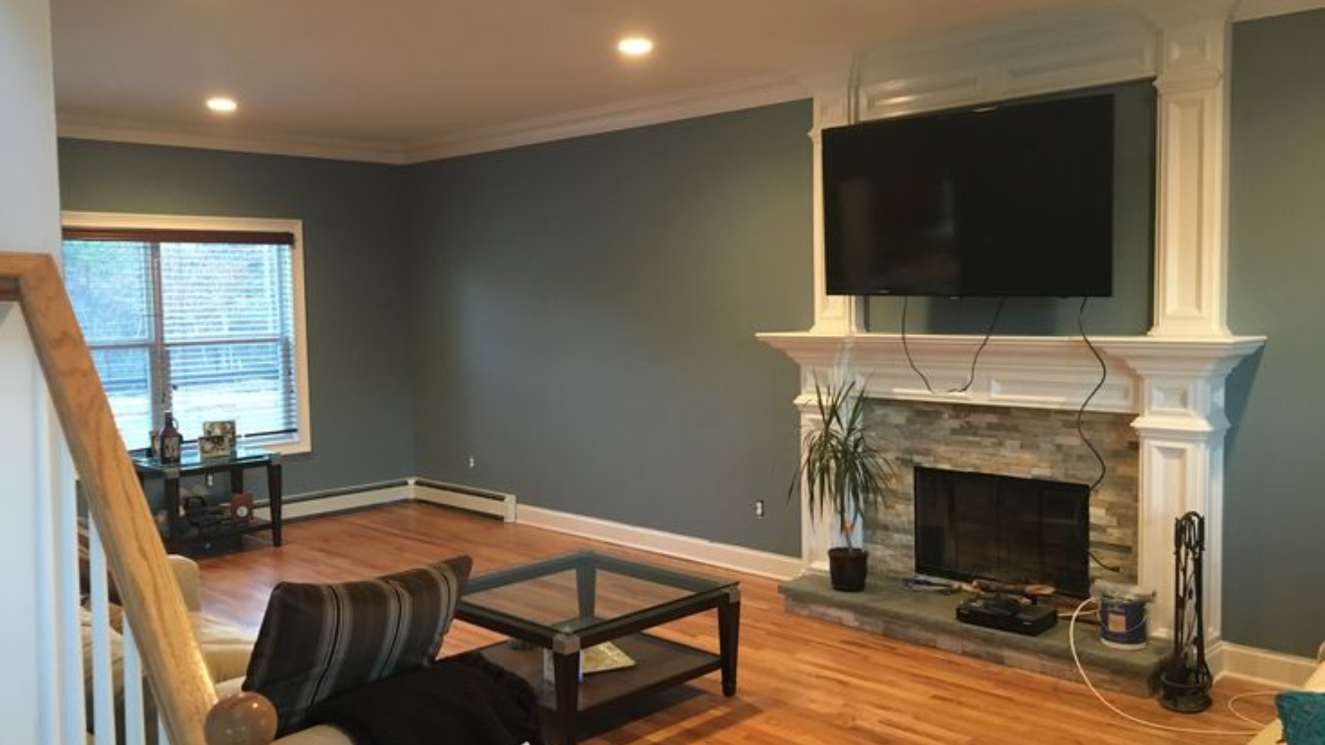
Where Is Amsterdam Best Used in an Interior?
This color fits in rooms where you want a bit more weight or mood. It helps shape a space without making it feel too dark. With the right lighting, Amsterdam brings a clear and smooth look that holds up during the day and night.
Good rooms for Amsterdam include:
- Bedroom: Creates a restful and focused space
- Home office: Brings calm and structure for better focus
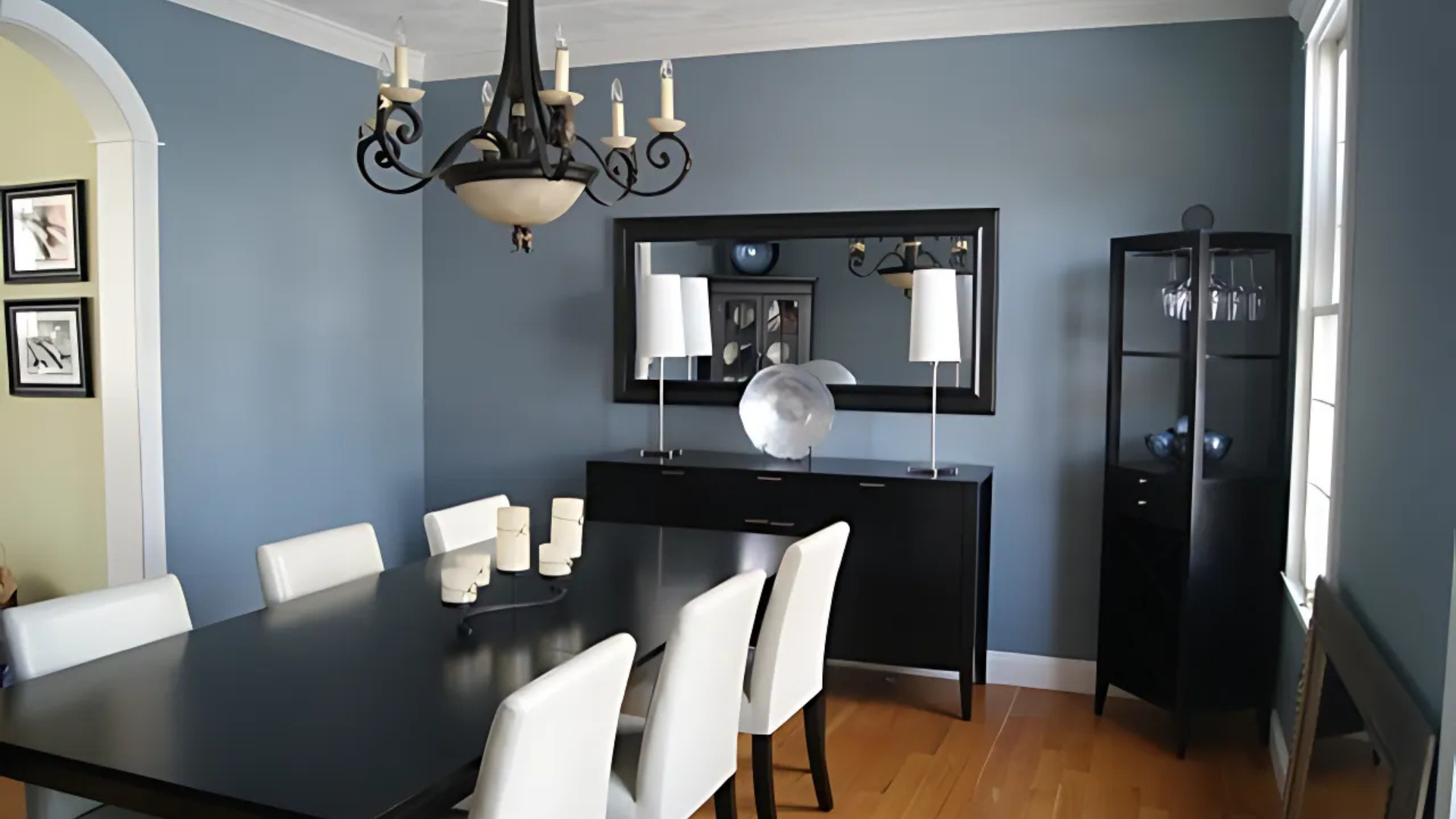
- Dining room: Adds depth and helps other colors stand out
- Entryway or hallway: Makes a bold first impression without being too loud
You can apply it in different ways:
- A single wall for a strong accent
- All walls in smaller spaces should be the room in color
- In open layouts, to create visual breaks between areas
Amsterdam performs well in spaces with natural or layered lighting. It adds weight to the room without making it feel flat or heavy
How to Incorporate Amsterdam Into Your Home Decor?
Once you’ve added Amsterdam to your walls, the next step is making the rest of the room work with it. This color is bold, so the key is to keep things balanced.
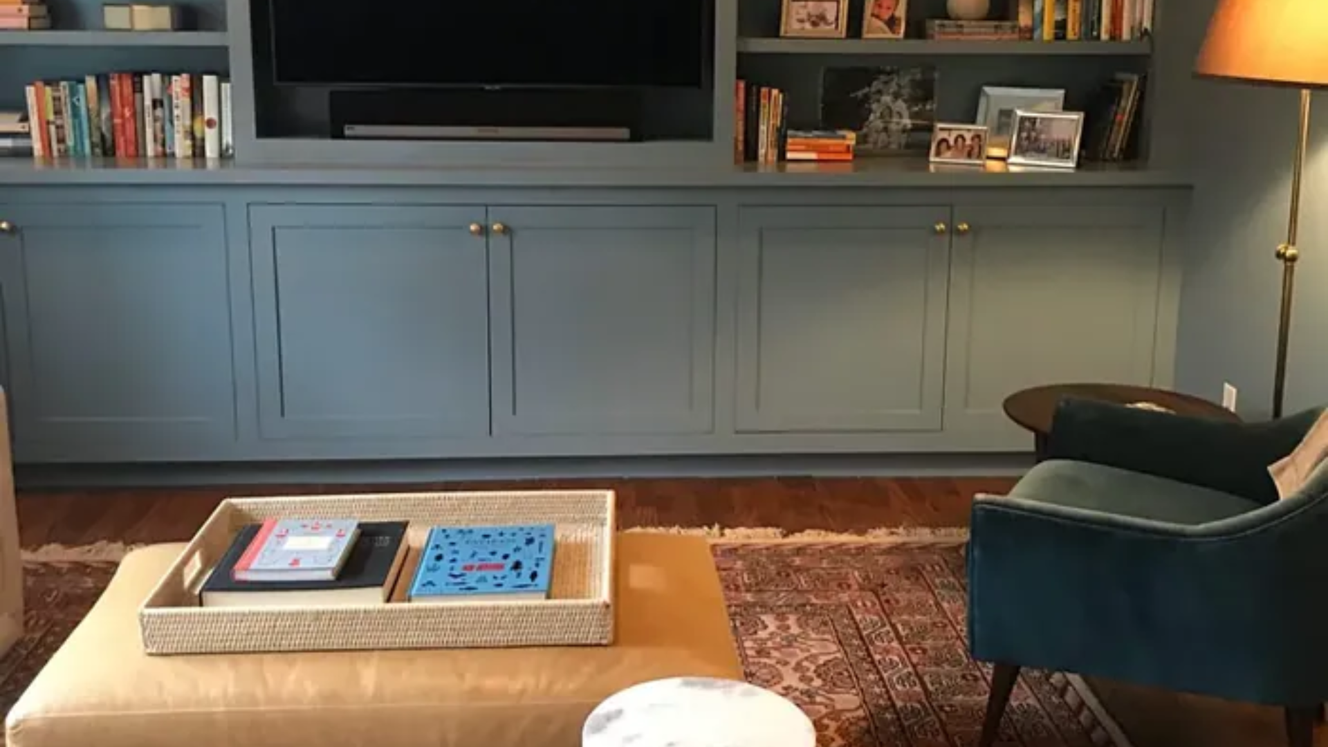
You can do that by using the right mix of materials, finishes, and textures. In the living room, try pairing Amsterdam with light-colored sofas, warm wood tables, and brass or matte black lamps.
In the bedroom, it works well with white or cream bedding, soft rugs, and brushed metal accents. In a dining room or office, add medium wood tones, black metal chairs, or clean white shelves for contrast.
For metal finishes, brass, matte black, and brushed nickel work well. Each brings out a different side of the color without making the space feel too heavy.
To soften the boldness, add texture. Try linen curtains, leather chairs, woven baskets, or wool throws. Also, flooring plays a big part in how a room feels in Amsterdam.
Since the color is deep and cool, your floor choice can help soften or sharpen the overall look. The goal is to keep things balanced and comfortable.
Floor types that go well with Amsterdam include:
- Light or medium oak floors: Add warmth and brighten the space
- Dark walnut or espresso wood: creates a cozy, bold feel
- Natural stone or slate tile: Add a touch of texture and cool tone
- Warm tile in tan or beige: Softens the contrast and keeps it grounded
- Neutral carpet in gray, cream, or taupe: This keeps the space soft and balanced
- Patterned rugs with blue, brown, or off-white: Tie the floor and wall together
When matched with the right flooring, this shade brings depth without making the space feel too closed in. You can pair it with texture and contrast for a room that feels strong and inviting.
Amsterdam vs. Other Deep Blue Paints
Many deep blue paints bring mood and style to a space. Each one has a different feel depending on its undertone and how it reacts to light.
Comparing Amsterdam to a few other popular shades can help you decide which one best fits your space.
| Color | Tone & Look | Light Reflection | Best Use |
|---|---|---|---|
| Amsterdam | Deep blue-gray with slight purple hints | moderate depth | Bedrooms, offices, dining rooms |
| Hale Navy | Strong navy with rich depth | very dark | Accent walls, bold cabinetry |
| Newburyport Blue | Classic navy with a crisp, cool tone | darker shade | Traditional spaces, formal rooms |
| Polo Blue | Warm navy with a slight gray base | soft richness | Living rooms, entryways, full rooms |
Amsterdam is a good pick if you want a color that brings structure without being too dark. It feels settled but still shows detail, especially in well-lit spaces or rooms with warm accents.
Conclusion
Amsterdam by Benjamin Moore is a deep, rich color that adds structure to a room. It feels balanced and clear. The right lighting and decor can help make a space feel strong and calm at the same time.
In this blog, I’ve covered how Amsterdam works in different rooms, what colors and finishes go well with it, and how light affects its look. You also saw how it compares to other dark blues and where it fits best inside a home.
If you’re considering a darker shade, this one is definitely worth trying. Put a test patch on your wall and see how it looks during the day and night.
To complete the space, add simple layers like wood, warm metals, and clean trim. These small touches can help highlight the color without making the room feel heavy.
Frequently Asked Questions
Is Amsterdam Too Dark for Small Rooms?
It can work in small rooms if there is enough natural or layered light. Using light furniture, trim, or flooring helps balance the depth and prevent the room from feeling closed in.
Can It Work on Cabinets or Doors?
Yes, Amsterdam looks strong and clean on cabinets or interior doors. It adds contrast in white kitchens and works well with brushed metal or wood handles.
What Ceiling Color Pairs Well with It?
A crisp white ceiling works best with Amsterdam. It reflects light and helps the walls feel clear and cozy without darkening the space.
Can Amsterdam Be Used in Outdoor Spaces?
Amsterdam can be used on a covered porch or door if protected from the weather. It adds a bold, neat look, especially when paired with a stone or white trim.