")
I’ve always loved soft, muted colors that make a room feel quiet and grounded. That’s precisely what drew me to Quietude by Sherwin-Williams.
It’s not just green, it blends hints of blue and gray in a way that feels like a deep breath at the end of a long day.
If you want calm without going all neutral, this shade might be just right.
In this post, I’ll walk you through what makes Quietude stand out, where it works best, and how it compares to other green paints.
I’ll also share ideas for pairing it with different colors and finishes, plus a few personal tips from using it in my own home.
By the end, you’ll know if this soft, peaceful green is a good fit for your space.
Sherwin-Williams Quietude: What Kind of Color Is It?
Sherwin-Williams Quietude (SW 6212) is a soft green paint with a peaceful, muted quality that creates a calm and easy-to-live-with atmosphere.
It falls somewhere between green, blue, and gray, giving it a balanced tone that doesn’t feel loud or overly bright.
With a Light Reflectance Value (LRV) of 48, it lands in the mid-range, neither too light nor too dark, which helps it stay flexible in both bright and dim spaces.
Part of the Sherwin-Williams “Living Well – Recharge” collection, Quietude is designed to support a relaxed and balanced atmosphere.
It works for those who want a peaceful green that feels grounded but not dull.
If other greens feel too sharp, minty, or bold, Quietude offers a calm option that’s modern, traditional, and timeless all at once.
Sherwin-Williams Quietude vs Similar Greens
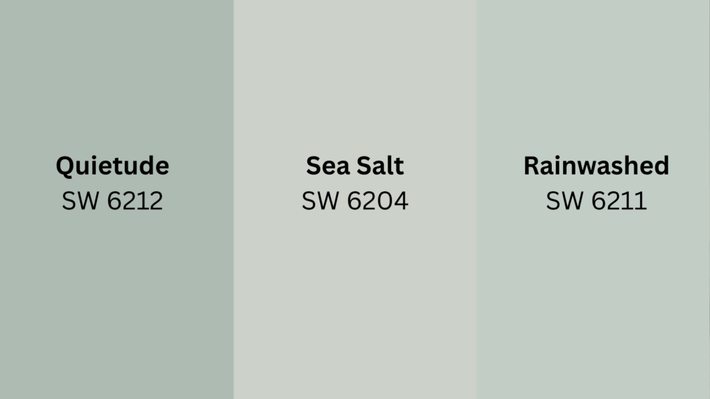
Quietude is often compared to Sea Salt and Rainwashed, two other soft Sherwin-Williams greens. While all three are peaceful and airy, they vary in tone, depth, and feel.
The table below shows differences to help you choose the best fit for your space.
| COLOR | UNDERTONE | LRV | BEST FOR |
|---|---|---|---|
| Quietude | Blue-gray | 48 | Cozy, mid-toned rooms |
| Sea Salt | Gray-blue-green | 63 | Light, breezy spaces |
| Rainwashed | Blue-green | 59 | Beachy or cool-toned rooms |
All three shades are beautiful in their own way, but if you’re leaning toward a stronger green that still feels soft and grounded, Quietude may be the best pick for your home. It brings color without being overwhelming.
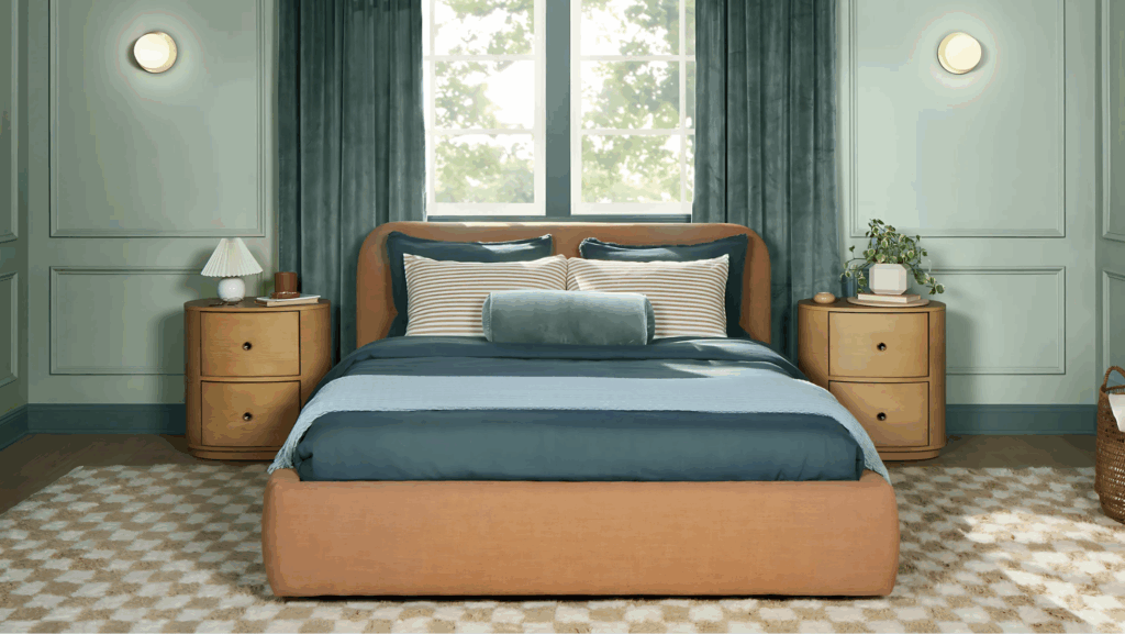
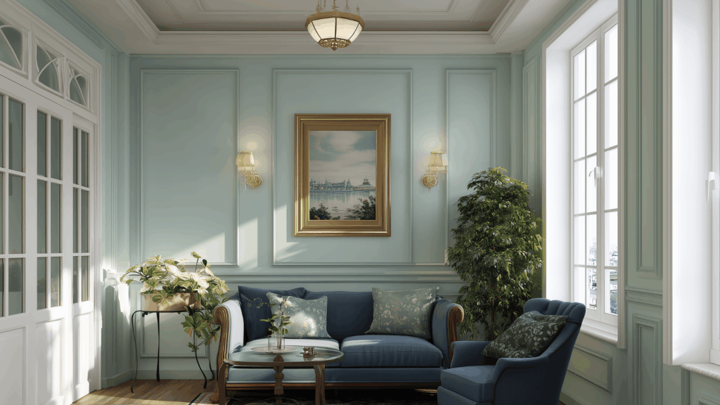
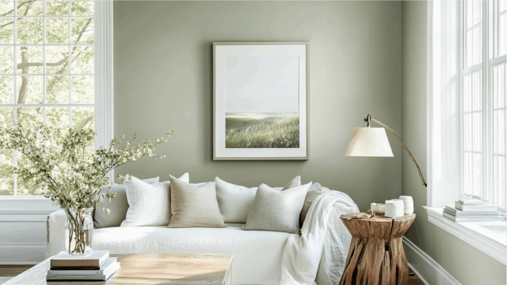
Where Quietude Sherwin-Williams Shines Best
Quietude works beautifully in spaces where calm and comfort matter most. Its soft, balanced tone brings out the best in rooms that need a peaceful, grounded feel.
- Bedrooms: Quietude creates a soothing and restful vibe that makes it easier to unwind after a busy day. It pairs well with cozy bedding, wood furniture, and warm lighting to create a soft, inviting space.
- Bathrooms: This shade brings a spa-like feel, especially when paired with clean white trim, marble countertops, or natural textures like bamboo or stone. It gives bathrooms a light, airy mood without being too stark or cold.
- Living Rooms: Quietude adds just enough color to feel interesting while still maintaining a cozy atmosphere. It blends well with both traditional and modern decor, complementing soft neutrals or layered textures nicely.
- Home Offices: The peaceful atmosphere of Quietude helps reduce visual stress, making it perfect for long work-from-home days. It supports focus and calm thinking, especially when paired with natural wood or clean white furniture.
- Entryways: A coat of Quietude in the entryway sets a gentle tone from the start, offering a warm, friendly welcome without being too bold. It works well with neutral rugs, wood doors, or black accents to add charm without too much contrast.
Avoid rooms with harsh fluorescent or overly yellow lighting, as it can shift the color toward a grayish tone. Sampling the paint in various lighting conditions is the best way to assess its performance before committing.
Quietude’s Personality: Cool, Warm, or Balanced?
Quietude by Sherwin-Williams is technically a cool color due to its subtle blue-gray base, but it doesn’t come across as cold or clinical. Instead, it brings a soft, peaceful energy that feels calm without feeling icy.
It’s the kind of color that adds quiet depth to a space and pairs beautifully with warm materials.
If you have wood floors, brass light fixtures, or woven textures, Quietude helps balance them out without clashing.
It also looks lovely with creamy whites, soft beige tones, and pale wood furniture, creating a grounded and inviting feel.
This flexibility makes it easy to use across different styles, from modern to traditional to coastal.
While it leans cool, the overall feel is more balanced, making it comfortable to live with year-round in nearly any space.
Coordinating Colors for Quietude Sherwin-Williams
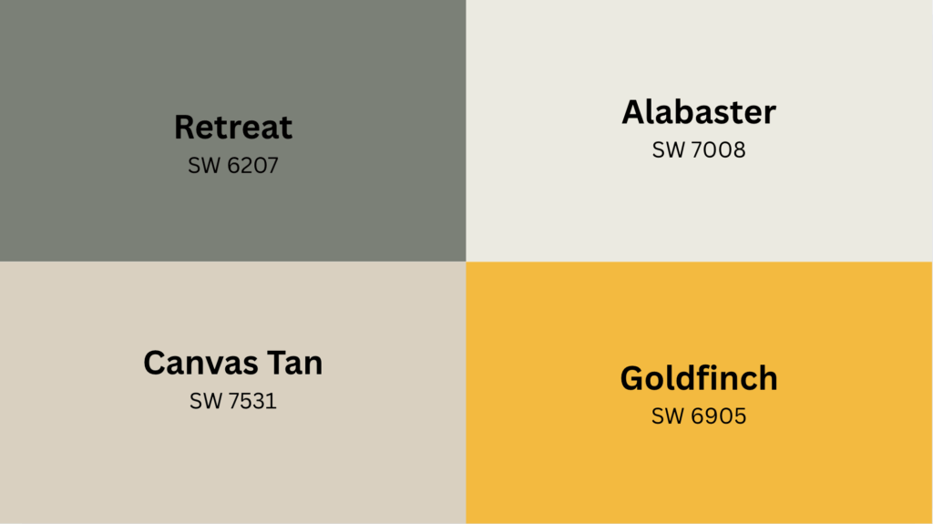
Quietude is a versatile shade, but it truly shines when paired with the right colors. Even if you’re planning trim, accents, or decor, the colors you choose can shift the mood of your space.
| Use Case | Pairing Color | Sherwin-Williams Code |
|---|---|---|
| Accent Wall | Retreat | SW 6207 |
| Wall Contrast | Canvas Tan | SW 7531 |
| Pop of Color | Goldfinch | SW 6905 |
| Clean White Look | Alabaster | SW 7008 |
These pairings are versatile enough for any room style, from modern to coastal.
Mix and match based on your space’s lighting and vibe to highlight Quietude’s full personality without overwhelming it.
Quietude by Sherwin-Williams in Coastal and Beachy Homes
Quietude is perfect for beach-inspired interiors, offering a calm, relaxed atmosphere that complements coastal, cottage, and modern farmhouse styles.
Unlike brighter beachy greens or turquoises, Quietude remains soft and muted, like sea glass on a cloudy day.
It pairs naturally with light driftwood, rattan chairs, jute rugs, and soft blues or sandy neutrals. For a modern touch, combine it with black hardware or minimalist lighting.
This color creates an airy, seaside vibe while feeling grounded and refined.
Quietude provides a natural, understated coastal look, giving you all the calm and charm without being overly trendy.
Paint Finish Tips for Quietude Sherwin-Williams
Choosing the right paint finish helps Quietude look its best and last longer in your space. Since sheen changes how paint reflects light, it also affects how Quietude feels on your walls. Here’s how to match the finish to the room:
Eggshell or Satin
These are perfect for bedrooms, living rooms, and offices where you want a soft look that’s still easy to maintain.
Eggshell gives a gentle glow and hides minor wall marks, while satin has just a touch more shine and stands up better to light cleaning.
Semi-gloss
Ideal for bathrooms, kitchens, or any high-use space where moisture and messes are common. Semi-gloss creates a smooth, sleek surface that resists water and wipes clean with ease.
It’s also a great choice for trim or cabinets when you want a bit of contrast against Quietude’s softer walls.
Matte or Flat
Best for ceilings or older walls that aren’t perfectly smooth. This finish hides dents and imperfections better than shiny sheens, offering a more muted and cozy texture.
Matte gives Quietude a deeper, more velvety look that feels grounded and comforting, especially in quiet reading nooks or tucked-away spaces.
Pro tip: Always sample the finish along with the color. Sometimes, sheen alters how we perceive the undertones.
Final Thoughts
I’ve used Quietude in both a guest room and a bathroom, and I still smile every time I walk in. It feels like a gentle sigh, a soft landing place after a long day.
It’s one of those shades that brings balance without being plain. I’ve paired it with soft woods, brass accents, and creamy trim, and it always fits in.
If you’re looking for a peaceful green that doesn’t feel too bold or too bland, Quietude could be the one.
Try a sample first, hold it up in different spots, and watch how it shifts with the light. That’s when its beauty stands out.
If this helped you pick a paint or sparked new ideas, share this blog with a friend or pin it for later. Someone else might love Quietude, too.