
Choosing the right white paint can completely change how a room feels. I’ve seen how the right shade can make a space feel calm, clean, and full of light.
In this blog, I’ll share some of the best white paint colors that designers and pros trust the most.
I’ll walk you through what makes each one special, how they look in different lighting, and where they work best: walls, trim, or ceilings.
You’ll also get simple tips on how to test them, what undertones to watch for, and how to match them with your home’s style.
I’ve gathered expert advice to help make the decision easier. If you’ve ever felt stuck picking a white paint, this guide is here to help you find the one that fits just right.
Understanding White Undertones
White paint may seem simple, but most shades have hidden undertones that can change how they appear in a room. These undertones usually fall into three categories: warm, cool, or neutral.
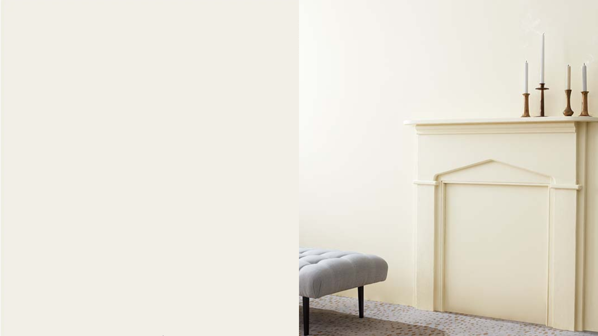
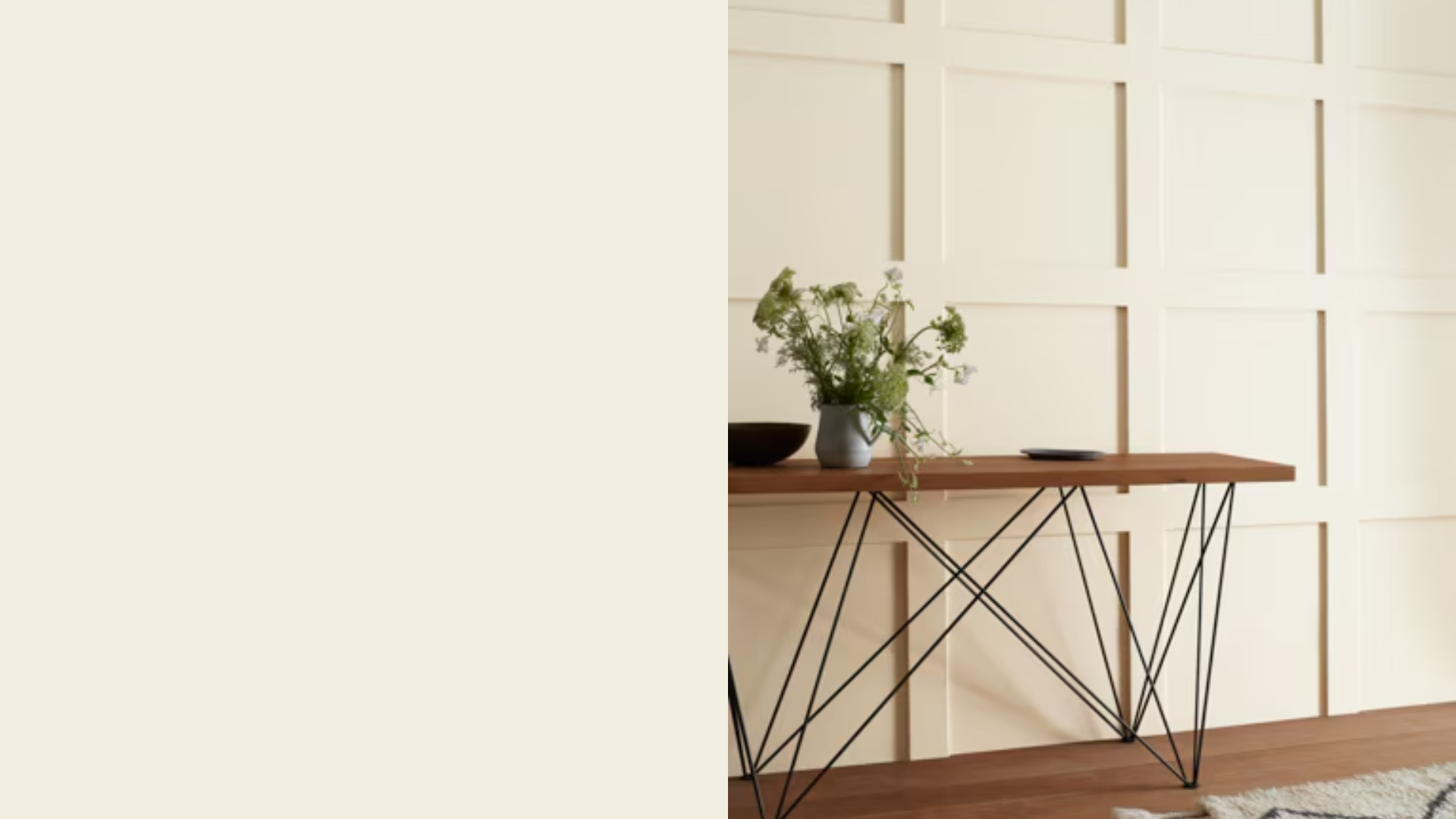
Warm whites often have hints of yellow, cream, or beige, giving rooms a soft, welcoming look. They work well in traditional or cozy spaces and pair nicely with wood tones and warm accents.
Cool whites tend to have blue or gray undertones, creating a fresh, clean appearance. They suit modern spaces and look great with cool-colored décor and sleek finishes.
Neutral whites stay closer to pure white without obvious color shifts, making them flexible for different uses.
Lighting plays a big role in how these undertones show up, so always test samples in your space before painting. The right undertone can completely change a room’s feel.
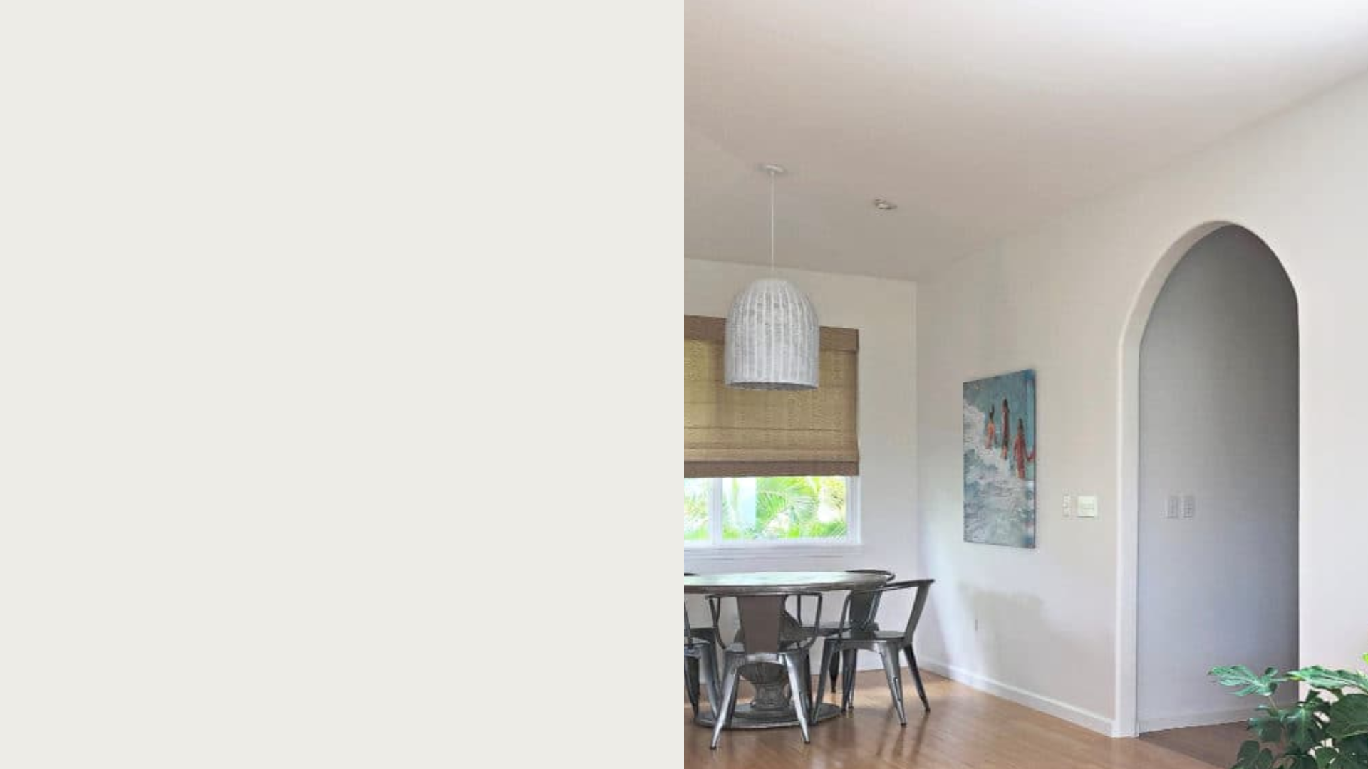
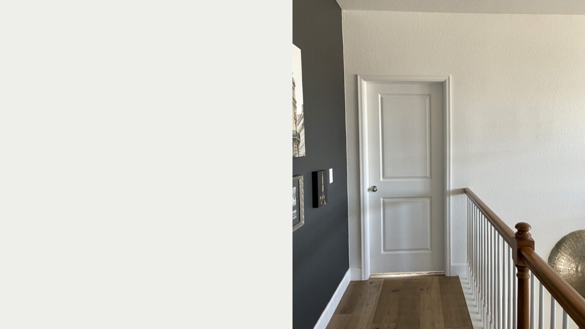
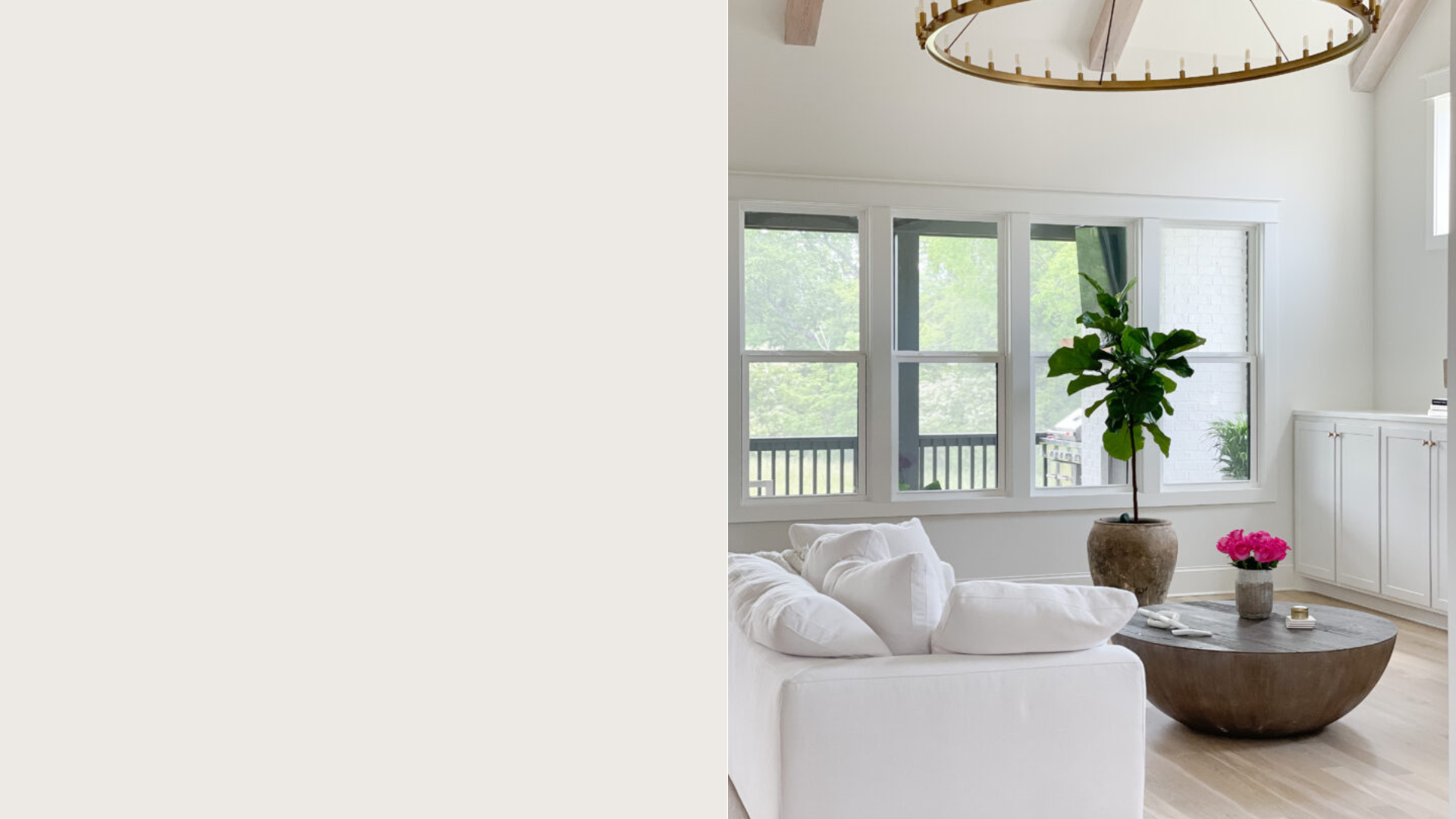
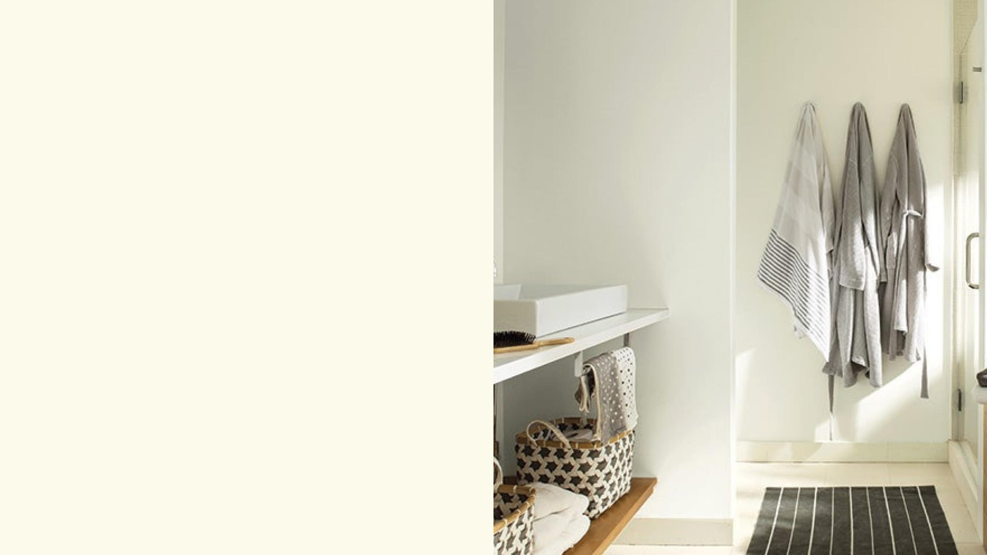
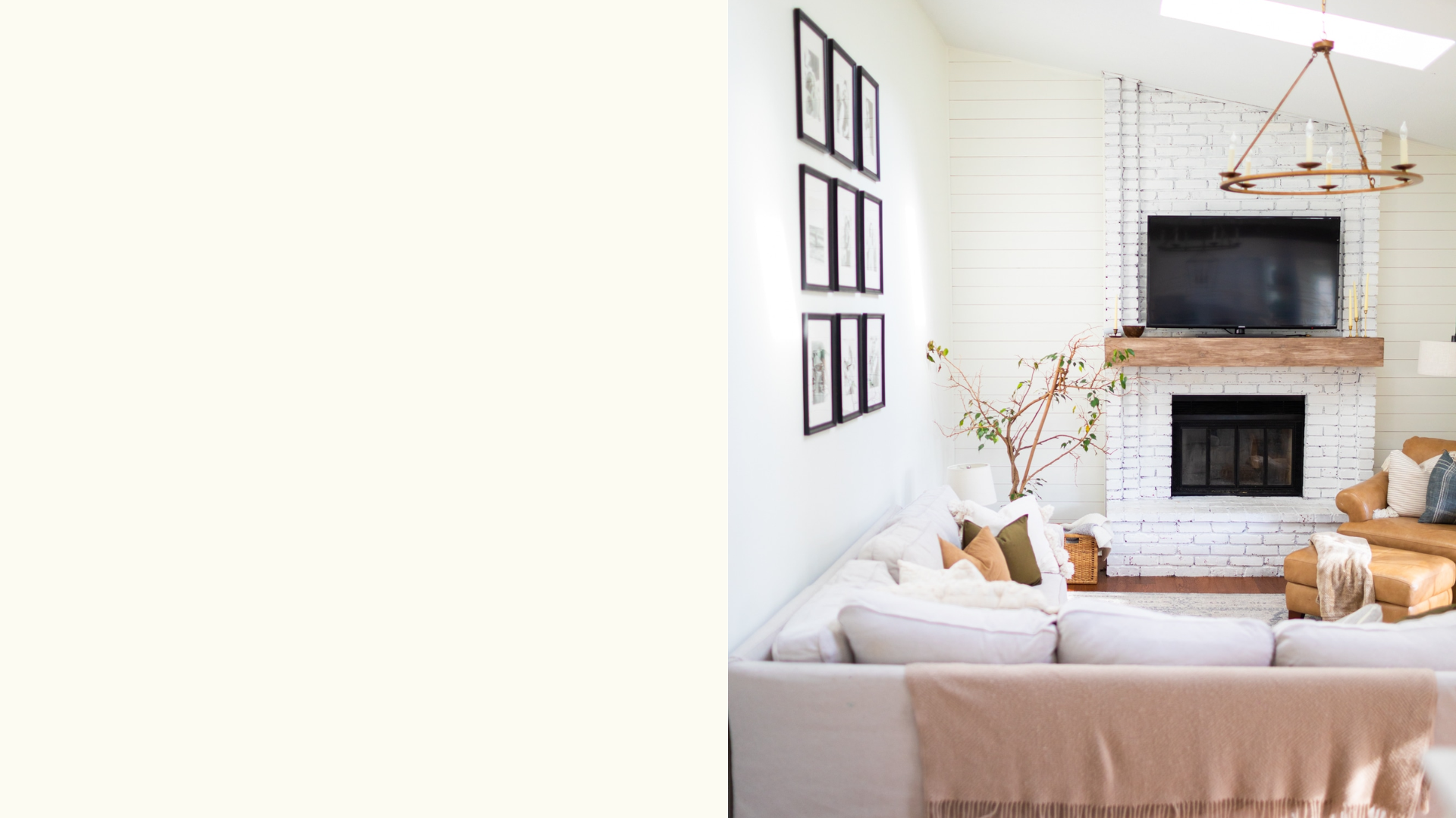
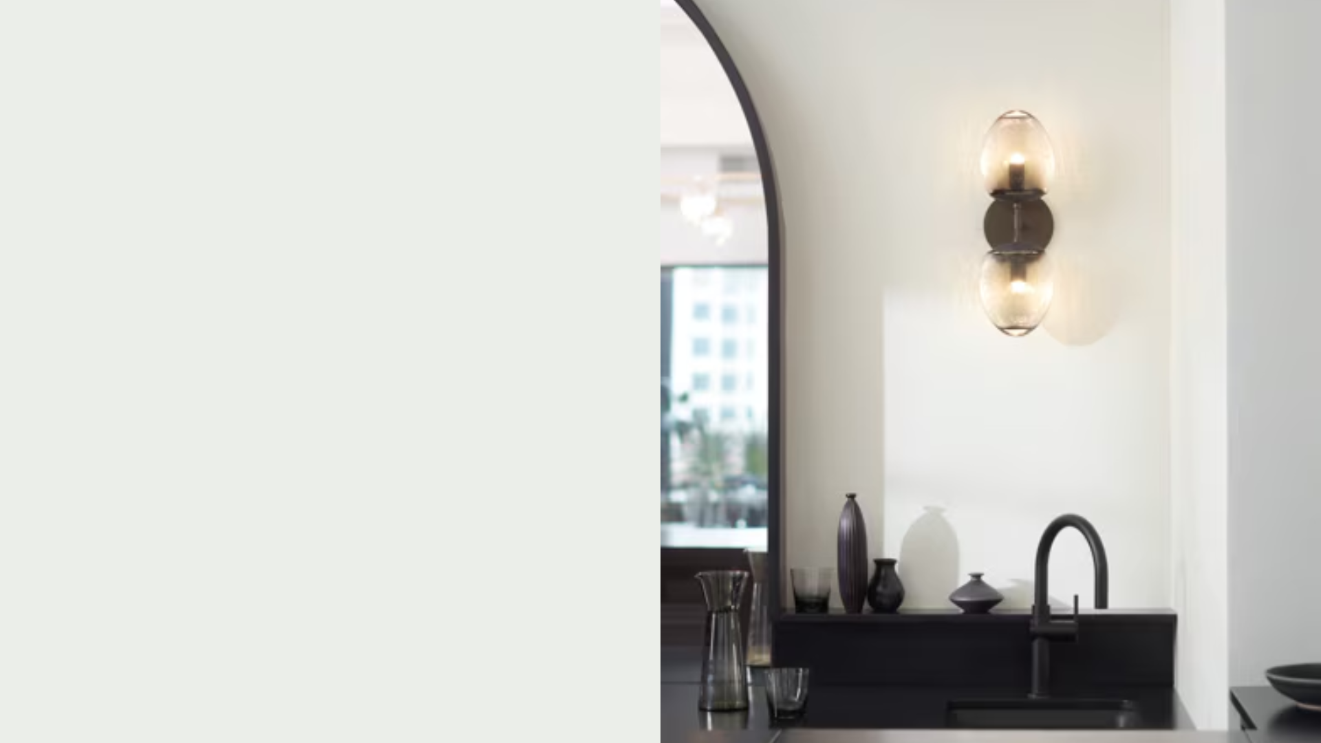
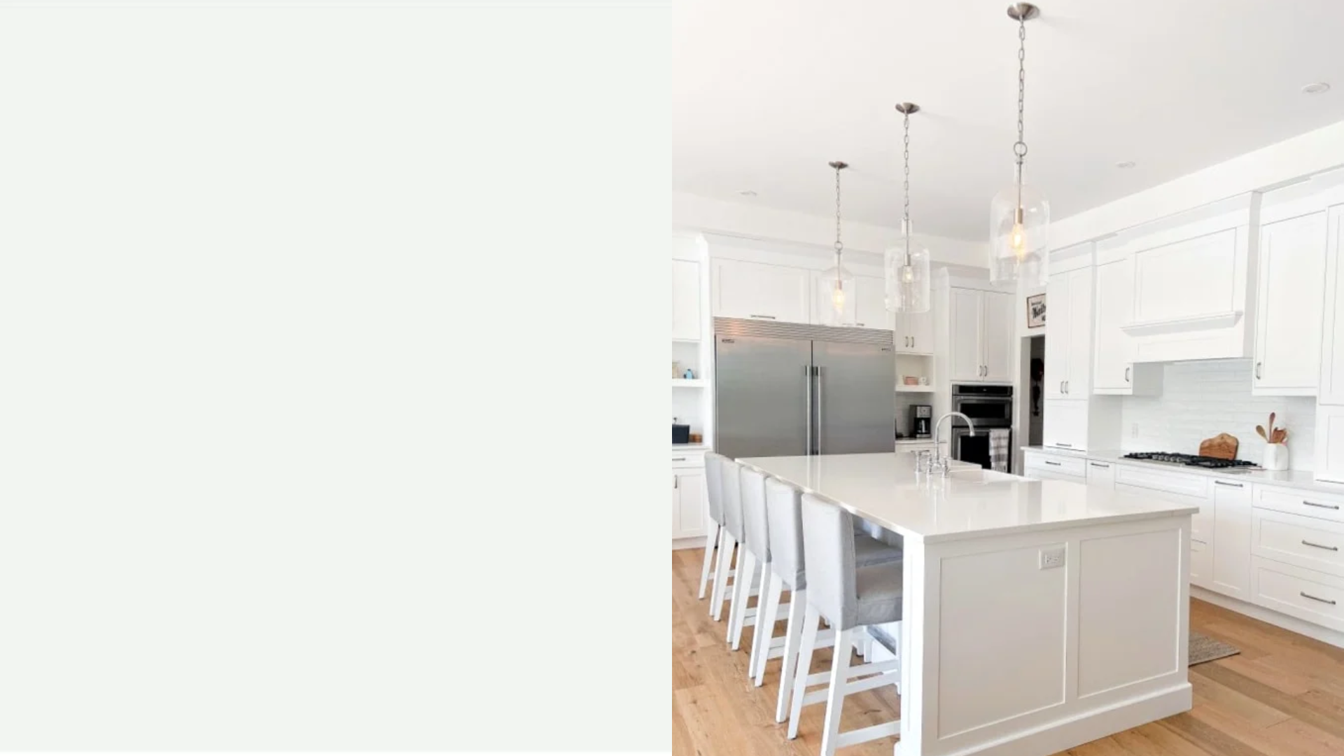
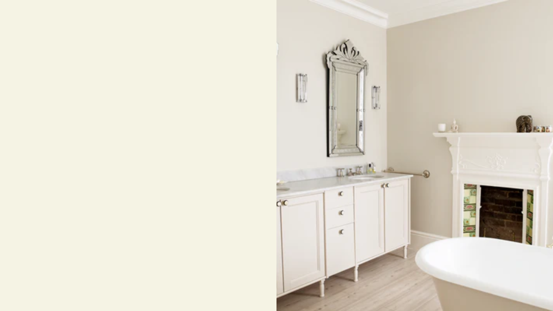
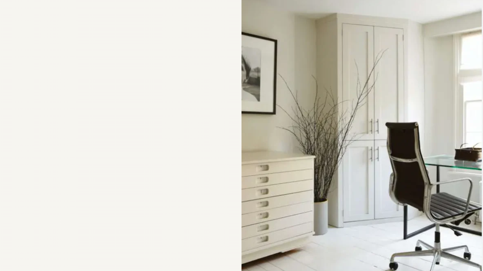
Best White Paint for Walls
Designers highly recommend these white paint colors for their reliable performance, subtle undertones, and wide range of uses.
1. Sherwin-Williams Pure White (SW 7005)
A go-to neutral, Pure White has soft warmth without looking yellow. It’s bright but not stark, making it ideal for walls, trim, and ceilings. Designers love its flexibility in both modern and traditional homes.
It pairs well with wood tones, bold colors, or soft palettes. With minimal undertones, it keeps a clean look that works beautifully in nearly every room.
2. Sherwin-Williams Extra White (SW 7006)
This bright, cool white has subtle blue-gray undertones that make it crisp and clean. It’s perfect for modern spaces, especially where you want a fresh, high-contrast look.
Many professionals recommend it for trim, cabinets, or ceilings. It reflects lots of light and holds its brightness in both natural and artificial lighting, giving rooms a sleek and polished appearance.
3. Sherwin-Williams Alabaster (SW 7008)
Alabaster is a warm, creamy white that feels soft and cozy without being too yellow. It’s a designer favorite for creating calm and welcoming rooms.
This shade works well in bedrooms, living areas, or spaces with north-facing light. It pairs beautifully with wood furniture and earthy tones. Alabaster’s subtle warmth adds depth while still feeling light and fresh.
4. Sherwin-Williams Snowbound (SW 7004)
Snowbound is a cooler white with gray undertones that gives off a soft and muted look. It’s often used in transitional or minimalist homes where a gentle, clean white is needed.
This paint color works great on walls and trim, especially when paired with other soft neutrals. It’s a favorite for those who want a light, subtle backdrop without harsh contrast.
5. Benjamin Moore Chantilly Lace (OC-65)
Known as one of the truest, cleanest whites, Chantilly Lace has no strong undertones, making it incredibly versatile. It works well in modern, farmhouse, or classic interiors.
This bright white reflects light beautifully and makes spaces feel crisp and airy. Ideal for trim, cabinets, and walls, it’s a go-to for anyone seeking a fresh and classic white.
6. Benjamin Moore Simply White (OC-117)
Simply White is a soft white with subtle yellow undertones, giving it a warm and inviting feel. It was once named Color of the Year and remains a favorite for interiors.
It brings just enough warmth to feel cozy without appearing too creamy. Ideal for walls, ceilings, or cabinetry, it works in both modern and classic homes.
7. Benjamin Moore White Dove (OC-17)
White Dove is a warm white with soft gray undertones, offering a balanced and classy look. It’s not too stark and works well in both bright and dim lighting.
Designers often use it for walls, trim, and cabinetry. It has just enough warmth to soften a space while keeping things bright and clean. It’s ideal for open-concept living areas.
8. Benjamin Moore Swiss Coffee (OC-45)
Swiss Coffee is a rich, warm white with subtle beige undertones. It’s perfect for cozy spaces or homes with a classic or cottage style. It pairs well with natural wood and warmer palettes.
While soft and creamy, it still reflects light well. Designers love it for living rooms, kitchens, and bedrooms where comfort and softness are key.
9. Benjamin Moore Decorator’s White (OC-149)
Decorator’s White is a cool white with slight gray undertones, often used for trim and cabinetry. It gives a crisp finish and looks clean in spaces with lots of natural light.
It pairs well with both warm and cool wall colors, offering contrast without appearing too stark. This is a long-time favorite among designers for its versatility.
10. Benjamin Moore Super White (OC-152)
Super White is bright, clean, and very modern. It leans cool but has minimal undertones, making it a strong choice for high-contrast looks.
It’s great for contemporary spaces, gallery-style walls, or anywhere you want bright, fresh energy. Its sharp appearance enhances trim, baseboards, and sleek cabinetry.
This shade shines in well-lit rooms and minimalist settings.
11. Behr Ultra Pure White
One of the brightest whites available, Ultra Pure White is almost pure with no obvious undertones. It’s a popular pick for ceilings, trim, and clean modern walls.
This high-reflective white helps make small spaces look larger and more open. It’s an affordable, easy-to-find option that works well in homes where a fresh, bright finish is needed.
12. Farrow & Ball Wimborne White
Wimborne White is a soft, warm white with a hint of creamy yellow. It’s cozy but still feels fresh and clean, ideal for traditional and relaxed interiors.
It offers a gentle brightness that works beautifully in living rooms and bedrooms. This shade pairs well with deeper colors or muted neutrals, making it a refined, designer-approved choice.
13. Farrow & Ball All White (No. 2005)
True to its name, All White is made with no added pigment, making it a pure, clean white. It has no strong undertones, so it works in nearly any space or light condition.
It’s a favorite for ceilings, trim, and contemporary designs. This neutral backdrop allows other colors to stand out while maintaining a clean, unified feel throughout.
14. Benjamin Moore Mountain Peak White
Mountain Peak White is a soft, creamy white with warm undertones that’s great for creating cozy, comfortable interiors. It works well in spaces with lots of wood or warm accents.
It offers just enough color to prevent starkness, making it ideal for bedrooms, dining areas, or cottage-style homes. It’s a calming, classic white that feels welcoming.
15. Clare Paint Snow Day
Snow Day is a bright, neutral white that works well in all light conditions. It has a clean feel without harsh coolness or warmth, which makes it ideal for open spaces.
Clare Paint’s low-VOC formula also makes it a healthier choice for indoor use. Snow Day is perfect for walls, ceilings, and trim, bringing a fresh, modern look to any room.
How Light Affects White Paint
Lighting plays a big role in how white paint appears in your home. Natural light from different directions can bring out cool or warm undertones you might not notice on a paint chip.
North-facing rooms often have less direct sunlight, making whites appear cooler or grayer. South-facing rooms get steady, bright light that can enhance warmth in white paint.
East-facing spaces have soft morning light, while west-facing rooms glow warmly in the afternoon. Artificial lighting also changes how white looks: LEDs, incandescent, and warm or cool bulbs all affect the shade.
Because of this, it’s important to test paint in the actual room you plan to use it in.
Apply swatches on multiple walls and check them throughout the day. You’ll get a better sense of how the color shifts before making your final choice.
Comparison: Cloud White vs. White Dove
Compare these two popular warm white paint colors to help decide which one fits your space best.
| Feature | Cloud White (OC-130) | White Dove (OC-17) |
|---|---|---|
| Brand | Benjamin Moore | Benjamin Moore |
| Undertone | Warm with a hint of cream | Warm with subtle gray/beige undertones |
| Appearance | Slightly brighter and creamier | Softer and more muted |
| Light Reflectance | Higher LRV (~87) | Medium-high LRV (~85) |
| Best For | Traditional spaces, wood trim, cozy rooms | Soft backdrops, transitional, and modern homes |
| Pairs Well With | Rich colors, wood tones, off-whites | Neutral palettes, muted tones, warm grays |
| Feel | Warm and inviting | Calm and balanced |
| Finish Versatility | Works well on walls and trim | Ideal for walls, ceilings, and cabinetry |
| Designer Pick | Great for soft warmth without yellowing | Popular for its subtle depth and elegance |
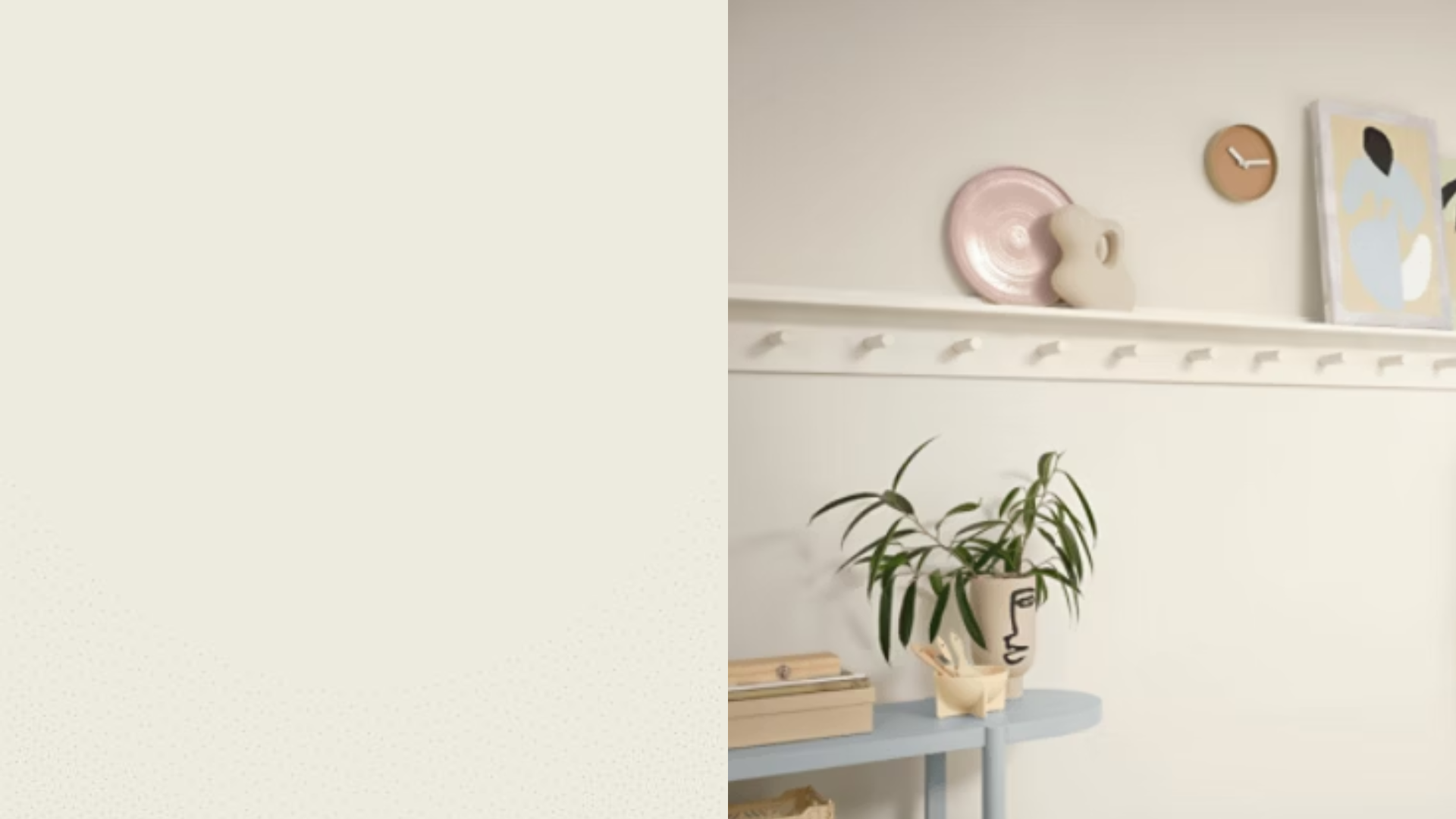
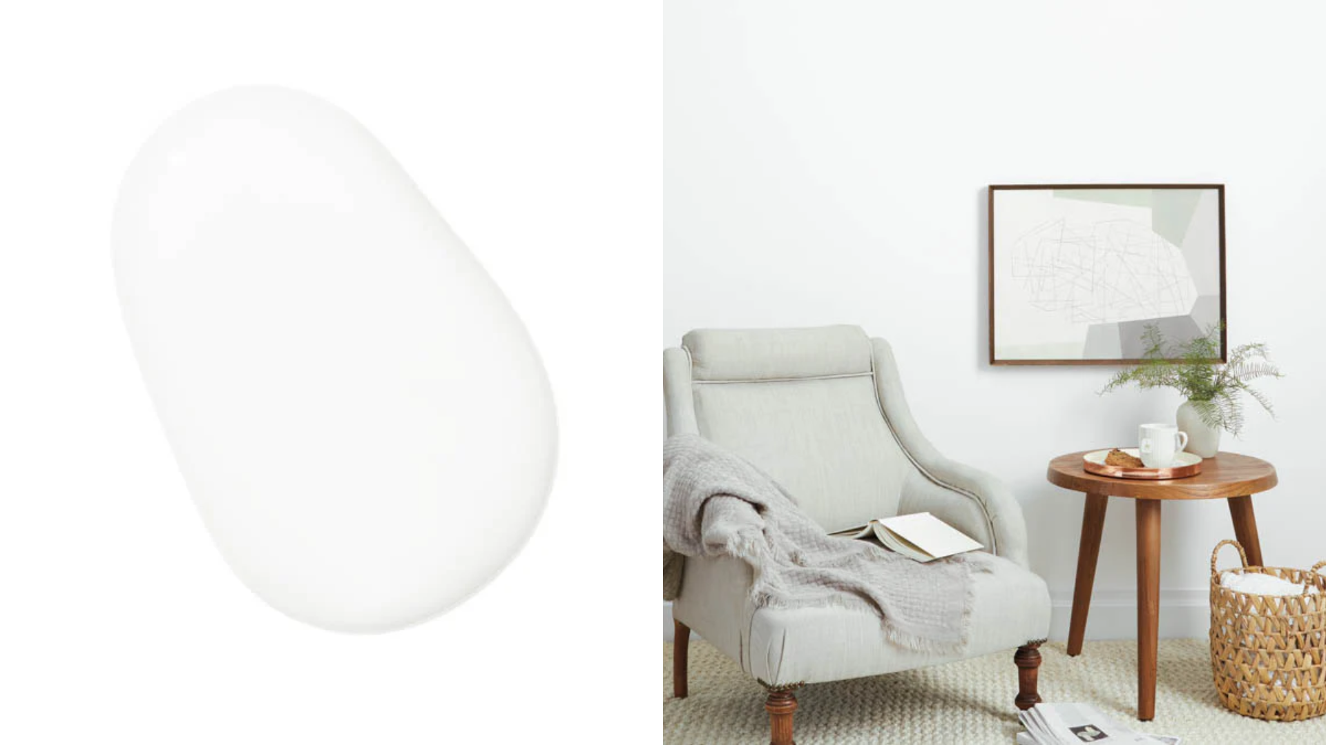
Where to Use Each White
Learn how to pick the right white paint for walls, trim, ceilings, and cabinets based on tone, brightness, and room function.
- Walls: Choose warm or neutral whites like Alabaster or White Dove for a cozy and inviting feel.
- Trim: Use crisp whites like Extra White or Super White to add clean contrast and highlight details.
- Ceilings: Pick pure whites like Ultra Pure White to reflect light and keep the space feeling open.
- Cabinets: Opt for bright whites like Chantilly Lace or Simply White for a clean, polished look.
Common Mistakes to Avoid
Avoid these common mistakes to make sure your white paint choice looks just right in your space and lighting.
- Ignoring undertones: Choosing white paint without checking its undertone can lead to clashing with your furniture or lighting.
- Skipping sample tests: Failing to test swatches in your space can result in unexpected color shifts once the paint is on the wall.
- Relying on online photos: Digital images often misrepresent how paint looks in real-life lighting and room settings.
- Using the wrong finish: Applying the wrong sheen can affect durability and appearance—use flat for ceilings, satin for walls, and semi-gloss for trim.
- Overlooking artificial lighting: Bulbs with different color temperatures can shift the look of white paint dramatically at night.
- Assuming all whites are the same: Every white has its own feel, some are stark and bright, others are soft and creamy, so always compare carefully.
- Painting without a primer: Skipping primer on darker walls or bare surfaces can lead to uneven or dull white paint coverage.
Conclusion
I know picking the right white paint can feel overwhelming, but it doesn’t have to be. With the help of expert recommendations and simple comparisons, you can find a white that truly fits your space.
I’ve shared some trusted white paint colors, explained their undertones, and offered tips on how to test and use them. From warm and cozy to crisp and clean, there’s a white here for every room and style.
The key is to sample a few shades, see how they look throughout the day, and pick the one that feels right in your home.
I’ve seen how the right white paint can make a room feel brighter and more welcoming. Try one from the list and let me know how it turns out. I’d love to hear what worked best for you.