
Colors do more than just look pretty. They can shape how a space feels or how a picture stands out. Certain colors seem to move closer, while different ones feel calm and distant.
This effect is not random. It comes from how color works and how people react to it.
People often hear the terms warm and cool when talking about color, but the difference can feel unclear at first. Without a simple way to tell them apart, choosing colors can feel confusing.
This blog explains how to spot warm and cool colors using simple clues like tone, mood, and color families, so anyone can make better choices when painting a room, picking clothes, or creating art.
What are Warm and Cool Colors?
Warm and cool colors are not about actual temperature. Instead, they describe the feeling a color gives and how it behaves visually. Warm colors tend to feel energetic and inviting. Cool colors feel calm and relaxing.
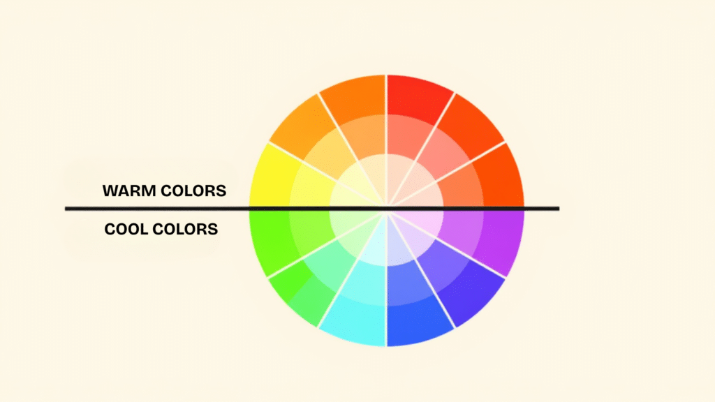
On the color wheel:
- Warm colors are found between red and yellow.
- Cool colors are between green and blue.
Here’s a simple breakdown:
| Warm Colors | Cool Colors |
|---|---|
| Red | Blue |
| Orange | Green |
| Yellow | Purple |
| Coral | Teal |
| Peach | Aqua |
| Gold | Navy |
Note: Some colors, like purple and green, can lean either way depending on their undertone (for example, a bluish green is cool, a yellowish green feels warmer)
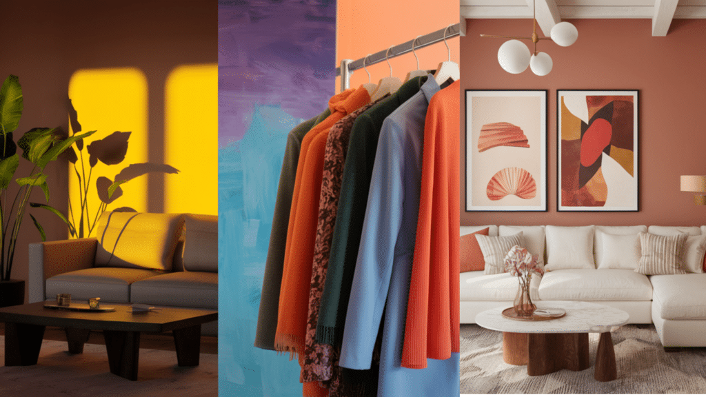
How Warm Colors Behave
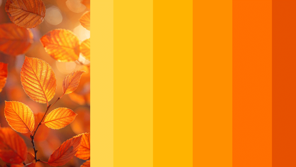
Warm colors feel like they move toward the viewer. They’re bold, energetic, and full of life. This makes them useful in spaces where you want to create warmth, closeness, or excitement.
Visual Effects:
- Draw attention easily
- Make large spaces feel smaller or more connected
- Add a sense of movement or action
Emotional Tone:
- Joyful
- Lively
- Friendly
- Stimulating
Best Uses:
- Living rooms or dining rooms to make them feel welcoming
- Restaurants to boost appetite and energy
- Artwork to make subjects stand out
- Clothing to create a bold, expressive look
Warm colors work well when you want to bring people together, add brightness, or energize a dull space. However, using too much can feel overwhelming. Pairing them with neutral tones or softer lighting helps maintain balance.
How Cool Colors Behave

Cool colors feel like they move away from the viewer. They help open up a space, reduce visual noise, and create a peaceful setting. Cool colors are ideal when you want calm, focus, or a clean atmosphere.
Visual Effects:
- Soften the look of a room
- Make small spaces feel bigger or airier
- Pull the eye away from the foreground
Emotional Tone:
- Peaceful
- Relaxed
- Thoughtful
- Clean
Best Uses:
- Bedrooms to support rest and sleep
- Bathrooms for a fresh, clean feel
- Offices to support quiet focus
- Clothing to create a cool, calm, or elegant appearance
Cool colors are especially helpful in sunny spaces or warm climates where they can balance heat and brightness. Darker cool shades (like navy or forest green) can feel serious or formal, while lighter ones (like sky blue or mint) add freshness and space
How to Know if a Color is Warm or Cool?
This is the key section that explains how you can figure out color temperature without guessing.
1. Think About What the Color Reminds You Of
Ask yourself simple questions:
- Does it remind you of the sun or fire? → It’s likely warm.
- Does it remind you of the sea or sky? → It’s likely cool.
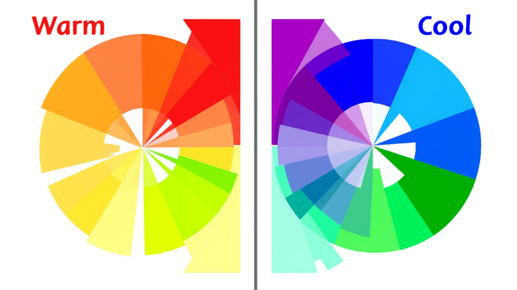
2. Use the Color Wheel for Guidance
Split the wheel in half from red to green.
- Left side (red to yellow): warm colors
- Right side (green to blue): cool colors
Some colors sit in the middle. For example:
- Purple can be warm or cool, depending on its base.
- Green can feel warm if it’s mixed with yellow.
3. Look at Undertones
Some colors mix warm and cool elements. Undertones can shift how they feel.
Examples:
- Purple with more red = warm
- Purple with more blue = cool
- Gray with brown = warm
- Gray with blue = cool
If you’re unsure, place the color next to pure red or blue and see which it looks better with.
4. Compare Two Colors Side by Side
Seeing two colors at once helps the eye spot the difference more easily.
- The warmer color will look more active or closer.
- The cooler one will seem softer or pulled back.
5. Ask What Emotion it Brings
Colors can feel emotional:
- If it feels lively or bright → It’s warm.
- If it feels soft or quiet → It’s cool.
Are Neutral Colors Warm or Cool?
Neutral colors like white, gray, beige, and black don’t seem warm or cool at first, but most of them have an undertone.
Examples of Neutral Undertones
| Neutral Color | Warm Version | Cool Version |
|---|---|---|
| White | Cream, Off-white | Bright white, icy white |
| Gray | Taupe, greige | Blue-gray |
| Beige | Golden beige | Ash beige |
| Brown | Reddish brown | Dusty gray-brown |
You can test undertones by placing the neutral color next to strong warm or cool shades and seeing how it reacts.
Why Warm & Cool Colors are Important in Everyday Life?
Knowing the difference between warm and cool colors isn’t just helpful for artists or designers. It plays a role in many everyday choices, from decorating your home to picking an outfit or designing a logo.
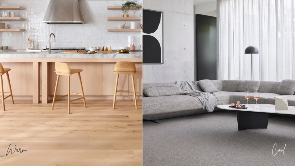
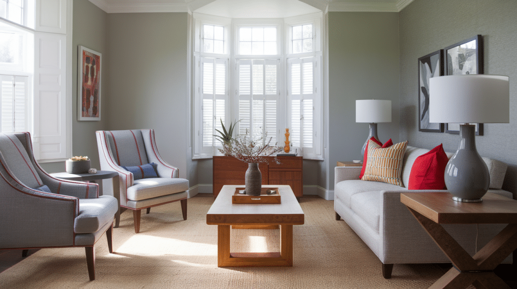
In Home Design
- Warm colors make a room feel smaller, cozier, and more inviting.
- Cool colors make a room feel larger, calmer, and more open.
Use warm tones for social spaces and cool tones for rest areas.
In Art and Illustration
- Warm colors draw the eye and add energy to the main subject.
- Cool colors help objects fade into the background, creating space or mood.
Painters often use both for contrast.
In Clothing and Style
- Warm colors (like coral or mustard) suit warm-toned skin with yellow or golden undertones.
- Cool colors (like navy or lavender) match cool-toned skin with pink or blue undertones
You’ll look brighter and more natural when wearing the right tone.
In Business or Branding
- Warm colors like red, orange, or yellow grab attention quickly. They’re often used in food, sales, and ads.
- Cool colors like blue or green build trust, calm, and stability. They’re common in tech, healthcare, and banking.
When used well, color temperature helps a brand send the right message without saying a word.
Can You Mix Warm and Cool Colors?
Yes, and when done right, mixing warm and cool colors adds depth and balance to your design or space. The key is to manage contrast and harmony.
- Pick one temperature as the main base, and use the other for accents. For example, cool blue walls with warm wood tones.
- Use neutral colors (like white, gray, or beige) to help tie both temperatures together.
- Match color intensity, soft warm colors work best with soft cool colors, and bold with bold.
- Test in real light, since lighting can change how warm or cool a color appears.
A balanced mix can make a space feel both lively and grounded.
The Bottom Line
Understanding warm and cool colors isn’t about memorizing lists. It’s about noticing how color feels, how it behaves in space, and how it fits your goal.
A single warm or cool tone can shift the mood of a room, a painting, or an outfit. With a bit of practice, spotting these differences becomes easier and more natural.
Use what you’ve learned as a tool to create balance, focus, or feeling, whatever you need. Color isn’t just a detail; it’s a decision.
Start small, test ideas, and trust your eye; you’ll get better every time you try something new.