 for You")
I’ll bet you’ve been staring at paint swatches for hours. Maybe days. And Cascades keeps catching your eye, but you’re not quite sure if it’s the right fit for your space.
Trust me, picking the perfect color can feel like solving a puzzle.
That soft, muted green-blue has a way of looking different under every light, and let’s be honest, paint samples never quite tell the whole story.
So before you commit to those gallons, let’s break down what Cascades really looks like in real homes, how it plays with different lighting, and whether it’s actually going to work for your project.
Sherwin-Williams Cascades Color Overview
Looking at Cascades up close reveals a color that’s harder to pin down than you might think. It sits in that interesting space where green, blue, and gray meet, creating a moody, sophisticated depth that changes throughout the day.
| Specification | Details |
|---|---|
| LRV | 4 |
| RGB | 39 / 62 / 62 |
| Hex Value | #273E3E |
| Available in | Interior/Exterior |
| Color Family | Green |
Understanding the Undertones of Sherwin-Williams Cascades
Cascades has undertones that like to keep you guessing. At first glance, you’ll notice the green trying to take center stage, but there’s a blue quality lurking just beneath the surface.
Depending on your lighting, the blue sometimes pushes forward, and the green takes a backseat.
The gray element acts like a neutralizer, keeping things from getting too bright or saturated. This is what makes Cascades feel so grounded and calm.
But those undertones shift dramatically between morning and evening light. Natural light brings out the blue-green character, while artificial lighting can make it appear darker and more mysterious.
Understanding these shifts helps you predict how it’ll look in your actual space.
Best Rooms to Use Sherwin-Williams Cascades
Cascades works beautifully in spaces where you want to create a sense of calm and depth. Its low LRV means it brings drama without being overwhelming, making it versatile for both intimate rooms and bold statements.
Living Rooms
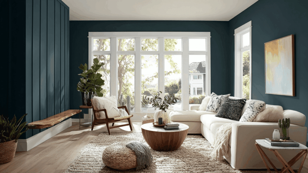
Living rooms can handle Cascades really well, especially if you’ve got decent natural light. The color creates this cozy, wrapped-up feeling that makes the space feel intentional and pulled together.
It pairs nicely with warm wood tones and lighter furniture, so your seating doesn’t disappear into the walls.
Just keep in mind that with an LRV of 4, you’ll want to balance it with lighter elements; think cream sofas, white trim, or plenty of texture.
Bedrooms
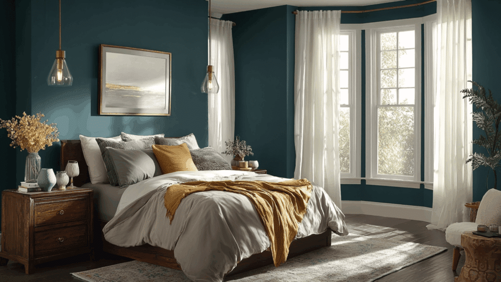
Bedrooms are probably one of the best spots for Cascades. There’s something about that deep, muted quality that makes a bedroom feel like a true retreat.
It’s dark enough to help you wind down at night, but doesn’t feel heavy or depressing during the day. If you’re painting all four walls, make sure your bedding and window treatments bring in some lighter tones to keep things balanced.
Add in some brass or gold fixtures, and you’ve got yourself a pretty sophisticated sleep space.
Bathrooms
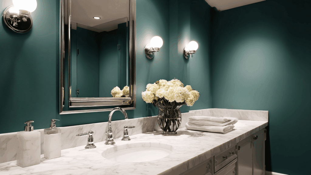
Bathrooms can really shine with Cascades, especially in smaller powder rooms, where you can go bold without worrying about the darkness.
The color feels clean and spa-like, which is exactly what you want in a bathroom. It pairs beautifully with white fixtures, marble countertops, and chrome or matte black hardware.
In a larger bathroom with good lighting, Cascades creates this luxurious, hotel-like atmosphere. Just be mindful of your lighting situation; you’ll want bright, warm bulbs to keep the space from feeling cave-like.
Accent Walls
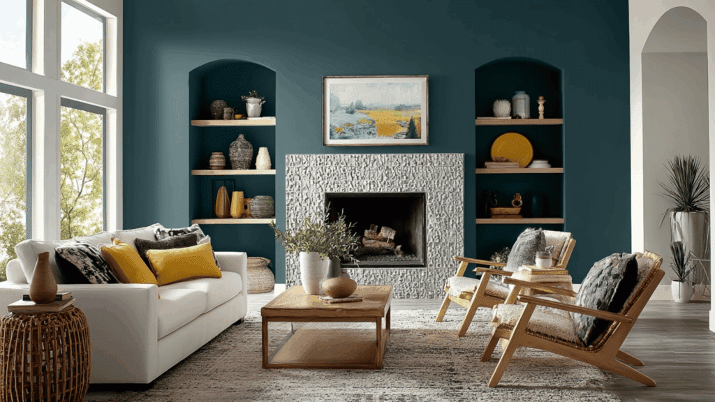
This is where Cascades really gets to flex. As an accent wall, it brings in all that moody drama without the commitment of painting an entire room.
It works particularly well behind a fireplace, in a dining nook, or as a statement wall in an entryway. The dark color creates depth and draws the eye, making architectural features pop.
You can use it to highlight built-in shelving, frame out a reading nook, or add interest to an otherwise plain hallway. Because it’s so saturated, it plays well with lighter wall colors; whites, creams, and soft grays all make great companions.
Exterior Applications
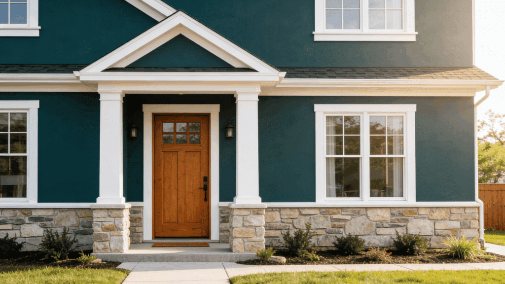
Cascades holds up beautifully on exteriors, particularly on front doors, shutters, or as a full-house color for more adventurous homeowners.
That deep green-blue reads as classic on traditional homes but can also give modern exteriors an edge. It pairs wonderfully with natural wood, white trim, and stone accents.
If you’re using it as a full exterior color, consider lighter trim and a contrasting door color to keep things from feeling too dark. The color weathers well and maintains its richness over time, which is a big plus for exterior applications where you don’t want to repaint every few years.
Sherwin-Williams Cascades Color Comparisons
Comparing Cascades to similar shades helps you see what makes it unique and whether one of its cousins might actually be a better fit for your project.
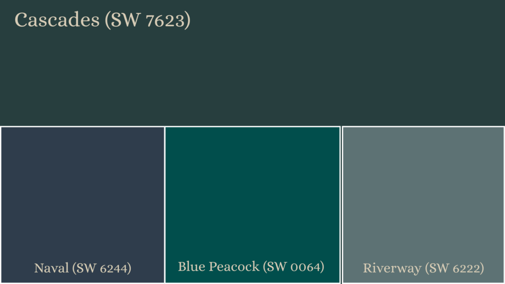
Sherwin-Williams Cascades vs Naval
Naval leans heavily into blue territory with a much stronger, cleaner presence. While Cascades has that muddy green-blue complexity, Naval is a straightforward deep navy. Naval’s LRV is also at 4, but it reads brighter and more saturated. If you want pure drama without the green undertones, Naval wins.
Sherwin-Williams Cascades vs Blue Peacock
Blue Peacock brings way more color saturation and brightness to the table. It’s a true teal with an LRV around 6, making it lighter and more vibrant than Cascades. Where Cascades feels moody and subdued, Blue Peacock makes a bolder, more energetic statement. Blue Peacock works when you want color that pops rather than whispers.
Sherwin-Williams Cascades vs Riverway
Riverway sits in a similar color family but feels earthier and more grounded. With an LRV of 16, it’s noticeably lighter than Cascades and reads more as a gray-green than a blue-green. Riverway works better in spaces where you need something dark but not quite as intense. It’s the safer cousin to Cascades’ moodier personality.
Coordinating Colors for Sherwin-Williams Cascades
Pairing Cascades with the right colors can either make it sing or fall flat. Here’s what actually works well with this moody shade.
| Category | Color Name | Why It Works |
|---|---|---|
| White Trim | Pure White (SW 7005) | Crisp contrast that keeps Cascades fresh |
| Soft White | Alabaster (SW 7008) | Warms up the Cascades without dulling it |
| Light Neutral | Agreeable Gray (SW 7029) | Balanced greige that softens bold walls |
| Dark Neutral | Iron Ore (SW 7069) | Adds depth and a moody, modern edge |
| Accent Blue | Naval (SW 6244) | Deep navy for cohesive layering |
| Green Accent | Evergreen Fog (SW 9130) | Earthy green that complements undertones |
| Warm Accent | Urbane Bronze (SW 7048) | Rich warmth for contrast and grounding |
| Wood Tone | Medium Walnut | Enhances richness and prevents coldness |
Interior Design Styles that Suit Cascades
Cascades adapts to several design styles, but it really shines in spaces that appreciate depth, contrast, and a bit of moodiness in their palette.
- Modern: Cascades brings the perfect amount of color to modern spaces without disrupting clean lines. Pair it with white, concrete, and metal finishes for a sleek, contemporary look that feels intentional.
- Transitional: This style loves Cascades because it bridges traditional warmth with modern simplicity. The color adds depth while staying neutral enough to work with both classic furniture and contemporary pieces seamlessly.
- Coastal: Cascades captures that deep ocean water feeling without being too literal. It works beautifully with natural textures, white shiplap, and weathered wood for a sophisticated take on coastal living.
- Scandinavian: While Scandinavian design typically favors light colors, Cascades works as a grounding accent. Use it sparingly alongside whites and natural woods to create cozy contrast without losing that airy feeling.
- Farmhouse: Modern farmhouse loves Cascades paired with shiplap, natural wood, and vintage accessories. The color adds to elements, boosting the style beyond the typical all-white farmhouse aesthetic we’ve seen everywhere.
To Conclude
So there you have it; Cascades in all its moody glory. This isn’t a color that plays it safe, and honestly, that’s exactly why it works so well when you use it right.
The key is understanding how that low LRV and those shifting undertones will behave in your specific space.
Don’t be afraid to test it out on a big sample board and live with it for a few days. Watch how it changes from morning to night.
And the right lighting and coordinating colors make all the difference. If you’re drawn to depth and refinement over bright and airy, Cascades might just be your perfect match.