 Color Review")
Choosing the right paint color can feel overwhelming. You stand in the store, staring at hundreds of swatches, wondering which one will actually look good on your walls.
Gray has been having a moment for years now, but finding the perfect shade? That’s the real challenge.
Porpoise by Sherwin-Williams keeps popping up in design magazines and Pinterest boards. It promises to be that ideal gray that works everywhere. But does it live up to the hype? Can one color really be that flexible?
Let’s take a closer look at what makes this particular shade tick and whether it deserves a spot in your home.
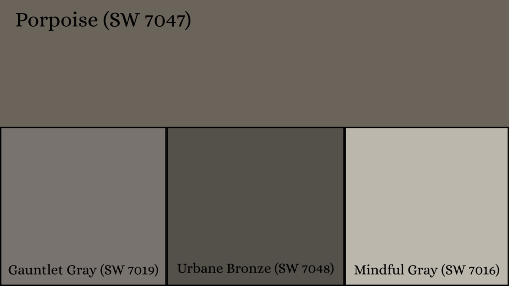
Porpoise Sherwin-Williams Color Details & Specifications
Porpoise sits comfortably in the medium-depth gray range. It’s not too light, not too dark. This versatile shade works across different rooms and lighting conditions, making it a go-to choice for designers and homeowners looking for reliable coverage.
| Specification | Details |
|---|---|
| Color Name | Porpoise |
| Color Code | SW 7047 |
| Color Family | Neutral |
| RGB Values | R: 107, G: 100, B: 91 |
| Hex Code | #6B645B |
| LRV | 13 |
| Undertones | Greige (gray-beige blend) |
Is Porpoise Sherwin-Williams Warm or Cool?
Porpoise leans toward the cooler side of the gray spectrum. It carries subtle green undertones that become more pronounced with different lighting.
Natural daylight tends to bring out these cooler qualities, while artificial lighting can shift how it reads.
The color doesn’t feel icy or stark, though. It maintains a balanced presence that keeps spaces feeling calm rather than cold. These green hints give it character without overwhelming a room.
You won’t get that sterile, clinical vibe some cool grays deliver. The overall effect stays neutral enough to work with both warm and cool color schemes throughout your home.
Best Rooms for Porpoise Sherwin-Williams Paint
Porpoise adapts well to different spaces throughout your home. Its medium depth and neutral character make it work in high-traffic areas and private retreats alike.
Living Rooms
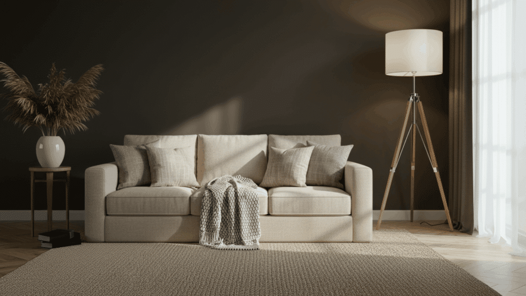
Living rooms benefit from Porpoise’s calming presence. The color creates a refined backdrop that lets your furniture and decor shine.
It pairs beautifully with both light and dark accent pieces. Natural light streaming through windows brings out its depth during the day, while evening lamplight keeps it feeling cozy.
The gray won’t compete with your artwork or throw pillows. You can change up your style from modern to traditional without repainting. It’s forgiving enough to handle the wear and tear of family life.
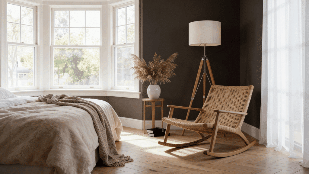
Bedrooms
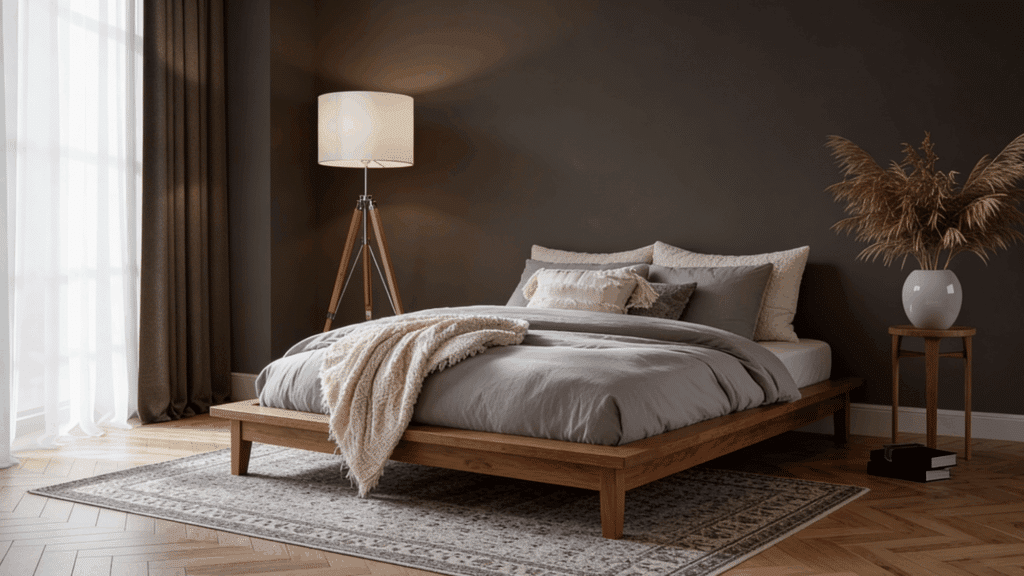
Bedrooms wrapped in Porpoise feel instantly relaxing. The color sets a peaceful mood that helps you unwind after long days. It’s neutral enough to work with any bedding color you choose.
Morning light makes it feel fresh and clean, while nighttime creates a cocoon-like atmosphere. The subtle undertones add interest without being distracting when you’re trying to sleep.
Kids’ rooms or primary suites both handle this shade well. It grows with you as your style evolves over the years.
Bathroom
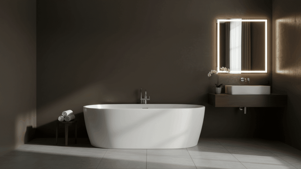
Bathrooms look polished and spa-like in Porpoise. The color handles moisture well and doesn’t show water spots as easily as lighter shades. White fixtures pop against it beautifully.
Chrome, brushed nickel, or matte black hardware all complement this gray perfectly. Small powder rooms feel more spacious, while large primary baths maintain an intimate feel.
The color stays consistent under bright vanity lighting. You can add colorful towels or keep everything neutral. Either way, the space feels clean and pulled together every single day.
Kitchen
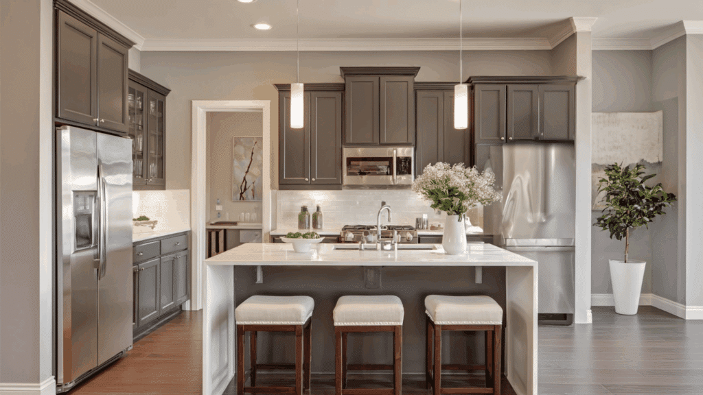
Kitchens painted in Porpoise feel both modern and timeless. The color works with white cabinets, wood tones, or even darker cabinetry. It handles kitchen lighting well, from bright overhead fixtures to under-cabinet strips.
Stainless steel appliances look right at home against these walls. The shade is practical too, hiding minor smudges better than lighter colors. It creates a neutral canvas that lets your backsplash or countertops become the focal point.
Exteriors
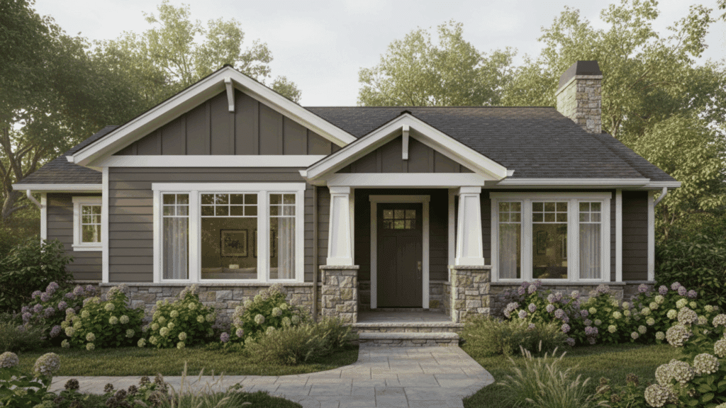
Porpoise brings curb appeal to home exteriors with understated style. The color looks good on various architectural styles, from Craftsman to Colonial.
It pairs well with white trim and darker shutters or doors. Natural stone, brick, or wood accents all complement this gray beautifully. The color holds up well against weather and UV exposure.
It doesn’t show dirt as obviously as lighter exterior colors. Your landscaping pops against this neutral backdrop. Neighbors will notice that the color is not screaming for attention every time they drive by.
Porpoise Sherwin-Williams vs. Similar Colors
Comparing Porpoise to similar shades helps you make the right choice. These popular alternatives share some qualities but differ in ways that matter.
Porpoise vs Gauntlet Gray
Gauntlet Gray runs less dark and dramatic than Porpoise. It has an LRV of 17, compared to Porpoise’s 13, making rooms feel cozier but smaller. Gauntlet leans slightly warmer, with brown undertones, while Porpoise stays cooler, with green undertones.
Porpoise vs Urbane Bronze
Urbane Bronze brings warmth that Porpoise doesn’t offer. This brownish-gray reads almost charcoal in low light with an LRV of 8. Porpoise feels lighter and more traditional. Urbane Bronze makes bold statements in dining rooms or accent walls, while Porpoise works better for whole-home consistency and broader appeal.
Porpoise vs Mindful Gray
Mindful Gray sits lighter on the scale with an LRV around 48. It feels airier and more open than Porpoise. Both carry cool undertones, but Mindful Gray leans slightly warmer. Porpoise offers more depth and presence on walls. Pick Mindful Gray for small spaces that need brightness, and Porpoise for rooms that want substance.
Best White Trims to Pair with Porpoise Sherwin-Williams
The right trim color makes Porpoise shine. Crisp contrasts or subtle complements both work, depending on your style.
| Trim Color Name | SW Number | Undertone | Why It Works with Porpoise | Best Use Case |
|---|---|---|---|---|
| Pure White | SW 7005 | Neutral-cool | Creates sharp contrast without warming Porpoise | Modern, clean interiors |
| Extra White | SW 7006 | Cool | Crisp, bright contrast that highlights Porpoise’s depth | Contemporary & minimal spaces |
| Alabaster | SW 7008 | Warm | Softens Porpoise and adds warmth | Traditional & cozy homes |
| Greek Villa | SW 7551 | Warm | Balanced warmth that prevents Porpoise from feeling heavy | Living rooms & open layouts |
| Shoji White | SW 7042 | Warm greige | Blends smoothly while maintaining contrast | Transitional interiors |
| Snowbound | SW 7004 | Soft cool | Slightly muted contrast for subtle elegance | Bedrooms & low-light rooms |
Should You Choose Porpoise Sherwin-Williams for Your Home?
Porpoise isn’t for everyone, but it might be perfect for you. Here’s who benefits most from this versatile gray.
- Want a neutral that doesn’t feel boring or flat in different lighting conditions
- Need a whole-home color that flows seamlessly from room to room without feeling repetitive
- Prefer cooler tones, but don’t want your space feeling cold or unwelcoming
- Like the flexibility to change decor styles without repainting every few years
- Value a refined backdrop that lets your furniture and art take center stage
Conclusion
Porpoise SW 7047 delivers what most homeowners actually need: a dependable gray that performs well without demanding constant attention. Its medium depth and cool undertones with subtle green hints create spaces that feel finished and intentional.
This color won’t transform your home into something magazine-worthy on its own.
What it will do is provide a solid foundation that lets everything else in your room work together. That’s honestly more valuable than chasing trendy shades that feel dated in two years.
Ready to commit? Grab samples and test them in your actual lighting first. Your walls will thank you.