
Something exciting is happening in bedroom design right now. The biggest paint brands – from Dulux to Little Greene – are all pointing towards the same thing: 2026 will be the year of deeper, richer colours that make your heart skip a beat. We’re talking olive greens that ground you, espresso browns that cocoon you, and romantic burgundies that make you want to linger under the covers just a little longer.
Pantone might have chosen Cloud Dancer, a crisp white, as their 2026 Colour of the Year. But here’s what’s really got us excited: Dulux has gone completely the other direction with not one, but three stunning blues for 2026. Picture the bold cobalt ‘Free Groove’ and the moody grey-blue ‘Slow Swing’. Benjamin Moore? They’ve picked Silhouette AF-655 – think rich espresso mixed with charcoal that practically whispers sophistication.
Your bedroom isn’t just a place to sleep – it’s where you start and end each day. The colours surrounding you can actually change how well you rest. Would you believe that people with blue bedrooms sleep nearly two hours longer than those with purple ones? Green works magic too, bringing those lovely feelings of comfort and peace right into your space.
This isn’t about chasing whatever’s trendy on Instagram. You’re about to discover how the right colours can turn your bedroom into something really special – a space that doesn’t just look beautiful, but actually helps you feel your best.
The Emotional Power of Bedroom Colours
The colours you choose for your bedroom can make a big difference to the quality of your sleep, and your mood when you wake up. Far from being just pretty decoration, your bedroom palette actually changes how your body and mind respond to your space. Scientific research confirms that certain colours trigger powerful responses that can either help or hinder your rest.
How Colour Affects Sleep and Mood
Here’s what the science tells us: your emotional state before bedtime directly influences how well you sleep. When you’re feeling stressed or anxious, your sleep quality suffers, leading to less efficient rest and shorter sleep time. The good news? Calming colours can actually boost melatonin production and reduce cortisol levels, setting you up for deeper, more restorative sleep.
Blue emerges as the clear winner for bedroom spaces. This soothing colour can reduce your heart rate and blood pressure, helping your body naturally wind down for the night. The proof is impressive – people sleeping in blue bedrooms averaged 7 hours and 52 minutes of sleep per night, whilst those in purple bedrooms managed just 5 hours and 56 minutes.
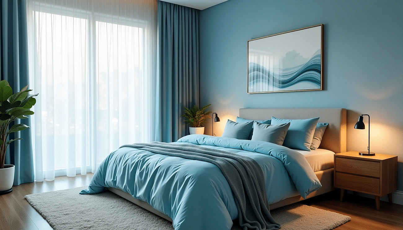 Image credit Bedstar: Blue bedroom décor, promotes calmness and tranquility.
Green works beautifully too, bringing feelings of comfort, peace, and happiness into your space. Both blue and green belong to the cooler colour family, and studies show these tones help lower your heart rate and blood pressure, making it much easier to drift off.
Some colours, however beautiful, simply don’t belong in the bedroom. Red can raise your blood pressure and pulse rate, making it harder to fall asleep. Bright, high-contrast colours send the wrong signal to your brain, keeping you alert when you need to unwind, often leading to lighter sleep or more night-time wakings.
Why 2026 is about feeling, not just style
We’re seeing something really interesting happen as we approach 2026. Bedroom design is shifting away from decorating purely for looks towards choosing colours that actually make you feel something. Rachel London from Lick puts it perfectly: “we’ve seen a move away from futuristic, white-on-white minimalist decor and towards a yearning for spaces that burst with colour, comfort and character”.
Industry experts are noticing this change too: “looking ahead to 2026, colours will be less about what looks timeless and more about what feels timeless”. Your emotional wellbeing is taking priority over simple visual appeal.
The 2026 colour forecast reflects this shift towards emotionally expressive design that puts your wellbeing first. “Designers are loving colours with plenty of depth and warmth that bring intrigue and sophistication to the home,” explains Lucy Steele, paint and interiors expert from Valspar Paint.
Tash at Lick sums it up beautifully: “2026 is all about feeling confident to play with colour and create homes that feel unapologetically you. After years of cooler, minimalist interiors, people are craving depth, personality and feeling”. The colours surrounding you as you prepare for sleep can either support or sabotage your journey to restful slumber.
Your perfect bedroom should tell your personal story. Studies show people actually fall asleep faster when their sleep space features their personally chosen colour. Remember, the most scientifically perfect colour won’t help if it doesn’t feel right to you.
The top bedroom colour families for 2026
Ready to dive into the colours that will define bedrooms this year? Four distinct families are stealing the spotlight, each bringing its own personality to your sleeping space.
Dusky blues: calm and timeless
Blues aren’t going anywhere – and for good reason. Dulux has doubled down with their “versatile family of indigos” for 2026, including that gorgeous vibrant “Free Groove” and the deeply meditative “Slow Swing”. These aren’t your typical baby blues. Think rich, sophisticated shades that design experts describe as offering “a sense of stability, fluidity and boundlessness”.
Deep indigo and teal work beautifully for creating “warm, inviting spaces perfect for cosying up in”. Want something lighter? Pale blues paired with floaty white linens and driftwood furnishings give you those “beach-inspired havens” that feel like a permanent holiday. Blues play well with others too – try them with grey for that relaxed coastal vibe, or add golden metallics for proper bedroom glamour.
Botanical greens: natural and grounding
Here’s where things get interesting. Green is having a serious moment, particularly “olive green in its deeper, earthier forms”. There’s something about these botanical shades that just makes sense in a bedroom – they bring the outdoors in without overwhelming your space.
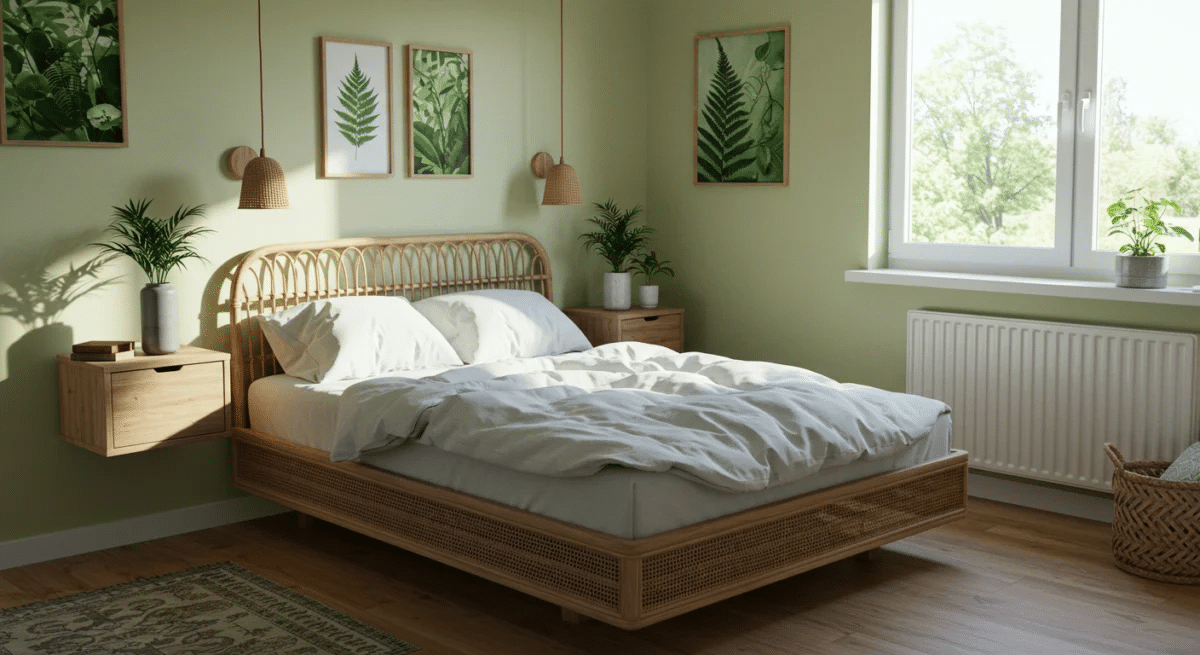
Image credit Bedstar: Nature inspired green bedroom décor, rattan bed frame.
Sage and olive tones create what designers call “the ultimate sleep sanctuary”, helping with both relaxation and concentration. These colours represent “growth, freshness and harmony, helping to reduce stress and promote relaxation, which is ideal for a bedroom space”. The best part? They strike “the perfect balance between stimulation and serenity”, working brilliantly whether your style is pared-back minimalist or full-on country cottage.
Earthy reds and terracotta: warm and expressive
After years of cool tones ruling the roost, warm terracotta is making quite the entrance. These earthy reds deliver “warmth, charm, and a touch of Mediterranean flair” that feels both sophisticated and welcoming. Experts predict “burgundy and red tones will make a confident return to both interior and exterior palettes, offering a sense of warmth, depth and sophistication”.
What makes terracotta so bedroom-friendly? Its rustic quality creates a “calm and cosy sanctuary” whilst playing nicely with other colours. You’ll find shades ranging from “deep baked clay to reddish brown and corals”, so there’s flexibility to match your comfort level. Pair it with blue or green for vibrant contrast, or keep things sophisticated with white, black or grey for that “sober, elegant look”. Terracotta with white creates a particularly lovely “fresh yet soothing atmosphere”.
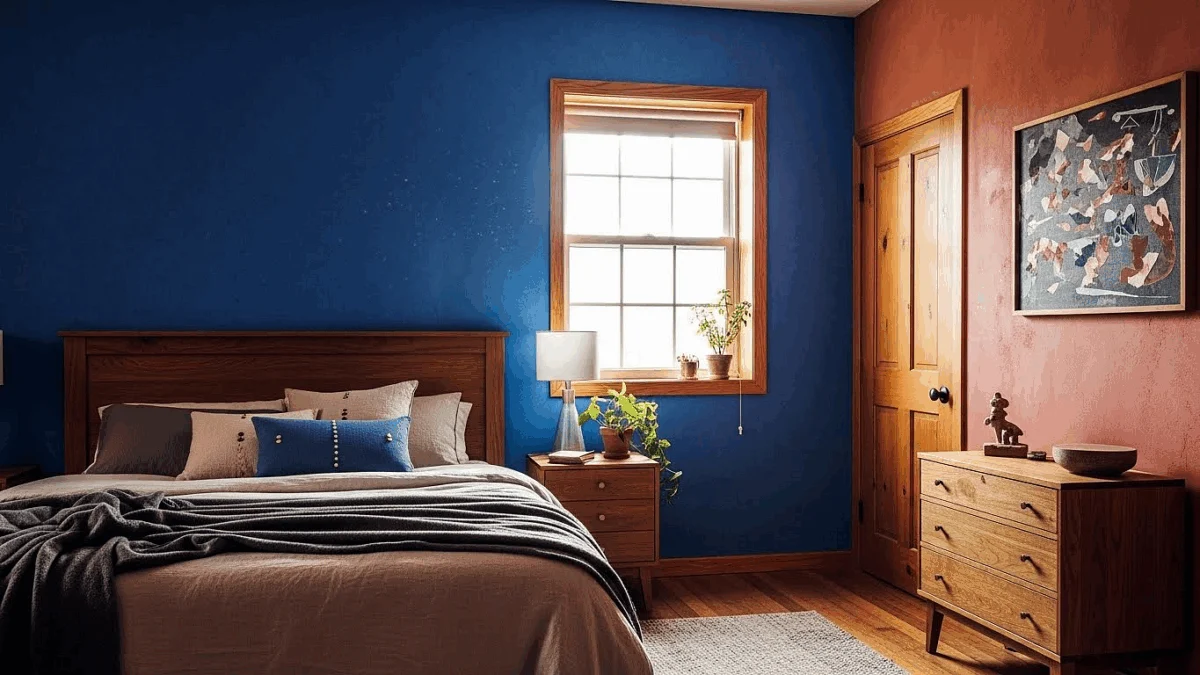
Image credit Bedstar: Cornflower blue bedroom feature wall, terracotta walls, wooden accents.
Taupe and beige: the new neutrals
Grey’s reign is ending, and taupe and beige are stepping up as 2026’s sophisticated neutrals. Designers are calling taupe “the unsung hero of the colour world” – and honestly, it’s about time it got some recognition. This clever blend gives you “that perfect blend of grey and beige that adds depth without overpowering a space”.
Taupe creates “a warm and welcoming space” in bedrooms, offering relief from stark whites whilst keeping things bright. Interior designer Jessica Quintero puts it perfectly: “people are gravitating towards taupe because it’s like a warm hug in a paint can”.
Beige works as “a basic in interior design”, bringing brightness without that sometimes clinical white feel. Try using “beige as the dominant colour” on “70% of the walls, and the rest with taupe” for what designers describe as “a soft and elegant ambiance, but above all, harmony”.
Techniques worth shouting about with colour
You’ve chosen your perfect palette – now let’s talk about how to make it sing. These three application techniques can turn even the simplest colour choice into something absolutely stunning for your bedroom.
Colour Drenching: your cocooning sanctuary
Picture this: walls, ceiling, woodwork, skirting boards, radiators, even furniture – all painted in the exact same gorgeous hue. Sounds bold? It absolutely is, and that’s precisely why colour drenching has become the technique everyone’s talking about as we head into 2026. This creates what designers call “a seamless backdrop which blends everything together, for an elevated, harmonious look”.
Here’s the magic bit – when everything flows in one colour, your eye doesn’t get caught on contrasting edges. Instead, it drifts smoothly around the space, creating this wonderfully tranquil atmosphere. Forest green, navy blue, charcoal grey – these deeper tones work beautifully to create that intimate, cocooning effect you’re after.
Takeaway Tip: worried about making your bedroom feel smaller? Colour drenching actually does the opposite. Without stark contrasts breaking up the room, your eye moves freely throughout the space, making it feel surprisingly expansive.
Image credit Bedstar: Birlea Tilly 4FT 6 Double Upholstered Bed Frame, Taupe Inspired Bedroom Décor.
Double Drenching: subtle sophistication
Ready to take things up a notch? Double drenching uses two related colours throughout your space – think cousins rather than twins. This technique creates gorgeous depth through subtle variation, using colours that differ in hue rather than strength.
The secret lies in choosing colours from the same family with slightly different undertones. Deep Cornflower walls paired with richer Acai Berry trim? Unexpected contrast that somehow maintains perfect harmony. Blues work particularly well here – imagine Royal Navy, Dock Blue and Smalt creating a bedroom that feels both cohesive and dynamic.
Ruth Mottershead, Creative Director at Little Greene, puts it perfectly: “Double drenching is an expansion of colour confidence, taking the concept into a highly creative, sophisticated and nuanced approach to decoration”.
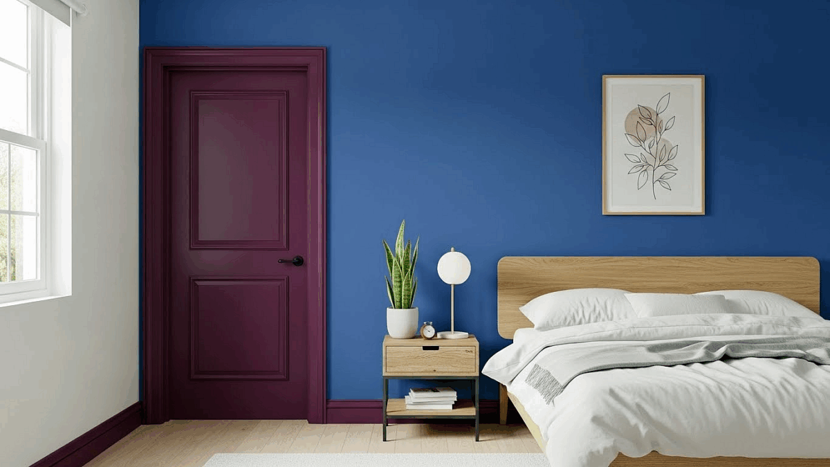
Image credit Bedstar: Cornflower coloured bedroom feature wall, acai berry bedroom door and door frame.
Accent Clusters: small steps, big impact
Not quite ready to drench everything? Accent clusters offer the perfect middle ground. Instead of painting one large accent wall, you’re adding strategic splashes of colour to architectural details like alcoves, window frames, shelves, and doorways.
This approach lets you experiment with bolder colours on a smaller scale whilst keeping everything balanced. Choose one or two architectural features and give them special treatment – perhaps that built-in nook in a complementary shade, or your window frame in an unexpected hue.
Don’t forget to think beyond corners. Extending colour past the edges of a room gives it a wonderfully modern, individual feel. Frame a window with colour and watch how it draws your eye outside, instantly making the room feel more spacious.
Matching colours to your interior style
Which interior style makes your heart sing? Each one has its own colour personality, and finding yours is the secret to creating a bedroom that feels completely, authentically you.
Scandi: whites and soft greys
Scandinavian bedrooms are all about that hyggeligt feeling – cosy, warm, and utterly peaceful. Your colour palette should centre around soft whites, gentle greys, and those lovely muted earth tones that make everything feel calm and collected.
Here’s a tip that’ll make all the difference: choose warm whites over cool ones for your walls. Cool whites might look crisp, but they can feel a bit clinical in a bedroom. Warm whites have those subtle red or yellow undertones that create a much more inviting space – perfect for those dark winter mornings when you need all the cosy vibes you can get.
Most whites aren’t actually “true white” anyway. They’re either warm (with red/yellow pigments) or cool (with blue pigments). Trust us, the warm ones are much easier to live with and pair beautifully with your Scandi furnishings.
Modern rustic: taupe, olive, and clay
This style is brilliant because it gives you the best of both worlds – contemporary clean lines with that lovely countryside warmth. Start with your foundation colours: think warm sand and taupe that feel like a gentle hug.
Then layer in those gorgeous earthy shades – ochre, terracotta, olive green, and soft muted pinks. These earth tones work beautifully in bedrooms because they naturally create that warm, restful atmosphere you’re after. The combination of terracotta with sage green? Absolute perfection for a rustic bedroom that feels both timeless and fresh.
Contemporary luxe: navy and metallics
Ready to create some serious bedroom glamour? Deep, saturated colours paired with refined finishes will give you that sophisticated impact you’re dreaming of.
Navy and indigo are your best friends here – they create dramatic, opulent spaces whilst still being soothing enough for proper sleep. Pair these rich blues with metallic accents, and you’ll create something truly special. Brass or gold fixtures add instant warmth and elegance against those cool blue backgrounds.
Want maximum impact? Try colour capping – painting everything from floor to ceiling in one colour family. It creates incredible cohesion whilst adding subtle depth and elegance that feels utterly luxurious.
Boho: sage, moss, and layered textures
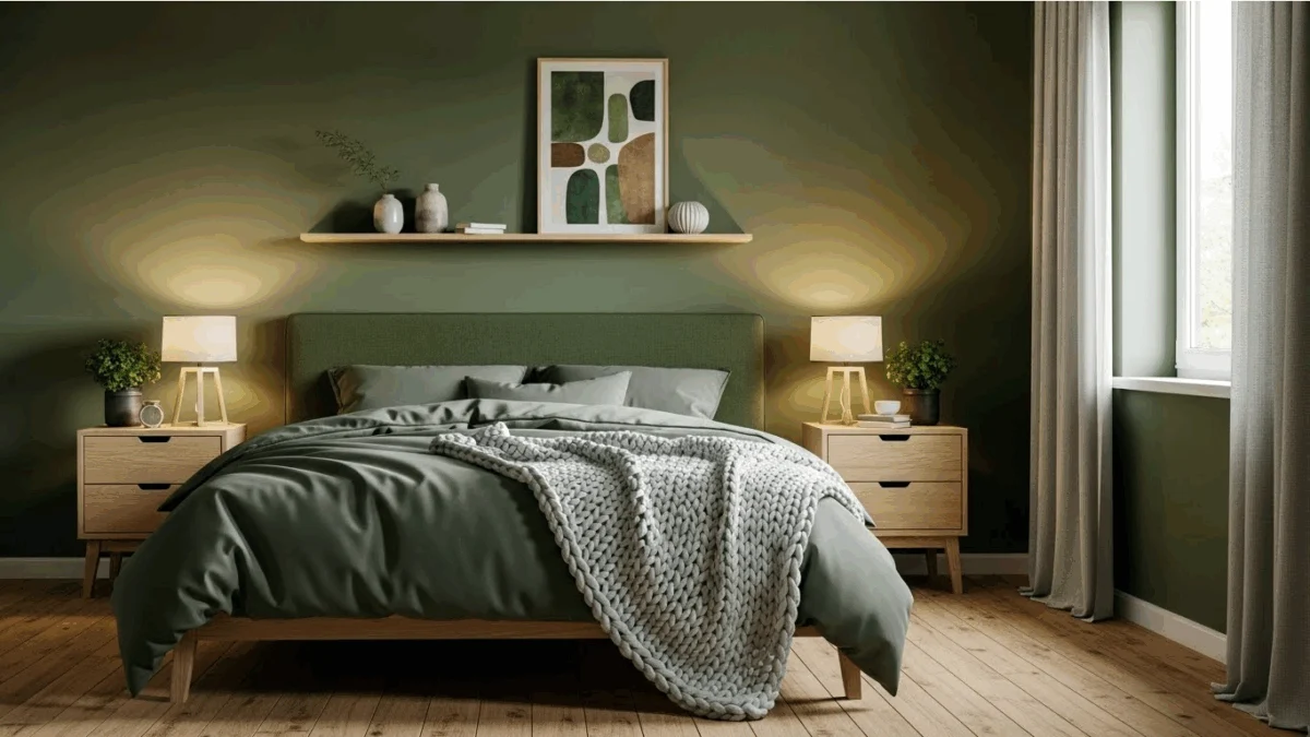
Image credit Bedstar: Moss green colour coloured bedroom, wooden accents.
Bohemian bedrooms are all about celebrating YOU through layers of texture, pattern, and natural elements. Botanical greens – from soft sage to deeper moss – create the perfect foundation for this free-spirited style.
These nature-inspired hues instantly connect you to the outdoors, giving you that gorgeous boho feeling. Build from there with warm neutrals like cream or sand, then add those earthy shades – terracotta, ochre, dusty rose. Feeling bold? Jewel tones like emerald make stunning statement pieces.
Remember, boho thrives on rich textures. Layer in handmade textiles, rustic woods, and plenty of lush greenery to complete your vibrant, personal sanctuary.
What to avoid and what’s fading out
Trends come and go, but some bedroom colours are definitely on their way out. Here’s what you might want to steer clear of if you’re planning your 2026 bedroom refresh.
Why millennial grey is on the decline
Remember when grey was everywhere? After nearly ten years of dominating bedroom walls, millennial grey is finally losing its grip. Those cool, crisp greys that once felt so modern now seem a bit… well, cold. Designers are swapping them for warmer alternatives like taupe and beige that actually make you want to spend time in your bedroom. Cool greys just don’t have that emotional connection we’re all craving in 2026.
Colours that disrupt sleep
Some colours might look stunning in photos, but they’re not doing your sleep any favours. Bright purple is particularly troublesome – people with purple bedrooms get nearly two hours less sleep than those lucky enough to have blue ones. Bright red works against you too, sending your blood pressure up when it should be winding down. Even brown can feel heavy and oppressive when you’re trying to create a restful retreat.
Overly minimal palettes
Those stark white-on-white schemes that filled Pinterest for years? They’re heading for the exit. All that clinical perfection might photograph beautifully, but it doesn’t feel particularly welcoming when you’re curled up with a good book. The 2026 shift towards colours with genuine emotional impact means those one-dimensional, sterile schemes are being replaced by palettes that actually make you feel something. Your bedroom should be a sanctuary, not a showroom.
What you need to remember
Your bedroom colours aren’t just about making your space look pretty – they’re about how you feel every single morning when you wake up and every single evening when your head hits the pillow.
We’ve talked about those gorgeous deep blues and botanical greens taking centre stage in 2026. Yes, they’re scientifically proven to help you sleep better. But here’s what really matters: does the colour make you feel calm? Does it make you smile when you walk into your room?
You might love the idea of colour drenching everything in that dreamy sage green, or perhaps those small accent clusters feel more like your style. Maybe you’re drawn to those warm terracottas we explored, or you’re completely smitten with the sophisticated navy and metallics approach.
There’s no wrong choice here – only what feels right for you.
Remember, the best bedroom colour is the one that makes your space feel like your own personal sanctuary. Whether you go bold with these bedroom colour trends for 2026 or choose something completely different, trust your instincts. Your bedroom should tell your story, support your sleep, and most importantly, make you feel genuinely happy to be home.
The colour world is your oyster – have fun with it!