
I’ve always loved the look of dark green paint; it feels rich, calming, and a little bold without being too loud.
When I began searching for the ideal shade, I quickly realized that Benjamin Moore offers some of the finest dark greens available. From deep forest tones to muted olive greens, each one brings a different mood to a space.
Some feel earthy and cozy, while others lean more towards elegance or drama. I wanted something that would make a statement but still feel easy to live with.
In this blog, I’ll share my favorite dark green paint colors from Benjamin Moore. You’ll find tips on how to use them, where they look best, and what to pair them with.
If you’re considering incorporating dark green into your home, these shades are a great place to start.
What Makes Dark Green a Good Color?
Dark green is a color that evokes a sense of both calmness and boldness. It can make a room feel peaceful without losing strength. That balance makes it easy to use in many styles.
It works in modern homes where clean lines are a priority. It also fits in classic spaces with more detail. In natural settings, it blends well with soft, earthy tones.
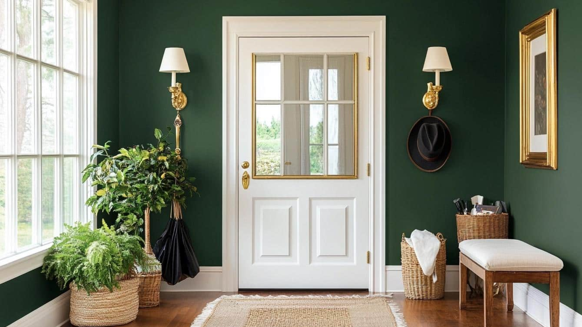
This colour pairs well with a wide range of materials. It looks warm next to wood, strong next to stone, and sharp next to metal. Dark green works exceptionally well with brass, black, or brushed silver finishes.
Whether you’re aiming for a cozy space or something more formal, dark green can complement the look without overwhelming it.
Top Benjamin Moore Dark Green Paint Colors
Dark green is a strong and steady color. It works in many areas of the home, including walls, cabinets, trim, and even doors. Benjamin Moore offers a wide range of dark green shades, each with a unique tone and texture.
1. Essex Green (HC-188)
Essex Green is a deep, dark green that nearly appears black. With an LRV of 5.64, it absorbs most of the light, creating a rich essence.
It creates a solid atmosphere in any space. This color works exceptionally well for exteriors, trim, or creating an intimate, cozy interior.
It pairs beautifully with brick, stone, or lighter contrasting colors to maintain a harmonious look. Also known as PM-11, Essex Green offers a timeless, grounded appeal.
2. Salamander (2050-10)
Salamander is a striking blend of black, green, and blue, resulting in a rich, dark tone. With an LRV of 5.72, it creates a strong contrast that brings depth to any room.
This popular shade is ideal for spaces like bedrooms or offices, or it can serve as a bold accent on a wall. It adds darkness and warmth simultaneously.
Salamander pairs beautifully with warm metallics, soft cream tones, or deep wood finishes, adding a touch of sophistication and drama without overwhelming the room.
3. Regent Green (2136-20)
Regent Green is a deep, sophisticated shade of pine that nearly appears black. With an LRV of 6.16, it absorbs light, making it an ideal choice for creating a bold and grounded feel in a room.
This dark, rich color brings a sense of depth and luxury to any space it inhabits, instantly drawing attention without overwhelming the senses.
It’s an excellent option for accent walls, where it can create a stunning focal point, or for cabinetry, providing a timeless and elegant look.
4. Hunter Green (2041-10)
Hunter Green is a deep, rich hue with a timeless, classic appeal. With an LRV of 6.39, it absorbs most light, giving spaces a bold, grounded presence without feeling overwhelming.
This versatile shade is perfect for both traditional interiors and modern settings, as well as natural spaces. Whether used on accent walls, cabinetry, or trim.
Hunter Green adds a sense of quiet strength and sophistication. It brings a sense of depth and calm, making it an ideal choice for spaces that need a touch of character without becoming too dominant.
5. Forest Green (2047-10)
Forest Green is a rich, dark green that exudes a sense of depth and stability. With an LRV of 7.58, it absorbs most light, creating a bold, grounding presence in any space.
This color is ideal for dining rooms, libraries, or accent spaces where you want to introduce an air of sophistication and calm.
Its deep tone pairs beautifully with off-whites, adding a soft contrast, while leather and warm wood finishes enhance its natural, timeless appeal.
6. Tarrytown Green (HC-134)
Tarrytown Green is a deep pine hue with cool, clean undertones. With an LRV of 9.71, it absorbs most light, creating a steady, bold presence in any room.
This versatile color works beautifully in traditional settings, libraries, or as an accent on exterior trim. Its rich tone pairs effortlessly with crisp whites, warm creams, or natural wood finishes.
Used indoors or outdoors, Tarrytown Green adds a timeless, grounded quality to any space, bringing a sense of calm and sophistication.
7. Vintage Vogue (462)
Vintage Vogue is a smoky, ultra-dark green that exudes a rich, shadowy ambiance. With an LRV of 11.85, it absorbs most of the light, though it reflects slightly more than black or charcoal.
This versatile shade can be used as a softer alternative to black or brown, offering a natural touch that adds quiet depth to any room.
It’s ideal for creating a sophisticated, understated atmosphere that remains grounded and serene. Vintage Vogue brings an elegant and timeless quality to any space.
8. Webster Green (HC-130)
Webster Green is a dark green with a crisp, clear tone that feels refreshing and stable. With an LRV of 20.2, it reflects more light than deeper green shades.
This versatile hue is perfect for living rooms, kitchens, or entryways, where it adds a sense of vibrancy and balance without overwhelming the space.
Also known as 636, Webster Green brings a fresh, grounded look to any room, offering a natural and welcoming atmosphere that complements a variety of decor styles.
9. Peale Green (HC-121)
Peale Green is an earthy forest green that offers a timeless, grounded feel. With an LRV of 14.15, it provides a deep tone that brings stability to a room without feeling too overpowering.
This versatile shade is ideal for dining rooms, offices, or cozy living spaces, where it creates a sense of warmth and depth.
Peale Green adds a quiet richness to both modern and traditional homes, enhancing the atmosphere without overwhelming the space. Its natural, calming quality.
10. Cushing Green (HC-125)
Cushing Green is a balanced, dark green that brings a smooth, steady vibe. With an LRV of 17.98, it reflects enough light to ensure the space feels inviting without becoming too dark or heavy.
This versatile shade works beautifully in both modern and traditional settings, offering a grounded and sophisticated look.
Cushing Green complements a wide variety of color schemes, striking the perfect balance between boldness and subtlety.
11. Balsam (567)
Balsam is a rich forest green with a balanced, natural tone. With an LRV of 15.32, it falls in the mid-dark range, providing depth and character without feeling too heavy or overpowering.
This versatile shade works beautifully in studies, kitchens, or as an accent wall, creating a bold yet steady atmosphere.
Balsam brings a grounded, confident feel to any room, making it a perfect choice for spaces that need a touch of richness and warmth without overwhelming the senses.
Styling Your Home with Benjamin Moore’s Dark Green
Below, you’ll find ideas for how and where to use dark green throughout the home, along with examples of Benjamin Moore shades that work well in each space.
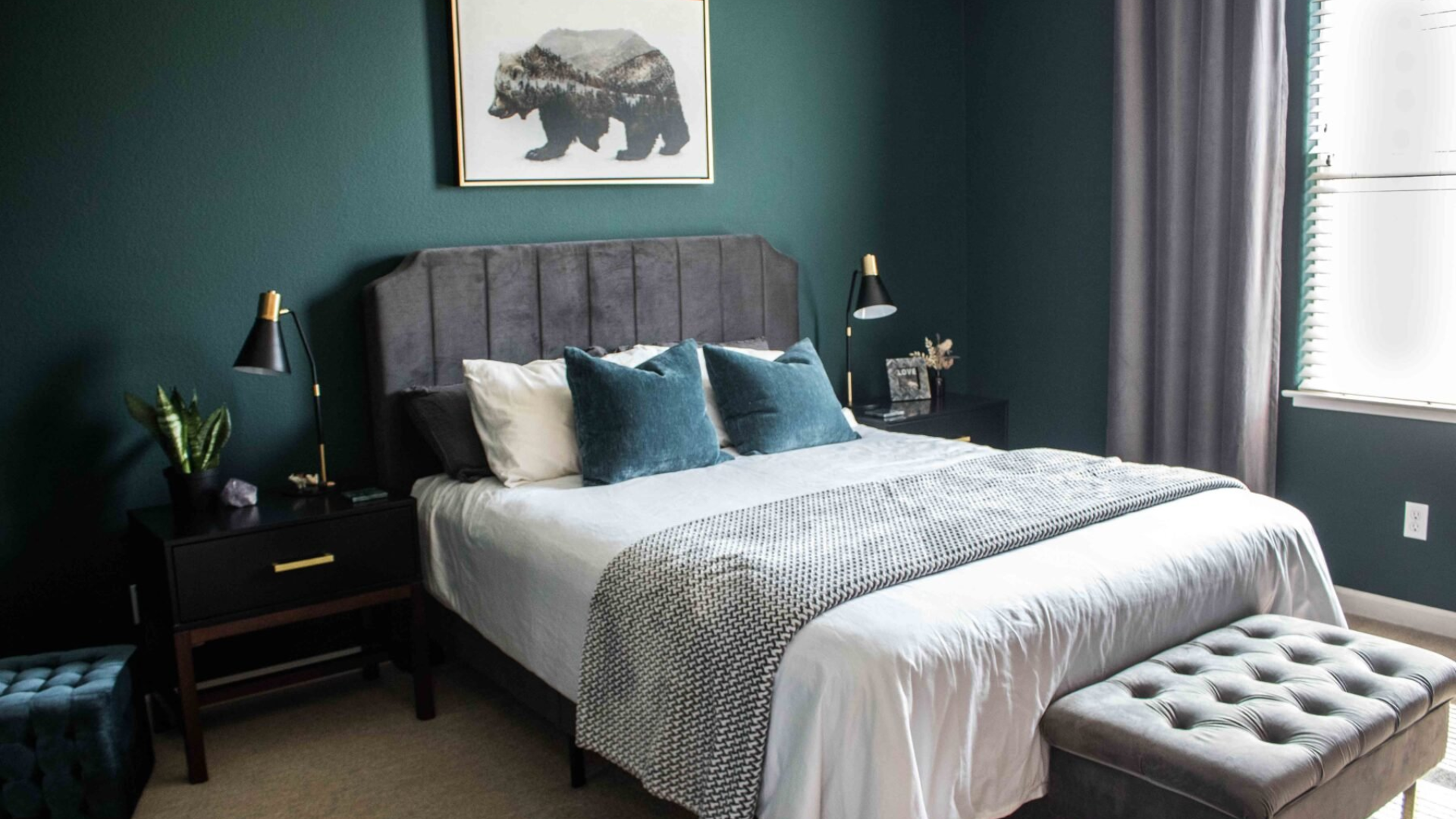
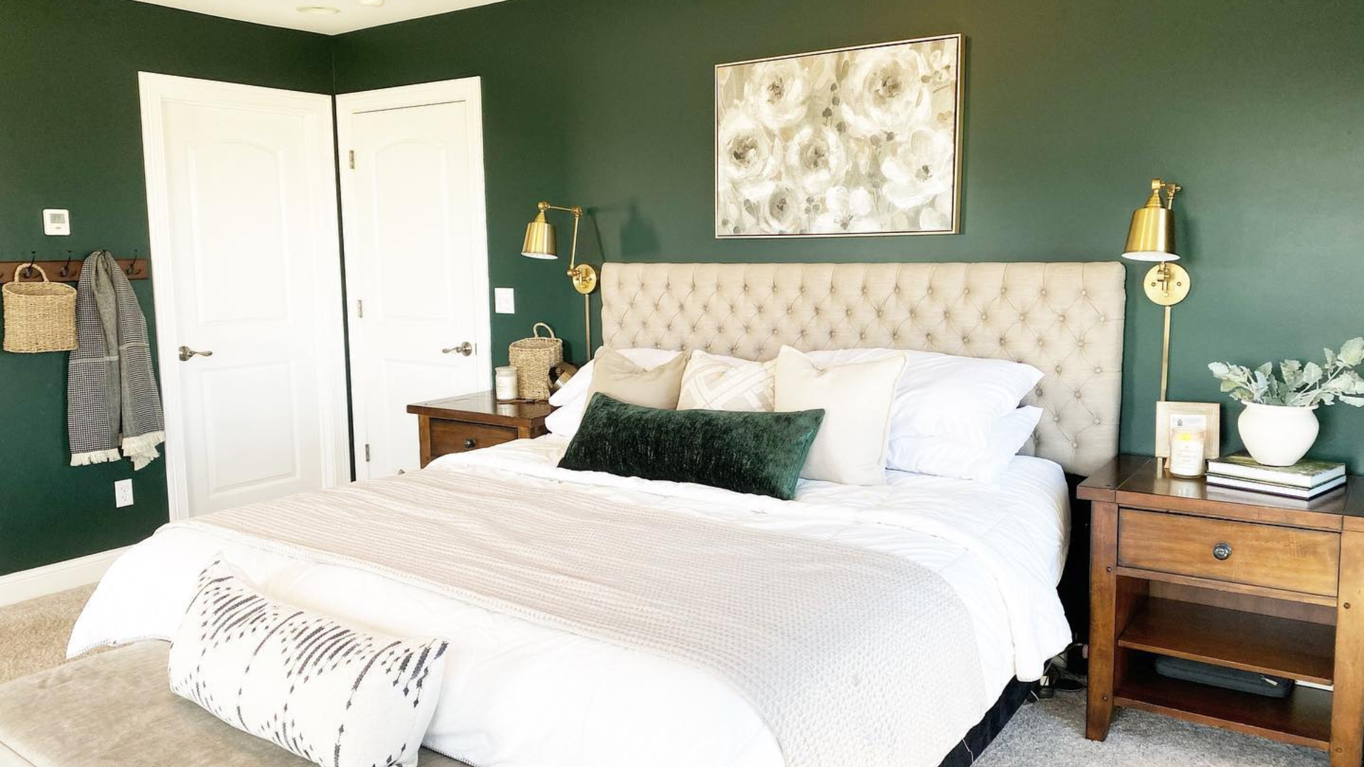
Bedrooms
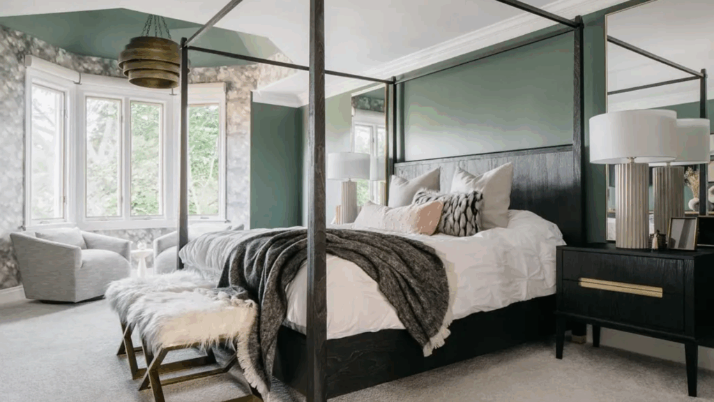
A dark green color scheme in the bedroom creates a calm and cocoon-like feel. It helps block out visual noise and gives the space a restful tone.
Try Salamander (2050-10) for a dramatic, moody feel or Cushing Green (HC-125) for something softer and more balanced. Both pair well with warm woods and soft lighting.
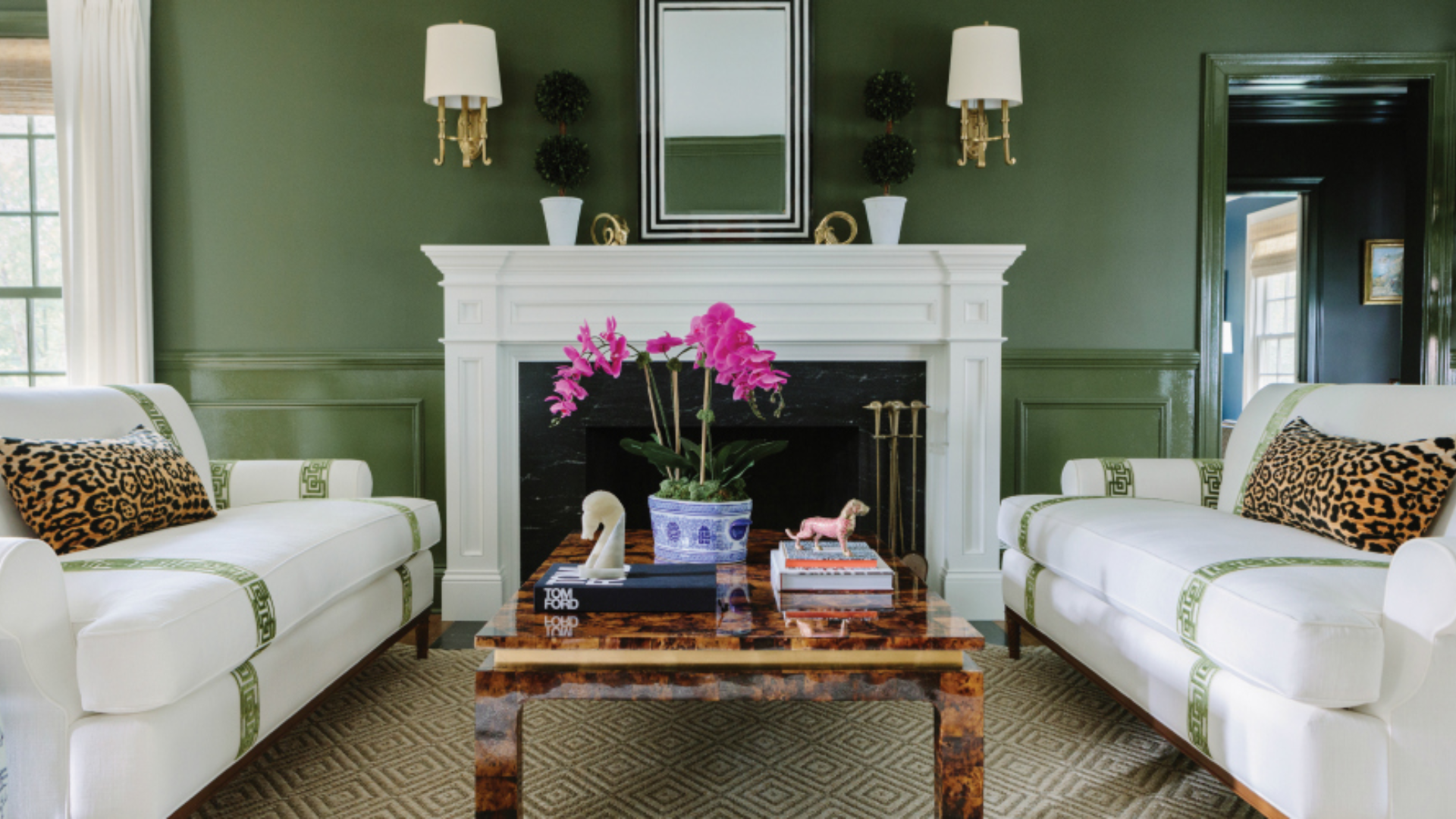
Living Rooms
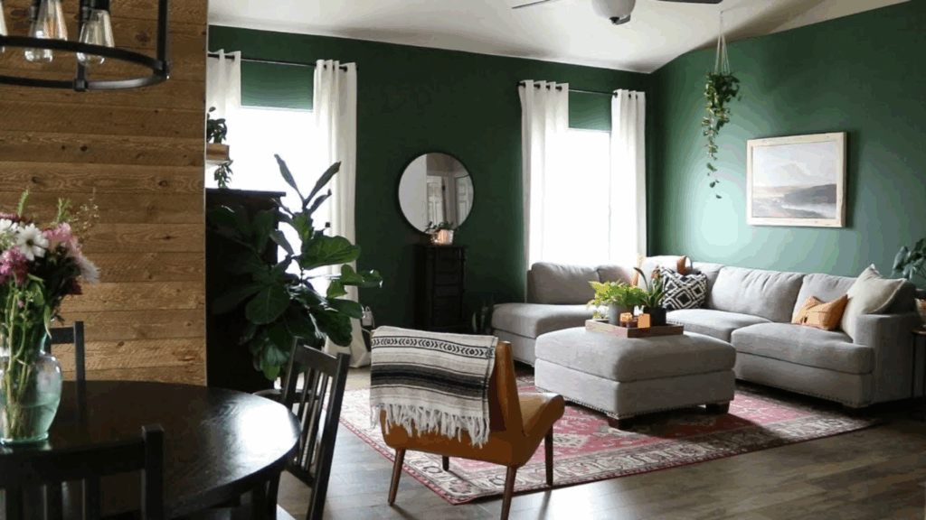
In living rooms, dark green can create a warm and grounded atmosphere. It works well with both modern and traditional furniture.
Webster Green (HC-130) adds a crisp look that feels fresh without being too dark. For a bolder feel, try Vintage Vogue (462) or Hunter Green (2041-10) with brass accents and off-white trim.
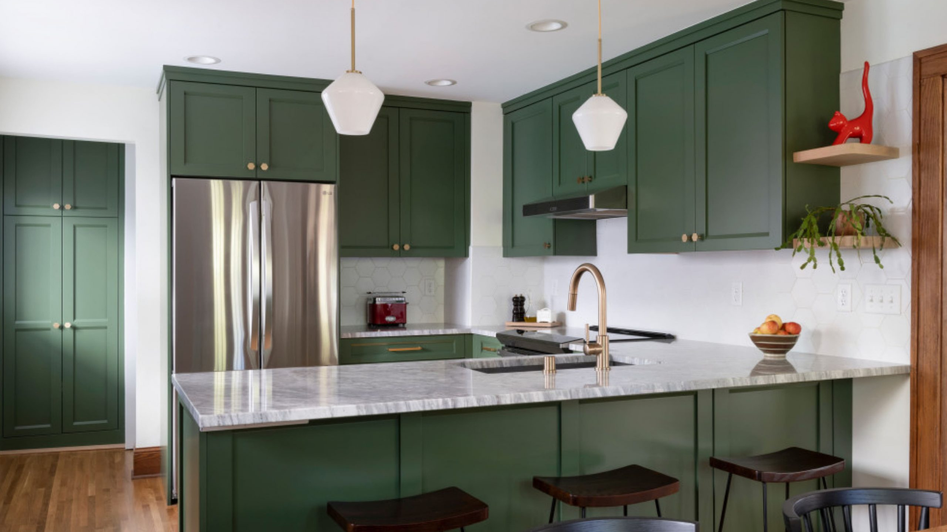
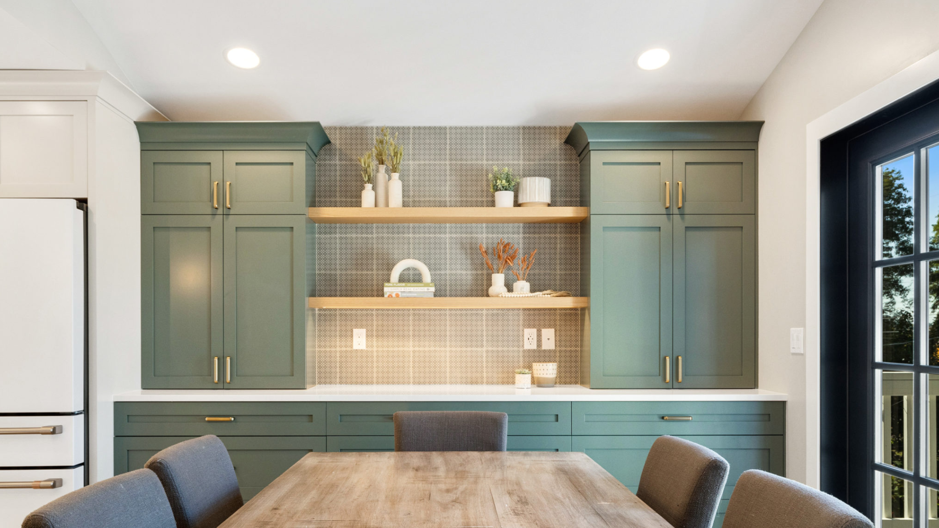
Kitchens
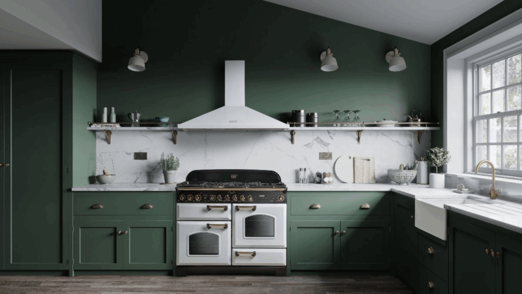
Dark green pairs well with wood, metal, and stone—common materials in kitchens. It looks great on walls, cabinets, or islands.
Use Balsam (567) or Peale Green (HC-121) for a rich, earthy feel. Tarrytown Green (HC-134) also works well with cream counters and wood shelves.
Cabinets or Built-ins
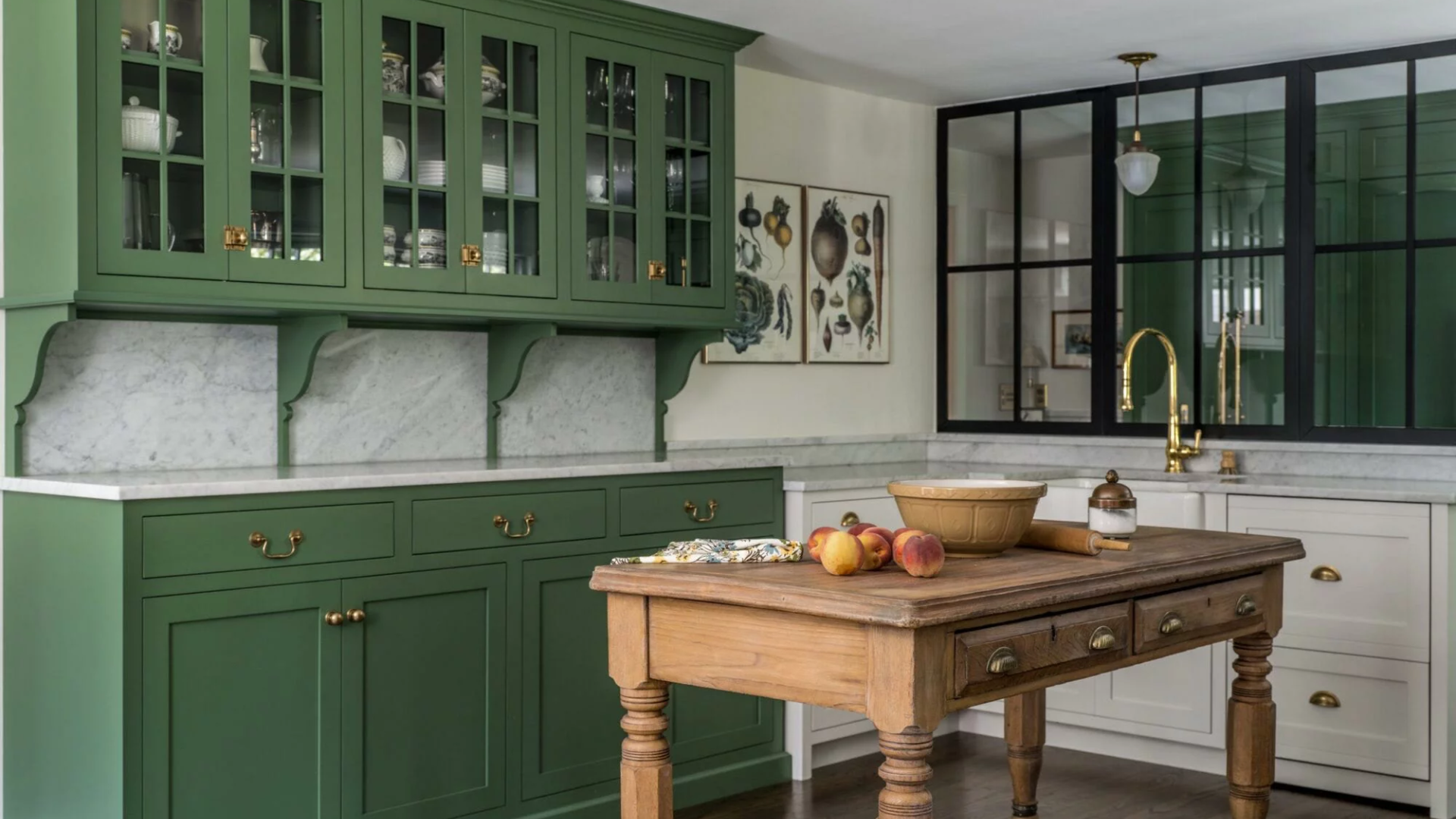
Painting cabinets or built-ins in dark green adds depth and structure to a room. The color adds weight and highlights architectural details.
Regent Green (2136-20) and Essex Green (HC-188) are strong choices here. Both are nearly black and bring a bold, classic touch.
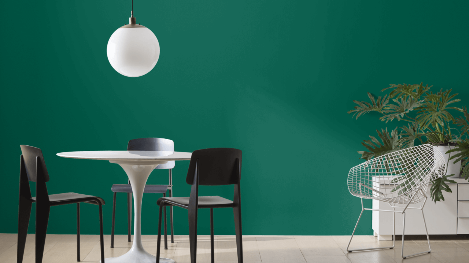
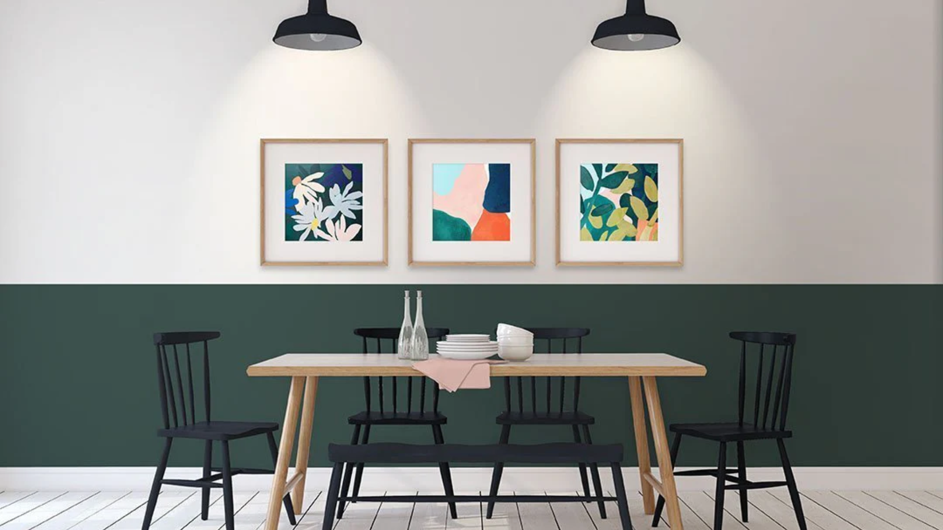
Accent Walls
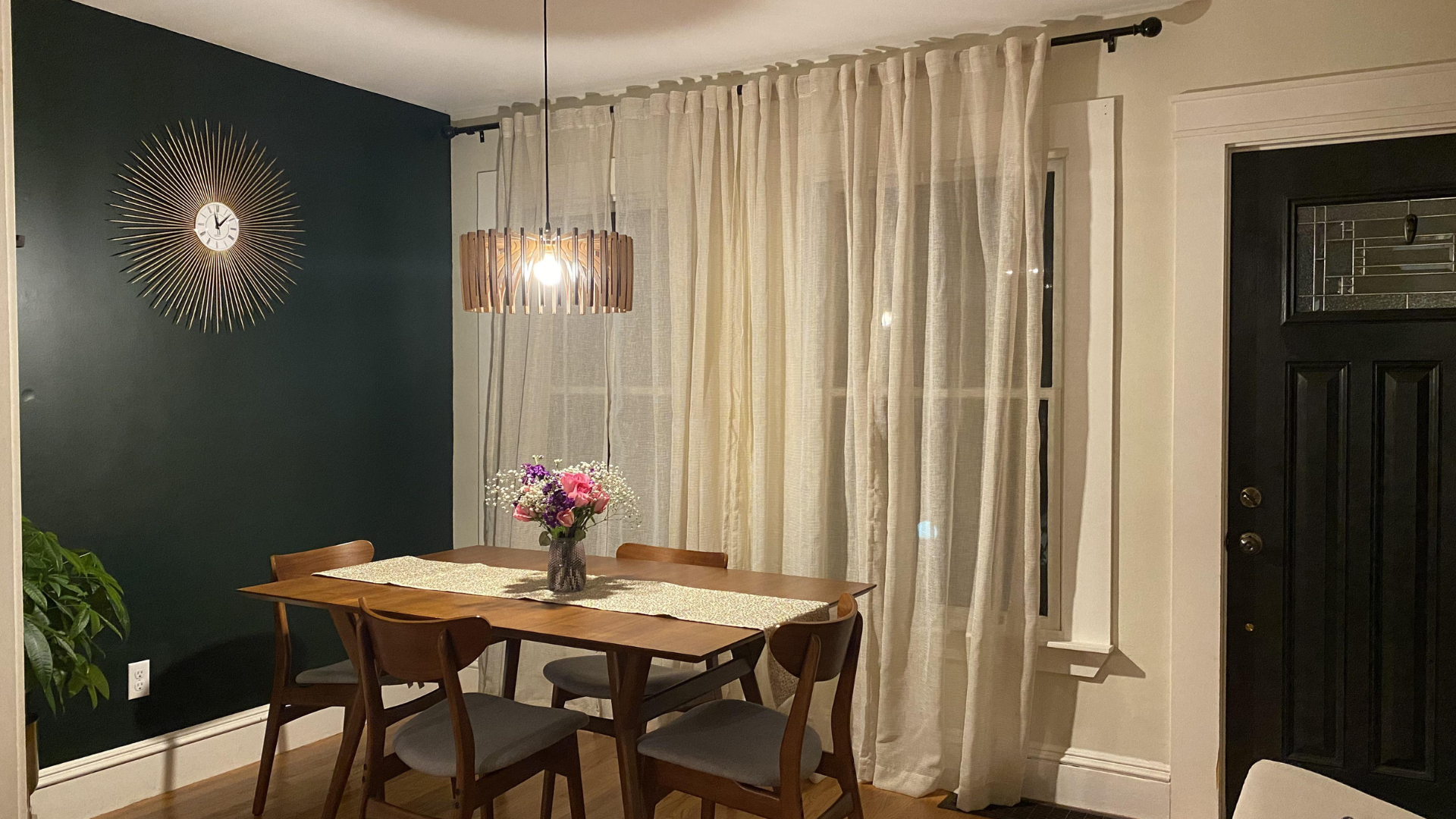
Dark green is a wise choice for accent walls. It draws attention without overwhelming the space.
Forest Green (2047-10) is great for dining rooms or reading corners.
For a more dramatic look, go with Salamander (2050-10) or Essex Green (HC-188). These colors add contrast and mood, especially when paired with soft textures or light floors.
Dark Green vs. Other Benjamin Moore Neutrals
In this section, I’ll compare dark green with other popular Benjamin Moore neutral colors.
The table below highlights their tone, feel, and best uses, helping you decide if dark green is the right choice or if another neutral fits your space better.
| Color Type | Tone | Feel | Best For | Example Shades |
|---|---|---|---|---|
| Dark Green | Deep, rich, bold | Calm, grounded, steady | Bedrooms, living rooms, cabinets | Essex Green, Salamander, Hunter Green |
| Greige | Mix of gray and beige | Soft, warm, flexible | Walls, trim, and open living areas | Edgecomb Gray, Revere Pewter |
| Taupe | Gray-brown | Earthy, cozy, muted | Living rooms, dens, dining rooms | Indian River, Smokey Taupe |
| Warm White | Off-white with yellow or beige | Clean, soft, bright | Trim, ceilings, all-over wall color | White Dove, Simply White |
| Cool Gray | Gray with blue or green tones | Crisp, modern, quiet | Bathrooms, kitchens, modern spaces | Stonington Gray, Gray Owl |
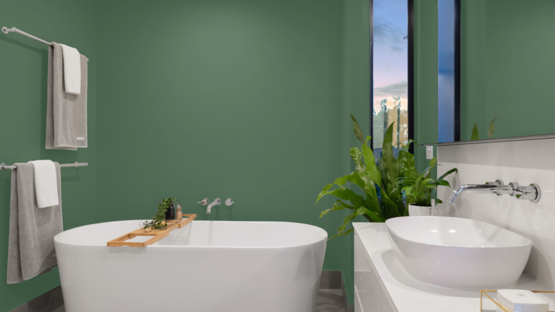
Colors and Materials That Work Well with Dark Green
Dark green works best when it’s paired with the right colors and textures. It can feel sharp, soft, warm, or cool, depending on what you place next to it.
- Trim: Use soft whites or deep creams on trim and ceilings. These lighter shades give contrast and help the green stand out. Some options are White Dove, Cloud White, or Simply White.
- Metals:Dark green pairs well with rich, muted metals. These add detail without feeling too shiny. Like, Brass for warmth, Matte black for contrast, and Bronze for depth.
- Floors:Flooring can shape how the color feels in the room. Light wood adds warmth and contrast. Stone creates a cool, grounded look. And, Neutral tile keeps things clean and simple.
- Fabrics:Textiles bring softness and texture to green spaces. Linen feels natural and airy. Leather adds weight and character. And Wool gives warmth and comfort.
Lighting Tips for Dark Green Walls
Light changes how dark green looks. The same paint can feel warm in one room and cool in another. That’s why lighting matters.
In natural light, dark green often appears lighter and more transparent. North-facing rooms may bring out cooler tones. South-facing rooms may make the green look warmer.
In artificial light, the color green can shift depending on the type of bulb. It may look richer or more muted at night. That’s why it’s essential to consider both daytime and evening lighting.
Paint can look different on the wall than it does on a sample card. Test a patch in various spots of the room.
Check it in the morning, afternoon, and night. Use both natural and indoor light. This will help you avoid surprises once the whole wall is painted.
Conclusion
Dark green is one of the most useful paint colors you can bring into a home. It works in many different spaces—from bedrooms and living rooms to kitchens and offices. It’s a color that can feel bold or soft, depending on how it’s used.
What makes dark green stand out is its balance and harmony. It adds weight without being too dark. It feels natural but also polished. It brings calm to a room while still maintaining its character.
Dark green also pairs well with a wide range of colors and materials. You can match it with wood, stone, soft whites, brass, or matte black.
It holds up well under different lighting conditions and complements both modern and traditional styles.
If you’re looking for a color that adds mood, depth, and quiet style, dark green is a strong choice. It’s simple, steady, and timeless.