
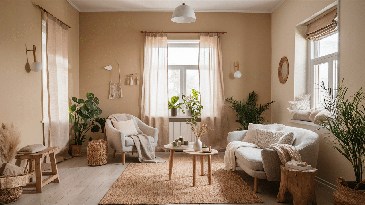
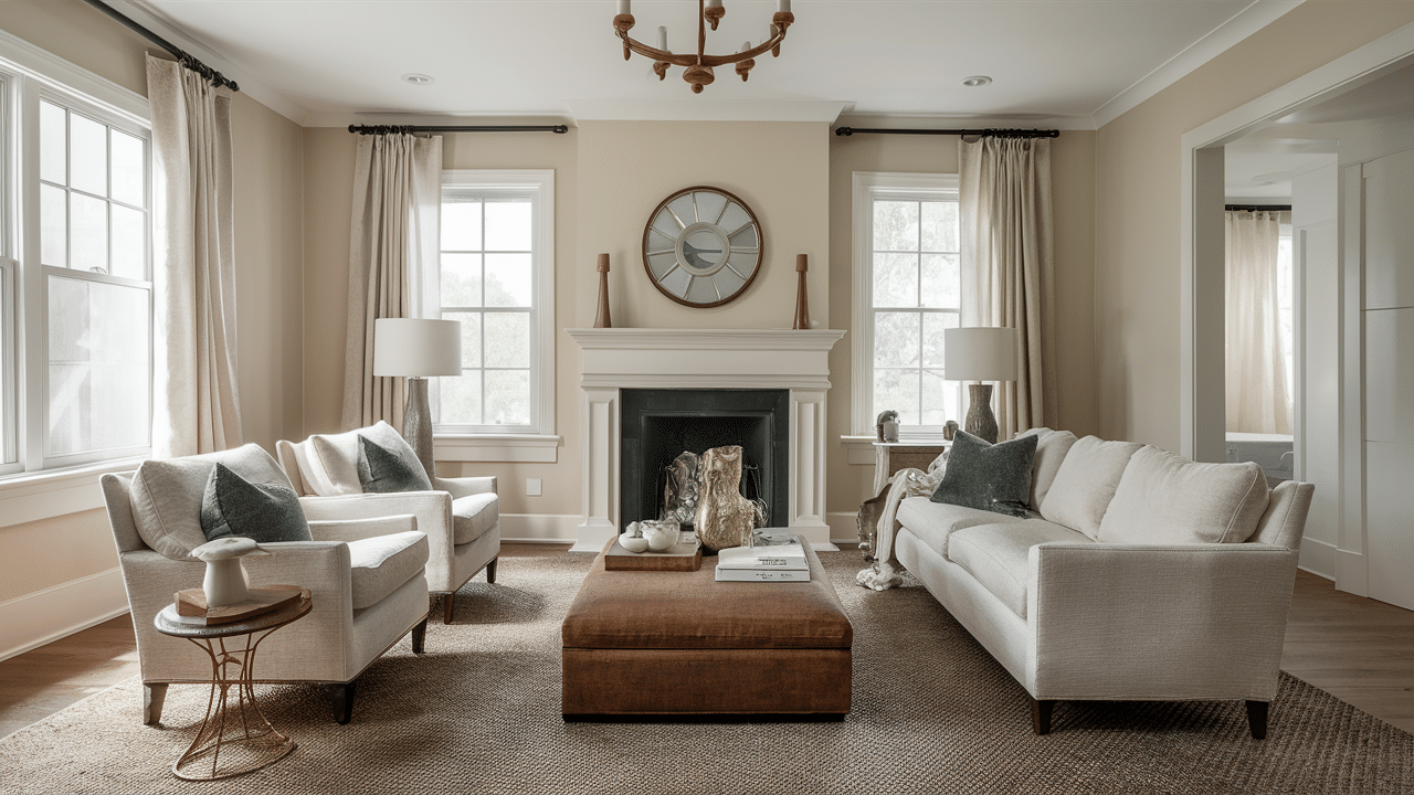
Finding the perfect beige paint color can feel impossible. Is it too yellow? Too gray? Too pink? I’ve been there, staring at dozens of seemingly identical swatches, wondering which one won’t make my living room look like a cardboard box.
In this article, I’ll share the best beige paint colors that actually work in real homes. These aren’t just random recommendations. Each one has been tested in different lighting conditions and paired with various decor styles.
As an interior designer with years of experience, I’ve helped hundreds of homeowners find their perfect neutral. The beiges in this list have consistently made my clients smile when they see their finished spaces.
Whether you’re looking for a warm beige for your living room or a sophisticated taupe for your bedroom, you’ll find options that create that cozy, welcoming feeling you’re after without the frustrating trial and error.
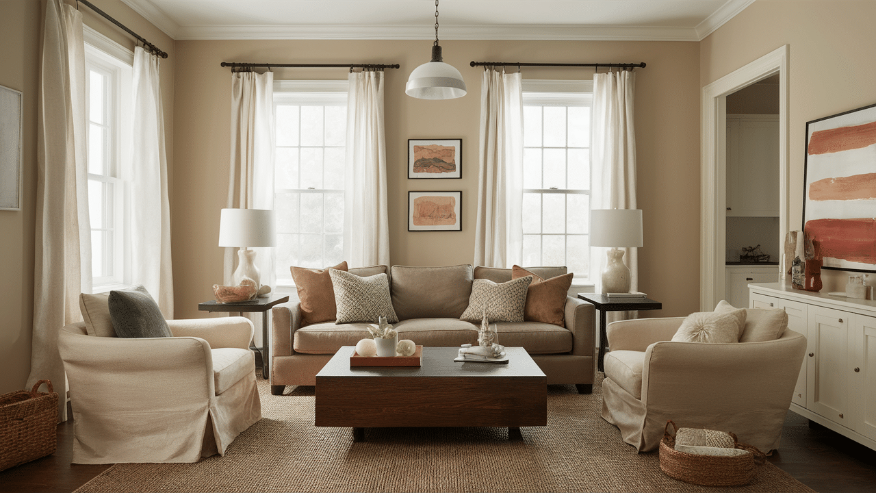
Why Beige Is the Final Cozy Color
Beige gets a bad rap. But trust me, it’s far from boring when done right.
I’ve painted countless rooms in my career, and beige consistently creates the most relaxing spaces. Why? The warm undertones instantly make a room feel comfortable, like being wrapped in a soft blanket on a chilly evening.
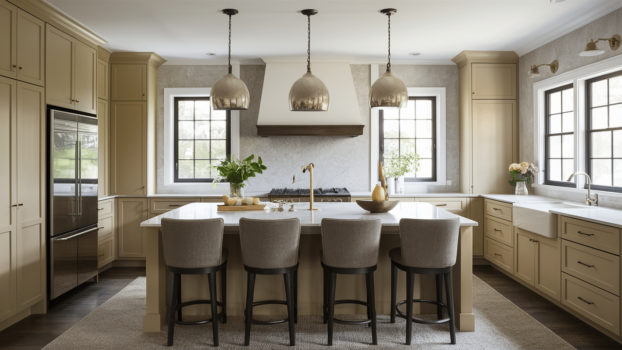
What makes beige so special is how it works everywhere. Your living room feels welcoming, your bedroom becomes a sanctuary, hallways feel more spacious, and yes, even kitchens look amazing with the right beige.
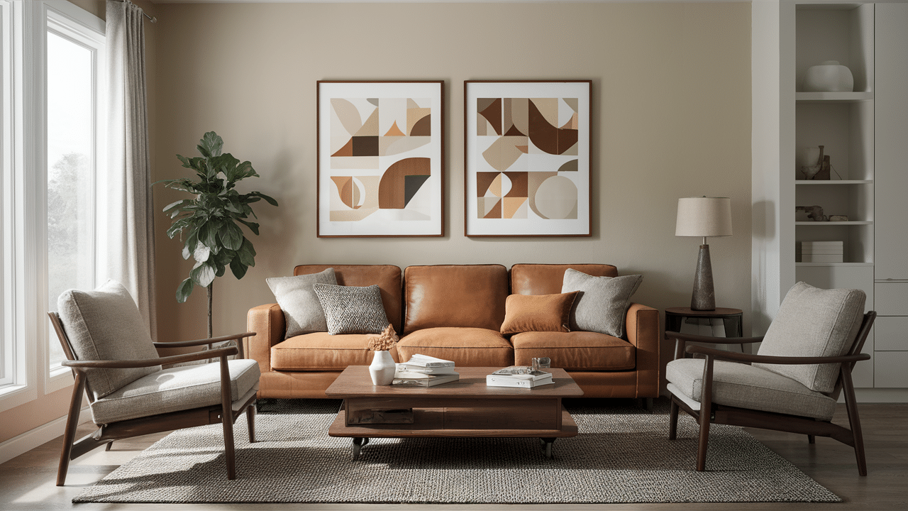
The magic happens when you pair beige with natural materials:
- Wood furniture looks richer against beige walls
- Linen curtains create a breezy, organic feel
- Leather sofas or chairs pop without clashing
Unlike bold colors that demand attention, beige plays a supporting role. It doesn’t compete with your art or furniture – it enhances them.
Have you ever noticed how museums use neutral walls to showcase art? That’s exactly what beige does in your home. It steps back and lets your favorite pieces shine.
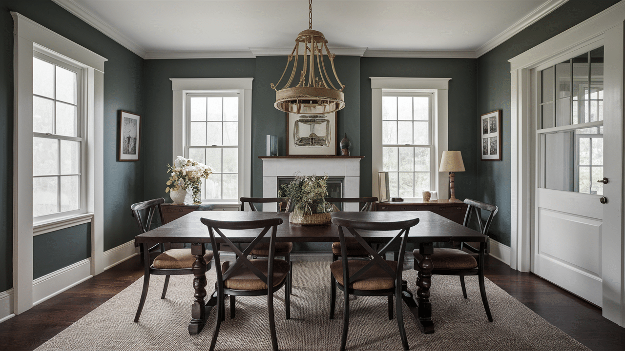
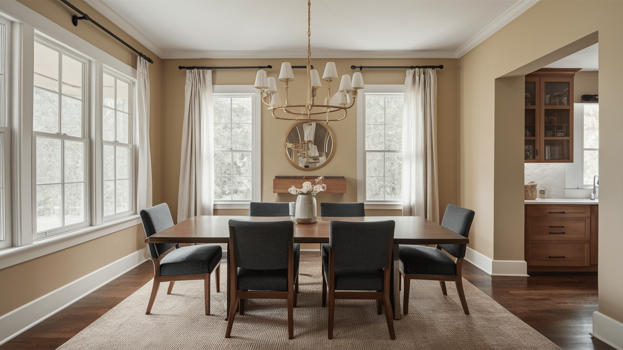
Best Beige Paint Colors for a Cozy Home
The best beige paint colors create warm, inviting spaces that transform any room into a cozy sanctuary perfect for relaxing or entertaining.
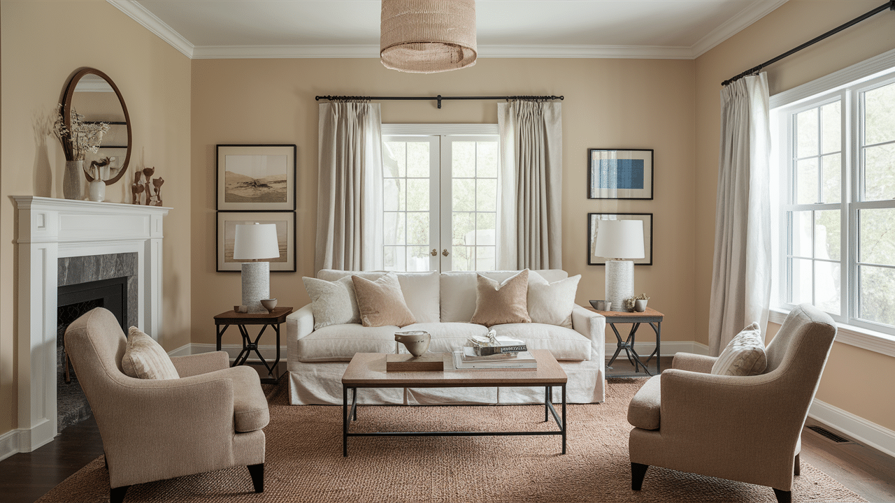
1. Accessible Beige – Sherwin Williams
Accessible Beige is one of Sherwin-Williams’ most popular neutral paint colors. I’ve seen it transform countless spaces with its warm, versatile tone.
It’s not quite beige. It’s not quite gray. It’s somewhere in between, making it incredibly versatile.
This paint color works in almost any room. Kitchens. Living rooms. Bedrooms. Even bathrooms.
Why do people love it? Simple:
- It’s warm without being yellow
- It plays well with both cool and warm accents
- It changes slightly throughout the day (in a good way)
- It helps rooms feel bigger and more open
You might notice it appears different depending on your lighting. That’s normal! In north-facing rooms, it may look slightly cooler. In rooms with lots of sunlight, its warm undertones shine through.
What colors pair well with Accessible Beige? Almost anything. The white trim looks crisp against it, and dark woods complement its warmth. Even bold accent colors feel balanced rather than overwhelming.
Not sure if it’s right for you? Try a sample first. Paint a small section of your wall and check it at different times of day.
Remember: lighting changes everything when it comes to paint colors.
2. Manchester Tan – Benjamin Moore
Manchester Tan is one of Benjamin Moore’s most beloved neutral paint colors. It creates a welcoming atmosphere in almost any space.
It has a distinct warm yellow-beige undertone. This warmth makes rooms feel instantly cozy and inviting.
Traditional living rooms love this color. So do dining rooms where you want that comfortable, relaxed feeling.
What makes Manchester Tan special? A few things:
- It glows beautifully in natural light
- It creates a perfect backdrop for rich wood furniture
- It pairs wonderfully with creamy whites for trim
- It feels timeless rather than trendy
You’ll notice that this color really comes alive in rooms with large windows. The natural light brings out its warm undertones without making it feel too yellow.
When decorating with Manchester Tan, consider rich wood tones for your furniture. The contrast is striking but still harmonious.
Not sure about trim color? Creamy whites work best. Stark whites can sometimes feel too harsh against its warmth.
Want to make the most of this color? Use it in spaces where you gather with family and friends. Its cozy vibe encourages people to relax and stay awhile.
Remember: A small sample can look different than a full wall. Always test before committing to the whole room.
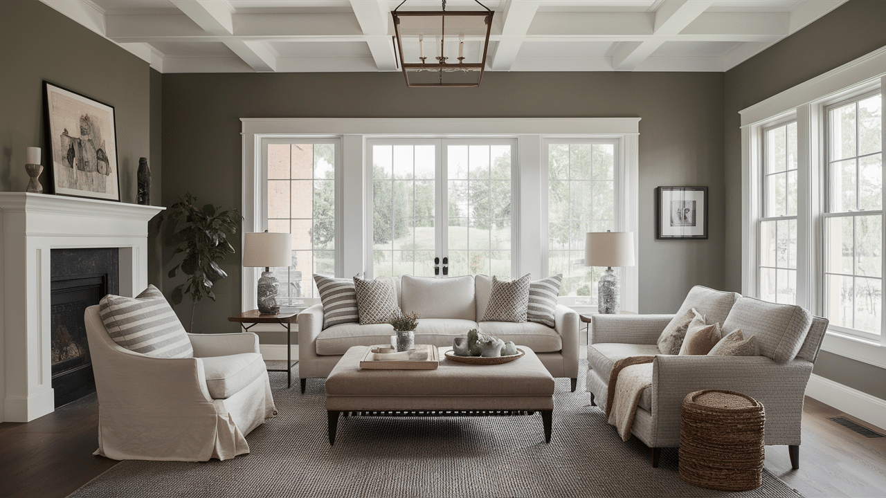
3. Edgecomb Gray – Benjamin Moore
Edgecomb Gray is a stunning neutral from Benjamin Moore’s collection. It creates a peaceful atmosphere that works in almost any room.
It’s a true greige with just enough warmth. Not too gray, not too beige, it sits perfectly in between.
Modern farmhouse styles absolutely shine with this color. Kitchens and bedrooms especially benefit from its calming presence.
What makes Edgecomb Gray so popular? Several things:
- It creates a soft, sophisticated backdrop
- It shifts subtly throughout the day without dramatic changes
- It complements both cool and warm accent colors
- It works beautifully as a whole-house neutral
You’ll love how this color pairs with muted greens. The combination feels natural and organic, perfect for creating a sense of bringing the outdoors in.
Want to enhance the warmth? Add warm wood tones to your furniture or flooring. The contrast is subtle but effective.
Choosing hardware? Brushed gold fixtures look amazing against this soft neutral. They add just enough warmth without overwhelming the space.
If you prefer a calm, quiet home environment, consider using Edgecomb Gray throughout your house. It provides consistency while still allowing each room to develop its personality through furnishings and accents.
Remember: lighting affects how this color appears. Always test a sample in your actual space before committing.
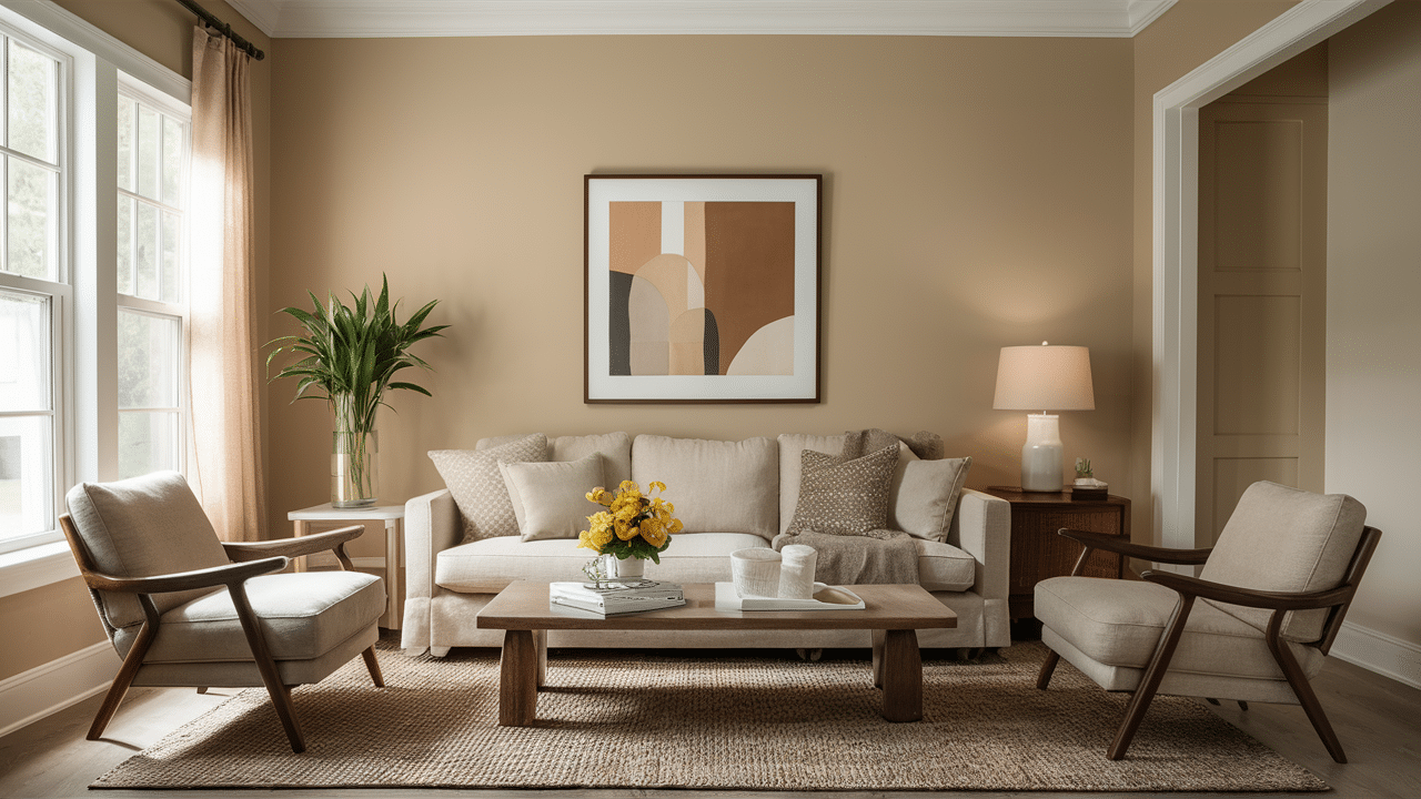
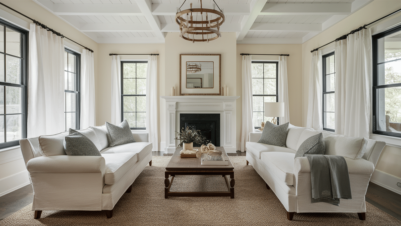
4. Natural Linen – Sherwin Williams
Natural Linen is one of Sherwin-Williams’ most versatile neutral paint colors. I’ve seen it create a warm, inviting atmosphere in many different spaces.
It has a soft beige base with subtle warm undertones. This gives rooms a cozy, sophisticated feel without being too bold.
This paint color works beautifully in living areas and bedrooms. It also shines in transitional spaces like hallways and entryways.
What makes Natural Linen special? A few key features:
- It provides warmth without feeling yellow or orange
- It creates a neutral backdrop that lets furniture stand out
- It transitions well between different lighting conditions
- It complements both traditional and contemporary décor
You’ll notice that this color has a timeless quality. It doesn’t follow trends. It creates a foundation that works year after year.
When decorating with Natural Linen, consider contrast in your accessories. Both light and dark accents work well against its middle-tone warmth.
Not sure about trim color? White trim creates a clean, defined look that many homeowners love with this shade.
Want to create a cohesive flow? Natural Linen pairs well with slightly darker neutrals in adjoining rooms for a subtle color transition throughout your home.
5. Revere Pewter – Benjamin Moore
Revere Pewter is one of Benjamin Moore’s most popular neutral paint colors. I’ve seen it transform spaces with its balanced, versatile tone.
It’s a perfect light beige—gray with beige undertones. This makes it incredibly adaptable to different lighting and décor styles.
This paint color works exceptionally well in living rooms, hallways, and open concept spaces. It creates a cohesive backdrop for your home.
What makes Revere Pewter stand out? Several qualities:
- It changes subtly throughout the day without dramatic shifts
- It feels warm enough to be cozy but cool enough to be modern
- It provides the perfect neutral backdrop for colorful furniture
- It works in both north-facing and south-facing rooms
You’ll appreciate how this color doesn’t fight with other elements in your room. Instead, it complements them, letting your furnishings and art take center stage.
When selecting accent colors, both cool and warm tones work beautifully with Revere Pewter. Blues, greens, warm reds—they all pair nicely.
Not sure about trim? White trim creates a crisp, clean look that defines the space without competing with this sophisticated neutral.
Want to create a layered look? Use darker neutrals for furniture against Revere Pewter walls for a subtle but effective depth in your design.
Remember: Always test a sample in your specific space before committing. The way light hits your walls can change how this versatile color appears.
6. Balanced Beige – Sherwin Williams
Balanced Beige is one of Sherwin-Williams’ most reliable neutral paint colors. I’ve watched it create warm, inviting spaces in countless homes.
It’s a true medium beige with subtle gray undertones. This balance makes it incredibly versatile for many different rooms and styles.
This paint color excels in living areas, dining rooms, and hallways. It creates a cozy atmosphere without feeling too dark or heavy.
What makes Balanced Beige so popular? Several key qualities:
- It provides warmth without appearing yellow or orange
- It works beautifully in both natural and artificial lighting
- It creates an excellent backdrop for artwork and furniture
- It transitions well between different spaces in your home
You’ll notice this color has staying power. Unlike trendy colors that quickly feel dated, Balanced Beige maintains its appeal year after year.
When decorating with Balanced Beige, consider both light and dark accents. The middle-tone nature of this color allows it to work with both extremes.
Are you unsure about coordinating colors? Crisp whites for trim and darker browns for furniture create a beautiful layered neutral palette.
Want to add some contrast? Consider blue or green accents—they provide a refreshing complement to the warmth of Balanced Beige.
Remember: Lighting affects every paint color. Always test a sample on your wall and check it at different times of day before making your final decision.
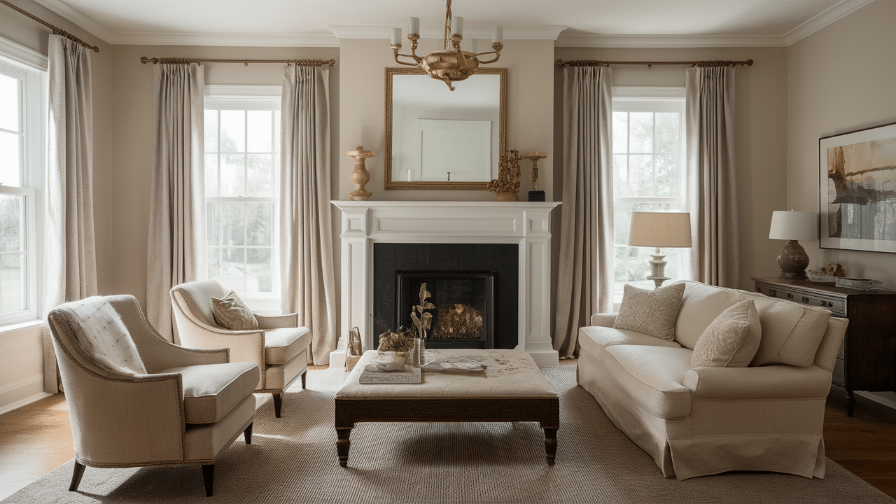
7. Shaker Beige – Benjamin Moore
Shaker Beige is one of Benjamin Moore’s classic neutral paint colors. I’ve seen it create warm, welcoming spaces that stand the test of time.
It’s a medium-toned beige with subtle golden undertones. This warmth gives rooms a cozy, lived-in feeling without being too yellow.
This paint color works beautifully in living rooms, dining areas, and hallways. It creates a seamless flow between spaces in your home.
What makes Shaker Beige special? Several key features:
- It has a traditional, timeless quality that never feels trendy
- It provides excellent coverage and depth on walls
- It creates a perfect neutral backdrop for various décor styles
- It pairs well with both light and dark wood tones
You’ll appreciate how this color feels familiar and comfortable. It instantly makes you and your guests feel at home.
When choosing trim colors, crisp whites create a clean contrast that defines the architecture of your space beautifully.
Are you unsure about accent colors? Deep blues, rich reds, and forest greens all pair wonderfully with the warm neutral base of Shaker Beige.
Want to create a cohesive look? Use Shaker Beige in connecting spaces like hallways and entryways to make a smooth transition throughout your home.
Remember: Always test your paint color in the actual space. The way light hits your walls can significantly impact how this warm neutral appears.
8. Soft Chamois – Benjamin Moore
Soft Chamois is one of Benjamin Moore’s most elegant neutral paint colors. I’ve seen it create serene, sophisticated spaces in many different homes.
It’s a delicate creamy beige with subtle yellow undertones. This warmth gives rooms a gentle glow without feeling overly yellow or bright.
This paint color works wonderfully in bedrooms, living rooms, and formal dining spaces. It creates an atmosphere of quiet refinement.
What makes Soft Chamois stand out? Several important qualities:
- It has a soft, luminous quality that brightens spaces
- It feels warm and inviting without being too saturated
- It complements both traditional and transitional décor styles
- It pairs beautifully with crisp whites and rich wood tones
You’ll notice that this color makes spaces feel larger and more open. It also beautifully reflects light throughout the day.
When decorating with Soft Chamois, consider adding textural elements like natural linens, woven baskets, or plush textiles to enhance its warmth.
Are you unsure about coordinating colors? Navy blue, deep olive green, or warm terra cotta accents create stunning contrasts against this subtle neutral.
Want to create a layered look? Use varying shades of cream and beige in your furnishings and décor to build depth while maintaining a cohesive palette.
Remember: lighting dramatically affects how this color appears. Test a sample in your specific space and observe it at different times of day before committing.
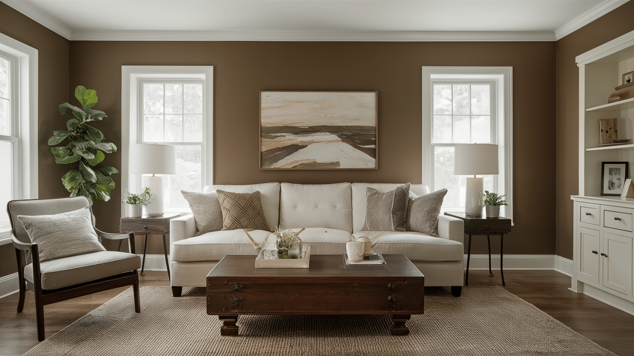
9. Kilim Beige – Sherwin Williams
Kilim Beige is one of Sherwin-Williams’ most popular neutral paint colors. Its warm, inviting tone has transformed countless spaces.
It’s a medium-toned beige with subtle orange-brown undertones. This warmth creates a cozy atmosphere in any room without feeling too heavy.
This paint color excels in living rooms, hallways, and open concept spaces. It provides a perfect backdrop for various decorating styles.
What makes Kilim Beige so versatile? Several key qualities:
- It has a rich, earthy warmth that makes spaces feel welcoming
- It pairs beautifully with both light and dark wood tones
- It maintains its character in different lighting conditions
- It coordinates well with many popular accent colors
You’ll appreciate how this color creates a neutral foundation without feeling boring or flat. It has just enough depth to add interest to your walls.
When selecting trim colors, crisp whites create a clean contrast that highlights architectural details and keeps the space feeling fresh.
Not sure about accent colors? Blues, greens, and deep reds all work wonderfully with Kilim Beige, providing beautiful contrast to its warm undertones.
Want to create a cohesive flow? Use Kilim Beige as your main neutral color and select coordinating colors from the same color family for adjoining spaces.
Remember: Always test a sample on your wall before committing. The way light interacts with this color can vary throughout the day.
10. Feather Down – Benjamin Moore

Feather Down is one of Benjamin Moore’s most versatile neutral paint colors. I’ve seen it create soft, welcoming spaces in many different homes.
It’s a light beige with subtle, warm undertones. This gentle warmth gives rooms a cozy feel without being too yellow or intense.
This paint color works beautifully in bedrooms, living areas, and nurseries. It creates a peaceful backdrop for both relaxation and gathering.
What makes Feather Down special? Several important qualities:
- It has a light, airy quality that brightens spaces
- It feels soft and comforting like its namesake
- It coordinates well with both cool and warm accent colors
- It transitions smoothly between different lighting conditions
You’ll notice this color has a timeless quality that won’t quickly feel dated or trendy. It creates a lasting foundation for your home.
When decorating with Feather Down, consider adding textural elements like natural fabrics, woven materials, or soft throws to enhance its cozy vibe.
Are you unsure about the trim color? Crisp whites and softer creams work well, depending on whether you want contrast or continuity.
Want to build a color palette? Blues, greens, and soft pinks all pair beautifully with Feather Down, allowing you to create a personalized space.
Remember: Always test your paint sample in different parts of the room and at different times of day before making your final decision.
11. Canvas Tan – Sherwin Williams
Canvas Tan is one of Sherwin-Williams’ most reliable neutral paint colors. I’ve observed it create balanced, inviting spaces in many different homes.
It’s a warm beige with subtle yellow undertones. This warmth adds a welcoming quality to rooms without feeling too bright or dominant.
This paint color works especially well in living rooms, kitchens, and transitional spaces. It creates a versatile backdrop for various décor styles.
What makes Canvas Tan stand out? Several key features:
- It provides a warm neutral foundation that feels timeless
- It complements both traditional and contemporary furnishings
- It pairs beautifully with natural materials like wood and stone
- It maintains its character throughout the day in different lighting
You’ll appreciate how this color creates a sense of comfort in your home. It has just enough depth to add interest without overwhelming the space.
When selecting trim colors, crisp whites create a clean, defined look that highlights architectural details beautifully.
Are you unsure about accent colors? Blues, greens, and terracotta tones all create striking contrasts against the warm foundation of Canvas Tan.
Want to create a cohesive flow? Use Canvas Tan in connecting spaces to establish a unified look throughout your home while allowing for different accent colors in individual rooms.
Remember: Light sources greatly impact how paint colors appear. Always test a sample in your specific space before committing to painting the entire room.
12. Muslin – Benjamin Moore

I love Muslin by Benjamin Moore. This soft, creamy off-white brings warmth to any room without overwhelming it.
You might wonder why it’s so popular. Simple answer? Versatility.
Muslin (OC-12) sits perfectly between beige and white. Not too yellow. Not too stark.
It works in every room. Kitchens. Bedrooms. Living spaces. Even bathrooms look fresh with this color.
What makes Muslin special? Its undertones. They shift slightly throughout the day, keeping your space interesting.
Morning light brings out its warmth. Evening light shows its sophisticated side.
Here’s why people choose Muslin:
- Pairs with almost any accent color
- Hides imperfections on walls
- Stays stylish year after year
- Creates a cozy feeling without darkening rooms
I’ve seen it transform dated rooms into modern spaces. The difference is dramatic yet subtle.
You don’t need designer training to use this color well. It’s forgiving. Fool-proof, even.
Muslin creates a backdrop that lets your furniture and art shine. Nothing fights for attention.
Try it. You’ll see why it’s been a Benjamin Moore bestseller for years.
13. Nomadic Desert – Sherwin Williams
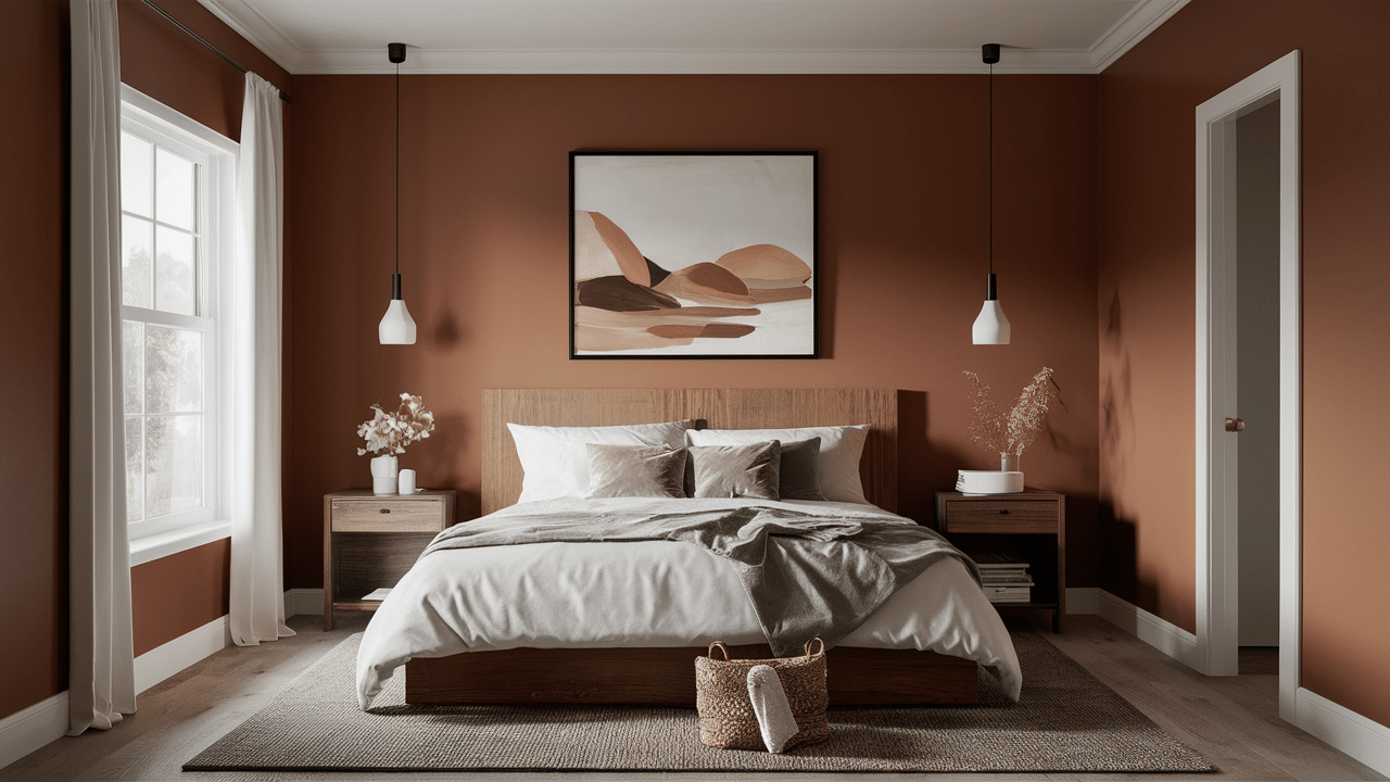
I fell in love with Nomadic Desert the moment I saw it. This Sherwin-Williams shade captures the warm essence of dunes at sunset.
You’ll notice how it transforms throughout the day. That’s its magic.
Nomadic Desert (SW 6107) balances warmth and neutrality perfectly. Not too orange. Not too beige.
It works everywhere. Living rooms feel cozy. Bedrooms feel serene. Offices feel professional with this color.
What makes Nomadic Desert special? Its depth. The color has subtle undertones that reveal themselves in different lights.
Morning brings out its golden qualities. The evening showcases its earthy richness.
Here’s why people choose Nomadic Desert:
- Coordinates with both cool and warm color schemes
- Creates a grounding feeling in open spaces
- Offers year-round appeal (not too seasonal)
- Provides warmth without feeling heavy
I’ve watched it bring life to sterile rooms. The transformation is subtle but powerful.
You don’t need color expertise to use it well. It’s remarkably forgiving.
Nomadic Desert creates a beautiful foundation that enhances your furniture and decor. Everything looks intentional.
Try it. You’ll understand why designers consistently recommend this versatile Sherwin-Williams color.
14. Barcelona Beige – Sherwin Williams
I adore Barcelona Beige from Sherwin-Williams. This rich, warm neutral brings instant character to any room it touches.
You’ll be amazed by its versatility. That’s its hidden power.
Barcelona Beige (SW 7530) is in the sweet spot between tan and cream, not too dark and not too light.
It works in every setting. This color makes kitchens feel inviting, living rooms feel established, and hallways gain depth.
What makes Barcelona Beige different? Its richness. The color has subtle golden undertones that create dimension.
Morning light highlights its warmth. Evening light shows its sophisticated side.
Here’s why people choose Barcelona Beige:
- Complements both cool and warm accent colors
- Creates a timeless backdrop for art and furniture
- Hides minor wall imperfections effectively
- Adds warmth without overwhelming a space
I’ve watched it transform sterile rooms into welcoming havens. The change is understated yet powerful.
You don’t need design experience to use it successfully. It’s remarkably intuitive.
Barcelona Beige establishes a foundation that makes everything in your room look intentional. Nothing feels out of place.
Try it. You’ll understand why this Sherwin-Williams shade has become a go-to for both homeowners and designers.
15. Linen White – Benjamin Moore
I trust Linen White by Benjamin Moore completely. This soft, creamy neutral creates timeless comfort in any space.
You might wonder what makes it different. The answer is subtlety.
Linen White (912) finds perfect balance in the off-white family. Not too yellow. Not too stark.
It works everywhere effortlessly. Bedrooms feel serene. Living areas feel fresh. Kitchens glow with this color.
What makes Linen White special? Its gentle warmth. The color has barely-there yellow undertones that feel like sunshine.
Morning light brings out its crispness. Evening light showcases its soft, cozy side.
Here’s why people choose Linen White:
- Brightens spaces without harsh reflection
- Pairs beautifully with wood tones and natural materials
- Creates a consistent flow from room to room
- Feels classic rather than trendy
I’ve seen it breathe new life into dated spaces. The transformation is quiet yet remarkable.
You don’t need color expertise to use it well. It’s practically foolproof.
Linen White establishes a canvas that allows your furniture and decor to be the stars. Everything feels harmonious.
Try it. You’ll find out why Benjamin Moore’s Linen White has remained popular for decades.
16. Wool Skein – Sherwin Williams
I treasure Wool Skein from Sherwin-Williams. This cozy, sophisticated neutral brings natural warmth to any space it touches.
You’ll be surprised by its depth. That’s what makes it special.
Wool Skein (SW 6148) is perfectly balanced between beige and beige—not too yellow, not too gray.
It works in all kinds of rooms. Bedrooms feel calm. Living areas feel grounded. Entryways feel welcoming with this color.
What makes Wool Skein unique? Its organic quality. The color mimics natural fibers with subtle undertones that shift throughout the day.
Morning light brings out its warmer side. Evening light reveals its more muted tones.
Here’s why people choose Wool Skein:
- Coordinates beautifully with wood tones and natural materials
- Creates a soft, lived-in feeling instantly
- Transitions between different design styles
- Offers warmth without feeling heavy or dated
I’ve watched it transform stark rooms into inviting spaces. The difference is subtle yet transformative.
You don’t need color expertise to use it successfully. It’s remarkably forgiving.
Wool Skein provides the perfect backdrop that makes everything else in your room look intentional. Nothing feels out of place.
Try it. You’ll understand why designers consistently turn to this versatile Sherwin-Williams shade.
17. French Canvas – Benjamin Moore
I can’t get enough of French Canvas by Benjamin Moore. This sophisticated greige creates instant style in any space.
You might be surprised by its complexity. That’s what makes it special.
French Canvas (1541) strikes the perfect balance between gray and beige. Not too cool. Not too warm.
It works beautifully everywhere. Dining rooms feel refined. Living areas feel welcoming. Bedrooms feel peaceful with this shade.
What makes French Canvas stand out? Its adaptability. The color shifts subtly as light changes throughout the day.
Morning light brings out its softer side. Evening light reveals its deeper tones.
Here’s why people choose French Canvas:
- Blends seamlessly with both modern and traditional styles
- Creates a neutral backdrop that elevates other elements
- Stays relevant despite changing design trends
- Adds sophistication without feeling pretentious
I’ve seen it completely transform ordinary rooms. The effect is subtle yet unmistakable.
You don’t need to be a color expert to use it successfully. It’s remarkably flexible.
French Canvas provides the perfect foundation that makes your furniture and art look their best. Everything feels cohesive.
Try it. You’ll find why Benjamin Moore’s French Canvas has become a designer favorite.
How to Choose the Right Beige for Your Space
I’ve seen many people get stuck when choosing beige paint. It seems simple, but it can be tricky.
You need to understand undertones to get it right. This is the secret to success.
Beige isn’t just beige. Some lean pink. Others green. Some yellow. This matters tremendously.
Look at your existing elements first. Flooring, cabinets, and furniture should guide your choice.
What makes choosing beige difficult? Light changes everything. The perfect beige in the store might look completely different in your home.
Morning light shows true undertones. Evening light can hide them completely.
Here’s how to choose the right beige:
- Test samples on multiple walls in your space
- View them at different times of day
- Consider the fixed elements you can’t change
- Think about the feeling you want (warm, cool, neutral)
I’ve watched people transform rooms with the right beige. The wrong one can make everything feel “off.”
You don’t need to hire a designer. Just be methodical with samples.
The right beige creates harmony with everything in your space; the wrong one fights with your furnishings.
Try larger sample sizes than you think necessary. You’ll avoid costly mistakes and find your perfect beige.
Cozy Pairing Ideas
I love creating warm, inviting spaces with the right color combinations. Paint is just the beginning of your room’s story.
You can transform any space with thoughtful pairings. The right elements make all the difference.
Soft neutrals need texture to shine. Think chunky knit throws, natural wood, and woven baskets.
Add layers to your space by using rugs on wood floors, pillows on sofas, and table lamps beside overhead lighting.
What makes a room truly cozy? Contrast and balance. Mix smooth with rough. Combine matte and glossy finishes.
Natural elements bring life to neutral rooms. Plants, stone, and wood add instant warmth.
Here are winning combinations for cozy spaces:
- Cream walls + caramel leather + brass accents
- Greige paint + navy textiles + natural wood
- Warm beige + forest green + woven textures
- Soft taupe + terracotta + white linens
I’ve seen stark rooms become instantly welcoming with these pairings. The transformation can happen in a weekend.
You don’t need a big budget. Strategic choices matter more than expensive items.
Cozy spaces need personal touches. Display books you love. Include photos that make you smile.
Try introducing one new texture each month. You’ll gradually build a space that feels thoughtfully collected rather than instantly decorated.
Conclusion
Finding the perfect neutral paint color can change everything about your home. French Canvas, Wool Skein, Barcelona Beige—they all offer something special. But the right choice is personal.
You’ll know you’ve found your perfect shade when it makes you feel at home the moment you walk in. Trust your instincts.
The best neutrals create a foundation that lets your life shine. They don’t demand attention but enhance everything else in your space.
Try samples, live with them, and watch how they change throughout the day. This small effort will lead to rooms you’ll love for years.
Whether warm or cool, light or deep, the perfect neutral creates spaces where memories are made and life feels beautiful. That’s what great paint colors do – they fade into the background while making everything else in your home look exactly right.