")
Are you having trouble picking the right white paint for your home? You’re not alone. White paint can be tricky, but there’s one shade that always stands out.
Decorator’s White (OC-149) by Benjamin Moore is a favorite for a reason. It’s clean, simple, and easy to use. This white works in almost any space and matches well with many styles.
It’s not too cold and not too creamy. The soft, cool undertones give it a crisp feel. But it’s still warm enough to use in cozy or classic rooms.
Decorator’s White brings a smooth, fresh look to walls, trim, cabinets, and more. It reflects light, making rooms feel open and bright. That’s why so many designers and homeowners love it.
In this guide, I’ll share a few of my favorite color combinations to use with Decorator’s White. You’ll see how this classic white pairs with bold colors, soft tones, and everything in between.
By the end, you’ll have simple, clear ideas to help you plan your space. Whether you’re painting one wall or a full room, this guide will give you the inspiration—and the confidence—you need.
Why Decorator’s White is Versatile
Decorator’s White is a go-to color for a reason. It works well in almost any room. It’s clean and simple, but it still has just enough depth to feel interesting.
This shade has a tiny hint of gray. That soft touch keeps it from feeling too bright or plain, and it helps the color change gently with the light during the day.
In north-facing rooms, it stays bright but not too cool. In sunny, south-facing spaces, it doesn’t turn yellow like some other whites. It keeps a steady, clean look no matter where you use it.
That’s why people often use it throughout the entire home. It brings balance and light to every space.
Decorator’s White also fits with many styles. You can use it in a modern city apartment or a warm, country-style kitchen. It works with colorful accents or calm, quiet tones.
It never fights for attention. Instead, it helps everything else in the room look better. Furniture, art, fabrics, and wood finishes all stand out against its smooth, soft base.
That’s what makes Decorator’s White so easy to love.
Color Combinations with Decorator’s White
Finding the right companions for your white walls can change a space from basic to breathtaking.
Each of these carefully selected colors brings out different qualities in Decorator’s White, allowing you to create exactly the mood you’re looking for in your home.
1. Hale Navy
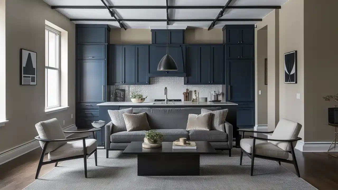
Hale Navy (HC-154) looks bold and classic when paired with Decorator’s White.
The deep navy blue adds strong contrast, while the white keeps the space feeling light and fresh. Together, they create a clean and timeless look.
Use Decorator’s White on walls and Hale Navy on cabinets, built-ins, or a single feature wall. This mix works great in bedrooms, dining rooms, and offices. It brings a calm but strong mood.
The combo has a nautical feel without going overboard. It works in beach homes, but it also fits well in city spaces. Add warm wood and brass for a rich, polished look.
2. Revere Pewter
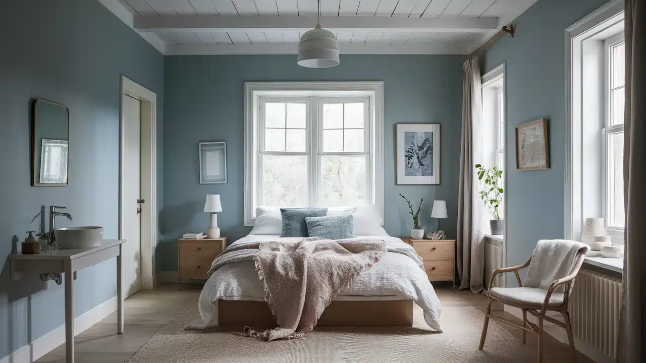
Revere Pewter (HC-172) is a warm gray that pairs smoothly with Decorator’s White. It feels soft, relaxed, and welcoming. The cool white and warm gray balance each other well.
Try using Revere Pewter on the walls and Decorator’s White on the trim or ceiling.
This creates gentle contrast and makes the room feel bright and open. It’s great for living rooms, hallways, or open spaces.
This combo feels calm and flexible. You can add almost any accent color. If you love bold patterns or soft textures, this base will support your style.
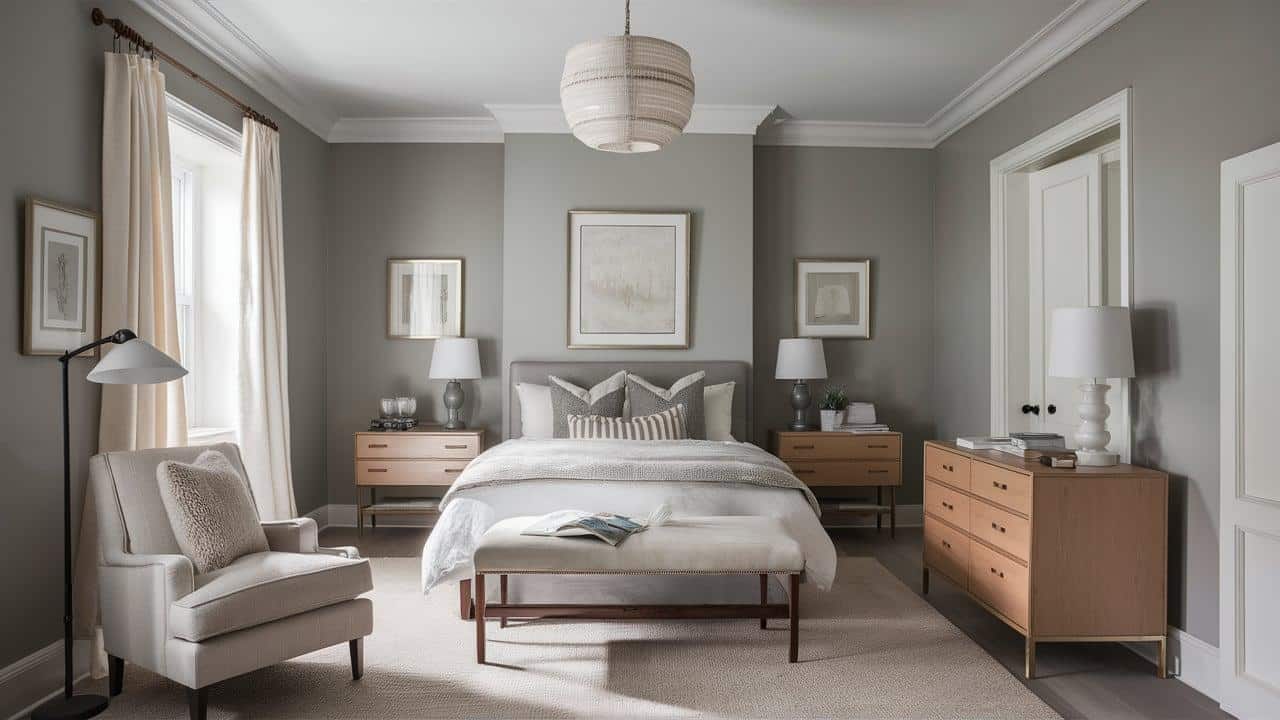
3. Chelsea Gray
Chelsea Gray (HC-168) adds depth and style when matched with Decorator’s White. It’s a medium gray with warm tones, so it never feels too cold. The strong contrast brings out the best in both shades.
Try using Chelsea Gray on an island, accent wall, or piece of furniture. Use Decorator’s White on the rest of the room to keep things balanced. This mix works well in bedrooms and living rooms.
It creates a space that feels calm but stylish. Add texture with wood, leather, or plants. This pairing gives a classic, updated look that lasts.
4. Simply White
Simply White (OC-117) and Decorator’s White may sound like an unusual pair, but they work beautifully together.
Simply White has a slightly warmer feel, while Decorator’s White is cooler and crisper. The mix gives a soft, layered look.
Use Decorator’s White on the walls and Simply White on trim, doors, or ceilings. This is a great way to add detail to an all-white room. It’s perfect for bedrooms, kitchens, or open spaces.
The gentle difference between the two whites adds depth. It helps your space feel clean and bright without looking flat or plain.
5. Palladian Blue
Palladian Blue (HC-144) adds a calm, breezy feel when paired with Decorator’s White. The soft blue-green tone brings in a touch of nature. It feels fresh and easy, like a clear sky.
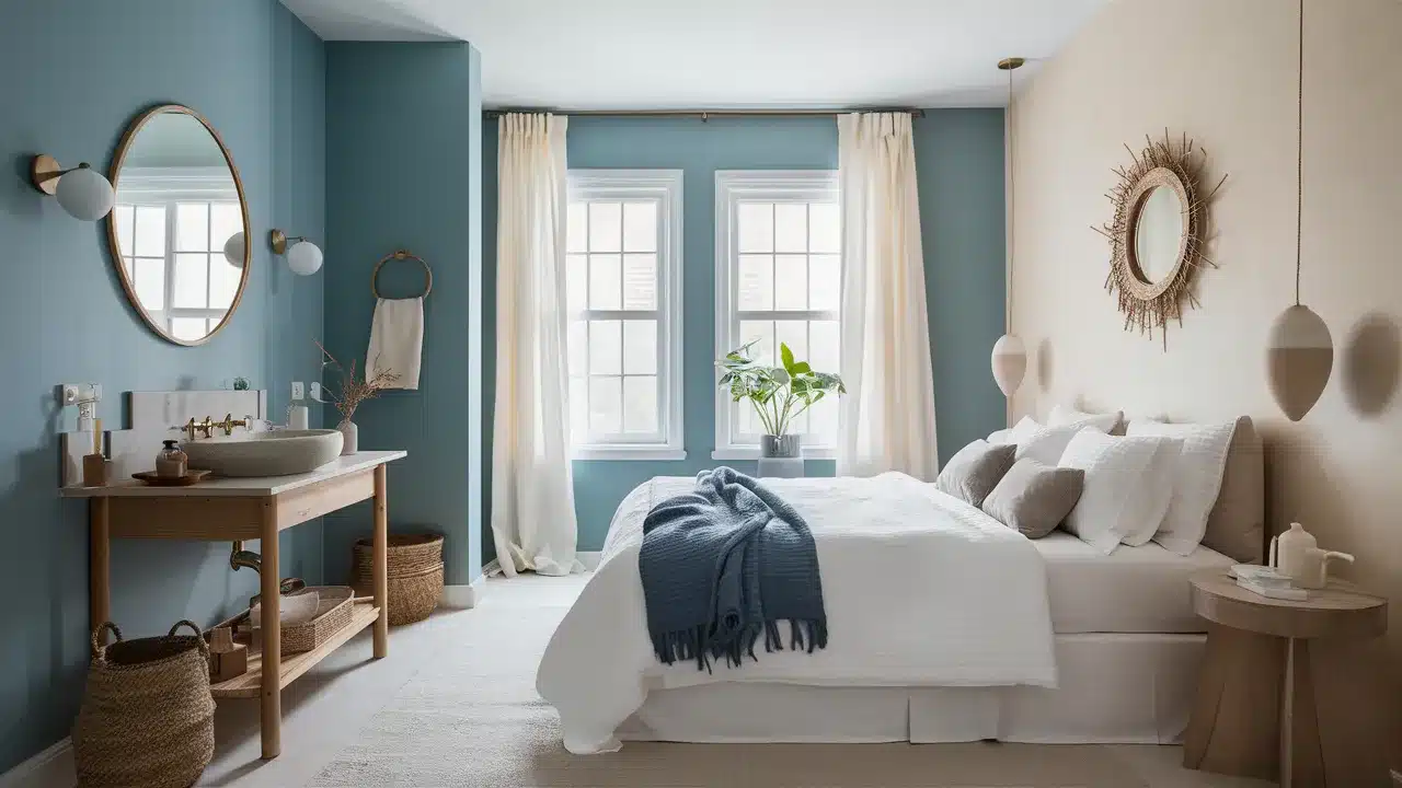
Use Palladian Blue on the walls and Decorator’s White on the trim or ceiling. This look works well in bedrooms and bathrooms. It creates a spa-like space that feels relaxing.
Both colors have cool tones, so they work well together. Add wood, soft fabrics, and a few cozy touches to warm things up.
6. Kendall Charcoal
Kendall Charcoal (HC-166) gives bold contrast when used with Decorator’s White. It’s a deep gray that adds strength without being too harsh. This pairing creates a clean, modern look that still feels classic.
Use Kendall Charcoal on one feature wall or a large piece like a fireplace or cabinet.
Decorator’s White on the other walls helps keep the space feeling light. This combo works great in offices, dining rooms, or living rooms.
The deep gray makes the white look even brighter. It adds interest and style—even in simple rooms.
7. Saybrook Sage
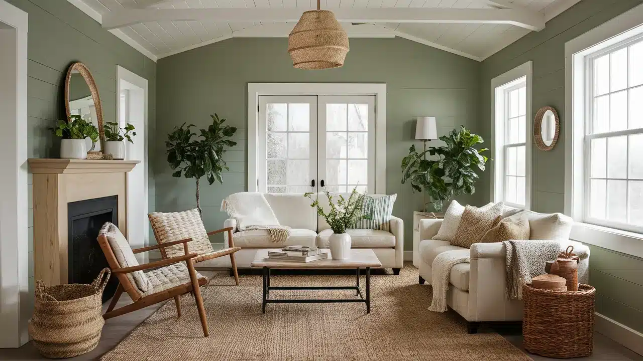
Saybrook Sage (HC-114) is a soft, nature-inspired green that looks beautiful with Decorator’s White. It feels calm, earthy, and gentle. The green adds color without being too bold.
Use Saybrook Sage on the walls with Decorator’s White on the trim and ceilings.
This pairing works well in bedrooms, living rooms, or sunrooms. It helps bring the outdoors inside in a quiet, peaceful way.
The green tones feel balanced next to the crisp white. This combo fits many styles—from farmhouse to modern. It’s a great choice if you want your home to feel cozy and natural.
8. Black Satin
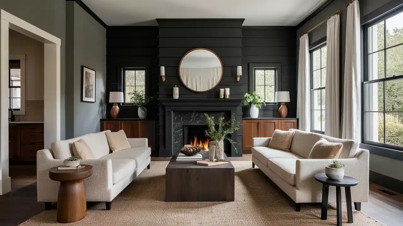
Black Satin (2131-10) brings bold contrast to Decorator’s White. This soft black has a smooth look with just enough depth. It feels strong but not too harsh.
Try Black Satin on doors, built-ins, or window frames. Use Decorator’s White on the walls for a clean, sharp contrast.
This combo is great in offices, dining rooms, or small spaces like powder rooms.
The black and white pairing highlights details in the room. You don’t need a lot of extra color. Add texture—like wood, stone, or fabric—to make the space feel more balanced.
9. Horizon
Horizon (1478) is a pale blue-gray that feels soft and airy. When paired with Decorator’s White, it creates a quiet, peaceful mood. It adds a light touch of color without taking over.
Use Horizon on the walls with Decorator’s White on the trim and ceiling. This look works well in bedrooms, bathrooms, and quiet living spaces. It makes the room feel bigger and more open.
The two shades are close in brightness, so the contrast is gentle. It’s a perfect match if you want a clean look that’s still soft and relaxed.
10. Soft Pumpkin
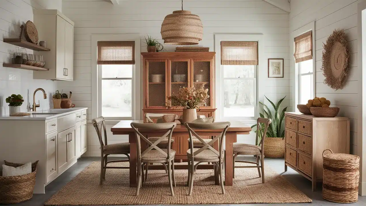
Soft Pumpkin (HC-44) brings warmth and charm when paired with Decorator’s White. It’s a soft orange-brown that feels cozy and rich. The white keeps the look bright and balanced.
Use Decorator’s White on the walls and trim. Try Soft Pumpkin on an accent wall, cabinets, or even a piece of furniture. This combo works well in kitchens, dining rooms, or family spaces.
The warm pumpkin tone adds energy, while the white keeps things clean. Together, they feel natural and welcoming.
Add in wood, baskets, or woven fabrics to bring out an earthy, relaxed feel.
11. Excalibur Gray
Excalibur Gray (1546) is a smooth, mid-tone gray that pairs nicely with Decorator’s White. It’s soft and even, with no strong undertones, making it easy to use in many rooms.
Try Excalibur Gray on walls with Decorator’s White on trim, doors, or ceilings. The mix creates a clean, elegant look. It’s great for bedrooms, offices, or living rooms.
The difference between the two shades gives just enough contrast. It helps show off details without feeling too bold.
You can add color through art, pillows, or rugs—this combo works with just about everything.
Tips for Pairing Colors with Decorator’s White
Choosing the right colors to complement Decorator’s White can change the feel of your room. The goal is to make your space feel clean, balanced, and true to your style.
Start by looking at the lighting in your space. Decorator’s White can look different depending on how much light your room gets.
Natural light, overhead lights, and lamps all change how the color appears. That’s why it’s important to test colors in the actual room.
Think about the feeling you want in the space. Soft greens or light blues help create a calm and peaceful mood.
Darker shades like navy or charcoal add boldness and make the room feel more grounded. These pairings can set the tone for your whole space.
Also, think about how much of each color you plan to use. Decorator’s White often works well as the main color.
Then, you can bring in a second shade through furniture or built-ins. Use small touches—like pillows or art—for a third color to add a little contrast.
Don’t forget about the finish of the paint. A matte finish gives a soft, calm look. A semi-gloss or satin finish makes the white feel brighter and more polished.
You can use both in the same space to create gentle changes without adding new colors.
Take a good look at what’s already in the room. Things like floors, tile, and counters can affect how the colors look.
Make sure your color choices work with the parts of the room that won’t be changing. Always test your colors before making a final choice. Paint large swatches on more than one wall.
Look at them during the day and at night. This step helps you see how the colors really feel in your space.
Conclusion
Decorator’s White has truly earned its place as a favorite among homeowners and designers. It’s clean, soft, and flexible enough to work in almost any room.
If you’re updating a single wall or painting your whole home, this color gives you a strong, fresh starting point.
What makes Decorator’s White so special is how well it works with other colors. It can stand next to bold shades like Hale Navy or Black Satin and still look bright. Or it can gently support soft colors like Horizon, Palladian Blue, or Simply White for a lighter, more peaceful space.
This paint is a great match for many styles—modern, classic, cozy, or clean. It won’t take over a room, but it will help everything else in the space shine.
Remember, the best color combo is the one that feels right to you. Take your time. Test a few different pairings and see how they look in your space at different times of day. It’s okay to make changes along the way.
Your home should feel like you. It should support how you live and set the right mood for each room. Let Decorator’s White help you build that foundation.
I hope these ideas gave you inspiration and a place to start. Which color pairing are you most excited to try? Have you used Decorator’s White in a unique way?
Drop your thoughts, ideas, or photos in the comments—I’d love to hear from you and see what you create!