
If you love cozy, classic spaces that never go out of style, traditional interior design might be perfect for you. One of the most important parts of this style is the color palette.
Traditional colors are warm, rich, and inviting. They help create a home that feels full of charm. From deep reds and forest greens to soft creams and beige, these colors bring comfort and a high-end look to any room. Whether you’re decorating a living room, bedroom, or even a hallway, choosing the right colors makes all the difference.
In this post, we’ll cover the most popular traditional color palettes, why they work so well, and how to use them in your own home. You’ll also find helpful tips and simple ideas to get started.
Importance of Color in Traditional Interiors
Color plays a big role in traditional interior design. It helps set the mood of a room and makes the space feel warm and welcoming. Traditional colors are often rich and cozy, like deep reds, soft golds, and creamy whites. These shades bring a sense of calm and comfort that many people love in their homes.
In traditional design, color also helps showcase the classic style. It works with furniture, fabrics, and decor to create a timeless look. The right color can make a room feel more stylish or more relaxed, depending on how it’s used.
Whether you’re painting walls, picking out curtains, or choosing a rug, color helps tie everything together. That’s why it’s so important to pick the right shades when decorating a traditional home. It’s all about creating a space that feels just right.
Characteristics of Traditional Color Palettes
When it comes to traditional interior design, the color palette is all about comfort and balance. These colors are picked to make a space feel cozy, classy, and welcoming.
-
Warm, Rich Tones: Think deep reds, soft golds, forest greens, and navy blues. These colors add a sense of warmth and history to any room.
-
Soft Neutrals: Creams, beiges, and light browns help balance the richer colors. They also make a great base for walls, furniture, and trim.
-
Earth-Inspired Shades: Many traditional colors, such as wood tones, stone grays, and leafy greens, are inspired by nature.
-
Balanced Look: Traditional palettes often use a mix of dark and light tones to create a classic, layered feel.
Traditional colors are easy to live with and are always in style. They make your home feel peaceful and put together, regardless of the trends.
Popular Traditional Color Combinations
Looking for classic color ideas that never go out of style? These traditional interior design color palette combinations bring warmth to any room.
1. Burgundy and Gold
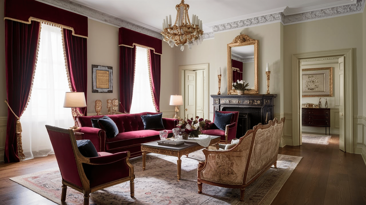
Burgundy and gold are rich combinations that add warmth to any room. Burgundy brings a deep, cozy feel, while gold adds a soft glow. This pair is great for living rooms or dining rooms, especially when used in curtains, pillows, or wall accents. It creates a look that feels classic.
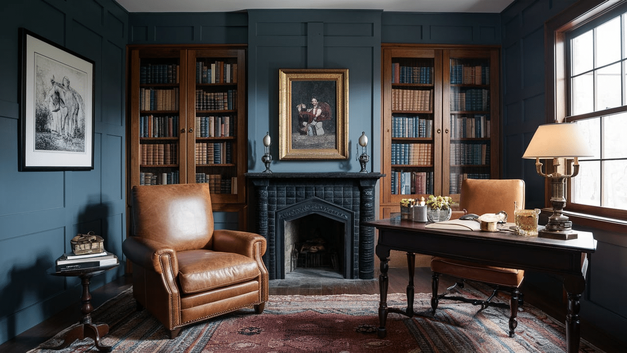
2. Navy Blue and Cream
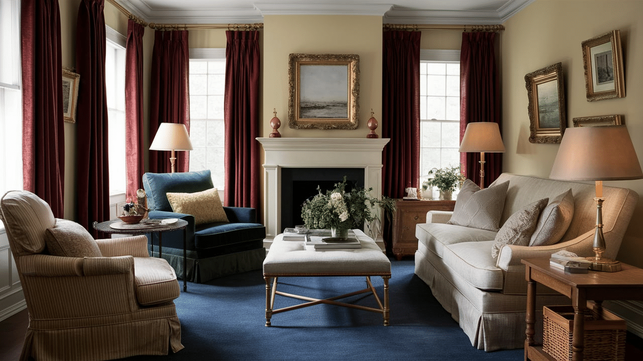
Navy blue and cream work well together because they balance each other out. The navy adds depth and a sense of calm, while the cream keeps the space feeling light and clean. This combo is perfect for bedrooms and studies, giving them a smart, classic look without being too dark.
3. Forest Green and Brown
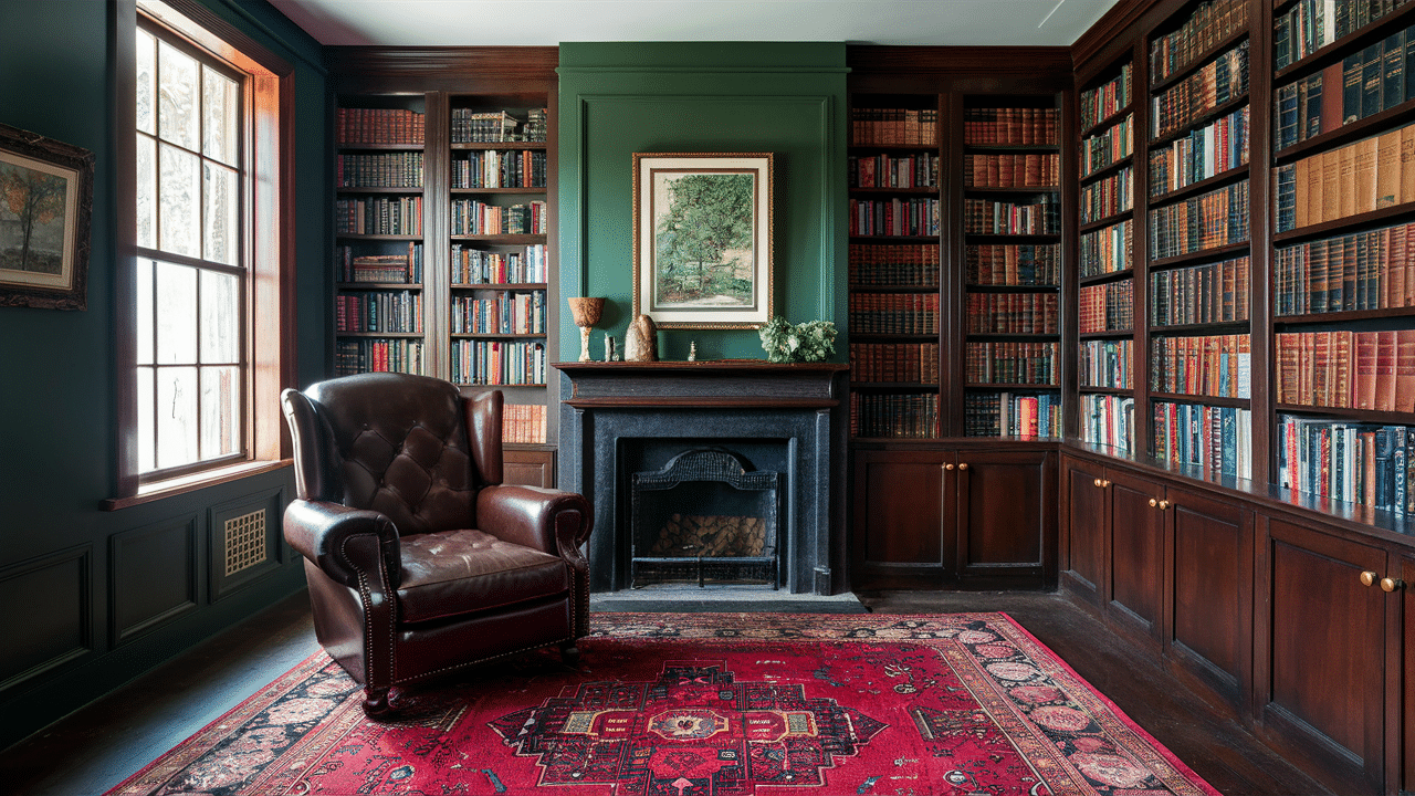
Forest green and brown are common colors in traditional homes. These shades are inspired by nature, so they make any room feel grounded and peaceful. Use forest green on walls or furniture and pair it with brown wood tones for a cozy, inviting space.
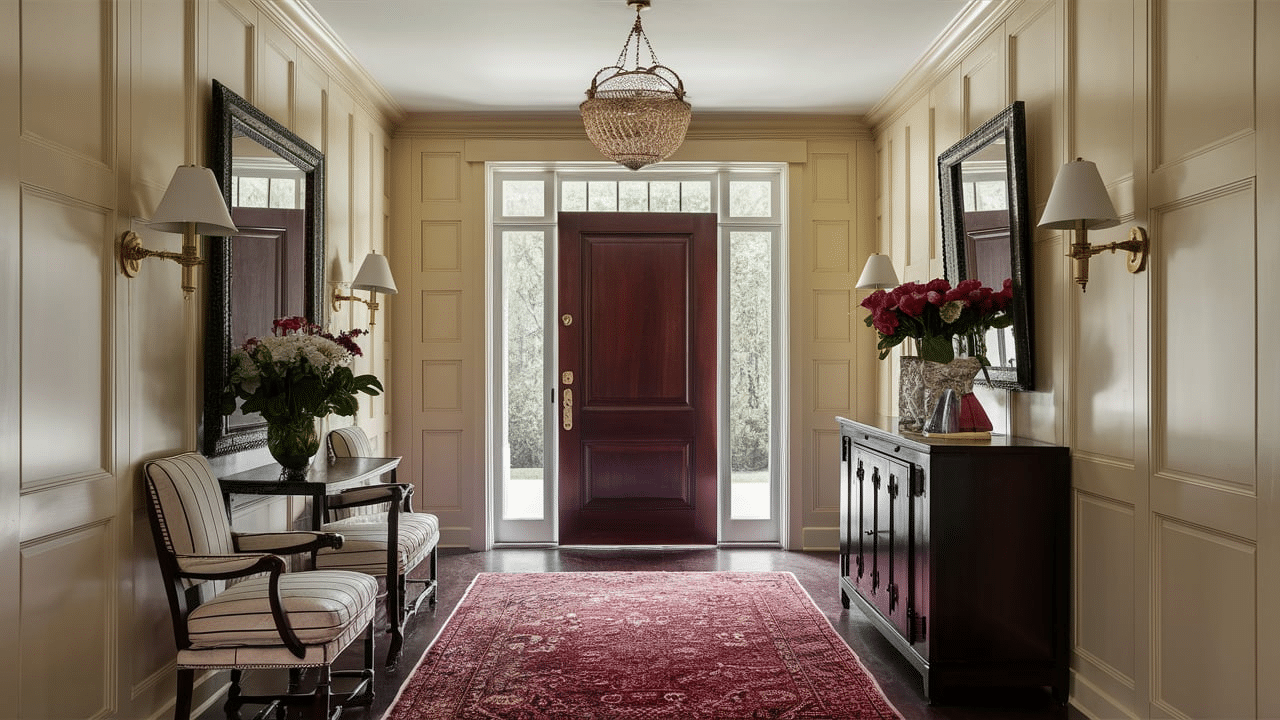
4. Deep Red and Beige

Deep red is bold and cozy, and when you match it with beige, you get a warm, balanced look. This combo works well in living rooms or entryways, adding a classic feel to your home. Red adds energy, and beige softens it, making the space feel both lively and welcoming. It’s a great choice if you want a space that feels both stylish and comfortable.
5. Sage Green and Cream
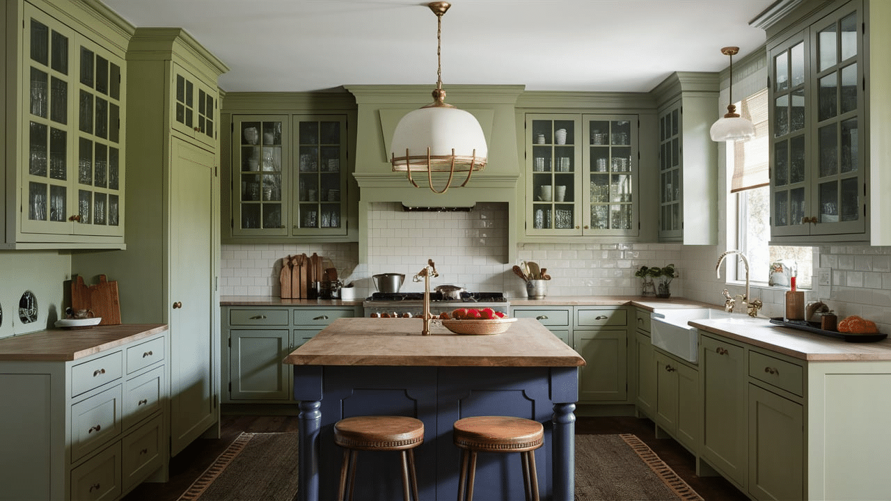
Sage green is a soft, calming color that works perfectly with cream. Together, they create a gentle, classic look that’s great for kitchens or bedrooms. Sage adds a bit of color without being too bold, while cream keeps the space bright and fresh.
6. Navy Blue and Gold
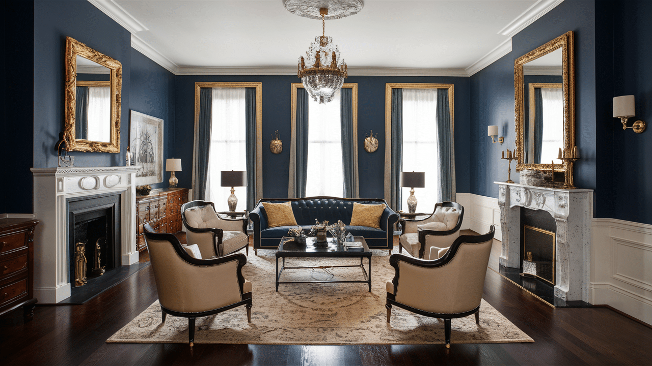
Navy and gold are a powerful pair in traditional design. The navy adds richness, and the gold brings a little sparkle. Try using this combo in a formal living room or dining area to create a classy and stylish feel. It also looks great with wood furniture.
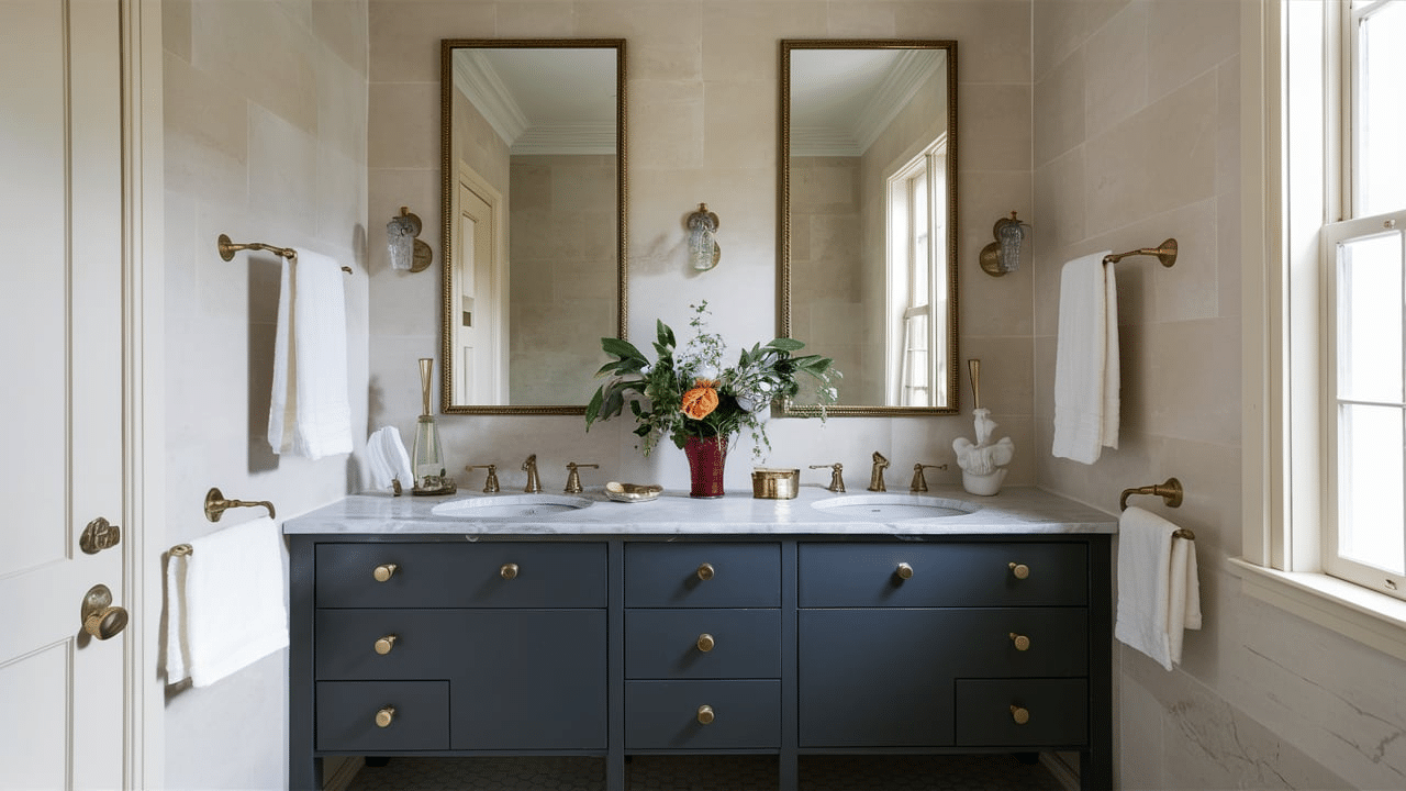
7. Taupe and White
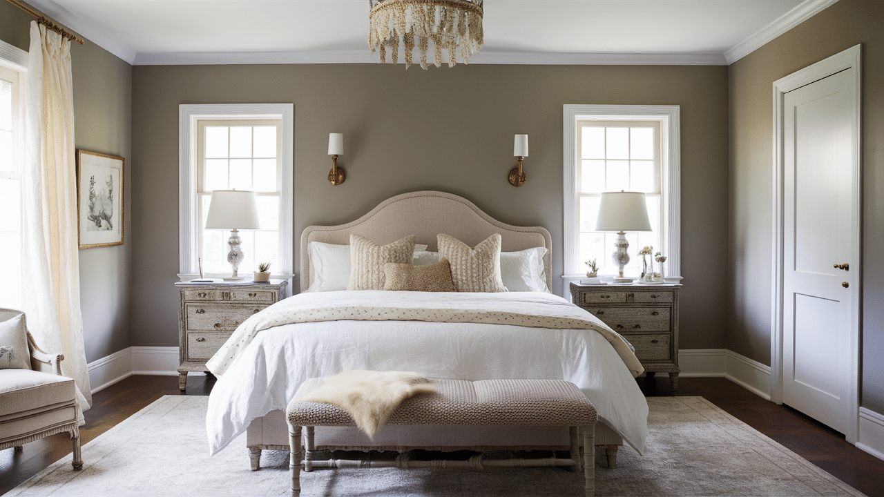
Taupe and white create a clean, soft look that’s easy to live with. Taupe has a hint of warmth, and white keeps things light and airy. This combo is perfect for traditional homes that want a calm and relaxed feeling without too much color. It works especially well in bedrooms, bathrooms, or any space where you want a peaceful vibe.
8. Olive Green and Rust
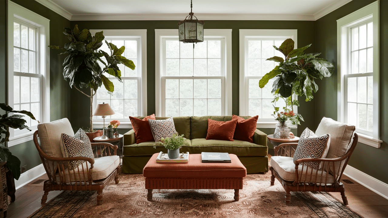
Olive green and rust are earthy tones that look beautiful together. Olive gives a natural vibe, and rust adds a cozy touch. These colors are great for fall-inspired spaces or rooms with a vintage look. Use them in fabric patterns or wall art to pull the room together.
9. Charcoal Gray and Ivory
Charcoal gray is bold but not too dark, and it looks great with soft ivory. This color pairing is ideal for creating a traditional space that feels calm and classy. You can use gray on furniture or walls and ivory for trim, rugs, or curtains. Add in some wood accents or metallic details to give the room even more character and charm.
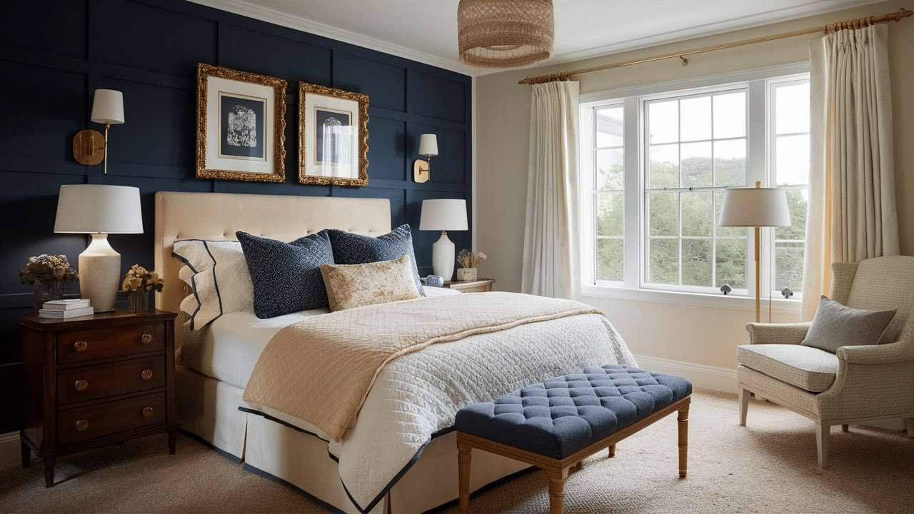
10. Chocolate Brown and Soft Blue
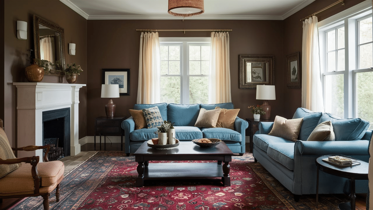
Chocolate brown adds depth and warmth, while soft blue brings a peaceful tone. Together, they create a look that’s cozy yet refreshing. This combo is great for traditional bedrooms or family rooms, especially with wood furniture and soft fabrics.
11. Plum and Cream
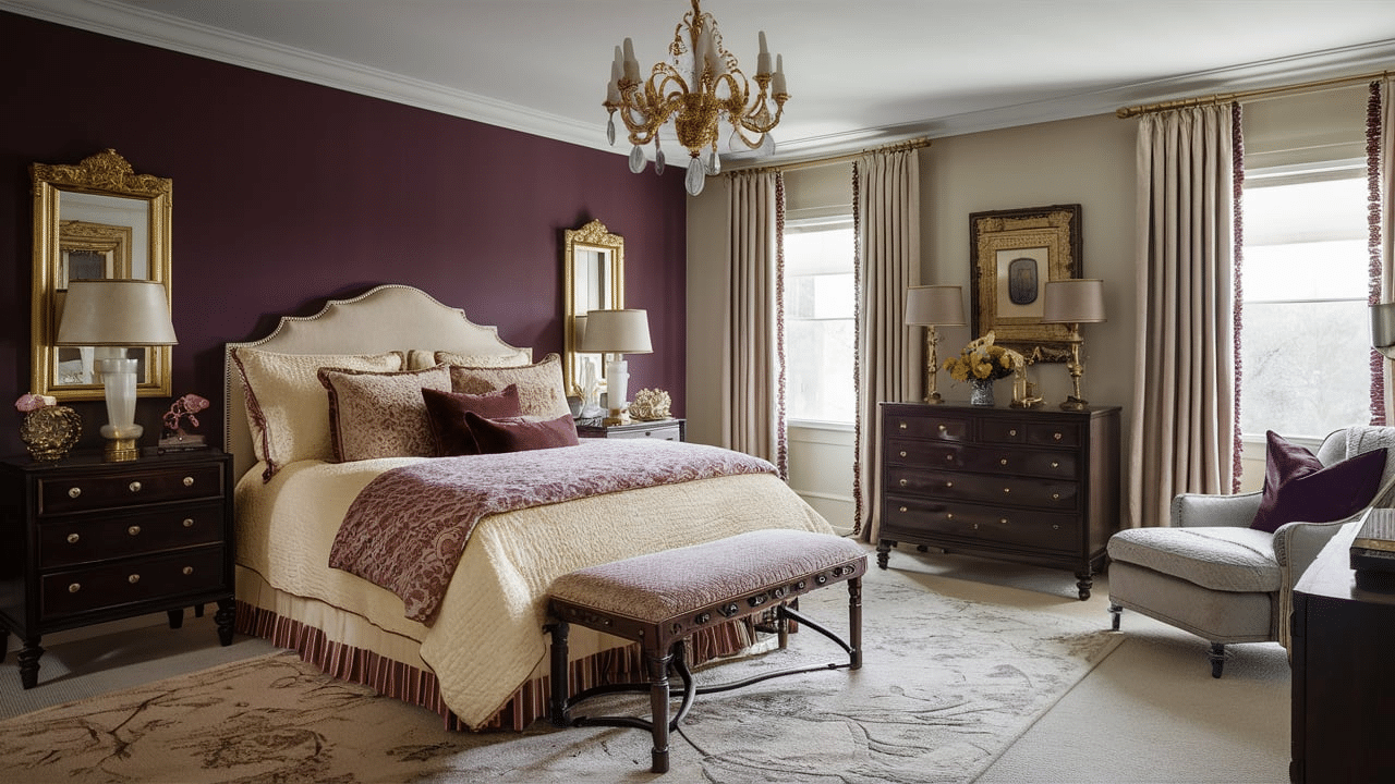
Plum is a deep purple shade that looks luxurious and cozy, and cream balances it out. This combo is perfect for formal spaces or bedrooms where you want a touch of drama without going too dark. Add gold or brass accents for an extra classic touch.
12. Terracotta and Beige
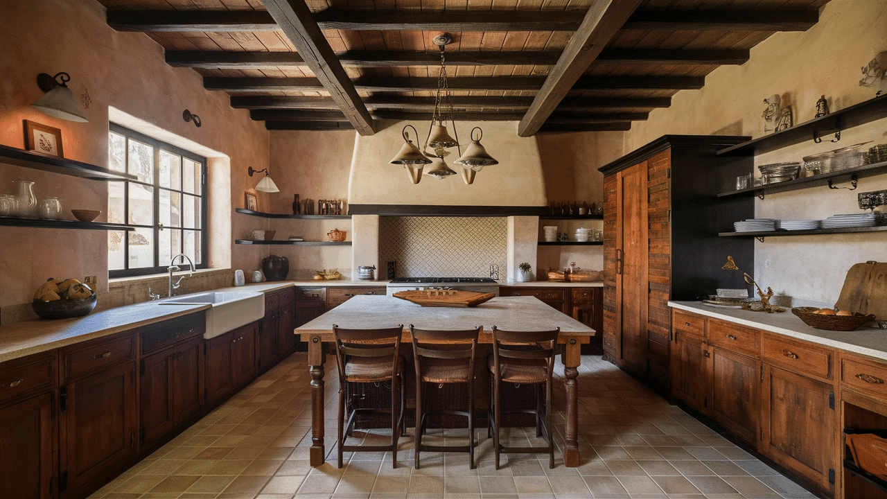
Terracotta brings warmth and an earthy feel, while beige tones it down. This combo is great for traditional kitchens or sunrooms. It feels welcoming and natural, especially when paired with wood, wicker, or rustic accessories. Try using terracotta in tile, pottery, or even painted walls for a cozy, grounded look.
13. Soft Yellow and White
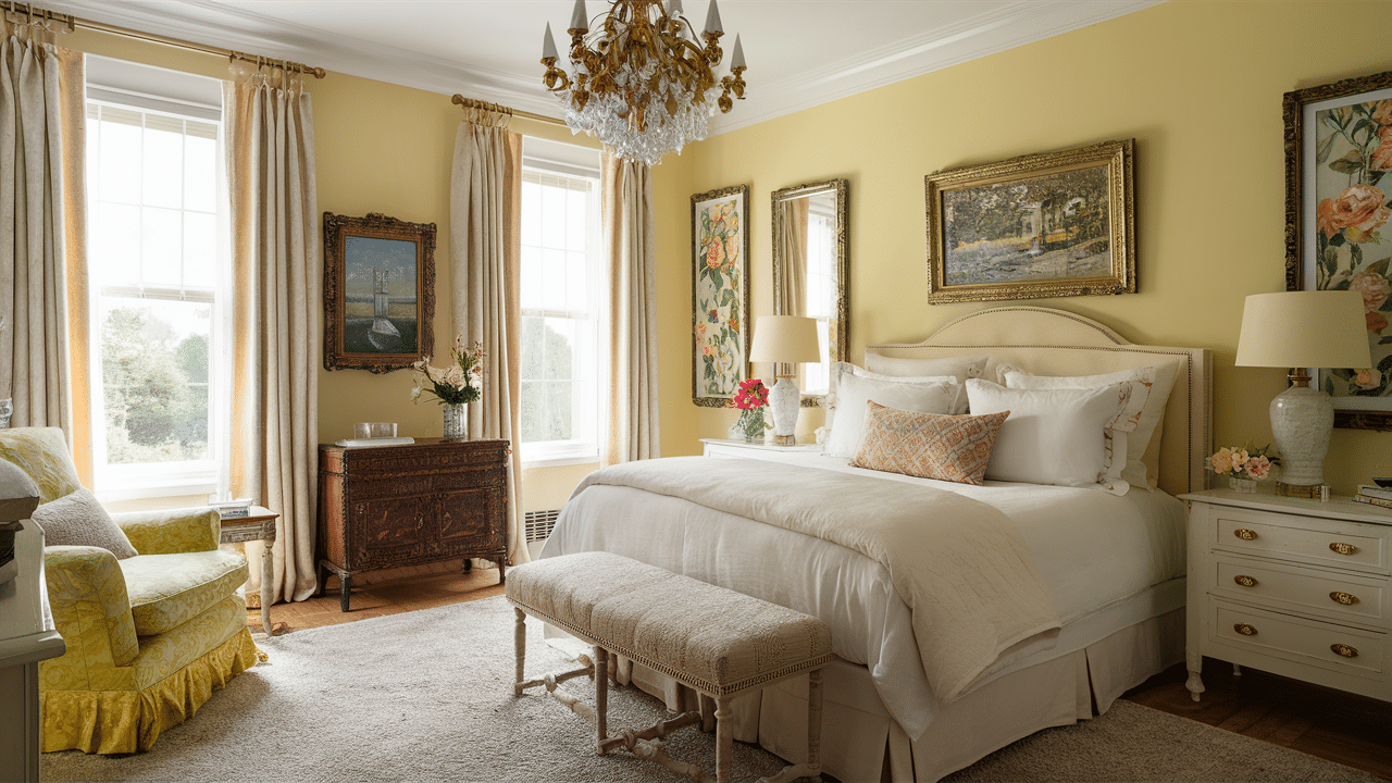
Soft yellow adds a sunny, cheerful vibe, and white keeps everything feeling clean and bright. This combo is great for traditional homes that want a light, happy look. It works well in kitchens, bathrooms, or guest rooms. You can also use yellow in floral fabrics or wall art to brighten the space even more.
14. Steel Blue and Tan
Steel blue is calm and cool, and tan adds a bit of warmth. Together, they make a great team in traditional spaces that want to feel balanced and classic. Use this combo in rugs, throw pillows, or wall colors for a relaxed but polished feel. It’s perfect for creating a peaceful vibe without feeling dull.
15. Mahogany and Ivory
Mahogany wood has a rich, reddish tone that pairs nicely with soft ivory. This combo gives a room a formal, traditional look. It works especially well in dining rooms, studies, or entryways where you want to make a strong but classic statement.
These color combinations bring out the best in traditional interiors. They’re timeless, comfortable, and easy to mix into your home—one room at a time.
Incorporating Traditional Colors in Modern Homes
Blending traditional colors into a modern home is easier than you might think. Even if your space has clean lines and contemporary furniture, you can still add warm, classic colors to make it feel more cozy and unique.
-
Start with Neutrals: Use soft creams, warm beiges, or light taupes as your base. These colors work great on walls and larger pieces like sofas or rugs.
-
Add Rich Accent Colors: Try deep reds, navy blues, or forest greens in small touches—like throw pillows, curtains, or artwork.
-
Mix with Modern Pieces: Pair traditional colors with modern furniture or lighting to create a nice balance of old and new.
-
Use Wood and Metal: Dark wood tones and brass or gold finishes look great with traditional colors and help tie everything together.
-
Keep It Simple: You don’t have to go all-in. A few well-placed colors can bring that traditional warmth without overwhelming the space.
Using traditional colors in a modern home gives you the best of both worlds—classic comfort and fresh style. Just a few touches can completely change the feel of a room and make it more welcoming and timeless.
Tips for Choosing Your Traditional Color Palette
Choosing the right color palette for a traditional home doesn’t have to be hard. With a few simple tips, you can pick colors that make your space feel warm, classic, and inviting.
-
Look at Your Furniture: Use the colors in your wood, fabrics, or rugs to guide your paint and accent choices.
-
Stick to 2–3 Main Colors: Don’t overdo it. A few well-chosen colors go a long way in traditional design.
-
Think About the Mood: Warm colors like red or gold feel cozy, while blues and greens feel calm.
-
Test in Natural Light: Paint a small patch and check it during the day and at night.
-
Use Neutrals as a Base: Creams, taupes, and beiges are perfect backdrops for richer shades.
With these tips, you’ll find it easier to pick a palette that feels just right for your home. Traditional colors can help create a comfortable and stylish space.
Conclusion
Traditional color palettes are all about warmth, classiness, and coziness. These classic shades have been used in homes for years, and they still look great today.
Whether you love rich reds, soft creams, or deep greens, there’s a traditional color combination that can fit your style. You don’t have to live in an old house or change your whole design to use these colors. With a few simple updates, you can add traditional touches to any room.
The best part? Traditional colors make your home feel cozy and welcoming. They’re easy to mix with modern pieces and work well in every room—from the kitchen to the bedroom.
So, if you’re looking to create a space that feels just right, try adding a few of these shades to your home. Stick with what you love, and you’ll have a look that never goes out of style.