
Calming colors help create a home that feels peaceful, warm, and easy to relax in. These gentle shades come from nature: soft blues, light greens, warm whites, and muted grays, and they make a room feel softer.
Color psychology shows that certain hues can lower stress and improve mood, which is why choosing calming paint colors matters when designing a relaxing space.
In this blog, readers will find simple explanations, helpful tips, and specific paint colors that work well in real homes.
They will also learn how to use these shades in different rooms to make their home feel more restful and inviting.
What Makes a Color Calming?
A color feels calming when it’s soft, gentle, and easy for the eyes to process. The science behind these soothing hues comes from things like undertones, light reflectance, and color temperature.
Cool undertones often feel fresh and peaceful, while warm undertones bring comfort and quiet energy.
Colors inspired by nature, such as the sky, sand, fog, or seafoam, help people relax by reminding the brain of safe, natural spaces.
That’s why calming palettes often include soft neutrals, gentle blues, muted greens, and warm greige tones.
Best Calming Colors for Home Interiors
Calming colors can transform a home into a peaceful retreat. These soft, soothing shades help create rooms that feel balanced, gentle, and relaxing.
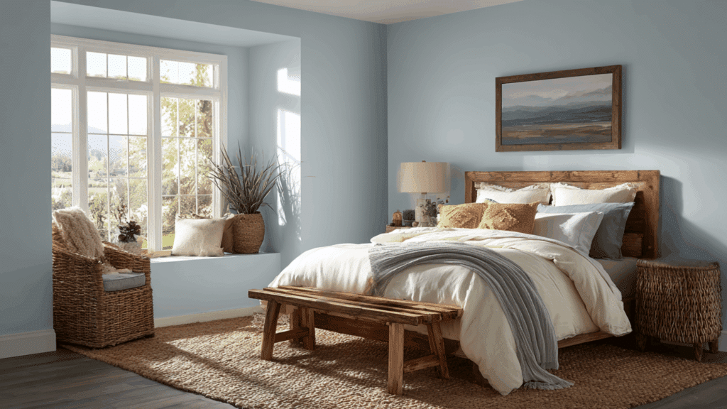
1. Sherwin-Williams Upward
Upward is a serene light blue-gray that evokes clear skies and promotes deep relaxation.
Its soft, airy tone works perfectly in bedrooms or living rooms, creating a sense of spacious calm without feeling cold. Pair it with creamy whites and natural wood for balance.
This versatile neutral reduces stress, making spaces feel open and peaceful, ideal for unwinding after a long day.
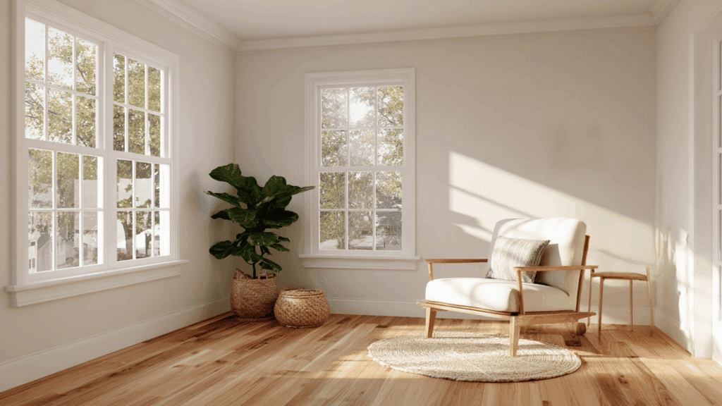
2. Sherwin-Williams Alabaster
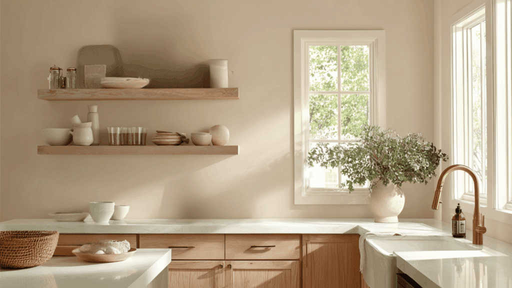
Alabaster offers a warm, soft white with subtle creamy undertones that feels clean yet inviting.
Unlike stark whites, it creates a soothing backdrop for any room, enhancing natural light and pairing beautifully with pastels or earth tones.
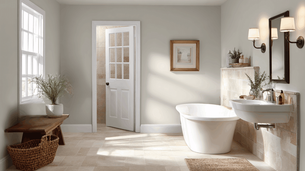
Designers love it for its calming versatility in kitchens or bathrooms, fostering tranquility and subtle style without overwhelming the senses.
3. Sherwin-Williams Shoji White
Shoji White is a creamy off-white that brings gentle warmth and respite to interiors.
Its soft depth suits bedrooms or studies, grounding spaces while allowing accents to shine.
This classic shade calms the mind, working well with grays, blues, or greens for a spa-like haven that feels modern yet comforting.
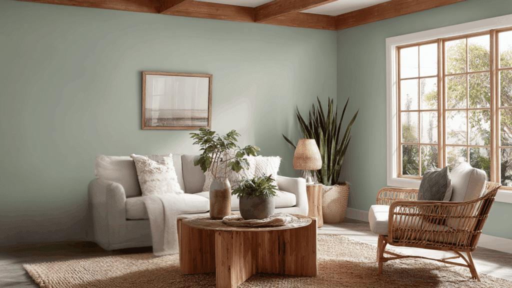
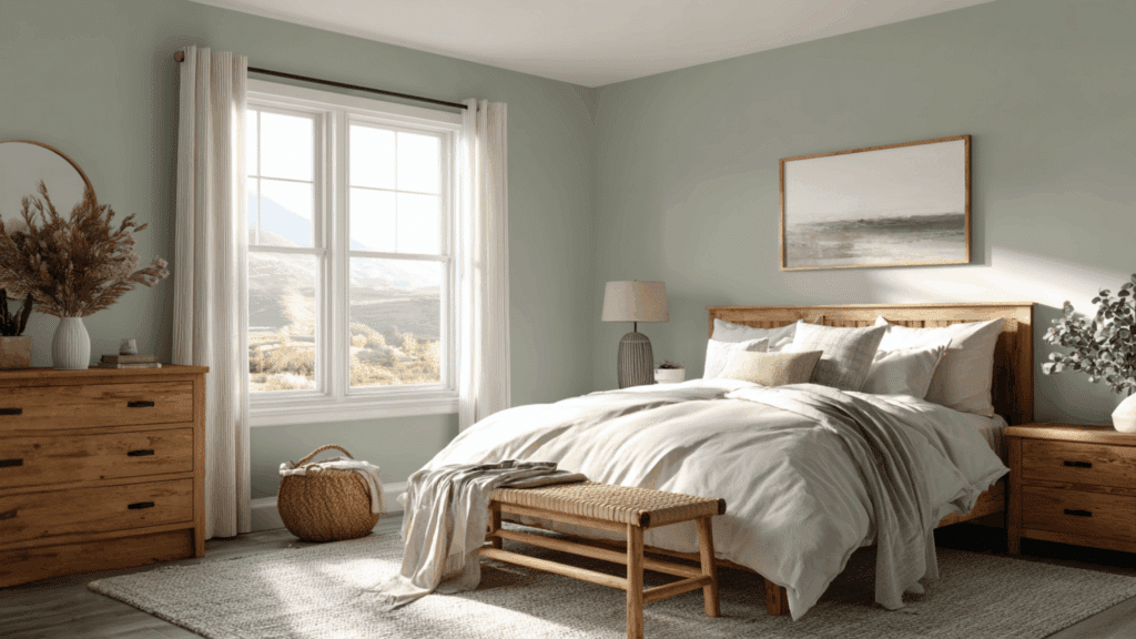
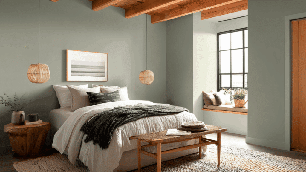
4. Sherwin-Williams Evergreen Fog
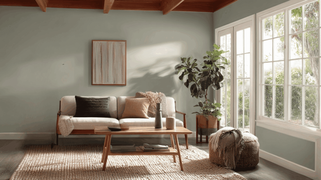
Evergreen Fog is a muted sage green-gray inspired by nature, instantly restful and earthy.
Perfect for living rooms or offices, it connects indoors to the outdoors, reducing anxiety with its subtle depth.
Pair with neutrals or wood for harmony, creating serene, balanced spaces that promote mindfulness and quiet reflection.
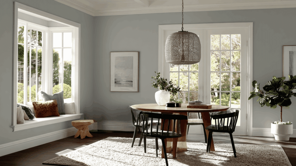
5. Sherwin-Williams Drift of Mist
Drift of Mist is a cozy light gray that feels soothing rather than stark, ideal for low-light rooms. It opens up spaces while adding subtle warmth, making it great for bathrooms or bedrooms.
This neutral pairs with earth tones for a spa vibe, helping create peaceful retreats that encourage relaxation and mental clarity.
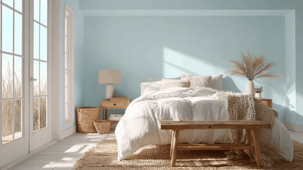
6. Sherwin-Williams Sea Salt

Sea Salt is a pale coastal blue-green that whispers ocean breezes, perfect for serene bedrooms.
Its airy quality brightens spaces, pairing with whites for a fresh, calm feel.
This popular shade soothes the soul, mimicking nature’s hush for stress-free interiors.
7. Benjamin Moore October Mist
October Mist is a sage green-gray with warm depth, evoking misty mornings for instant calm. When paired with creams, warm whites, or natural textures, the color feels perfectly balanced.
Suited for living rooms, it softens edges and pairs beautifully with neutrals. This 2022 Color of the Year reduces tension, creating nurturing, nature-inspired sanctuaries.
8. Benjamin Moore Gray Owl
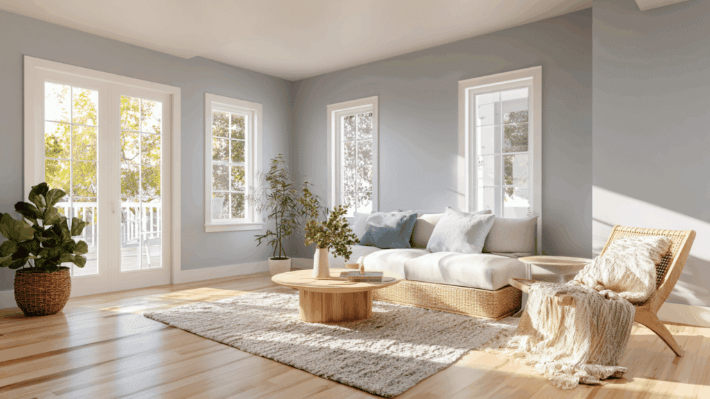
Gray Owl is a soft, adaptable gray that shifts slightly with changing light, giving bedrooms and living spaces a calm, airy feel.
Its gentle undertones prevent it from looking too cool or too warm, making it a reliable choice for many styles.
This shade brightens rooms without feeling sharp, and it pairs beautifully with natural woods, soft pastels, and cozy textiles. It’s loved for creating peaceful, balanced interiors.
9. Benjamin Moore Quiet Moments
Quiet Moments is a subtle blend of blue, green, and gray that creates a hushed, spa-like calm.
Its gentle tone works especially well in bathrooms, bedrooms, or reading nooks where relaxation is the goal. When combined with crisp whites or soft neutrals, the color feels even more soothing.
It’s a favorite for anyone who wants a light, peaceful backdrop that encourages rest, quiet reflection, and soft, cozy moments.
10. Sherwin-Williams Krypton
Krypton is a soft blue-gray that delivers coolness without feeling cold, making it perfect for peaceful retreats like bedrooms and guest rooms.
Its gentle undertones help quiet the mind, while its versatility allows it to pair easily with warm woods, creamy whites, or muted grays.
Krypton gives spaces a clean, relaxed feel and works well in both bright and low-light rooms, offering steady, calming comfort throughout the day.
11. Sherwin-Williams Kind Green
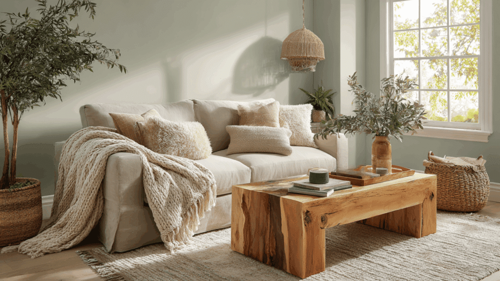
Kind Green is a muted green with warm, earthy undertones, evoking a comforting, natural feel. It works beautifully in living rooms, kitchens, and family spaces where gentle relaxation is key.
Its botanical softness blends effortlessly with warm neutrals, woven textures, and natural wood finishes.
The result is a room that feels soothing, friendly, and quietly refreshing, perfect for creating a home atmosphere rooted in nature-inspired ease.
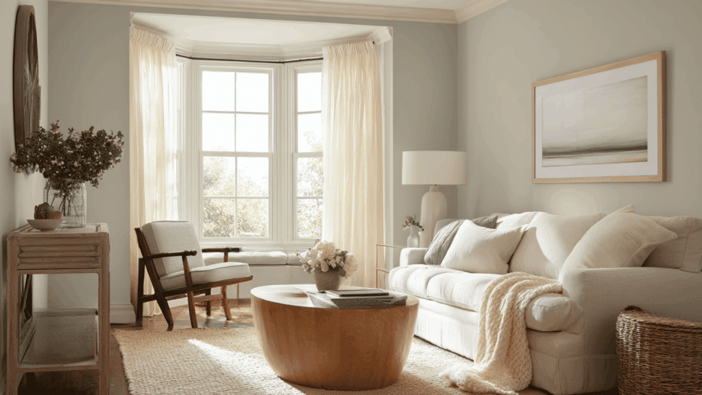
12. Sherwin-Williams Pearl Gray
Pearl Gray is a soft, stylish neutral that brings calm through its subtle warmth and gentle shimmer.
It brightens rooms without feeling stark, making it suitable for walls, trim, or even cabinetry. Its understated tone helps create a clean, relaxed atmosphere in any interior style.
Paired with whites, charcoals, or soft blues, Pearl Gray maintains its peaceful presence and adds a refined sense of quiet sophistication.
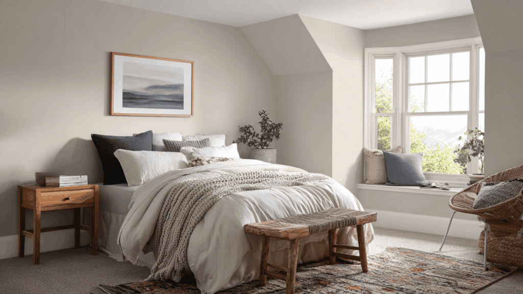
13. Benjamin Moore Sterling
Sterling is a light gray-blue with soft undertones that resemble aged silver, giving it a classic, calming presence.
It works well in hallways, studies, bedrooms, or any space needing subtle style.
Sterling brightens rooms gently without overwhelming them, making it easy to pair with whites, muted greens, or natural textures. This shade creates a peaceful backdrop that feels cool, quiet, and effortlessly refined.
14. Sherwin-Williams Acacia Haze
Acacia Haze is a muted green-gray that captures the quiet mood of nature. Its soft depth makes it ideal for home offices, reading nooks, or bedrooms where calm focus is important.
When paired with warm wood tones, beige, or soft white, it brings a clean, grounding effect.
This shade offers tranquility with a mature, refined feel, making rooms look both serene and stylish.
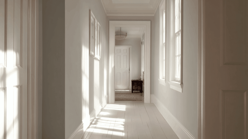
15. Sherwin-Williams Ibis White
Ibis White is a quiet, clean white that softens a room without making it feel stark or cold. Its warmth creates an airy, peaceful vibe ideal for walls, ceilings, or trim.
This color brightens spaces gently and pairs easily with virtually any palette, especially soft blues, greens, and warm woods.
Ibis White is perfect for anyone wanting a simple, calming foundation for their home.
16. Benjamin Moore Smoky Green
Smoky Green is a soft sage with a cool, misty quality that brings immediate calm to a room.
It works beautifully in bedrooms, bathrooms, or kitchens where a soothing, nature-inspired palette is desired. When paired with warm neutrals or natural textures, it feels balanced and refreshing.
Smoky Green adds quiet depth without overpowering, creating a relaxing atmosphere that feels both stylish and organic.
17. Benjamin Moore Gray Cashmere
Gray Cashmere is a light, airy blend of gray with a touch of green and blue, giving it a soothing warmth.
It works in almost any room, offering flexibility and calm. Its gentle softness makes spaces feel open, fresh, and relaxing.
Paired with natural textures or soft whites, Gray Cashmere delivers a serene, balanced look that feels welcoming and easy on the eyes.
How to Choose the Right Calming Color for Your Space
Choosing the right calming color depends on light, existing décor, and undertones. A few simple steps help create a peaceful, balanced room.
- Consider natural light direction: Light changes a color’s mood; north light cools shades, while south light warms them, affecting how calming the color feels.
- Match calming colors to existing furniture or flooring: Coordinating with wood tones, fabrics, and finishes ensures the color blends smoothly and keeps the room visually soothing and consistent.
- Test samples on large swatches before committing: Viewing big samples in different lighting helps reveal the color’s true personality, preventing surprises once it covers the whole wall.
- Understand undertones to avoid unexpected results: Knowing whether a color leans warm or cool helps it harmonize with décor, keeping the space calm instead of accidentally clashing.
Accent Colors that Pair Well with Calming Shades
Accent colors can make calming shades feel even more peaceful when chosen carefully.
Soft whites help brighten a room without creating harsh contrast, while natural wood tones add warmth and a grounded, organic feel.
Charcoal and soft blacks bring gentle depth without overwhelming the space, acting as subtle anchors in a soothing palette.
Brass adds a warm touch that complements muted colors beautifully. To keep the overall look serene, pair these accents in low-contrast combinations, think soft gray with warm wood or pale blue with creamy white.
This approach avoids visual tension and helps every color blend smoothly, creating a calm, balanced atmosphere throughout the room.
Conclusion
Calming colors have the power to shape a home’s atmosphere in a gentle, meaningful way.
By choosing shades that feel soft and peaceful, anyone can create rooms that support rest, comfort, and emotional balance.
Readers are encouraged to sample a few favorites on their walls, observe them in different lighting, and trust the shades that naturally bring ease.
In the end, the best calming palette is one that feels personally soothing and helps the home become a place of simple, everyday peace.