
Picking paint colors feels harder than it should be. Those tiny swatches at the store never look the same at home.
The blue that seemed calm turns electric under the living room lights. That warm beige suddenly feels like baby food on the walls.
And then there’s the paralysis of choice. Hundreds of whites alone. Most folks stand in the paint aisle, overwhelmed, second-guessing every decision.
Choosing the right color is about understanding how light, space, and existing elements interact. This blog breaks down the practical steps to pick colors confidently, ones that’ll actually look good once the roller hits the wall.
What Most People Get Wrong When Choosing Paint Colors
Before diving into color charts, it helps to know the common traps. These mistakes trip up even experienced DIYers, leading to expensive do-overs and walls that just feel off.
- Testing colors on tiny sample cards instead of large sections of the actual wall.
- Ignoring how natural and artificial lighting completely transform paint throughout the day.
- Picking colors in isolation without considering furniture, flooring, and fixed elements.
- Forgetting that paint looks different on all four walls than it does on one.
- Choosing trendy colors over shades that complement the home’s architecture and personal style.
- Skipping primer, which affects both color accuracy and coverage quality.
Easy Steps to Choose Perfect Paint Colors
Choosing the right paint comes down to a methodical approach. These five steps remove the guesswork and build confidence in color decisions.
Step 1: Start With What You Already Have
Look around the room before looking at paint chips. Flooring, countertops, furniture, and artwork aren’t going anywhere. These fixed elements set boundaries for color choices.
Pull undertones from existing materials; if the floor has warm oak tones, cool grays might clash.
Take photos of the space in different lighting conditions. Bring fabric swatches, tile samples, or even cushions to the paint store for accurate matching.
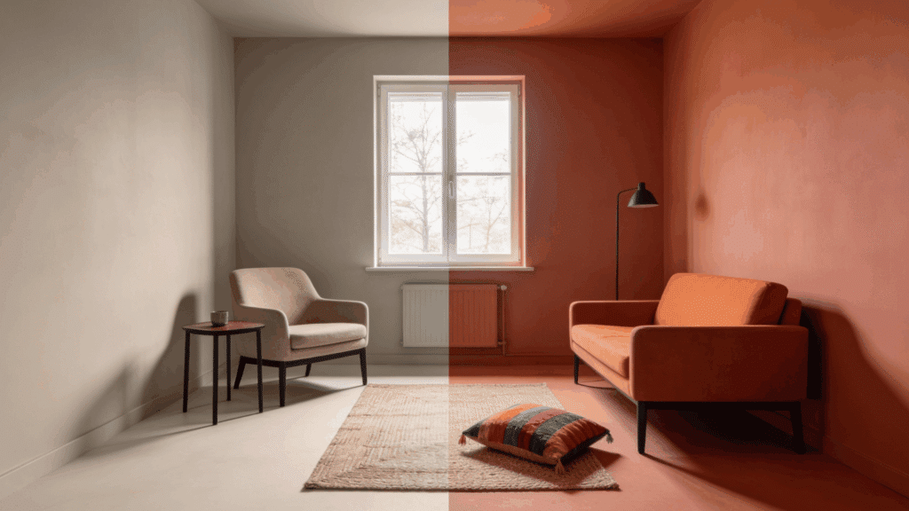
Step 2: Understand Lighting in Your Space
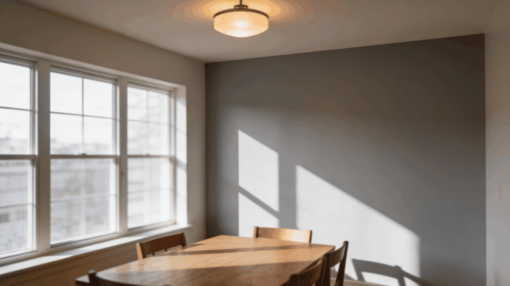
Light makes or breaks paint colors. North-facing rooms get cooler, bluer light that can make colors feel flat.
South-facing spaces receive warm, consistent light that intensifies color. East-facing rooms glow in the morning but dim by afternoon. West-facing walls catch harsh late-day sun.
Test paint samples on multiple walls, not just one. Watch how they shift from morning to evening, under natural daylight and artificial bulbs at night.
Step 3: Test Colors Properly on Your Walls
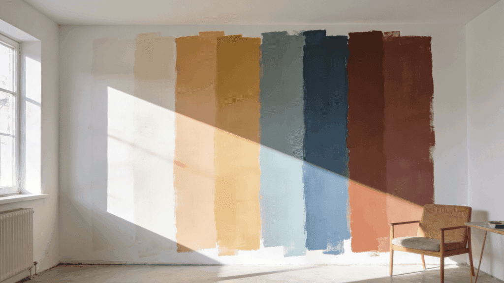
Sample pots exist for a reason. Paint large swatches, at least two feet by two feet, on different walls in the room. Include a wall that gets direct light and one that doesn’t.
Live with these samples for several days. Check them at different times, in various moods, with lights on and off. Colors behave differently depending on surrounding shades, so test them where they’ll actually live.
Step 4: Consider the Room’s Purpose and Mood
Bedrooms call for different energy than kitchens. Calm, muted tones help bedrooms feel restful.
Energizing colors work well in spaces meant for activity and conversation. Think about how the room gets used and who uses it. A home office might need focus-friendly neutrals.
A playroom can handle bolder choices. The color should support the room’s function, not fight against it.
Step 5: Use the 60-30-10 Rule for Balance
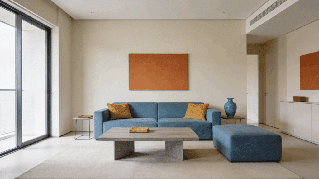
Professional designers rely on this ratio: 60% dominant color, 30% secondary color, 10% accent.
Walls typically take the dominant role. Furniture and larger decor pieces carry the secondary shade. Accessories, pillows, and artwork provide accent pops.
This formula creates visual harmony without overwhelming the senses. It prevents the “too much of everything” look that makes spaces feel chaotic instead of cohesive.
How to Choose Paint Colors for Different Rooms
Different rooms serve different purposes, and paint colors should reflect that. Here’s how to approach color selection for specific spaces throughout the home.
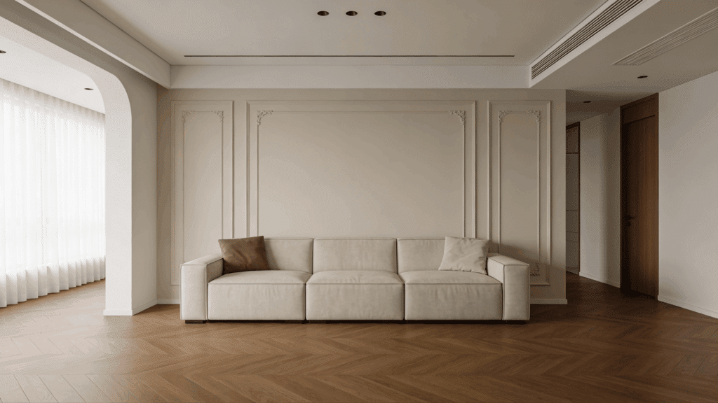
1. Living Rooms
This is where life happens: conversations, movie nights, gatherings. Neutrals with warm undertones create welcoming vibes. Greiges, soft taupes, and warm whites work well.
Bolder accent walls can add personality without overwhelming. Consider how the space connects to adjacent rooms for flow.
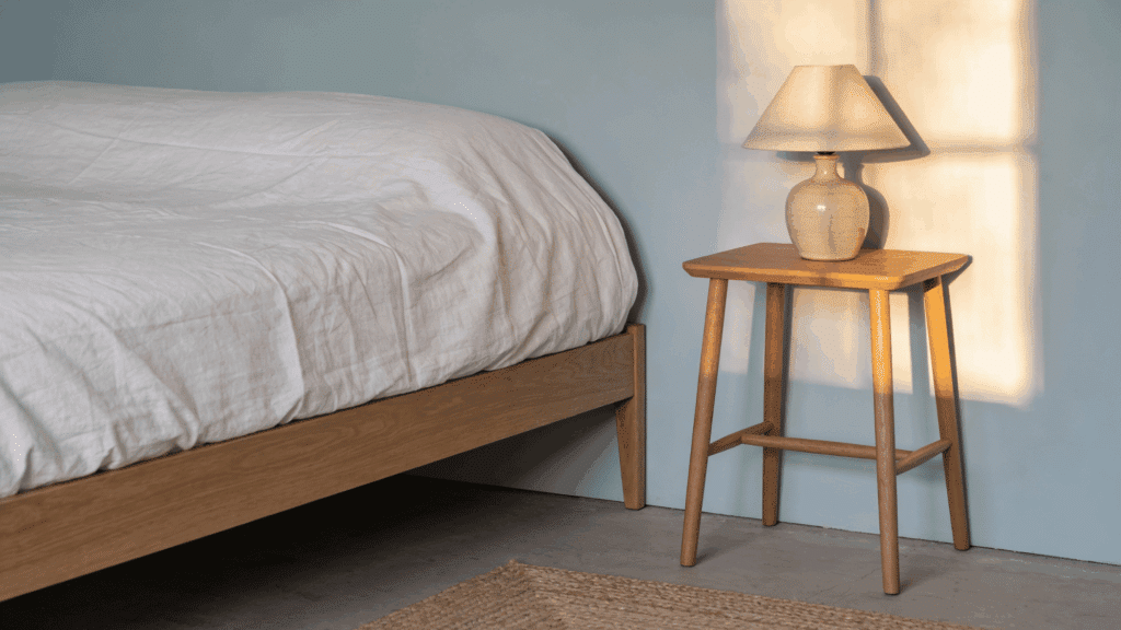
2. Bedrooms
Rest is the priority here. Soft blues, gentle greens, and muted lavenders promote relaxation.
Avoid overly stimulating shades like bright reds or electric yellows. Deeper tones can feel cozy in larger bedrooms, while lighter shades help small spaces breathe. The goal is calm, not chaos.
3. Kitchens
Kitchens handle a lot: cooking, eating, and socializing. Crisp whites and light grays keep things fresh and clean-looking. Warmer neutrals add coziness to eat-in kitchens.
If cabinets are bold, keep walls neutral. If cabinets are white or wood, walls can handle more color. Consider how grease and splatter show.
4. Bathrooms
Moisture matters here, so choose paint formulated for bathrooms. Spa-like blues and greens feel refreshing. Soft neutrals create timeless elegance. Small powder rooms can handle dramatic darks or fun patterns.
Larger bathrooms benefit from colors that complement tile and fixtures without competing.
5. Home Offices
Focus and productivity need support from color. Soft blues amplify concentration. Greens reduce eye strain during long screen hours.
Avoid stark whites that cause glare or overly warm tones that induce sleepiness. The space should feel energizing but not distracting, professional but not sterile.
6. Hallways and Entryways
First impressions count. These transitional spaces connect the home, so colors should flow with adjacent rooms. Lighter shades make narrow hallways feel wider.
Darker tones add drama in spacious entryways. Consider how natural light enters, or doesn’t, in these often windowless areas.
How to Choose Paint Colors Based on Undertones
Undertones are the sneaky culprits behind paint fails. That “perfect white” looks pink on the wall. The gray reads purple in certain light. The beige suddenly screams orange.
Every paint color has an undertone, the subtle hue hiding beneath the surface color.
Whites lean warm (yellow, peachy) or cool (blue, gray). Grays pull green, blue, or purple. Even beiges have undertones ranging from pink to yellow to green.
Understanding undertones prevents costly mistakes. They determine whether colors clash or harmonize with existing elements. A warm beige sofa fights against cool gray walls. Blue-toned whites make warm wood floors look dinky.
The key is identifying undertones before committing. Compare paint samples against pure white paper.
The hidden color emerges. Check how undertones interact with flooring, trim, and furniture. Match warm with warm, cool with cool, or intentionally contrast for effect.
Trending Paint Color Tips Designers Say to Follow
Design professionals have learned through trial and error what actually works. These insider tips save time, money, and the headache of repainting rooms that just don’t feel right.
- Paint the ceiling the same color as the walls to make small rooms feel larger and more cohesive.
- Test colors next to white trim first, since most homes have white molding that affects perception.
- Go two shades lighter than the swatch because paint always looks darker once it covers the entire wall.
- Use flat or matte finishes in low-traffic areas to hide imperfections and create depth.
- Paint samples on poster board instead of directly on walls to move them around the room easily.
- Choose colors in the room where they’ll live, not under fluorescent store lighting that distorts everything.
Conclusion
Choosing paint colors doesn’t require a design degree. It requires patience, testing, and trust in the process. Those samples living on the wall for a few days? Worth it.
The extra trip to compare undertones? Necessary. The time was spent observing how light shifts throughout the day. Essential.
Rooms change with the right color. They feel bigger, cozier, more pulled together. And when the color works, really works, it stops being just paint. It becomes the backdrop for life.
So grab those sample pots. Test liberally. Trust what looks good in the actual space, not what trends dictate. The perfect color is the one that makes coming home feel right.