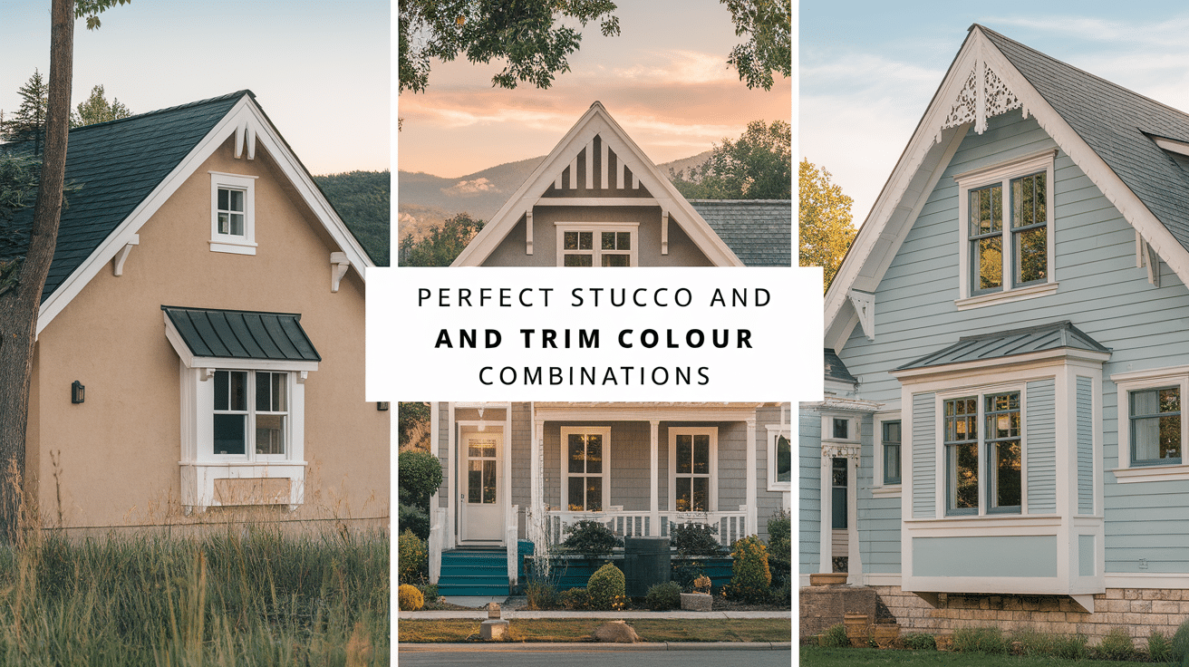
Standing in front of paint samples feeling completely overwhelmed? You’re not alone. Choosing the right stucco and trim colors for your home is one of the most stressful decisions homeowners face—and for good reason. These choices will define your home’s appearance for years to come.
In this guide, I’ll walk you through a simple process to select stucco and trim colors that complement each other perfectly. You’ll explore foolproof combinations that enhance your home’s architecture and reflect your style.
I’ve helped hundreds of homeowners make these exact decisions, turning their color paralysis into confidence. As a designer who’s worked with stucco homes across various climates and neighborhoods, I understand what works and why.
If you’re building new or refreshing your existing home, you’ll find practical advice to create a color palette you’ll love coming home to every day.
Understanding Stucco and Trim Colour Roles
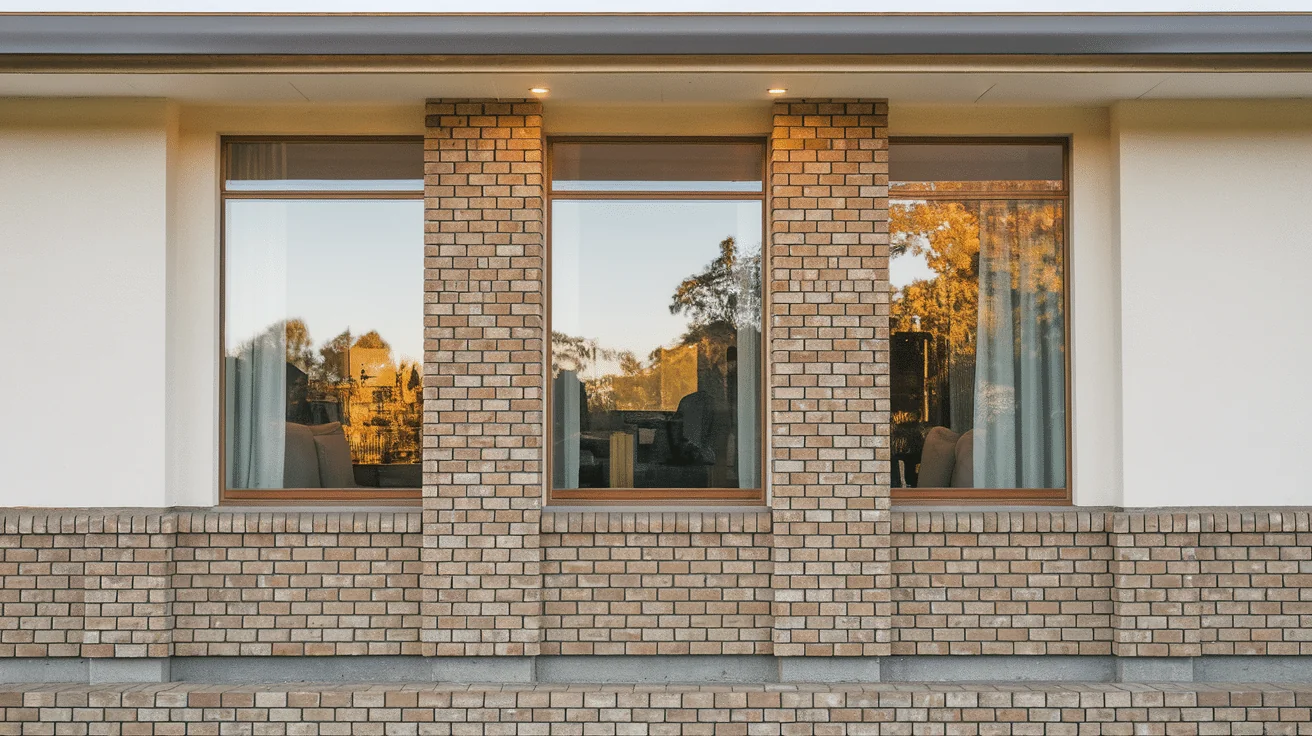
Think of your home’s exterior as a canvas where stucco and trim each play distinct but complementary roles.
Stucco: Your Home’s Main Character
Stucco is your house’s dominant surface—the backdrop for everything else. It covers most of your exterior walls, making it the first thing people notice.
I always tell homeowners to consider stucco as your home’s “personality statement.” This large surface area sets the tone for your entire property.
What does your stucco do for your home?
- Creates the base canvas for your design
- Determines how large or small your home appears
- Affects how your house sits in its environment (blending in or standing out)
Trim: The Critical Supporting Role
Trim is like jewelry for your house. It frames windows, outlines doors, defines rooflines, and accents architectural features.
You might not realize how important trim is until you see a house without it—everything looks flat and undefined. A good trim adds dimension and character to your home.
The relationship between your stucco and trim colors creates either:
- Harmony – when colors are similar
- Contrast – when colors are distinctly different
I’ve seen how the right trim can make a simple house look elegant, while poorly chosen trim makes even expensive homes look awkward.
Together, these elements create your home’s first impression before anyone steps inside. Getting this combination right isn’t just about looks; it’s about creating a home that feels right to you every time you pull into the driveway.
Things to Consider Before Choosing Colors
Before grabbing paint swatches, take a step back and consider the bigger picture. Your color choices need to complement several existing elements.
Home Style
The architectural style of your home should guide your color selections.
- Spanish or Mediterranean homes traditionally feature warm stucco colors (cream, terra cotta, soft yellow) with contrasting darker trim.
- Modern homes often use crisp whites or cool grays with minimal trim in similar tones.
- Traditional homes work well with neutral stucco and classic white or dark trim.
- Craftsmen styles typically feature earth tones with contrasting trim colors.
I’ve seen homeowners make the mistake of choosing colors they love but that fight against their home’s natural character.
Roof Color
Your roof occupies about 40% of your home’s visible exterior and cannot be easily changed. It must also harmonize with your color choices.
- Brown or terracotta roofs pair beautifully with warm stucco colors
- Gray or black roofs complement cooler stucco tones
- Your trim color often works best when it echoes or complements your roof tone
Light and Surroundings
Colors behave differently depending on your environment:
- Bright, sunny locations make colors appear lighter and warmer
- Shaded properties may need warmer tones to avoid looking gloomy
- Your landscaping creates a color backdrop that interacts with your home
- Neighborhood context matters—your home should feel connected but distinct
Permanent Elements
Take inventory of features you won’t be changing:
- Stone or brick accents
- Decorative tile work
- Driveway materials
- Outdoor fixtures and hardscaping
These elements contain undertones that should influence your color selections. I always recommend bringing samples outside and viewing them near these permanent features before making final decisions.
Popular Stucco and Trim Color Combinations
Finding the right color pairing can feel overwhelming with endless options. Here are combinations I’ve seen work beautifully across different home styles.
1. Warm & Earthy Tones
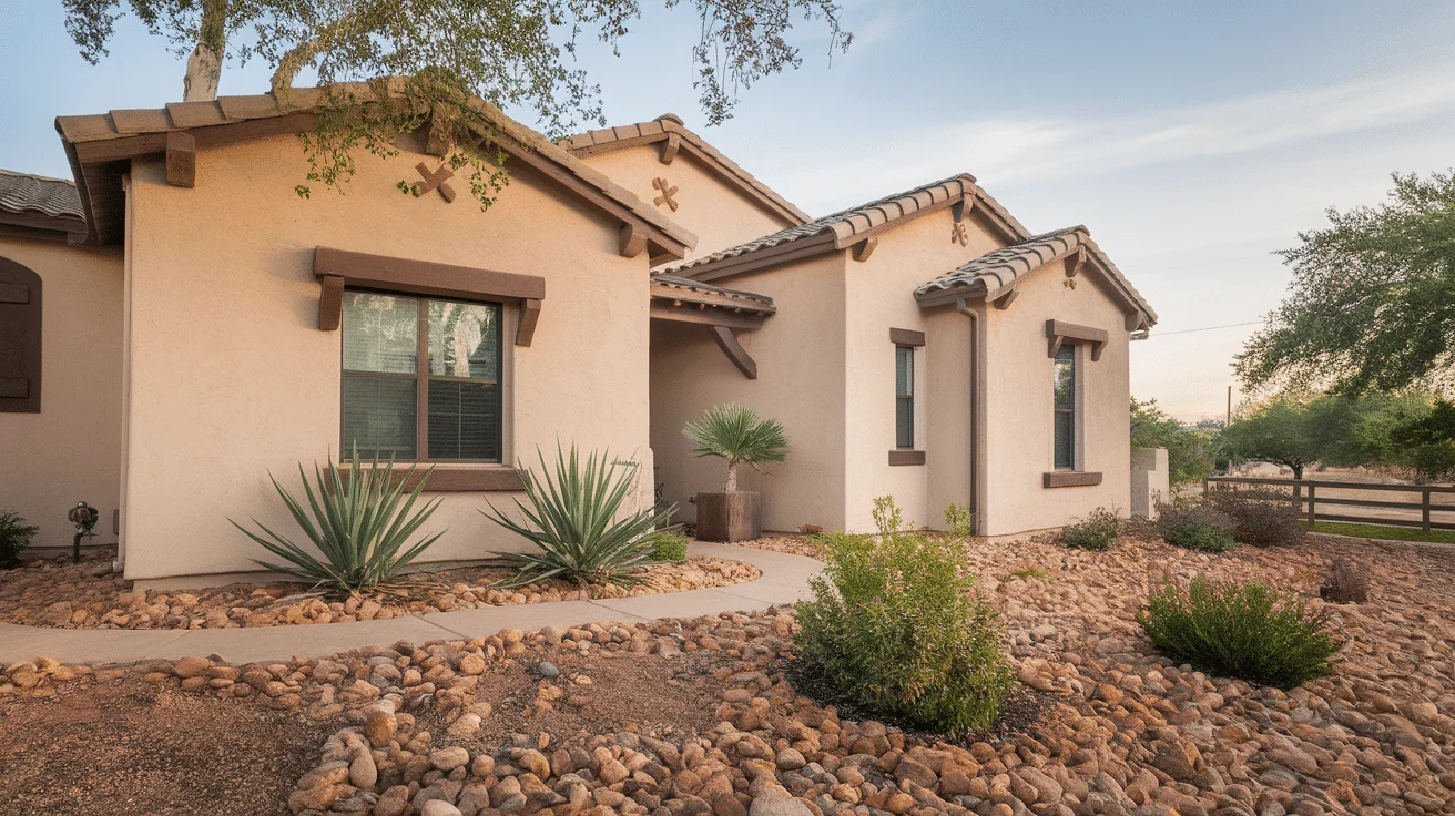
These colors feel grounded and timeless, perfect for creating a welcoming presence.
Stucco options:
- Tan (from light sand to deeper camel tones)
- Beige (with yellow or pink undertones)
- Terracotta (ranging from subtle to rich clay colors)
Complementary trim choices:
- Cream or warm white (softer than stark white)
- Bronze or chocolate brown (for defined architectural details)
- Rusty red-brown (for Spanish-influenced designs)
I’ve noticed these combinations work especially well for Spanish Colonial, Tuscan, Mediterranean, and desert-style homes. They connect naturally with landscape elements like terra cotta pots and desert plantings.
2. Cool & Crisp Neutrals
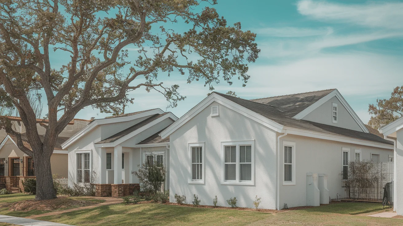
These combinations create a contemporary, sophisticated look.
Stucco options:
- Light gray (with blue or green undertones)
- Soft taupe (a perfect “greige” middle ground)
- Pale silver (for a subtle metallic quality in changing light)
Complementary trim choices:
- Charcoal or graphite (for definition without harshness)
- Crisp white (for maximum contrast)
- Deep blue-gray (adds interest while maintaining sophistication)
These pairings excel in modern or transitional homes where clean lines and subtle distinction matter more than bold statements.
3. High Contrast
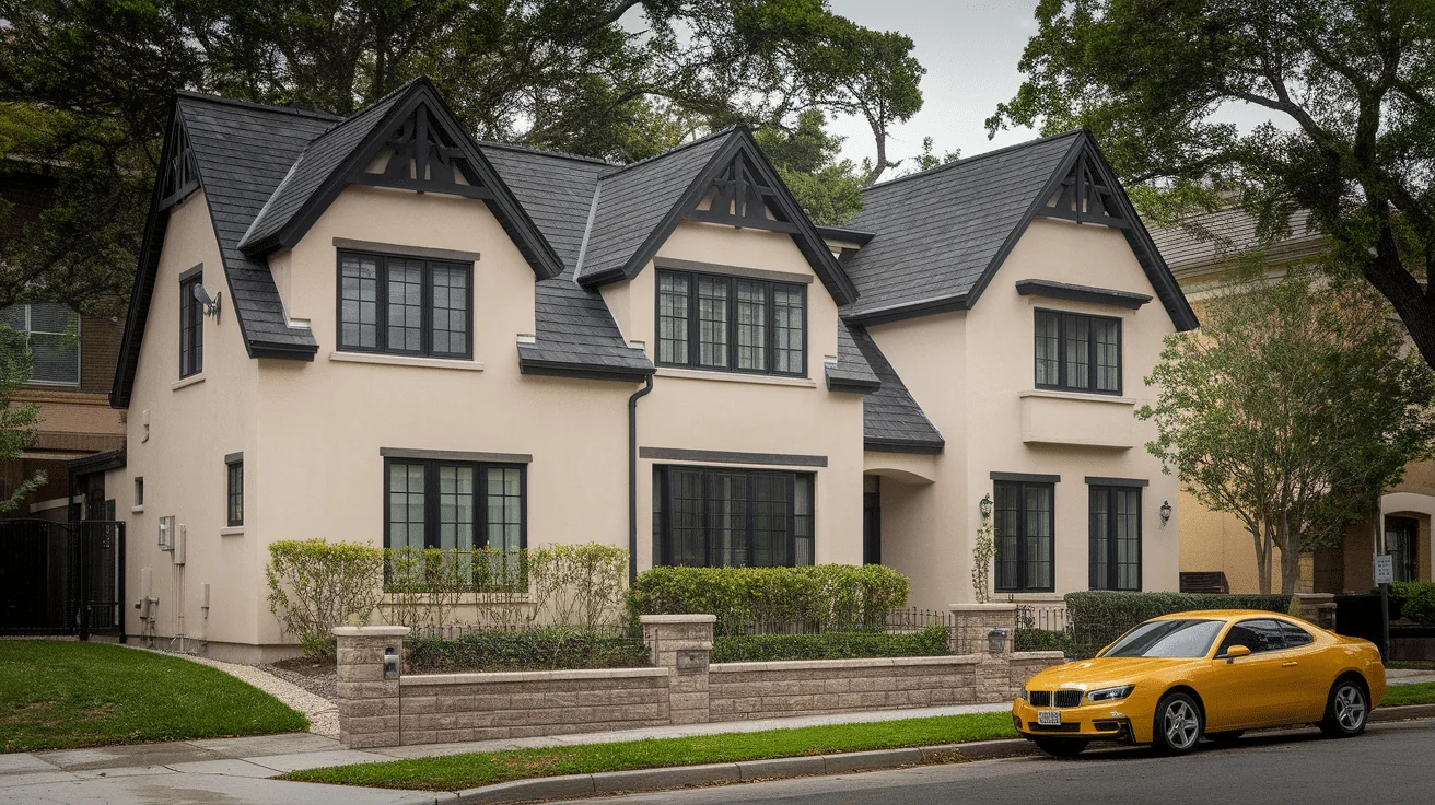
For those who want their home to make a statement:
Stucco options:
- Bright white or soft off-white
Complementary trim choices:
- Black (for dramatic definition)
- Navy blue (slightly softer than black but still bold)
- Deep forest green (unexpected but elegant)
This approach creates a clean, photogenic look that’s currently very popular for updated traditional homes. The high contrast beautifully highlights architectural details.
4. Soft & Subtle
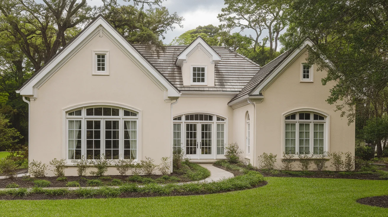
These gentle combinations create a soothing, understated elegance:
Stucco options:
- Pale sage green
- Dusty blue
- Warm sand
Complementary trim choices:
- Light gray
- Cream
- Soft white
These combinations are especially suitable for coastal properties, cottage-style homes, or any house that wants a calm, cohesive appearance without strong contrast.
How to Choose the Right Combo for Your Home
Finding your perfect color combination requires more than picking colors you like. You need to see how they work together in your actual home.
Use Paint Samples or Digital Mockups
Never trust tiny paint chips for big decisions.
- Buy sample pots and paint 2′ x 2′ squares on different sides of your house
- Or use digital tools where you upload a photo of your home to “try on” different colors
- Some paint companies offer large peel-and-stick samples that can be moved around
I always recommend seeing colors at actual size rather than tiny swatches. What looks perfect in the store often feels completely different when painted on a large surface.
Test Colors in Different Lighting
Light changes everything when it comes to exterior colors.
- Check your samples in morning light (cooler, bluer light)
- Look again at midday (when colors appear truest)
- Evaluate once more in evening light (warmer, golden tones)
- Don’t forget to look on cloudy days, too
I’ve had clients completely change their minds after seeing how dramatically colors transform throughout the day.
Start with 2-3 Combinations and Narrow Down
Begin with a few options that appeal to you:
- Select combinations that fit your home’s architecture
- Consider what your neighbors have done (similar or complementary)
- Get feedback from friends or family who have good design sense
Take your time with this decision—there’s no need to rush. Live with your samples for at least a week before making your final choice.
Coordinate with Other Exterior Elements
Your stucco and trim need to work with:
- Roof color and material
- Garage door (often a large visual element)
- Front door (where you might want a bolder accent color)
- Driveway and hardscaping
A cohesive exterior considers all these elements together, not just the stucco and trim in isolation.
Balance Is Key
Choose a trim color that adds definition without overwhelming the stucco.
The right balance depends on your home’s architecture and your personal preference for subtle or bold design.
Remember that a darker trim makes windows appear smaller, while a lighter trim makes them look larger. This optical effect can significantly impact how your home is perceived.
Tips for a Professional-Looking Finish
Even perfect color combinations can look amateur if applied incorrectly. These tips will help you achieve results that look like you hired a designer.
Don’t Mix Too Many Colors
Simplicity creates elegance:
- Limit your palette to 2-3 colors maximum
- One main stucco color
- One trim color
- Optional accent color (for front door or architectural details)
I’ve seen too many homes that look busy and chaotic because the owners tried to incorporate too many different colors. Professional designers know that restraint creates sophistication.
Use the Right Paint Finishes
Different surfaces need different sheens:
- Flat or low-sheen paint for stucco – Hides imperfections and creates a soft, sophisticated look
- Semi-gloss for trim – Stands up to weather and creates contrast with the matte stucco
- High gloss for accent areas – Perfect for front doors or special architectural elements
The contrast between these finishes adds subtle dimension, even when the colors are similar.
Balance Color Temperatures
Colors look most natural when their undertones complement each other.
- Pair warm stucco with warm trim colors
- Match cool stucco with cool trim colors
- When mixing temperatures, ensure one dominates while the other accents
This harmony makes your color scheme look intentional rather than random or mismatched.
Choose Timeless Over Trendy
Your home’s exterior is expensive to repaint, so think long-term:
- Avoid color combinations that are currently trending but might look dated quickly
- Consider how your colors will look in 5-10 years
- Classic combinations tend to be more versatile as your landscaping matures
I always encourage homeowners to choose colors they genuinely connect with rather than what’s currently popular on social media. Your home should reflect your taste, not passing trends.
Common Mistakes to Avoid
Even experienced homeowners make these errors when choosing stucco and trim colors. Learning from others’ mistakes can save you time, money, and disappointment.
1. Picking Colors Without Testing Them Outdoors: Indoor lighting dramatically distorts colors. Only outdoor testing with actual samples will show their true appearance. Colors that look perfect in the store often appear completely different in natural light.
2. Using Bright White Trim With Warm-Toned Stucco: Bright white trim has cool blue undertones, while warm stucco has yellow or red undertones. This mismatch creates a harsh contrast. Instead, pair warm stucco with cream or off-white trim for harmony.
3. Ignoring Roof and Landscaping Color Impact: Your roof and landscaping significantly influence how stucco colors appear. For a cohesive look, always view your color samples next to existing elements.
4. Making Trim Too Bold: Overly dramatic trim draws attention away from your home’s architecture. The trim should enhance your home’s features, not compete with them—like a perfect picture frame that complements without distracting.
Conclusion
Choosing the perfect stucco and trim color combination transforms your home’s entire appearance and creates lasting curb appeal. While the process might feel overwhelming at first, taking a methodical approach makes it manageable.
Remember that your home’s architecture, surroundings, and existing elements should guide your decisions. Test colors thoroughly in different lighting conditions before committing, and keep your palette simple with just 2-3 harmonious colors.
By avoiding common mistakes like ignoring your roof color or choosing untested colors, you’ll create a finished look that feels both personal and professional. The right color combination makes your home feel cohesive, welcoming, and distinctive.
Whether you prefer warm earthy tones, cool, crisp neutrals, high-contrast combinations, or soft, subtle pairings, your thoughtfully chosen colors will create a home exterior you’ll love for years to come.
Frequently Asked Questions
How Often Should I Repaint My Stucco Exterior?
Most quality stucco paint jobs last 7-10 years, depending on your climate. Homes in harsh sun, coastal areas, or extreme weather may need repainting sooner. Watch for signs of fading, chalking, or cracking—these indicate it’s time to repaint.
Can I Paint My Stucco a Different Color without Changing the Trim?
Yes, but consider how the existing trim will look with your new stucco color. Sometimes, just changing the stucco creates an unintended clash with the existing trim. If you’re uncertain, painting a large test patch near your trim is the best way to evaluate the combination.
What Colors Make a Small Stucco House Look Larger?
Lighter stucco colors generally make homes appear larger, especially when paired with trim in a similar tone. Soft whites, light grays, and pale beiges create an expansive feeling. Avoid dark colors if your goal is to maximize perceived size.
Do HOA Restrictions Affect My Color Choices?
Many HOAs have specific guidelines for exterior colors. Always check your HOA regulations before purchasing paint. Some require pre-approval of your color choices and may limit you to certain color families or specific color combinations.
Should My Stucco Color Match My Neighbors’ Homes?
Your home doesn’t need to match your neighbors exactly, but it should harmonize with the neighborhood aesthetic. Consider colors that complement rather than clash with nearby homes. This creates a cohesive street appearance while still allowing your home to express your style.

