
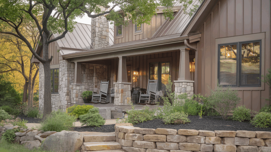
When it comes to improving the look and value of your home, choosing the right metal siding color is an important step.
The right color can change the entire feel of your house, adding exterior beauty and even affecting energy efficiency.
I know from experience how challenging it can be to choose a color that works with your home’s style, the environment, and your budget.
In this article, I’ll share everything you need to know about metal siding colors, including popular color options, tips for choosing the right hue, and how to make sure your home looks great for years to come.
So, if you’re ready to get started, keep reading to find the perfect color for your next project!
What is Metal Siding?
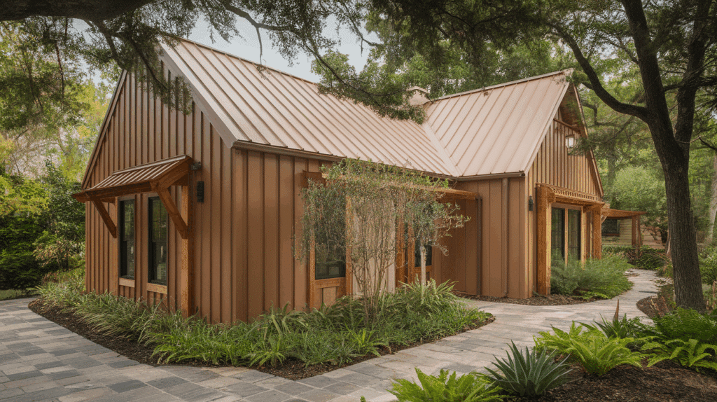
Metal siding, made from materials like steel or aluminum, is a popular choice for both homes and commercial buildings due to its durability, low maintenance, and sleek appearance.
It’s resistant to harsh weather conditions, pests, and fire, making it an excellent long-term investment.
Many homeowners choose metal siding for its modern look, low upkeep, and energy efficiency. Color plays a big role in how your house looks and feels.
It affects exterior looks, the harmony between your home and its surroundings, and even its resale value.
A well-chosen color can enhance architectural details, making your home look more polished. On the flip side, the wrong color can make even the most well-designed house look uninviting or out of place.
So, it’s important to choose a color that not only suits your style but also complements the environment around you.
Popular Metal Siding Colors
If you’re looking for a siding color that exudes character and stands out in your neighborhood, you need to look at the following options to select the best one.
1. Forest Green
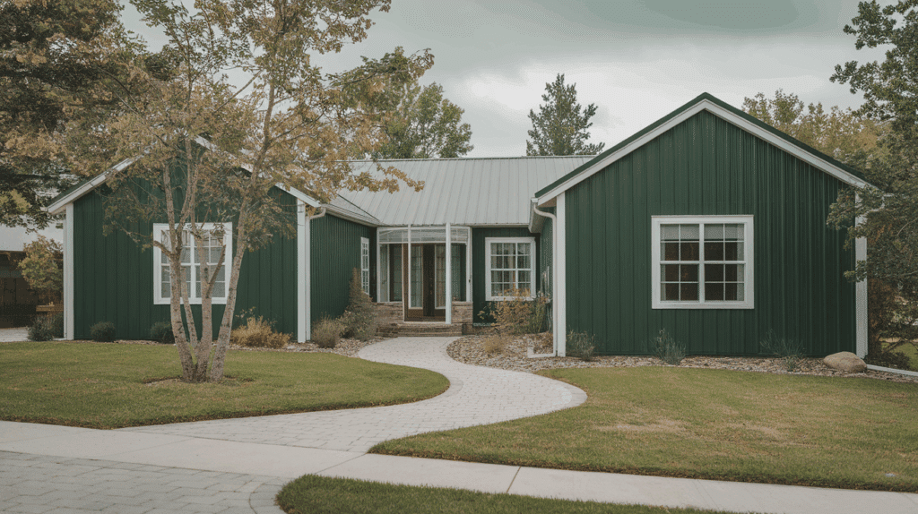
Forest green siding blends naturally into wooded or lush landscapes, giving your home a calm, grounded appearance. It’s ideal for rural homes, cabins, or properties surrounded by greenery.
This color creates a peaceful, earthy vibe and pairs well with white trim for contrast or warm wood tones for a fully natural look.
Forest green also feels classy and sturdy, making it a reliable choice for those wanting their home to feel cozy, private, and in harmony with nature.
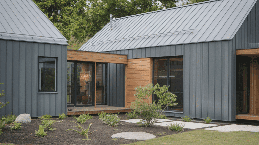
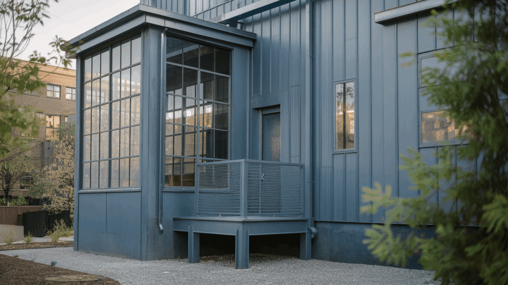
2. Charcoal Gray
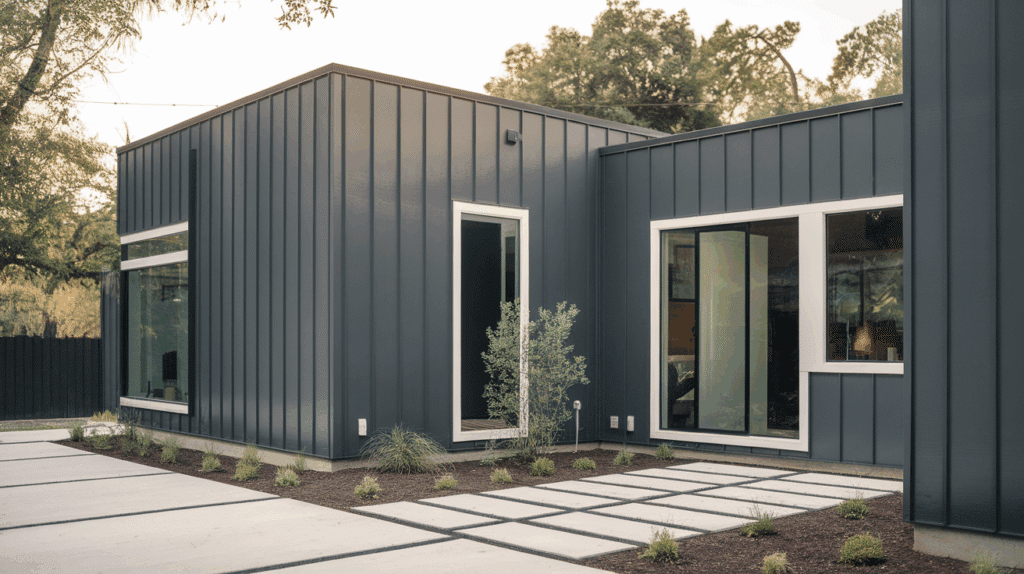
Charcoal gray offers a refined, modern look that works with both classic and contemporary homes. Its dark hue hides dirt and weather stains well, making it practical and low-maintenance.
When paired with bright white or cream trim, it creates a clean, bold contrast.
This color also complements wood, stone, or metal elements beautifully, making it a favorite for homeowners who want a timeless yet striking exterior that feels polished and classy.
3. Barn Red
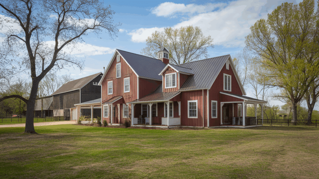
Barn red siding delivers a warm, classic farmhouse vibe. It’s bold without feeling too bright and works especially well in rural or suburban settings.
The deep red stands out nicely against green grass, trees, and shrubs.
Pair it with white trim and a dark roof for a balanced and welcoming look. It also complements rustic materials like wood and stone, making it a great option for homes with traditional beauty.
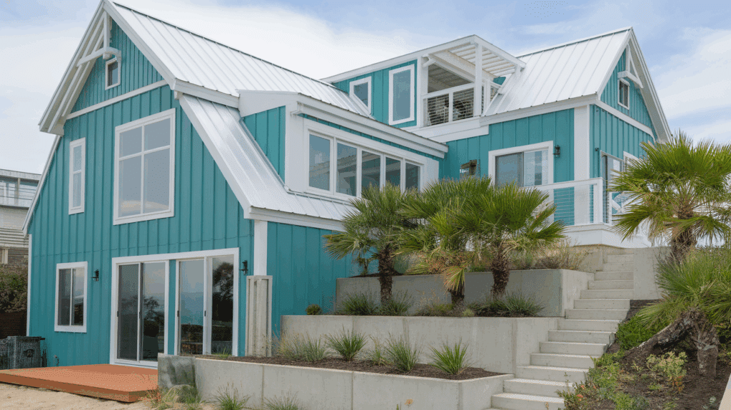
4. Coastal Blue
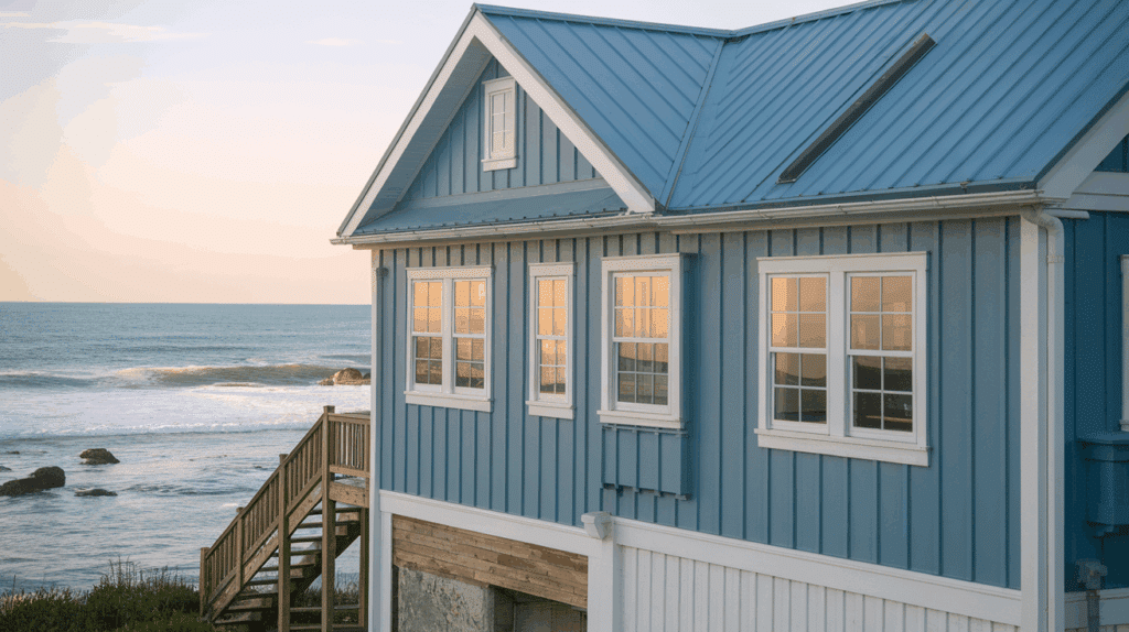
Coastal blue brings a light, breezy feel that’s perfect for waterfront or light-filled neighborhoods.
This fresh shade makes homes feel more spacious and cheerful. It reflects the sky and sea, adding a peaceful tone to your exterior. White or soft gray trim highlights the color beautifully.
Coastal blue is a top pick for beach cottages, modern homes, or any property looking for a calm, airy style.
5. Copper Penny
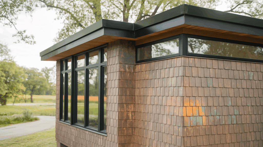
Copper penny siding stands out with a bright, metallic finish that adds a touch of personality and warmth. Over time, it develops a rich patina that gives your home character and depth.
It’s great for modern, industrial, or creative architectural styles. This unique shade pairs well with dark trim like black or charcoal, creating a balanced and bold look.
It’s perfect for homeowners who want something eye-catching and full of life.
6. Midnight Black
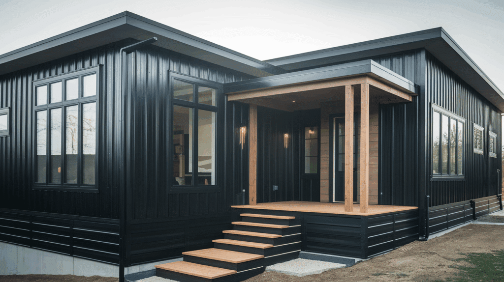
Midnight black siding creates a bold, modern appearance. It’s often used on contemporary homes and pairs well with natural wood, white trim, or large glass windows.
This dark color can help absorb heat, making it useful in cooler regions.
When combined with clean lines and simple accents, black siding gives a house a sharp, polished look. It works especially well for homes that focus on contrast and strong design features.
7. Sandstone Beige
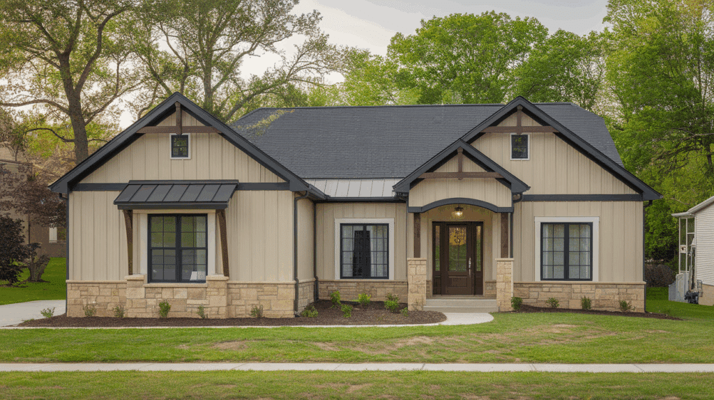
Sandstone beige gives homes a soft, clean look that feels easygoing and natural. It reflects heat well, which is helpful in warm climates. This color works with darker roofs, brick features, or wood details.
It doesn’t overpower other design elements, making it a safe choice for many types of homes.
Sandstone beige helps create a welcoming feel without standing out too much, fitting easily into most neighborhoods.
8. Slate Blue
Slate blue is a cool, calming color that blends well with both light and dark accents. It’s a solid choice for homes with gray roofs, stone features, or white trim.
This shade adds depth without being too bright or too dark. It works well on homes that mix old and new styles. Slate blue also fits into a variety of surroundings, whether you’re near trees, open fields, or quiet streets.
9. Autumn Brown
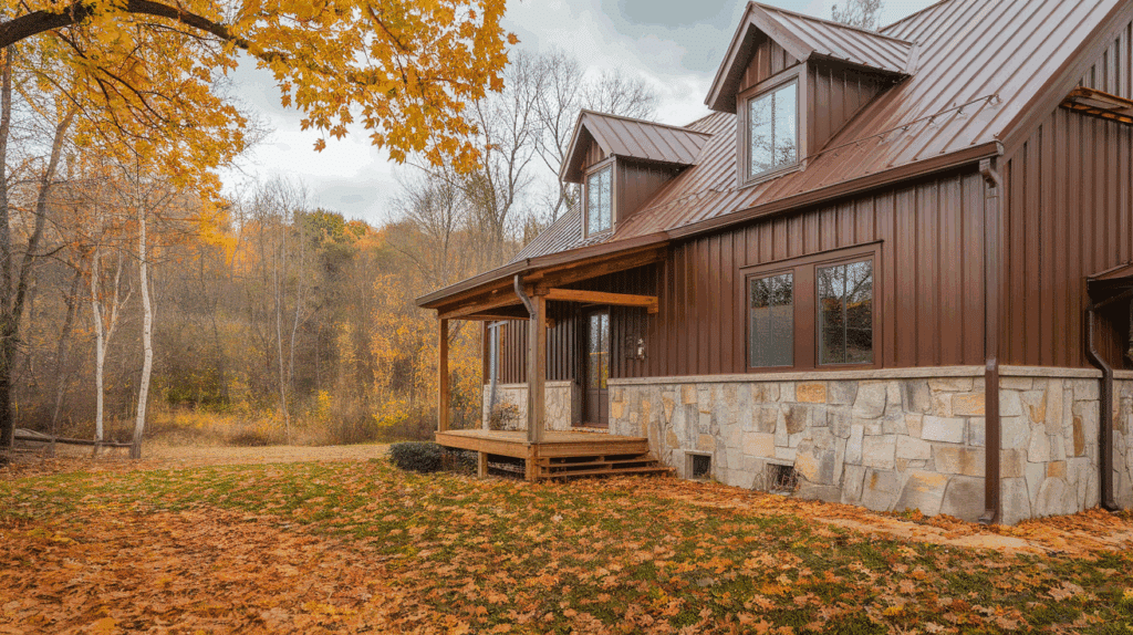
Autumn brown siding brings in the colors of fall, rich, warm, and grounded. It pairs well with natural materials like wood and stone.
This color fits nicely into wooded areas or homes with large yards. It doesn’t draw too much attention but gives your home a steady, comfortable look.
Autumn brown also works well with beige or tan trim, helping the house feel more connected to the land around it.
10. Sage Green
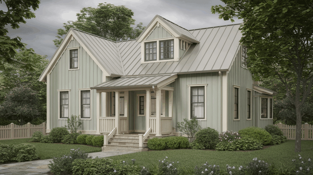
Sage green is a soft, muted green that works well in quiet, natural settings.
It’s a good pick for rural or suburban homes surrounded by trees or gardens. This gentle color pairs well with cream, beige, or brown trim.
Sage green creates a homey feel and blends nicely with the outdoors. It’s not too bright or too dark, making it a reliable color for peaceful-looking homes.
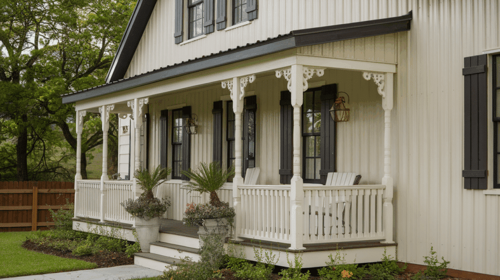
11. Pearl White
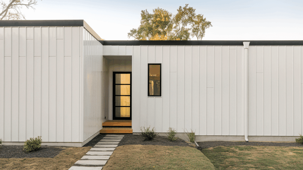
Pearl white siding gives your home a clean and bright look. It reflects sunlight, helping to keep interiors cooler in warm weather.
This color works well with nearly any roof or trim color, especially dark shades like black, navy, or forest green.
It also creates a blank canvas for bold doors or landscaping. Pearl white fits well with both older and newer homes, offering a fresh appearance without being too plain or too flashy.
12. Rustic Orange
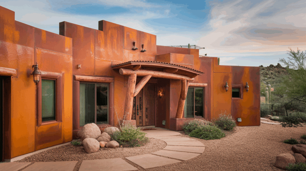
Rustic orange brings energy and warmth to your home’s exterior.
It’s especially well-suited for homes in dry or wooded regions where earthy tones look natural. This rich color pairs well with brown or deep green trim for balance.
Rustic orange adds personality without being too bright. It’s a strong option for homeowners looking to make a bold yet grounded color choice that still fits into natural surroundings.
13. Mocha Brown
Mocha brown siding has a rich, grounded tone that gives your home a solid and comfortable look.
It blends well with stonework, wooden features, or natural landscaping. This color works nicely in both country and suburban settings. Pair it with beige, cream, or deep gray accents for added contrast.
Mocha brown doesn’t fade quickly and offers a stable background that supports a variety of design styles and materials.
14. Dove Gray
Dove gray is a light, neutral shade that offers flexibility and ease. It pairs well with nearly any accent, white, navy, black, or even red.
The soft tone gives homes a clean look without drawing too much attention.
Dove gray works well for both old and new builds. It’s a reliable choice if you want your siding to feel calm and well-balanced across different seasons and surroundings.
15. Burgundy

Burgundy siding adds depth and color without being overly bright. It’s a good choice for homeowners who want something bold but more grounded than red.
Pair it with white, beige, or soft gray trim to create a steady look.
Burgundy fits into many types of landscapes, especially areas with trees and flowers. It also works well with traditional home styles and brick or stone details.
16. Champagne Gold

Champagne gold has a soft, warm glow that feels refined but not too flashy. It adds a hint of shine to the home’s exterior, especially under natural sunlight.
This color works best with darker trim like bronze, brown, or black.
It suits homes in well-kept neighborhoods or modern designs with subtle detailing. Champagne gold is a great option if you want something different but not overwhelming.
17. Pewter Gray
Pewter gray siding is a cool, medium-tone neutral that fits well with clean lines and simple features. It’s great for modern homes with minimal designs, especially when paired with natural wood or stone.
Pewter gray has enough color to stand out, but it doesn’t compete with other elements. It’s a balanced pick that can work in city homes, suburban areas, or even wooded lots.
18. Ocean Teal
Ocean teal adds a splash of color that feels both calm and bold. It brings in blue and green tones, making it ideal for homes near water or in tropical settings.
This shade pairs nicely with white or gray trim and stands out without being too loud. Ocean teal is perfect for homeowners looking for a color that feels lively but still has a steady, relaxed look.
19. Clay Tan
Clay tan is a soft, natural color that blends easily with outdoor surroundings. It looks especially good next to green lawns, wood fences, or stone paths.
This earthy tone works with many accent colors, including brown, white, and dark green. Clay tan is a safe pick for any home style, offering a grounded appearance that doesn’t go out of style or draw too much attention.
20. Steel Blue
Steel blue siding gives homes a cool, modern feel with a slight industrial touch.
It’s darker than traditional blue but softer than charcoal, which makes it unique without being overpowering. This shade works well with metallic, white, or wood accents.
It’s a great fit for urban homes or newer builds that use mixed materials. Steel blue stands out while still feeling structured and balanced.
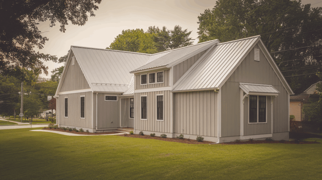
21. Ivory Cream
Ivory cream siding gives a soft, warm tone that works well with nature-inspired features. It’s great for traditional homes or those with gardens and porches. This shade pairs well with dark brown, black, or even deep green accents.
It reflects light gently, helping homes feel open and inviting. Ivory cream is a dependable choice for a relaxed and tidy appearance.
Factors to Consider when Choosing Metal Siding Colors
Picking the right siding color can change how your home looks and feels. I’ve learned it’s not just about what looks good; there’s more to think about. These are the things I’d tell you to keep in mind before making a choice:
- Where you live matters: If your home is in a hot area, lighter colors like white or beige reflect heat better. In colder places, darker shades like black or deep green can help keep warmth in.
- Think about your roof and trim: You want your siding to go well with other parts of your home. If your roof is dark, try a lighter siding for contrast. If your trim is white, most colors will match well.
- Style of your home: Different house styles look better with certain colors. A modern home often looks best in bold, dark shades. A farmhouse or older home might look better in softer, natural tones.
- What you’re okay with maintaining: Some colors show dirt more than others. If you don’t want to clean often, avoid pure white or very dark shades that show dust or water stains easily.
- How the color looks in sunlight: Always look at color samples in natural light. A color that looks great inside a store might look totally different outside on your house.
How to Match Metal Siding with Other Exterior Features?
A well-coordinated exterior creates a harmonious look that enhances the overall look of your property. Some key tips for matching metal siding with other exterior features are:
1. Roofing, Windows, and Doors
When choosing a color for your siding, it’s important to think about how it will look with your roofing, windows, and doors.
Dark roofing pairs well with lighter siding, while dark-colored siding can complement a light-colored roof.
You’ll also want to think about your windows and doors – make sure the siding color works well with these features for a cohesive look.
2. Landscaping and Outdoor Features
The landscaping around your home plays a big role in how your siding color will be perceived. Make sure your color choice works with the plants, trees, and outdoor furniture around your home.
For example, earthy tones like brown or tan blend nicely with green plants, while bold colors like red can add contrast and make your house stand out from the greenery.
3. Color Trends and Modern Combinations
Color trends change over time, and right now, some popular combinations include deep green siding paired with natural wood accents or navy blue with white trim.
You don’t have to follow trends, but they can provide inspiration and help you choose something fresh and modern.
Maintaining the Color of Your Metal Siding
Keeping your siding looking fresh doesn’t have to be hard. I’ve picked up a few easy habits that can help you keep the color from fading or getting damaged. This is what you can do:
- Regular Cleaning: To keep your metal siding looking great, make sure to clean it regularly. Dirt and grime can build up over time, dulling the color. A simple cleaning with mild soap and water will help maintain the finish.
- Protective Coatings: Periodically recoating your metal siding will help protect the color and keep it looking fresh. This is especially important for darker colors that may fade over time.
- Avoiding Fading: To prevent premature fading, choose a powder-coated finish, which is more resistant to the sun’s UV rays and will keep the color from fading too quickly.
Conclusion
Choosing the right metal siding color can make a big difference in how your home looks and feels.
I’ve shared some colors that work well with different styles, settings, and needs. You don’t have to follow trends; go with what feels right for you.
Think about your home’s design, the weather, and how much upkeep you want to do. Look at color samples in real light before you decide. It helps more than you’d think.
And remember, there’s no perfect pick. What matters most is that you like it and it works for your home.
I hope this list gave you some good ideas and made the process a little easier. If you’re still unsure, take your time. You want to choose a color you’ll feel good about every day.