: Color Guide & Ideas")
When I first came across Pale Oak Benjamin Moore, I quickly understood why it is so well-loved by designers and homeowners. This paint color offers a soft balance between beige and gray, giving it a versatile appeal.
I admire how it reacts to light in such unique ways. In brighter spaces, it feels fresh and airy, while in cozier rooms, it takes on a warmer character that feels inviting and calm.
I have found that Pale Oak works beautifully as a backdrop for a variety of styles, from modern layouts to more traditional spaces.
Its flexibility makes it a reliable option when planning a cohesive design for the entire home.
In this blog, I will walk you through its color specifications, undertones, lighting effects, best uses, coordinating shades, and comparisons so you can choose with confidence.
What Is Pale Oak Benjamin Moore?
Pale Oak Benjamin Moore (OC-20) is a light neutral paint color that blends the softness of beige with the subtle depth of gray. Often called a greige, it has a gentle character that feels calm and adaptable in many settings.
The way it interacts with light is one of its best qualities. In north-facing rooms, it shows a cooler gray side, while in sunnier southern spaces, it takes on a creamy warmth that feels inviting.
This balance makes it a perfect fit for both modern and traditional interiors. Because it does not dominate, many homeowners choose it as a whole-house shade.
It works beautifully as a backdrop that highlights furniture, artwork, and décor while keeping the overall look soft and harmonious.
| Specification | Detail |
|---|---|
| Color Name | Pale Oak |
| Color Code | OC-20 |
| LRV (Light Reflectance Value) | 69.89 |
| Color Family | Neutral |
| Hex Value | #DED7CD |
Undertones of Pale Oak Benjamin Moore
The undertones of Pale Oak Benjamin Moore are what give this color its charm and versatility. It leans toward warm gray but carries enough beige to keep the overall effect soft and welcoming.
In certain conditions, faint pink or purple tones may appear, especially under artificial lighting, adding subtle depth without overwhelming the space.
This balance ensures that Pale Oak never feels too cool or too yellow, keeping interiors calm and consistent. I find it pairs beautifully with warm woods, creamy whites, and muted colors like gentle blues or greens.
Its undertones bring life to a neutral palette while still maintaining a sense of simplicity.
To appreciate how Pale Oak behaves in your own setting, try applying a sample and observe it throughout the day, noticing how the light brings out its different sides.
Pale Oak Benjamin Moore in Different Lighting Scenarios
Lighting plays a big role in how Pale Oak Benjamin Moore looks, as its soft greige base shifts gently depending on natural and artificial light. This adaptability makes it a reliable neutral for any room.
- Cool Morning Light (North-Facing): In cooler, bluish morning light, Pale Oak leans toward gray, giving the room a soft and calming feel that feels peaceful.
- Bright Afternoon Light (South-Facing): In strong southern sun, its beige undertones show more clearly, creating a warm, cozy, and welcoming effect.
- Evening Artificial Light (Warm Bulbs): Under warm bulbs, faint pink or purple undertones may appear, adding depth and a gentle glow that feels inviting.
- Mixed Lighting in Open Spaces: In open-concept areas with shifting light, Pale Oak balances beautifully, keeping harmony across different zones.
- Indirect Light in Shady Rooms: In spaces with limited light, Pale Oak can appear slightly cooler, offering a soft neutral backdrop that still feels warm compared to pure grays.
Best Places to Use Benjamin Moore Pale Oak
Benjamin Moore Pale Oak is a versatile neutral that fits different rooms, making it popular for whole-house use. Its softness provides a balanced backdrop without overwhelming the space.
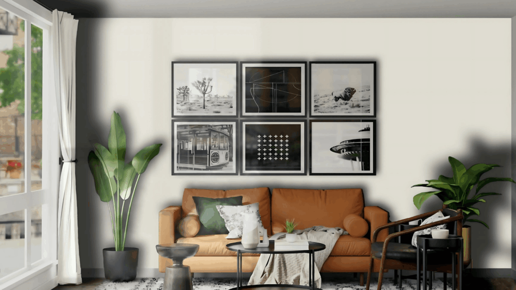
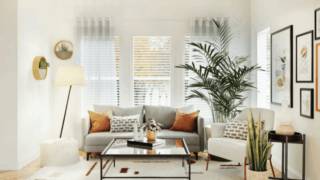
- Living Rooms offer an inviting backdrop that highlights furniture, artwork, and textures while maintaining an open, airy space. This shade makes statement pieces stand out and keeps harmony, creating a comfortable, refined atmosphere.
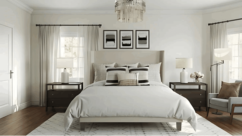
- Bedrooms create a soothing environment that encourages rest, pairing soft fabrics and muted accents. It brings calm to sleeping areas, supporting a restful, timeless, and cozy atmosphere.
- Kitchens: Complements white cabinets and warm wood finishes, offering a timeless, fresh, adaptable look. Its beige-gray balance suits traditional or modern kitchens.
- Hallways should be bright and cohesive to connect rooms with a smooth color flow. This creates a feeling of connection and provides a clean backdrop linking different décor styles.
- Bathrooms offer a spa-like feel with crisp white trim, natural light, and subtle decor. Pale Oak’s soft warmth enhances relaxation, making bathrooms feel fresh, open, and polished without being stark.
Coordinating Colors for Pale Oak Benjamin Moore
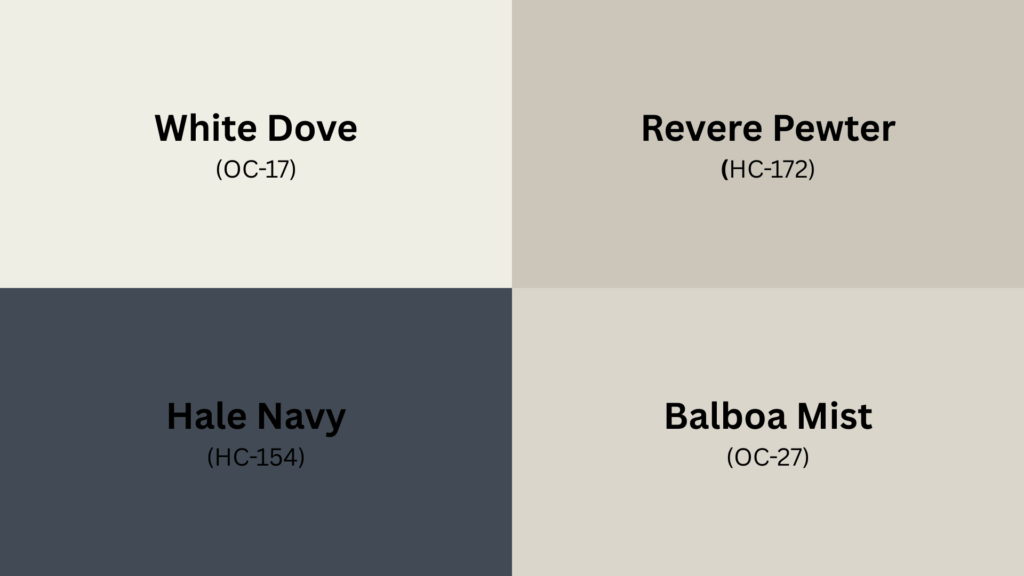
Pale Oak Benjamin Moore easily pairs with other shades thanks to its balanced gray-beige mix. It works well with warm whites, neutrals, and bold colors, highlighting its undertones and adding personality and depth to interiors.
| Color Name | Code | Description | Best Use |
|---|---|---|---|
| White Dove | OC-17 | A warm, soft white with a clean finish | Works beautifully for trim, ceilings, and doors to frame Pale Oak walls |
| Revere Pewter | HC-172 | A medium greige with more depth | Great for accent walls, open layouts, or pairing in living rooms |
| Hale Navy | HC-154 | A bold, rich navy with timeless appeal | Stunning for cabinetry, built-ins, or statement walls against Pale Oak |
| Balboa Mist | OC-27 | A lighter warm gray with subtle softness | Ideal for layering neutrals in bedrooms, hallways, or cozy corners |
Comparing Pale Oak with Similar Shades
Choosing the right neutral can be tricky since many shades look alike on a paint chip but behave differently on the wall.
Pale Oak Benjamin Moore sits in the middle of the greige spectrum, offering a balance of warmth and softness that makes it adaptable.
| Color | Undertone | LRV | What Makes It Different |
|---|---|---|---|
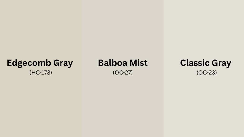
| Edgecomb Gray (HC-173) | Warm beige-gray | 63.09 | Slightly darker, richer, and warmer, best for cozier spaces |
| Balboa Mist (OC-27) | Soft warm gray | 67.37 | Cooler, lighter, and grayer, offering a more modern tone |
| Classic Gray (OC-23) | Warm light gray | 74.78 | Brighter and closer to off-white, it works well in low-light rooms |
Styling Tips for Pale Oak Benjamin Moore Interiors
Pale Oak Benjamin Moore is at its best when styled with thoughtful textures, colors, and finishes. Its soft balance between beige and gray allows it to adapt easily to different looks.
- Layer natural textures such as warm woods, rattan, and linen to highlight Pale Oak’s softness and create an inviting atmosphere. Natural materials emphasize subtle paint undertones, making the space feel cozy and approachable without a sterile look.
- Add contrast with accents: Use black or navy furniture, lighting, or décor for depth. Dark accents contrast beautifully with Pale Oak, adding structure without overpowering its gentle character.
- Introduce metallic finishes: Brushed gold, matte silver, or bronze accents enhance refinement without overwhelming the neutral base. Metallic details add a polished touch that elevates the design, making rooms feel refined yet approachable.
- Add greenery: Plants and natural foliage complement Pale Oak well, bringing freshness and vitality to any space. The green shades create an organic contrast, keeping the neutral palette lively while fostering a calming environment.
- Balance warm and cool elements: Combine soft textiles with crisp lines for a modern vibe or layer traditional details for a timeless appeal. This balance ensures Pale Oak adapts to your style, offering flexibility for contemporary and classic interiors.
Conclusion
After spending time researching Pale Oak Benjamin Moore, I can honestly say it is one of the most dependable neutrals I have worked with.
I love how it shifts gracefully with different types of lighting, never feeling flat or overwhelming. It has just the right amount of warmth to create cozy spaces, while still looking fresh and modern in brighter rooms.
I have seen it bring balance to living rooms, bedrooms, and even kitchens, proving that it adapts beautifully across an entire home.
For me, the real strength of Pale Oak lies in its ability to highlight furnishings and textures without competing with them.
If you found this guide helpful, do share it with others. Sharing helps spread inspiration and may give someone else the confidence to choose the perfect shade.