")
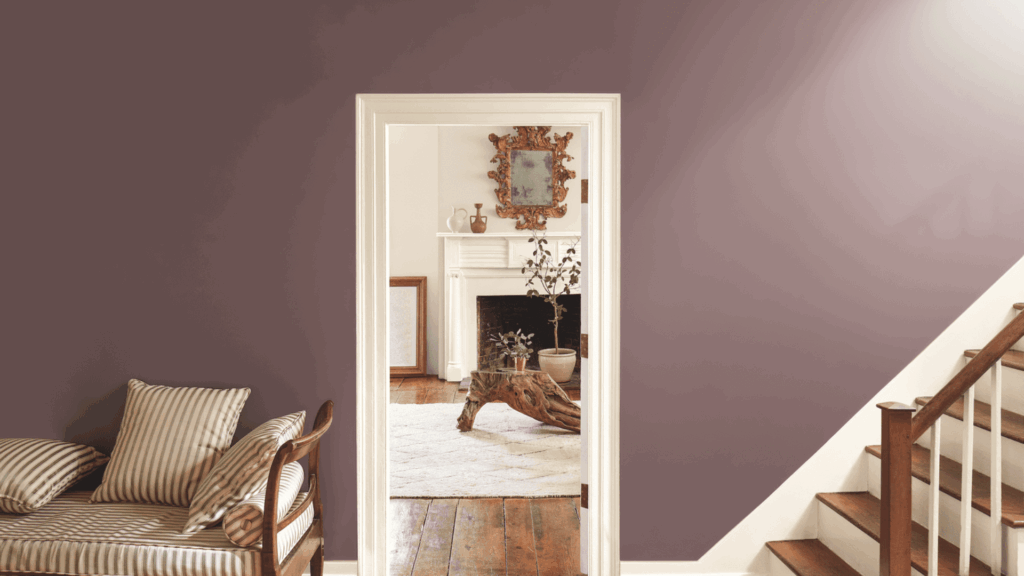
Are you looking for a soft, cozy color that still feels a little different? Let me introduce you to Benjamin Moore Mauve Desert (2113-50).
It’s a gentle purple with warm undertones that instantly makes any room feel calm and welcoming. I love how it adds just the right touch of color, never too loud or too plain.
It’s perfect for bedrooms, bathrooms, or even a quiet home office where you want a peaceful vibe. Mauve Desert strikes the ideal balance between subtlety and style.
This color pairs beautifully with neutral shades like cream, beige, and warm whites.
If you’re thinking about trying something fresh on your walls, Mauve Desert is definitely a must-see.
In this blog, I’ll walk you through why Mauve Desert stands out, how it looks in different rooms, and the best colors to pair it with
Why Mauve Desert Is an Ideal Paint Color?

Mauve Desert (2113-50) is a muted paint color that blends purple with a heavy touch of gray. Its calm, grounded feel makes it easy to use in different rooms.
The color stands out without being loud. It brings a sense of quiet strength to any space.
With a Light Reflectance Value (LRV) of 37.77, Mauve Desert reflects a medium amount of light.
It sits comfortably between dark and light, making it a safe and versatile option for walls, furniture, or small accents.
This tone is cool and steady. The gray base gives it weight, while the soft purple adds a hint of mood. It doesn’t take over a room but subtly adds depth.
Because it works well with both cool and warm shades, you can pair it with colors like soft cream, deep charcoal, light blue, or warm brown.
Mauve Desert fits in bedrooms, living rooms, and even workspaces. It helps create a peaceful mood.
Whether used in large areas or small details, this color adds balance and style without effort.
Understanding the Subtle Undertones of Mauve Desert
Mauve Desert blends gray and purple in a soft, balanced way. The gray is more noticeable, which gives the color a calm and neutral feel.
The purple is gentle and quiet, adding a bit of mood without making the color too bright or bold.
This color leans more neutral than colorful, so it fits easily into many rooms. But its look can change depending on the lighting.
In natural daylight, it may appear cooler and more gray. Under artificial lighting, especially with warm bulbs, the purple tones may appear more pronounced.
Cool bulbs tend to bring out the gray.
Warm bulbs bring out the purple. Due to these shifts, it’s advisable to test a sample before painting.
Place it in different areas of the room and check how it looks at other times of the day. This helps you see how the color reacts to both natural and indoor light.
Best Places to Use Mauve Desert in Your Home
Mauve Desert is a versatile color that complements many areas of the home. Its soft mix of gray and purple helps it feel calm, muted, and easy to work with.
Whether you want a quiet backdrop or a subtle accent, Mauve Desert gives you that option.
Bedrooms
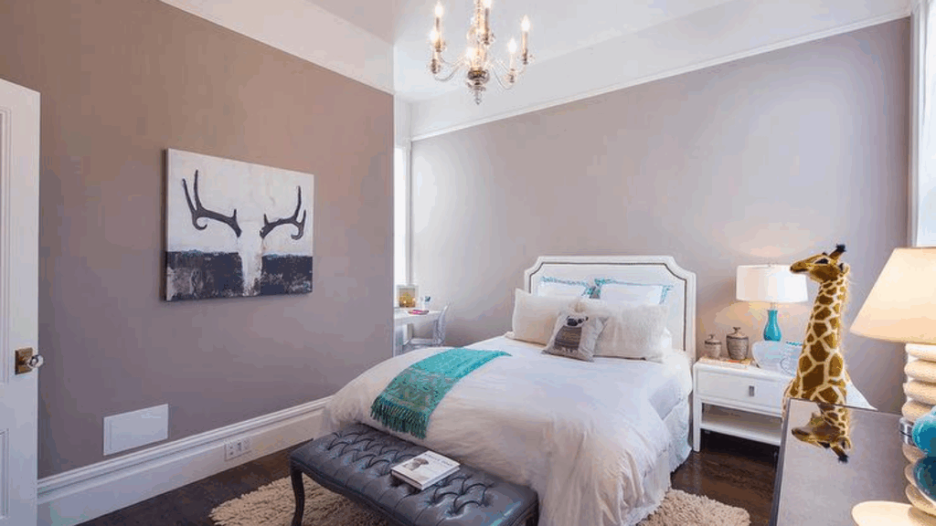
Mauve Desert is a great choice for bedrooms. The color feels soft and soothing, making it easier to relax after a long day.
The gray tones help block out visual noise, creating a calm and uncluttered atmosphere. The hint of purple adds a little depth, like a shadow at dusk, giving the room a gentle, peaceful vibe.
Living Rooms
In living rooms, Mauve Desert creates a space that feels both modern and warm. It doesn’t shout, but it still makes a space feel put together.
You can use it on all walls or just one. It works with a variety of styles, including minimal, rustic, and simple modern.
Bathrooms
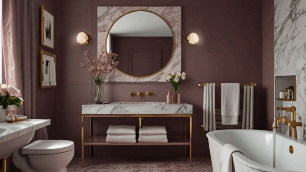
Bathrooms can feel cold if they use too much white or gray. Mauve Desert solves that. It brings in a soft, muted color that still feels clean.
It pairs well with tile, marble, or even natural stone. Try it with black fixtures for a sleek look, or opt for white for a softer appearance.
Dining Rooms
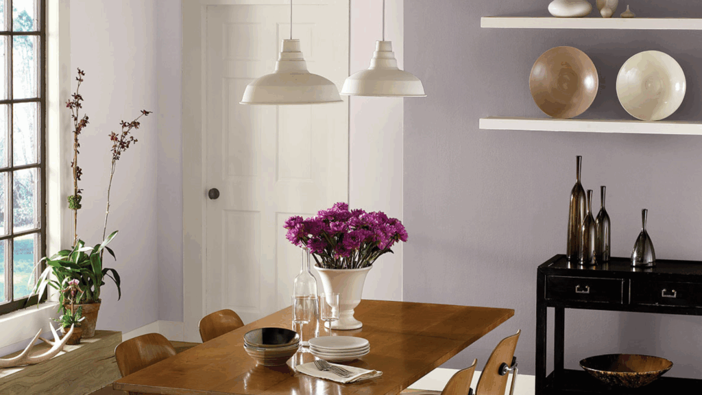
Dining rooms need a color that feels calm but still adds some mood. Mauve Desert does both. It casts a soft shadow on the room, making it feel more settled and complete.
The color complements wood tables, warm lighting, and even dark-colored chairs or cabinets.
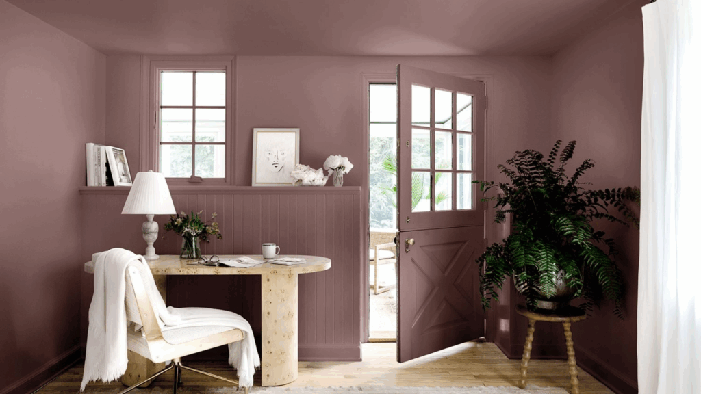
Accent Walls or Hallways
If you’re not ready to paint a whole room, try Mauve Desert on an accent wall. It adds just enough color to be noticeable, but not so much that it dominates the scene.
In hallways, it creates a quiet connection between rooms. It also works well in entryways or stairwells.
Flooring Options That Pair Beautifully with Mauve Desert
Flooring can significantly alter the appearance and feel of a room in the Mauve Desert. Since the color is soft and muted, the right floor adds balance, depth, or contrast.
- Light wood: Like oak or maple, it creates a clean contrast. The warmth of the wood makes the purple-gray tone feel fresher and open.
- Dark wood: Like walnut or espresso, adds richness. These deeper tones bring out the moody side of Mauve Desert, making the space feel grounded and bold.
- Warm gray or greige carpet: Works well if you want something soft and subtle. It blends seamlessly without looking flat and helps keep the room feeling calm.
- Stone tile: It is another great option. Its cool, natural texture fits the tone of Mauve Desert. It works well in bathrooms, kitchens, or entryways.
Mauve Desert Compared to Other Warm Neutral Paints
The Mauve Desert stands out from other warm neutrals due to its cooler undertone and soft blend of purple and gray. Mauve Desert leans more toward gray with a touch of muted color.
| Paint Color | Main Tones | Feels Like | Compared to the Mauve Desert |
|---|---|---|---|
| Beige | Yellow, tan | Warm, soft, classic | Warmer and more yellow than Mauve Desert |
| Greige | Gray + beige | Calm, soft, flexible | Lacks the muted purple found in Mauve Desert |
| Taupe | Brown + gray | Deep, steady, earthy | Heavier, browner than Mauve Desert |
| Mauve Desert | Gray + muted purple | Cool, quiet, balanced | Adds soft color while staying neutral |
Trim and Ceiling Colors That Work with Mauve Desert
Choosing the right trim and ceiling color helps Mauve Desert look its best. The wall color is soft, so the trim and ceiling can either sharpen the look or blend in gently, depending on your preference. Some good options are:
- Crisp whites: Like Chantilly Lace or White, add clear contrast. They make the walls stand out more and give the room a clean edge.
- Soft off-whites: Such as White Dove or Cloud White, create a smooth blend. These tones are warm enough to match but light enough to keep the space open.
- Flat white ceiling: Keeps the focus on the walls. It also helps the room feel grounded and balanced.
- Matching trim: It gives a tone-on-tone look. This works well in cozy spaces or when you want a quiet, even feel.
Conclusion
Mauve Desert is a quiet color that brings a lot to a room without feeling too strong. I love its soft blend of gray and muted purple, which gives the color such a balanced, calm feel.
It doesn’t demand attention, but it doesn’t fade away either, and that’s what makes it so useful to me.
I’ve found it works well in many parts of the home, like bedrooms, living rooms, bathrooms, dining rooms, and hallways.
It pairs well with various flooring options, trims, and ceiling colors. Whether the space has light wood, dark tile, or soft carpet, Mauve Desert fits right in.
You can use it with cool or warm tones, simple furniture, or natural textures. It helps the room feel calm, steady, and more complete.
If you’re looking for a neutral that still feels thoughtful, Mauve Desert is a strong choice. It adds just enough depth and mood to make any room feel more complete.