Choosing the right gray paint can feel impossible. After testing dozens of colors, I found Amherst Gray by Benjamin Moore, and it changed everything. This blog will guide you through everything about this rich, complex gray.
You’ll learn:
- How it looks in different lighting
- Where it works best in your home
- What colors pair well with it
- How it compares to other popular grays
Finding the perfect paint shouldn’t be so hard. I’ve helped hundreds of homeowners make the right choice. I’ve seen Amherst Gray transform boring rooms into stunning spaces.
Whether you’re painting one wall or your whole house, this guide will help you decide if Amherst Gray is right for you. Let’s solve your paint dilemma once and for all.
The Rich Neutral Tone of Amherst Gray: What You Should Know

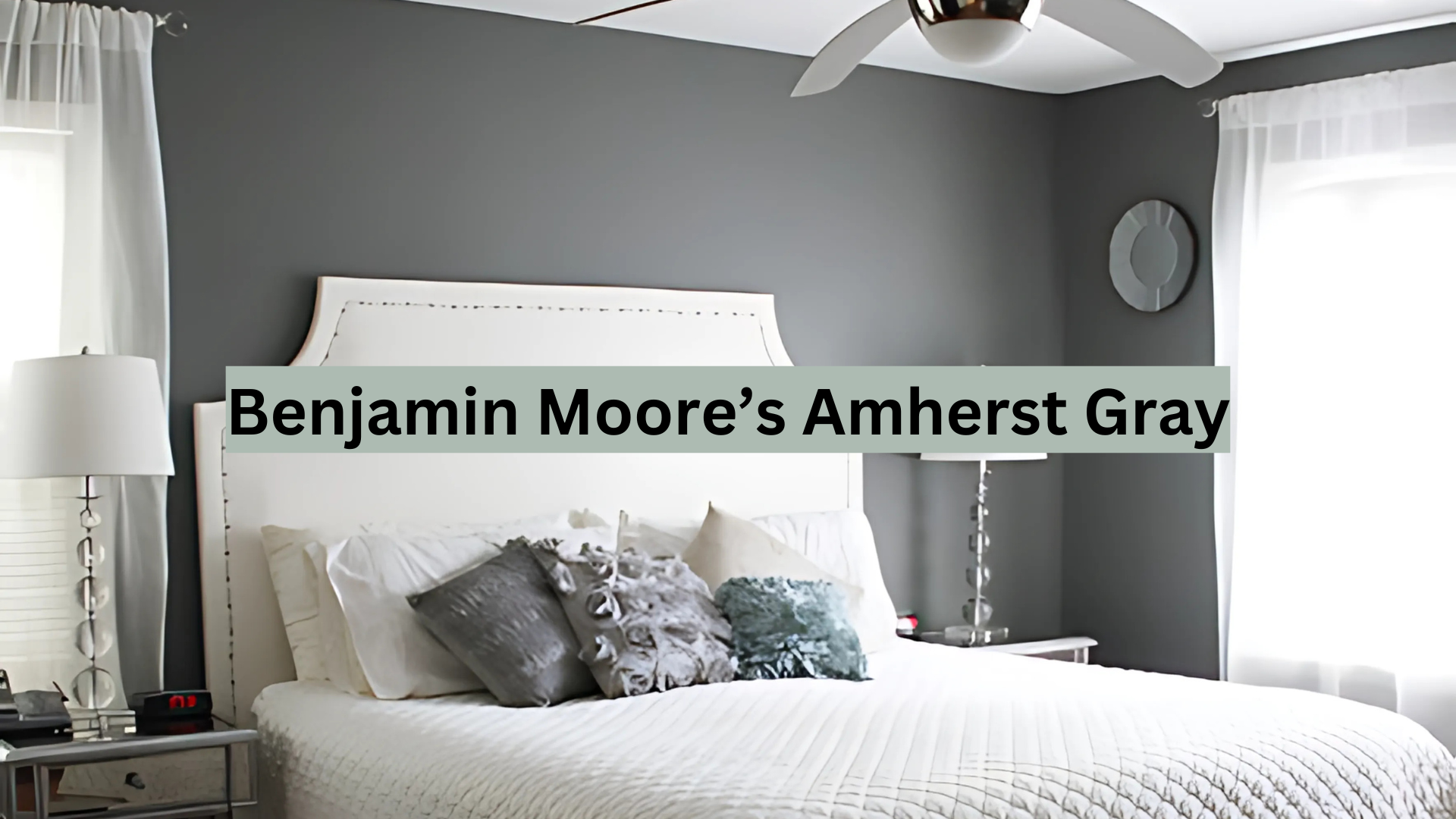
Amherst Gray (HC-167) is a deep, saturated gray with subtle undertones that give it depth. It sits on the darker end of Benjamin Moore’s gray spectrum, making it more dramatic than lighter grays.
What makes this color special is its balance. It’s not too warm or too cool – it finds that sweet spot in between. The color has slight blue-green undertones that show up in certain lights.
Is it truly neutral? Yes, but with character. This isn’t a flat gray that fades away. It makes a statement while still working as a background for other colors in your room.
The Mood of Amherst Gray: How This Strong Gray Affects a Room

Amherst Gray creates a cozy, grounded feeling in any space. When I painted my office this color, I noticed how it instantly made the room feel more serious and focused.
This gray has a way of making rooms feel:
- More intimate and pulled together
- Slightly formal but not stuffy
- Calm and controlled
The psychological effect of this gray is interesting. It’s not cold or sad like some grays can be. Instead, it feels protective and stable – like a comfortable blanket wrapped around your room.
In small spaces, it can feel a bit heavy. But in open areas with good light, it creates a perfect backdrop that makes furnishings stand out.
Where to Use Amherst Gray in Your Home for a Timeless Look
I’ve seen Amherst Gray work wonders in many areas of the home. Here are my top picks:
- Living rooms: Creates a formal yet comfortable base for gathering spaces.
- Home offices: Helps with focus and concentration while adding style.
- Dining rooms: Makes evening meals feel more special and intimate.
- Exterior trim: Looks amazing as contrast to lighter siding.
- Kitchen cabinets: Creates a high-end look without going too dark.
This color works best in rooms with good natural light. It might feel too heavy in very small or dark rooms, so test it first. Pair it with white trim to create a clean contrast for a timeless look. This combination never goes out of style.
What Flooring Works Best with Amherst Gray Walls?
The right flooring can make Amherst Gray shine. Through my testing and research, I’ve found these pairings work especially well:
- Wood floors: Medium to light oak creates a beautiful contrast. Walnut can work too, but it makes a darker overall look.
- Tile: Creamy limestone or marble with gray veining complements the wall color without competing.
- Carpet: Light neutral carpets (beige, greige, or light gray) balance the depth of the walls.
- Luxury vinyl: Wood-look LVP in honey tones creates warmth against the cool gray.
What to avoid: Very dark floors paired with Amherst Gray can make a room feel too heavy and closed in.
My favorite combination is Amherst Gray with natural oak floors – the warmth of the wood balances the cool undertones in the paint.
Color Combinations That Complement Amherst Gray
After trying many color pairings, these ten combinations work best with Amherst Gray:
1. Cloud White (OC-130)

This clean, crisp white creates a perfect contrast with Amherst Gray. I use it for trim, doors, and ceilings to brighten the space. Cloud White has minimal undertones, making it a true white that doesn’t compete with the gray. It works particularly well in spaces where you want to highlight architectural details against your gray walls.
2. Muslin (OC-12)

A soft off-white with subtle warm undertones that softens the contrast with Amherst Gray. This gentle color creates a more relaxed transition than stark whites. I’ve used this combination in bedrooms where the softer contrast promotes relaxation. The warm undertones help balance Amherst Gray’s cooler notes.
3. Pale Oak (OC-20)

This light greige adds warmth to spaces with Amherst Gray. The subtle beige undertones create a sophisticated pairing that feels grounded. I’ve found that this combination works beautifully in living rooms and connecting spaces. The colors share similar undertones but at different depths, creating harmony.
4. Revere Pewter (HC-172)

A lighter gray that creates a tonal effect when used with Amherst Gray. This combo works well for connecting spaces – perhaps Revere Pewter in hallways leading to an Amherst Gray living room. The colors belong to the same family, creating a cohesive flow throughout your home.
5. Hale Navy (HC-154)

This deep, rich navy pairs sophisticatedly with Amherst Gray. The blue-gray undertones in both colors create a natural affinity. I love using this combination in studies, libraries, or dining rooms for a classic, timeless look. The colors feel inherently traditional yet still fresh.
6. Caliente (AF-290)

A bold, vibrant red that creates a dramatic contrast with Amherst Gray. This pairing works best as an accent – perhaps Amherst Gray walls with Caliente on a statement piece of furniture. The warm-cool contrast creates visual interest and energy in any space.
7. October Mist (1495)

This soft sage green provides the perfect balance to Amherst Gray. The colors share a muted quality while offering complementary undertones. I’ve used this combination in kitchens and breakfast nooks, where the green adds a natural, fresh element to the more serious gray.
8. Golden Retriever (2165-30)

A rich mustard yellow, this color brings warmth and energy when paired with Amherst Gray. It is the perfect accent color for throw pillows, artwork, or small furniture pieces. The contrast between cool gray and warm yellow creates a dynamic, contemporary feel.
9. Simply White (OC-117)

A versatile white with subtle warm undertones that creates a beautiful contrast with Amherst Gray. This is my go-to white for cabinetry when the walls are Amherst Gray. The slight warmth prevents the combination from feeling too stark or clinical while maintaining clean lines.
10. Van Deusen Blue (HC-156)

A complex blue-gray that creates depth when used with Amherst Gray. These colors share similar qualities but with different undertones, creating a sophisticated layered effect. I’ve used this combination in bedrooms and bathrooms for a serene, cohesive feel.
- For a classic look: Stick with whites and creams as your main companion colors.
- For a modern look: Try high contrast with bright whites and black accents.
- For a cozy look: Blend with warmer beiges and soft yellows.
Simple Ways to Decorate with Amherst Gray in Your Home
I’ve found these easy approaches work well when using Amherst Gray:
Use it as an accent wall if you’re not ready to commit to a fully gray room. The color creates a natural focal point.
Paint built-ins and bookcases this color to make them stand out while adding depth to your room.
Try it in unexpected places like:
- Inside closets for a surprise of color
- On a ceiling with lighter walls
- On kitchen lower cabinets with white uppers
Add texture through:
- Natural wood accents
- Woven baskets
- Plush fabrics like velvet
- Metal finishes (brass looks amazing against this gray)
Keep some white space to prevent the room from feeling too dark. White trim, light curtains, or white furniture help balance the depth of this color.
Amherst Gray vs. Other Popular Dark Grays: A Color Comparison
| Paint Color | Brand | Undertones | LRV | Best Used For |
|---|---|---|---|---|
| Amherst Gray (HC-167) | Benjamin Moore | Blue-green | 18.8 | Living rooms, offices, cabinets |
| Chelsea Gray (HC-168) | Benjamin Moore | Warm, slight brown | 23.33 | Bedrooms, dining rooms |
| Kendall Charcoal (HC-166) | Benjamin Moore | Green-brown | 14.61 | Accent walls, exteriors |
| Gauntlet Gray (SW 7019) | Sherwin Williams | Warm, taupe | 17 | Whole rooms, trim |
| Iron Ore (SW 7069) | Sherwin Williams | Blue-black | 6.58 | Doors, cabinets, exterior |
| Dovetail (SW 7018) | Sherwin Williams | Warm, brown | 25.50 | Living spaces, kitchens |
I’ve tested Amherst Gray alongside other popular dark grays to see how it compares. Here are my key findings:
- Amherst Gray vs. Chelsea Gray: Chelsea Gray is slightly warmer with brown undertones, while Amherst Gray is more neutral with those slight blue-green undertones.
- Amherst Gray vs. Kendall Charcoal: Kendall Charcoal is significantly darker and has stronger green undertones than Amherst Gray.
- Amherst Gray vs. Gauntlet Gray: These colors are similar in depth, but Gauntlet Gray (Sherwin Williams) pulls more taupe, making it warmer.
The main thing to know is that Amherst Gray is in the middle of these options—not too dark, not too light, not too warm, not too cool. This makes it more flexible for different spaces.
When testing paints, I always recommend getting sample pots and painting large swatches (at least 12″x12″) on multiple walls to see how the light affects the color throughout the day.
Design Styles That Work Beautifully with Amherst Gray
I’ve found that Amherst Gray works with many design styles, but these are where it truly shines:
- Modern Farmhouse: The color creates a perfect backdrop for white shiplap, natural woods, and black metal accents.
- Traditional: Pairs beautifully with classic moldings, antique furniture, and rich wood tones.
- Transitional: Bridges the gap between traditional and modern elements.
- Industrial: Complements concrete, exposed brick, and metal fixtures.
- Coastal Modern: Creates a sophisticated base for a more grown-up beach house style.
For each style, the key is balancing the depth of Amherst Gray with lighter elements to keep the space feeling open and intentional.
Conclusion
After living with Amherst Gray in my home for over a year, I can confirm it’s a color worth considering. It strikes the perfect balance—bold enough to make a statement yet neutral enough to adapt as your style changes.
This color isn’t for everyone. It shines in rooms with good natural light and creates an intimate, sophisticated atmosphere. However, without proper lighting, it can feel heavy in dark spaces.
Still unsure? Start small. First, try it on one wall or in a powder room. I’ve seen this rich gray transform ordinary spaces into something special countless times. Always test before committing! Paint a large swatch (at least 12″x12″) on different walls and observe it throughout the day. What looks perfect at noon might feel too dark by evening.
Amherst Gray might be exactly what your home needs – that perfect neutral that’s anything but boring.
Frequently Asked Questions
How Does Amherst Gray Change Throughout the Day?
Amherst Gray shifts dramatically with changing light. In morning light, it appears more true gray, while afternoon sun brings out its blue-green undertones. Evening artificial light can warm it considerably, creating a cozy atmosphere.
What’s the Best Paint Finish for Amherst Gray in A Bathroom?
I recommend a pearl or semi-gloss finish with Amherst Gray. These finishes resist moisture better and make cleaning easier. The slight sheen also helps reflect light in typically smaller bathroom spaces.
Can Amherst Gray Work in An Open-Concept Floor Plan?
When balanced properly, Amherst Gray can work beautifully in open concepts. Use it on feature walls or in areas you want to visually separate. Pair with lighter neutrals in connecting spaces to prevent the color from overwhelming the entire region.
How Do I Prevent Amherst Gray from Looking Too Dark or Heavy?
Balance is key—pair it with lighter furnishings, ample lighting, and reflective surfaces like mirrors. If the space has limited natural light, consider using it on just one or two walls rather than the entire room.
Does Amherst Gray Work with Existing Brown/Wood Tones?
Amherst Gray pairs wonderfully with medium to light wood tones. Oak, maple, and lighter walnut create a beautiful contrast. Very dark woods (like espresso) can make the combination feel too heavy, so use these more sparingly as accents.