")
If you’ve ever looked for a cozy, versatile paint color that works in almost any room, you might want to consider Brandon Beige.
This warm neutral tone from Benjamin Moore offers the perfect balance between beige and gray, not too yellow, not too cool.
In this post, I’ll walk you through everything you need to know about this popular paint shade.
You’ll learn about its undertones, how it changes in different lighting, and which rooms it suits best.
By the end of this article, you’ll know exactly if Brandon Beige is right for your home.
No more standing confused in front of paint swatches or bringing home samples that look nothing like you expected.
I’ve tested this color in various homes and lighting conditions, so you can trust the information comes from real-world experience, not just theory.
The Rich Undertones of Brandon Beige by Benjamin Moore

Brandon Beige is a warm neutral that has more going on than meets the eye. When I first put this color on my walls, I noticed how it changed throughout the day.
This isn’t just a plain beige – it has subtle tones that show up in different lights. The main color you’ll see is a soft beige with hints of taupe mixed in.
In some lights, you might spot a touch of pink warmth that makes rooms feel cozy. When the sun hits it directly, small gold notes can appear, adding depth to your walls.
Morning light brings out its warmer side, and evening light can make it look more like a soft tan. This color shifts and changes like few others.
Brandon Beige has an LRV (Light Reflectance Value) of 37.86. What does this mean for you? It’s right in the middle range – not too dark, not too light.
It will reflect a good amount of light back into your room without being too bright.
I’ve put this color in both north-facing and south-facing rooms. In northern light, the taupe tones become clearer, while in southern light, the warm gold notes stand out more.
Your furniture colors will also change how Brandon Beige looks. Next to white trim, it appears darker and richer. With wood tones, it creates a soft, earth-toned look that feels natural and calm.
The Psychology of Brandon Beige by Benjamin Moore
When I walk into a room painted with Brandon Beige, I notice how it makes me feel right away.
This color creates a sense of calm that’s hard to put into words. It’s like the walls are giving you a gentle hug.
Warm neutrals like this one help ground a space. They make rooms feel steady and safe. Have you ever noticed how some colors can make you feel on edge?
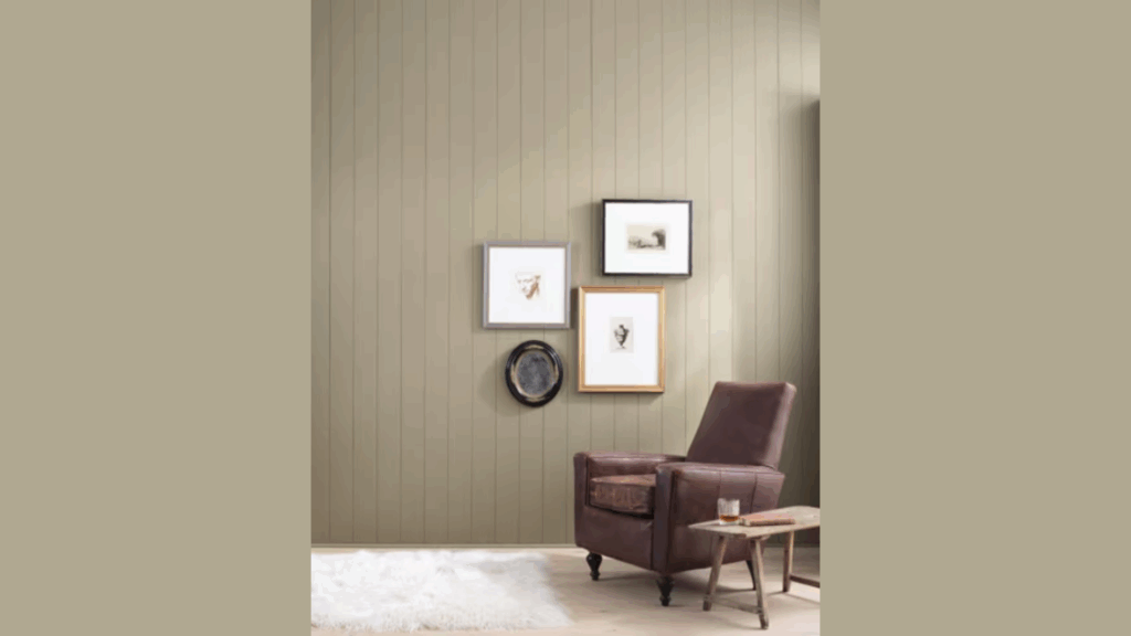
Brandon Beige does the opposite. This is why so many people choose it for living rooms and family spaces.
When folks gather in a room with this color, conversations seem to flow better. The warm tones help everyone feel more at ease. It’s not just about looks – it’s about the feeling.
I’ve used Brandon Beige in my own home for this very reason. When friends come over, they often say, “Your house feels so comfortable.”
The color is doing a lot of that work behind the scenes.
The color strikes a good middle ground between cool and warm, helping to balance the emotional tone of any room it’s in.
Why Brandon Beige Is an Ideal Paint Color for Any Room?
Brandon Beige offers a warm, neutral background that suits many different rooms and styles.
1. Works in Spaces of All Sizes
I’ve used Brandon Beige in tiny bathrooms and large open living areas. It performs well in both. In small rooms, it doesn’t make the space feel closed in.
The light to medium tone helps walls recede rather than crowd you.
For bigger rooms, this color adds just enough warmth to prevent the space from feeling cold or empty.
You won’t have that echo-y feeling that sometimes comes with very large painted areas.
2. Provides Warmth While Staying Neutral
Brandon Beige acts like a blank canvas but with more personality than plain white. It gives you a starting point with character.
Have you ever tried to decorate around a wall color that fights with everything? This isn’t one of those colors.
It adds warmth without taking over. The subtle beige tones bring life to a room while letting your furniture and art do the talking.
3. Fits Multiple Design Styles
What I love most about this color is how it fits so many styles. In my friend’s traditional home, it highlights her antique wood furniture is highlighted beautifully.
But it’s just as effective in modern spaces. For modern rooms, it softens the hard edges and helps balance cool metals and glass.
In farmhouse settings, it complements natural woods and white trim perfectly.
4. Makes Decorating Simple
With Brandon Beige on your walls, picking accessories becomes much easier.
Nearly all wood tones, from light oak to dark walnut, work well with it. Both silver and gold metals shine against this background.
Your colorful pillows, art, and rugs will stand out clearly without clashing. When you want to change your decor with the seasons, you won’t need to repaint.
Fall oranges and reds look warm and rich against it. Spring greens and blues pop nicely without seeming out of place.
Best Places to Use Brandon Beige in Your Home
Brandon Beige offers a warm, inviting feel that works well in many areas of your home. This neutral shade creates a cozy background that lets your furniture and accessories stand out.
1. Bedroom
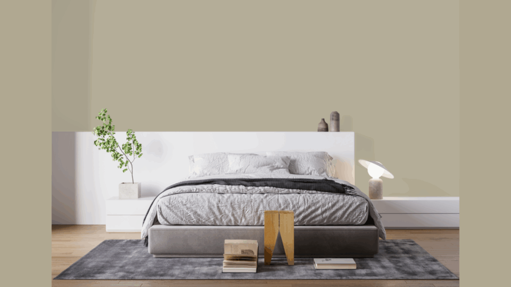
For bedrooms, Brandon Beige offers that cozy, restful quality that helps you unwind. I painted my own bedroom this color three years ago and still love it.
At night with soft lamps on, the walls take on a gentle glow that signals your brain it’s time to relax. The color isn’t too light or too dark – just right for sleep spaces.
Have trouble falling asleep? Colors can really help. This shade doesn’t stimulate your brain like brighter colors might.
It pairs beautifully with white bedding for a clean look, or with deeper colors if you want more of a cocoon-like feel.
2. Kitchen
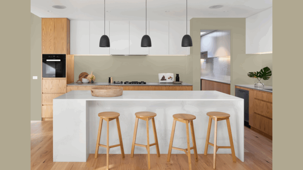
Your kitchen gets a lot of use, and Brandon Beige provides a warm backdrop that can handle the activity.
I like how it complements so many kitchen materials. Wood cabinets look rich next to it. White cabinets pop against it.
Even stainless steel seems less cold when set against these warm walls.
The color also hides minor marks and splashes better than lighter shades, which is practical for such a busy room. It stays looking fresh between deeper cleanings.
Plus, food just looks better against warm neutral walls. Your meals will seem more appealing when served in this setting.
3. Bathroom
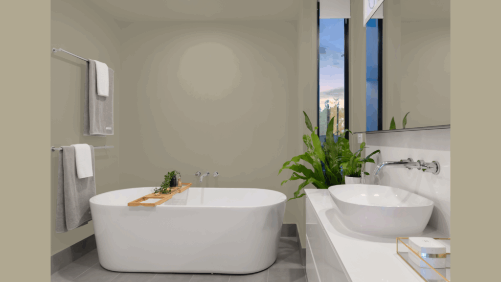
Bathrooms need colors that can handle moisture while still looking good. Brandon Beige fits this bill perfectly.
It’s neutral without being plain or boring. In smaller bathrooms, it makes the space feel a bit larger and more open.
In larger ones, it adds just enough warmth to keep the room from feeling cold and clinical. I painted my guest bathroom this color, and it works with both the white fixtures and the wood vanity.
It makes the chrome faucets shine without creating harsh contrasts.
The color also pairs well with towels of any shade, making it easy to update the look of your bathroom just by switching out a few items.
Flooring Options that Pair Beautifully with Brandon Beige
When your walls wear Brandon Beige, selecting the right flooring creates a complete, well-designed look. This warm neutral paint works with many floor types to create different moods in your rooms.
1. Warm Wood Tones
I’ve seen Brandon Beige paired with oak floors in several homes, and the match works wonderfully.
The warm undertones in both the paint and the wood create a cozy, flowing feel throughout the space.
Maple flooring, with its honey tints, also makes a natural partner for these walls. The slight yellow in maple picks up similar hints in the beige, making both look richer.
Walnut floors create a beautiful contrast while still keeping things warm. The darker wood grounds the space while the lighter walls help bounce light around the room.
2. Natural Stone and Tile
When I redid my kitchen, I chose a beige ceramic tile that works seamlessly with Brandon Beige walls.
The match isn’t perfect, and it shouldn’t be. You want just enough difference to create interest.
Natural stone, like travertine or limestone, has those small color shifts that echo what happens in Brandon Beige.
The walls and floor seem to belong together without looking flat or one-note. Have you considered slate?
Though often thought of as gray, many slate tiles have warm beige undertones that pair nicely with this paint color.
For bathrooms, cream-colored tiles with Brandon beige walls create a spa-like feel that’s both clean and welcoming.
3. Carpet Options
Light beige carpet with Brandon Beige walls creates a soft, open feeling. This works especially well in bedrooms where you want that plush, comfortable vibe.
I put a medium tan berber carpet in my office with these walls, and the texture difference keeps things interesting while the colors blend well.
Even greige carpets (those with gray and beige mixed) work nicely, picking up the taupe undertones in the paint.
If you want a bit more separation between floor and wall, try a carpet with a simple pattern that includes beige tones – it will tie everything together while adding visual interest.
4. Creating Contrast
For a more dramatic look, try pairing Brandon Beige with dark espresso floors. I was surprised at how well this works in my friend’s home.
The dark floor anchors the space while the walls keep it from feeling too heavy.
Black slate or dark tile can create this same striking contrast. The key is keeping everything else in the room fairly light to balance the dark floor.
Even a very light, almost white floor can work by creating contrast in the opposite direction. The walls become the “darker” element, which can make small rooms feel bigger and airier.
Brandon Beige Compared to Other Warm-Neutral Paints of Benjamin Moore
I’ve used all these colors in different homes. Brandon Beige stands out because it sits right in the middle, not too yellow like Muslin can sometimes look. It’s also not as green-tinted as Manchester Tan.
| Paint Color | How It Compares to Brandon Beige | Best For |
|---|---|---|
| Brandon Beige | Our main color – soft, muted with balanced undertones | Most rooms; versatile and modern |
| Muslin | Lighter than Brandon Beige with more yellow undertones | Smaller spaces that need brightening |
| Manchester Tan | Greener undertones than Brandon Beige; more earthy | Rooms with lots of plants or natural elements |
| Shaker Beige | Darker and more traditional than Brandon Beige | Formal dining rooms or studies |
What makes Brandon Beige special is its balance. While Shaker Beige can feel a bit heavy in some rooms, Brandon Beige keeps things light but still warm.
The LRV numbers tell us Brandon Beige will reflect a good amount of light back into your room, though not quite as much as Muslin or Manchester Tan.
Which is your favorite? Your choice really depends on what feeling you want in your space.
Conclusion
After looking at Brandon Beige from all angles, I can say it’s a color worth your attention.
This balanced neutral creates spaces that feel both current and lasting, no quick trend that you’ll tire of next year.
Its warm notes make rooms feel lived-in and welcoming without being too bold or flashy. The subtle mix of beige and taupe works in all kinds of light and with many decor styles.
Before you commit, I strongly suggest buying a sample pot. Paint a large piece of poster board and move it around your home at different times of day.
See how it looks in your morning light, evening shadows, and with your own furnishings.
Your home should make you happy, and the right paint color is a big part of that feeling.