")
Rose Bisque (2102-50) is a warm-neutral paint color from Benjamin Moore that brings coziness to any room.
I picked this shade to review because it often gets overlooked among more talked-about neutrals, yet it offers something special.
I’ve seen how the right shade can change a space. That’s why I tested Rose Bisque in different lighting conditions and rooms.
In this post, you’ll learn:
- How Rose Bisque looks in various lighting conditions
- Which room styles does it work best with
- Color combinations that make it shine
Choosing paint shouldn’t be stressful. By the end of this article, you’ll know if Rose Bisque is the perfect fit for your home.
The Rich Undertones of Rose Bisque by Benjamin Moore
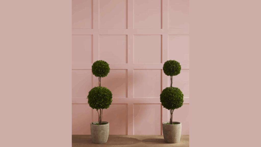
Rose Bisque is not a simple beige. When I first put it on my walls, I noticed right away that it has soft pink-peach undertones that warm up the base beige color.
This gives it more depth than plain neutral shades.
The color shifts throughout the day. In morning light, Rose Bisque shows more of its warm pink side.
By midday, with full sun, it appears more balanced and neutral. When evening comes, the color takes on a cozier, slightly darker tone.
Under artificial lights, things change again. With warm bulbs (2700K-3000K), the peachy tones come forward. Cool white bulbs bring out more of the beige.
Rose Bisque has an LRV (Light Reflectance Value) of 44.08. What does this mean for you? It’s light enough to make rooms feel open, but not so light that it looks washed out.
Is it modern or traditional? Both, actually.
When paired with clean lines and minimal decor, Rose Bisque feels fresh and current. But put it with wooden furniture and classic elements, and it fits right into a traditional home.
I’ve found this versatility makes it work in almost any room, from bedrooms to living spaces.
The Psychology of Rose Bisque by Benjamin Moore
Colors affect how we feel in a space. I’ve noticed Rose Bisque creates a sense of calm that’s hard to match with other colors.
Its warm pink-beige tones bring comfort to any room they touch.
When you walk into a room painted with Rose Bisque, you might feel a gentle wave of nostalgia.
It has that quality that makes you want to stay a while. Not too bold, not too shy, just right.
I once painted my reading nook with Rose Bisque and found myself spending hours there without noticing the time pass.
The warm undertones in this color help make spaces feel safe and welcoming. Your guests will feel at home even if they can’t explain why.
Who loves Rose Bisque the most? In my experience:
- People who want a neutral that isn’t boring
- Homeowners who like hints of warmth without going too pink
- Anyone looking for a color that works well with both modern and old-fashioned items
This shade is perfect if you want your home to feel put-together but not cold or stiff.
The pink tones in Rose Bisque can lift your mood on gray days. They catch light in a way that makes spaces feel sunny even when it’s cloudy outside.
Will this color work for you? If you like spaces that feel both fresh and familiar, I think you’ll love Rose Bisque’s addition to your home.
Why Rose Bisque Is an Ideal Paint Color for Any Room?
Rose Bisque offers a subtle warmth that works well across many rooms in your home. This soft, pink-tinted neutral brings a gentle glow to walls without being too bold or limiting.
1. Living Areas that Welcome Everyone
I’ve used Rose Bisque in countless living rooms over the years. Its soft warmth makes these spaces feel ready for company without trying too hard.
The color works as a backdrop that stays interesting without stealing attention from your furniture or art.
You might notice how the color seems to change slightly throughout the day. This subtle shift keeps your living space feeling fresh no matter the time.
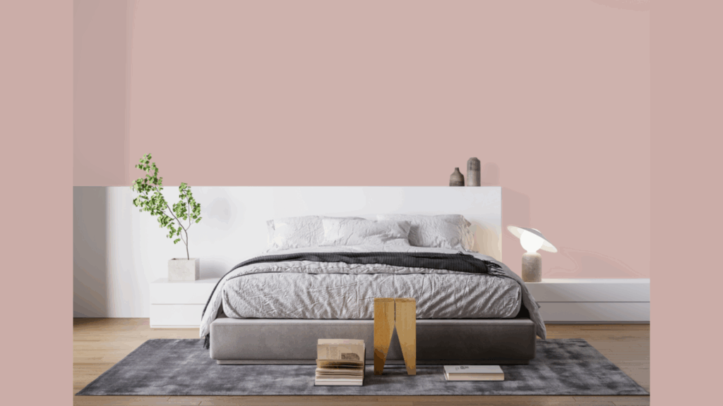
2. Restful Bedrooms with Character
Rose Bisque truly shines in bedrooms. I painted my guest room this color three years ago, and visitors always comment on how well they sleep there.
The gentle pink-beige tones create a cocoon-like feeling without being dark or heavy. Your bedroom should be your safe place, and this color helps make it so without feeling dull.
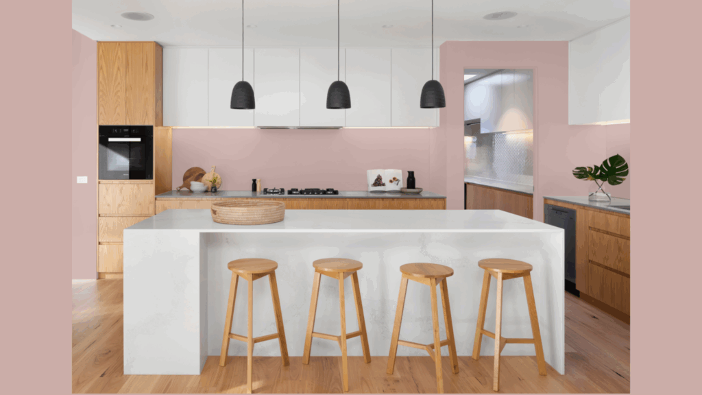
3. Kitchens with A Twist
When most people think of kitchen colors, they go straight to white or gray. But I’ve found Rose Bisque offers something special in cooking spaces.
It’s light enough to keep kitchens feeling clean and open, yet warm enough to make them inviting.
You can pair it with white cabinets for a clean look or wood tones for something more homey.
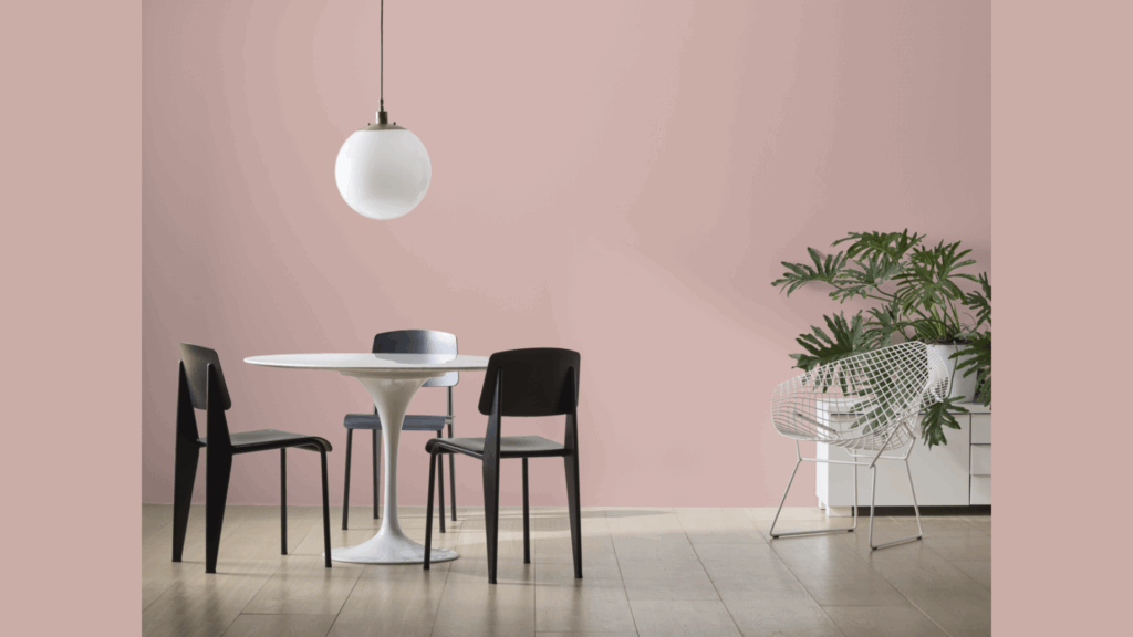
4. A True Team Player with Other Colors
What makes Rose Bisque work in so many rooms is how well it plays with other colors. I’ve seen it next to navy blue, forest green, and even bright yellow; it makes friends with them all.
Your bold accent pieces will stand out against it, but not in a jarring way. If you prefer a quiet room with fewer colors, Rose Bisque has enough interest on its own.
Best Places to Use Rose Bisque in Your Home
Rose Bisque brings a gentle warmth to your home that works well in several key areas. This soft, pink-tinted neutral creates a welcoming feeling without overwhelming your space.
1. Guest Bedrooms that Impress
When painting guest rooms, I always think about comfort first. Rose Bisque creates a feeling that helps visitors relax right away. It’s not too bold or too plain, just right for making guests feel welcome.
Styling tip: Pair Rose Bisque walls with crisp white bedding and maybe one or two items in deeper colors like navy or olive green.
Your guests will notice how put-together the room feels without knowing it’s the paint color doing most of the work.
2. Hallways that Feel Special
Why are hallways often the most ignored spaces? I’ve found that painting a hallway in Rose Bisque turns it from a pass-through area into part of your home’s story.
The color is light enough to keep narrow spaces feeling open, but warm enough to make them feel planned.
Your hallway can become a place that ties different rooms together instead of just a space between them.
3. Home Office Accent Wall
Not ready to commit to a full room? I understand. An accent wall in your home office gives you the benefits of Rose Bisque without painting the whole space.
Put it behind your desk where you’ll see it most often. The color is known to be easy on the eyes during long work sessions.
You might find yourself feeling less tired at the end of the day with this color in your line of sight.
Flooring Options that Pair Beautifully with Rose Bisque
The right floor creates a perfect foundation when paired with Rose Bisque walls. This soft, pink-tinted neutral works with several flooring types to create various looks in your home.
1. Wood Flooring Choices
I’ve worked with Rose Bisque in dozens of homes, and certain wood floors make it look its best.
Medium oak floors bring out the warmth in Rose Bisque without competing with it. The natural golden tones in oak create a smooth flow from floor to wall.
Walnut floors offer a striking contrast that makes Rose Bisque walls appear lighter and brighter.
You might be surprised how this darker wood makes the pink undertones in the paint stand out in a good way.
Maple is my top pick for Rose Bisque walls. Its light, slightly pinkish tone creates a seamless look that makes rooms feel bigger and more open.
2. Carpet Colors that Work
When choosing carpet to go with Rose Bisque walls, I stick to a simple rule: avoid anything with strong yellow undertones.
These can clash with the pink in Rose Bisque and create an odd feeling in the room.
Soft greige carpets (that mix of gray and beige) make for a calm foundation that lets your walls be the star.
I painted my bedroom Rose Bisque and paired it with a light greige carpet, the result feels like a spa retreat.
White or cream carpets also work well, but show dirt more easily. Your decision might depend on how the room will be used.
3. Tile Options for Kitchens and Bathrooms
White subway tile is a classic choice that never fails with Rose Bisque. I use this combination often in bathrooms where the clean white tile balances the soft wall color.
For kitchen floors, gray slate or porcelain tiles create a modern base that grounds the warmth of Rose Bisque walls. Your kitchen will feel both fresh and cozy at the same time.
4. Luxury Vinyl and Laminate Pairings
Not everyone wants real wood or tile. I’ve found that luxury vinyl planks in weathered gray or washed oak tones pair nicely with Rose Bisque.
The slight gray wash prevents too much yellow from coming through.
You’ll want to avoid very orange-toned laminate floors, as they can make the pink in Rose Bisque look more obvious than you might want.
Rose Bisque Compared to Other Warm-Neutral Paints
I’ve used all these colors in different homes over the years. Rose Bisque stands out because it has just enough pink to feel warm without being too colorful.
| Color Name | Undertones | Best For | How It Differs From Rose Bisque |
|---|---|---|---|
| Rose Bisque | Pink-peach | All-around warm neutral for any room | Our base color – soft beige with pink warmth |
| Muslin | Yellow-beige | South-facing rooms needing warmth | Lighter than Rose Bisque with more yellow, less pink |
| Shelburne Buff | Gold-tan | Traditional spaces, rooms with wood trim | Deeper than Rose Bisque with stronger gold undertones |
| Pink Damask | True pink | Bedrooms, powder rooms, feminine spaces | Much pinker than Rose Bisque, less beige |
| Manchester Tan | Green-beige | Rooms with lots of plants or green accents | Similar depth to Rose Bisque but with green rather than pink undertones |
| Pale Oak | Gray-beige | Modern spaces, rooms with cool accents | Lighter and grayer than Rose Bisque, less warmth |
My personal take: If your room gets cold, north light, Rose Bisque will warm it up better than Pale Oak. But if you have lots of yellow-toned wood furniture, Muslin might be a better match than Rose Bisque.
Choose Rose Bisque when you want warmth with restraint. Pick Shelburne Buff when you need something a bit deeper with more golden tones.
Conclusion
Rose Bisque offers something special that many paint colors miss: warmth without being pushy about it.
Its soft pink-beige tones work in nearly any room, from sunny kitchens to cozy bedrooms.
Always test before you commit. Paint a sample board or a small wall section and watch how it changes throughout the day.
What looks perfect in morning light might feel different by evening.
I’ve used Rose Bisque in my own home and on dozens of client projects. I keep coming back to it because it rarely disappoints.
Your home should feel like you. If you want spaces that feel both fresh and comforting, Rose Bisque might be the perfect choice.
It’s a color that stays in the background while making everything else in your room look better.