")
Silhouette (AF-655) is a rich, warm, and versatile deep color that many homeowners and designers turn to when looking for the perfect shade.
This color is part of Benjamin Moore’s Affinity Color Collection, which is known for its carefully selected tones that work well together.
In this blog, I’ll tell you what makes Silhouette special – its undertones, the mood it creates, and which rooms it works best in.
I’ll also compare it to similar colors so you can make the right choice for your home.
Picking the wrong paint color can be costly and frustrating. By the end of this article, you’ll know if Silhouette is right for your space or if another option might work better.
The Rich Undertones of Silhouette by Benjamin Moore

Silhouette isn’t a simple color. When I look at it closely, I see a mix of gray, brown, and violet that gives it depth. It’s not just one thing – it’s a blend that changes as you look at it.
What makes this color special? The way it shifts.
In morning light, the gray tones stand out more. By afternoon, the brown warms up the walls. And when evening comes? That’s when you might notice the subtle violet hints that make this color unique.
You’ll find Silhouette has an LRV (Light Reflectance Value) of 10.18. This means it absorbs more light than it reflects, making it a deeper tone on your walls.
The warmth in this color makes rooms feel cozy. But don’t worry – it still looks modern and clean. This balance is hard to find in a paint color.
I’ve seen Silhouette turn a plain room into a snug and stylish space. The color is rich without being too heavy.
The Psychology of Silhouette by Benjamin Moore
When I first saw Silhouette on a wall, I felt myself relax. There’s something about deep, warm neutrals that calms the mind and grounds the body.
This isn’t random – color experts know these tones affect how we feel in a space.
Colors set the mood, and Silhouette creates a sense of safety. It wraps around a room like a soft blanket, making guests feel welcome and at ease.
I’ve noticed people tend to linger longer in rooms painted with this color.
Why does this happen? The color sits in that sweet spot – not too dark, not too light. It has enough depth to feel solid and trustworthy. When you use it in your home, it sends a message of stability.
Silhouette adds a touch of class without trying too hard. It’s grown-up without being stuffy. While many deep colors can feel cold or harsh, this one keeps its warmth.
You might notice you sleep better in a bedroom with this color, or that conversations flow more easily in a living room painted in this shade.
These effects aren’t by chance – they’re linked to how this particular blend of tones speaks to our brains.
Why Silhouette Is an Ideal Paint Color for Any Room?
Silhouette offers a perfect balance of depth and subtlety that makes it suitable for many settings in your home.
1. Finding Balance Between Rich and Neutral
I’ve tested dozens of paint colors over the years, and few strike the perfect balance like Silhouette does.
It has enough richness to make a statement but stays neutral enough to work with many styles. You can pair it with bold colors or keep things simple – it works either way.
This color doesn’t shout for attention. Instead, it creates a solid foundation that lets your furniture and art stand out.
When clients ask me for a color that has character without taking over, this is often my go-to suggestion.
2. Works Well in Both Small and Large Spaces
Many people avoid darker colors in small rooms. But I’ve found that Silhouette can actually make a small space feel more put-together.
You don’t need to fear using it in your powder room or office nook.
What about bigger areas? In large spaces, this color keeps rooms from feeling empty or cold. It fills the space with warmth without shrinking it too much.
3. Adding Depth without Going Too Dark
When you want more depth than standard grays but aren’t ready for black walls, Silhouette steps in perfectly, I recommend it to clients who find browns too traditional and blacks too stark.
The hint of violet in the mix adds interest that pure grays often lack. Your walls will change slightly throughout the day as light shifts, keeping the color feeling alive and interesting.
This middle-ground position makes it useful for so many spots in your home. From kitchen cabinets to bedroom walls, it adds weight and interest without heaviness.
Best Places to Use Benjamin Moore’s Silhouette in Your Home
Silhouette paint color fits well in many areas of your home. This mid-tone shade brings warmth and character to spaces while maintaining a clean look.
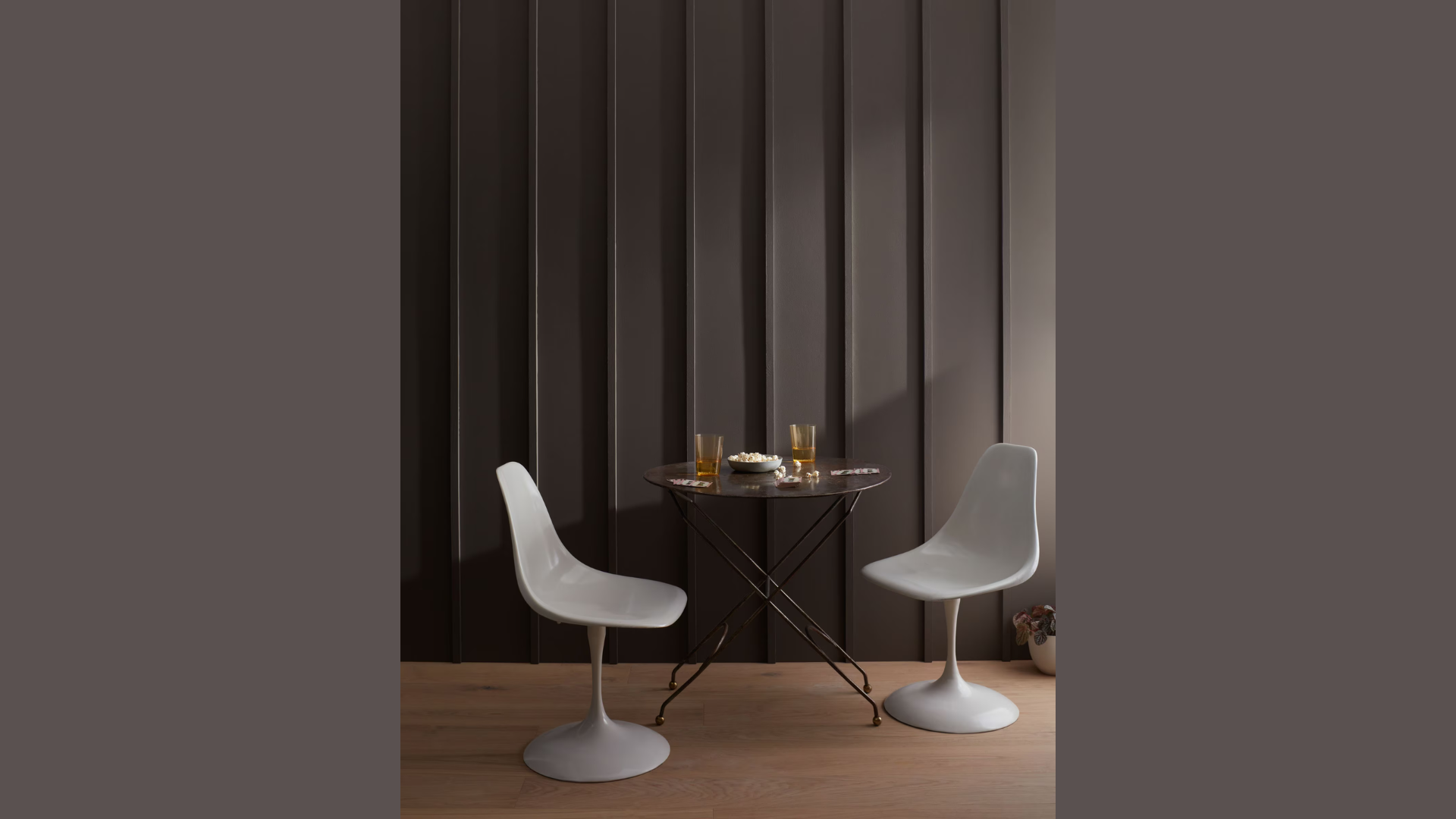
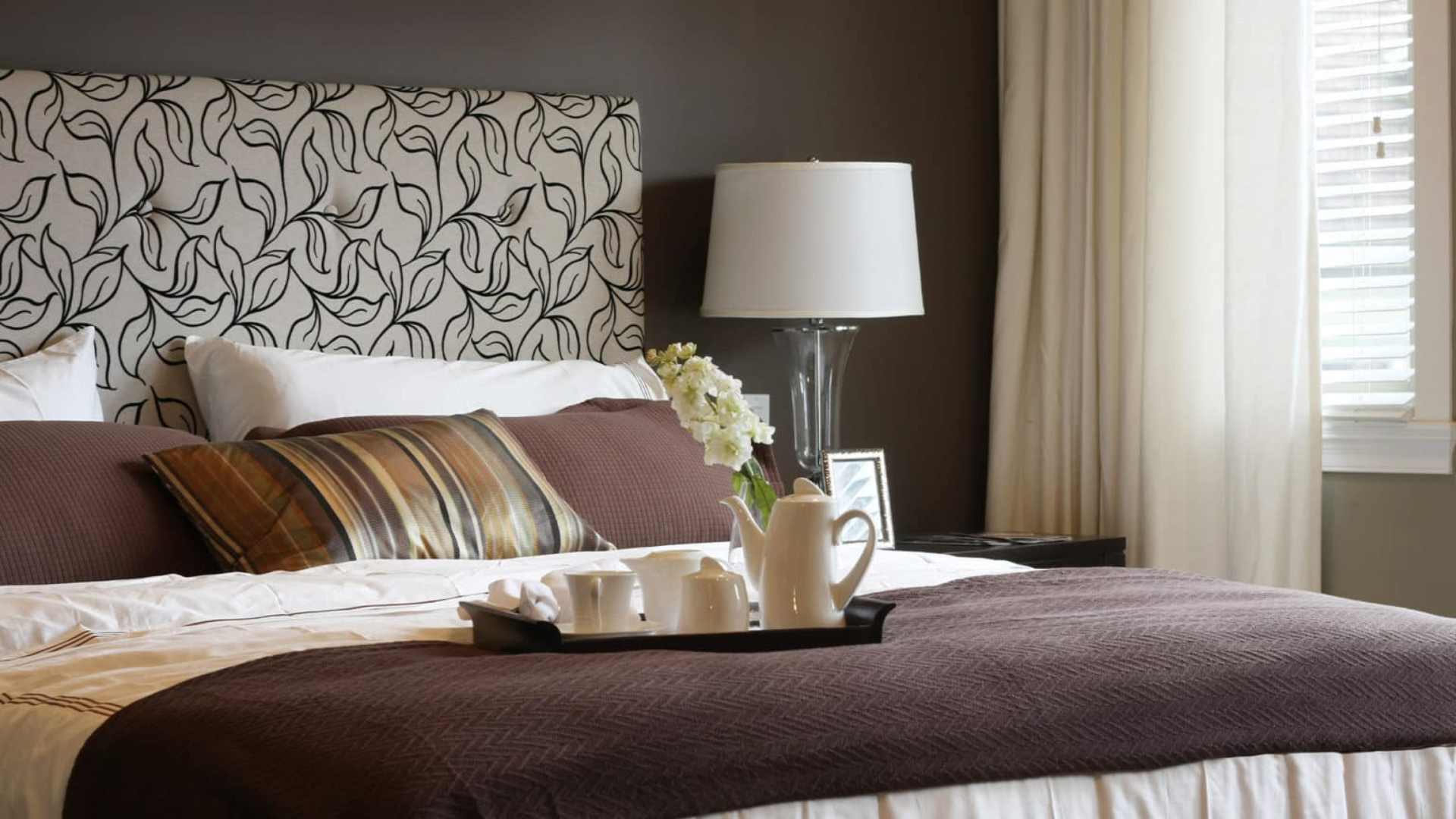
Living Rooms and Bedrooms
I’ve seen Silhouette work wonders in living rooms. The color creates a cozy backdrop that makes everyone want to sink into the sofa and stay awhile.
Your guests might not even notice the wall color directly, but they’ll feel its effects.
This color helps set the stage for rest in bedrooms. The depth of Silhouette makes the space feel like a retreat from the busy world.
You might find yourself sleeping better surrounded by walls that aren’t too dark or too light.
What makes it work so well in these spaces? The balance. It’s bold enough to make a statement but soft enough to live with day after day.
Dining Rooms
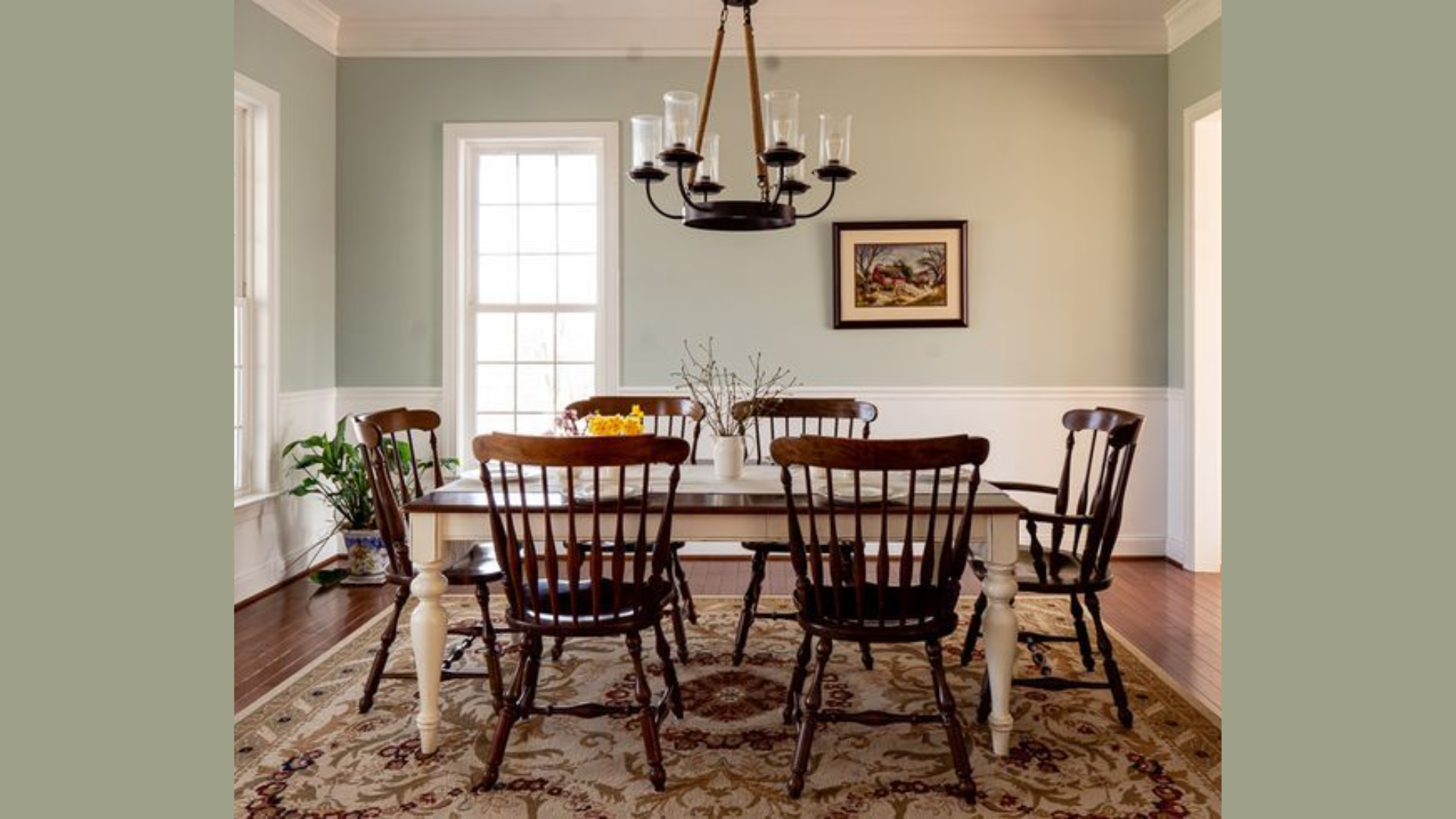
Want to make dinner feel special every night? Paint your dining room with Silhouette. I’ve noticed that meals in a dining room with this color tend to last longer.
People linger at the table, talking more and enjoying the moment. The color creates an intimate setting without trying too hard.
Does your dining room get natural light? This matters with Silhouette – it will look different depending on your windows and lighting.
In a room with lots of windows, it stays rich without feeling heavy.
Accent Walls and Cabinetry
Not ready to commit to a full room? I understand. Starting with an accent wall lets you test the waters. Silhouette makes for a perfect accent wall behind a bed or sofa.
It draws the eye without shouting for attention. The subtle drama it adds can change how the whole room feels. For kitchen or bathroom cabinets, this color adds weight and interest.
Painted cabinets in Silhouette look finished and thoughtful. Your kitchen can feel both classic and current with this choice. I’ve helped clients use this color on built-in bookshelves, too.
Flooring Options that Pair Beautifully with Silhouette
When you’ve selected Silhouette for your walls, choosing the right flooring completes the look. This mid-tone paint color works with various floor materials to create different moods in your home.
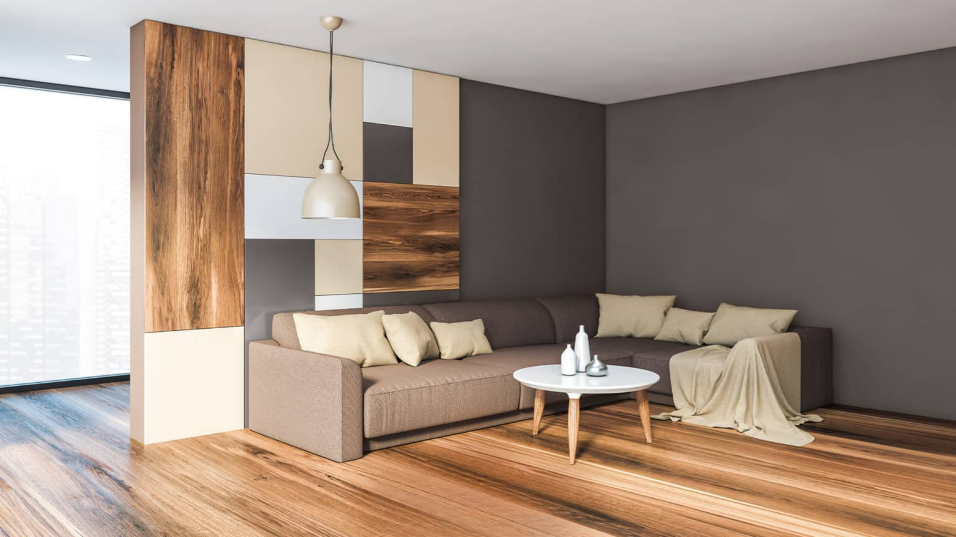
1. Light Oak and Whitewashed Wood Floors
I love how Silhouette looks against light oak floors. The contrast between the deep wall color and bright wood creates a striking visual balance in any room.
Your space will feel more open and airy, even with the deeper wall color.
Whitewashed wood takes this contrast even further. The pale, washed-out look of these floors makes Silhouette’s richness stand out even more.
This pairing works especially well in spaces that get plenty of natural light.
Have you seen this combination before? It’s one of my favorite ways to keep a room from feeling too heavy when using a deeper wall color.
The light floor reflects more light upward, keeping the overall feel bright and fresh.
2. Dark Wood Tones
For a more cohesive look, I often suggest pairing Silhouette with darker wood floors.
Walnut or mahogany tones create a rich, flowing feel from floor to wall, and your room will have a sense of togetherness that feels purposeful.
This combination makes spaces feel cozy and complete. I find it works well in studies, libraries, or dining rooms where you want that wrapped-in-warmth feeling.
The trick with this pairing is to add some lighter elements elsewhere. Think cream-colored rugs or lighter furniture to break up the depth.
3. Natural Stone and Neutral Tiles
Stone floors in soft grays or taupes make perfect partners for Silhouette walls. I’ve used this combination in entryways and bathrooms with great results.
The natural texture of stone adds interest while the colors work together smoothly.
For kitchens and bathrooms, neutral-toned tiles create a clean look alongside this wall color. Soft whites, light grays, or cream tiles let the walls be the star while still holding their own in the design.
This matters because you might not need to change your flooring at all. Many existing floors work well with Silhouette – it’s more flexible than people often expect from a deeper color.
Silhouette Compared to Other Warm-Neutral Paints of Benjamin Moore
I’ve tested all these colors in various homes. What stands out about Silhouette is how it adds mood and character while the others play it safer.
When clients want something with more personality that won’t go out of style, I often point them to Silhouette.
| Paint Color | Main Characteristics | How It Differs From Silhouette | Best Used For |
|---|---|---|---|
| Kangaroo | Lighter tan with gray undertones | Much lighter than Silhouette with fewer purple notes | Works better in spaces where you want warmth without depth |
| Brandon Beige | Mid-tone beige with yellow undertones | Warmer and much lighter than Silhouette, it lacks the richness | Perfect for those who find Silhouette too bold or dark |
| Pashmina | Gray-beige with slight green undertones | Lighter and less complex than Silhouette’s blend of tones | Great for larger spaces where Silhouette might feel too heavy |
| Silhouette | Deep blend of gray, brown, and violet | Has more depth and complexity than the others | Ideal when you want a statement color that still works as a neutral |
You might notice that while the other colors are more typical neutrals, Silhouette takes things a step further. It offers drama without going too far.
Conclusion
After looking at Silhouette from all angles, I can say it stands out for good reasons. Its warmth, beauty, and flexibility make it work in many spaces and styles.
This color offers something special – depth without heaviness and character without being loud. But remember: paint looks different in every home.
Always test before you commit. Get a sample and paint a small area. Watch how it changes throughout the day as light shifts. This step saves both money and regret.
Silhouette makes a stronger statement than typical neutrals, but it does so with class. It’s not trendy – it’s a timeless choice that won’t look dated in a few years.
For those willing to step beyond basic beige and gray, Silhouette offers a bold but beautiful option that creates spaces people notice and remember.