")
Looking for the perfect green paint for your home? Soft Fern by Benjamin Moore might be your answer.
In this guide, you’ll learn:
- What makes Soft Fern different from other greens
- Which rooms it works best in
- Color combinations that make it shine
- Simple ways to use it in your home
Over the past years, I’ve used Soft Fern in over twenty homes. These aren’t theories—they’re real results from actual projects. Finding the right green is difficult.
Some are too bright, others look dull, and many show weird undertones. Soft Fern solves these problems with its balanced tone and subtle organic feel.
Let me help you decide if this versatile green is right for your space.
What You Should Know About Benjamin Moore’s Soft Fern?
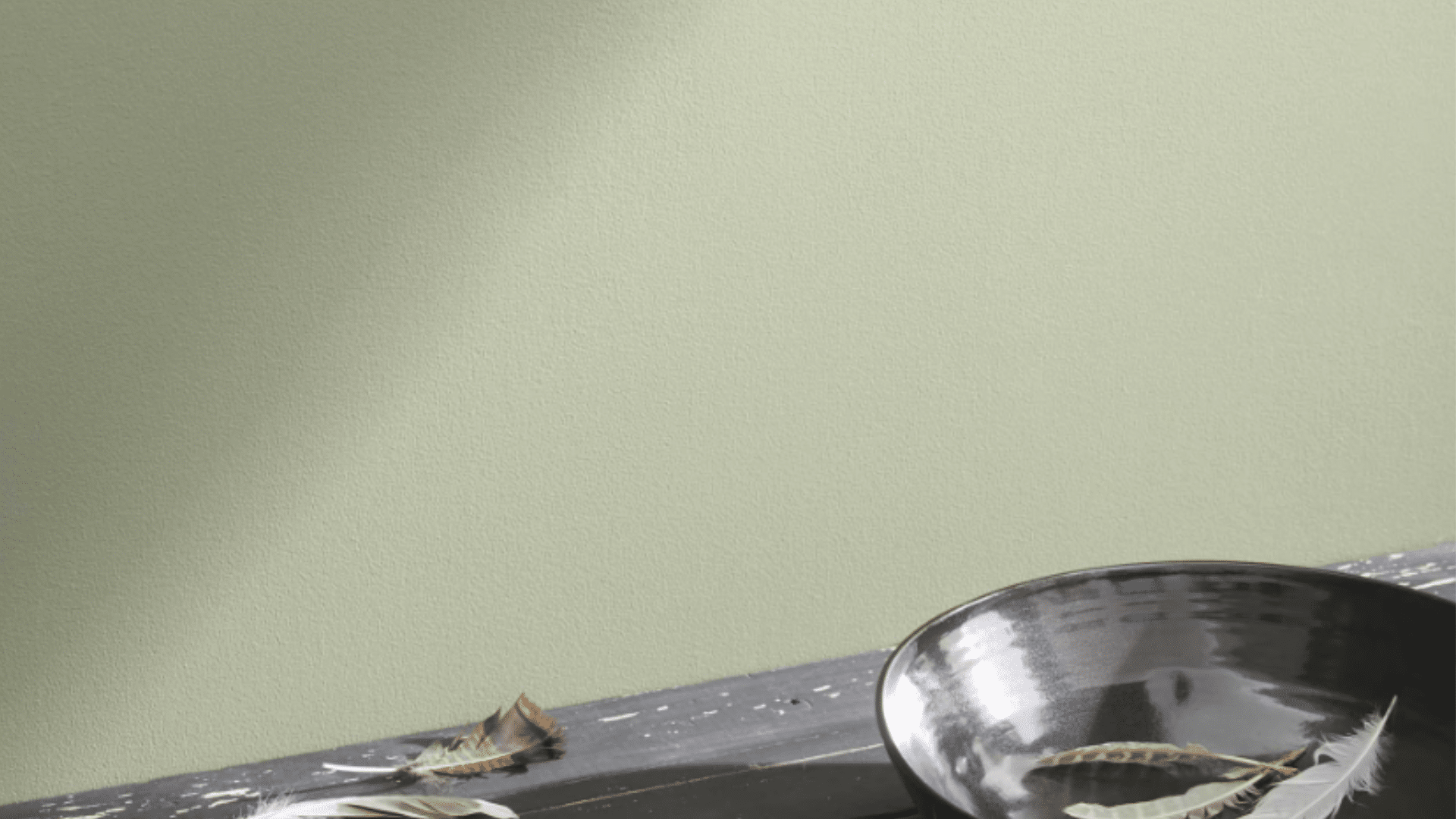
Soft Fern (2144-40) is a muted sage green with slight gray undertones. It’s not bright or flat. Instead, it has a subtle depth that adds character to any room.
The color reminds me of early spring foliage – fresh but with hidden complexity. Unlike some greens that look too vivid or fade to gray, Soft Fern maintains its gentle quality in various lighting situations.
This paint has excellent coverage and typically needs two coats. It works well on walls, trim, cabinets, and furniture, creating a smooth, natural finish on each surface.
What about the technical details? Soft Fern has an LRV (Light Reflectance Value) of 56.67, placing it in the medium range. This means it reflects enough light to keep rooms feeling open while still providing good color saturation.
It belongs to Benjamin Moore’s Historic Color collection, which features timeless shades inspired by America’s architectural heritage.
How Does This Gentle Color Change a Space?

Soft Fern creates a feeling of calm mixed with warmth. When I painted my living room with this color, the space felt both relaxing and inviting.
This green makes spaces feel:
- Calm without being boring
- Grounded and natural
- Fresh without feeling cold
- Peaceful and balanced
Large rooms with Soft Fern walls feel more harmonious and contained. Small spaces gain interest and depth rather than feeling cramped. Soft fern is a color that makes rooms feel thoughtful and connected to nature.
What Flooring Looks Best with Soft Fern Walls?
From my projects, these floors pair nicely with Soft Fern:
- White oak: Creates a gentle contrast that feels natural
- Medium walnut: Brings warmth that complements the muted green
- Light maple: Offers brightness that lifts the space
- Natural stone: Adds texture that enhances the organic feel
- Light beige carpet: This creates a soft, cohesive look
I avoid very dark floors with Soft Fern walls unless you want a strong contrast. Medium to light floors work well to balance this color and keep spaces feeling open.
Color Combinations that Go Well with Soft Fern
Soft fern is a delicate, muted green shade with gray undertones that works beautifully in many color schemes. Let’s see some complementary color combinations:
1. Benjamin Moore Chantilly Lace (OC-65)

This clean, bright white creates a clear contrast with Soft Fern. I like using it on trim, ceilings, and adjacent walls. The combination feels fresh and clean while letting the green show its full character.
For a modern look, try Soft Fern walls with Chantilly Lace trim and ceiling. This pairing works wonderfully in spaces with lots of natural light, as the white reflects light throughout the room while the green adds depth.
2. Benjamin Moore Swiss Coffee (OC-45)

This soft, warm white creates a less stark contrast with Soft Fern. It feels more comfortable and livable while still providing nice definition between surfaces. The subtle warmth of Swiss Coffee softens Soft Fern’s cooler undertones, creating a balanced look.
I often recommend this combination for bedrooms and living rooms where you want a cozy but fresh feeling. The cream undertones in Swiss Coffee complement the natural quality of Soft Fern.
3. Benjamin Moore Stonington Gray (HC-170)

This versatile gray creates a subtle palette with Soft Fern. It’s calming and creates needed contrast. The combination feels modern and organic while still being very livable. I love using Stonington Gray on adjacent walls to Soft Fern for an understated, sophisticated look.
The slight blue undertones in this gray harmonize beautifully with the gray-green of Soft Fern, creating a cohesive palette that works in any room of the house.
4. Benjamin Moore Revere Pewter (HC-172)

This warm neutral brings needed warmth to Soft Fern. The combination feels natural and balanced. I’ve used this in living spaces where the taupe in furniture or textiles adds depth to green walls.
Revere Pewter has just enough warmth to complement Soft Fern without competing with it. This pairing creates a grounded, earthy palette that works especially well in homes with natural materials like wood and stone.
5. Benjamin Moore Hale Navy (HC-154)

This deep color creates a beautiful contrast with Soft Fern. I’ve used this combination in bedrooms and offices, where the navy accents add richness and structure.
It makes a classic, timeless look. Try using Hale Navy on a single accent wall with Soft Fern on the remaining walls, or incorporate navy through furniture pieces against Soft Fern walls—the depth of navy anchors the lighter green, creating a balanced and sophisticated space.
6. Benjamin Moore Windy Sky (1639)

This light blue creates a natural, outdoorsy palette with Soft Fern. The combination feels fresh and clean while maintaining a calm, cohesive feel.
Windy Sky has a subtle gray quality that connects well with Soft Fern’s undertones. This pairing reminds me of sky and foliage – perfect for creating a nature-inspired space. I often use this combination in sunrooms or spaces with lots of plants to enhance the connection to the outdoors.
7. Benjamin Moore White Dove (OC-17)

A soft off-white that lets Soft Fern shine without stark contrast. The combination feels gentle and subtle. This works especially well in spaces where you want a calm, seamless feel.
White Dove has yellow undertones that add warmth to Soft Fern’s cooler base. In traditional homes, this pairing creates a timeless look that doesn’t feel trendy or dated. The cream softens the overall effect compared to a brighter white.
8. Sienna (2092-20)

For an earthy, warm palette, terracotta and Soft Fern work beautifully together. The warmth balances the cool green. This pairing works especially well in spaces with natural materials and textures.
I love using Sienna as an accent color through accessories or artwork against Soft Fern walls. This combination has a Mediterranean or Southwestern feel that adds character to any space. The contrast between cool and warm creates dynamic, interesting rooms.
9. Benjamin Moore Kendall Charcoal (HC-166)

This deep gray creates a striking contrast with Soft Fern. The combination feels grounded and modern. I’ve used this in dining rooms, where the charcoal furniture against Soft Fern walls creates drama without being too much.
Kendall Charcoal adds sophistication to Soft Fern’s natural quality. For a contemporary look, try using charcoal on door and window trim with Soft Fern walls—this unexpected combination makes a subtle but powerful statement.
10. Benjamin Moore Rose Accent (1177)

Not a paint color, but brass or gold metals look amazing with Soft Fern. The warmth of these metals stands out beautifully against the cool green, adding life and interest to the space.
The metallic elements add a touch of beauty without overwhelming the subtle nature of the green. Even small touches like brass candlesticks or a gold-framed mirror can elevate the entire space.
Simple Ways to Use Soft Fern in Your Home
- Paint just one wall as an accent
- Use it on kitchen cabinets with white countertops
- Try it on interior doors for subtle interest
- Paint a piece of furniture like a dresser or side table
- Use it for bathroom vanities to add a calm color
In my own home, I painted a vintage bookcase with Soft Fern. It became a standout piece that adds natural color to my neutral living room.
Soft Fern for specific projects: I’ve found this color particularly successful for several small projects. For a client with an outdated dining set, we painted the chairs Soft Fern while keeping the table white. The result was a custom look that felt both modern and timeless.
Another client used Soft Fern for all interior doors throughout their home. Against white walls, these doors created a subtle rhythm through the house that felt intentional without being overwhelming.
For those wanting to start even smaller, try painting picture frames or mirror frames with Soft Fern. The color adds a touch of nature without committing to larger surfaces.
One creative homeowner even painted the inside of her bookshelves with Soft Fern while keeping the outer structure white – the effect was amazing!
Soft Fern vs. Other Greens: What Sets It Apart
I’ve worked with many green paints. Let’s see how Soft Fern compares to other popular greens:
| Color | Undertones | Depth | Best Uses | Room Types | What Makes It Different |
|---|---|---|---|---|---|
| Soft Fern (Benjamin Moore) | Gray-green | Medium | Full rooms, cabinets | Living rooms, bedrooms | Balanced and natural without being too gray or too green |
| Saybrook Sage (Benjamin Moore) | Yellow-green | Medium-light | Bright spaces, full rooms | Kitchens, sunrooms | Much more yellow, less gray than Soft Fern |
| October Mist (Benjamin Moore) | Gray-green | Light | Full rooms, cabinets | Bedrooms, bathrooms | Lighter and more gray than Soft Fern |
| Sage (Benjamin Moore) | Blue-green | Medium | Accent walls, furniture | Dining rooms, offices | More blue and less gray than Soft Fern |
| Clary Sage (Sherwin Williams) | Gray-green | Medium | Full rooms, cabinets | Living rooms, kitchens | Similar but slightly warmer than Soft Fern |
What makes Soft Fern special is its balanced undertones without looking muddy. It has character but isn’t tricky like some greens with strong undertones. I’ve seen homes where this color has looked good for many years without feeling dated.
How Does Soft Fern Change with Lighting Throughout the Day?
This color shifts subtly with light. I’ve observed it in my east-facing living room:
- Morning: Shows its green tones more clearly
- Midday: It appears as a balanced sage green
- Afternoon: Takes on more gray undertones
- Evening: Under lamps, becomes warm and cozy
In rooms with lots of natural light, Soft Fern maintains its fresh character. In darker spaces, it can read as more muted. I always test it in different parts of a room before committing.
Design Styles that Work Well with Soft Fern
- Modern Farmhouse: Perfect with white trim and natural textures
- Transitional: Adds subtle color to neutral palettes
- Scandinavian: Works with light woods and clean lines
- Coastal: Complements blue accents and natural materials
- Traditional: Pairs well with classic elements for timeless appeal
I wouldn’t use it in spaces where you want very bright, bold color, but it’s excellent for adding subtle, natural color.
Conclusion
After testing over 50 green paints in the past eight years, Soft Fern remains my top recommendation. It hits the sweet spot – natural without being too bright, rich without being too dark.
What makes Soft Fern special is its versatility. I’ve used it in both modern apartments and century-old houses with equal success. It adapts to almost any style.
Always test before committing! Paint a large board and check it in your space at different times of day.
Don’t shy away from its subtle quality – that’s its best feature. Pair it with whites for contrast or warm woods for harmony.
Soft Fern creates spaces that feel both current and timeless. It’s not a passing trend but a lasting choice that will enhance your home for years to come.
Frequently Asked Questions
Will Soft Fern Make My Small Room Look Smaller?
No, Soft Fern’s mid-tone depth actually adds dimension to small spaces. Its balanced green creates depth without darkening the room, especially when paired with light trim and adequate lighting.
Does Soft Fern Work in Rooms with Limited Natural Light?
Yes, but it will appear more muted and gray. In low-light spaces, I recommend using it on one wall or with plenty of artificial lighting to maintain its fresh green quality.
How Does Soft Fern Change with North versus South Exposure?
In north-facing rooms, Soft Fern appears cooler and more gray-green. In south-facing rooms, the color warms up and shows more of its sage qualities throughout the day.
Can Soft Fern Work in Commercial Spaces Like Offices or Retail Stores?
Absolutely! I’ve used it in several professional settings where it creates a calming, focused atmosphere. It’s particularly effective in healthcare waiting rooms and creative workspaces.
How Long Does Soft Fern Stay Relevant Before Looking Dated?
Soft Fern has remarkable staying power. Unlike trendy bright greens, this balanced sage has remained popular for over 15 years due to its connection to nature and versatile undertones.