")
When I decided to try Vintage Taupe by Benjamin Moore in my home, I was impressed by how easily it transformed the space.
This soft, warm neutral creates a cozy atmosphere without overwhelming the room.
If you’re updating your living room, hallway, or bedroom, Vintage Taupe provides a timeless backdrop that suits a variety of design styles.
What I love most is how it pairs effortlessly with different accent colors and materials, from wood to metal, making it a perfect choice for those looking for flexibility in their decor.
In this blog, I’ll share how Vintage Taupe can be incorporated into various spaces and how you can bring it into your home for a stylish, inviting look.
The Rich Undertones of Vintage Taupe by Benjamin Moore

Vintage Taupe by Benjamin Moore is a warm, inviting neutral that brings depth and elegance to any room.
With an LRV (Light Reflectance Value) of 38, it sits comfortably in the medium-tone range, offering a balanced feel between light and dark.
The rich undertones of gray and brown create a sophisticated, timeless look that complements both modern and traditional interiors.
This versatile color works beautifully in living rooms, bedrooms, and even kitchens, providing a cozy atmosphere without being too overpowering.
Whether paired with bold accents or softer tones, Vintage Taupe adds warmth and character to your space, making it a perfect choice for creating a welcoming, stylish home.
The Psychology of Vintage Taupe by Benjamin Moore
Colors affect our mood in ways we don’t always notice. Vintage Taupe works on our minds by:
- Creating a sense of quiet
- Making spaces feel cozy
- Helping reduce stress
- Providing a neutral backdrop that doesn’t demand attention
Vintage Taupe by Benjamin Moore is more than just a beautiful color; it has a calming and grounding effect.
The combination of gray and brown tones in Vintage Taupe makes it a neutral that promotes balance, offering a sense of security without being too stark or cold.
It’s a color that feels inviting and timeless, making it perfect for spaces meant for relaxation, like living rooms and bedrooms.
Vintage Taupe creates a soothing environment that helps reduce stress and promotes a peaceful atmosphere, making it an ideal choice for those looking to create a serene and welcoming home.
Why Vintage Taupe Is an Ideal Paint Color for Any Room?
Vintage Taupe offers a calm and flexible option for walls in any part of your home. This neutral color mixes brown and gray tones to create a shade that fits with many styles and settings.
1. Bedrooms
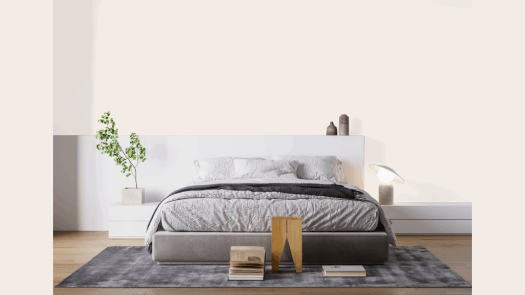
I’ve used Vintage Taupe in three different bedrooms over the years. Each time, it created a restful space that felt just right for winding down. The soft tone works with many bedding colors – from crisp whites to deep blues.
You might find that this color helps make your bedroom feel larger yet still cozy. It doesn’t crowd the space like darker colors can, but it’s warmer than plain white.
2. Bathroom
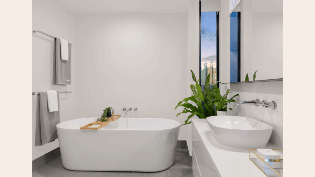
Your bathroom needs a color that won’t tire your eyes or clash with furniture. Vintage Taupe fills this role perfectly. When I painted my own bathroom, I was shocked at how well it worked with both my brown leather sofa and gray accent chairs.
Nothing had to be replaced! This color creates a clean backdrop for art and photos, too. The neutral base lets other colors stand out without fighting for attention.
3. Kitchens
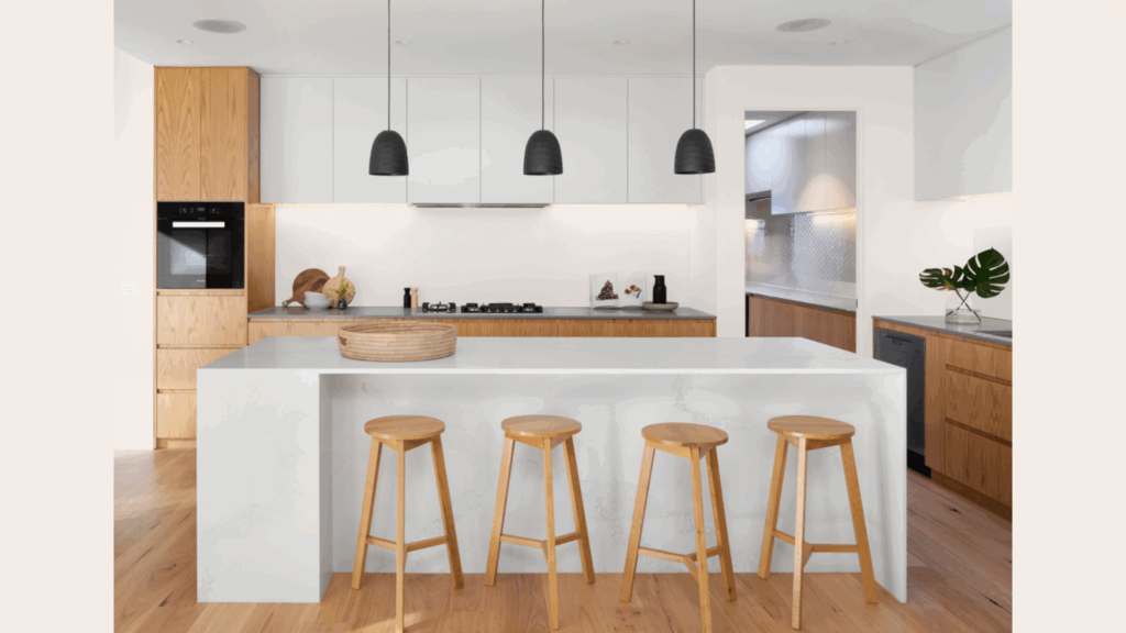
Kitchens need colors that hide small marks while still feeling clean. Vintage Taupe handles both tasks with ease. I recommend this color for kitchen walls if you have white or wood cabinets.
The contrast is just enough to add interest without making the space feel busy. You’ll notice how it complements both stainless steel and brass fixtures – a rare quality in a paint color.
4. Home Offices
Your home office should help you concentrate without putting you to sleep. This balanced neutral does exactly that. When I switched my office from bright white to Vintage Taupe, my work focus improved.
The gentle color reduced eye strain during long computer sessions. My tip is to pair this wall color with a few green plants for an office that feels both professional and peaceful.
Flooring Options that Pair Beautifully with Vintage Taupe
Vintage taupe is a versatile color that bridges neutral tones with warmth. When selecting flooring to complement this beautiful shade, several options can create visual harmony in your space.
1. Light Oak or Maple Flooring
I’ve seen Vintage Taupe work wonders with light oak floors in several homes. The gentle contrast between the warm walls and the pale wood creates a soft, flowing feel throughout the space.
You might notice how this pairing makes rooms feel larger and more open. The light floors bounce sunlight around while the taupe walls add just enough color to feel homey.
This combo works in almost any room. My kitchen has this exact pairing, and visitors always comment on how pleasant and welcoming it feels.
2. Rich Walnut or Espresso Woods
Dark wood floors create a striking base when paired with Vintage Taupe walls. The contrast is stronger here, but still very pleasing to the eye.
I painted my dining room in this color to complement the walnut floors, and the result was pretty nice. The walls seem to recede while the rich floor takes center stage.
You’ll find this combination particularly good for more formal spaces. The dark wood adds weight and substance, while the taupe keeps things from feeling too heavy or stuffy.
3. White-Washed Wood for Coastal Vibes
Have you ever walked into a room that instantly made you feel like you were on vacation? That’s what happens when you pair Vintage Taupe with white-washed wood floors.
This combo brings a breezy, relaxed feeling to any space. I used it in my guest bathroom, and now it’s everyone’s favorite room in the house.
You can enhance this coastal feel with blue accents and natural textures. The taupe walls provide the perfect neutral backdrop without being stark white.
4. Neutral or Warm-Toned Tiles
Tile floors in cream, beige, or warm gray tones match wonderfully with Vintage Taupe. The similar color family creates a smooth visual flow from floor to wall.
I recently helped a friend choose this color for her kitchen with travertine tile floors. The walls and floor now work together to create a welcoming space that feels both classic and current.
Testing is crucial with this pairing. Tiles often have multiple tones within them, and you’ll want to make sure the undertones play nicely with Vintage Taupe.
Vintage Taupe vs Other Warm-Neutral Paints
When choosing the right warm neutral, it helps to see how Vintage Taupe stacks up against similar colors. I’ve worked with all these shades and can share what makes each one unique.
| Paint Color | How It Differs From Vintage Taupe | Best Used For | My Personal Take |
|---|---|---|---|
| Vintage Taupe (2110-70) | Our baseline color is – soft blend of beige and gray with subtle mauve undertones | All-purpose; works in most rooms and lighting conditions | My go-to for clients who can’t decide between beige and gray |
| Edgecomb Gray (HC-173) | Cooler and grayer with less of the warm undertones; can look more “greige” | North-facing rooms that need warmth without yellow | I find it feels more modern, but it can look flat in rooms without much natural light |
| Feather Down (OC-6) | Lighter and airier with more yellow undertones than Vintage Taupe | Smaller rooms that need to feel bigger and brighter | When I used this in my hallway, it felt clean but warmer than white |
| Pale Oak (OC-20) | More muted with stronger gray undertones; less warmth showing through | Modern spaces that need softness without being too beige | Works better with cool-toned furniture than Vintage Taupe in my experience |
| Manchester Tan (HC-81) | Noticeably yellower/more golden than Vintage Taupe | Traditional homes pair well with wood trim | I’ve found this can look dated in certain lighting conditions |
You might notice these colors all have similar LRV (Light Reflectance Values), but they create very different feelings in a room. The undertones make all the difference.
Conclusion
Vintage Taupe offers a special balance that’s hard to find in other paint colors. It sits perfectly between beige and gray, with just enough warmth to make a room feel welcoming without being too yellow or pink.
I’ve used this color in many rooms over the years, and it rarely disappoints. Its ability to shift slightly with changing light keeps spaces interesting while still providing a calm backdrop.
Remember these key points about Vintage Taupe:
- It works in most lighting conditions
- It pairs well with many flooring types
- It creates a peaceful feeling in any room
- It’s neutral enough to last through changing trends
Before you commit, please test a sample on your walls. Paint a large swatch and live with it for a few days.
Looking for a color that feels both peaceful and full of subtle depth? Give Vintage Taupe a try. Your walls – and your mood – will thank you.