")
I’ve had Benjamin Moore’s Gentle Gray on my walls for about a year now, and I want to share what I’ve learned about this soft, balanced color. This subtle, cool-toned gray has changed my home in unexpected ways.
In this blog, you’ll learn:
- What Gentle Gray truly looks like in actual homes
- The best rooms for this color
- Perfect color combinations
- How to properly test before buying
I’ve used this paint in several rooms with different light exposures and noticed how it changes throughout the day. I’ve made the mistakes, so you don’t have to.
Let’s determine if this soft, balanced gray is the ideal choice for your home.
What Kind of Color Is Gentle Gray?
Gentle Gray (Benjamin Moore 1626) is a soft, mid-tone gray with subtle blue undertones. It makes a calm background and adds a cool, soothing feeling to any room. I think of it as morning mist—quiet, balanced, and full of depth.
I’ve watched it change throughout the day. In morning light, it shows more of its blue character. By afternoon, the true gray aspects become more clear, and in evening light, it takes on a deeper, more complex quality.
The color has an LRV (Light Reflectance Value) of 57.2, placing it in the medium-light range. This means it balances light absorption and reflection, adding character without making a room too dark. This balanced nature makes Gentle Gray perfect for creating spaces that feel both cool and cozy.
What makes Gentle Gray special is its ability to create a sense of calm and subtle depth. In most spaces, it adds a feeling of peace with a refined quality that fits many settings and home styles.
What Rooms Work Best with Gentle Gray?
I’ve found that Gentle Gray works well in spaces where a clean, timeless look is desired that will last for years. Based on my experience, here are the top five spaces where Gentle Gray works best:
Living Rooms
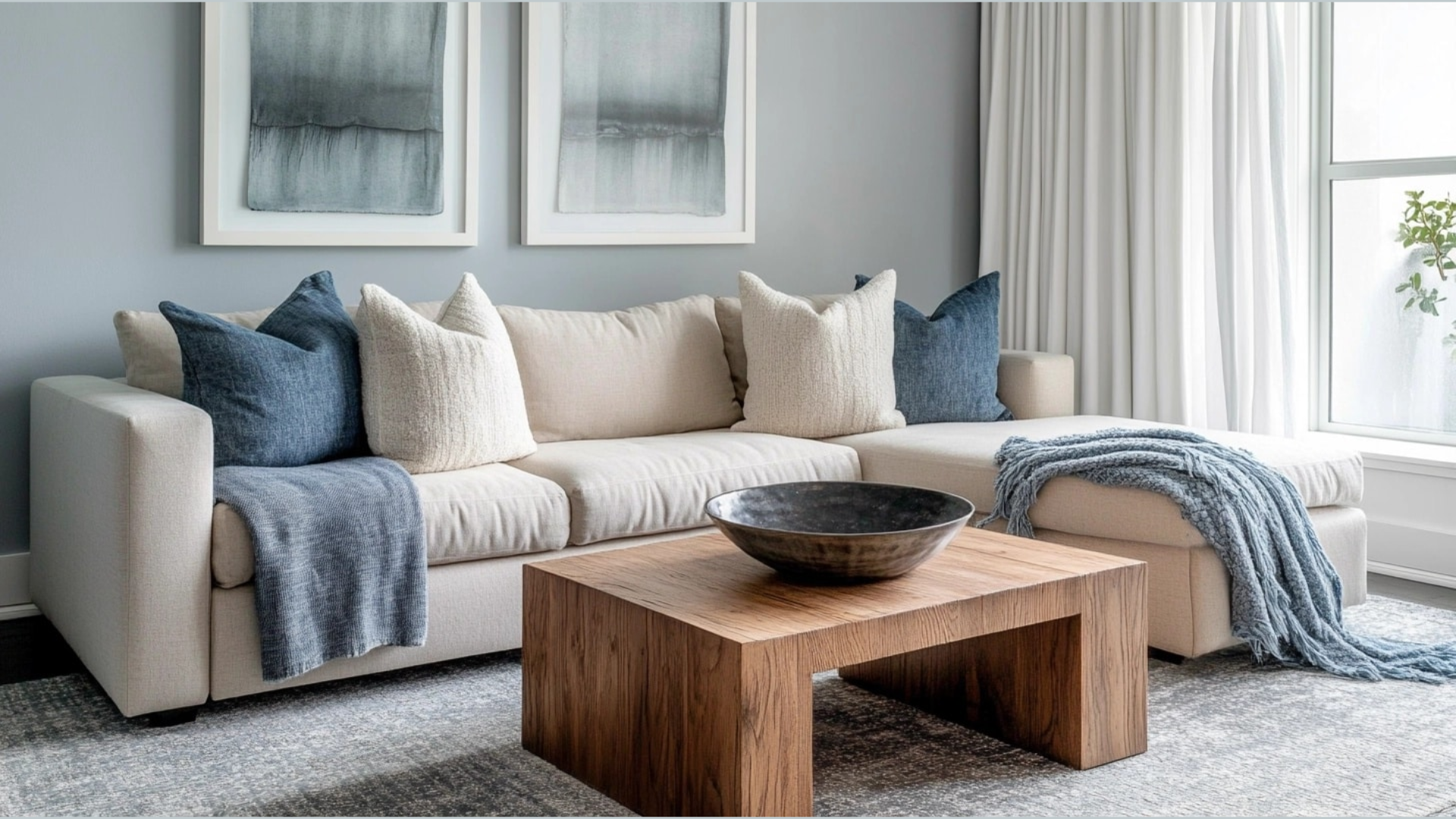
This color creates a sense of calm and warmth in living spaces. It makes a soothing background that allows furniture and art to stand out nicely. In my living room, the Gentle Gray walls make the space feel balanced while showcasing my wooden furniture and silver accent pieces.
The color works especially well in spaces that need to feel bright without being too stark. When paired with good lighting, it creates a room that feels both clean and comforting.
Bedrooms

This balanced gray can add a touch of calm to these personal spaces. I painted my guest bedroom Gentle Gray, and it feels both cool and cozy. It works well for a space that needs to feel peaceful yet not boring.
The color goes beautifully with white bedding and natural wood fixtures. It adds just the right amount of color without being overpowering, making it a smart choice for a room that needs to encourage rest.
Home Offices and Studies
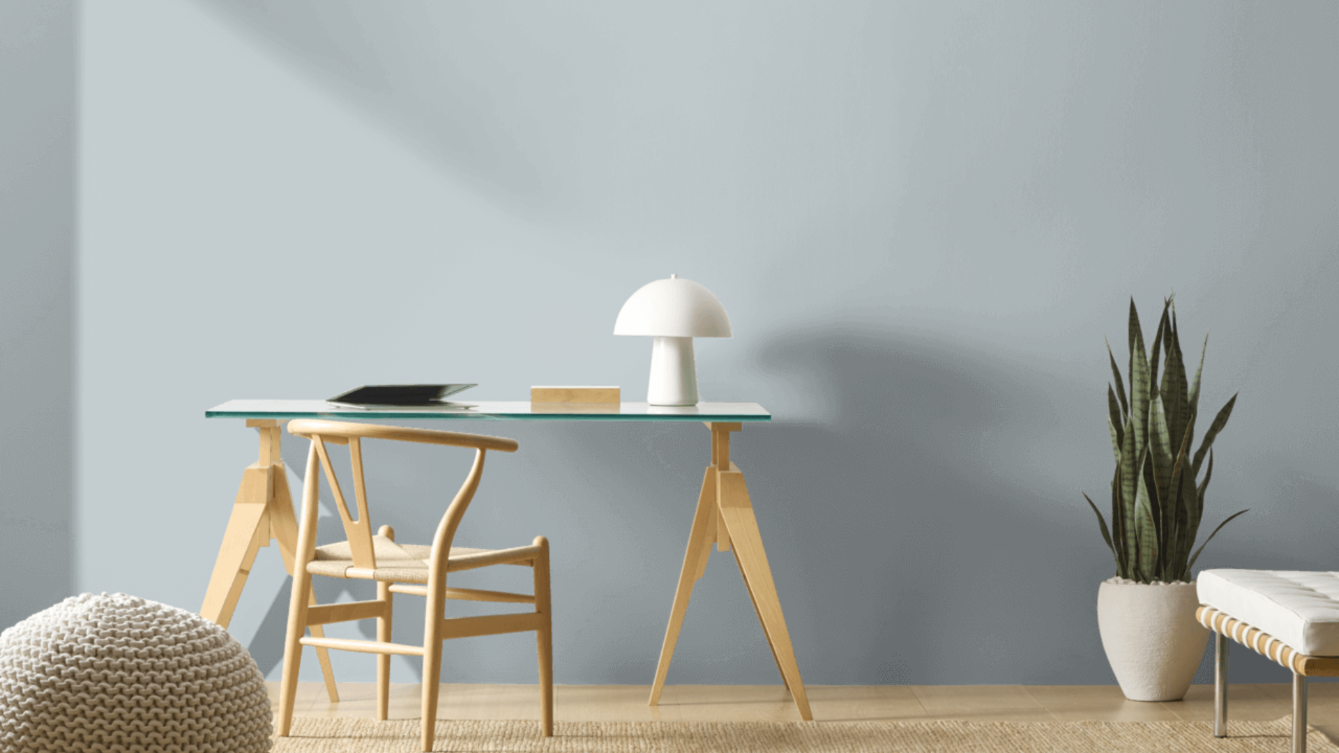
Gentle Gray helps create a sense of calm and focus in work areas. The balanced gray feels fresh yet comfortable during long working hours. I painted my small home office in this shade and find it makes the perfect background for productivity while keeping me relaxed and focused.
Gentle Gray is ideal for spaces that require a clean yet comfortable ambiance. The color seems to reduce stress while helping concentration. I’ve noticed I feel more at ease working in my Gentle Gray office compared to my previous, plain white workspace.
Kitchens

Gentle Gray brings a clean yet refined feel to kitchen spaces. I used it on my kitchen walls, creating a fresh canvas that adds depth to the room without being too much. The cool tone feels clean and fresh, perfect for a food preparation area.
What works especially well is how Gentle Gray complements both light and dark cabinets. With my white cabinets, the gray creates a soft, cool contrast. My neighbor used it with dark wood cabinets, and it added balance while still keeping a clean feel. The color also pairs nicely with stone countertops, creating a cohesive, fresh look that doesn’t feel too cold.
Bathrooms

This mid-tone gray can make bathrooms feel like spa retreats. I used it in my main bathroom, where it created a clean, cool atmosphere. The gray tone feels fresh and peaceful, making it an ideal choice for a space designed for relaxation.
What surprised me is how well it works with different tile colors. My white subway tiles look crisp against the Gentle Gray walls, while plants bring life that helps balance the cool quality of the walls. The room feels special yet comfortable.
What Colors Complement Gentle Gray?
- Crisp whites: They create a clean contrast that feels fresh and balanced
- Soft creams: Offer a subtle contrast that feels cohesive and warming
- Medium to dark wood tones: Add natural texture and complementary warmth
- Navy blue accents: Create a cool combination that enhances the blue undertones
- Silver and chrome accents: Add a touch of brightness that complements the cool undertones
For my living room, I combined Gentle Gray walls with white trim and silver lighting fixtures. The combination feels both fresh and balanced.
What Style Works Well with This Color?
Gentle Gray fits various design styles. In modern homes, it creates a perfect clean background for simple pieces. For coastal spaces, it offers a cool quality that feels fitting and grounded. In traditional settings, it brings a fresh update while respecting classic elements.
Most impressively, Gentle Gray complements homes that mix different styles by adding a calm presence to spaces that combine various elements.
My own home combines contemporary items with more traditional ones, and this color creates the perfect backdrop for both. This flexibility makes it a smart choice if you like to change your decor or mix elements from different styles.
Is It a Warm or Cool Color?

Gentle Gray is a cool color with subtle blue undertones. The gray base gives it a clean, fresh feel, while the slight blue elements add depth.
I’d describe it as “softly cool” – the kind that makes a room feel refreshed rather than cold or stark. The balanced aspects keep it from feeling too cool. This balance makes it work well year-round in most homes.
When used well, it creates spaces that feel both clean and comfortable. The depth keeps it livable for everyday spaces. In rooms with ample natural light, the balance allows it to showcase its true character throughout the day.
If you’re worried that a space feels too cool, I’ve found that adding warmer elements, such as wood tones, fabric textures, or brass fixtures, creates the perfect balance. In my bathroom, the Gentle Gray walls look beautiful with my natural wood vanity and warmer metal fixtures.
Color Characteristics Table
| Characteristic | Gentle Gray | What This Means For Your Space |
|---|---|---|
| Temperature | Cool | Creates a clean, calming atmosphere |
| Undertones | Gray with slight blue notes | Adds depth and sophistication |
| Light Reflectance Value | 57.2 | Reflects more light than it absorbs, creating a bright, airy atmosphere |
| Seasonal Feel | Year-round | Works well in both summer and winter settings |
| North vs. South Rooms | Adaptable | Appears cooler in north-facing rooms, more balanced in south-facing rooms |
How to Test This Color in Your Space?
- Buy a sample: Get a small container of Gentle Gray
- Paint a board: Use a 2×2-foot piece of white poster board
- Move it around: See how it looks in different locations at different times of day
- Live with it for 3 days: Your first impression might change
When I tested Gentle Gray, I was surprised by the changes it underwent from morning to evening. In my north-facing bedroom, it seemed more blue and cool. In my south-facing kitchen, it displayed its balanced gray aspects more prominently throughout the day.
What Paint Finish Should You Choose?
- Flat: Good for ceilings and walls with texture issues
- Matte: My top choice for most walls – the color looks soft without glare
- Eggshell: This works in kitchens and bathrooms, where you need to clean walls
- Satin: Adds a slight sheen, could make the color look slightly brighter
- Semi-gloss: Too shiny for Gentle Gray walls, but works for trim and doors
I used a matte finish in my bedroom and an eggshell finish in my kitchen and bathroom. The eggshell finish makes cleaning easier without adding too much shine that would alter the color’s appearance.
Real Home Ideas Using Gentle Gray
- Accent wall: Gentle Gray on one wall creates a focal point that makes a room feel more balanced
- With white trim: Used with white trim colors for a crisp contrast
- Cabinets: Kitchen island or bathroom vanity in this shade creates a custom look
- Furniture: A bookcase or dresser painted this shade adds a cool touch
- Exterior: Works beautifully as an accent color for doors or trim
My friend painted just one wall in her dining room, Gentle Gray with white trim, creating a balanced look that feels both fresh and clean. It looks amazing and has inspired me to think about using it in more areas of my home.
Mistakes to Avoid
- Using it with purely warm lighting: I tried Gentle Gray in my hallway with very warm (2700K) bulbs, and it looked muddy, losing its character. Use balanced white light (3000-4000K) to show its true beauty.
- Not checking it at night: I was shocked how different Gentle Gray looked under artificial lighting at night compared to daytime. Always check your sample both during the day and evening hours before committing.
- Going too cool with decor: In my first attempt, I paired Gentle Gray with only cool-toned fabrics and metals, and the room felt cold. Adding some warm oak pieces and brass lamps created the perfect balance.
- Painting directly over dark colors: When I painted my office Gentle Gray over a previous dark blue, the color looked patchy and darker than expected. Always use a proper primer first or plan for extra coats.
- Forgetting about ceiling color: In my bathroom, I left the ceiling bright white, and it created a stark contrast with the Gentle Gray walls. Using a softer white or even a 50% diluted version of Gentle Gray on the ceiling created a much more cohesive look.
Why Do People Like Gentle Gray?
Gentle Gray has become popular among many homeowners, and I understand why. Its balanced quality creates spaces that are calm while still feeling very livable. People like it because it’s not a basic gray—it has personality without being hard to use.
The color creates clean spaces that still feel cozy and inviting. It works with many decorating styles and doesn’t go out of style quickly, unlike more trendy colors. Whether in natural or artificial light, it shifts throughout the day, keeping spaces interesting.
Conclusion
Gentle Gray creates spaces that feel both clean and cozy at the same time. After using this color in multiple rooms over several months, I remain satisfied with my choice. What makes it stand out is how it adds character while remaining very flexible with different furniture and decor styles.
It’s not a color for those who want very warm walls. Instead, it creates a foundation that supports your furniture and accessories while making a subtle statement of its own. This balanced presence explains why it remains a favorite choice year after year.
In a world of stark whites and basic beiges, Gentle Gray is the ideal choice for those seeking to add color with purpose. It works with modern, coastal, traditional, and many other styles.
It’s a truly useful color that creates beautiful, livable spaces that feel fresh and personal, and that’s what truly matters in a home.
Frequently Asked Questions
Does Gentle Gray Look Too Blue in Some Rooms?
In north-facing rooms with limited natural light, Gentle Gray can show more of its blue undertones. I found this in my small powder room, which faces north. To balance this, I added warm brass fixtures and soft cream towels, which helped create the perfect balance.
How Does Gentle Gray Hold up Over Time?
After one full year, my Gentle Gray walls have maintained their color without fading or yellowing. The balanced nature of the color means it ages well. In high-traffic areas like my hallway, I’ve found that marks and scuffs are less noticeable than on the previously white walls.
Can I Use Gentle Gray for Exterior Trim?
Yes! My neighbor used Gentle Gray for her exterior window trim against white siding, creating a subtle and refined contrast. It works especially well in shaded areas where the blue undertones add depth without becoming too stark or dark.
How Many Coats Will I Need?
In my experience, Gentle Gray typically needs two full coats for even coverage. When I painted over a previous light color, two coats were sufficient. However, when covering a dark red accent wall, I needed a primer plus two coats to get the true color. Using high-quality paint makes a big difference in coverage.
Is Gentle Gray Too Cold for North-Facing Rooms?
While Gentle Gray does show its cool side in north-facing rooms, I wouldn’t say it’s too cold. In my north-facing office, I balanced the coolness by incorporating warm wood furniture, a textured rug with warm tones, and brass lighting fixtures. These elements work together to create a space that feels cool yet comfortable throughout the day.