")
I tested a few gray paints before choosing Sherwin-Williams Escape Gray, and I noticed right away that it does not look flat or plain.
It has a soft tone that changes slightly with light, which made me pay closer attention before using it in my space.
If you are thinking about this color, I will share what I saw after trying it on the walls.
I will share the undertones, how it looks in natural and artificial light, and where it fits best in a home. I also include simple tips to help you match it with trim, floors, and furniture.
By the end, you will have a clear idea if this shade works for you and how to use it the right way before you paint.
An Overview of Sherwin-Williams Escape Gray
Sherwin-Williams Escape Gray is a soft green-gray paint that feels calm and easy to use in many rooms. It is not a strong gray, so it can look a bit green, especially in natural light.
The undertone is the key thing to notice, because it changes based on the lighting in your space.
In bright rooms, it may look lighter and fresher, while in darker rooms, it can feel deeper and warmer.
This color works well in living rooms, bedrooms, and even kitchens if you want a relaxed look. It pairs best with white trim and light wood tones for a clean finish.
I find it helpful to test a sample first, since lighting can shift how it looks.
Overall, it is a good choice if you want a soft color that is not too cold or too dark.
Color Details at a Glance
This quick table helps you check the main specs of Escape Gray fast. You can use it to compare shades before picking the right paint for any room.
| Detail | Value |
| SW Code | SW 6185 |
| Hex Code | #ABAC9F |
| RGB Values | 171 / 172 / 159 |
| LRV | 41 |
| Color Family | Green / Gray |
| Collection | HGTV Home by SW – Neutral Nuance |
| Best Use | Interior & Exterior |
| Recommended Finishes | Eggshell, Satin, Semi-Gloss |
Understanding the Undertones of Escape Gray by Sherwin-Williams
Escape Gray has a green base with blue and gray undertones. This combination is what gives the color its cool, calm quality. It doesn’t carry any yellow or beige warmth, which means it leans cool overall.
Understanding this matters before you commit. The green undertones are subtle enough that the color won’t read as a bold green in most spaces.
But in rooms with a lot of natural light, especially in the afternoon, those green notes will become more visible.
The blue undertones keep things from feeling too earthy, adding a quiet crispness to the overall tone. Together, the green and blue undertones make Escape Gray feel fresh without feeling stark.
It’s a color that pairs well with both warm and cool accents, which gives you a lot of flexibility when it comes to furniture, textiles, and trim choices.
How Lighting Affects Escape Gray?
Lighting changes everything with this color. Before you paint a full room, test it in your actual space over a full day.
Natural Light
In bright natural light, the green undertones in Escape Gray become much more visible. The color feels fresh and open, almost like a soft sage.
Rooms that get a lot of sunlight will show more of the green side of this color, especially in the afternoon hours.
East-facing rooms catch warm morning light that gives the color a softer, slightly warmer tone early in the day.
West-facing rooms pick up the golden tones of late afternoon sun, which can make Escape Gray feel richer and more layered than it looks on a swatch.
Artificial Light
Under warm artificial lighting, such as standard incandescent or warm LED bulbs, Escape Gray pulls back toward gray. The green tones quiet down, and the color takes on a softer, more muted look that feels cozy in the evening.
If your space relies heavily on artificial light, test the color under your actual bulbs before committing.
Cool white LEDs will push the color toward a blue-gray, while warm bulbs will neutralize the green undertones and make the space feel calmer and more settled overall.
North vs. South-Facing Rooms
North-facing rooms receive cooler, indirect light throughout the day, so Escape Gray will lean more toward blue-gray and feel noticeably cooler in these spaces.
To balance this, pair it with warm white trim and wood-toned furniture.
South-facing rooms get stronger, more direct sunlight for most of the day, which draws out the green undertones and adds a sense of warmth to the color.
These rooms show Escape Gray at its best, with a bright, calm, and welcoming feel.
Best Rooms to Use Escape Gray
I like how it balances light and depth, making the space feel open yet warm. It works well with wood, metal, and soft fabrics for a clean, relaxed look overall.
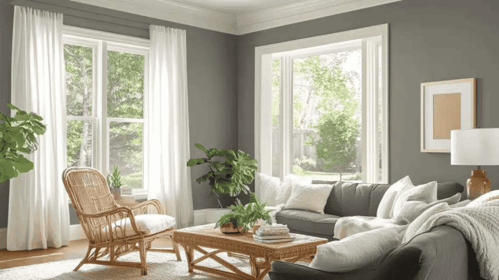
1. Living Room
Escape Gray makes a strong choice for living room walls. It creates a calm backdrop that lets your furniture and decor take center stage.
The subtle green undertones add a quiet earthiness without pulling attention away from the rest of the room.
Pair it with natural textures like wood, linen, or woven rugs to bring out its grounded side.
It also works well as an accent wall behind a main seating area if you want to test the color before committing to all four walls.
Soft whites on the trim and ceiling help the color feel clean and complete rather than heavy.
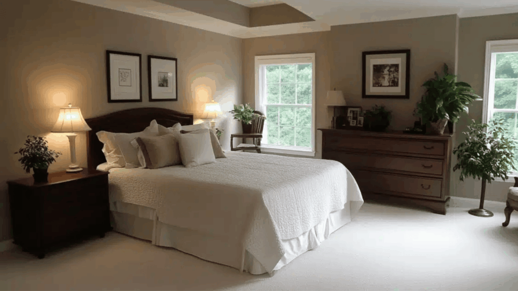
2. Bedroom
This color is a natural fit for bedrooms. Its soft, cool tones create a restful feeling that makes it easier to wind down at the end of the day.
It works well in both large and small bedrooms. In bigger rooms, it keeps the space grounded without making it feel cold.
In smaller rooms, it creates a snug, settled feeling without closing the space in.
Layer it with soft whites, muted greens, and warm textiles like linen or cotton for a bedroom that feels put-together and easy to sleep in.
Adding green plants against this backdrop also works well.
3. Kitchen
Escape Gray works particularly well on kitchen cabinets. It adds character without looking trendy.
Also, it holds up well against both warm and cool countertop materials like white quartz, butcher block, or light stone.
Pair it with white walls and brushed-nickel or matte-black hardware for a clean, classic result. It also works on kitchen walls when paired with white cabinetry, giving the space a fresh, balanced feel.
The color is forgiving enough to work in both modern kitchens and more traditional styles without feeling out of place in either.
4. Bathroom
For a spa-like bathroom, Escape Gray is a solid pick. It pairs well with white tiles, natural wood accents, and soft towels in neutral tones.
The cool undertones give the space a clean, calm quality that feels intentional rather than plain.
A satin finish works best in bathrooms since it holds up to moisture and wipes down easily.
For smaller bathrooms, keep the trim light and add a mirror or two to reflect light back into the room and prevent the space from feeling too closed in.
5. Exterior and Front Door
Don’t overlook Escape Gray for exterior use. On a front door, it adds a clear pop of color that feels grounded and intentional without going loud or bold.
It looks strong against brick, white siding, or natural wood finishes, and pairs well with dark green shutters for added contrast.
On exterior walls, the subtle green undertones blend naturally with surrounding landscaping, making the home feel like it belongs in its setting rather than standing apart from it.
It also holds up well on shutters and trim when you want a cohesive exterior color story.
Colors that Pair Well with Escape Gray
The right color combinations can make Escape Gray look even better in your space. These pairings work well for trim, accent walls, cabinetry, and more.
| Color Name | SW Code | Best For |
| Alabaster | SW 7008 | Trim, ceilings, and adjacent walls |
| Pure White | SW 7005 | Crisp trim contrast |
| Accessible Beige | SW 7036 | Warm accent walls, adjacent rooms |
| Naval | SW 6244 | Bold accent walls, front doors |
| Evergreen Fog | SW 9130 | Deeper tones on cabinetry or shutters |
| Elephant Ear | SW 9168 | Warm neutrals, furniture |
| Shade Grown | SW 6188 | Deeper green accents |
| Urbane Bronze | SW 7048 | Hardware, accent furniture |
Best Finish for Escape Gray
The right finish affects how the color looks and how long it lasts. This is what works best for each surface:
- Walls: Eggshell finish; low sheen, easy to clean, works in most living spaces
- Trim and doors: Semi-gloss; adds contrast and holds up to frequent touch
- Bathrooms and kitchens: Satin finish; durable, moisture-resistant, and easy to wipe down
- Cabinets: Semi-gloss or satin; provides durability and a clean look
- Exterior surfaces: Sherwin-Williams Duration Exterior in satin or gloss for weather protection
Escape Gray vs. Similar Sherwin-Williams Colors
Escape Gray isn’t the only soft gray-green out there. The table shows how it compares to a few similar Sherwin-Williams colors so you can be sure you’re picking the right one.
| Color | LRV | Undertone | Best Use |
| Escape Gray SW 6185 | 41 | Green + Blue-Gray | All rooms are versatile |
| Evergreen Fog SW 9130 | 30 | Deeper green | Accent walls, cabinets |
| Saybrook Sage HC-114 | 44 | True sage green | Bedrooms, living rooms |
| Passive SW 7064 | 58 | Blue-gray | Bright, airy spaces |
| Rare Gray SW 6199 | 51 | Neutral gray | Minimal, cool spaces |
Tips to Know Before You Paint
A little preparation goes a long way before you open a single can. Keep these points in mind to get the best results from Escape Gray in your space.
- Check at different times of day: View the sample in morning light, afternoon light, and under your artificial lights at night.
- Use light trim to balance: Pairing Escape Gray with a crisp white trim like Pure White or Alabaster helps define the space cleanly.
- Avoid very bright accent colors: Escape Gray works best with muted, natural tones. Bright, clean reds or neon accents will clash with its cool base.
- Use the color at least three times in a room: Repeat it across walls, textiles, or decor to create a cohesive look.
- Factor in room size: An LRV of 41 means this color absorbs a fair amount of light. In smaller rooms with limited windows, use lighter trim and reflective surfaces to keep things bright.
- Natural materials work well: Wood furniture, stone countertops, and woven textiles all complement Escape Gray’s earthy undertones.
Conclusion
Escape Gray is one of those paint colors that works quietly and consistently across almost any space.
It feels calm but not plain, neutral but not dull, and works well from bedroom walls to doors and kitchen cabinets.
If you’ve been searching for a color that brings a sense of calm to your home without committing to a full green or a flat gray, Escape Gray hits that sweet spot.
Test it in your space, check how it behaves in your light conditions, and pair it with the right trim and accents.
Chances are, it’ll be exactly what you were looking for. Have you used Escape Gray in your home? We’d love to hear how it turned out.
Drop a comment below and share which room you painted or how you styled it.