")
Choosing the right paint color can feel tricky. I have spent time looking at many shades of green, and one color that keeps coming up in homes and design projects is Sherwin-Williams’ Pewter Green.
It has a rich look that feels calm, natural, and easy to style.
In this guide, I will share everything you should know before using it. You will learn what the color looks like, its undertones, and whether it leans warm or cool.
I will also explain how lighting changes the way it appears and what colors pair well with it.
You will also find helpful details, such as the LRV, design styles that suit this shade, and tips to keep rooms from feeling too dark.
By the end, you will have a clear idea of whether this deep green is the right choice for your home.
What Color Is Sherwin-Williams’ Pewter Green?

Pewter Green is a rich, nature-inspired shade that sits between a classic deep green and a modern gray-green.
The color has a quiet, grounded feel that many people find easy to live with. Instead of feeling bright or sharp, it gives a room a steady and relaxed look.
People like this shade because it brings depth to a space without making it feel overwhelming. The tone feels balanced and natural, making it a good fit for many home styles.
Whether a space is modern, traditional, or farmhouse, the color tends to blend in smoothly with the surrounding décor.
Another reason people notice this color is its moody yet calming presence. It adds character to walls or surfaces while still feeling comfortable and timeless.
This mix of richness and subtlety is why the shade often stands out among darker green paint options.
Key Characteristics of Sherwin-Williams’ Pewter Green
People like to look at a paint color’s basic traits before deciding where to use it. These details help you understand how the color behaves on walls, cabinets, or exteriors.
1. Color Code
The official identifier for this paint is SW 6208. Sherwin-Williams uses this code so you can easily find the exact shade in stores or online.
When you give the code to a paint professional, they can mix the precise formula without confusion.
Using the correct code also helps if you need more paint later for touch-ups or another room.
It keeps the color consistent across different surfaces and projects, ensuring the shade stays the same every time you purchase it.
2. Color Family
Pewter Green belongs to the green color family, but it is not a bright or lively green. Instead, it sits in a deeper and more muted part of the spectrum.
This makes it easier to use in many homes because it feels natural rather than bold.
The shade often reminds people of forest tones, moss, or deep plant leaves.
Because of this, it blends well with wood, stone, and other natural materials and keeps the color feeling calm and balanced in most environments.
3. Undertones
One of the most important traits of Pewter Green is its soft gray undertones. These undertones reduce the intensity of the green, giving it a calm, balanced feel.
Without the gray influence, the color could appear too vibrant. The gray base helps the shade look more refined and versatile.
It also allows the paint to work in both modern and classic spaces.
It pairs easily with neutral colors like white, cream, or beige and maintains a steady, sophisticated appearance across different rooms.
4. Depth
Pewter Green is considered a medium-dark paint color. This depth gives it a rich and slightly dramatic look on walls or cabinets.
While it is darker than many greens, it does not feel overwhelming when used correctly.
The gray undertones soften the depth and make the color feel grounded instead of heavy. Because of this balance, the shade appears strong yet calm.
The darker value adds character to a surface while still allowing surrounding décor and materials to remain visually balanced.
5. Light Reflectance Value
The Light Reflectance Value (LRV) of Pewter Green is 12. LRV measures how much light a paint color reflects back into a space.
Lower numbers mean the color absorbs more light and appears darker.
Since 12 is quite low, Pewter Green tends to create a deeper visual presence on walls.
In bright spaces, the color still shows its green tone clearly, but in dim areas, it may appear slightly richer and more muted while maintaining its balanced green-gray appearance.
6. Mood and Style
Pewter Green creates a calm and grounded mood in a space. The color often feels sophisticated without looking too formal or stiff.
Its muted tone helps rooms feel relaxed and comfortable while still looking polished.
The gray undertone prevents the green from becoming too bright, which keeps the overall atmosphere steady and balanced.
Because of this character, the color fits easily into many interior design themes while maintaining a timeless, natural appearance that does not feel trendy.
7. Finish Compatibility
Pewter Green performs well across different paint finishes. Sherwin-Williams offers it in matte, eggshell, satin, semi-gloss, and gloss finishes.
Each finish changes how the color reflects light and highlights surface texture.
Matte gives the shade a soft, muted look, while satin or semi-gloss can make the green appear slightly richer and brighter.
Because the color is deep, smoother finishes can emphasize its class. Choosing the right finish helps maintain the calm and refined appearance that makes Pewter Green widely appreciated.
8. Visual Depth
One key feature of Pewter Green is its strong visual depth. The darker green base, combined with gray undertones, creates a layered appearance rather than a flat color.
This depth gives painted surfaces a sense of richness and dimension. As light moves across the surface, subtle shifts in tone may appear.
That layered effect helps the color feel sophisticated and grounded.
Many deep greens can look harsh, but Pewter Green maintains a smooth and balanced depth that feels natural and visually comfortable.
9. Natural Earthy Tone
Pewter Green has a strong, earthy quality that complements natural color palettes. The shade reflects tones often seen in forests, moss, and shaded leaves.
Because of this natural feel, the color tends to appear calm rather than bold. The gray undertones soften the green, making it feel more organic and grounded.
This feature keeps the color visually stable and pleasant over time.
Instead of demanding attention, Pewter Green creates a steady background that feels timeless and balanced.
10. Color Stability
Another feature of Pewter Green is its color stability across different surfaces and environments.
The gray undertone helps keep the green balanced, preventing it from shifting strongly toward yellow or blue.
Many greens can change noticeably depending on surrounding colors, but Pewter Green usually stays within a muted green-gray range.
While lighting still slightly affects its appearance, the core tone remains consistent. This stability makes the shade easier to predict and dependable when planning interior or exterior paint projects.
Why Designers Love Sherwin-Williams’ Pewter Green?
Designers often choose Sherwin-Williams’ Pewter Green because it brings depth while still feeling calm and balanced. The shade has a rich presence without overpowering a space.
This makes it a reliable option when a room needs color without looking too bold.
Another reason professionals favor this paint is that it works well with a range of colors. Pewter Green pairs well with common design materials such as warm wood, brass, marble, and natural stone.
Its muted tone also blends smoothly with neutral colors like white, cream, and soft gray.
Designers also value the contrast it creates. The deeper green highlights cabinets, built-ins, and architectural details without appearing harsh.
Finally, the color fits many design styles. It works well in modern, farmhouse, traditional, and rustic interiors, which helps it remain popular across different projects and design trends.
Sherwin-Williams’ Pewter Green in Different Lighting
Lighting has a strong effect on how Sherwin-Williams Pewter Green appears in a room. Because it is a deep green with gray influence, the shade can shift slightly depending on the light source.
- Bright Natural Light: The green tone becomes more noticeable and fresh. Sunlight reveals the natural richness of the color and keeps it from feeling too dark.
- Low Natural Light: In darker rooms, the shade can appear deeper and more muted. The gray influence becomes stronger, creating a slightly moodier look.
- Warm Artificial Lighting: Soft yellow lighting adds warmth to the color, making the green feel richer and more inviting.
- Cool Artificial Lighting: Cool white bulbs can bring out the gray side of the color, giving it a sharper green-gray appearance.
- Changing Light Throughout the Day: As daylight shifts, the color may look lighter in the morning and deeper in the evening, subtly altering the room’s mood.
Colors that Pair Well with SW Pewter Green
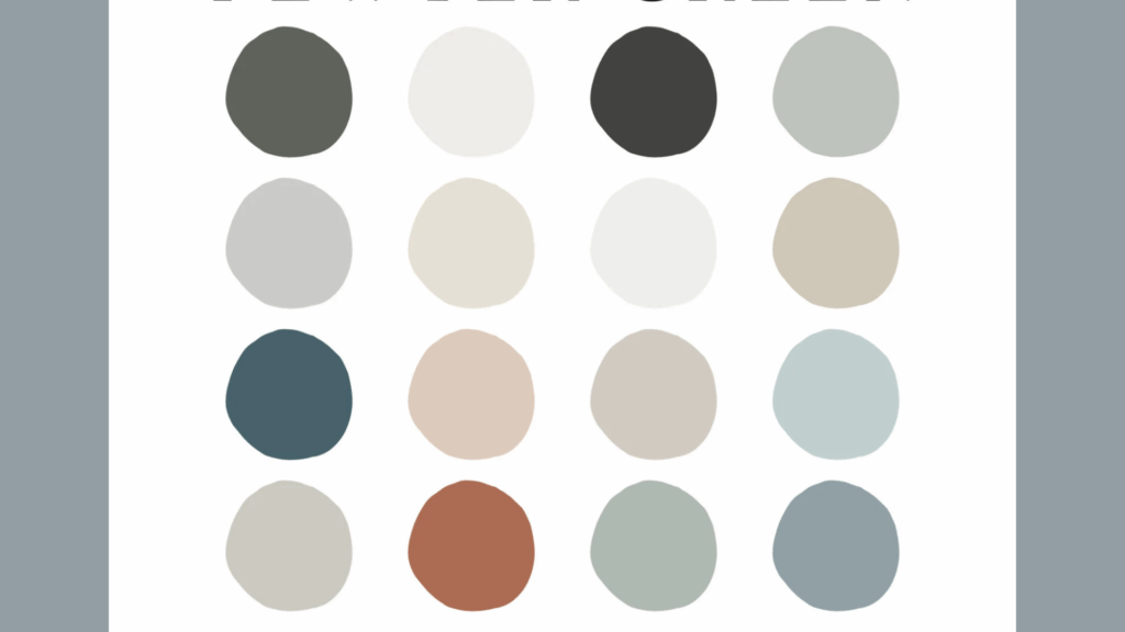
The deep green tone of Pewter Green works well with many colors. Its muted look makes it easy to combine with both light neutrals and warmer natural shades.
- Warm White: Soft whites create a clean contrast with Pewter Green, keeping the space feeling bright and balanced.
- Cream: Cream tones add warmth and soften the darker green, making the room feel comfortable and inviting.
- Light Gray: A pale gray complements the gray undertones in Pewter Green and helps create a calm, modern palette.
- Natural Wood Tones: Oak, walnut, and other wood finishes complement the earthy quality of the color and add natural warmth.
- Brass or Gold Accents: Warm metallic tones highlight the richness of Pewter Green and add an elegant touch.
- Soft Beige: Beige shades help balance the depth of the green and keep the overall color scheme relaxed and neutral.
- Muted Blues: Soft blue tones can pair nicely with Pewter Green, creating a layered palette that still feels calm and natural.
Sherwin-Williams’ Pewter Green vs Similar Green Paint Colors
Many green paint shades look similar to Sherwin-Williams Pewter Green, but subtle differences in undertones, brightness, and depth can alter how they appear in a room.
| Paint color | Brand | Main undertone | LRV | Key difference vs Pewter Green |
|---|---|---|---|---|
| Pewter Green (SW 6208) | Sherwin-Williams | Gray-green | 12 | Deep, muted green with balanced gray undertones; reads as a grounded, darker green. |
| Evergreen Fog (SW 9130) | Sherwin-Williams | Soft gray-green | 30 | Noticeably lighter and softer; works better as an all-over wall color than a dark accent. |
| Rosemary (SW 6187) | Sherwin-Williams | Rich green | — | Slightly lighter and more overtly green; less gray, more color-forward than Pewter Green. |
| Cast Iron (SW 6202) | Sherwin-Williams | Warm gray-green | — | Very close in depth but a bit warmer and more organic; leans slightly more olive than Pewter Green. |
| Night Owl (SW 7061) | Sherwin-Williams | Gray-green | ~13 | Similar depth but reads more gray, so it feels more muted and less “green” than Pewter Green. |
| Backwoods (469) | Benjamin Moore | Dark olive green | — | Deeper and more olive; has a stronger earthy/olive feel than the more neutral Pewter Green. |
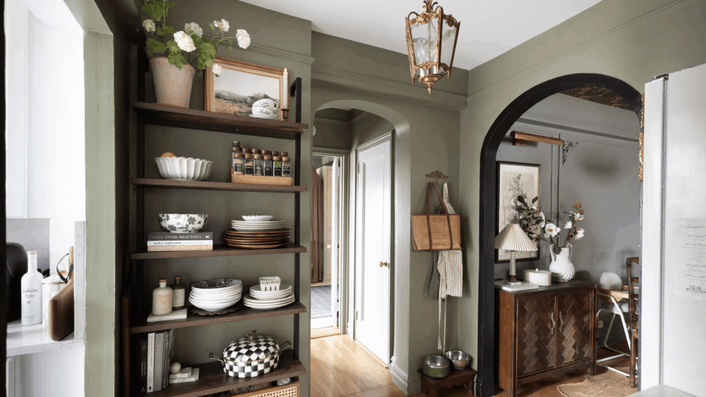
Popular Styles that Use Pewter Green
The deep, muted tone of Sherwin-Williams Pewter Green fits naturally into several home design styles. Its balanced green-and-gray character allows it to blend with both classic and modern interiors.
- Modern Farmhouse: Pewter Green pairs well with shiplap walls, warm wood tones, and black or brass hardware, creating a cozy farmhouse feel with a polished touch.
- Traditional Style: The rich green complements classic details such as crown molding, paneled walls, and classic furniture pieces.
- Rustic Style: The earthy tone complements natural wood beams, stone surfaces, and textured materials often used in rustic homes.
- Modern Style: In modern interiors, Pewter Green can add depth without cluttering the space or tipping the balance.
- Transitional Style: This color combines traditional and modern elements, creating a sense of class and comfort in rooms.
- Scandinavian Style: The muted green pairs well with light woods, simple furniture, and soft neutral tones common in Scandinavian spaces.
- Cottage Style: Pewter Green adds beauty to cottage interiors, especially when combined with soft whites, vintage décor, and natural fabrics.
Where Pewter Green Works Best in Your Home?
Sherwin-Williams Pewter Green can work in many areas of a home because its muted tone feels calm and balanced. The color adds depth while still blending easily with neutral materials and natural textures.
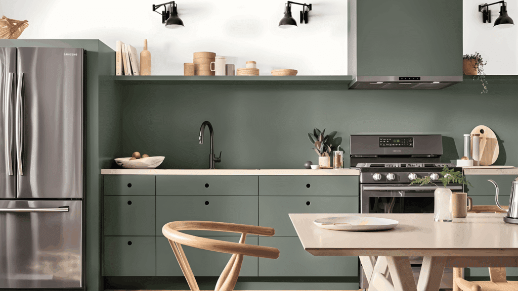
- Kitchen Cabinets: Pewter Green cabinets create a strong focal point in kitchens. The color pairs well with white countertops, brass hardware, and warm wood accents.
- Accent Walls: A Pewter Green accent wall can add depth to living rooms or bedrooms while keeping the overall space balanced.
- Built-In Shelves: Painting built-ins in this shade highlights architectural details and adds contrast against lighter walls.
- Interior Doors: Pewter Green on doors introduces subtle color without changing the entire room.
- Bedrooms: The muted green tone creates a calm, restful environment, making it suitable for sleeping areas.
- Dining Rooms and Home Offices: In dining rooms, the shade adds richness and character; in offices, it creates a grounded, focused setting.
- Exterior Surfaces: On siding, front doors, or shutters, Pewter Green creates a natural, grounded appearance that pairs well with white trim and wood elements.
- Entryways and Bathrooms: These smaller spaces can benefit from the color when balanced with lighter tiles, neutral décor, or warm wood finishes.
Tips for Using Pewter Green without Making a Room Too Dark
Because Sherwin-Williams Pewter Green is a deeper shade, it can sometimes make a room feel heavier if not balanced well. The key is to pair it with lighter elements and good lighting.
- Use Light Trim Colors: Pair Pewter Green with warm white or soft cream trim to create contrast and keep the room from feeling closed in.
- Add Natural Light: Rooms with larger windows or strong daylight help the green appear more balanced and less heavy.
- Combine With Light Furniture: Sofas, chairs, or rugs in lighter shades can soften the darker wall color.
- Use it as an Accent Color: Instead of painting every wall, consider using Pewter Green on one accent wall, built-ins, or cabinets.
- Include Reflective Materials: Mirrors, glass décor, and metallic finishes can help bounce light around the room.
- Layer Warm Wood Tones: Natural wood furniture or flooring adds warmth and balances the darker paint.
- Test the Color First: Paint a sample on the wall and observe it throughout the day to see how lighting affects the shade.
Should You Use Pewter Green for Interior or Exterior Paint?
Sherwin-Williams Pewter Green works well for both interior and exterior spaces. Its deep, muted tone gives homes a calm and balanced look without feeling too bold.
For interiors, the color adds depth and character. It is often used on kitchen cabinets, accent walls, built-ins, and interior doors.
The darker shade helps create contrast while still blending well with neutral colors and natural materials.
For exteriors, Pewter Green offers a rich, classic appearance.
It can look striking on siding, shutters, or front doors, especially when paired with warm white trim or natural wood elements.
Overall, the color is versatile enough for both indoor and outdoor the. The key is choosing the right lighting and surrounding colors to keep the space balanced.
Conclusion
Choosing the right paint color often comes down to how a shade feels in your home. Sherwin-Williams Pewter Green stands out for its depth without feeling overwhelming.
Its balanced green-and-gray character allows it to work across many rooms, materials, and design styles.
From cabinets and accent walls to exterior details, the color can create a calm and grounded look that still feels rich and timeless.
With the right lighting and colors, Pewter Green adds personality while keeping the space cozy and inviting.
Taking time to test the color and see how it reacts in your own lighting can make the final result even better.
If you have used Pewter Green in your home, your experience could help other readers, too. Share how you used this color and what you think about it in the comments below.