")
Ready to change your space with a color that works everywhere?
Let me walk you through everything you need to know. I have spent many hours testing Sherwin-Williams Alpaca. I am excited to share what I found.
This warm, versatile neutral has become one of my go-to recommendations for people who ask me what my favorite neutral color is. SW Alpaca sits in that sweet spot between beige and greige without looking dated.
Even if you’re painting one room or your entire house, this color adapts beautifully to different spaces and lighting conditions.
Sherwin Williams Alpaca and Its Color Properties
Alpaca is a smooth and warm beige-gray that brings balance to any space. This color leans slightly toward beige with subtle gray undertones, creating a neutral backdrop.
The warmth in Alpaca comes from its taupe base, which adds depth without overwhelming a room.
It’s light enough to brighten spaces but has enough pigment to add character to your walls. This makes it incredibly forgiving in homes with varying natural light throughout the day.
| Property | Details |
|---|---|
| Color Code | SW 7022 |
| Hex Code | #CCC5BD |
| Undertone | Warm Beige |
| LRV | 57 |
| RGB | R: 204, G:197, B:189 |
How Does Alpaca Look in Different Lighting?
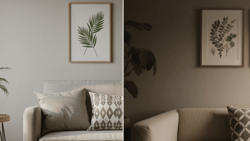
The way Alpaca responds to light is truly remarkable. In north-facing rooms with cooler light, it maintains its warmth and prevents spaces from feeling too gray or dull.
Southern exposure brings out the beige undertones beautifully, creating a soft, glowing effect throughout the day.
Under artificial lighting, Alpaca stays consistent and doesn’t shift dramatically like some neutrals do.
Morning light makes it appear slightly brighter and airier, while evening light improves its cozy, warm qualities.
If you have rooms with limited natural light, this paint color still performs superbly without appearing muddy or dark.
Room-by-Room Application of Sherwin Williams Alpaca
Let’s check out how Alpaca performs in different spaces and find out which rooms benefit most from this versatile warm shade.
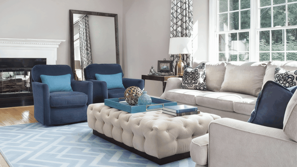
1. Living Room
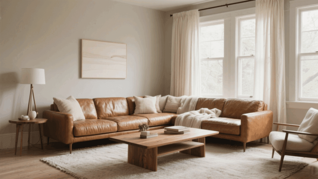
Alpaca creates a foundation for living spaces. The warm neutral tone makes furniture stand out while providing a calming backdrop for daily activities.
I love this pair for its blend of traditional and contemporary design elements, giving you flexibility as your style evolves.
- Preferred Furniture Styles: Mid-century modern pieces, leather sofas, wooden coffee tables, and upholstered accent chairs work perfectly.
- Fixtures and Accents: Brushed nickel hardware, cream curtains, natural wood shelving, and warm brass lighting fixtures.
2. Bedroom
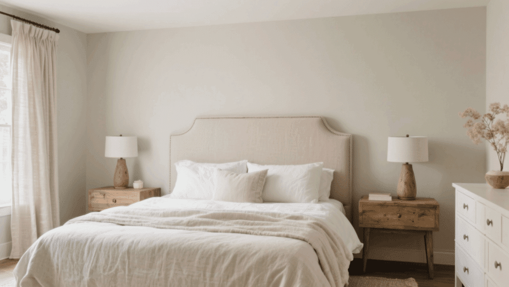
In bedrooms, Alpaca establishes a peaceful retreat that promotes relaxation and rest. The soft warmth of this greige creates a cocoon-like atmosphere without feeling heavy.
It’s neutral enough to work with various bedding colors and patterns throughout the seasons. Its velvety warmth creates a restful escape.
- Preferred Furniture Styles: Upholstered headboards, white dressers, natural wood nightstands, and vintage-inspired furniture pieces complement beautifully.
- Fixtures and Accents: White trim, linen curtains, antique brass lamps, and soft textured throws in cream tones.
3. Dining Room
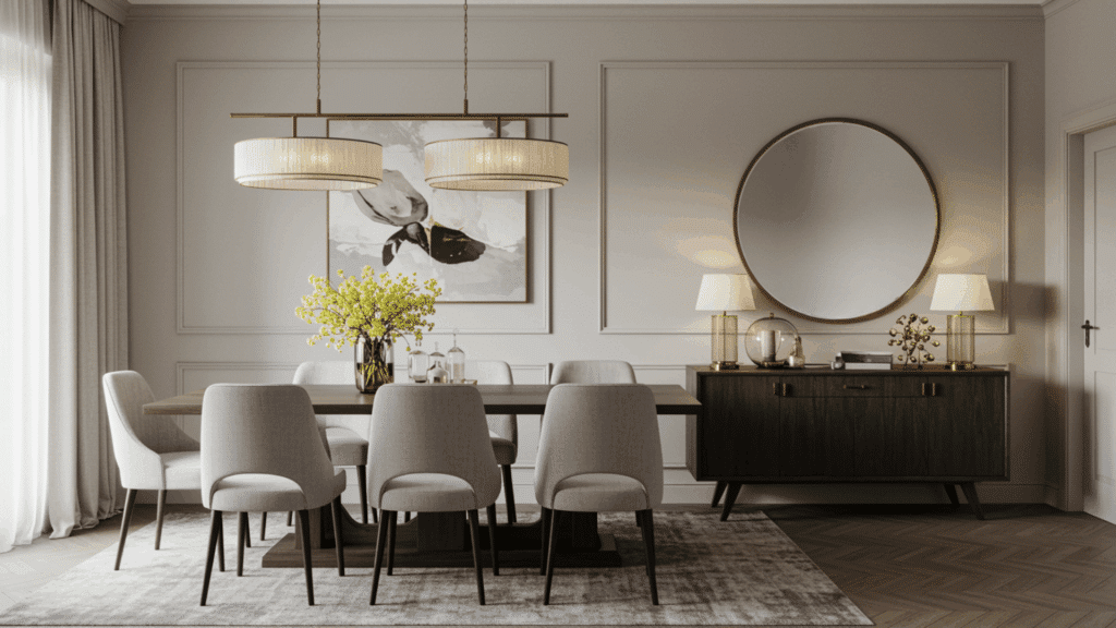
This color creates an intimate setting that encourages conversation while remaining light enough for daytime use.
I like the artwork and mirrors that beautify your dining space and add dimension. The neutral backdrop lets your table settings and decor the center stage.
- Preferred Furniture Styles: Dark wood tables, upholstered dining chairs, modern sideboards, and glass-front china cabinets look beautiful.
- Fixtures and Accents: Statement chandeliers, gold picture frames, white wainscoting, and colorful table linens pop against the walls.
4. Kitchen
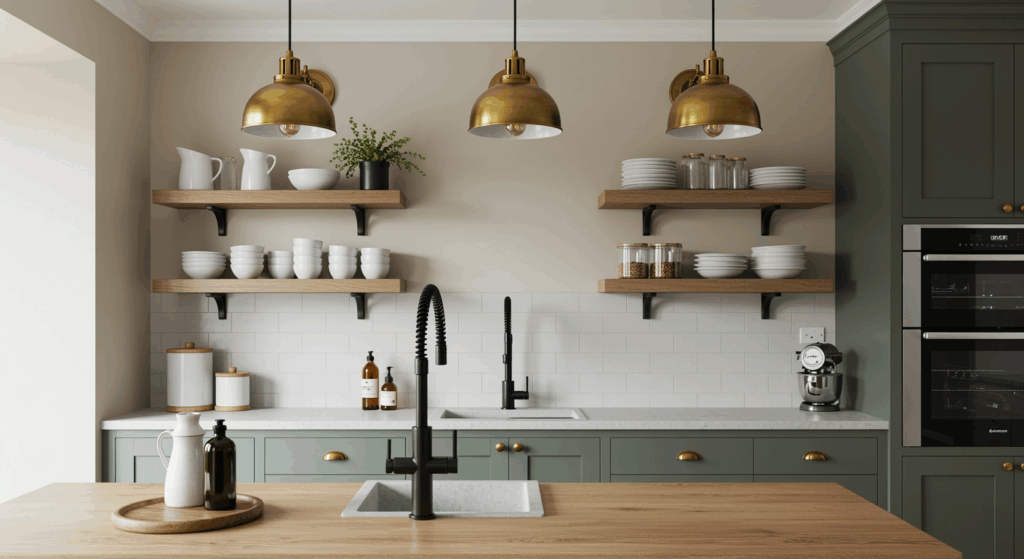
Kitchens painted in SW Alpaca feel clean and fresh while maintaining a homey warmth that pure whites lack.
This color works exceptionally well with white cabinets, creating a subtle contrast without harsh lines. It’s forgiving with kitchen messes and doesn’t scuff as easily as darker colors.
- Preferred Furniture Styles: White shaker cabinets, butcher block islands, open wooden shelving, and modern bar stools create cohesion.
- Fixtures and Accents: Subway tile backsplash, marble countertops, matte black faucets, and pendant lights in various finishes.
5. Bathroom
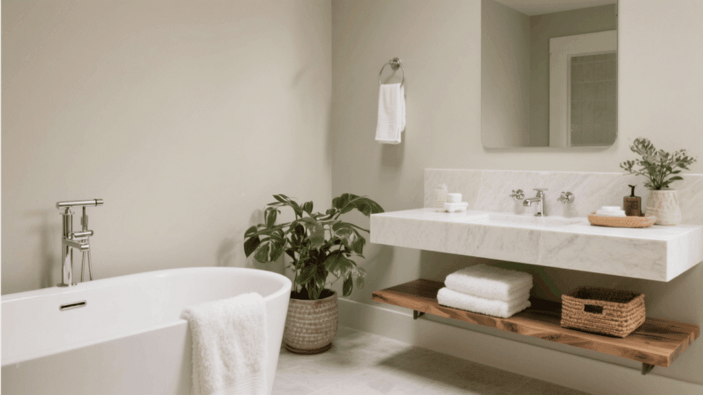
Bathrooms become spa-like sanctuaries when painted with Sherwin Williams Alpaca. The warm neutral creates a clean feeling that bright white can sometimes bring.
I just tried this color handles moisture and maintains its appearance even in steamy conditions. It’s effective in bathrooms with minimal natural light, keeping spaces open.
- Preferred Furniture Styles: Floating vanities, freestanding tubs, wooden storage ladders, and modern medicine cabinets work beautifully together.
- Fixtures and Accents: White subway tiles, chrome fixtures, natural stone counters, and fluffy white towels complete the look.
6. Home Office
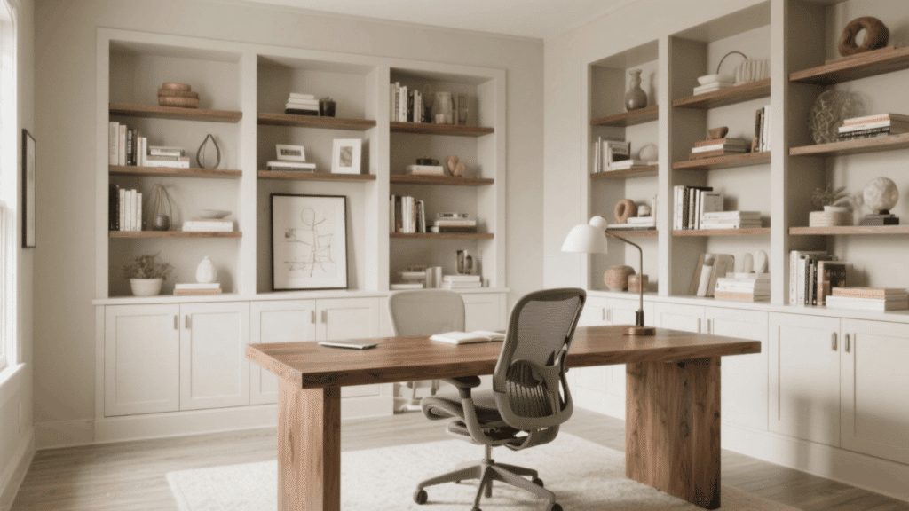
Home offices painted in SW Alpaca promote focus without feeling too serious. The neutral warmth reduces eye strain during long work sessions.
This color creates a good environment that helps minimize distractions throughout your workday.
- Preferred Furniture Styles: Modern desks, ergonomic chairs, built-in bookshelves, and floating shelves create an efficient workspace.
- Fixtures and Accents: Task lighting, brass desk accessories, white trim, and indoor plants bring life to the space.
7. Hallways and Entryways
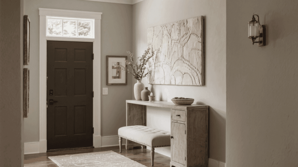
This color makes narrow hallways feel wider and more welcoming to guests entering your home. It’s durable enough to handle traffic areas while hiding minor scuffs and marks well.
I also tried this warm neutral color serves as the perfect bridge when connecting rooms with different accent colors.
- Preferred Furniture Styles: Console tables, upholstered benches, coat racks, and narrow storage cabinets fit perfectly in spaces.
- Fixtures and Accents: Runner rugs, wall hooks, framed mirrors, and ceiling lights brighten and define these areas.
8. Exterior House
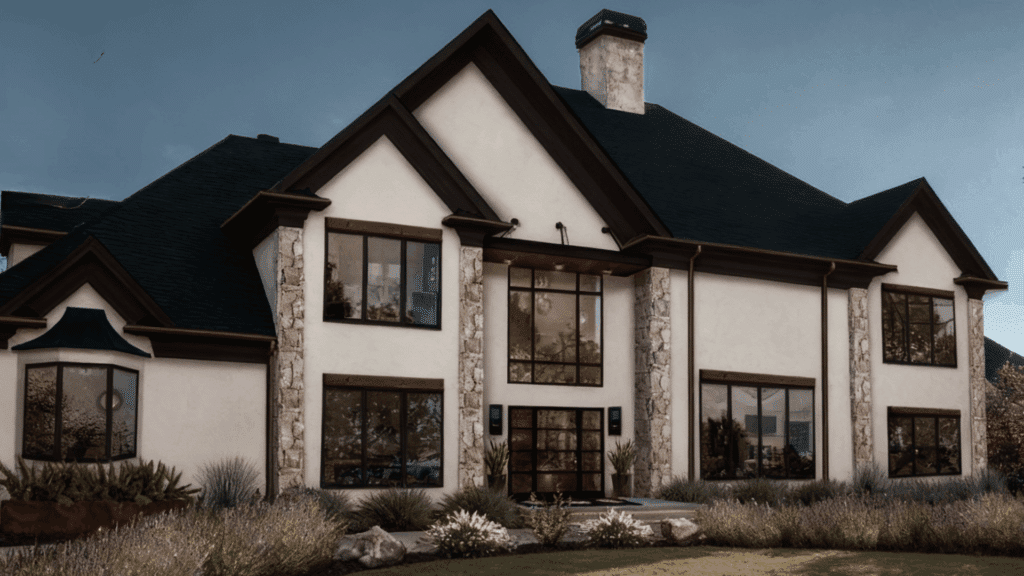
Alpaca Changes exterior walls into welcoming, lasting facades that blend beautifully with any structural style.
The color adapts to changing light throughout the day, appearing warmer in morning sun and cooler in the evening.
- Preferred Furniture Styles: Wicker patio sets, wooden Adirondack chairs, and wrought iron benches complement the neutral warmth of Alpaca exteriors perfectly.
- Fixtures and Accents: Black or bronze light fixtures and white trim details create a striking contrast that enhances architectural features beautifully.
Benefits and Limitations of Alpaca
Choosing the right paint color can change your space, but understanding the benefits and drawbacks helps you make the best decision for your home’s unique needs.
| Pros | Cons |
|---|---|
| Works beautifully in all lighting conditions. | It may appear too warm for those preferring cooler tones. |
| Versatile enough for any room in the house. | It can look slightly different on each wall depending on the light. |
| Hides minor wall imperfections well. | Requires careful coordination with existing flooring colors. |
| Pairs easily with most furniture styles and colors. | May need multiple coats for full coverage over darker colors. |
| Creates a smooth, lasting look. | Not ideal if you want a dramatic, bold wall color. |
| Higher LRV keeps rooms feeling bright and open. | It can appear bland without proper accent colors and textures. |
Color Combination Suits with Alpaca
Alpaca plays well with an impressive range of accent colors. Crisp whites like Pure White or Extra White create beautiful contrast for trim and ceilings.
Deep navy blues and forest greens add drama when used on accent walls or in furnishings. Soft blush pinks and sage greens bring a gentle, modern farmhouse feel to spaces.
For a smoother look, I also pair Alpaca with charcoal grays and black accents. Warm terracotta and burnt orange tones create an earthy, peaceful retreat.
Natural wood tones in any finish complement this beige beautifully, from light oak to dark walnut. Golden yellows introduce cheerful energy without a neutral foundation.
Burgundy accents provide richness that feels classic in living areas. Coastal blues and aqua tones pair surprisingly well, creating serene spaces that feel fresh and calming.
To Conclude
The plunge with this beautiful alpaca might be exactly what your space needs right now. You’ve now got all the information necessary to make the right choice for your home.
This shade bridges the gap between trendy and classic, meaning your walls won’t feel outdated as design trends shift.
In my view, this investment in paint like Alpaca pays off through its lasting appeal. Start with a room to see how it changes your space before committing to the entire house.
Ready to test Alpaca in your home? Pick up a sample this weekend and paint swatches in different rooms to see how the color performs throughout the day.